13 Easy Gallery Wall Ideas for Modern Living Room Styling
By Emily | April 22, 2026
Are you standing in front of a blank wall in your living room, wondering how to fill it without it looking too cluttered or sterile? A gallery wall is one of the best ways to add character, depth, and personality to a space—but it can be easily messed up. Too many frames and it feels chaotic. Too few and it feels boring. Poorly organized and it looks like you’ve just thrown things in, not planned.
A modern gallery wall isn’t about being perfectly symmetrical or collecting expensive frames. It’s about creating visual balance while expressing your own style. And the good news is, you don’t have to be an interior designer to do it. You just need to understand a few basic principles—how visual weight, negative space, color harmony, and layout logic work.
In this article, you’ll find thirteen easy-to-implement gallery wall ideas that will fit into a modern living room. Alongside each idea, you’ll find specific product recommendations that actually work, not just look good. You’ll learn how to get started with the design, how to select pieces, what colors to combine, and how to avoid the most common mistakes. It’s a step-by-step guide you can start tonight.
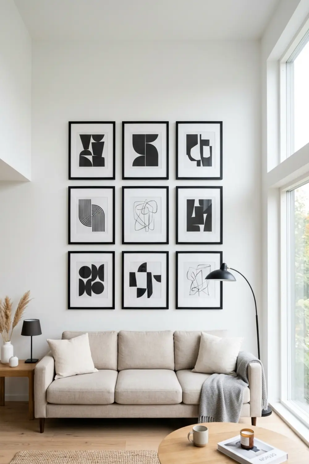
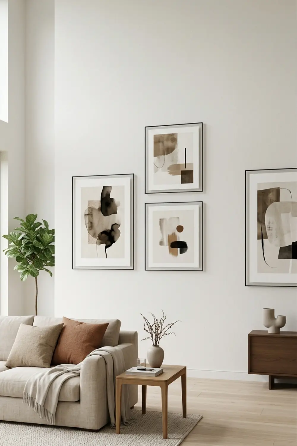
1. Create a Symmetrical Grid Layout for Clean Modern Lines
 Save it
A grid layout is one of the easiest and cleanest ways to create a gallery wall because it gives you a predefined structure. This is perfect if you like order, predictability, and visually calm spaces. A symmetrical arrangement means that all the frames are the same size and are evenly spaced apart – like a grid.
The key here is consistency. Choose frames that are all the same size – for example, all 8×10 inches – and arrange them in a 2×3 or 3×3 grid. The same frames provide structure, but the content can be varied: black and white photos, abstract prints, minimal graphics. The point is that the sameness of the frames creates visual calm, so you can be bolder in the content.
If you’re styling the rest of your space to match this clean look, you might also like [How to Decorate a Coffee Table for a Modern Living Room].
Monochrome palettes work best for a modern living room – black frames with a white mount, or vice versa. If your walls are white, black frames provide a strong contrast. If your walls are gray or another neutral tone, the frames can also be thin metal frames – gold or copper, which adds a subtle warmth.
The big advantage of a grid layout is that it is easy to plan. Measure the wall area, calculate the distance between the frames (usually 2-3 inches between them is ideal), and use a tape measure and a level. If you don’t want to drill holes everywhere, try Command strips, which will hold the frames and won’t damage the wall – perfect for renters.
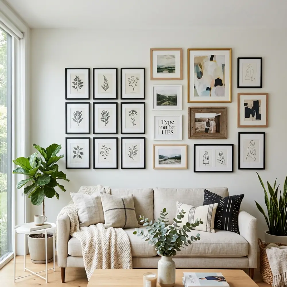
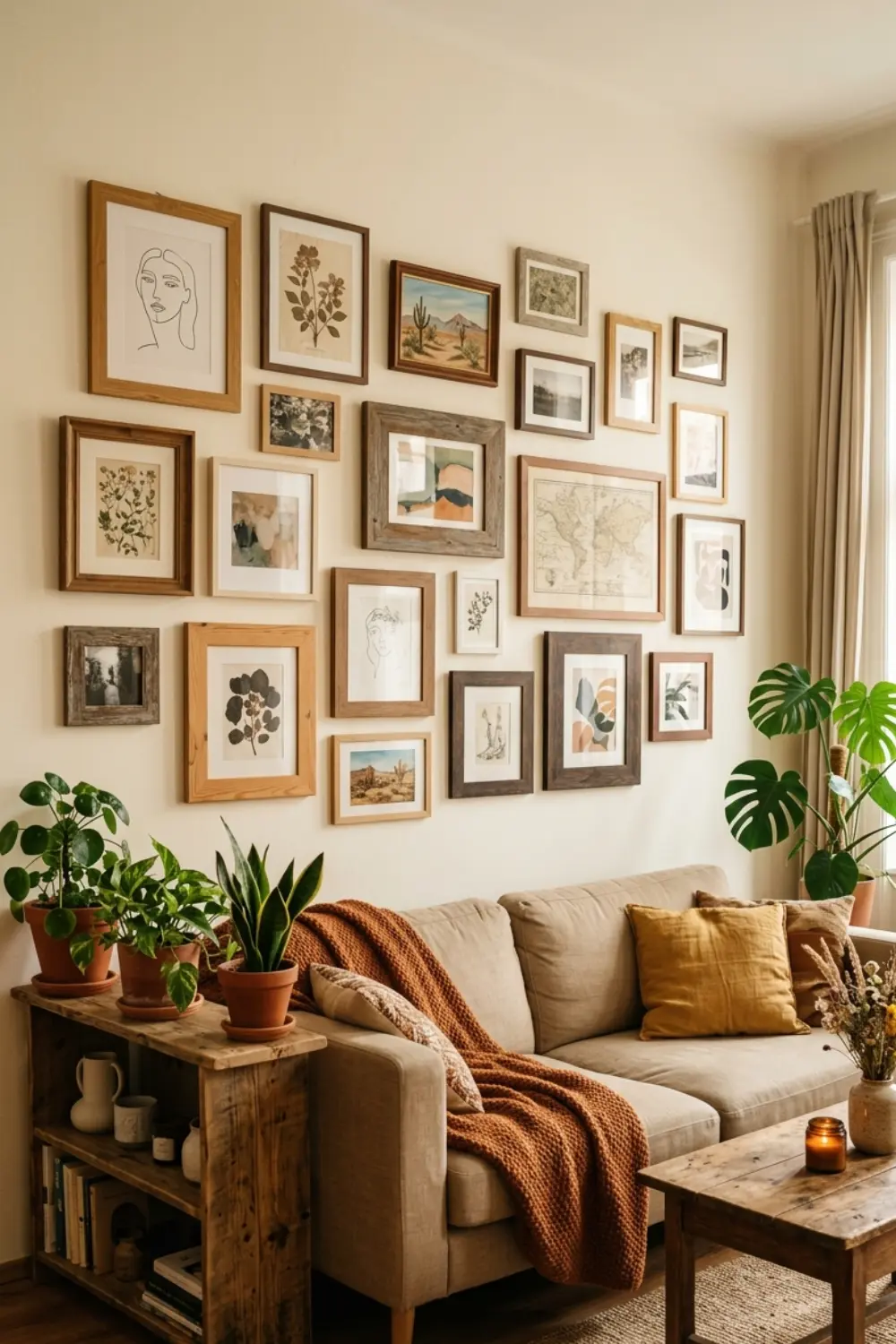
2. Try an Asymmetrical Mix for Organic Visual Interest
 Save it
If the grid is too rigid for you, an asymmetrical arrangement gives you freedom while maintaining balance. Here, you don’t have identical frames, but different sizes, shapes, and thicknesses—but you arrange them in a way that still visually balances the composition.
An asymmetrical gallery wall looks like it grew organically out of the wall, rather than being meticulously planned—but it’s actually just as much planning as a grid, just in a different way. The secret? First, arrange the frames on the floor until you find a layout that works. Take a photo of it with your phone, then copy it exactly onto the wall.
Start with a larger centerpiece, like an Abstract Line Art Print and build smaller frames around it. Vary the sizes: have a couple of 8x10s, a couple of 5x7s, or maybe a narrow 4×6. Frames can also be a mix of styles: some wood, some black, some white. But don’t let there be too many differences – no more than three colors/materials, otherwise it will look chaotic.
If you have a variety of frames, then the prints should be more consistent – for example, all black and white photos or graphics. Or vice versa: if the frames are all black, then the prints can be colorful, but keep them within a palette – warm tones (terra cotta, mustard, cream) or cool tones (blue, gray, white).
When positioning the wall, think of it as starting from the center and building outwards in a radial pattern. Imagine the central piece as the “anchor” and the other frames floating around it. The distances are not the same, but none of them are too far or too close – usually 1-3 inches between frames.
For more ways to create a layered, lived-in feel, explore [Wall Art Ideas That Make Your Home Feel Finished].
3. Use Matching Black Frames for Bold Contrast
 Save it
Black frames are one of the easiest ways to make a gallery wall look modern, sophisticated, and professional—even if your prints are simple. A black frame always adds contrast, highlights, frames, and creates a visual boundary between the picture and the wall.
If you want a complete unit, choose one frame and buy more of it—like a classic black wood frame set, which comes in different sizes (one large, a few medium, a few small), so you don’t need to size them separately, they’re already coordinated. Black frames look especially good on white or light gray walls—a clean, sharp, graphic effect. But they also work on darker walls, if the prints are light—the frame is more of a shade than a contrast, and the whole thing feels softer and more elegant.
With black frames, any color can work on prints, but the cleanest effect is with a monochrome or limited palette. Black and white photos, grayscale abstract works, or a single color accent – for example, a black and white base + a yellow or red element. If you use color prints, make sure that each print has a common color – this will connect them.
Another advantage of black frames: they are timeless. They do not go out of style, they do not become old-fashioned. A well-chosen set of black frames will work the same in ten years as they do today.
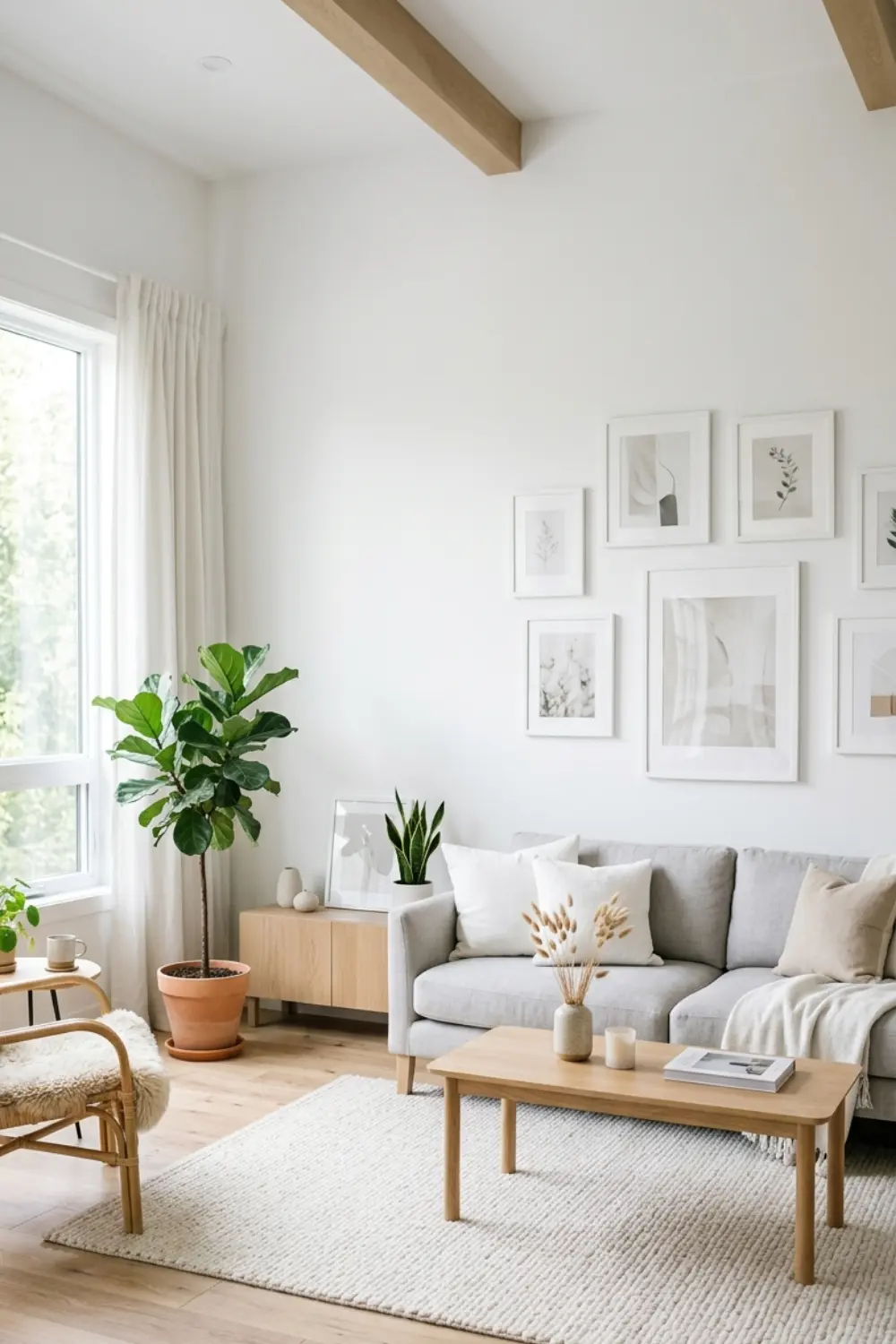
4. Go Full White Frames for Light Airy Scandinavian Vibes
 Save it
White frames create the exact opposite effect of black ones: lightness, airiness, lightness. This is the basic element of Scandinavian design – clean lines, natural light, minimalism. The white frame almost blends into the white wall, so the focus is not on the frame, but on the content.
Choose white frames with a thin profile – not thick, not ornate, just simple, clean lines. If your wall is also white, the frame almost disappears and the prints float – this works especially well if the prints have a lot of white negative space. Color scheme: soft, natural tones work best with white frames – beige, beige, light gray, terra cotta, olive green. But black and white graphics also look beautiful in a white frame – clean, modern, restrained. Avoid too intense, neon colors, because they stick out from the Scandi aesthetic.
Another trick with white frames: if there is some color variation between the wall and the frame (e.g. wall off-white, frame pure white), it gives a subtle shade, and the frames are still visible, just discreetly. This refines the wall surface without creating a strong contrast.
If you want a really light, airy feel, add natural elements – a dried leaf print or a plant photo between one or two frames. This enhances the natural, organic feel.
5. Mix Wood Frames for Warm Organic Texture
 Save it
Wooden frames bring warmth, texture, and naturalness to a gallery wall. They work especially well in a modern-rustic, boho, or mid-century modern living room. Wood isn’t cold or sterile—it feels tactile, even when you just look at it.
Choose a natural wood color—light oak, walnut, or black stained wood. You can have them all the same type, or mix light and dark frames—but stick to two or three wood tones at most so it doesn’t look too garish.
With wooden frames, it’s best if the prints are warm—cream, beige, terra cotta, mustard, brownish-red tones. These resonate with the natural warmth of the wood. But black and white works too, if you want contrast—in a wooden frame, a cold monochrome print will be softer and friendlier. The big advantage of wooden frames? They fit into a wide variety of styles. If you have a modern living room, then a thin profile wooden frame; if it is rustic, then a wider, more solid frame. Wood is flexible, it adapts to the style of the other furniture.
If you mix wood and other materials (e.g. some wooden frames + some black), that also works, but not in a 50-50 ratio – more like 70% wood, 30% black, or vice versa. That way, there is a dominant material that holds the composition together
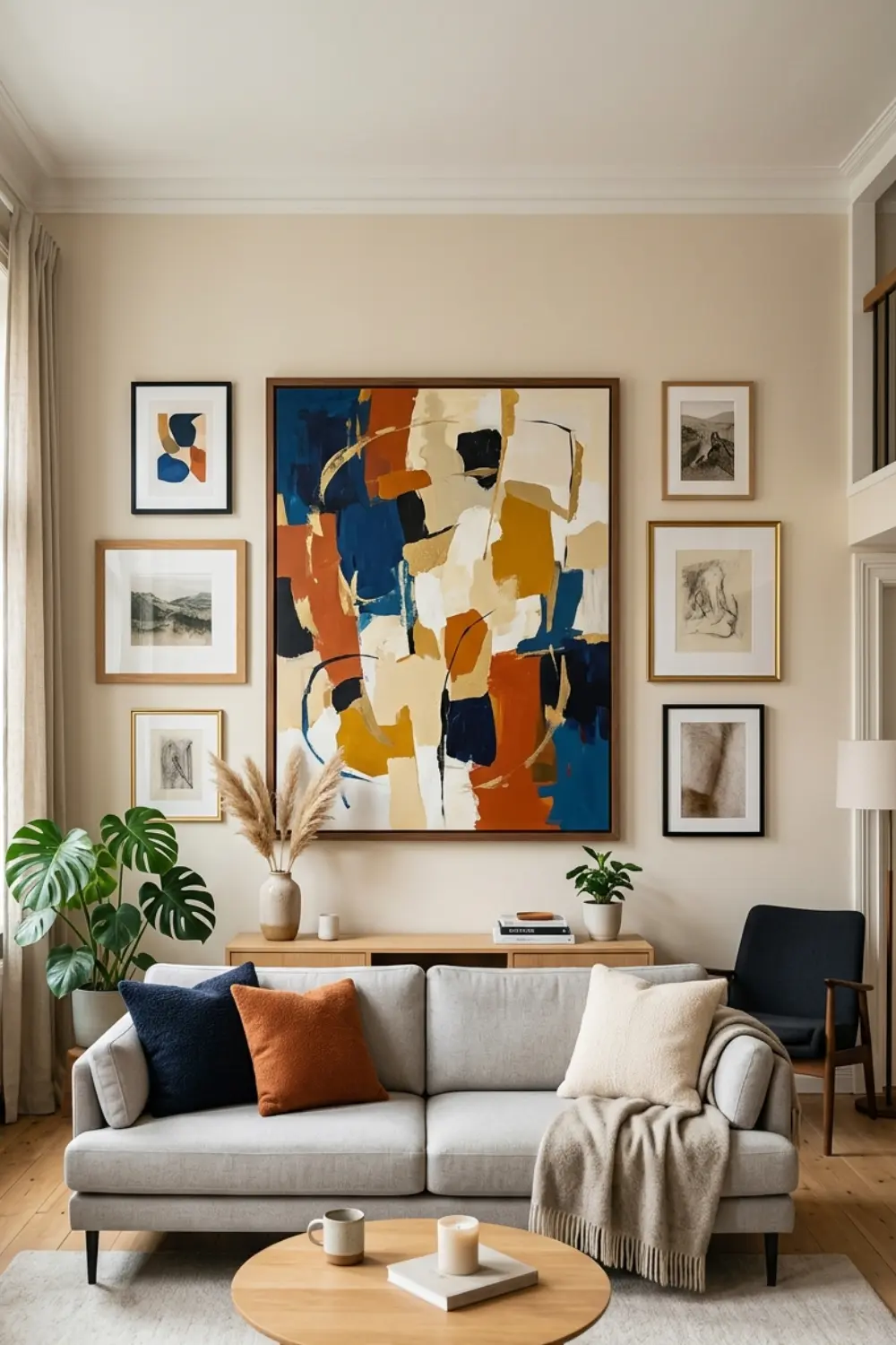
6. Add One Large Statement Piece as the Anchor
 Save it
A gallery wall often looks haphazard because there is no central anchor – all frames have the same weight and the eye doesn’t know where to look first. One of the best ways to create balance is to have a large, statement piece with smaller elements arranged around it.
Choose a 24×36 or 20×30 printed art print – it can be abstract, it can be a photo, it can be a graphic, but it should be visually strong. It will be the “king” of the gallery wall, and the other frames will be its companions. Arrange this large piece in the middle of the wall or slightly to the left/right of center – not completely centered, just emphasized. Surround it with small frames – 8×10, 5×7, maybe a few even smaller ones (4×6) – that don’t compete with it, but complement it.
Let the large print set the palette. If it has beige, terra cotta and white, then the smaller prints will echo these colors. That way, there is unity, but no boredom. The small prints can be details – plants, lines, abstract shapes – that shade the mood of the large print.
Another function of the anchor piece: it simplifies the decision. Once you have the large print, you don’t have to worry about “what should be the center” – it already has it. You just have to choose the smaller pieces built around it, and it’s much easier.
If you’re working with a compact space, this trick is especially useful—see [12 Small Living Room Ideas for a Cozy Apartment].
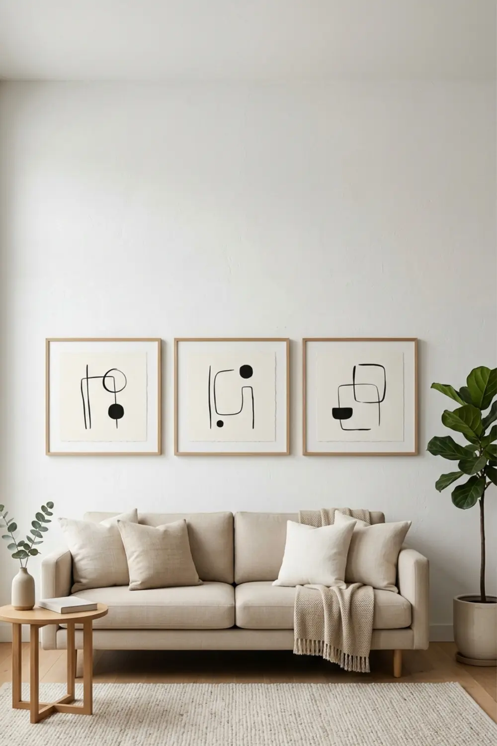
7. Keep It Simple With Three Large Prints Only
 Save it
If a bunch of small frames seems too complicated, simplify it: three large prints and you’re done. This minimalist approach works in a modern, clean living room, where less is more. Three pieces are enough to fill the wall, but not so many that it’s chaotic.
Choose three frames of the same size – like all 16×20 – and arrange them horizontally in a line, evenly spaced. This arrangement is clean, symmetrical, and calm. Perfect above a sofa or credenza. The prints can be a series – like three abstracts in the same style, in different colors. Or three different but complementary themes – plants, landscapes, geometric shapes. The key is to have something that connects them – color, style, or mood.
If you have three prints, it’s very important that they are consistent. It’s best if all three have one color in common – like all three have beige and black, but the proportions vary. Or all three are the same monochrome palette – grayscale or sepia.
The advantage of three large prints? They are ready quickly. You don’t have to spend hours packing ten different frames. You measure the distance, stack the three pieces, and you’re done. And yet it looks professional, because symmetry and uniformity give the complexity.
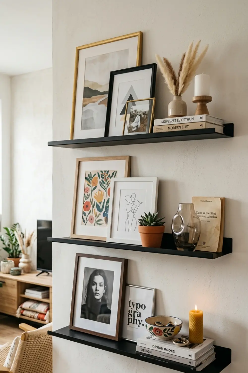
8. Layer in Small Shelves for 3D Dimension
 Save it
A gallery wall can work not only in a vertical plane – if you add small shelves, you get depth, layering, 3D dimension. This works especially well if you like variety, because you can rotate the decor on the shelves without drilling new holes.
Use narrow picture ledges, these are mini shelves that you lean the frames on, rather than hanging them. Their advantage: it is easy to change the frames, rearrange, try a new print. And the shelves themselves add a visual element – a horizontal line that breaks the vertical/horizontal axis of the frames.
Arrange the shelves so that they are at different heights – one higher, one lower. Place 2-3 frames on each one (in different sizes, facing each other, slightly overlapping) and add a small object or two – a mini vase, a candle, a book. This gives life, not just a picture.
The shelves should be neutral – black, white or wood, so that they don’t compete with the frames. The frames and prints should keep the same palette – for example, all black frames, monochrome prints, and the objects on the shelf should also be neutral colors (white vase, beige candle). The advantage of a picture ledge is flexibility. If you get bored with the current print after a month, you can take it off and put something else on. No drilling new holes, no messing around. This is perfect if you like to change, experiment, or if you are a renter.
9. Use Floating Frames for a Museum Quality Look
 Save it
A floating frame is a frame in which the print or photo appears to float – there is no mount, the image is directly behind the glass, and the frame is thin, barely visible. This type of frame gives a museum-like, professional effect and works especially well in a modern, minimal living room.
Choose a floating frame set – these usually have thin metal or acrylic frames that almost disappear. The focus is entirely on the print, the frame is just a subtle border. With floating frames, it’s best to choose prints that have a strong visual weight in their own right – sharp photos, colorful abstracts, graphic designs. Since there is no mount to provide a buffer, the image itself carries the show
Since the frame is minimal, the prints can be bolder. Monochrome works, but color works too – it’s important to keep it within a palette. For example, all warm tones (orange, red, yellow) or all cool (blue, green, purple).
Another advantage of a floating frame is that you can easily change the content. You open the frame from the back, take out the old print, put in the new one, and that’s it. This is perfect if you want prints that change according to the season or mood – cool colors in winter, warm in summer.
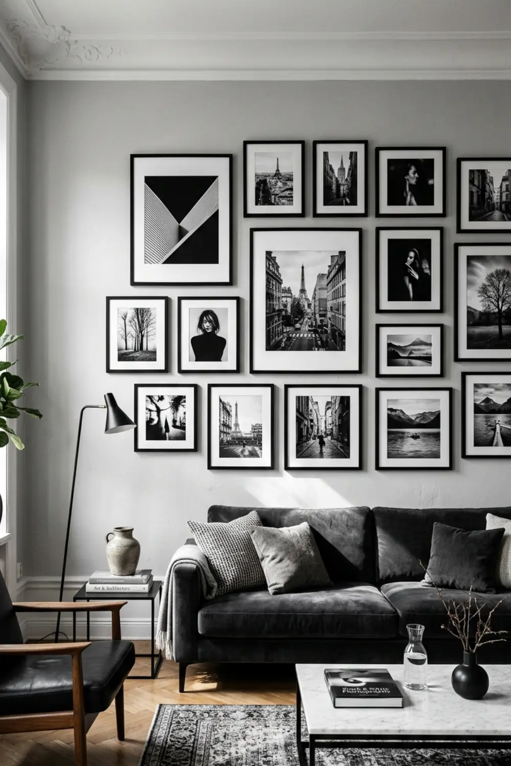
10. Mix Black and White Photos for Timeless Elegance
 Save it
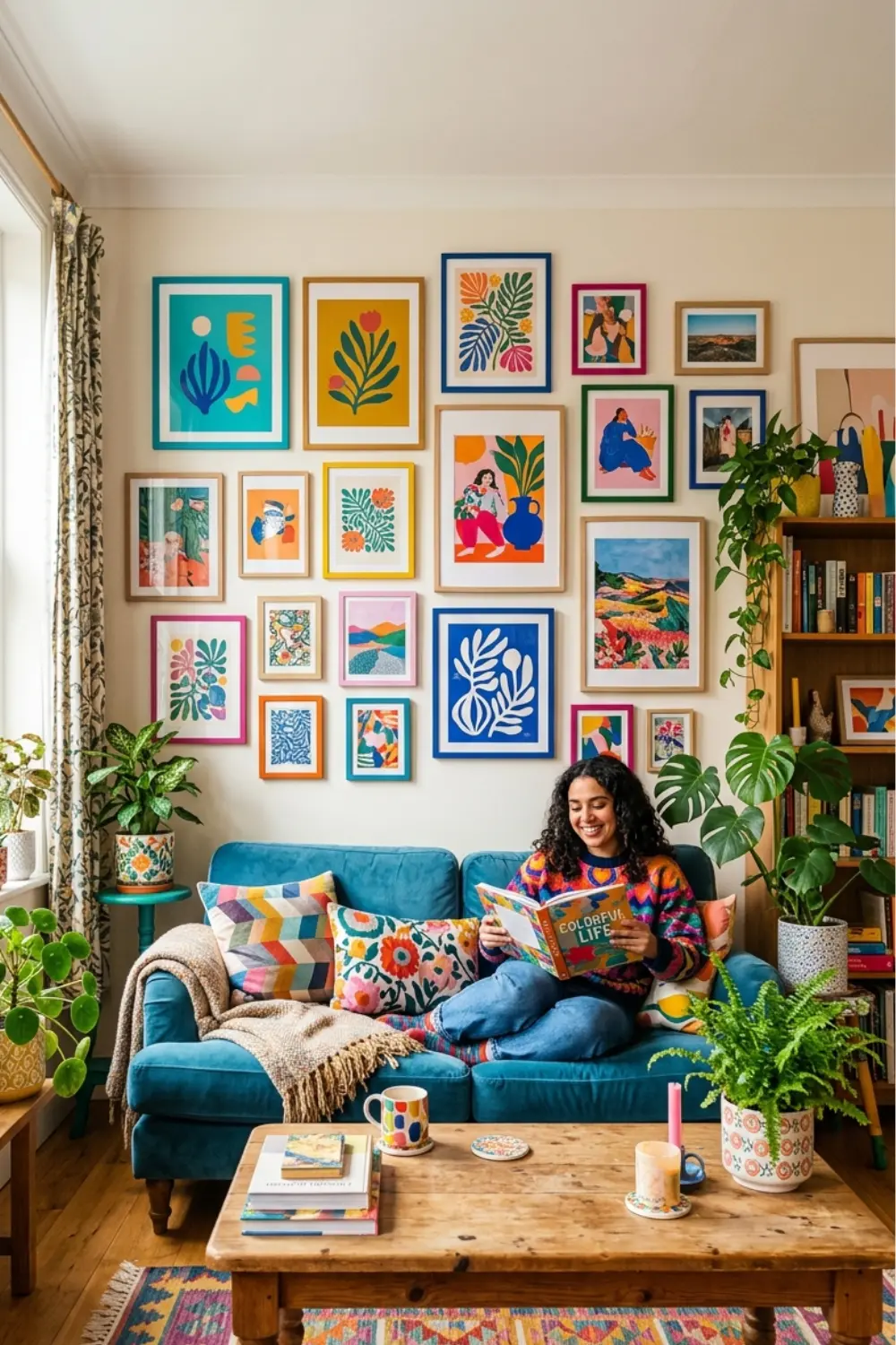
If monochrome is too subdued for you, colorful prints bring life, energy, and personality to your living room. A colorful gallery wall can be cheerful, bold, or playful—it depends on the colors you choose and how you arrange them. Choose prints that follow a palette—for example, all warm colors —terra cotta, mustard, cream, coral. Or all cool—blue, green, gray. This ensures that even though they are colorful, they are still in harmony.
The key is don’t have too many different colors. If each print has 5-6 colors and they are all different, it will be chaos. Instead, choose 3-4 colors and repeat them in several prints, in different proportions. For example, mustard is dominant in one print, terra cotta in another, but both have both colors.
Colorful prints work well in a black frame (high contrast, strong), a white frame (soft, airy), or a wooden frame (warm, organic). Which one you choose depends on how much you want to emphasize the colors. Black frame = colors pop. White frame = colors are softer. Wooden frame = colors are warmer.
If the living room is otherwise neutral in tone (gray sofa, white walls, wooden furniture), then a colorful gallery wall can be the only splash of color – it adds personality, bringing life to an otherwise quiet space.
11. Incorporate Colorful Art Prints for Vibrant Energy
 Save it
Black and white photos never go out of style. They have something timeless, classic, nostalgic – but still modern if you arrange them properly. An entire gallery wall of black and white photos is elegant, sophisticated, and not boring at all if the subjects are varied. Choose photos that have a strong composition – faces, buildings, nature, details. The advantage of black and white photos: the shapes, lines, and play of light and shadow come to the fore, not the color. This way it is easier to create a unified atmosphere.
Arrange them in a varied arrangement – it can be a grid, it can be asymmetrical, but the unified monochrome palette holds everything together. If they are all in a black frame, it gives extra structure; if in a white frame, it is softer, more airy. Since the photos are all in black and white, the wall color is important. On a light wall (white, off-white, light gray), the photos stand out sharply. On a darker wall (dark gray, dark blue), the photos blend in, and the whole thing becomes deeper and more atmospheric.
Another big advantage of black and white photos: you can add personality without it becoming too intimate. Family photos, travel photos – when processed in black and white, they are less “snapshot” and more like art
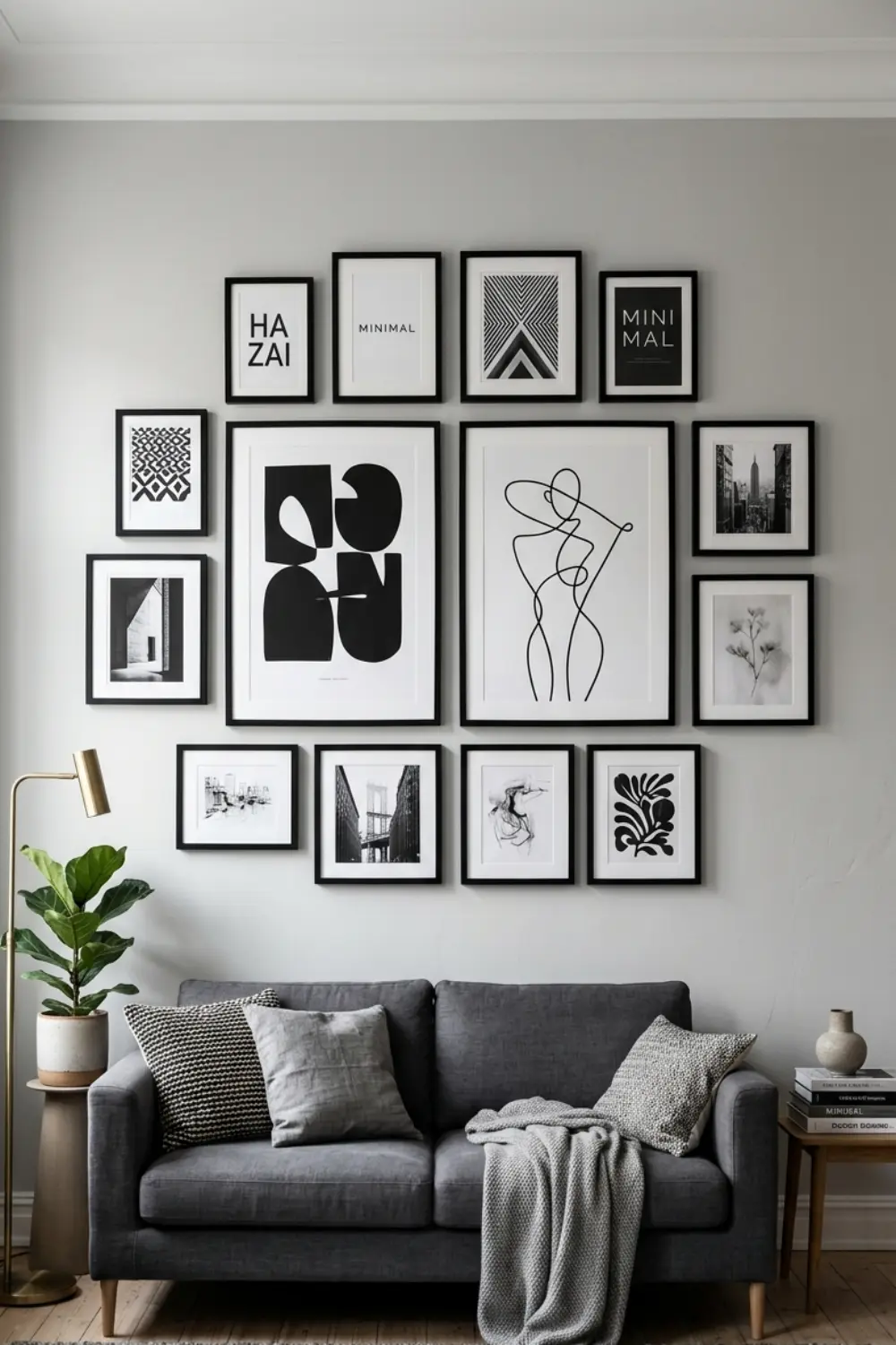
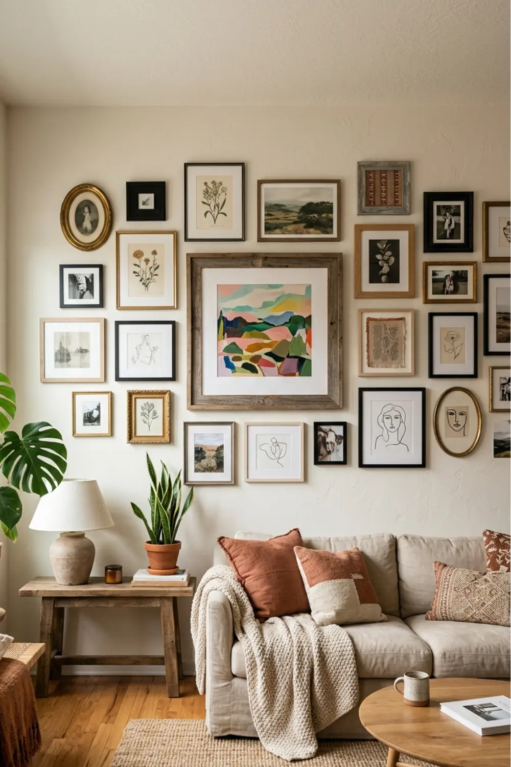
12. Try a Salon Style Clustered Arrangement
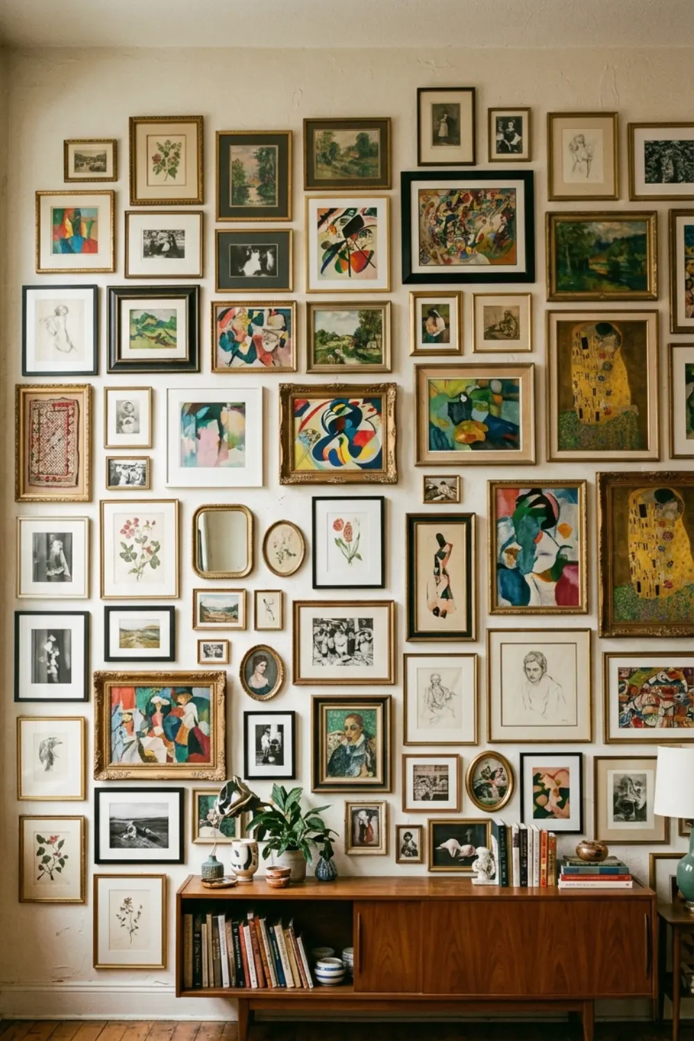
 Save it
Salon style is when you fill an entire wall with frames – close together, in different sizes, as if it were an art gallery wall. It’s a maximalist approach, and it works if you have a large enough wall space and you like the rich, layered effect. Salon style doesn’t require identical frames or a uniform theme – in fact, variety is the power. Small, large, portrait, landscape, square – anything goes. But there are a few rules to prevent chaos: 1) keep the frames consistent (usually 1-2 inches), 2) try to keep the visual weight balanced – don’t pile all the big frames on one side.
The best way to plan a salon style is draw out the wall dimensions on a large piece of paper, cut out the frames from paper (in the exact size), and stack them until you find an arrangement that works. Or use a template – trace the frames on paper, stick them to the wall with masking tape, and then move around. Since there are so many frames, the frame color should be consistent – either all black, all white, or all wood. The prints can be varied, but they should keep the same mood – for example, all vintage style, all modern abstract, or all nature theme.
The advantage of salon style: you can constantly expand. If you find a new print you like, you add it. If you get bored with an old one, you take it out and put another one. This is a living, growing composition, not a fixed setup.
13. Add Greenery with Small Framed Botanical Prints
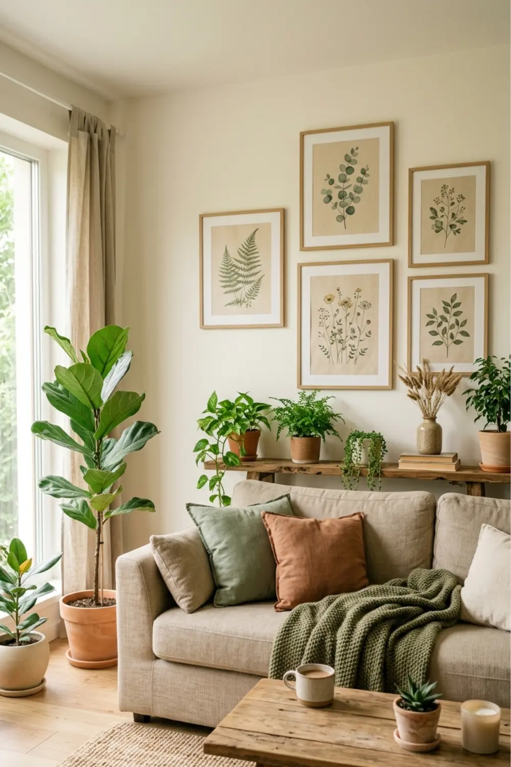
 Save it
Botanical prints bring freshness and naturalness to your gallery wall without having to take care of live plants on the wall (although that’s not a bad idea in another context). Botanical prints – leaves, flowers, branches – are calming, organic, and fit into any living room. Choose simple line art plants – not photorealistic, but a graphic, minimal representation. It’s modern, clean, and not too “naturey” – it works well in an urban apartment.
Botanical prints can be mixed well with other themes – for example, there are two abstract prints, two geometric, and two botanical. This gives variety, but the clean style keeps them together. Or do a full botanical gallery wall – different plants, all in the same line art style.
Botanical prints can be monochrome (black lines on a white background), or they can be colorful – green leaves, beige branches. If they are colorful, stick to natural tones – greens, browns, white, beige. Avoid neon green or artificial colors.
The advantage of botanical prints: they are universal. They fit into all styles – modern, rustic, Scandi, boho. And they are timeless – they never go out of style, because nature is always relevant.
Helpful Tips: How to Plan Before You Drill
Most people start their gallery wall by drilling holes in the wall, only to realize they’re in the wrong place and have to start over. It’s frustrating and unnecessary. There’s a better way.
Step one: Measure the wall area. Typically, the center of your gallery wall should be at eye level (about 57-60 inches from the floor). If it’s going to be above a couch or furniture, start 6-8 inches above the top of the furniture.
Step two: Lay out your frames on the floor exactly as they will be on the wall. Take a photo from above. This is your “template.” Measure the distances between the frames and write them down.
Step three: Use paper templates. Cut out paper (or use newspaper) the size of each frame and tape them to the wall with masking tape. This will give you a visual idea of how it will look, and if you don’t like it, you can simply rearrange it without drilling holes.
Step 4: Once you’re happy with your paper templates, mark the wall through the paper (in pencil) where the hooks will go. Remove the paper and drill (or use Command strips).
If you’re a renter and can’t drill: Command Picture Hanging Strips can hold a surprisingly heavy load (up to 16 pounds) and won’t leave a mark. Or use a picture rail – a rail that you attach to the ceiling or top of the wall and hang the frames from by wire. It’s flexible and won’t damage the wall.
Final tip: don’t rush. It’s better to plan for a week and then put it up in an afternoon than to rush it and spend weeks fixing it.
Common Mistakes to Avoid
One of the most common mistakes: too many different frame colors/styles. Six different types of frames – black, white, gold, silver, wood, plastic – communicate that you randomly collected what you found, rather than consciously planning. Three frame styles max, two are better.
Another mistake: frames are too far apart. If there is 6-8 inches of empty space between frames, it is not a gallery wall, independent pictures on the wall. The ideal distance is 1-3 inches – close enough to form a coherent unit, far enough apart so that each frame remains independent.
Many people also make the mistake of placing frames too high or too low. If it is too high, it will be a strain to look at; if it is too low, it will look like it is hanging on the floor. The center line (or the center of the largest frame) should be about eye level – 57-60 inches from the floor.
Some people choose frames that are too small for a large wall area. Ten 4×6 frames on a huge blank wall are lost—they look like tiny stamps on a blank sheet of paper. A large wall needs at least a few large frames (16×20 or larger) to give it weight and presence.
Another common problem: there’s no central anchor or visual balance. All the frames are the same size, the same weight, and the eye doesn’t know where to look. Or they’re all pushed to the left and the right side is empty. Visual balance means that if you imagine a vertical line in the middle, the two sides are roughly balanced (not perfectly symmetrical, but visually balanced).
And finally, the prints don’t match. One is a photo, another is an abstract, a third is a cartoon character, a fourth is a vintage poster—and they have nothing in common. This isn’t eclectic, this is chaotic. Pick a style or mood and stick with it.
Frequently Asked Questions
How many pictures should I put on a gallery wall?
There is no set rule, but usually 5-15 frames is ideal. Less than that – it’s not really a “gallery”, just a few pictures. More than that – it can easily become overcrowded unless you have a very large wall space. Start small (5-7 frames), and expand later if you feel like it.
How far apart should the frames be?
Usually 1-3 inches. 1 inch is a tight, complex effect – this works for a salon style. 3 inches is looser, more airy – this works for a modern, minimal layout. 2 inches is a middle ground and looks good in most cases.
Do all the frames have to be the same size?
No. In fact, different sizes add dynamics. But if you are a beginner, it is easier to start with the same sizes (grid layout), because it requires less planning. Once you have experience, mix the sizes, but pay attention to visual balance.
How do I choose the colors for the prints?
Look at the existing palette of your living room – sofa, cushions, rug, curtains. Choose 2-3 colours that are already in the space and repeat them in your prints. This way, the gallery wall won’t be an alien element, but will blend into the space as a whole.
What if I’m a renter and can’t drill?
Use Command Picture Hanging Strips – they won’t damage the wall and are strong enough for most frames. Or try picture ledges, which are fixed at just a few points and the frames rest on them. Or use a mobile/portable gallery wall solution – a large board that you put the frames on and prop it up against the wall.
Conclusion
A gallery wall is not a rocket science, but it does require planning, intention, and a little patience. The biggest mistake you can make is to rush into it with random things and then wonder why it doesn’t look like it does on Pinterest. The secret is consistency, visual balance, and thinking before you drill a hole.
Start by deciding what style you want. Modern, clean lines – then a grid or three large prints. Organic, varied – then an asymmetrical mix. Maximalist, rich – then salon style. There is no right or wrong, it’s all about what suits your space, your living room, and your personality.
Then choose your frames. Stick to 1-2 frame styles – black, white, wood, but not all at once. The consistency of the frames provides the structure in which the prints can move freely. And finally: the prints. They should be consistent – in color, style, or mood. They don’t all have to be the same, but there should be some common thread.
Don’t be afraid of paper templates, measuring, planning. Your first gallery wall is always the most work, but once you have it, you can enjoy it for years. And when you get bored, simply change the prints – the frames stay, the content changes. Start today, get out your tape measure, and plan how you’re going to transform that empty wall into something personal, modern, and professional.
Related posts
This post contains affiliate links. I may earn a small commission at no extra cost to you.