Wall Art Ideas That Make Your Home Feel Finished
By Emily | December 15, 2025
When a room in your home almost feels complete but still slightly unfinished, the missing piece is often wall art. Furniture sets the function, textiles add comfort, but artwork defines atmosphere. Without it, even a beautifully styled space can feel flat or temporary. Choosing wall art isn’t about filling empty walls. It’s about creating balance, proportion, and intention. The size, placement, and style of a piece influence how cohesive a room feels. A well-chosen painting or print ties together color palettes, anchors furniture, and adds depth without crowding the space.
When I first redecorated my own living room, I realized how easy it is to overthink: the walls felt bare, so I started adding pieces randomly. The result? Visual chaos, despite “matching” frames and colors. The breakthrough came when I shifted from adding more to editing carefully. Each piece earned its place, and suddenly the room felt polished, purposeful, and effortless.
We’ll explore strategies to choose and arrange wall art that makes any room feel finished and cohesive without clutter. You’ll learn how to assess your walls, mix materials and textures, and select pieces that elevate your home while reflecting your personal style.
By the end, you’ll see how small, deliberate decisions create spaces that feel thoughtful, polished, and completely “done.”
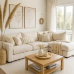
Oversized Art That Grounds the Entire Room
 Save it
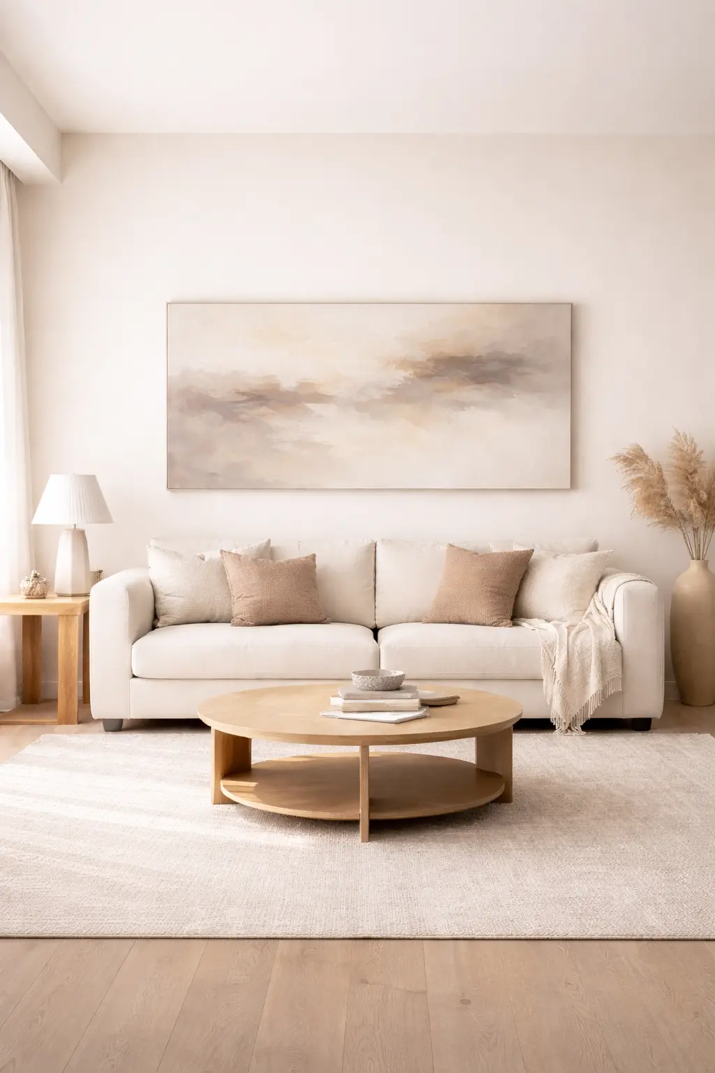
The most transformative shift I ever made was going larger. Small frames create hesitation. Oversized art communicates certainty. When artwork is too small for the wall it occupies, the furniture beneath it feels like it’s floating. When scale is correct, everything settles.
In my own living room, replacing a cluster of undersized prints with a single large textured canvas changed the room immediately. The visual noise disappeared. The seating area felt defined. The wall stopped whispering and started anchoring.
A substantial neutral abstract canvas — similar to this oversized textured wall art — works especially well because it introduces movement without overwhelming the palette. The key is proportion, not color matching.
As a general rule, art above a sofa should span about two-thirds of the sofa’s width. That ratio creates visual stability. Anything significantly smaller begins to feel apologetic.
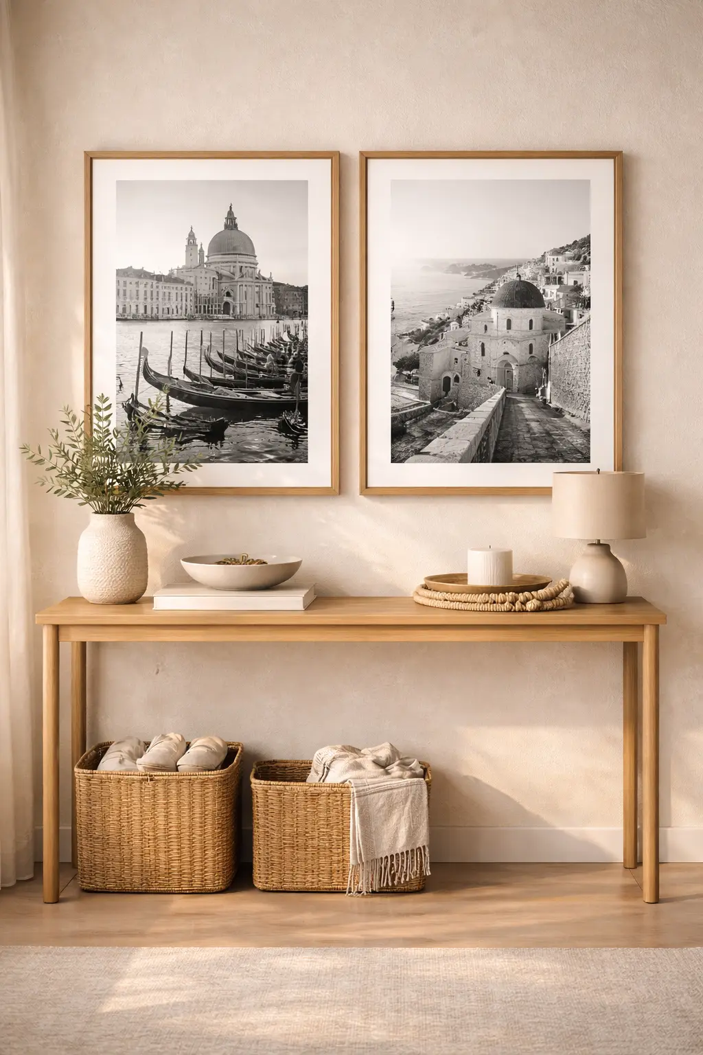
Framed Sets That Create Continuity
 Save it
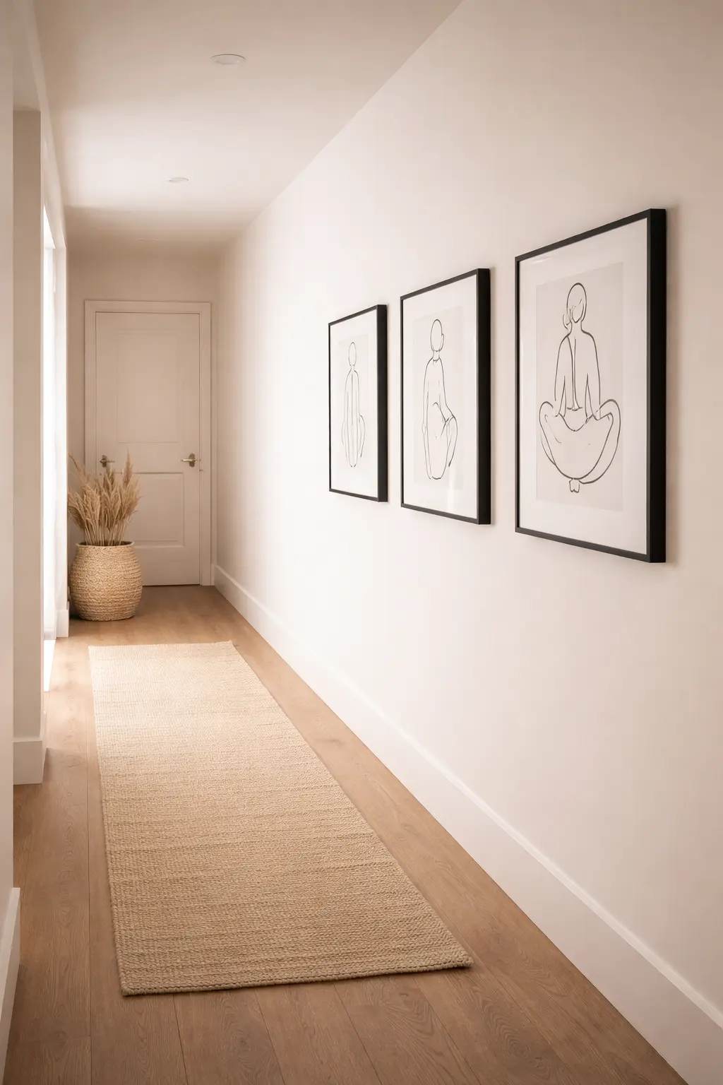
Not every wall calls for a singular statement. In transitional spaces — hallways, staircases, entry corridors — repetition creates rhythm and guides the eye naturally through your home. These often-overlooked areas are the threads that connect your rooms, and treating them intentionally transforms how people experience your entire space.
When I styled a long hallway that once felt like an afterthought, I installed three evenly spaced framed prints in matching black frames with generous white matting. The transformation wasn’t dramatic. It was subtle — and that’s why it worked. A curated minimalist gallery wall set, similar to this modern framed print collection, helps eliminate decision fatigue by removing the burden of constant choice-making. Identical frames create cohesion and establish a visual language that feels deliberate rather than accidental. Even spacing adds intention and allows the eye to move through the space with ease. The result feels architectural rather than decorative — less like decoration and more like structural design.
Wall art can quietly guide someone through your home, creating visual bookmarks that mark transitions between spaces. That thread of continuity is what makes separate rooms feel like parts of a whole, rather than disconnected boxes. It’s the difference between a house that feels assembled and one that feels designed.
Textural Pieces That Add Dimension
 Save it
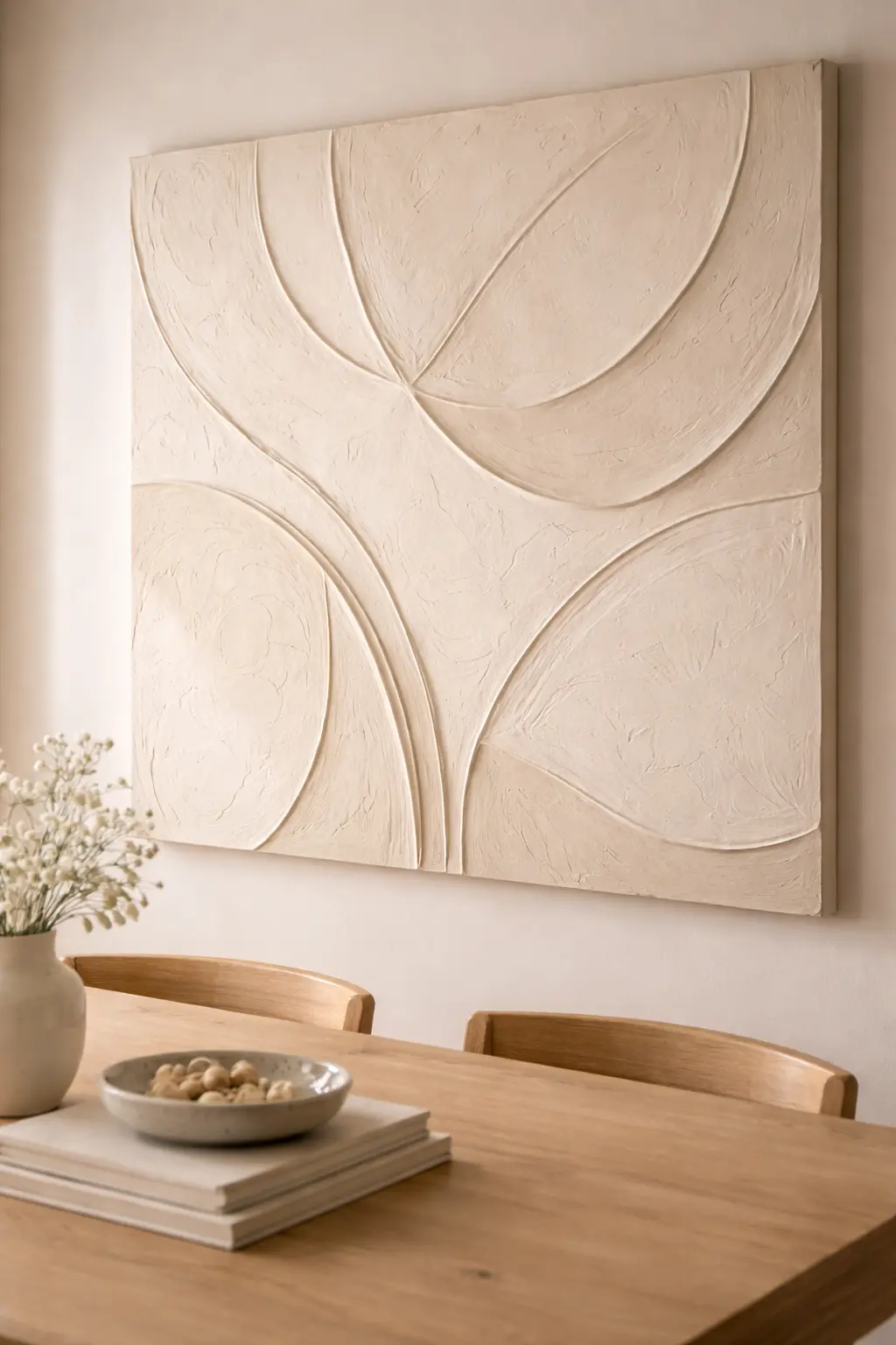
One of the most overlooked layers in a home is dimensional wall art — plaster relief panels, woven textile pieces, heavily textured canvases, or sculptural elements that invite touch as much as sight. These don’t compete for attention. They deepen it, creating a richness that flat artwork simply cannot achieve. Texture is the secret language of sophisticated interiors, communicating luxury and intention without requiring a bold color or pattern.
In my dining area, I added a monochromatic plaster-style art piece that demonstrated the power of restraint. During the day, it blended so seamlessly into the wall that you might overlook it entirely. But in the evening, when side lighting hit the surface at an angle, the shadows created movement and depth, making it feel alive and ever-changing. The piece became a conversation about light itself.
A neutral textured wall sculpture like this minimalist panel works beautifully in restrained spaces because it doesn’t demand visual real estate — it enhances what’s already there. It absorbs light differently throughout the day, which prevents the room from ever feeling static or one-dimensional. This is particularly valuable in monochromatic or neutral schemes, where texture becomes the primary visual interest.
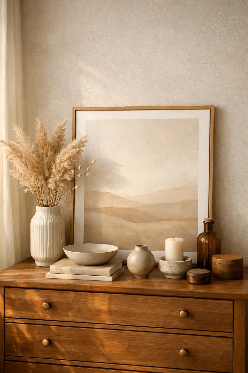
Leaning Art for Relaxed Structure
 Save it
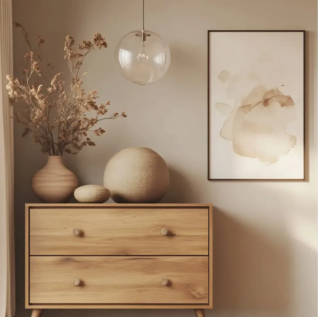
Not every piece needs to be hung with permanent commitment. Leaning framed artwork against a wall — on a dresser, console, or shelf — introduces a softer edge to structured interiors while maintaining that crucial sense of intention. This approach works particularly well in bedrooms and personal spaces where you want design to feel curated but not rigid.
In my bedroom, a large framed neutral print rests against the wall behind the dresser. In front of it sits a ceramic vase and a short stack of books. It feels layered rather than installed, as if the arrangement evolved naturally rather than being perfectly planned. This is the paradox of good design: it should look effortless while being entirely intentional.
A substantial framed canvas works particularly well in this context because the frame itself becomes part of the composition, adding visual weight and dimension to what might otherwise feel like a flat arrangement. The key is weight and proportion. Leaning art should feel intentional — not temporary, not forgotten, but deliberately resting in a state of beautiful pause. Relaxed design still requires structure; the structure just happens to be invisible.
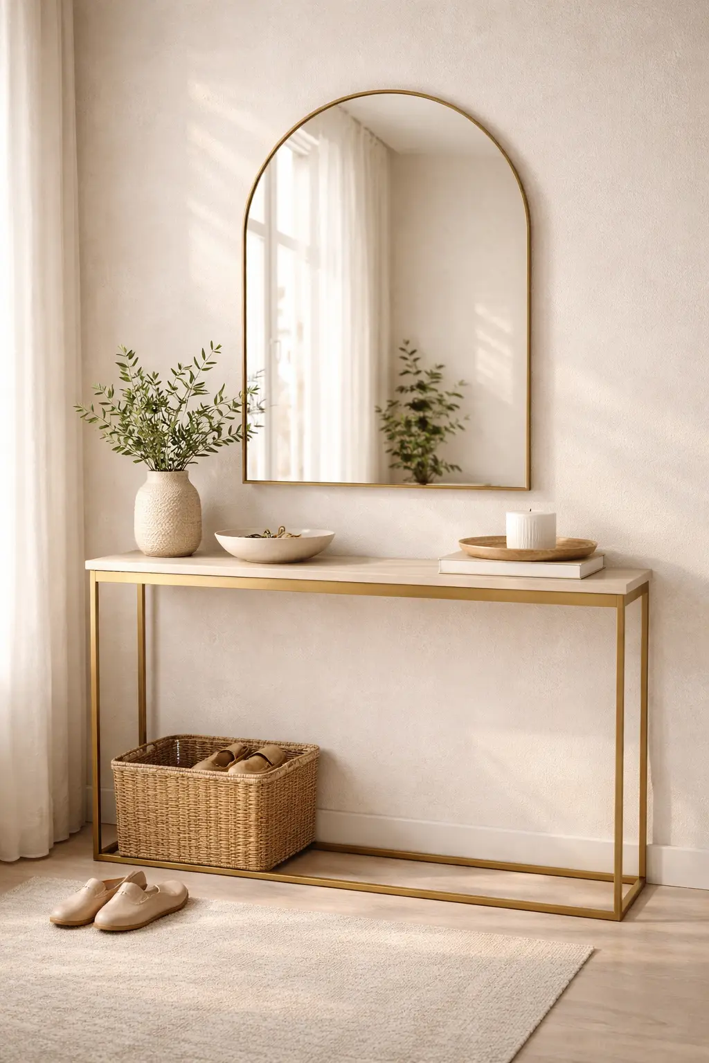
Statement Mirrors That Function as Art
 Save it
Sometimes the piece that completes a wall isn’t traditional art.
It’s a mirror.
In smaller rooms especially, a mirror acts as both sculpture and architecture simultaneously. It reflects light, doubles perceived depth, and interacts with its environment rather than simply occupying space as decoration. A well-placed mirror can transform a cramped room into one that feels expansive and luminous. When I installed an oversized arched mirror in my entryway, the area transformed from transitional to intentional. It no longer felt like a passage — it felt like an introduction to the home. Suddenly, visitors caught their reflection, light multiplied, and the space became a moment rather than a mere corridor.
An oversized arched mirror like this modern statement piece adds visual height while echoing other finishes in the room, creating unexpected connections between elements. Frame selection matters enormously. Repeating metal tones from hardware or lighting creates cohesion and makes the mirror feel like it was always meant to be there. Mirrors don’t just decorate walls. They activate them, enliven them, and fundamentally change how light and space behave in a room.
Personal Art That Feels Edited, Not Random
 Save it
Family photos, travel photography, even a child’s drawing can elevate a space — but presentation determines whether it feels curated or chaotic. The difference between a living room that feels intentional and one that feels cluttered often comes down to this single decision: how you present personal imagery.
When I printed travel photographs in large format and framed them consistently, they stopped feeling like memories pinned to a wall in a moment of nostalgia. They started feeling like art — like deliberate choices that belonged in the room. Suddenly, they were part of the interior language rather than afterthoughts.
Using cohesive wood or black frames — similar to this minimalist frame set — keeps personal pieces aligned with the room’s aesthetic and prevents the visual chaos that comes from mixing too many frame styles. Editing is the difference between clutter and curation. Restraint is the mark of sophistication. A finished home reflects personality — but through careful selection and intentional pairing, not through accumulation.
Wall art doesn’t exist independently from the rest of your decor. It interacts with lighting, textiles, furniture shape, and even negative space. Every element speaks to every other element. If you’re building cohesion from the ground up, revisiting foundational elements — like those discussed in How to Create a Cozy Living Room with Simple Design Tricks — can make wall decisions easier. When the base is clear, when color and texture and proportion are already speaking a unified language, the art selection becomes obvious.
Common Wall Art Mistakes That Disrupt Completion
1. Too Small Wall Art for a Large Wall
One of the most common mistakes people make is choosing a beautiful print or a series of picture frames and then hanging them on a large blank wall, and it doesn’t feel right or balanced. The wall is already too empty. The rule of thumb is that if a large wall is 60 plus inches wide or tall, the wall art should be at least 40% that size.
2. Placing Wall Art Too High or Too Low
People often think that wall art should hang at eye level, which is true, but then you don’t really measure it in the home where eye level is next to furniture. The average person’s eye height is 57-60 inches from floor level; the center of wall art placed this way should be about 58 inches when you sit down. Wall art placed this way works beautifully and naturally.
3. Choosing the wrong frame that works against the style of your home
People often buy a beautiful print and then put it in a cheap or contrasting frame that doesn’t work with the home. A warm rustic print in a gray saddle frame just works – it doesn’t match. Choose frames that are similar to the materials and color scheme of your home. Warm, wood prints work in a wood frame, and modern prints work in a metal or black frame. Cheap framing literally takes away the feel of the home, even a nice print won’t work.
FAQ
How big should wall art be above a sofa?
Roughly two-thirds the width of the sofa creates visual balance and grounding.
Should all frames match?
Not necessarily, but consistency in tone or material creates cohesion.
Is a mirror better than artwork?
In smaller spaces, mirrors often provide more visual impact because they reflect light and depth.
What type of art works best in neutral homes?
Oversized abstracts, textural panels, and monochromatic photography tend to feel cohesive.
Closing Thoughts
A home that feels “done” is a home that thinks about the walls. It doesn’t have to be expensive or trendy—just intentional and carefully chosen. Choose pieces that resonate with your taste and that you know you’ll love even after many years. Place them carefully based on the size and structure of the home, considering eye level and visual balance. Integrate them with the rest of the home in a way that feels logical from an aesthetic perspective—the materials, the framing, and the color palette work as a unit.
These simple decisions you make directly affect how the home feels—finished, thought-filled, finally, homey. The walls are the canvas for the personality of the home, and what you choose to fill them with will shape the entire living space.

This post contains affiliate links. I may earn a small commission at no extra cost to you.