How to Decorate a Coffee Table for a Modern Living Room
By Emily | April 17, 2026
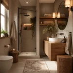
You know that feeling when you walk into someone’s place and the whole living room looks like it stepped out of a design magazine—and then you glance at your own coffee table and it’s just a pile of remotes, a half-empty coffee cup, and an old magazine? That’s exactly what I’m talking about. The coffee table is the surface that determines whether your living room feels pulled together and intentional, or just a place where things land. And here’s the thing: it’s not about the furniture. I’ve seen gorgeous marble-topped tables that looked like a garage sale, and I’ve seen Amazon pieces that created perfect harmony in the space.
A modern living room isn’t about everything being sterile or minimalist. It’s about consciously choosing what goes on the surface and having those things tell a story together. If you feel like your coffee table never looks quite right—always too empty or too cluttered, never hitting that balance—keep reading. I’ll show you how visual weight, grouping, heights, and negative space work together to make a table not just functional, but beautiful. And yes, you can do this with any table, in any style you’re living with.
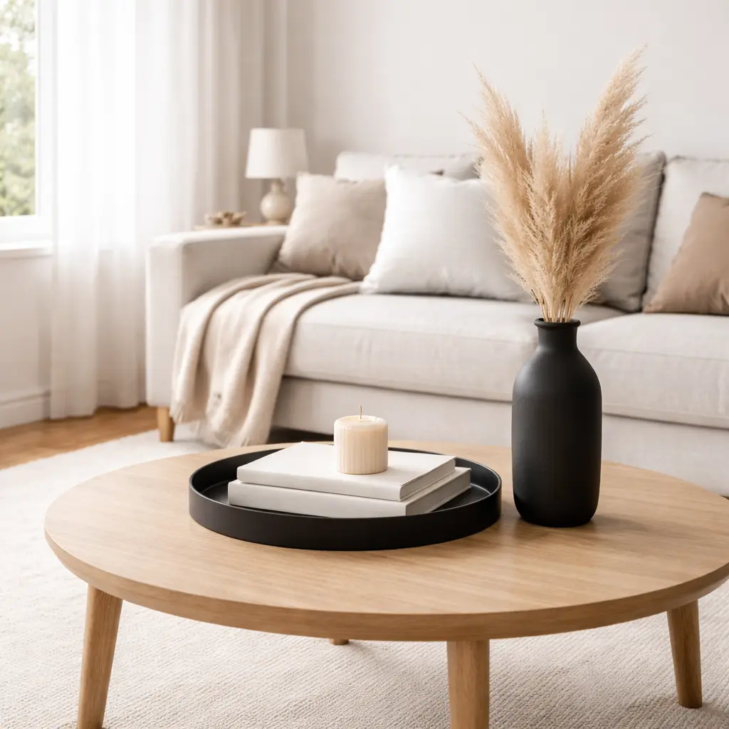
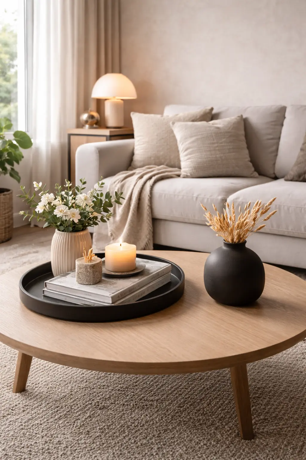
1. Use a Tray to Create Visual Order
 Save it
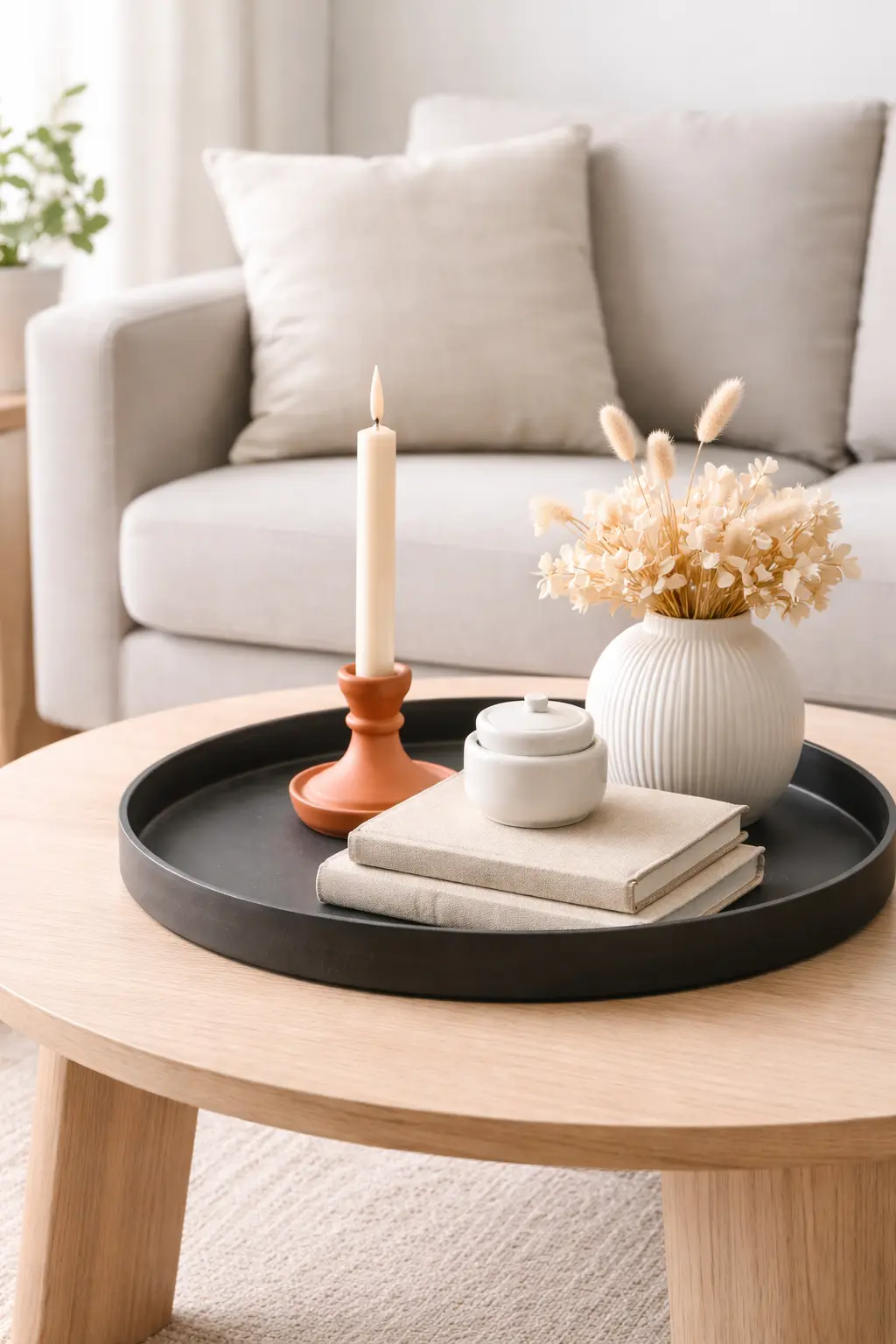
The first thing you need to understand about decorating a coffee table: every decorative element you put on it is competing for attention. If there’s nothing connecting them, they’re just random objects that happened to land on a surface. And that’s exactly where a tray comes in. A tray doesn’t work because it’s trendy or stylish—it works because it creates a visual boundary. When you place a book, a candle, and a small vase on a tray, they suddenly become one unit. Your brain doesn’t read them as separate things, but as a grouping, a composition. This reduces visual noise and gives structure to the table without feeling forced or overthought.
I’ve tried multiple materials, and the best solution for me has been a simple, matte black or natural wood tray. It doesn’t shine, doesn’t call attention to itself, but it visibly frames what’s inside. Size matters too: too small and it gets lost; too big and it takes over the whole table. Usually a 15.75 – 19.69 inches long piece is perfect for an average coffee table.
The other power of a tray is that it’s mobile. When guests come over and you need to set down a plate or glass, you simply slide the tray over—everything inside moves together, and the order remains. You don’t have to rearrange the candle and the books. That’s the little practicality that makes the difference between a coffee table being decoration or a usable surface.
What I learned is that don’t fill the tray completely. Leave empty space around it on the table. That’s what gives it breathing room.
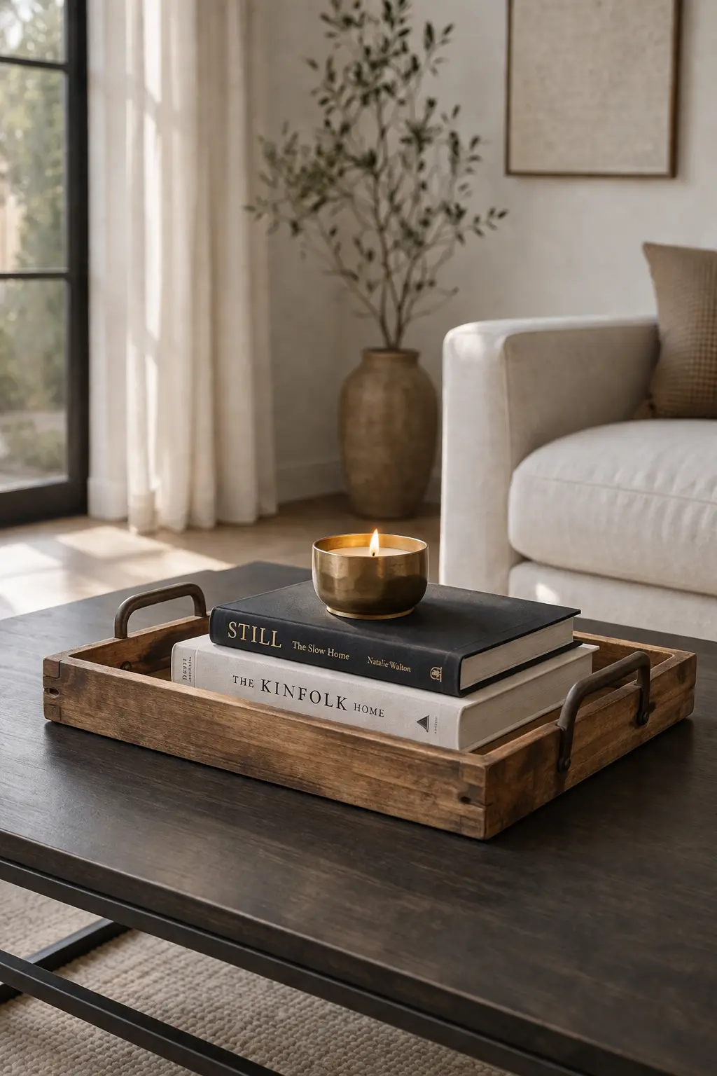
2. Create Height with Books or Risers
 Save it
The most common mistake I see with coffee tables: everything is at the same height. A vase, a candle, a planter—all at one level, like they’re sitting on a shelf. The result? Flat. Boring. No visual interest. One of the fundamental principles of modern design is that varying heights creates dynamism. And the easiest way to do this is stacking hardcover books. Not just because they’re beautiful—but because a 5-10 cm book stack instantly gives a platform to any object. You place a small sculpture, a candle, or even a glass on it, and suddenly there’s layer, dimension.
I usually use 2-3 large-format books (photo books, design albums, art publications—things that are visually beautiful, not just functional). But if you don’t have books like that, a simple marble pattern decorative box works just as well. It not only elevates, but also hides—remotes, chargers, anything you don’t want to see.
Height isn’t just about vertical space-filling—it creates hierarchy. When you elevate an element, it appears more important. This is a psychological trick that visual communication has used for ages. If there’s a candle that’s particularly beautiful or meaningful, elevate it with books. It instantly becomes a focal element without screaming.
Don’t put everything on a platform. If everything is high, nothing is high. Elevating one or two elements is perfect—the rest should stay at table level to create contrast. In my [12 Small Living Room Ideas for a Cozy Apartment] article, I also wrote about the importance of vertical layering in small spaces, and the same logic works here.
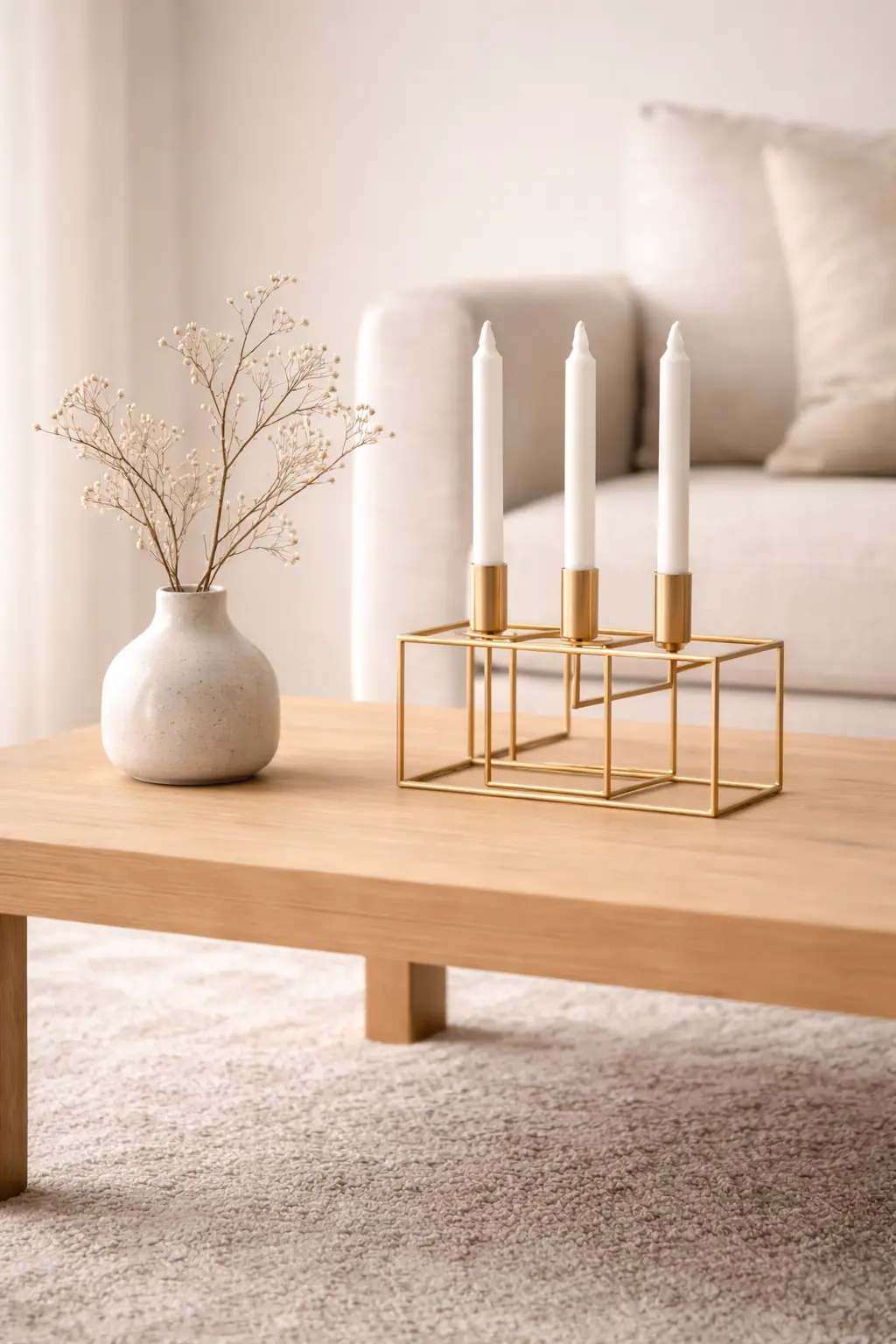
3. Anchor the Space with a Statement Object
 Save it
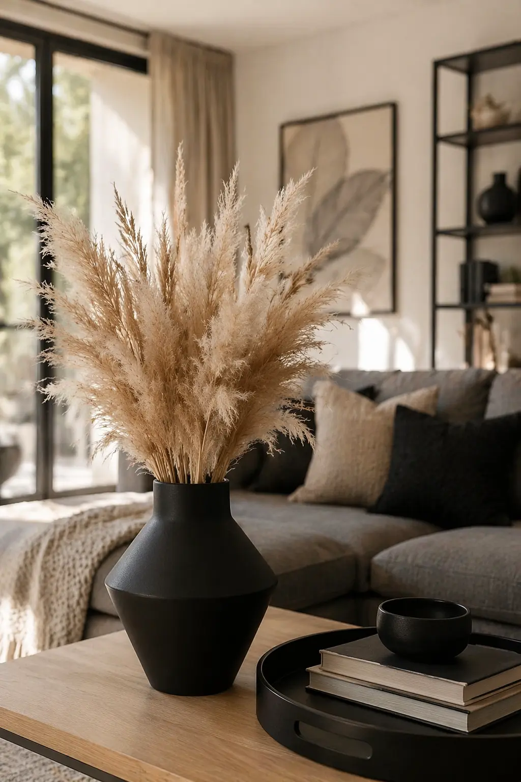
Every well-decorated coffee table has an anchor piece. An element that visually anchors the composition and around which the other objects build. This can be a large vase, a sculptural candle, a sculptural bowl—anything that’s interesting on its own and not just filler. For a long time, I thought the anchor piece had to be large. But it’s not size that matters—it’s visual weight. A dark, textured ceramic vase anchors better than a large but transparent glass vase. Color, material, form all contribute to how “present” an object appears in the space.
My current anchor piece is a matte black ceramic vase with minimal design. Simple, but characterful. Perfect on its own, but works with branches, dried flowers, or even empty. That’s the point: the anchor doesn’t have to function—it just has to be interesting.
What I noticed is that the anchor is always where you look first when you enter the room. If your table is in the center, place it there. If the table is to the left of the seating, then the anchor should also be on the left—where your eye lands first. This isn’t random—it follows visual flow.
I always leave a little empty space around the anchor so it can breathe. If you place other objects close to it, it loses its power. I found that if 60% of the coffee table remains empty around the anchor, that’s the point where it looks elegant without being dead. In my [From Simple to Stunning: Vase Decor Ideas You’ll Love] article, I wrote more about how to choose a vase so it’s truly a statement and not just a container.
4. Balance Organic and Structured Elements
 Save it
One of the biggest differences between an orderly and a lifeless coffee table: the balance between organic and structured elements. If everything is geometric, angular, symmetrical—it’ll be rigid. If everything is organic, curved, natural—it’ll be chaotic. The two together create harmony. For example, if you have a hard-edged marble tray (structured), put in a branch or a dried pampas grass tuft (organic). If you have a soft, textured book (organic), pair it with a sharp-lined metal candle holder (structured). This contrast creates the visual tension that’s interesting but not excessive.
On my table right now is a modern geometric metal candle holder, next to which sits a natural twig in a small ceramic vase. The metal is cold, precise, angular—the branch is warm, random, living. Together they create perfect balance without either dominating.
I call this the 60/40 rule: 60% structured, 40% organic, or vice versa—depending on your living room style. If you live in a modern, minimal space, lean toward structured. If the vibe is boho, rustic, organic should be stronger. But don’t go 100% in either direction, because you’ll lose the dynamism.
Organic elements aren’t just decorations—they bring warmth. A fully angular, modern table feels cold. A little green, a little natural form, and it instantly becomes more human. This is psychological—our brains relax when they see natural forms, because we’re evolutionarily coded to them.
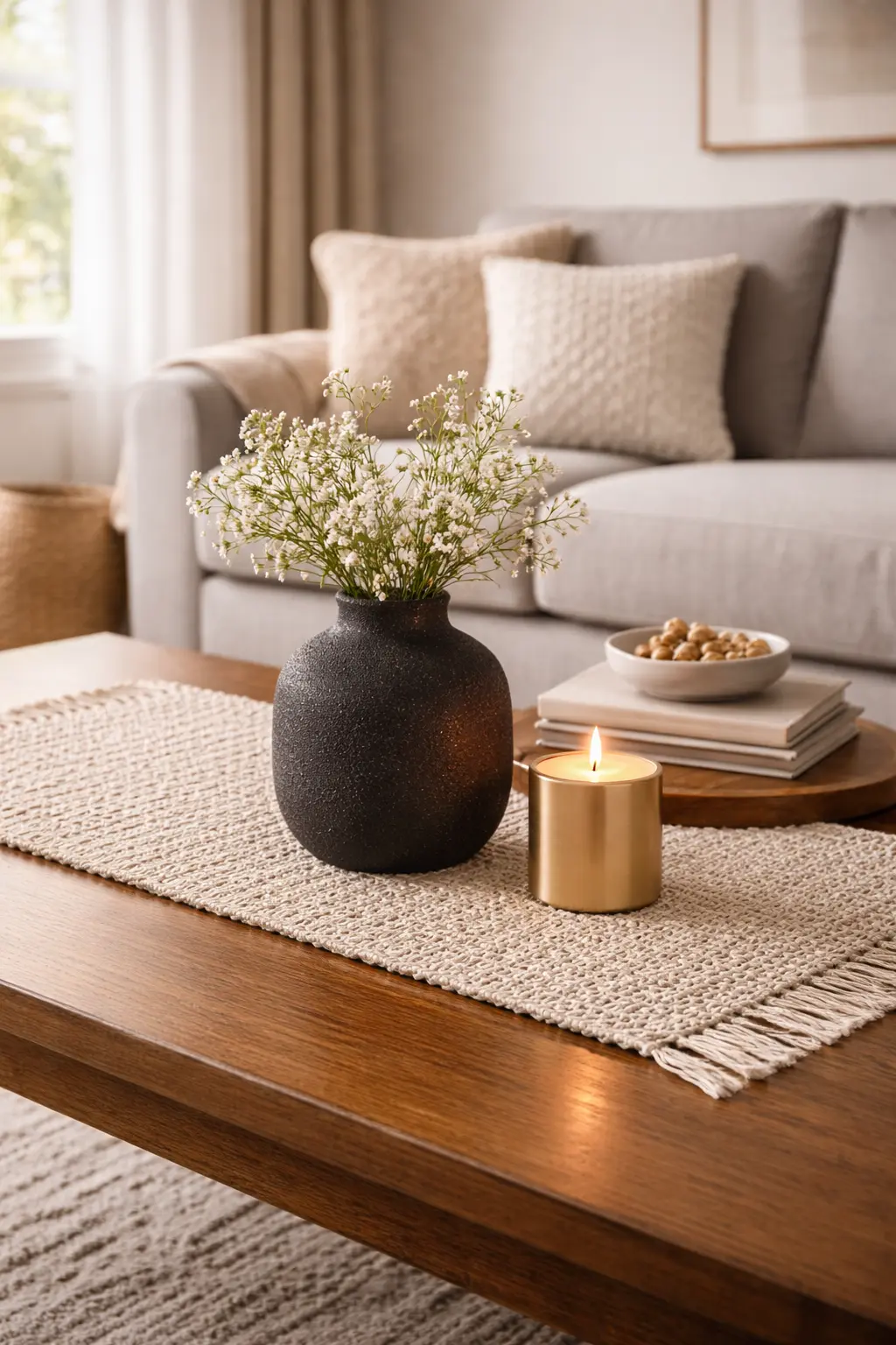
5. Layer Textures to Add Depth
 Save it
Texture is the invisible element that separates amateur styling from professional design. Two objects of the same color still look completely different if one is matte and the other glossy; one smooth and the other textured. This is what gives depth to a visual composition without having to bring in new colors or forms. I’ve tried full smooth setups—glass, polished marble, glossy ceramic—and they always felt sterile. Then I started bringing in texture: a rough knit runner, a candle holder in natural stone, a wood tray. The result immediately became warmer, more layered.
Now I use a rustic knit cotton table runner, underneath which is the table’s glossy surface. The contrast instantly gives depth. The runner doesn’t cover the whole table—just runs in a strip, just enough to give structure but not dominate the surface. Texture layering isn’t just about materials—finish matters too. Matte and glossy, smooth and rough, cold and warm surfaces work together. If you have a matte black vase, put a glossy gold candle next to it. If you have a smooth glass tray, fill it with textured things—books, plants, stone.
When you just look at a table visually, you can’t always tell what’s missing. But if you analyze it from a texture standpoint—”is there matte, glossy, rough, smooth here?”—you immediately see the gaps. This is a layer many people skip, but it’s what takes a setup to the next level.
In my [How to Create a Cozy Living Room with Simple Design Tricks] article, I also covered texture layering in detail, because it’s the foundation for a space to be not just beautiful, but warm and inviting.
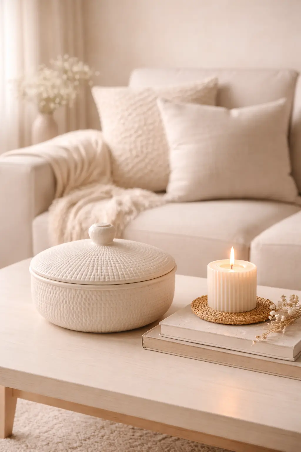
6. Incorporate Functional Decor
 Save it
The coffee table isn’t a museum exhibit. You live with it. You use it. And if everything on it is just decoration, then either you never touch it, or it constantly becomes messy because there are no functional elements that serve real-life situations. That’s why it’s important that what you put on the table isn’t just beautiful, but usable. The tray—which contains things. The books—which you actually read or browse through. A textured ceramic bowl with lid, in which you hide the remote, but it’s beautiful on its own. This is the kind of decor that doesn’t just sit there—it serves.
On my table is a small metal dish that looks like just decor. But actually, lip balms, hand creams, little things I use on the couch at night are in it. There’s no visible pile, but it’s accessible when needed. This is the difference between practical and just “apparent” order.
My another favorite is candles that actually burn. They don’t just sit there. If you choose a candle that smells good and is in a beautiful container, it’s function + decor in one. When you light it in the evening, it suddenly creates atmosphere. This isn’t passive decoration—it’s active.
The best coffee table styling works when it looks like you live with it, but it’s still orderly. If it’s too functional, it’ll be a furniture store. If it’s too decorative, it becomes untouchable. The balance is when a guest can’t tell if you decorated or just live this way. This is the point where the “perfect Instagram picture” and the “real living space” meet. And if you nail this, your table won’t be a source of stress, but a surface you love to see and use at the same time.
7. Play with Asymmetry for a Relaxed Vibe
 Save it
Symmetry is orderly, but rigid. If everything mirrors, everything is balanced to the millimeter—yes, it’ll be professional, but also a bit stiff. Modern design isn’t about formal balance, but asymmetric balance, which is calm but not rigid.
What I noticed if I put a larger grouping on one side of the table (like a tray with books and candles), and a smaller but visually heavy anchor piece on the other side (like a dark vase), the table feels balanced without being symmetrical. It’s like when you hang a picture off-center, but it still looks good because the weight distribution is right.
I tried fully centric too. A large vase in the middle, two candles on each side. It was beautiful, but like a hotel lobby. Didn’t feel like mine. Then I shifted the vase to the left, put a book stack with a small plant on the right—and it instantly became more personal, more alive. Asymmetry doesn’t mean you randomly scatter things. It means the mathematical center doesn’t matter—visual balance does. If there’s a heavy element on one side, have something lighter but larger on the other. Your brain instinctively balances it—this works.
A practical example: a modern structured ceramic planter on the left, books with a candle on the right. One is vertical, the other horizontal. One is a plant (living, organic), the other is static objects. Yet they’re balanced, without mirroring each other.
If symmetry feels too show-home and asymmetry feels too chaotic, you’re probably grouping wrong. Asymmetry works when the weights are in place, even if the forms aren’t.
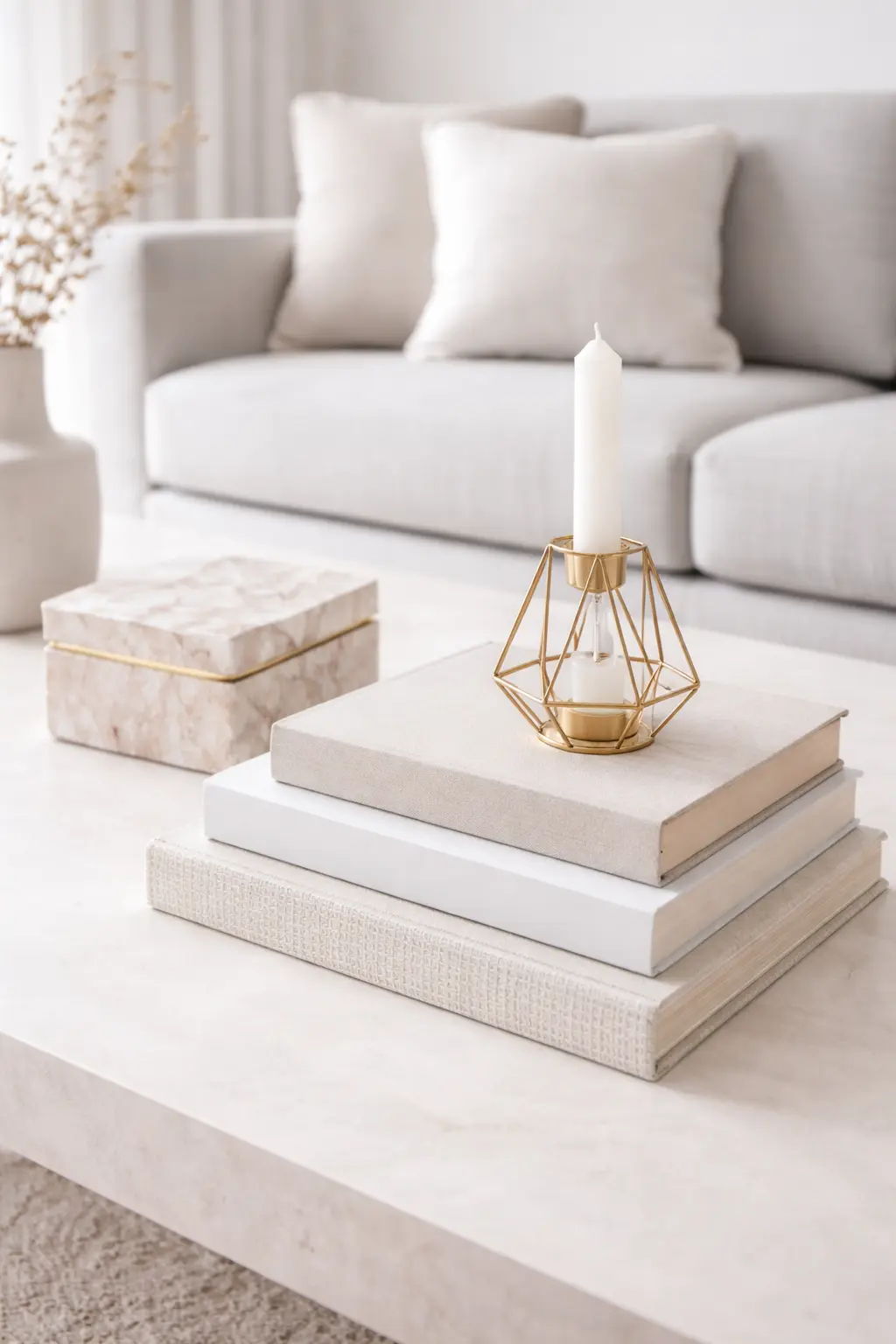
8. Use Neutral Tones with One Accent Color
 Save it
The color palette is what determines whether your table came together or is a collection of random things. And here too lives the golden rule: neutral base + one accent color. When you bring in many colors—red candle, blue book, green plant, yellow tray—the table becomes a circus. There’s no cohesion. When you stay in neutral tones (black, white, beige, grey, wood tones) and throw in an accent color (like a sky-blue vase or terracotta candle), the whole composition comes together.
In my current setup, everything is neutral—black tray, beige books, white ceramic—and the only accent is a matte terracotta candle holder. This orangey-brown warm tone is just enough to give character, but it doesn’t scream. Rather a subtle accent that ties the whole palette together. The neutral base is also genius because it’s timeless. It doesn’t go out of style. If you feel like you’re bored with the accent color, you swap it out—the rest stays. This gives flexibility without having to restyle everything.
The accent color should be something that already appears in the living room—pillows, throw, wall art. This visual connection is what makes the table not float as an island in the space, but part of the broader composition. If you’re not sure about colors, stay with a monochrome neutral setup, and if you get bored, add a single accent element. But never start by adding three different colors at once. That will never come together.
For those living in minimalist and modern styles, this is especially easy—the neutral palette is the foundation of the style. But even in a more boho, eclectic space it works if you stick to the one accent rule. Multiple colors are only possible if you already have styling experience and know how to balance them.
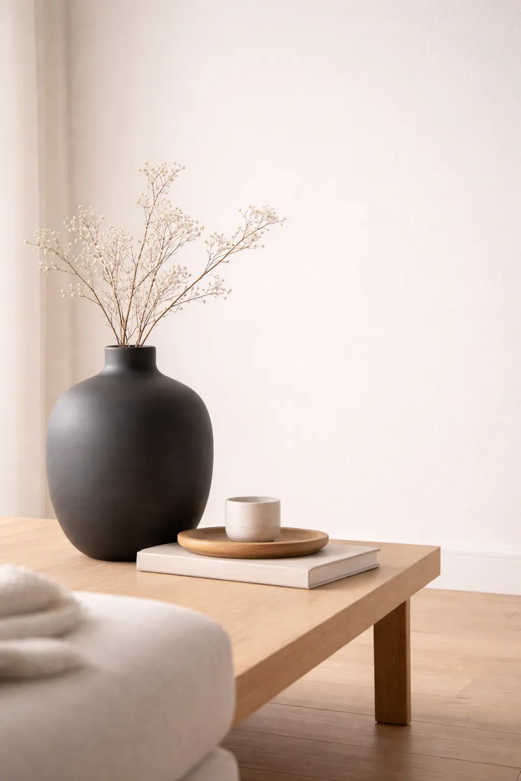
9. Bring in Natural Elements for Warmth
 Save it
One of the biggest dangers of modern design is coldness. If everything is plastic, metal, glass—it’ll be sterile. And natural elements solve this: wood, stone, plant, branch, anything that’s organic in origin. A simple wood branch in a vase brings instant warmth. It doesn’t have to be flowers, doesn’t have to be a living plant—dried eucalyptus, pampas grass, or even just a naturally shaped branch is perfect.
My current favorite is a natural dried pampas grass bundle, sitting in a matte black vase in the corner of the table. The soft, textured head contrasts with the hard, geometric vase, and pushes the whole vibe toward a subtle boho direction without being excessive. The natural element isn’t just aesthetic—it’s psychological. People instinctively feel calmer in a space if there’s something living or nature-derived. Even just a small pebble in a bowl, or a wood candle holder—anything that reminds you nature exists.
Don’t be afraid of dry, dried elements. Many people think the plant has to be alive. But dried branch, grass, flower is just as natural and just as warm in effect—you just don’t have to water it. This is a practical solution if you’re not plant-friendly, or if you don’t have enough light.
Natural elements aren’t trendy or old-fashioned—they’re timeless. They’ve been present in every style for years because they simply work. In modern design especially, they’re important, because the whole aesthetic is raw, clean—nature softens this, makes it more human.
Helpful Tips: Small Space vs Large Coffee Table
If you’re working with a small coffee table—say a 70-80 cm piece—the most important thing is not to try to treat it like a large table. The same number of elements won’t fit, and if you try, it’ll be cluttered.
Stick to the double rule: maximum two groupings. A tray + an anchor, done. Negative space is even more critical here because a small table quickly becomes overcrowded. Better to have less, but well-chosen elements.
With a large table—120 cm and up—you have the luxury to experiment. Here the three grouping rule works, here you can bring in more texture, more layers without it being overloaded. But even here it’s valid: don’t fill it completely. The large table isn’t for putting everything on, but for giving air to the composition.
A practical tip for both: if you live in a rental, choose decors that pack easily. Lidded boxes, light trays, movable vases. This way when you clean or tidy, the whole setup stays mobile—you don’t have to pack each element separately.
Now a little transition to common mistakes: I know how frustrating it is when you feel like you did everything right, but it still doesn’t look the way it should. That’s why I’ve collected the most common styling mistakes I’ve made myself and see in others. If you avoid these, you’re already halfway there.
Common Mistakes to Avoid
1. Too many small objects
The biggest sin: when there are ten little candles, five mini vases, three books, four planters on the table. Each is beautiful on its own, but together it’s chaos. Your brain can’t focus because too many little points are competing for attention. Instead of putting out many small things, put out fewer but larger, statement elements. Three well-chosen pieces are always better than ten random ones.
2. Everything at the same height
When every object is the same height, there’s no dimension. Flat, boring. Varying heights is what gives dynamism—elevate a thing or two with books, risers, to bring in vertical layering too. This creates visual interest without having to buy new objects.
3. Placing everything too centrically
Symmetry is comfortable, but often rigid. If everything is centrically placed on the table’s center, it’ll be beautiful but boring. Asymmetric balance—a larger grouping on the left, a smaller anchor on the right—is much more modern, alive. Try shifting the weight point and watch how much fresher it becomes.
4. Not leaving empty space
Many think if there’s space, fill it. But empty space is just as important as objects. Without it, you can’t breathe, the composition will be tense. Stick to the 40-50% negative space rule—this gives calm and elegance.
5. Elements not matching in style
In a modern space, a rustic clay planter can clash. In a minimalist setup, a baroque candle holder will look odd. It’s not about everything being identical, but speaking the same visual language. If your living room is modern, the coffee table decor should be too—clean lines, neutral tones, simple forms.
Frequently Asked Questions
How do I make my coffee table look expensive without spending a lot?
The luxury feel isn’t about expensive objects, but curation and cleanliness. Choose fewer, but better quality pieces. Good form, clean lines, neutral color—these give the premium feel. Better one beautiful vase than three cheap ones. Better one textured tray than five random accessories. And most important: don’t overload. Empty space is what makes something look expensive.
What colors should I use to make the living room calm?
Stay with the neutral palette—white, beige, grey, black, wood tones. These are calming, timeless, and easy to combine. If you want a little color, add an accent element—terracotta, sage green, powder blue—but just one. A monochrome setup is always calmer than multi-colored.
How do I decorate the table so it’s not cluttered?
Stick to the rule of three: maximum three groupings. And leave negative space—at least 40-50% of the table should remain empty. If you feel “it’s beautiful but too much,” take away one element. Then another. Until the whole composition gets air.
How often should I change my coffee table decor?
There’s no rule, but I do it seasonally—spring, summer, fall, winter. Not a full makeover, just swapping a few elements. A candle color, a vase shape, a plant type. This keeps the space fresh without being a lot of work.
Final Thoughts
Decorating a coffee table isn’t rocket science—but it’s not random either. It’s not about going into a store, buying three random things, and done. It’s about understanding what works visually: grouping, heights, textures, empty space, balance between organic and structured.
What I learned over the years: the best setups never come from doing everything at once. But from building slowly—an anchor piece, a tray, a book, a candle—and watching what’s missing. Sometimes the missing element isn’t even an object, but empty space. Sometimes you don’t need more, but less.
Don’t be afraid to experiment. Move things around, try it asymmetrically, swap colors, add the natural element. The coffee table is the surface where it’s easiest to practice styling, because it’s small, quickly transformable, and you instantly see the result.
And most important: don’t stress about it. If you like what you see, it’s good. If not, change. There’s no perfect setup, only what works for you and makes you feel good when you walk into your living room. That’s the goal. Not Instagram, not magazines—you. Your home. Your space.
This post contains affiliate links. I may earn a small commission at no extra cost to you.