
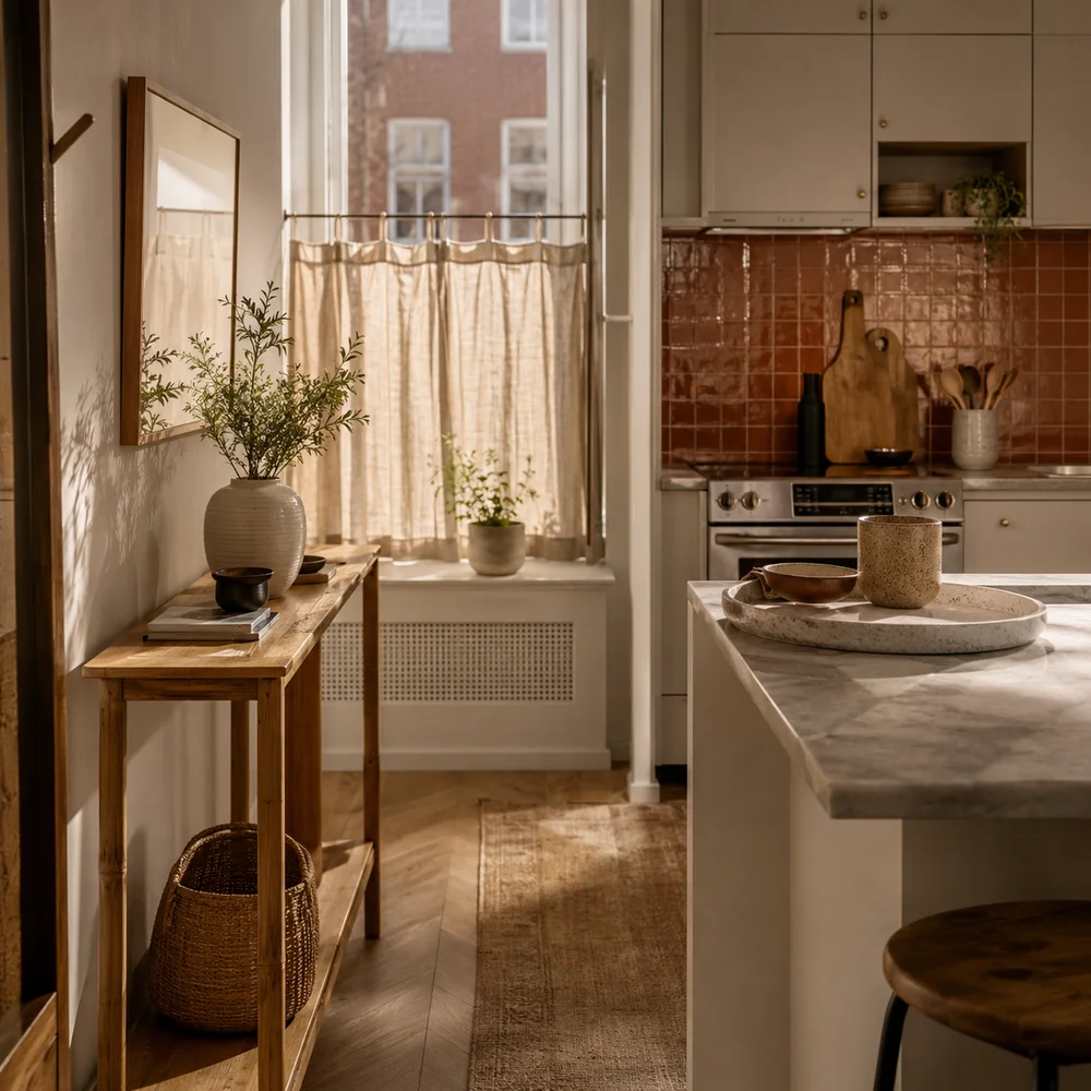
The Best Small Kitchen Decor Ideas for Apartments
By Emily | August 24, 2026
There’s a specific kind of frustration that comes with loving a room you can’t touch. You scroll past kitchens with painted island bases and hand-laid tile and full brass hardware suites, and then you look at your own galley kitchen — beige laminate counters, builder-grade cabinets, a landlord’s idea of neutral — and the gap between the two feels less like a decorating problem and more like a permission problem. Nobody handed you a lease that says you get to want beauty here too.
But an apartment kitchen isn’t a lesser kitchen. It’s a kitchen with a different rulebook. Nothing gets bolted down, painted over, or ripped out — which means every decision has to work harder, chosen for its look and its reversibility in equal measure. That constraint, it turns out, is a surprisingly good editor. It forces you toward pieces with real presence instead of filler, toward decor that earns its spot on a countertop that has no spot to spare.
This isn’t a list of things to buy so your kitchen looks styled for a photo. It’s a way of thinking about a rented, often-small kitchen as a space that’s fully, currently yours — not a placeholder you’re decorating around while you wait for the version with a real pantry. Every idea here leaves with you when you move, and none of them require a single conversation with a property manager. That’s not a limitation to work around. It’s the whole design brief, and once you accept it, the decisions get easier, not harder.
1. Let Furniture Do the Job Renovation Can't
 Save it
When you can’t move a wall or swap a cabinet run, furniture becomes your only structural lever — and most renters underuse it, treating their kitchen as a fixed box instead of a room that can hold freestanding pieces the way a living room does. In a house, an island solves the problem of a kitchen with only one working surface. In an apartment, that same problem exists and gets ignored, because the assumed solution — cabinetry, built-ins — was never available to begin with. Furniture was available the whole time.
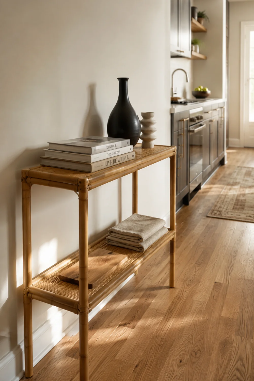
A narrow console tucked against an empty stretch of wall does what an island would do in a house you owned: it adds a surface for prep, a shelf for display, a sense that the room has more than one function packed into its footprint. The trick is scale. It needs to read as furniture, not as a shortcut — real wood tone, real presence, proportioned for a hallway-width kitchen rather than squeezed in as an afterthought that apologizes for itself. A piece that’s too delicate disappears into the room; a piece with genuine weight anchors it the way a real architectural feature would. Modern Kitchen Decor Ideas for Small Spaces to Copy Now covers the structural version of this idea, the kind that assumes you can alter cabinetry and sightlines to make a small kitchen read larger. The furniture version is the apartment translation of the same instinct: you’re still making a small kitchen feel considered and complete, just through a piece you could carry out the door on moving day instead of one bolted to the floor.
Style the top shelf the way you’d style a credenza in a living room — a stack of cookbooks, a single object with real weight, something that isn’t food. The lower shelf can hold what actually needs to live there: a cutting board, a folded stack of linens. One piece, two jobs, zero installation, and a silhouette that will look just as intentional in whatever kitchen comes after this one.
2. Give the Wall Above the Counter Restraint, Not Just Storage
 Save it
The instinct in a small kitchen is to fill every blank wall with function — another shelf, another rail, another place to put things, because surface area feels scarce enough that leaving any of it empty seems wasteful. But a wall that’s asked to do nothing but hold a few considered objects reads as intentional in a way a wall crowded with utility never does. This is the harder discipline: choosing two or three pieces and trusting that the empty plaster between them is doing real visual work, not sitting there unfinished. 15 Minimalist Kitchen Counter Styling Ideas You’ll Love makes this same argument about the counter itself — that negative space is a material you’re styling with, not an absence to correct. Applied vertically, above a counter that’s already doing plenty of practical work, it means resisting the urge to hang one more organizer, one more rail, one more thing that turns the wall into an extension of storage rather than a place the eye can actually rest.
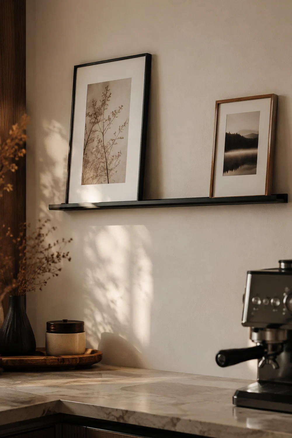
A shallow ledge mounted with adhesive strips holds two or three small framed pieces without a single nail hole to patch when you leave — art that leans rather than hangs, which somehow always looks a little more relaxed, a little less staged, than anything mounted flush to the wall. Choose pieces with some tonal relationship to each other, but not a matched set; a slight mismatch in frame color or scale reads as collected over time rather than purchased in a single afternoon, which is exactly the impression you want a rented kitchen to give.
What you leave off the ledge matters as much as what goes on it. Skip anything with visible text, anything overtly seasonal, anything that will feel dated by next year — a kitchen wall gets looked at daily, at close range, over years, in a way that makes trend pieces wear out their welcome fast. A print with a strong color story or a single graphic shape holds up far longer, because it functions more like a piece of art you chose for how it makes the room feel than a decoration you picked to fill a gap. Two pieces, styled with obvious intention, will always outlast five that were bought to solve an empty-wall problem in a hurry.
3. Fake a Backsplash Before You Commit to One
 Save it
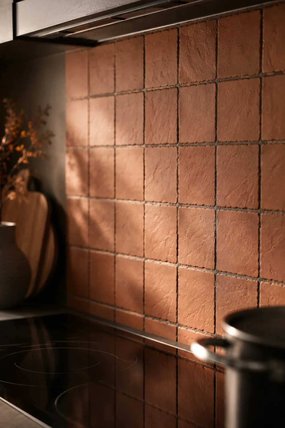
Almost no apartment kitchen has a backsplash worth keeping, and almost no lease lets you install one properly — tile means grout, grout means permanence, and permanence is exactly what a rental agreement exists to prevent. What you can do instead is borrow the visual effect of a real backsplash — pattern, color, a clear line where the counter ends and the wall begins — without a single tile going in for good. Simple Kitchen Color Palettes That Work in Any Home lays out how to choose a palette around your fixed elements — the counter, the floor, the cabinet finish you didn’t choose and can’t change. A peel-and-stick treatment behind the stove is where that palette actually gets to show up, in the one zone of the kitchen that gets the most visual attention and asks for the least amount of permanent commitment in return.
Keep it contained to the stretch directly behind the range rather than running it wall-to-wall. A smaller, framed application looks like a deliberate accent chosen on purpose; covering the entire wall starts to read as an attempt to disguise the actual tile underneath, which undercuts the whole effect you’re going for. Applied with intention and edited to one clear zone, it reads as a design choice. Applied everywhere, it reads as a cover-up — and most people can tell the difference without knowing exactly why.
Sheen matters more here than most people expect going in. A matte, hand-finished-looking texture reads as considered and grounded; a high-gloss vinyl finish reads as exactly what it is, which is a sticker. Look closely at the edges too — a mat with a slight, irregular border rather than a hard rectangular cutoff blends into the wall instead of announcing where it starts and stops, which is the entire difference between something that looks like it belongs and something that looks applied. And because the whole point is reversibility, resist the urge to reinforce the edges with extra adhesive or caulk to make it feel more permanent; the less committed the installation, the more freely you get to change it again in a year.
4. Double Your Cabinet Space Without Touching a Single Screw
 Save it
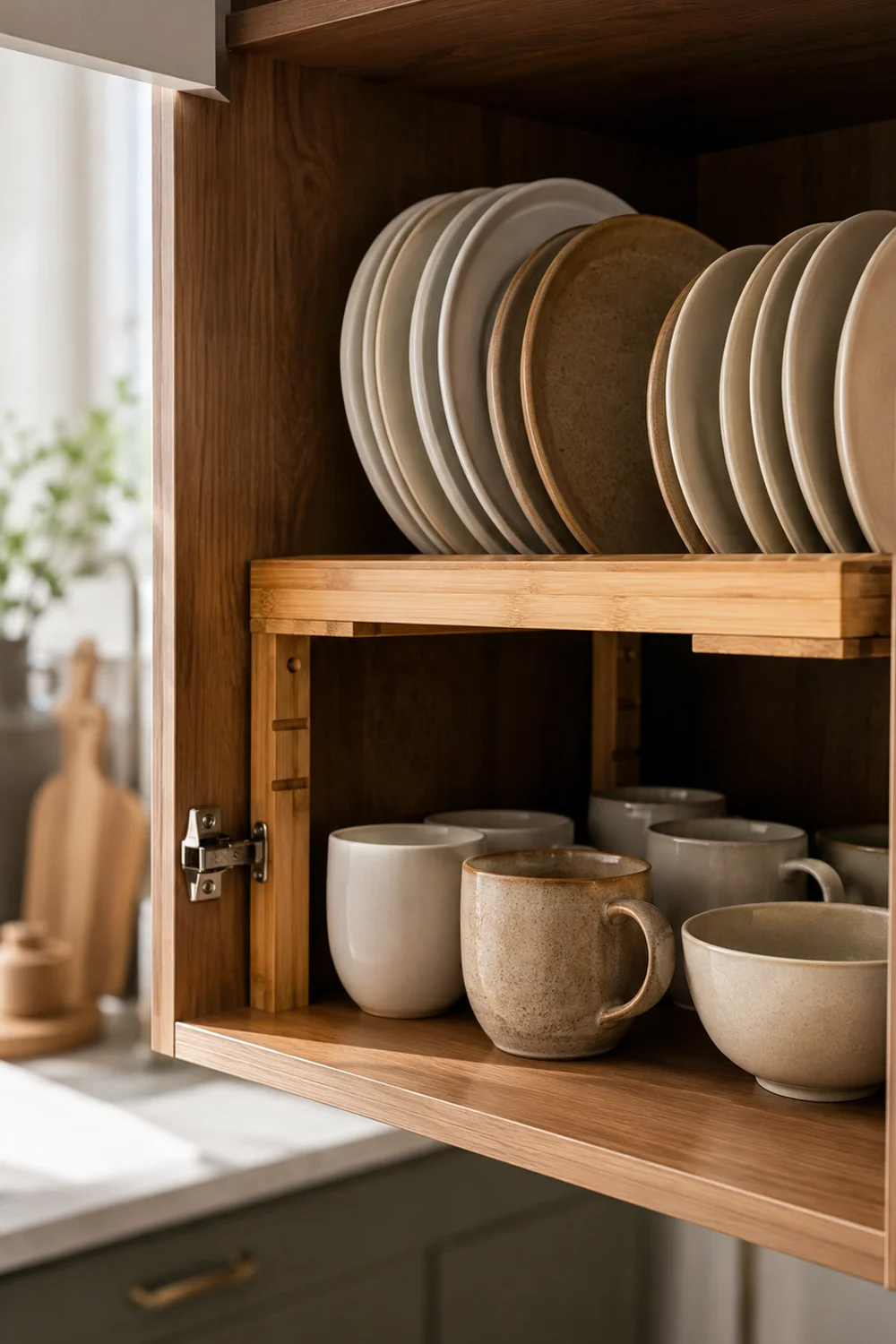
Apartment kitchens rarely lack for beauty problems as much as they lack for actual room — one shallow cabinet expected to hold everything from mugs to mixing bowls, stacked in a way that means digging for the thing at the bottom every single time you cook. This is the one section here that isn’t really about how the kitchen looks. It’s about the fact that a kitchen that functions badly never looks good either, no matter how well the counter is styled, because clutter always finds its way back out and undoes whatever careful decorating happened elsewhere.
The instinct is to buy more containers, but containers only rearrange the same volume of stuff into slightly tidier piles; they don’t create new space. What actually creates space is using the vertical air inside a cabinet that’s currently sitting empty above whatever’s already stacked there — air that exists in nearly every rental cabinet, because standard shelf spacing is built for the tallest item you own, not the average one.
A riser that expands to fit the width of any cabinet turns that wasted vertical air into a genuine second tier — plates and bowls no longer stacked six deep, mugs no longer nested inside each other and chipping against one another every time you reach for the wrong one first. It slides in, expands to fit, and comes back out just as easily when you move, which is the whole test for whether something actually belongs in a rental kitchen at all: does it improve the space today, and does it leave without a trace tomorrow.
The best cabinets for this are the ones holding your everyday dishware, not your deep storage — the plates and bowls and mugs you touch multiple times a day, where the friction of digging through a stack compounds fastest. Put the riser to work there first, before you even consider the pantry side of the kitchen. A second tier means the everyday stack sits at eye level instead of buried, which sounds like a small thing until you notice how much calmer the whole routine feels once you’re not excavating for a bowl every morning before coffee.
5. Build One Small Vignette Instead of Styling the Whole Counter

 Save it
A common overcorrection: in the effort to make an apartment kitchen feel decorated, every inch of available counter gets a little something, until the surface reads as busy rather than styled, and the eye has nowhere clear to land. One contained vignette — a tray with two or three grouped objects — does more visual work than five scattered ones, because it gives the room a single, deliberate focal point instead of a dozen small competing ones. The Secret to Beautiful Yet Functional Kitchen Counter Decor covers the logic of grouping in threes across an entire counter run, the kind of styling that assumes you have several feet of clear surface to work with. Here, that same principle gets compressed onto a single tray, which matters even more in a small kitchen, where you may only have one genuinely clear stretch of counter to begin with and everything else is claimed by function.
Anchor it near the stove or the sink, somewhere your eye already travels while you’re moving through the room, rather than tucked into a corner where it competes for attention with nothing and consequently earns none. A tray with a slight riser height also does something subtle but real: it separates the objects on it from the counter itself, so even a plain laminate surface underneath starts to feel like a stage rather than just a countertop.
Fill it with genuine variation in height and material rather than three similar objects — a taller bottle, a low ceramic dish, something with visible texture — so the eye has somewhere to travel within the small footprint instead of landing flat. And resist adding a fourth item once the tray feels finished; the temptation to keep going is exactly what turns a vignette back into clutter. The tray’s edge is a real boundary, not a suggestion, and everything that belongs to this moment should stay inside it.
6. Dress the Window Without Drilling a Single Hole
 Save it
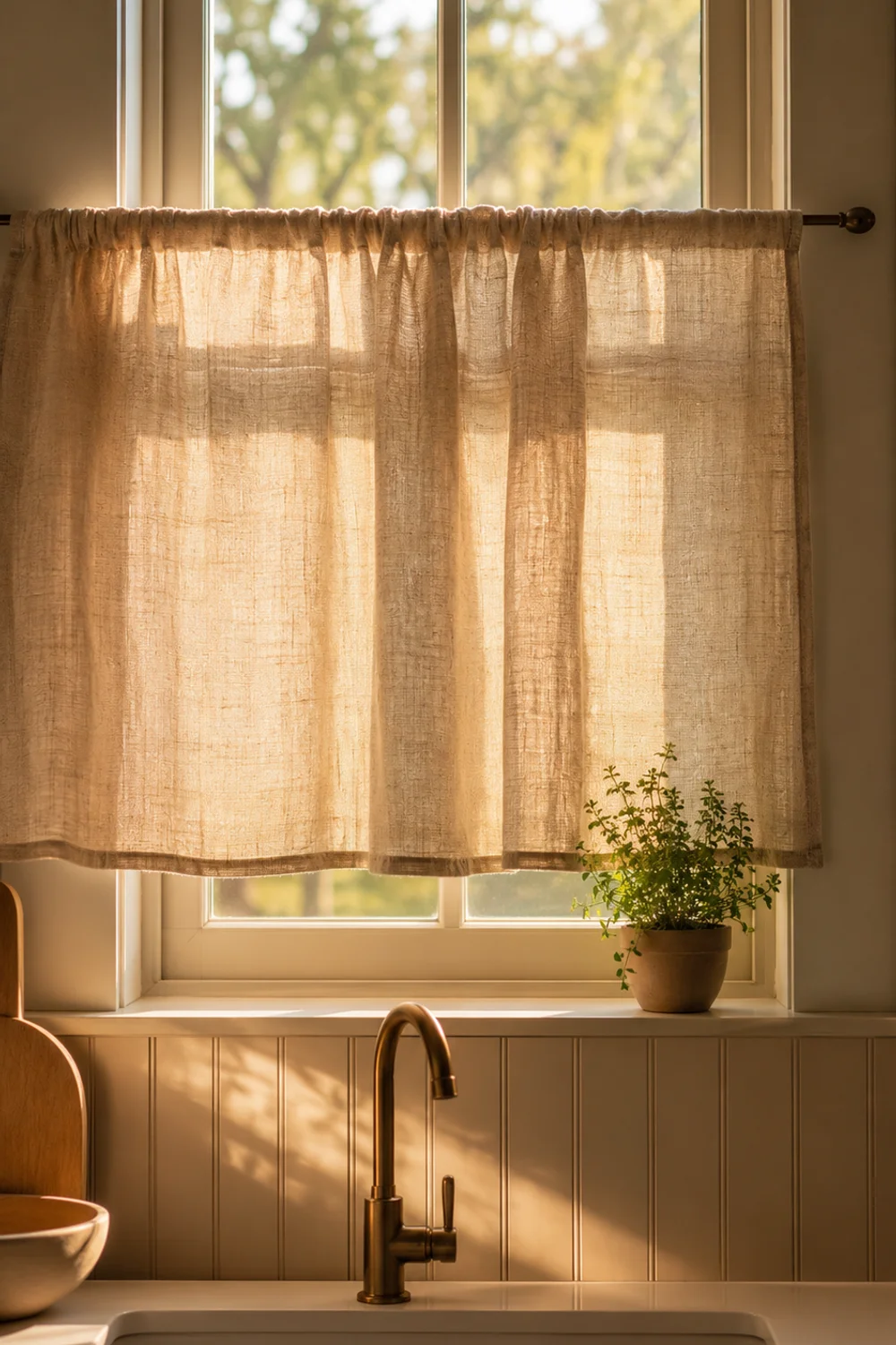
If your apartment kitchen has a window at all, it’s probably the single most valuable spot in the room, in the sense that it’s the one place that can register as decorated, personal, and soft in a space that otherwise reads hard and utilitarian — laminate, stainless, grout lines. And it’s usually the one thing renters leave completely bare, on the assumption that curtains mean hardware, and hardware means a drill, and a drill means a conversation with the landlord that nobody wants to have over something as small as a window treatment. How to Style a Cozy Neutral Kitchen on Any Budget builds a full tiered plan for warming up a cold kitchen without a full renovation budget behind it. The window is the fastest, lowest-commitment entry point into that plan, because a tension rod asks absolutely nothing of the wall — no anchors, no measuring for studs, no patching required when you take it down.
A café-length linen panel, hung at sill height on a spring-tension rod, softens the one window in the room without blocking light or requiring a single screw — and it comes down in under a minute the day you move, folds flat, and goes right back up in the next place. Choose a linen with visible texture rather than a flat cotton; the slight irregularity in the weave is what reads as considered rather than incidental, and it’s the difference between a window that looks dressed and one that just looks covered.
Café length matters more than it seems like it should. A full-length curtain in a kitchen window usually means fabric near a stove or sink, which is a genuine hazard as well as a maintenance headache; stopping the panel at sill height keeps it purely decorative and completely out of the way of anything you’re actually cooking. If the window sits directly above the sink, angle the rod slightly forward from the glass so the fabric clears the faucet when it swings — a small adjustment that saves you from a damp hem within the first week.
7. Swap the Shade, Not the Wiring
 Save it
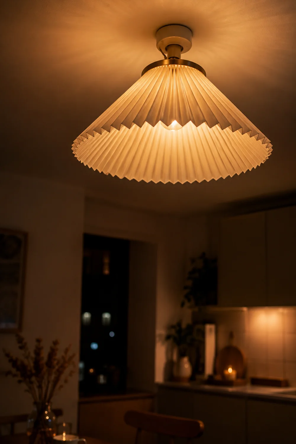
Most apartment kitchens come with one overhead fixture, chosen by whoever built the unit with no particular thought given to how it would actually feel to cook under it — usually a flat glass dome or a bare builder’s fixture that throws light evenly and flatters absolutely nothing it touches, including the food and the person making it. Rewiring it is out of the question, and most renters correctly assume the fixture itself is untouchable.
But the shade is not the fixture. In most builder-grade lights, it’s a separate piece that clips or twists onto the base, entirely removable from the electrical component underneath it. Swapping just that piece changes the entire character of the light without an electrician anywhere near the job, and without disturbing anything the landlord would ever notice or need to be told about.
A pleated fabric shade clipped over the existing bulb diffuses the light instead of scattering it flat and even across every surface, trading that clinical wash for something with actual warmth, dimension, and shadow. It’s a fifteen-minute change that touches nothing electrical, reverses just as fast as it went on, and does more to change how a kitchen feels in the evening than almost anything else on this list — because light, more than any object in the room, decides whether a space feels like a rental or a home.
Pay attention to the bulb underneath, not just the shade on top of it. A warm-white bulb, somewhere around 2700 kelvin, is what makes a diffused shade actually feel cozy rather than just dimmer; a cool daylight bulb underneath the same fabric shade will still read sterile, just softer around the edges. The two changes together, a warmer bulb and a fabric shade, do more than either one does alone, and both come out of the fixture in seconds when it’s time to move.
8. Lean a Shelf Instead of Mounting One
 Save it
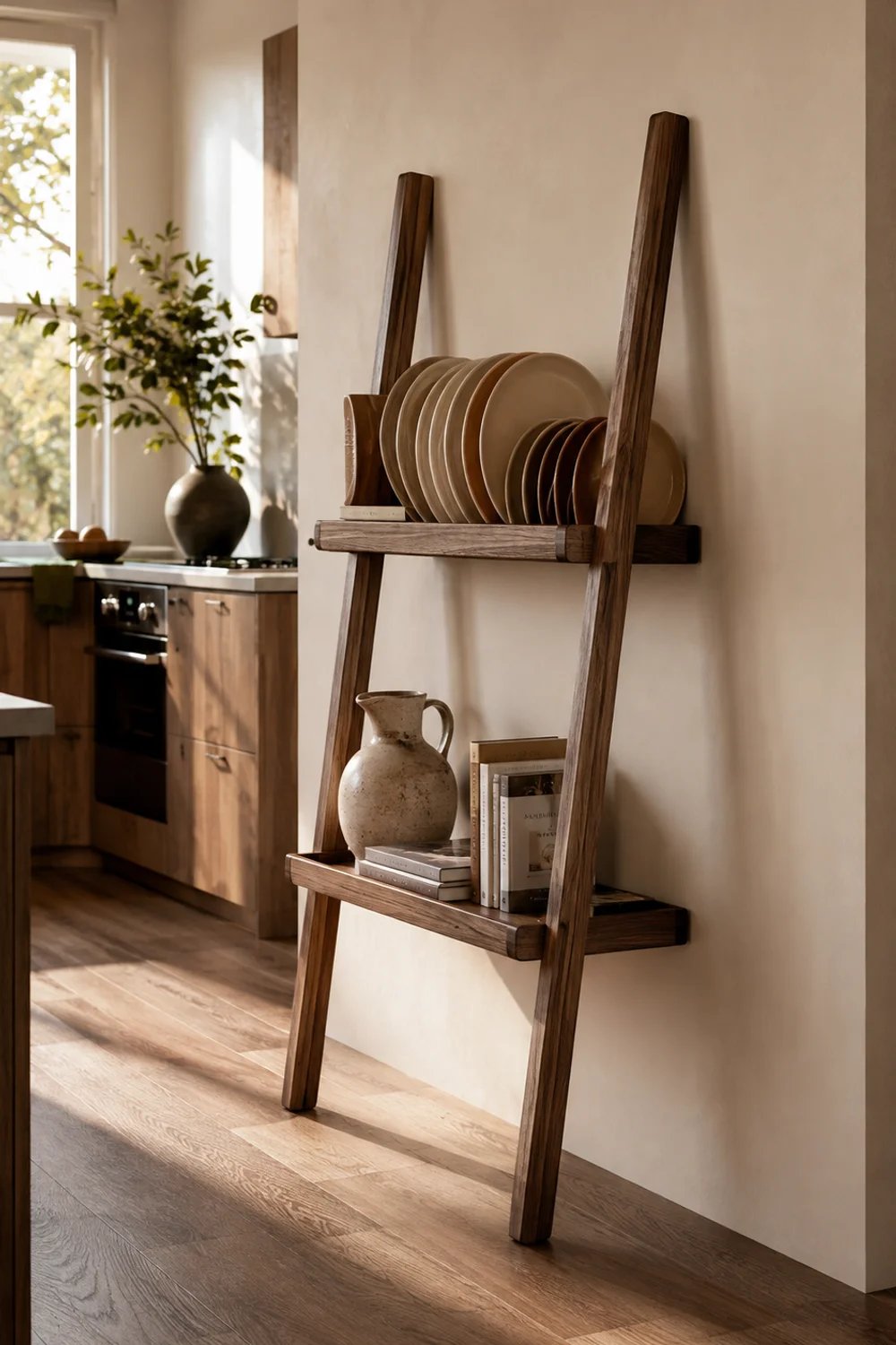
Open shelving is one of the most requested looks in a small kitchen and one of the least available to renters, since achieving it almost always means drilling into tile or plaster to hang something load-bearing enough to hold actual dishware without pulling out of the wall under the weight. It’s a look people want and then abandon the moment they realize what installing it would require.
A leaning shelf solves the same problem from a different angle: tall, freestanding, angled against the wall rather than fixed to it, it gets you the same displayed, editorial look without a single anchor going into anything. The lean itself does real structural work — enough weight low and back against the wall, and the whole unit stays put through normal use without ever needing a bracket. Above Fridge Styling Ideas for a Beautiful and Organized Kitchen covers the instinct to treat awkward vertical space as an opportunity rather than dead air to ignore. A leaning shelf is that same instinct applied to a kitchen that doesn’t have a fridge-top zone worth styling, or already has one that’s full and needs a second display moment somewhere else in the room.
Use it for the dishware you’d actually want visible — stoneware in a color you chose deliberately, not the mismatched mugs that accumulated from three different apartments ago — and keep everything else behind a cabinet door where it belongs, out of sight and out of the styling equation entirely.
Position it against a solid wall segment rather than wedged into a corner, where the angle of the lean can look accidental instead of intentional. Give it a few inches of breathing room on either side too; a leaning shelf pushed right up against a doorframe or appliance reads as squeezed in, while the same piece with a little clearance around it reads as though the room was actually planned with it in mind. It’s a small detail, but it’s the one that separates a display shelf from something that just looks like it’s waiting to be moved.
9. Let the Trash and Recycling Corner Earn Its Place in the Room
 Save it
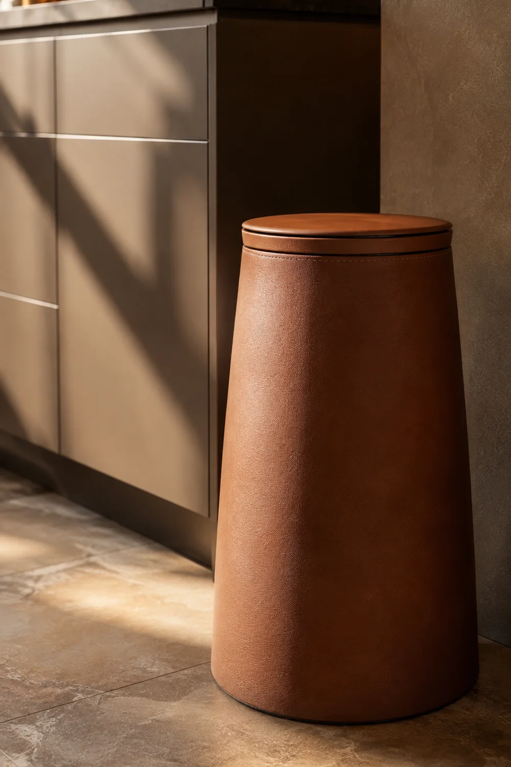
Every kitchen has one zone nobody photographs and everybody sees constantly, and in an apartment it’s usually more visible than it would be in a house with a pantry or a cabinet built specifically to hide it. A bare plastic bin in the corner of a small kitchen isn’t just an eyesore in isolation — it undercuts every other decision you’ve made in the room, because the eye registers the worst thing in a space before it registers the best, no matter how much care went into everything else.
This is the section people skip first when they’re decorating, because it doesn’t feel like decor — it feels like maintenance, a functional necessity rather than a design opportunity. But a small kitchen doesn’t have the luxury of an unstyled corner. Every zone is visible from every other zone, which means the trash can is never really out of frame.
A tapered bin in a material that reads more like furniture than utility closes that gap without adding a single task to your routine — it’s still just a trash can, doing exactly what a trash can does, but it stops being the thing your eye catches first when you walk into the room. The tapered shape also helps in a literal, spatial sense: it takes up less floor footprint at the base than a standard cylindrical bin, which matters in a kitchen where every square foot of floor is already spoken for.
Match the finish to whatever else is already grounding the room at floor level — a warm cognac tone if your console or leaning shelf leans wood-toned, a deeper charcoal if the room is cooler overall. This is one of the only floor-level objects in a small kitchen, which means it has an outsized effect on how finished the bottom half of the room feels, even though it’s rarely the thing anyone consciously notices when the styling works.
10. Give the Room One Sculptural Moment

 Save it
Function accounts for almost everything in a small kitchen, out of sheer necessity — every surface is claimed, every shelf has a job, every object exists because it solves a problem. Which means the room can end up feeling entirely utilitarian, beautiful in its efficiency, maybe, but with nothing in it that exists purely because you liked the shape of it, the way a piece of art exists in a living room for no reason other than that you wanted to look at it.
One object with no job beyond being interesting does more to make a kitchen feel like yours than another organizer ever will, precisely because it’s the one thing in the room that isn’t apologizing for itself or justifying its presence through utility. It’s a small act of stating that this room is allowed to hold something just because you find it beautiful.
Place it somewhere it won’t get shuffled aside during actual cooking — a console shelf, the top of a leaning shelf, a spot that’s seen but not in the way of the counter’s real work — and let it be the one thing in the room that isn’t solving a problem. Its glaze will catch light differently depending on the time of day, which is its own quiet argument for why it belongs somewhere you’ll actually see it.
Resist pairing it with anything else in the same sightline. Part of what makes a purely sculptural piece register is the isolation around it — set beside a stack of mail or a spare mug, it stops reading as art and starts reading as clutter that happens to be ceramic. Give it its own clear inch of space, even in a kitchen where clear inches are the scarcest resource in the room, and it will do more work sitting alone than it ever would grouped in with something functional.
11. Make the Decor Portable, Because You Are
 Save it
Every idea in this article shares one requirement that a homeowner’s kitchen decor never has to meet: it has to survive a move. That’s not a constraint to apologize for or work around reluctantly — it’s a genuinely different way of collecting a home, where the things you buy for one kitchen get to travel with you into the next one, and the one after that, accumulating meaning instead of getting left behind with the lease when the time comes.
There’s something quietly satisfying about decor that’s designed with its own eventual disassembly in mind. It doesn’t ask you to pretend permanence you don’t have. It just asks you to care about the room you’re in right now, fully, while staying honest about the fact that you won’t always be in it.
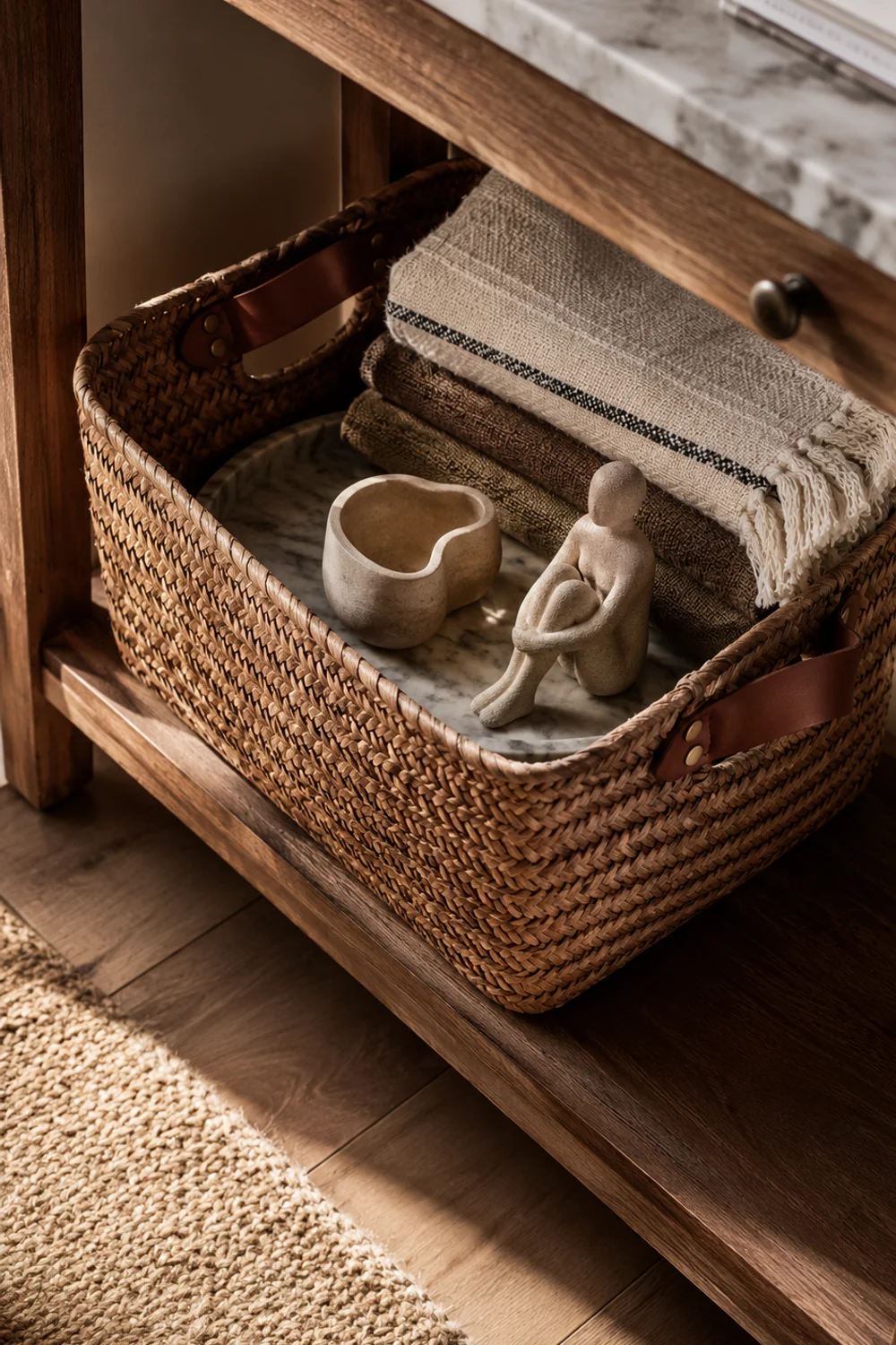
Keep one basket, leather-handled and sturdy enough to carry real weight, as the place where loose kitchen decor lives between apartments — the tray, the sculptural object, the console’s top-shelf styling, gathered in one spot instead of individually bubble-wrapped and scattered through a dozen different moving boxes. It’s a small, practical thing that makes the next apartment feel like a continuation of this one, not a blank start you have to decorate all over again from nothing.
Use it for that purpose year-round, not just on moving day — a basket that’s already doing the job of gathering your decor between uses is one less scramble the week the lease ends. Between moves, let it live somewhere visible, holding the objects it’s built to carry anyway; it’s furniture and packing material at once, which is precisely the kind of double duty every piece on this list should be quietly performing.
Think of it as the one piece that ties the entire room together conceptually, even if it never gets photographed the way the console or the leaning shelf will. Every other idea here is a single, contained decision — one wall, one window, one tray. This is the piece that acknowledges all of those decisions are connected, that they belong to one coherent plan for one particular kitchen, and that the plan itself is allowed to travel intact instead of dissolving into a box of miscellaneous items the next time you sign a new lease.
Common Mistakes
1. Treating every idea here as permanent once it’s in place
The entire premise of an apartment kitchen is reversibility, but it’s surprisingly easy to forget that once something looks good — people start reaching for the drill “just this once,” telling themselves one small hole won’t matter. Stay disciplined about the no-installation rule even after the room feels finished and you’ve stopped noticing the constraint; it’s the only thing that keeps a security deposit intact when the lease is up.
2. Styling every surface at once
A console, a full counter vignette, a leaning shelf, and a dressed window, all styled with equal intensity and equal density, stop reading as individually considered moments and start reading as cluttered, no matter how nice each individual piece is on its own. Choose two or three moments to give real, focused attention and let everything else in the room stay deliberately quiet by comparison.
3. Buying decor before measuring the actual space
Apartment kitchens vary wildly in dimension from one building to the next, and a console or ladder shelf that looks perfectly proportionate in a product photo, staged in a spacious studio, can dominate a narrow galley kitchen the moment it arrives. Measure the actual footprint, walkway width included, before ordering anything freestanding.
4. Ignoring the fixed, unchangeable colors already in the room
Countertop laminate, cabinet finish, and flooring aren’t going anywhere no matter how much you’d like them to, and decor chosen without any reference to them will always look slightly at odds with the room instead of part of it, no matter how nice the individual pieces are in isolation.
5. Skipping the trash and recycling zone
It’s the least glamorous section of this entire article and the one most people skip first when they start decorating — but an unstyled utility corner undercuts every other careful decision in the room more than any single missing decor piece ever would, precisely because it’s the thing the eye notices without meaning to.
Frequently Asked Questions
Will peel-and-stick tile damage the wall behind it when I remove it?
Most peel-and-stick products made for rental use are designed specifically to lift cleanly off painted drywall when removed slowly and at a low, deliberate angle rather than pulled straight off. Test a small corner first before committing to a full application, and avoid applying it directly over unpainted or heavily textured surfaces, where both adhesion and clean removal become far less predictable.
Is it actually safe to use adhesive strips for shelving above a counter?
Adhesive-mounted ledges are rated for light display use — small framed art, lightweight ceramic objects — not for anything with real, concentrated weight like dishware stacked deep or a row of cookbooks. Check the specific weight rating printed on the packaging before hanging anything, and when you’re unsure, it’s always safer to keep the load lighter than you think you actually need to.
How do I make a rented kitchen feel cohesive without repainting the cabinets?
Cohesion comes from repeating two or three materials and tones consistently across the freestanding pieces you do control — the console, the textiles, the tray — rather than trying to correct or compete with the cabinets themselves. The eye reads a room as cohesive when the elements that can change agree with one another, even when the fixed elements underneath stay exactly as they were the day you moved in.
What’s the single best place to start if I can only do one thing from this list?
The window, if your kitchen has one at all. It’s the lowest-effort, lowest-cost change with the most immediate emotional impact, because it’s usually the only source of natural light in the room and the one spot that can go from bare and forgotten to genuinely soft in the time it takes to hang a single tension rod.
Final Thoughts
None of this requires a landlord’s permission, a security deposit put at risk, or a single trip to a hardware store for anything heavier than adhesive strips and a tension rod. What it requires is treating the kitchen you have right now as worth the effort — not a placeholder for the kitchen you’ll eventually own someday, but a real room you get to live in fully today, exactly as it is.
There’s a particular kind of home that gets built by people who refuse to wait for permission to make a space feel like theirs. It’s not the home with the biggest budget or the most permanent fixtures — it’s the one where every choice, however small or temporary, was made with real intention. A console chosen for its proportions instead of its price. A window dressed because it deserved to be, not because a lease required it. That’s a different kind of decorating altogether, and it tends to produce rooms with more personality than the ones built with an unlimited renovation budget and none of the constraint.
The best apartment kitchens don’t look like they’re waiting for a renovation that may never come. They look like someone who actually lives there made every single choice on purpose, knowing the whole time that all of it had to be able to leave when they did — and choosing to make it beautiful anyway.
This post contains affiliate links. I may earn a small commission at no extra cost to you.
Get cozy inspiration delivered to your inbox.
✓ 14-page beautifully designed ebook
✓ Cozy decorating ideas
✓ Practical room-by-room inspiration
You’re in! 🎉
Thanks for joining the NestFlowHome community!
Your free ebook is already on its way to your inbox. If you don’t see it within a few minutes, please check your Promotions or Spam folder.
Join the NestFlowHome community for weekly decorating inspiration.

Timeless home decor ideas and slow living inspiration for a calm, beautiful life.