
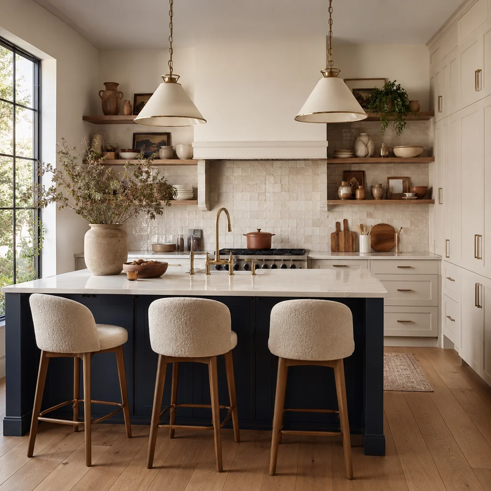
Simple Kitchen Color Palettes That Work in Any Home
By Emily | August 15, 2026
Stand in a kitchen that feels finished, and you can usually trace the feeling to something you can’t quite name. It isn’t the appliances, and it isn’t the layout. It’s the color, or more precisely, how few colors are actually doing the work. Walk through any kitchen that photographs well and you’ll find the same quiet discipline underneath every version of it, whether it’s a white farmhouse space with brass hardware or a moody navy galley kitchen with pale oak floors: a handful of colors, chosen in relation to each other, repeated with intention rather than accumulated by accident.
Most kitchen color advice starts in the wrong place. It hands you a list of trending hues, sage green one year, warm terracotta the next, and leaves you to figure out how those colors are supposed to behave once they’re actually on your walls, cabinets, and countertops. That’s backwards. A color palette isn’t a collection of pretty shades; it’s a structural decision about proportion, placement, and how much of your kitchen each color is allowed to claim. Get the structure right and almost any color family will read as intentional. Get it wrong and even a beautifully chosen paint color will feel like it’s fighting the room.
This guide isn’t a list of colors to copy. It’s the underlying formula, the same one that holds together every kitchen palette that has ever felt calm and cohesive rather than accidental, broken into pieces you can apply regardless of your kitchen’s size, your budget, or whether you’re allowed to touch the walls at all. By the end, you won’t just have a color in mind. You’ll have a system for choosing one, testing it, and building outward from it with confidence.
1. Start With What You Can't Change
 Save it
Before a single paint chip enters the conversation, your kitchen already has a palette. It’s just not one you chose. Your countertop, your flooring, and your cabinet material if you’re keeping the boxes and only changing finishes, these are your fixed elements, and they carry undertones whether you’ve consciously registered them or not. A quartz counter with faint gray veining, a butcher-block surface with a golden cast, a tile floor leaning warm terracotta or cool greige: each one is already voting on every color decision you make from here forward.
The mistake almost everyone makes is choosing a wall or cabinet color in isolation, holding a swatch up against a blank section of drywall, falling in love with it under store lighting, and only discovering the clash once it’s on the wall next to a countertop it was never introduced to. Undertones fight quietly. A cool, blue-gray cabinet color next to a warm, honey-toned countertop doesn’t look wrong exactly, it just never settles. The room feels slightly unresolved in a way that’s hard to diagnose without knowing what to look for.
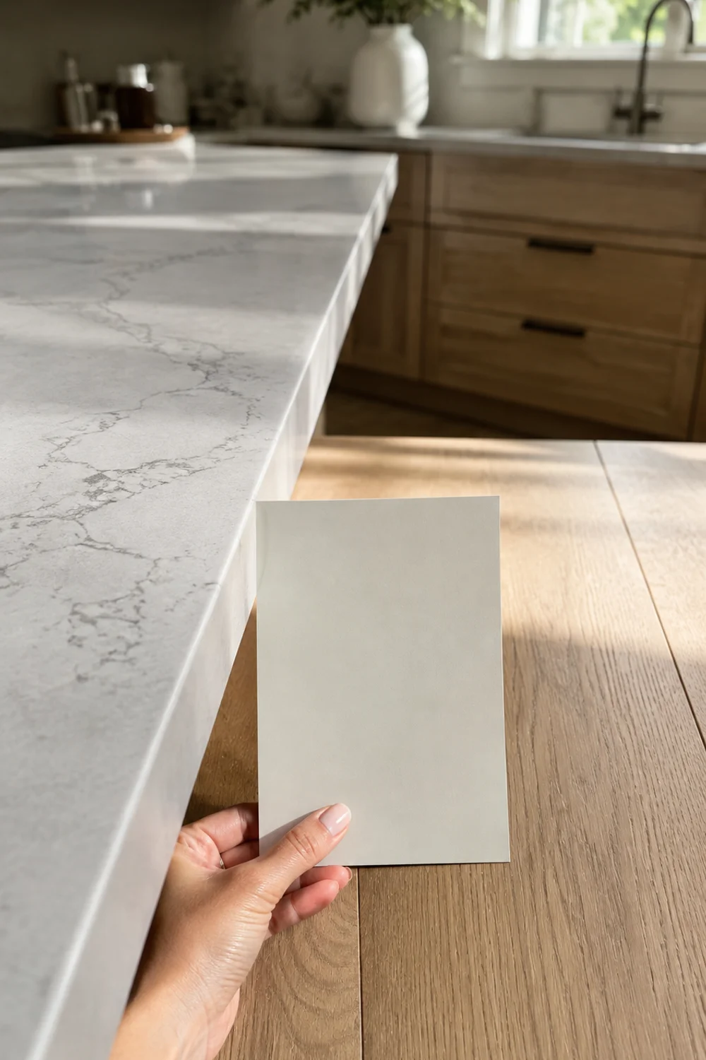
The fix is sequencing. Photograph your countertop and flooring in natural daylight, then hold prospective colors directly against them, not against a white wall, not on a screen.
Large sheets read far more honestly than a two-inch chip, since color intensifies dramatically across bigger surface areas. If your fixed elements lean warm, so should your new colors, at least at first. You can introduce controlled contrast later, but every high-functioning kitchen palette starts by acknowledging what it’s already been handed.
Picture a mid-century kitchen with a golden-toned butcher-block counter, the kind of warm honey surface that photographs beautifully in the right light. A homeowner falls for a cool, dove-gray cabinet color on a showroom wall and paints the entire run before ever setting a sample against the actual counter. The result isn’t ugly exactly, it’s unresolved, a kitchen that never quite settles no matter how the rest of the room is styled, because two fixed temperatures are quietly working against each other every time the light changes. Checking the fixed elements first would have caught the mismatch for the cost of an afternoon instead of a full repaint.
2. The Simple Ratio Behind Every Palette That Works
 Save it
Ask most people how many colors belong in a kitchen and you’ll get a shrug, or a number pulled out of nowhere. But walk through kitchens that consistently feel resolved and you’ll notice a pattern: they tend to divide roughly into a dominant color, a secondary color, and a small accent, in proportions that favor restraint over balance. Interior designers borrow this ratio from fashion and graphic design because it works everywhere color needs to feel intentional rather than evenly distributed.
In a kitchen, that usually translates to cabinets and walls carrying the dominant share, since they occupy the most visual real estate. A secondary tone, often the island, the lower cabinets against upper cabinets, or a large expanse of backsplash, takes a meaningfully smaller share. The accent, hardware, a light fixture, a runner, gets the least real estate but the most personality. Even distribution is the enemy here. A kitchen where every element competes for equal attention reads as busy no matter how good the individual colors are.
What trips people up is applying this ratio evenly instead of hierarchically. They paint the island the same as the walls and then wonder why the room feels flat, or they choose three colors of roughly equal weight and end up with a kitchen that looks like a mood board instead of a room.
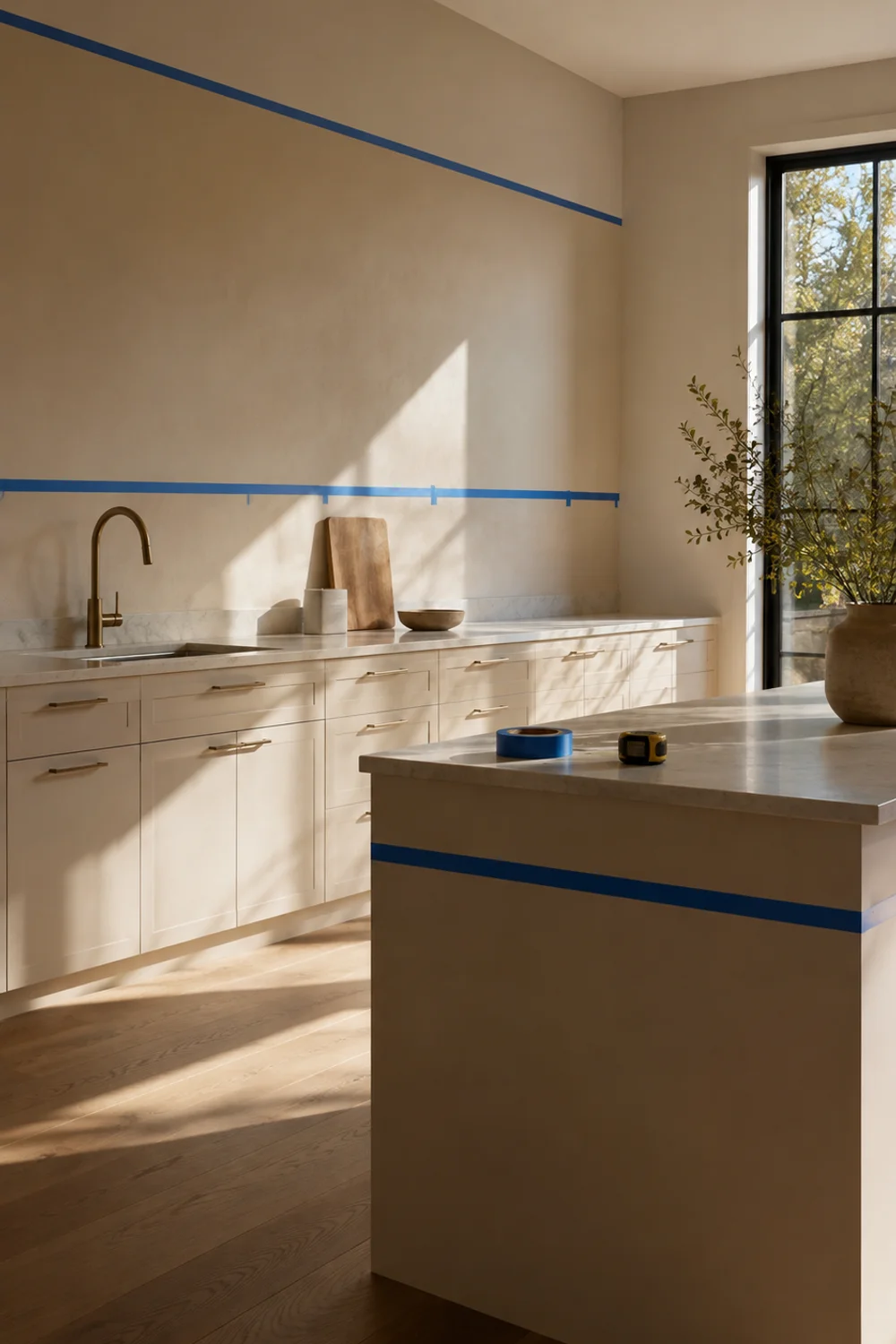
Mapping your ratio with painter’s tape before committing to paint lets you stand back and see the proportions at full scale, which is the only way to actually judge whether a ratio feels right rather than just correct on paper.
The ratio also has to flex with your layout. In an open-plan kitchen that flows directly into a dining or living area, the dominant share often needs to stretch further than it would in a fully enclosed kitchen, simply because there’s no wall or doorway to visually reset the palette between rooms. A galley kitchen, by contrast, can afford a punchier secondary share since the whole room is visible in a single glance and there’s less territory for a bold choice to overwhelm. The proportions stay the same in spirit; what shifts is how much physical room each one is given to work with.
3. Choosing One Anchor Color and Letting Everything Else Respond
 Save it
Every resolved kitchen palette has a single decision everything else is quietly answering to. Call it the anchor: the one color choice you make first and most deliberately, after which every other decision, hardware finish, backsplash tone, even the stools, gets evaluated by how well it responds to that anchor rather than chosen independently. Skip this step and you end up decorating by accumulation, adding pieces you like individually that never resolve into a coherent whole.
The anchor doesn’t have to be dramatic. It can be as quiet as a warm white cabinet color, as long as it’s the color you commit to first and measure everything else against. What matters isn’t boldness, it’s sequence. Choosing your countertop, then your cabinet color, then your backsplash, then your hardware, each in reaction to the last, produces a fundamentally different result than picking all five at once from a mood board and hoping they cohere.
This is the same restraint principle behind a kitchen counter kept to a single, considered material and finish rather than a collection of small appliances in mismatched tones; 15 Minimalist Kitchen Counter Styling Ideas You’ll Love pushes that same logic further, showing how a monochrome approach to visible appliances removes competing finishes entirely so nothing distracts from the counter’s material itself. Color works the same way. One committed decision, responded to rather than duplicated, does more for cohesion than five decisions made in parallel.
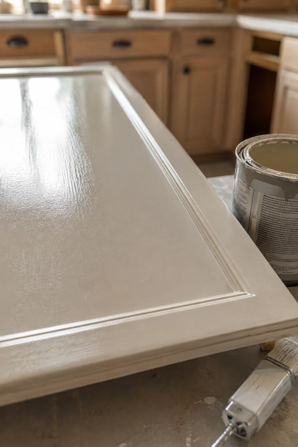
Buy the anchor color in enough quantity to actually live with it on a cabinet door for a week before committing the whole kitchen, since a color that reads perfectly on a swatch can shift entirely once it’s covering real square footage under your actual lighting.
Once the anchor is set, the rest of the sequence gets noticeably easier, not harder. A backsplash tile that would have taken weeks of indecision when chosen against a blank slate suddenly narrows to two or three obvious candidates once it only has to answer to one established color instead of an open field of possibilities. The anchor isn’t just the first decision, it’s the filter every later decision runs through.
4. The Warm Palette Family: Cream, Terracotta, and Soft Clay
 Save it
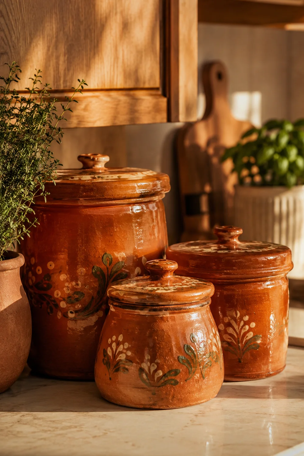
Warm palettes read as inviting almost instantly, which is part of why they’ve become the default choice for kitchens meant to feel lived-in rather than showroom-perfect. The family centers on cream instead of stark white, terracotta and soft clay instead of true orange, and warm wood tones left largely unpainted. What separates a warm palette that feels considered from one that feels dated is restraint in saturation: the terracotta stays dusty rather than vivid, the clay leans toward sand rather than brick.
This family works especially well in kitchens with abundant natural light, since warm tones can turn muddy under dim, cool-toned artificial lighting. It also plays well with brass and unlacquered hardware, natural stone with warm veining, and unfinished or lightly oiled wood, all of which reinforce the same warm undertone rather than introducing a cool note that fights it.
A common failure point is treating warm as synonymous with rustic. A warm palette can be sleek and contemporary; the warmth lives in the undertone, not in farmhouse styling choices layered on top of it. Introducing warmth through displayed ceramics keeps the commitment low while still establishing the palette’s temperature clearly.
Group two or three pieces rather than a full matching set; uniform repetition reads as a display case, while slight variation in glaze reads as collected over time.
This family also tends to age gracefully in a way that trend-chasing colors don’t, largely because cream, terracotta, and clay have been used in kitchens for centuries rather than for a single design cycle. A warm palette built on these tones doesn’t announce a decade the way a saturated millennial pink or an overly cool greige can; it reads as though it simply belongs, whether the surrounding architecture is a century-old farmhouse or a brand-new build with clean, modern lines. That durability is part of what makes it such a dependable starting point for anyone unsure of their exact style but confident they want the kitchen to feel warm.
5. The Cool Palette Family: Greige, Sage, and Dove Gray
 Save it
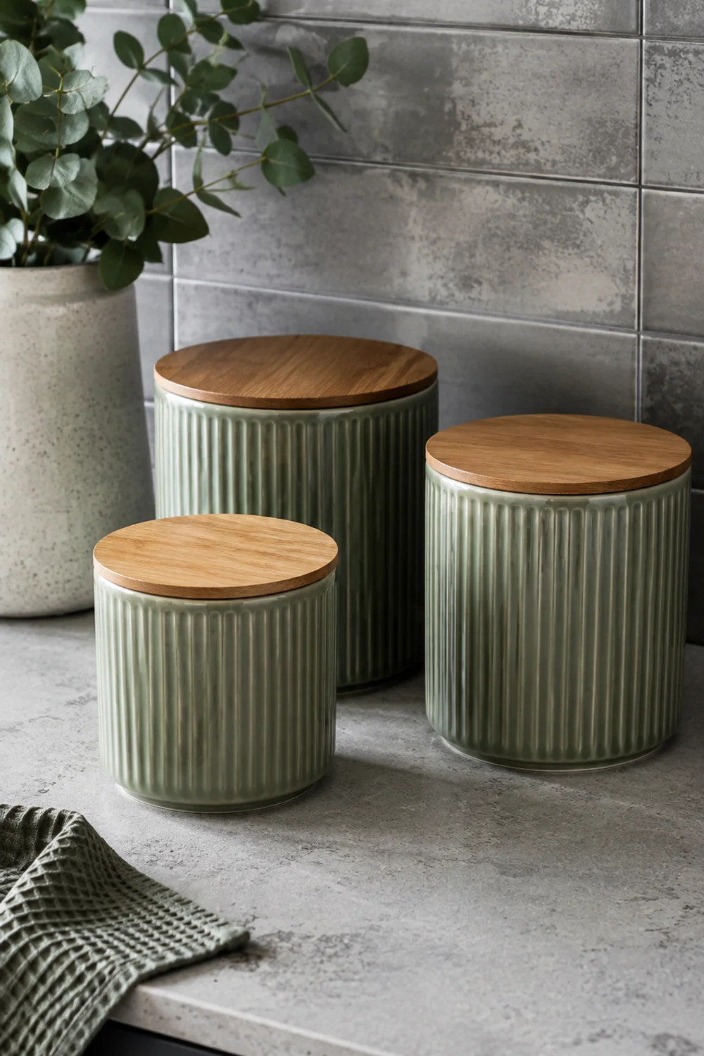
Where warm palettes lean toward comfort, cool palettes lean toward calm, and they tend to suit kitchens with north-facing windows or heavy artificial lighting, where warmer tones can start to look sallow rather than inviting. The core players here are greige (a gray with just enough beige to avoid feeling clinical), muted sage, and dove gray, none of which read as cold on their own but which need careful handling to avoid tipping into sterile.
The difference between a cool palette that feels serene and one that feels flat usually comes down to texture doing the work color alone can’t. A dove gray cabinet against a matte, textured backsplash feels considered; the same gray against glossy, flat tile can feel like an unfinished hospital corridor. Cool palettes benefit from at least one warm counterpoint, brushed brass rather than chrome, or a wood cutting board left visible, so the room doesn’t tip entirely into a single temperature.
Sage in particular has become common enough that it risks reading generic unless it’s paired thoughtfully. Choosing a dustier, more desaturated sage rather than a bright, saturated version, and repeating it in only one or two places rather than throughout, keeps it from feeling like a trend applied wholesale.
The bamboo lids matter more than they seem to; a warm material touchpoint on an otherwise cool object keeps the whole grouping from reading one-note.
Cool palettes also photograph differently depending on the season, which is worth knowing before you commit. Under the flat gray light of a winter afternoon, greige and dove gray can lean toward lifeless if there’s no texture or warm accent to anchor them, while the same palette under bright summer daylight reads crisp and airy without any extra effort. If your kitchen faces north or gets limited direct sun for a good part of the year, weighting the palette slightly warmer than you initially planned, or adding one more warm material touchpoint than you think you need, tends to prevent the coolness from tipping into flatness once winter light sets in.
6. Letting the Island Break From the Rest of the Room
 Save it
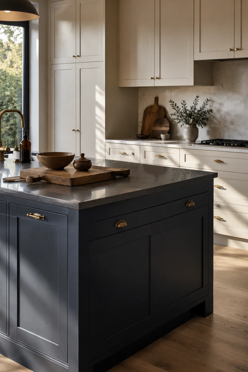
An island is the one piece of a kitchen that can carry a genuinely different color from everything around it without breaking the palette, because it functions as a piece of furniture rather than architecture. This is where a lot of kitchens introduce their boldest color decision: a deep navy or forest island against pale perimeter cabinets, a move that would feel overwhelming across an entire kitchen but reads as confident and intentional contained to one element.
The mechanism is proportion working in your favor. An island typically occupies far less surface area than the perimeter cabinetry, which means it can absorb a much higher-saturation color without overwhelming the room the way the same color would if it covered every cabinet. It’s the accent in the ratio from section two, scaled up to furniture size, which is exactly why it can afford to be louder than anything else in the room.
A different finish helps signal that the color break is deliberate rather than accidental. A chalky, matte finish on the island against a satin or semi-gloss finish on the perimeter cabinets separates the two visually even when viewed from across the room, reinforcing that the island is meant to read as a distinct object rather than a mismatched cabinet run.
A pint is plenty for testing the contrast on a single island panel before committing to the full piece, since chalk finish reads noticeably different once cured than it does wet.
This move also does quiet work in open-plan homes, where the kitchen island is often the object closest to the living or dining area and effectively functions as the transition point between two rooms. A deliberately different island color can act as a soft boundary marker, signaling where the kitchen ends and the next space begins without a wall or a change in flooring. In a fully open floor plan, that boundary matters more than people expect; without it, the kitchen and living area can start to blur into one undifferentiated room, and the island’s color break is often the simplest way to reintroduce a sense of distinct zones.
7. The Backsplash as the Bridge Between Counter and Cabinet
 Save it
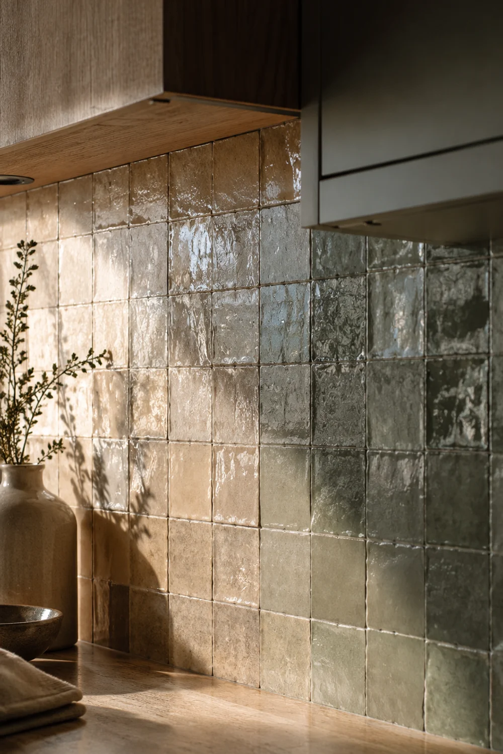
The backsplash occupies an unusual position in a kitchen’s palette: it’s the one surface in direct contact with both your countertop and your cabinets, which makes it the natural place to resolve any tension between the two. A backsplash that leans toward the countertop’s undertone on one edge and the cabinet’s on the other, through texture, subtle color variation, or a handmade tile’s natural inconsistency, does more to unify a kitchen than a backsplash chosen purely because it matched a photo online.
Handmade tile does this particularly well. Its color rarely reads as one flat tone; the surface shifts subtly across a wall depending on kiln variation and glaze pooling, which lets it visually harmonize with two different adjacent tones rather than sitting flatly between them like a hard edge. A perfectly uniform machine-cut tile, by contrast, can end up emphasizing the gap between countertop and cabinet rather than closing it.
Grout color matters as much as tile color here, and it’s the detail most often overlooked. Grout that matches the tile closely lets the backsplash read as a single textured plane, which reinforces its bridging role, while high-contrast grout turns the same tile into a grid pattern that competes with, rather than resolves, the surrounding colors.
Lay several tiles loose against both your countertop and cabinet sample before installing anything; the natural variation between individual tiles means you’re really testing a range, not a single fixed color.
A kitchen with a pale marble-look quartz counter and deep sage lower cabinets illustrates the bridging role well. Chosen on its own, a stark white subway tile would sit closer to the countertop’s tone and leave the cabinet color feeling slightly stranded below it. A handmade tile in a soft, warm-white glaze with faint variation instead picks up threads of both, cool enough near the counter, warm enough near the cabinet, so the eye reads the whole wall as one continuous, considered surface instead of two materials that happen to be stacked on top of each other.
8. Hardware Finish Is Your Third Color
 Save it
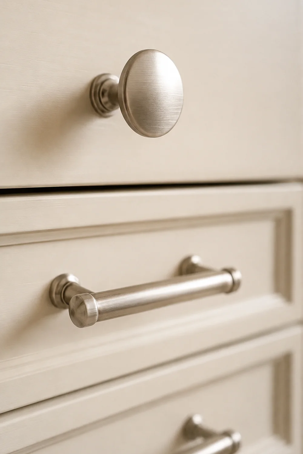
Paint and countertop get all the attention, but hardware, knobs, pulls, faucet, light fixtures, functions as a full third color in the palette, and it’s usually the one people choose last and think about least. That’s backwards, because metal finish behaves differently than painted color: it reflects light, it has its own inherent warmth or coolness, and unlike a wall you can repaint in an afternoon, replacing hardware across an entire kitchen is enough of a project that most people live with the wrong choice for years.
The undertone rule from section one applies here just as strictly. Warm palettes generally want warm metals, unlacquered brass, aged bronze, warm gold, while cool palettes tend to pair more naturally with brushed nickel, chrome, or matte black, which reads as temperature-neutral rather than warm or cool. Mixing metals deliberately, one dominant finish and one small contrast finish, can work beautifully, but mixing them accidentally, because each piece was bought separately without reference to the others, tends to read as unplanned.
Sheen matters nearly as much as color. A brushed or matte finish diffuses light softly and tends to feel more current, while a highly polished finish throws sharper reflections that can read either luxurious or dated depending on everything else in the room.
Install two or three on a single cabinet run before ordering enough for the whole kitchen; hardware finish is notoriously hard to judge from a single sample photographed under store lighting.
A common scenario makes this concrete: a kitchen renovated in phases, cabinets and paint finished one year, faucet and pendant lighting replaced separately the next, each purchase made in isolation without the earlier ones in mind. The individual pieces might each be beautiful, but a chrome faucet installed alongside brass cabinet pulls chosen a year earlier reads as an oversight rather than a style choice, precisely because hardware finish was never treated as a single, coordinated decision. Deciding on one dominant metal finish before any of the individual pieces get purchased avoids stitching together a kitchen’s hardware after the fact.
9. Treating Wood Tone as a Neutral, Not an Afterthought
 Save it
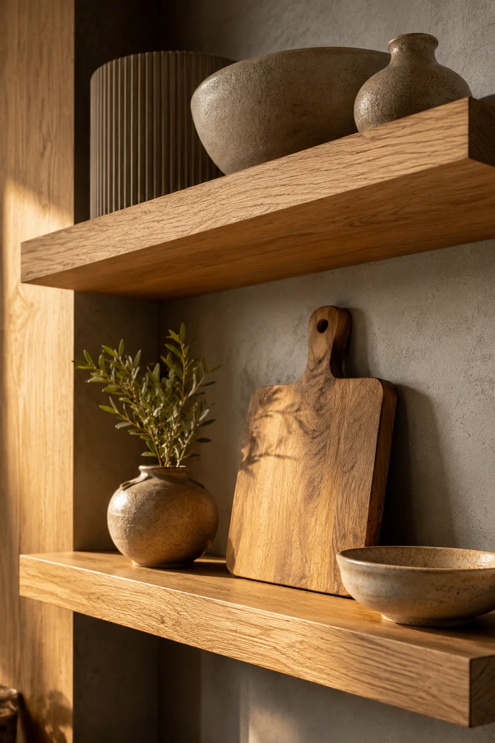
Wood shows up in nearly every kitchen, open shelving, a butcher-block section, floors, a dining chair, and it’s almost always treated as a background material rather than an active part of the palette. That’s a mistake. Wood carries a genuine undertone, honey-warm oak, reddish cherry, ash-gray white oak, cool-toned walnut, and that undertone either supports or undermines everything else you’ve chosen just as strongly as a painted color would.
The clearest failure mode is mixing wood tones that fight each other: a warm honey oak floor beneath cool gray-washed open shelving, for instance, creates the same quiet tension as clashing paint undertones, just harder to spot because most people don’t think to check wood the same way they check paint. Treat every wood surface in the kitchen as a color decision, not a material decision, and audit it against your anchor the same way you would a paint chip.
Open shelving is often the easiest place to correct a wood mismatch without a full renovation, since it’s a smaller, more contained surface than flooring or cabinetry.
Unfinished wood lets you apply a stain or oil that matches your existing wood tones exactly, rather than hoping a pre-finished shelf happens to land close enough.
Consider a kitchen with warm honey-oak flooring inherited from a previous renovation, paired with a set of open shelves installed later in a cool, gray-washed finish because it photographed well in a catalog. Individually, both materials are attractive. Together, they create a low-grade visual tension that most people can sense without being able to name, the same unresolved feeling described in section one, just relocated from paint to wood. Restaining the shelving to match the floor’s warmth, rather than replacing either material outright, resolves the clash for a fraction of the cost of redoing the floor.
This is also where a kitchen’s dining chairs, stools, and any exposed wood furniture deserve a second look. It’s easy to select furniture on comfort and shape alone and forget that its wood finish is participating in the same palette as the cabinetry and flooring, sometimes as the single largest wood surface in the room after the floor itself.
10. How Light Changes a Color Throughout the Day
 Save it
A color you fell in love with at noon can look entirely different by seven in the evening, and this is the single most common reason a carefully chosen palette suddenly feels wrong once it’s actually installed. Natural daylight shifts from cool-blue in the morning to warm-gold in late afternoon to nearly absent by evening, when artificial lighting takes over entirely, and every one of those shifts changes how a color reads on your walls and cabinets.
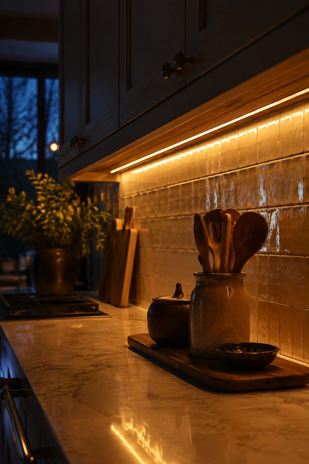
Color temperature in your light bulbs compounds this further. A bulb rated around 2700K casts a warm, amber-tinted light that flatters warm palettes but can mute cool ones into looking dull, while a bulb closer to 4000K reads crisper and whiter, which suits cool palettes but can make warm tones look slightly sickly by comparison. Most kitchens layer several light sources, under-cabinet task lighting, an overhead fixture, a window, and if those sources don’t share a consistent color temperature, your palette will look like three different rooms depending on which light happens to be on.
Under-cabinet lighting deserves particular attention because it sits closest to the surfaces doing the most color work: the backsplash and countertop.
A tunable strip lets you match its color temperature to your overhead fixtures rather than being locked into a single fixed tone, which matters more than people expect once everything else in the palette is finally in place.
Consider a cool sage and dove gray kitchen photographed for a listing at midday under bright, even daylight, where the palette reads exactly as intended, calm and current. The same kitchen, visited in person on a weekday evening under a single warm overhead bulb, can look muddier and less resolved than the photos promised, simply because the light source shifted the entire room’s temperature without anyone touching the paint. This is precisely why testing a color only once, under one lighting condition, gives an incomplete answer, and why the fix belongs in the light fixtures themselves rather than in another round of repainting.
11. Introducing Color Through What You Choose to Display
 Save it
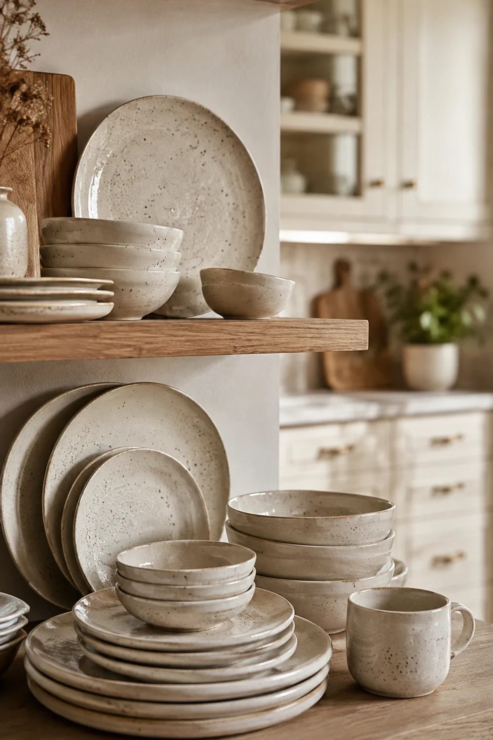
Not every color decision needs to be permanent. Displayed dishware, the mugs on open shelving, the bowls stacked on a counter, the plates leaning against a backsplash, offers a genuinely low-risk way to test how a new color behaves in your kitchen before committing to anything that requires a paintbrush or a contractor. It’s also one of the few places in a kitchen’s palette that can rotate seasonally without touching the architecture at all.
The principle that makes this work is the same one behind any well-styled surface: a considered collection reads intentionally, while an accumulated one reads cluttered, regardless of how good the individual colors are. Choosing dishware in your anchor color’s family, rather than whatever happened to be on sale, keeps the display working with your palette instead of introducing a fourth or fifth competing tone.
This is exactly the territory that The Secret to Beautiful Yet Functional Kitchen Counter Decor covers in more depth, walking through how a handful of well-chosen, frequently used objects, arranged with real intention rather than left out by default, can carry as much visual weight as a full renovation. Color is often the missing ingredient in that equation: the same styling principles land differently once every displayed object is also reinforcing the same undertone.
A speckled glaze in particular hides the slight tonal variation between pieces that a flat, uniform glaze would make obvious, which is part of why it photographs so consistently well.
Because displayed objects require no tools and no drying time, they’re also the easiest layer to rotate with the seasons or simply with changing taste, in a way paint and tile never can be. A set of cream stoneware can give way to a slightly different glaze a few years later without disturbing anything else in the room, letting the palette evolve gradually at the surface level while the anchor color and fixed elements underneath stay exactly the same. That kind of low-stakes flexibility is worth building into a kitchen palette deliberately, rather than treating every color decision as equally permanent.
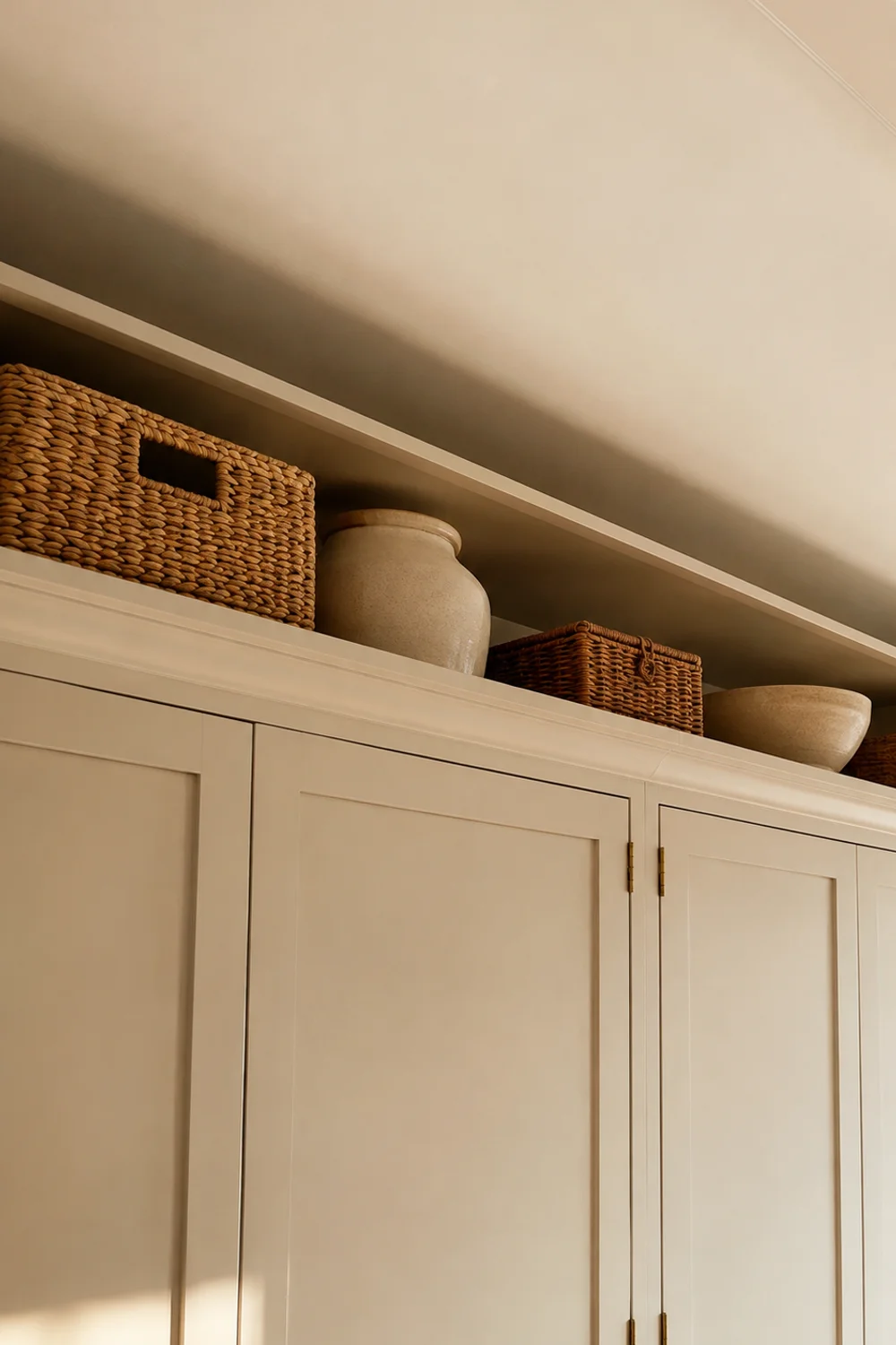
12. Carrying the Palette Into the Spaces Above Your Cabinets
 Save it
The zone above your upper cabinets, and the space directly above the fridge, is easy to treat as storage overflow and forget entirely once a few baskets are up there. But it’s also fully visible from most angles in a kitchen, which means whatever color and material choices live up there are either reinforcing your palette or quietly working against it from a spot most people never think to audit.
The goal isn’t to add more color up there; it’s to make sure whatever occupies that space, baskets, trays, the concealment pieces doing the actual storage work, shares the same undertone as everything below it. A cool-toned gray basket sitting above warm oak upper cabinets creates the exact same clash discussed in section nine, just elevated to a spot people notice peripherally rather than consciously. Above Fridge Styling Ideas for a Beautiful and Organized Kitchen covers the styling mechanics of that specific zone in detail, and pairing its concealment strategies with a genuine color audit turns a purely functional storage decision into one more place your palette gets reinforced rather than diluted.
A painted riser in your anchor color, rather than raw or stained wood, ties that top shelf visibly back to the rest of the room instead of leaving it to read as an unrelated storage afterthought.
Picture two versions of the same kitchen. In the first, the space above the refrigerator holds a jumble of mismatched cardboard boxes and a single stray basket in whatever color happened to be on hand, visible the moment anyone stands at the sink or looks up from the stove. In the second, that same zone holds a color-matched riser shelf carrying two or three uniform storage pieces in a tone pulled directly from the cabinetry below. Neither kitchen has spent more than a modest amount on that specific zone, but only one of them reads as a finished room from every angle rather than a finished room with one unresolved corner.
This is also the zone most likely to get skipped entirely during a renovation, since it sits above eye level and outside the immediate work triangle of counter, stove, and sink. Treating it as part of the palette rather than an afterthought is less about the objects themselves and more about training your eye to audit a kitchen from every vantage point, not just the ones captured in a straight-on photograph.
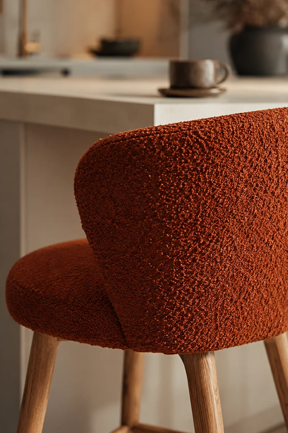
13. Seating as the Layer You're Allowed to Change
 Save it
If cabinetry is the palette’s most permanent decision, seating is close to its most flexible. Counter stools and dining chairs sit apart from the architecture, which means they can carry your accent color, the smallest slice of the ratio from section two, without the commitment level of paint or tile. This is often the easiest place to introduce a bolder color choice for anyone hesitant to commit that same color to a larger surface.
Fabric adds a dimension paint and tile can’t: texture reads as much as hue does. A bouclé or nubby woven upholstery in your accent color feels layered and intentional in a way that a smooth, flat fabric in the identical color often doesn’t, simply because texture breaks up light and adds visual depth that a flat surface can’t replicate. This matters especially in kitchens where every other surface, cabinet fronts, countertop, tile, is inherently hard and smooth.
Because seating is replaceable without any real renovation, it’s also the lowest-stakes place to test whether a color you’re considering for something more permanent actually holds up in daily use and changing light.
Living with the accent color on a stool for a season before committing it to tile or paint tells you far more than any swatch ever could, since you’ll actually see it under every lighting condition your kitchen experiences.
Seating is also where a kitchen palette can most easily track a household through different life stages without a full redesign. A young couple furnishing their first home might choose a bold terracotta stool as their only real color statement, low risk, high impact, and swap it for something quieter a decade later as their taste shifts, all without touching a single painted or tiled surface. That kind of built-in adaptability is worth designing for deliberately rather than treating seating as a purely functional afterthought once the “real” decisions are finished.
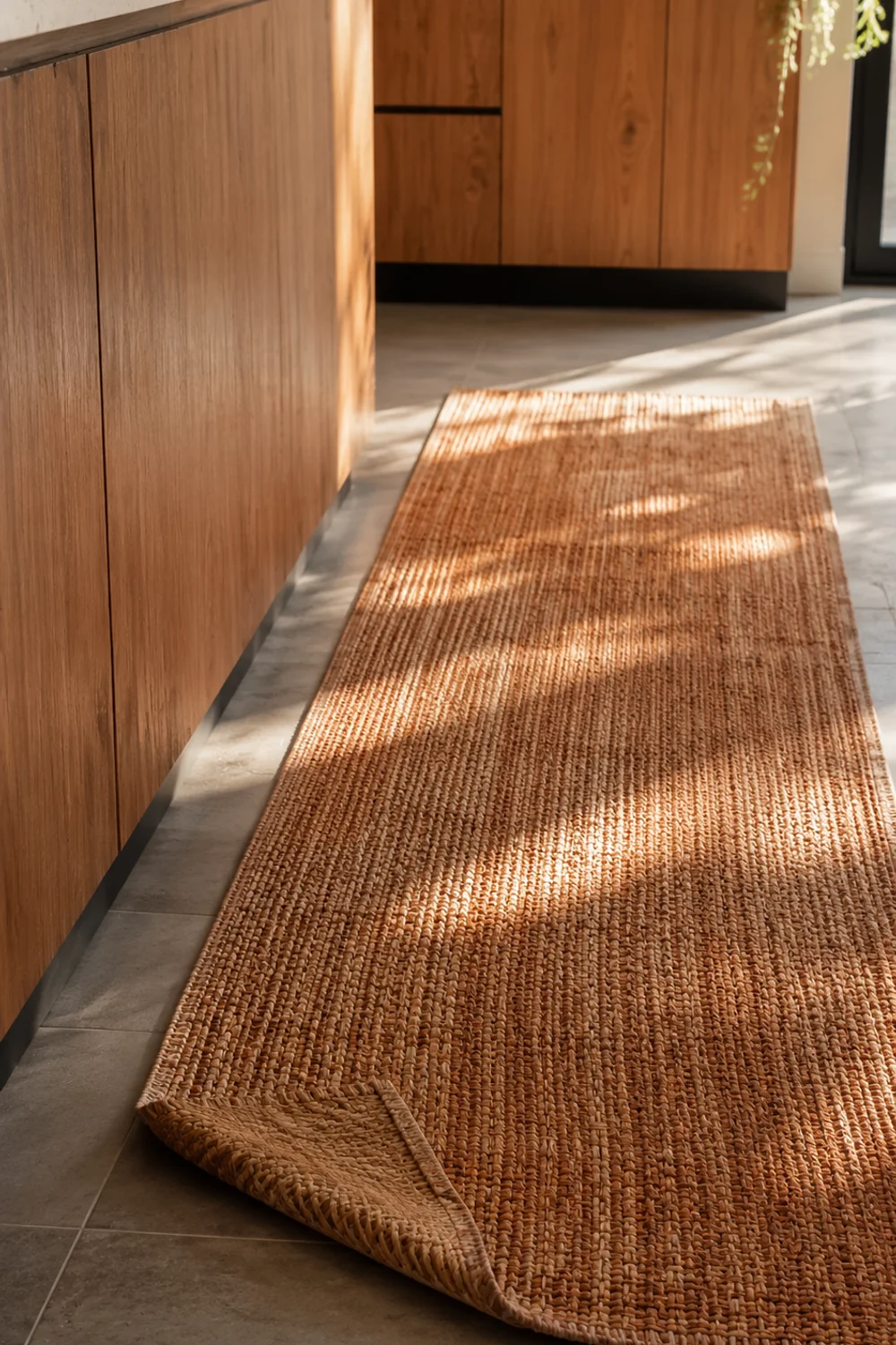
14. Testing Color Through Textiles Before You Commit to Anything Permanent
 Save it
Before any paint goes on a wall or any tile gets set in mortar, textiles offer the cheapest, fastest way to see how a color family actually behaves in your specific kitchen. A runner, a set of towels, even a single deliberately chosen textile object, tests a color’s relationship to your light, your fixed elements, and your existing finishes without a single irreversible decision.
This step is frequently skipped because textiles feel too minor to matter, but that’s precisely their value. A low-stakes decision is a fast decision, and fast decisions are how you accumulate real information about a color instead of theorizing about it from a paint deck. If a runner in your prospective anchor color looks wrong within a week of living with it, you’ve just avoided a much costlier mistake on cabinetry.
Rotating a textile test piece through different times of day, morning light, midday, the evening lighting you’ll actually be cooking under most often, reveals more about a color’s real behavior in your kitchen than a single glance at a store display ever could.
A woven texture, rather than a flat printed one, gives you a more honest preview of how the color will look once layered into a room full of other textures, not just how it looks as flat pigment.
A useful way to think about textiles is as a palette’s rough draft. A writer doesn’t publish a first attempt at a sentence; they test it, revise it, and only commit once it reads the way they intended. A runner, a set of towels, or a single deliberately placed textile object functions the same way for color, a low-cost draft you can revise or discard entirely without the sunk cost of paint or tile. Anyone who has repainted a wall twice because the first color didn’t survive contact with real daylight already understands intuitively why this cheaper, faster draft stage is worth building into the process rather than skipping straight to the permanent version.
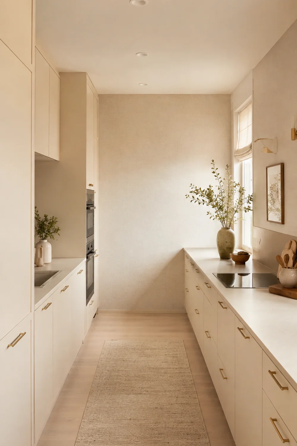
15. Scaling the Palette Up or Down for the Size of Your Kitchen
 Save it
A palette that reads as rich and layered in a large kitchen can overwhelm a small one, and a palette pared back for a compact galley kitchen can look sparse and underdesigned in a sprawling open-plan space. The formula itself doesn’t change, dominant, secondary, accent, but the number of distinct materials and finishes carrying each role needs to scale with the room.
In a small kitchen, Modern Kitchen Decor Ideas for Small Spaces to Copy Now makes the case for color and finish continuity between walls and cabinets specifically because unbroken color reads as more square footage than the same space chopped into visually separate zones. That’s the small-kitchen version of this formula: fewer breaks, more continuity, reflective surfaces doing double duty as both color and light strategy. A large kitchen can afford, and often needs, more visual variation to keep that same continuity from reading flat and monotonous across a bigger footprint.
The test is simple: stand at the entrance to your kitchen and count how many distinct color zones you can identify at a glance. A small kitchen should read as one or two. A large kitchen can comfortably hold three or four without feeling chaotic, provided each one still respects the same underlying ratio.
In a small kitchen especially, a textured solid rather than a pattern extends your anchor color onto a wall without introducing a second competing visual language.
A one-bedroom apartment kitchen makes the scaling logic concrete. With roughly eight linear feet of cabinetry and a single window, that kitchen has room for exactly one color story: an anchor cabinet tone carried straight through to the wall, with the accent living entirely in hardware and a single textile. Try to give that same kitchen a bold island contrast, a patterned backsplash, and a statement light fixture all at once, and the room stops reading as a cohesive small kitchen and starts reading as a mood board crammed into eight linear feet. The formula didn’t fail; it simply wasn’t scaled down to match what the room could actually hold.
16. Why a Cluttered Kitchen Can't Show Off Its Palette
 Save it
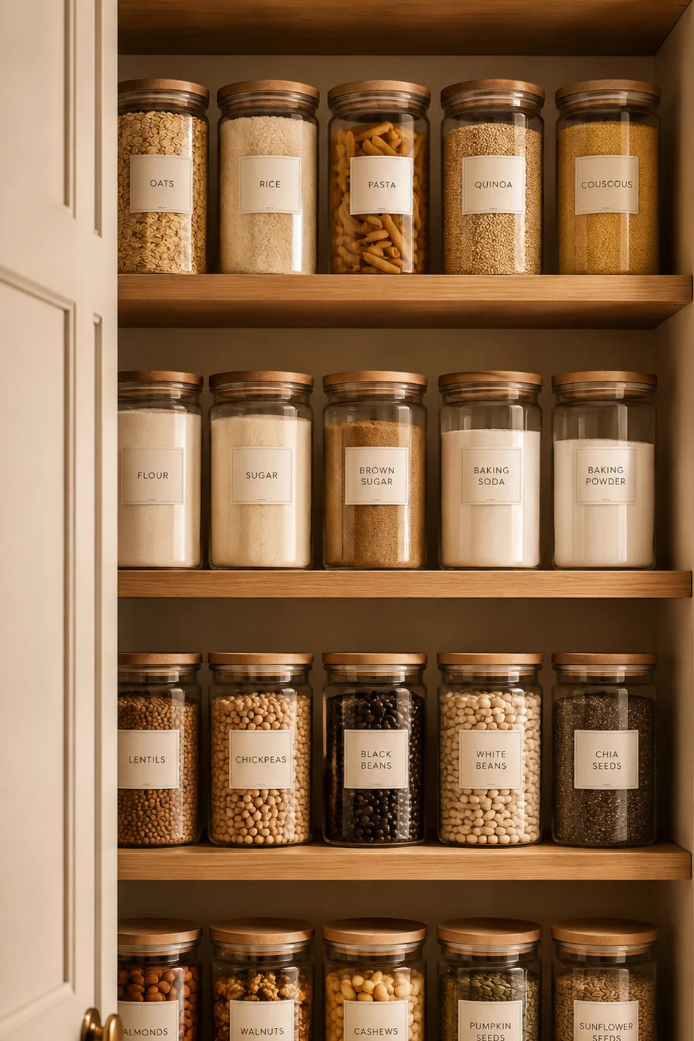
Even a perfectly resolved color palette disappears behind enough visual clutter. Countertops crowded with mismatched appliances, open shelving stuffed past the point of being legible, drawers that don’t fully close, all of it adds visual noise that competes directly with the careful color decisions made in every section before this one. A palette needs negative space to actually be seen; color read against clutter just becomes one more thing competing for attention rather than the calm, organizing element it’s meant to be.
This is where color and organization stop being separate projects and start being the same one. How to Create a Clutter-Free Kitchen You Actually Enjoy lays out the systems, a genuine declutter before buying more storage, one-touch habits, zoned pantry logic, that clear a kitchen down to the elements actually worth looking at. Applied alongside a considered palette, those same systems do double duty: they’re not just functional, they’re what makes the palette itself legible in daily life rather than only in photographs taken right after a deep clean.
A calm palette and a cluttered counter cancel each other out. No amount of careful undertone-matching survives a countertop buried under mail, half-used appliances, and orphaned kitchen tools with no assigned home.
Uniform, labeled jars do more than organize; visually, a matched set reads as one calm surface instead of a dozen competing shapes and colors, which is exactly the negative space your palette needs to actually register.
Think of two kitchens with the exact same paint colors, the same tile, the same hardware, photographed a year apart. In the first photo, the counters are clear, the pantry is zoned, and the palette reads immediately, the whole point of every decision made in the sections before this one. In the second, mail has colonized one end of the counter, mismatched containers crowd the open shelving, and a tangle of cords sits beside the stand mixer. Nothing about the underlying color choices has changed, yet the second kitchen photographs, and lives, as a completely different room. The palette was never the problem; the absence of a system to keep it visible was.
17. Building the Same Palette Without Touching a Single Cabinet
 Save it
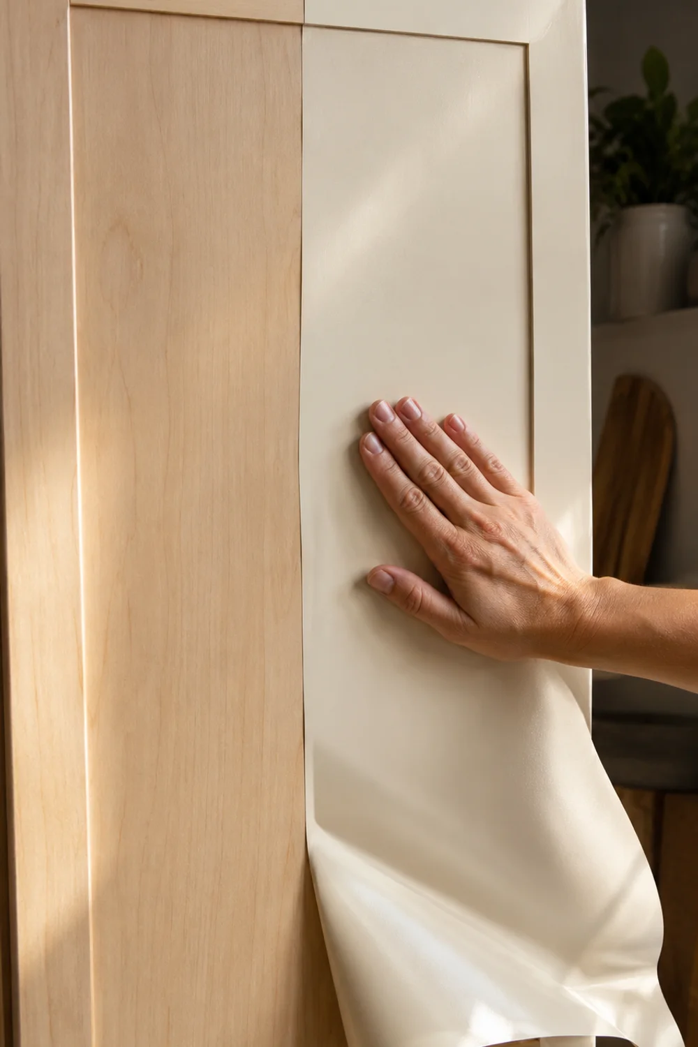
None of this formula requires ownership, a renovation budget, or permission to paint. Every principle so far, fixed-element anchoring, the ratio, an anchor color, undertone-matched hardware, works just as well through removable, renter-safe materials as it does through permanent ones. The mechanism doesn’t change; only the commitment level does.
Removable wallpaper handles the wall or backsplash layer without a security deposit at risk. A cabinet-safe adhesive wrap film can carry your anchor color onto cabinet fronts and be fully removed later without stripping paint or damaging the original finish underneath, which makes the entire palette formula from this guide available to a renter exactly as it is to an owner. The formula is the point, not the permanence. A palette built from swappable layers, textiles, displayed objects, removable surfaces, can be every bit as resolved as one built from paint and tile, and it has the added advantage of leaving with you when you move.
Test the wrap on the inside of a cabinet door first; adhesion and color both read slightly differently once applied to a real surface than they do on the sample swatch.
Consider a renter in a builder-grade apartment with flat, honey-oak cabinets she has no legal ability to paint. Applying the fixed-elements audit from section one to the existing cabinet and counter tones, then choosing a removable wallpaper and adhesive wrap in colors that respond to those fixed elements the same way a homeowner’s paint would, produces a genuinely resolved palette using nothing but reversible materials. When the lease ends, every layer peels away cleanly, leaving the original cabinets untouched, and the entire palette moves with her to the next apartment. The formula never asked for permanence in the first place; permanence was simply the version most people defaulted to because it’s the version most commonly shown in design media.
That distinction matters more than it might seem. A renter who assumes color is off-limits until they own a home is skipping years of a kitchen that could have felt resolved the entire time, for the cost of wallpaper and wrap film rather than a security deposit.
Common Mistakes
1. Choosing a color before checking your fixed elements
This is the mistake almost every clashing kitchen traces back to. A cabinet color chosen against a blank wall, without ever holding it up to the actual countertop and floor it will live beside, is a color chosen blind. The undertone conflict that results is rarely dramatic enough to name outright; it just leaves the room feeling slightly off in a way that’s hard to fix after the fact.
2. Using too many colors in equal proportion
A kitchen with four or five colors, each given roughly the same amount of visual real estate, reads as busy no matter how good each individual choice is. The ratio matters more than the colors themselves. Restraint in proportion is what makes a bold color choice feel confident instead of chaotic.
3. Ignoring hardware and lighting as part of the palette
Paint and tile get all the deliberation, while hardware finish and bulb color temperature get chosen last, often as an afterthought once the bigger decisions are already made. Both function as active parts of the palette, not accessories to it, and both are far more expensive to correct after installation than to plan for from the start.
4. Testing color under the wrong light
A swatch judged only under bright store lighting or a single time of day gives an incomplete picture. Kitchens are used morning, noon, and night, under sun and under bulbs, and a color needs to hold up across all of those conditions, not just the one moment it happened to be evaluated in.
5. Over-committing before testing anything reversible
Painting an entire kitchen, or replacing every piece of hardware, before testing the color through textiles, displayed objects, or a single sample panel skips the cheapest, fastest feedback available. The reversible layers exist precisely so the expensive, permanent ones don’t have to be a guess.
Frequently Asked Questions
How many colors should a kitchen palette actually have?
Most cohesive kitchens work from roughly three: a dominant tone covering the majority of the room, a secondary tone for a smaller feature like an island or lower cabinets, and a small accent carried through hardware, stools, or a light fixture. More than that tends to require a confident hand to keep from feeling scattered.
Do I need to match my cabinet color to my countertop exactly?
No, matching exactly isn’t the goal, and can actually look flat. What matters is undertone compatibility: warm tones paired with warm tones, cool with cool, even when the actual colors are quite different from each other. A countertop and cabinet can contrast in hue while still agreeing in temperature.
Can a small kitchen handle a bold color choice?
Yes, especially on a smaller-footprint element like an island or a backsplash, where a saturated color reads as an intentional accent rather than an overwhelming wash across the whole room. Bold color and small space aren’t incompatible; the ratio just needs to shift in the color’s favor on a smaller surface.
What’s the fastest way to test a color before committing?
Textiles and displayed objects. A runner, a set of dishware, even a single accent object in the color you’re considering will tell you more about how it behaves in your actual light and against your actual fixed elements than any paint chip or online photo can.
Is white still a safe default for kitchens?
It can be, but it works best as a considered choice within the same formula, not a fallback for avoiding one. A warm white chosen to complement your fixed elements’ undertone functions very differently from a stark, undertone-mismatched white chosen simply because it felt neutral.
Final Thoughts
A kitchen palette that works isn’t the product of a good eye for trending colors; it’s the product of a formula applied with discipline. Fixed elements acknowledged before anything else. A ratio respected instead of ignored. One anchor color chosen deliberately, with everything else responding to it rather than competing alongside it. None of that depends on your kitchen’s size, your budget, or whether you own the walls you’re working with.
What changes from home to home is the specific palette. What doesn’t change is the structure underneath it, the same structure holding together every kitchen that reads as effortless, even though effortless is rarely how it actually got there. Start with what you can’t change, choose one color to commit to first, and let every decision after that answer to it. The rest of the room, and the rest of this formula, will follow, whether you’re painting cabinets outright or building the same palette entirely from removable, renter-safe layers.
This post contains affiliate links. I may earn a small commission at no extra cost to you.
Get cozy inspiration delivered to your inbox.
✓ 14-page beautifully designed ebook
✓ Cozy decorating ideas
✓ Practical room-by-room inspiration
You’re in! 🎉
Thanks for joining the NestFlowHome community!
Your free ebook is already on its way to your inbox. If you don’t see it within a few minutes, please check your Promotions or Spam folder.
Join the NestFlowHome community for weekly decorating inspiration.

Timeless home decor ideas and slow living inspiration for a calm, beautiful life.