
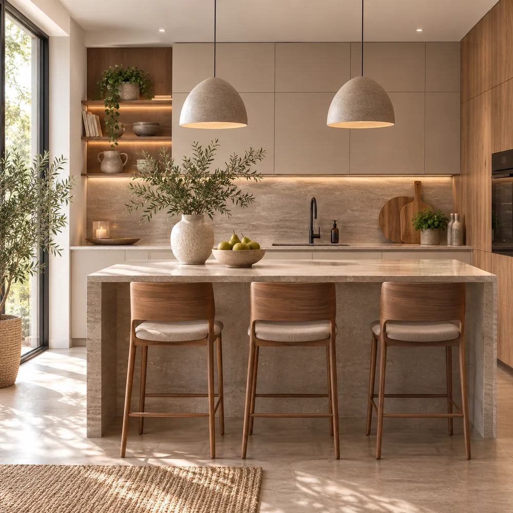
15 Minimalist Kitchen Counter Styling Ideas You'll Love
By Emily | August 6, 2026
Most kitchens don’t feel cluttered because there’s too much stuff in the house — they feel cluttered because the counter has become the default parking spot for everything without a home. The blender never goes back in the cabinet. The mail pile grows next to the toaster. Somewhere along the way, the counter stopped being a workspace and became a catch-all, and that shift is exactly why the room feels tired even when it’s technically clean.
Minimalism on a kitchen counter isn’t about owning fewer things. It’s about being ruthless with what earns a permanent spot on that specific surface versus what belongs behind a door, in a drawer, or simply gone. A counter with three carefully chosen objects photographs better and functions better than one with fifteen “useful” items competing for the same six square feet.
This guide walks through fifteen concrete ways to rethink your counters — not as storage, but as a considered surface that supports how you actually cook, pour coffee, and move through your morning. Some ideas involve concealment, some involve restraint, and a few involve simply choosing better-looking versions of things you already own.
Work through these in whatever order matches your kitchen’s biggest pain point first. If your small appliances are the problem, start there. If it’s cords and clutter near the sink, start there instead. None of these require a renovation — just a willingness to edit.
1. The Deliberately Empty Counter Run
 Save it
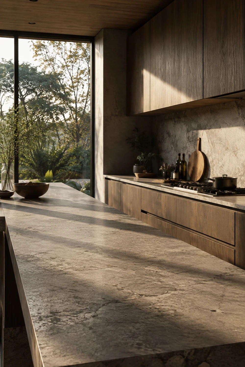
Every kitchen has one stretch of counter that quietly accumulates the most stuff — usually the run nearest the fridge or the entry point from the dining room. The fix isn’t better organization for that zone; it’s removing everything from it entirely. A deliberately empty counter run signals calm before you’ve even started cooking, and it gives your eye somewhere to rest in a room that’s otherwise full of visual activity from cabinets, appliances, and hardware.
This works because the brain reads uninterrupted surface as spaciousness, even in a modest kitchen. You’re not hiding clutter elsewhere and calling it minimal — you’re committing one specific zone to staying bare, permanently, as a rule rather than a temporary tidy-up. That distinction matters. A counter that’s clear today because you just cleaned isn’t the same as a counter that’s structurally designed to never hold anything.
The easiest way to enforce this is to pick the run closest to a high-traffic path, since that’s the one people set things down on out of habit — keys, mail, a phone charger. Once you’ve claimed it as off-limits, redirect those objects to a drawer or a small tray near the entry instead, so the habit has somewhere else to land.
Picture a narrow galley kitchen where the run beside the stove used to hold a spice rack, a cutting board, and a stack of cookbooks. Clearing it down to bare stone made the entire kitchen read wider, even though nothing about the square footage changed. The homeowner didn’t need to renovate — she needed to stop treating that eighteen inches of counter as available real estate.
This principle echoes something that shows up again and again in calm, considered rooms throughout the house: restraint reads as intention, not deprivation. The same logic that makes The Secret to Beautiful Yet Functional Kitchen Counter Decor feel restful rather than empty applies directly here — one protected bare zone does more for the room’s atmosphere than any amount of careful arranging elsewhere.
2. Appliance Garage Behind a Tambour Door
 Save it
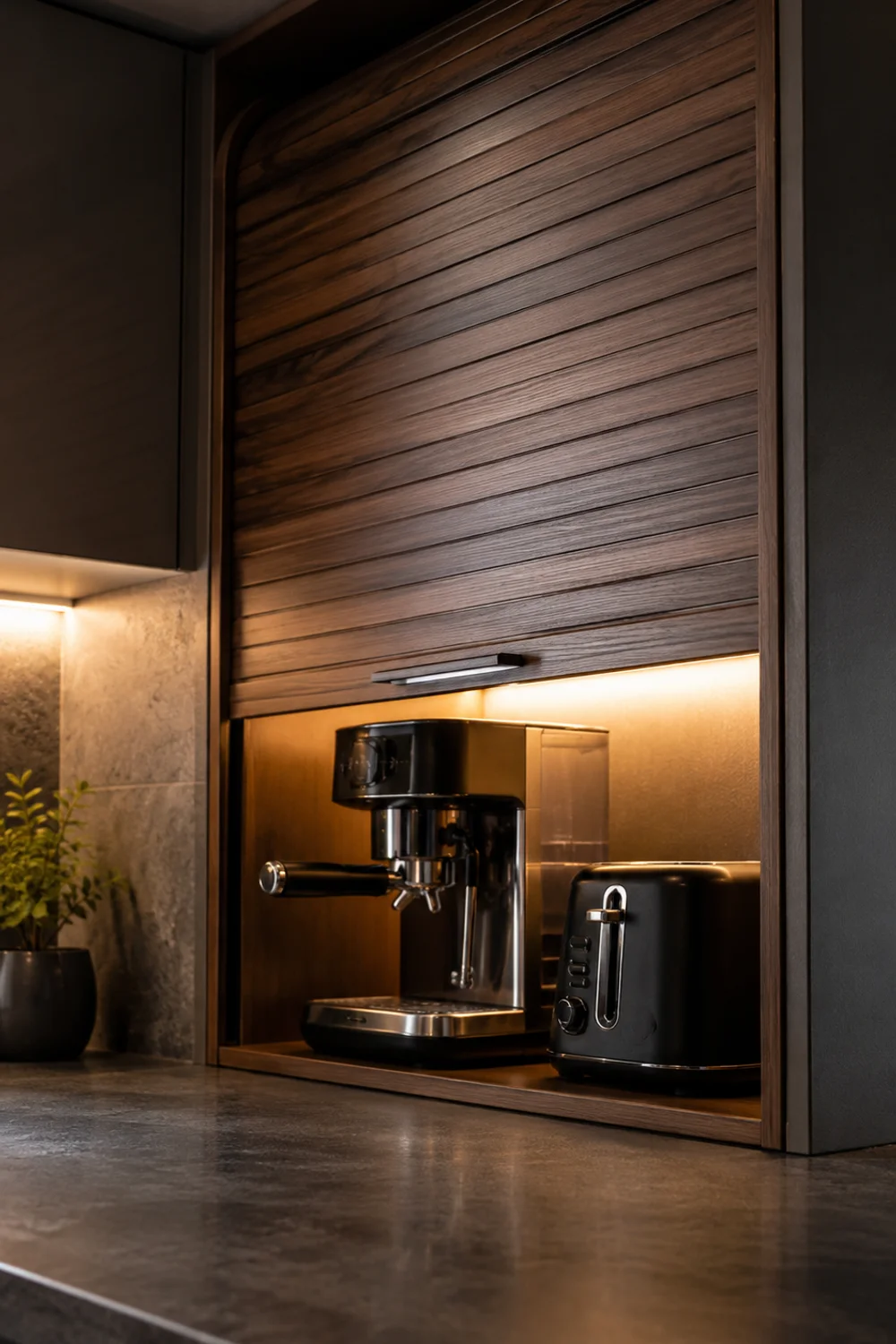
Small appliances are usually the single biggest source of counter clutter, and the instinct to simply “style” them — lining up the toaster, the kettle, the coffee maker in a neat row — only goes so far before the row itself starts to feel busy. An appliance garage solves the problem at the root by giving those objects a dedicated, concealed home that still keeps them within arm’s reach of an outlet.
The mechanism is straightforward: a tambour or lift-up door is installed in a corner or end-run cabinet, wired internally for power, so the toaster and coffee maker live behind a closed panel until you need them. You roll the door up, use the appliance in place, and roll it back down. Nothing gets lifted in and out of a cabinet daily, which is the usual reason people abandon this kind of system within a month.
Not every kitchen has room for a full built-in garage, and that’s fine — a freestanding cabinet with a tambour insert can be added to an existing counter run without construction. For renters or anyone hesitant to modify cabinetry, a retrofit tambour kit designed to slot into a standard base cabinet achieves nearly the same result at a fraction of the cost and effort.
Consider a compact city kitchen where the coffee maker, toaster, and blender used to occupy the entire counter beside the sink. Installing a garage insert into the existing end cabinet freed that entire run for prep space, and the appliances are still used just as often — they’re simply invisible between uses, which changed how the whole kitchen photographed and felt day to day.
You can read about the appeal of hidden storage in my article How to Create a Clutter-Free Kitchen You Actually Enjoy. The kitchen counter comes with the same discipline: use it daily, see it rarely.
3. Monochrome Small-Appliance Palette
 Save it
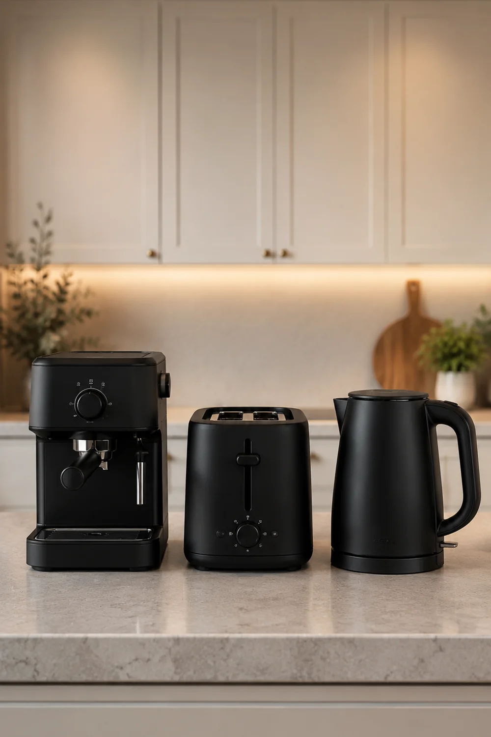
If a full appliance garage isn’t realistic for your layout, the next best option is controlling the palette of what stays visible. Mismatched appliances — a black air fryer, a stainless toaster, a red kettle — create visual noise even when each object individually looks fine. A monochrome small-appliance palette removes that competition by committing every visible appliance to one finish family.
The technique works because color and finish variation is what the eye registers as “clutter” long before object count does. Three appliances in matte black or three in brushed steel read as a coordinated set, almost like intentional decor, while the same three objects in three different finishes read as a pile of unrelated stuff, even if they’re lined up neatly. Consistency does more visual work than tidiness alone.
This doesn’t mean replacing every appliance you own overnight. Start with whatever sits on the counter permanently — usually the coffee maker and one other daily item — and commit those to the palette first. Appliances used occasionally, like a stand mixer or blender, can be stored away and don’t need to match, since they’re not part of the everyday visual field.
Large fixed appliances don’t need to be part of this discipline either. A stainless steel refrigerator or dishwasher already reads as a neutral, architectural surface rather than a countertop object, so it won’t clash with a matte black toaster and kettle the way two small appliances would clash with each other. Save the palette commitment for what’s small enough to be handled and moved daily — that’s where finish mismatch actually registers as clutter.
In a kitchen with warm white cabinetry and brass hardware, swapping a mismatched black microwave and silver kettle for two appliances in brushed brass-toned steel pulled the whole counter into visual agreement with the rest of the room within an afternoon, without a single structural change.
4. The Single Utensil Crock Rule
 Save it
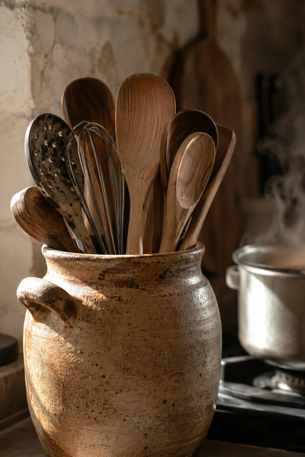
Utensil crocks are one of the most common counter offenders because they multiply — one by the stove for cooking tools, a second near the sink for scrubbers, a third somewhere for miscellaneous gadgets. The single utensil crock rule consolidates everything into one vessel, positioned at the stove, holding only the handful of tools used in nearly every meal.
The technique requires an honest audit of what actually gets reached for daily. Most kitchens use five or six utensils constantly — a spatula, a wooden spoon, tongs, a whisk, a slotted spoon — and own fifteen more that sit untouched for months. Everything outside that core group moves into a drawer, sorted by type, leaving the crock genuinely functional rather than a display of every gadget ever purchased.
Size matters here more than people expect. An oversized crock invites overfilling because the empty space feels like it needs to be used, while a crock sized to hold exactly the daily tools enforces the edit automatically — there’s simply nowhere to put a seventh utensil once six are already standing in it.
The rule gets tested in households where two people cook, since each person tends to reach for a slightly different set of tools. Rather than doubling up on crocks to accommodate both preferences, the stronger solution is a single shared crock stocked with genuinely overlapping essentials, while each cook’s more specialized tool — a particular knife, a favored spatula — lives in the drawer just beneath it, close enough to grab without needing its own container on the counter. This keeps the visual rule intact without forcing either cook to give up what they actually rely on.
A home cook who previously kept three separate holders — one by the stove, one by the sink, one on the far counter for baking tools — consolidated down to a single crock beside the range and moved the baking tools into a drawer insert. The stovetop instantly looked calmer, and cooking felt faster because there was one obvious place to reach, not three to check.
The lesson generalizes past utensils: a single, well-chosen container almost always beats several scattered ones, whether it’s holding wooden spoons or anything else competing for counter space in a busy room.
5. A Leaning Cutting Board as Sculptural Object
 Save it
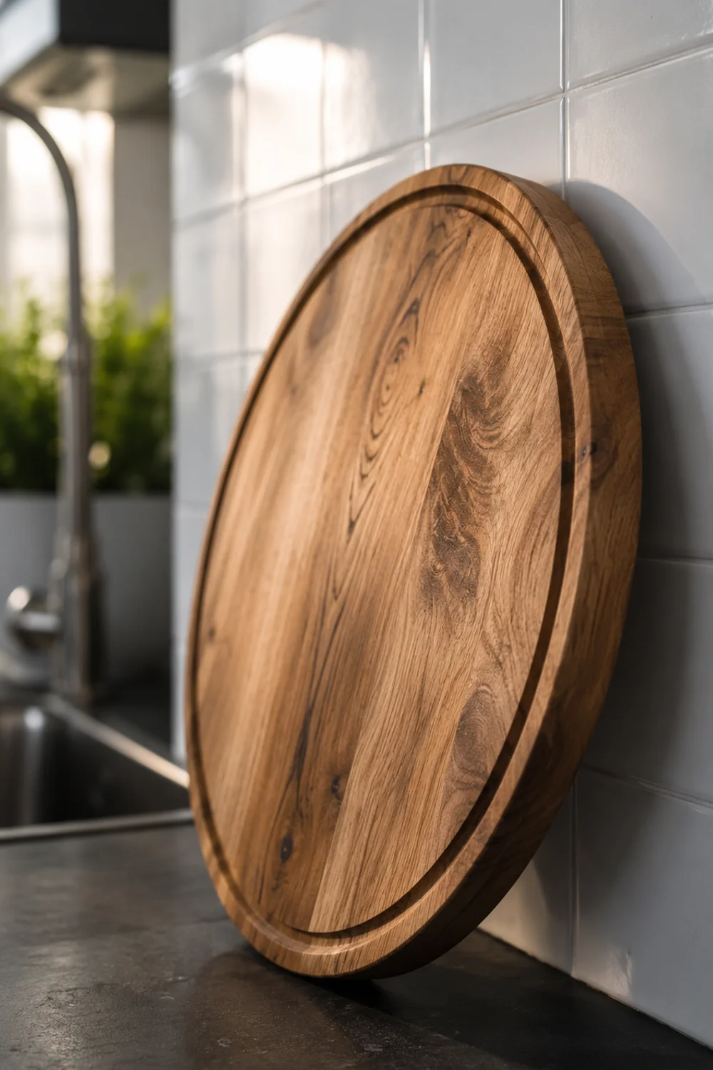
Most cutting boards live flat on the counter or stacked in a cabinet, purely functional and rarely considered as objects worth looking at. Leaning one against the backsplash, propped on its edge behind the sink or stove, turns it into something closer to art — a single warm, textural shape that breaks up an otherwise hard, reflective surface without adding a decorative object that serves no purpose.
The technique depends on choosing a cutting board with genuine presence: a round or organically shaped edge-grain board with visible wood grain reads as sculptural in a way a rectangular prep board doesn’t. Lean it at a slight angle against the backsplash, ideally in a spot that’s out of direct splash range from the sink, so it stays useful rather than becoming purely decorative and neglected.
This works especially well in kitchens with a lot of cool, hard surfaces — quartz counters, stainless appliances, glass-front cabinets — where the wood introduces the one warm material in an otherwise clinical palette. It doesn’t require adding anything new to the room; it simply repositions an object you already own and use weekly.
A kitchen with an all-white counter and cabinetry once felt sterile until the owner started leaning a round maple board against the tile behind the stove instead of storing it flat in a drawer. The board is still used for weekend baking, wiped down and returned to its leaning spot afterward, and that single warm shape now anchors the entire cooking zone visually.
Scale matters more than people expect. A small paring board disappears against a full-height backsplash and reads as clutter rather than intention, while a board sized closer to sixteen or eighteen inches across holds its own as a real visual anchor. If your kitchen runs narrow, propping the board in a corner where two surfaces meet gives it a natural resting point without eating into usable counter space, and it keeps the board from sliding when the angle is right.
The idea of letting one functional object double as the room’s visual anchor is a quiet, efficient way to add character without adding clutter — you’re not decorating, you’re just displaying what you already reach for.
6. Cord Concealment Through a Countertop Grommet
 Save it
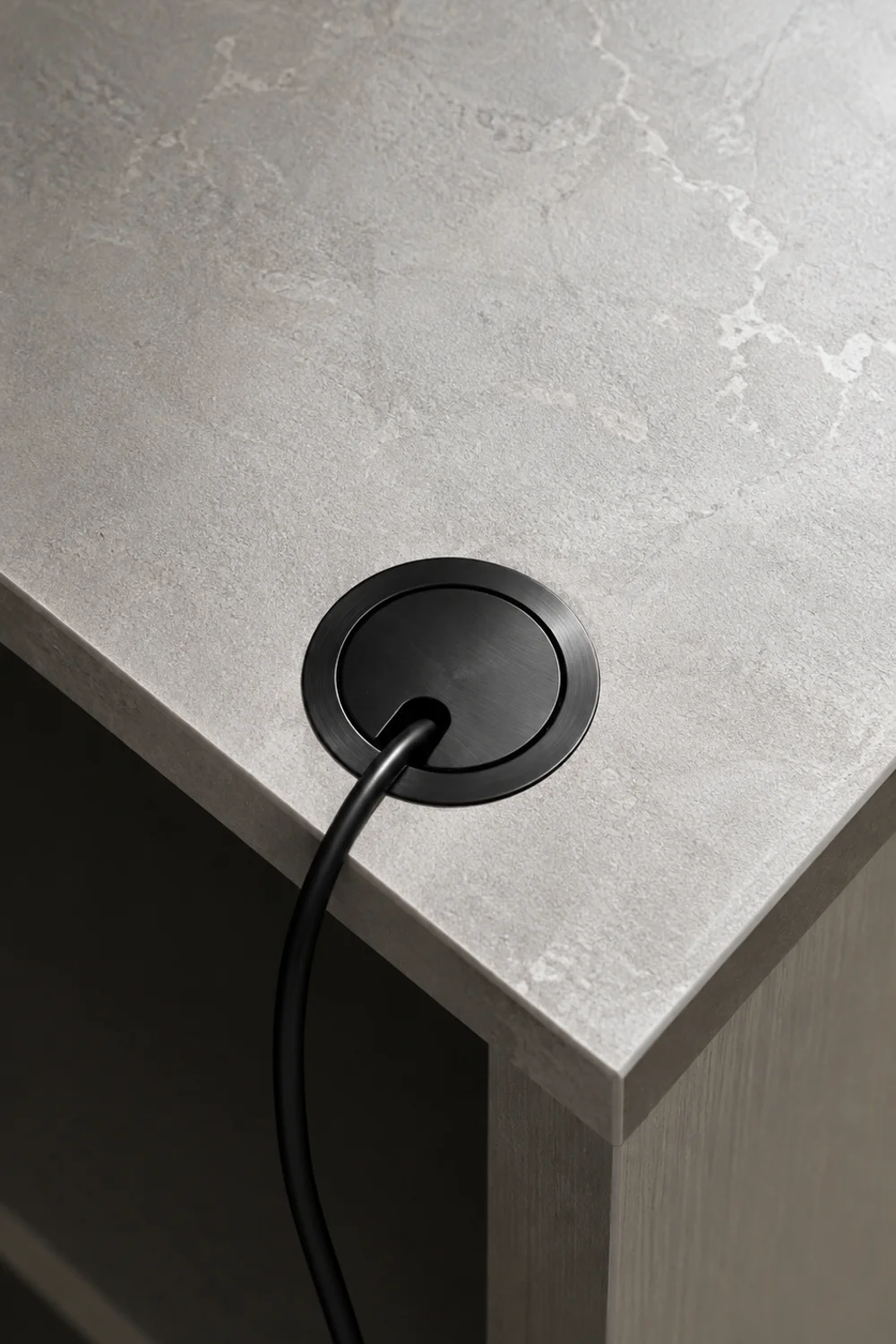
Cords are one of the least discussed sources of counter chaos, mostly because people assume nothing can be done about them short of a full appliance garage. A countertop grommet offers a middle path: a small circular cutout, usually near the backsplash, that lets cords drop straight down into the cabinet below instead of trailing across the counter to a wall outlet.
The mechanism is simple carpentry — a hole saw creates the opening, a grommet ring finishes the edge, and an outlet strip is mounted inside the cabinet directly beneath it. Appliances plug in below the counter line and stay powered, but the cord itself disappears from view entirely, which does more to visually calm a counter than almost any styling change on its own. Grommet diameter matters more than people expect — a 2-inch opening handles a single appliance cord comfortably, but if you’re routing two or three cords through the same hole, sizing up to 2.5 or 3 inches keeps the grommet from looking stuffed or straining at the edges.
This solution works particularly well for appliances that need to stay accessible and plugged in constantly, like a coffee maker or a stand mixer used most mornings, where a full appliance garage would be inconvenient but a visible tangle of cords is equally unappealing. It’s a compromise between full concealment and full display.
In a kitchen where the coffee station sat against a wall with no nearby outlet, cords used to stretch across half the counter to reach a plug near the stove. Adding a grommet and a hidden power strip inside the cabinet below solved the problem permanently — the coffee maker still sits in the same spot, but the counter now reads as clean rather than tangled.
The cabinet underneath matters as much as the grommet itself. If it’s open shelving, the power strip can simply sit on the surface, tucked behind whatever’s stored there. But if the cabinet holds a drawer instead, the outlet strip needs to be mounted to the cabinet’s side wall, above where the drawer glides, so the cord has somewhere to live without getting pinched or caught every time the drawer opens.
Cord management rarely gets attention in kitchen design conversations, but it’s often the single fastest fix for a counter that otherwise looks styled but somehow still feels chaotic.
7. The Coffee Station as a Contained Ritual Corner

 Save it
Coffee stations tend to sprawl — the machine, the grinder, a jar of beans, a stack of filters, a mug or two left drying nearby. Rather than eliminating the station, the minimalist approach contains it deliberately to one defined corner of the counter, treating it as a small, self-sufficient ritual zone rather than an extension of general clutter.
The technique is about boundaries as much as objects. Pick one corner, ideally near an outlet and away from the primary prep zone, and commit to keeping every coffee-related item within that footprint only. A grinder that migrates to the far counter or a bag of beans left by the stove breaks the containment and undoes the effect, so the discipline matters as much as the initial setup.
Filters, extra beans, and mugs used only for coffee can move into a nearby cabinet, leaving just the machine, the dripper, and perhaps one small canister visible. This keeps the ritual functional and beautiful without spreading its footprint across the whole counter, which is usually what happens when a coffee habit grows unchecked over a few years.
A couple who previously had coffee gear scattered across two separate counter runs consolidated everything into one twenty-four-inch corner near the window, moving backup supplies into the cabinet directly below. The morning routine actually got faster because everything needed was in one place, and the rest of the kitchen counter stayed clear for actual meal prep.
The same logic holds for households with more elaborate setups. A home with both a drip machine and a manual pour-over ritual might be tempted to split the two across different counters — one for weekday speed, one for weekend leisure — but that split is exactly what invites sprawl. Keeping both within the same footprint, stacked vertically on a small tray if counter space is tight, preserves the boundary without forcing anyone to give up either ritual. Even a household of coffee-and-tea drinkers can apply the same containment: a shared tray with both kettle and dripper keeps two habits from quietly claiming two separate zones.
Containing a habit to one small, well-equipped zone — rather than eliminating it — is often the more sustainable minimalist move, since it respects how people actually live rather than fighting it.
8. Off-Counter Knife Storage
 Save it
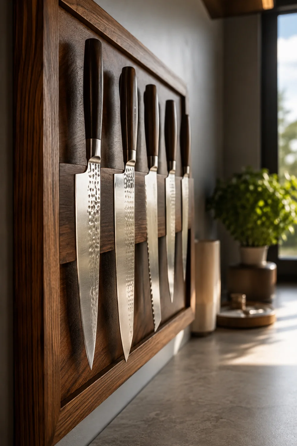
A knife block might be one of the most common counter fixtures, but it’s also one of the bulkiest, occupying a permanent footprint that rarely earns its square footage relative to how often it’s actually used. Moving knives off the counter entirely — either to a wall-mounted strip or an in-drawer insert — reclaims that space without sacrificing accessibility.
A magnetic strip mounted on the backsplash keeps knives visible and instantly reachable while removing the block’s footprint from the counter surface itself. For kitchens that prefer nothing on the walls, an in-drawer knife organizer near the main prep zone achieves the same goal, keeping blades protected and organized just below counter level instead of standing in a block.
The choice between the two usually comes down to wall space and personal preference rather than one being objectively better. A magnetic strip suits kitchens where the backsplash is otherwise undecorated and could use one warm, functional detail; a drawer insert suits kitchens where every wall surface is already doing visual work and can’t absorb another element.
There’s also a practical safety argument for the drawer route that rarely comes up in the wall-mount conversation: households with young children or a rotating cast of houseguests often prefer blades tucked below the counter line rather than displayed at eye level, even magnetically secured ones. An insert with individual slots also keeps the knives from knocking against each other the way a shared drawer bin would, which matters more for a well-maintained edge than most people realize.
A narrow kitchen with limited counter space previously dedicated nearly a foot of prime real estate near the stove to a wooden knife block. Replacing it with a slim magnetic strip mounted just above the backsplash freed that entire section for actual prep work, and the knives are arguably more visible and accessible than they were standing in slots.
Reclaiming space from a single bulky object like a knife block is often the fastest way to make a small kitchen counter feel dramatically larger, without touching anything else in the room.
9. One Sculptural Catchall Bowl
 Save it
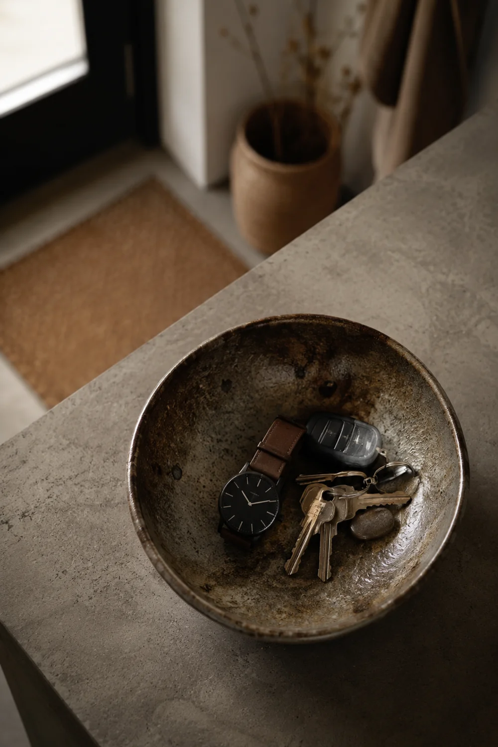
Every kitchen accumulates small loose items — spare change, a rubber band, a stray screw, a phone left charging — and without a designated spot, these things scatter across whatever surface is nearest. A single sculptural catchall bowl, placed in one consistent spot, gives all of that overflow one home instead of five, which keeps the rest of the counter free of random small objects.
The key to making this work aesthetically is choosing a bowl substantial enough to read as a decorative object in its own right, not a leftover piece of Tupperware repurposed for the job. A raw-glazed ceramic or stoneware bowl with real weight and texture earns its place on the counter visually, so it doesn’t need to be hidden away when guests are over.
This differs from a styled decorative bowl meant purely for display — this one is meant to be used daily and to actually collect things, which means it needs to sit somewhere genuinely convenient, like near the entry point from the garage or front door, not tucked into a corner where it won’t get used.
A family with three kids found that keys, hair ties, and loose coins were constantly scattered across the counter near the back door. Introducing one deep ceramic bowl in that exact spot solved the problem almost immediately — everyone adopted the habit within a week because the bowl was simply the most convenient place to drop things, easier than leaving them loose on the counter.
Size matters more than people expect. A shallow trinket dish reads as precious and fussy, and it fills up within days, which defeats the purpose. A bowl with real depth — closer to the proportions of a serving vessel than a jewelry dish — can absorb a week’s worth of clutter without looking overwhelmed, and that visual slack is part of what makes it feel calm rather than chaotic. One household that travels often keeps a second, smaller version of the same bowl by the bedroom door specifically for watches and cufflinks, proof that the same idea scales down without losing its logic.
A single well-placed catchall does more to prevent daily clutter than any amount of after-the-fact tidying, because it intercepts the mess at the moment it would otherwise happen.
10. The Prep Zone Kept Permanently Clear
 Save it
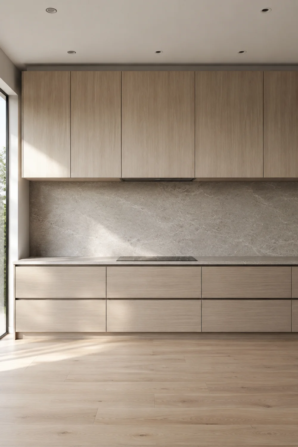
Every kitchen has a functional center — the stretch of counter where actual chopping, mixing, and assembling happens most often. That zone is usually the first to disappear under mail, appliances, and random objects, which forces cooks to clear space every single time before they can start, adding friction to a task that should feel effortless.
The fix is to designate that stretch explicitly as a prep zone kept permanently clear, distinct from the empty counter run discussed earlier because this one stays available specifically for active use, not simply for visual calm. Nothing decorative or semi-permanent gets placed there, ever — not a fruit bowl, not a mail stack, not a stack of cookbooks.
Establishing the boundary usually means physically relocating whatever currently lives in that zone to a more appropriate spot elsewhere on the counter or inside a cabinet. It also means enforcing the rule daily, since prep zones tend to attract clutter faster than any other counter area simply because they’re centrally located and easy to set things on. Even a stand mixer or a coffee station, if it happens to sit on that particular stretch, is worth moving a few feet over — the goal isn’t to banish every appliance from the counter altogether, just to keep this one working surface free of anything that isn’t actively part of that day’s cooking.
A home cook who struggled to start dinner without first clearing mail, kids’ school papers, and a fruit bowl off the main counter began enforcing a strict no-object rule on that thirty-inch stretch. Within a month, the habit of avoiding that space for anything but active prep had taken hold across the whole household, and dinner prep genuinely started faster because the space was already available. The rule held up even during busier weeks, when guests visiting for a holiday meal instinctively set bags and dishes down elsewhere on the counter without being told, simply because that one stretch visibly read as off-limits.
A permanently clear prep zone isn’t about aesthetics at all — it’s a functional decision that happens to also make the kitchen look calmer, which is often the most sustainable kind of minimalism because it’s reinforced by daily use rather than willpower alone.
11. Windowsill Styling to Relieve Counter Pressure
 Save it
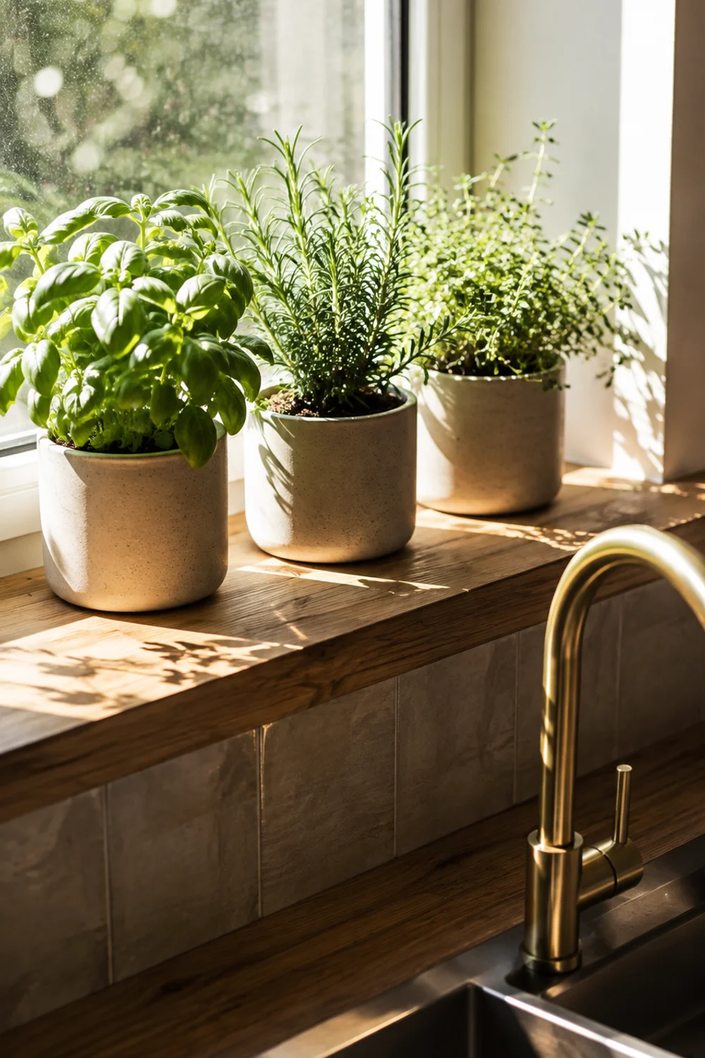
Kitchens with a window over the sink have an underused surface hiding in plain sight: the windowsill. Moving small decorative or functional objects there — rather than onto the counter itself — relieves pressure on the main surface while giving those items a genuinely good spot, since windowsills catch natural light in a way counters rarely do. The exposure shifts throughout the day, too, so an object placed there doesn’t just sit in better light — it sits in changing light, which is part of what makes a windowsill feel alive in a way a static counter surface never quite manages.
The technique works best with objects that are small, low-maintenance, and benefit from sunlight. A trio of herb pots, a single small vase, or a jar of wooden spoons are all better suited to a sunlit sill than to a shadowed corner of the counter, and relocating them frees real counter space without requiring you to get rid of anything.
This only works if the windowsill is deep enough to hold objects securely and if the items chosen are genuinely proportioned to the space — an oversized vase will look precarious on a narrow sill, while three small pots sit comfortably and catch light beautifully throughout the day. Orientation matters here too: a south-facing sill can support sun-hungry herbs like rosemary or thyme, while a north-facing one does better with something more shade-tolerant, such as a trailing pothos cutting in a small jar, so it’s worth matching what you place there to the actual light exposure rather than assuming every sill behaves the same way.
A kitchen with a deep farmhouse sink and a wide sill above it previously had a cluttered counter beside the sink holding a dish soap bottle, a sponge caddy, and a small plant. Moving the plant to the sill and relocating the soap and sponge into a concealed under-sink caddy left the counter beside the sink completely clear, while the sill itself became the most photogenic spot in the kitchen. Even the smaller details shifted with it: a chipped mug, no longer fit for coffee, was repurposed to hold kitchen twine and a pair of scissors, tucked at one end of the sill just behind the herb pots — useful, but out of the way of the light and the view.
An underused architectural feature like a windowsill often solves a storage problem more elegantly than buying a new organizer ever could, simply by putting existing square footage to better use.
12. The Sink Zone: Soap and Sponge Concealment
 Save it
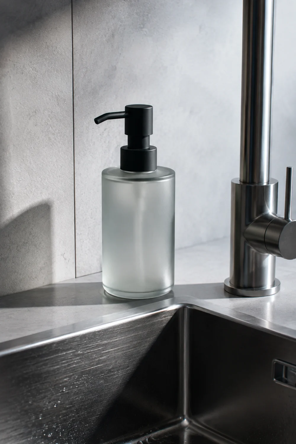
The area immediately around the kitchen sink accumulates some of the least attractive daily-use objects in the entire kitchen — a plastic soap bottle, a visible sponge, a scrub brush standing in a cup of dirty water. Concealing this cluster, rather than simply upgrading each object individually, does more to calm that zone than any amount of styling.
The most effective approach is an under-sink caddy that hangs inside the cabinet door or sits on a pull-out tray just below the counter line, holding the sponge, brush, and extra soap refill out of sight. What stays visible on the counter is reduced to a single refillable dispenser, chosen in a finish that matches the faucet rather than whatever came with the dish soap bottle.
A family kitchen with a farmhouse sink previously had three separate bottles, a sponge holder, and a dish rack crowding the counter on either side. Concealing the extra bottles and sponge storage inside a cabinet-door caddy, and keeping only one refillable glass dispenser visible, reduced the sink zone from five objects down to one, dramatically changing how that corner of the kitchen felt.
The same principle applies to the scrub brush, which is often the single worst offender in this zone — sitting upright in standing water, visibly grimy within days. Swapping it for a wall-mounted brush holder that drains inside the cabinet, rather than balancing in a dish on the counter, removes that particular eyesore entirely while keeping the brush within easy reach the moment it’s needed.
Concealment doesn’t mean the items disappear from daily use — it means they’re one door away instead of permanently on display, which is often all it takes to transform the least attractive zone in the kitchen.
13. Corner Cabinet Concealment for Bulky Appliances
 Save it
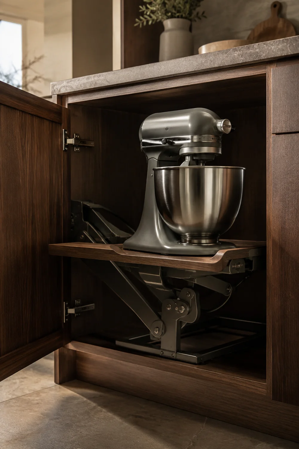
Corner counters are notoriously awkward — hard to reach, often wasted, and frequently where the biggest, least attractive appliances end up parked simply because there’s nowhere else to put them. A stand mixer or a large air fryer often lives permanently in the corner, visible from nearly every angle of the kitchen, simply by default rather than intention.
The fix is a pull-out corner cabinet organizer that brings bulky appliances up to counter height on a sliding or rotating shelf when needed, and tucks them fully out of sight into the corner cabinet below when not in use. This solves the accessibility problem that usually keeps people from storing heavy appliances away in the first place.
Because corner cabinets are typically deep and difficult to access with a standard shelf, a mechanism that swings or slides the appliance forward removes the main obstacle to actually using that storage daily — most people abandon cabinet storage for heavy appliances precisely because lifting them in and out of a deep, dark corner feels like too much friction.
Not every pull-out mechanism handles weight the same way, and this matters more than most people expect before installing one. A kidney-shaped shelf that swings out on a pivot tends to suit lighter countertop appliances well, but a heavier stand mixer, especially one loaded with a dough hook or extra bowl attachments, often does better on a straight sliding shelf rated for higher weight capacity, since a pivoting mechanism under strain can feel unstable over time. It’s worth checking the manufacturer’s weight rating against the actual loaded weight of the appliance, not just its listed weight alone, before assuming any pull-out will do.
A baker who used her stand mixer several times a week had resigned herself to keeping it permanently on the corner counter, since storing it in the deep corner cabinet felt impractical. Installing a pull-out shelf mechanism meant the mixer could roll forward at counter height for use and disappear completely afterward, freeing the entire corner for the first time in years.
Corner space is some of the most awkward real estate in any kitchen, but with the right mechanism it can absorb exactly the kind of bulky object that otherwise dominates the counter permanently.
14. Stovetop as a Breathing-Room Zone
 Save it
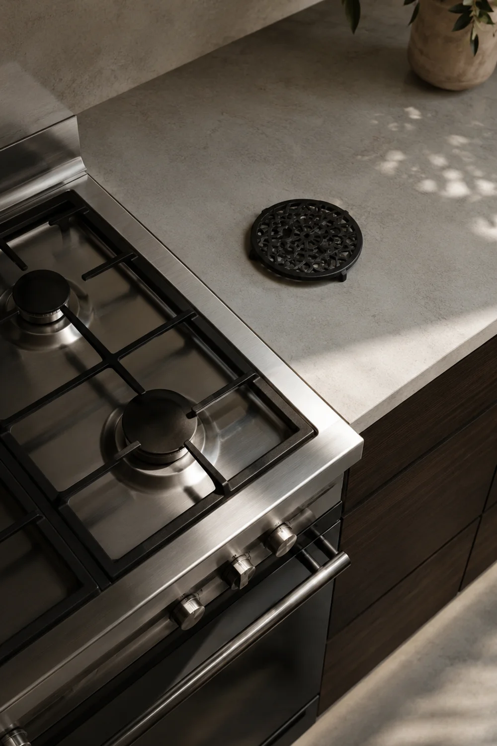
The area directly around the stovetop tends to accumulate oil bottles, salt cellars, and utensils mid-use, which is understandable during active cooking but often lingers well past mealtime. Treating the stovetop surround as a breathing-room zone — cleared completely between cooking sessions — keeps the visual busiest part of the kitchen from becoming permanently cluttered. There’s a practical reason beyond aesthetics, too: oil bottles and salt cellars left out near an active burner slowly pick up a film of grease and residue from rising heat, which means the “convenience” of leaving them out actually creates more cleaning work over time, not less.
The technique is about timing as much as placement. Everything used during cooking has a home nearby, but nothing stays out once the meal is finished — oils go back in the cabinet, the utensil crock stays only as long as needed, and the surface around the burners returns to bare stone or steel between uses rather than staying perpetually staged.
A single trivet, left out permanently near the stove, is the one exception worth keeping visible, since it’s used almost every time something comes off the burner and prevents heat damage to the counter. Beyond that one functional object, the goal is a stovetop surround that looks essentially untouched when the stove itself is off.
A home cook who previously left oil bottles, a salt cellar, and a pepper grinder permanently clustered beside the range began putting the oils away after each use and keeping only the trivet out. The stovetop area went from looking perpetually “in use” to looking calm and put-together even mid-week, without changing anything about how often she actually cooked. In households where more than one person cooks, this reset is worth assigning explicitly — whoever finishes at the stove is the one who clears it, the same way someone is responsible for turning off a burner, so the habit doesn’t quietly fall to whoever happens to notice the clutter first.
Applying an active-versus-resting distinction to the busiest zone in the kitchen prevents the natural buildup that happens when convenience quietly turns into permanent clutter.
15. Backsplash-to-Counter Material Continuity
 Save it
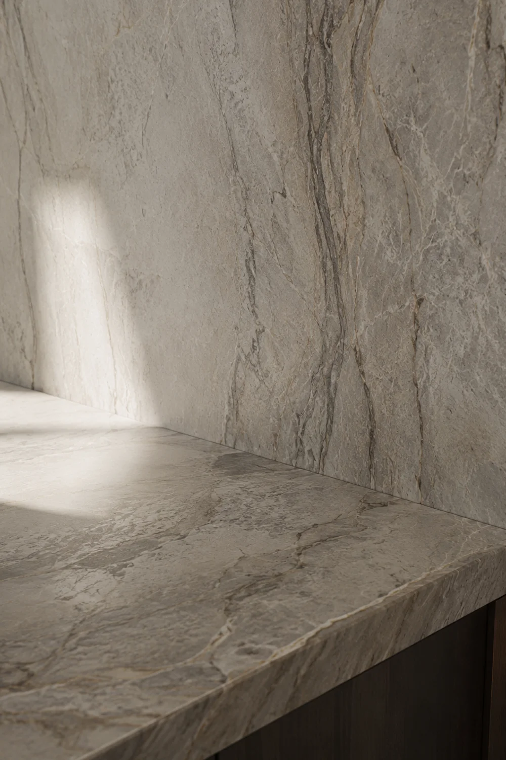
Visual breaks between the counter and the backsplash — a different material, a strong grout line, a mismatched color — can make even a genuinely clean counter feel busier than it is, because the eye registers the transition as a seam rather than a continuous surface. Choosing materials that flow from counter to backsplash with minimal contrast removes that visual interruption entirely.
The most seamless version of this uses the same slab material for both counter and a short backsplash run, eliminating the seam almost entirely and letting the stone’s natural veining read as one continuous surface rather than two separate elements meeting at a hard line. Where a full slab backsplash isn’t feasible, choosing a tile in a closely matched tone achieves a similar, if slightly less dramatic, effect.
This matters most in smaller kitchens, where every visual break reads as more significant simply because there’s less overall space to absorb it. A stark white counter against a dark grout line, even with nothing sitting on the counter, can make the whole zone feel more fragmented and visually loud than a counter and backsplash that flow together in tone.
A compact kitchen renovation originally paired a pale quartz counter with a contrasting dark grey grout on a subway tile backsplash, and even fully cleared, the counter photographed as busy. Switching to a grout tone closely matched to the tile, and extending the same quartz four inches up the wall as a mini-backsplash, made the entire counter run read as one continuous, calm surface.
The same principle shows up even in kitchens that never touch a renovation budget. A galley kitchen with a butcher block counter and a plain painted backsplash achieved nearly the same continuity simply by matching the paint color to the wood’s undertone rather than defaulting to a crisp white — the warm taupe wall let the counter’s grain feel like it extended upward instead of stopping abruptly at a hard edge, proving that continuity is as much about tonal proximity as it is about matching materials outright.
Material continuity is one of the few minimalist strategies that requires a genuine renovation decision rather than a styling change, but it’s also one of the most permanent ways to make a counter feel resolved, regardless of what’s placed on it day to day.
Common Mistakes to Avoid
1. Styling instead of editing
The most common mistake in minimalist counter design is treating it as an arranging exercise rather than a removal one. People carefully line up the same fifteen objects instead of asking whether ten of them need to be on the counter at all. Real minimalism starts with subtraction, not rearrangement.
2. Concealing clutter without giving it a real home
Shoving loose items into a drawer without an organizer just relocates the mess out of sight, and it tends to spill back onto the counter within weeks. Every object moved off the counter needs an actual designated spot — a drawer insert, a cabinet shelf, a labeled bin — or the clutter simply migrates rather than disappears.
3. Choosing appliances in mismatched finishes
Buying appliances one at a time over several years, without any thought to finish consistency, is how kitchens end up with a black microwave, a silver kettle, and a red mixer all competing on the same counter. Even a genuinely tidy counter looks busy when the visible objects don’t share a material or color language.
4. Overcrowding the one “allowed” decorative object
People often understand the rule of keeping the counter minimal, then undermine it by choosing one oversized, overly ornate decorative piece to compensate — a huge floral arrangement or an elaborate fruit display. A single object still needs to be proportioned modestly to the space; minimal doesn’t mean one enormous thing instead of several small ones.
5. Ignoring the sink and stove zones
Many people focus their minimalist effort on the open counter runs while leaving the sink and stove surrounds untouched, since those areas feel “functional” and therefore exempt from the same standard. But these zones are usually the most visually active parts of the kitchen and benefit the most from the same editing applied everywhere else.
Frequently Asked Questions
How many objects should actually stay on a minimalist kitchen counter?
There’s no fixed number, but a useful test is whether every object earns its spot through daily or near-daily use. A functional kitchen counter styled this way typically ends up with somewhere between three and seven visible items total across the whole space, including appliances, rather than counting objects per zone. The goal isn’t an arbitrary count — it’s making sure nothing is there simply out of habit or indecision about where else it might go.
Is it realistic to keep a counter this clear with kids in the house?
Yes, though it requires designating specific catch zones — like the single catchall bowl described earlier — rather than expecting a completely empty counter at all times. Families that succeed with this approach usually accept that some zones will see daily activity and focus their editing energy on the zones that matter most, like the prep area and one clear counter run, rather than demanding perfection everywhere at once.
Do I need to renovate to achieve this look, or can it work with existing counters?
Most of the strategies here, including appliance concealment, cord grommets, and material choices for visible objects, require no renovation at all. Only the backsplash continuity idea genuinely benefits from construction-level changes. Everything else — editing what stays visible, choosing a consistent appliance palette, relocating small objects to a windowsill or drawer — can be implemented in an afternoon with the counters and cabinets you already have.
What’s the fastest single change to make a cluttered counter feel more minimal?
Concealing or relocating small appliances almost always produces the most dramatic single improvement, since they typically occupy the most visual and physical space of anything on the counter. Even without a full appliance garage, simply moving one or two rarely used appliances into a cabinet and committing the remaining visible ones to a consistent finish will noticeably calm the space faster than any decorative styling change could on its own.
Final Thoughts
A minimalist kitchen counter isn’t the product of owning less — it’s the product of deciding, deliberately, what earns a permanent place on one of the busiest surfaces in the house. Every idea here comes back to that same discipline: concealment for what’s used daily but doesn’t need to be seen, restraint for what stays visible, and genuine emptiness for the zones that benefit most from breathing room.
None of these changes require a full renovation to start working. A single afternoon spent relocating small appliances, consolidating utensils into one crock, or adding a cord grommet near the coffee station can shift how the entire kitchen feels, long before any bigger material decisions come into play. Small, consistent edits compound faster in a kitchen than almost any other room in the house.
Save whichever ideas match your kitchen’s biggest pressure point, and revisit the rest gradually as your habits and your space evolve. A counter this considered isn’t a one-time project — it’s an ongoing relationship between what you use and what you’re willing to keep visible, and it rewards patience far more than it rewards a single big weekend of cleaning.
This post contains affiliate links. I may earn a small commission at no extra cost to you.
Get cozy inspiration delivered to your inbox.
✓ 14-page beautifully designed ebook
✓ Cozy decorating ideas
✓ Practical room-by-room inspiration
You’re in! 🎉
Thanks for joining the NestFlowHome community!
Your free ebook is already on its way to your inbox. If you don’t see it within a few minutes, please check your Promotions or Spam folder.
Join the NestFlowHome community for weekly decorating inspiration.

Timeless home decor ideas and slow living inspiration for a calm, beautiful life.