
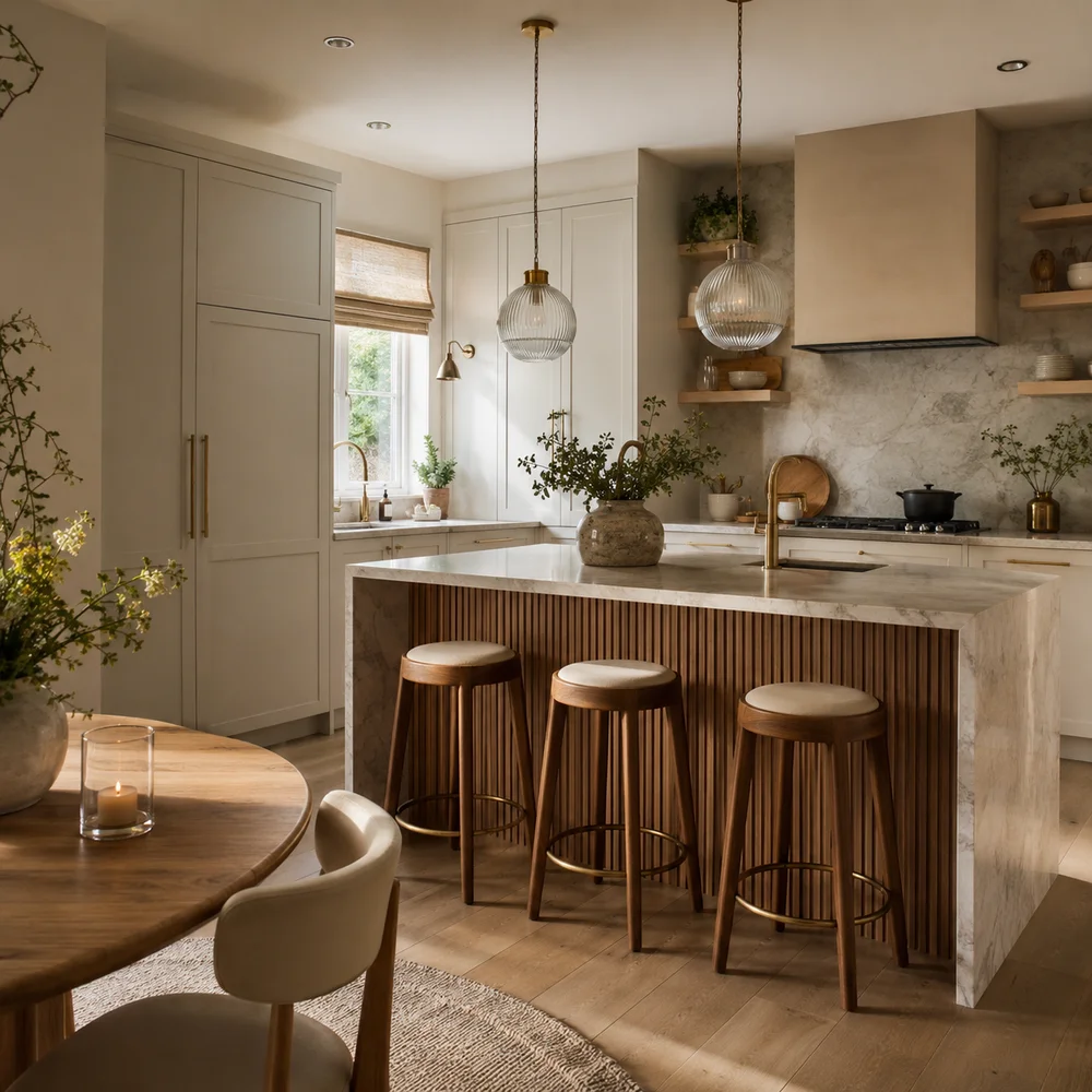
Modern Kitchen Decor Ideas for Small Spaces to Copy Now
By Emily | August 10, 2026
A small kitchen has a way of making you feel like you’re constantly negotiating with your own walls. You reach for a pan and your elbow hits the fridge. You want a corner that feels considered, curated, even beautiful, but every square foot already has a job. Most advice tells you to simplify, to declutter, to edit down to bare minimalism, as if the only answer to limited space is limited personality.
But a small kitchen doesn’t have to read as a compromise. The real issue usually isn’t the square footage itself, it’s that the room is being styled like a larger kitchen shrunk down, rather than designed on its own terms. Compact spaces respond to different logic: scale, reflection, flexibility, and intentional focal points do more work here than they would in a sprawling layout.
This guide walks through nine ideas built specifically for tight kitchen footprints, from materials that visually expand a room to furniture that flexes between functions depending on the hour. Some solve a spatial problem outright, others simply make the space feel more finished, more like a kitchen you chose rather than one you’re stuck with. None of them require knocking down a wall.
Read through in order or skip to whichever idea speaks to your layout first. Some solutions pair naturally, like a rolling island and a fold-down table both solving for flexible floor space, while others stand alone as single, high-impact changes. Try one before committing to all nine. A kitchen that evolves gradually, tested change by change, tends to feel more genuinely yours than one overhauled in a single weekend.
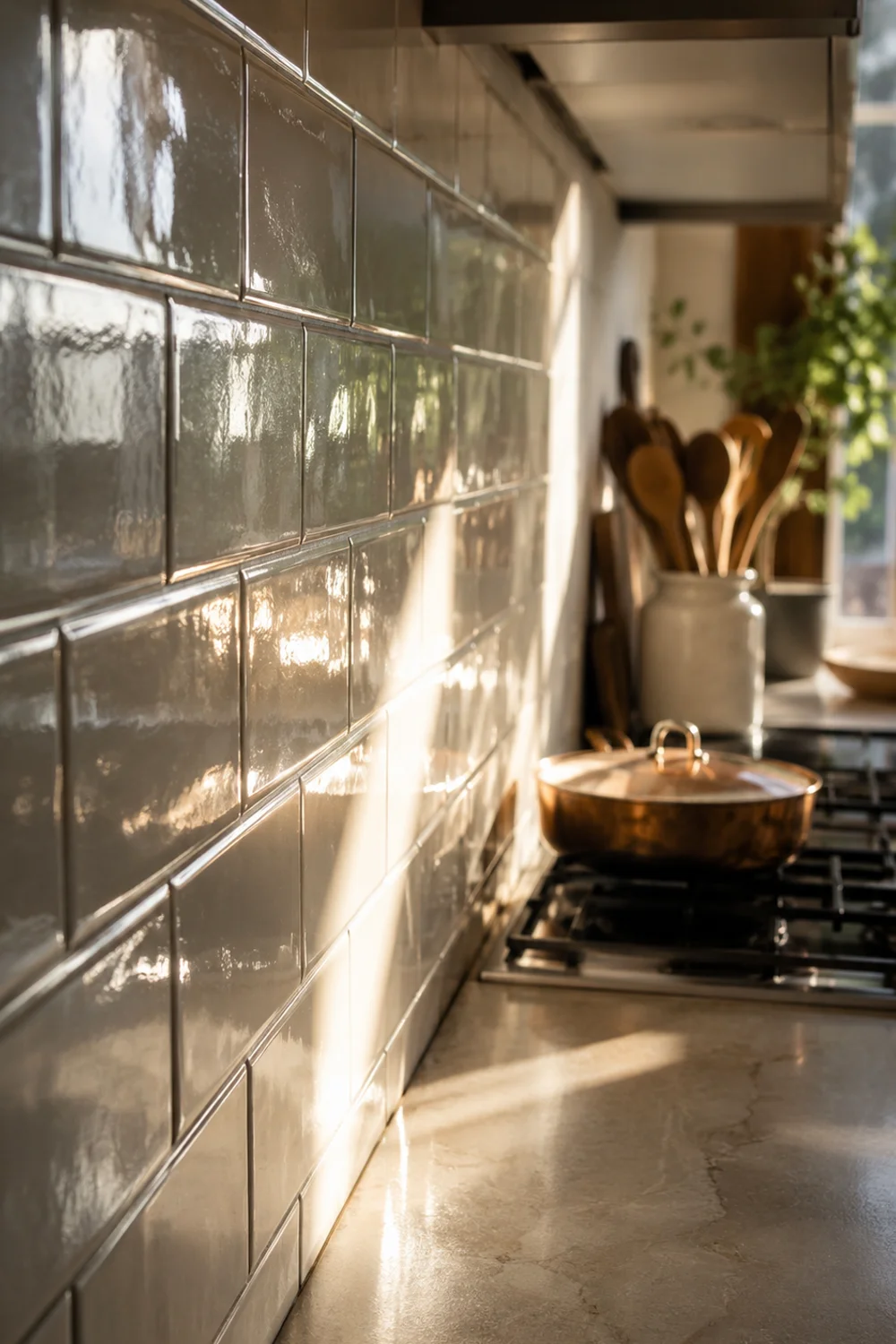
1. Glossy Backsplash Tile That Bounces Light Across the Room
 Save it
Small kitchens are often starved for light, not because there isn’t enough of it, but because matte surfaces absorb what little reaches them. A high-gloss or glazed backsplash tile changes that equation entirely. Instead of soaking up the light from a window or a single overhead fixture, a reflective surface scatters it back into the room, effectively multiplying the brightness without adding a single new bulb. This is a material choice doing the work that people usually assign to lighting fixtures.
The mechanism is straightforward: light hits a polished, glazed surface and bounces at a sharper angle than it would off a chalky or textured one, sending brightness sideways into the room rather than absorbing it into the wall. In a narrow galley kitchen, this means light from a single window can travel much further down the counter run than it otherwise would. The effect is strongest on the wall directly facing your primary light source.
Not every glossy tile works the same way. A glazed ceramic subway tile in a pale tone reflects diffusely, giving a soft glow rather than a mirror-like bounce, which tends to feel more livable day to day than a high-shine slab that can read cold or clinical.
A slightly warmer glaze, like a soft cream or pale celadon, keeps the reflectivity from feeling sterile.
Picture a narrow 1960s apartment kitchen with a single east-facing window. In the morning, sunlight hits the glazed tile behind the stove and throws a faint, warm glow across the opposite cabinet run, an effect that a matte tile in the same spot would simply have absorbed. By early afternoon, the kitchen still reads bright even though direct sun has moved off the counter entirely, because the tile is doing quiet, continuous work the rest of the day.
This is really a lesson in material physics applied to interior design: reflectivity is a design tool, not just an aesthetic preference. Once you start noticing how much a surface either holds onto or releases light, you’ll see it everywhere, from the difference between a matte and a glossy countertop to why polished floors make hallways feel wider. Small kitchens benefit disproportionately from this principle simply because they have less natural light to work with in the first place.
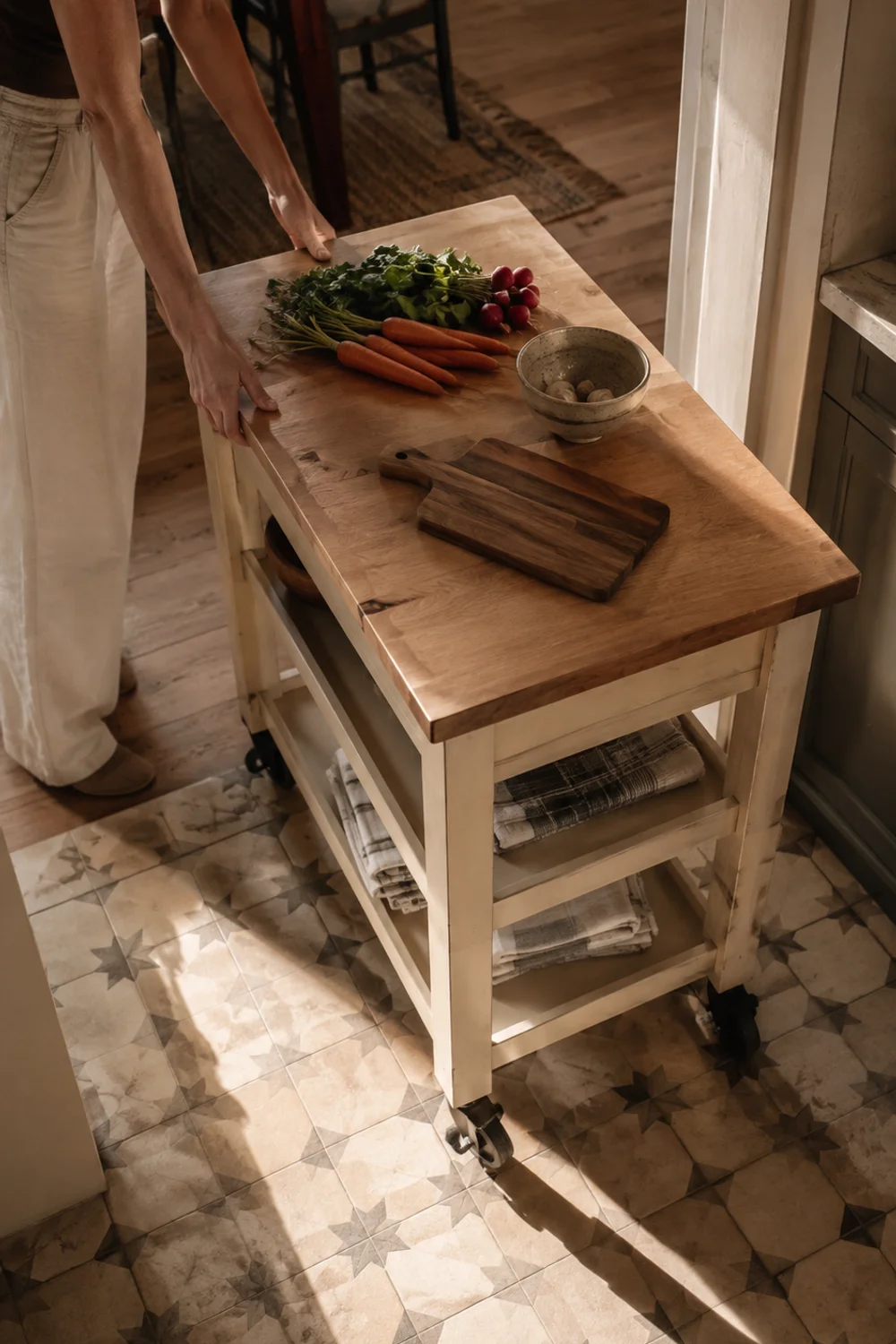
2. A Rolling Island That Becomes Whatever the Moment Needs
 Save it
The fixed kitchen island is a luxury most small kitchens don’t have room for, but a rolling island cart solves the same problem without demanding permanent floor space. It can serve as extra prep surface during dinner, roll aside to open up the walking path when guests arrive, or tuck against a wall entirely when it’s not needed. The core idea is that a small kitchen doesn’t need less counter space, it needs counter space that isn’t locked into one position all day.
The mechanism here is less about the object itself and more about how it changes your relationship to the floor plan. A fixed island commits you to one traffic pattern permanently, whether or not that pattern suits every task you do in the kitchen. A cart on locking casters lets the room reconfigure itself in seconds: pulled into the center for chopping vegetables, pushed flush against the counter for extra staging space, rolled into the dining area to double as a serving station.
Butcher block tops tend to outperform stone or laminate on a rolling cart because they’re lighter, which matters when you’re actually moving the thing daily, and because the material develops a lived-in patina that suits a piece meant to be touched and used rather than admired from a distance.
Choose one with a lower shelf, since that space quietly absorbs cutting boards or serving bowls that would otherwise crowd the counter.
Consider a one-bedroom apartment kitchen with eleven inches of counter space beside the stove, not nearly enough to plate a full dinner party spread. Rolled into the gap between the kitchen and the dining table twenty minutes before guests arrive, the cart becomes a staging area for serving dishes, then gets pushed back against the wall the moment everyone sits down. The same eleven inches of fixed counter never could have done that job alone.
The bigger takeaway is that flexibility is its own form of storage. A room that can reconfigure itself for different tasks effectively behaves like a larger room, even though nothing about its actual dimensions has changed. This is the same logic furniture designers use for studio apartments, and it works just as well in a kitchen that has to serve six different functions before nine in the morning.
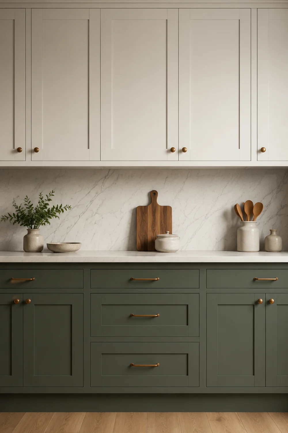
3. Two-Tone Cabinetry That Tricks the Eye Into Reading Depth
 Save it
A single-color cabinet run in a small kitchen tends to flatten the whole room into one visual plane, which paradoxically makes the space feel smaller rather than more cohesive. Two-tone cabinetry, where lower cabinets carry a deeper, richer tone and upper cabinets stay lighter, breaks that flatness and introduces a sense of depth the eye reads almost instantly. This isn’t about picking two colors you like together; it’s about using contrast to separate the room into distinct visual layers.
The reasoning is rooted in how the eye processes weight and distance. Darker tones read as visually heavier and appear to recede less than they physically are, while lighter tones near eye level and above open up the upper portion of the room. Anchoring the lower cabinets in a deeper hue while keeping uppers pale creates a natural gradient from floor to ceiling, similar to how a dark rug grounds a room while pale walls keep it feeling tall.
The pairing matters more than either color alone. A near-black lower cabinet against a stark white upper can feel severe in a small footprint, while a deep clay or forest tone against a soft ivory upper tends to feel warmer and more intentional.
Testing both tones side by side on cabinet doors before committing avoids a mismatch that only becomes obvious once the whole kitchen is painted.
Imagine a rental kitchen with builder-grade oak cabinets, uniformly beige from floor to ceiling. Repainting only the lower run in a deep sage while leaving the uppers a soft off-white transforms the room without touching a single layout element. Guests walking in for the first time consistently describe the kitchen as feeling larger, even though the footprint is unchanged. What shifted was the visual hierarchy, not the square footage.
This is a principle worth carrying into other parts of a small home: contrast, used deliberately, does more to create the illusion of scale than uniformity ever will. A monochrome room can feel calm, but in a genuinely small space, that calm often reads as cramped. Two-tone cabinetry gives the eye a place to travel, which is often exactly what a tight kitchen needs.
4. A Wall-Mounted Pot Rail That Turns Cookware Into Display
 Save it
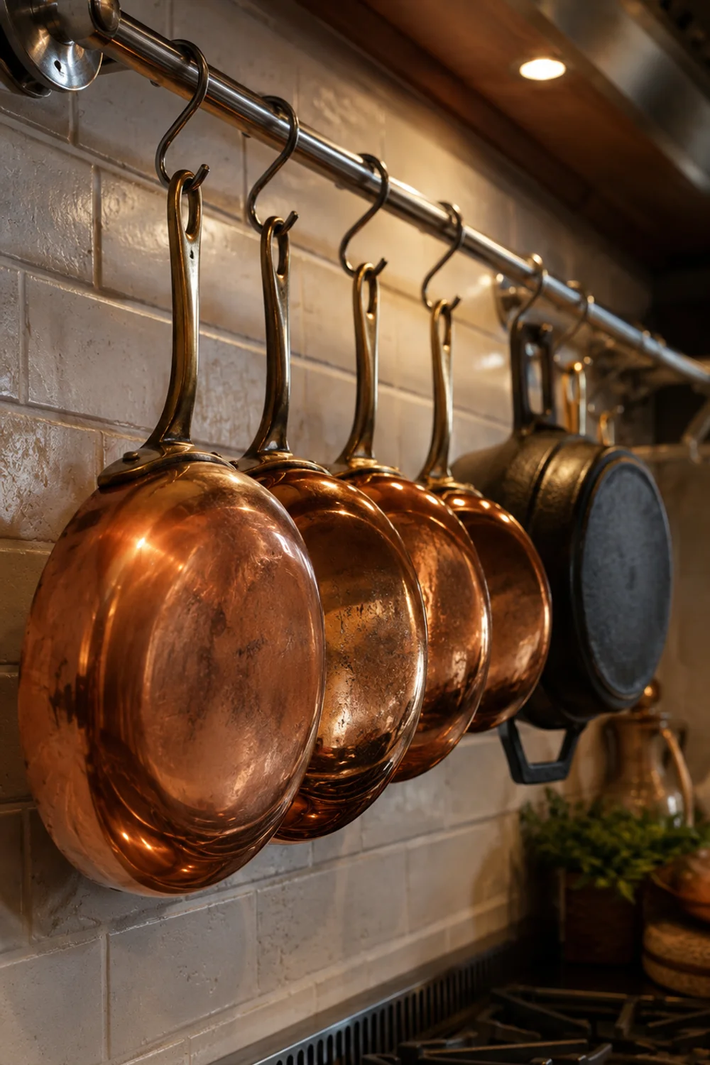
Cabinet space in a small kitchen is almost always the first thing to run out, and pots and pans are usually the culprits, stacking awkwardly and taking up disproportionate room relative to how often any single piece gets used. A wall-mounted pot rail solves this by moving cookware off the shelf entirely and onto open display, which frees cabinet real estate while also giving the room a layer of texture that flat cabinet fronts can’t provide on their own.
The logic works on two levels at once. Practically, hanging pots vertically along a rail uses wall space that would otherwise sit empty above the stove or a counter run, space that isn’t competing with anything else for storage. Visually, well-worn copper or matte black cookware hanging in view reads as intentional rather than cluttered, the same way open kitchens in professional restaurants use hanging pots as both function and atmosphere. It turns necessary objects into the room’s decor rather than hiding them.
A rail mounted slightly below eye level, roughly six to eight inches above the stove’s splash zone, keeps pots reachable without them becoming a hazard, and S-hooks let you rearrange the arrangement seasonally as your most-used pieces change.
Grouping pans by size rather than color creates a cleaner visual rhythm along the rail.
Picture a galley kitchen where the single overhead cabinet above the stove had been packed floor to ceiling with pots stacked three deep, meaning the bottom pan was never once retrieved without unstacking the other two. Replacing that cabinet with a rail freed the entire upper cabinet for dishware instead, while the pots themselves became the most visually interesting part of the wall, catching light differently depending on the time of day.
The deeper principle is that storage doesn’t always need to be concealed to feel organized; sometimes it needs to be seen. This overlaps beautifully with How to Create a Clutter-Free Kitchen You Actually Enjoy, which explores how visible order, not just hidden storage, is often what makes a kitchen feel calm rather than chaotic. A pot rail is one of the clearest examples of that idea in physical form.
5. A Built-In Banquette That Replaces Chairs With a Room
 Save it
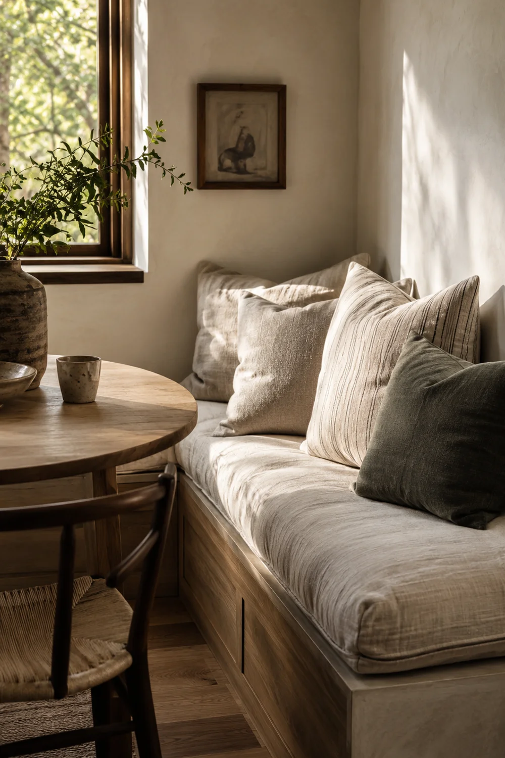
Freestanding dining chairs eat floor space in a way that’s easy to underestimate until you try to pull one out in a narrow kitchen and realize there’s nowhere for it to go. A built-in banquette, a bench seat fitted against a wall or tucked into a corner, solves this by removing the need for chairs to be pulled away from the table entirely on at least one side, which reclaims walking space that a full chair rotation would otherwise require.
The spatial math is what makes this work. A chair needs roughly two feet of clearance behind it to be usable, multiplied by however many chairs surround the table. A bench fixed against a wall needs none of that clearance on its side, since diners simply slide in rather than pulling a chair backward. In a kitchen where the dining area shares space with a walkway to the stove or fridge, this single change can be the difference between a cramped pinch point and a room that flows.
Corner banquettes work especially well in awkward, underused nooks, the kind of dead space beside a window that’s too small for a full table setup but too large to ignore. A cushioned bench there converts wasted square footage into genuine seating.
A removable, washable cover matters more here than in most upholstery decisions, given how close the bench sits to daily meals.
Consider a kitchen with an L-shaped dead corner beside the back door, too narrow for a full four-chair table but wide enough for a bench along one wall. Adding a banquette there with a small round table and just two chairs on the open side turned that corner into the kitchen’s most-used seat, the spot where morning coffee actually happens, while freeing the rest of the room for cooking traffic that previously had to detour around chair legs.
The broader lesson is that seating doesn’t have to be freestanding to feel inviting. A banquette built into the architecture of the room reads as more permanent, more intentional, and often more comfortable than a matching chair set, precisely because it was designed for that exact corner rather than dropped into whatever space was left over.
6. Curved Cabinetry Corners That Let You Move Through the Room
 Save it
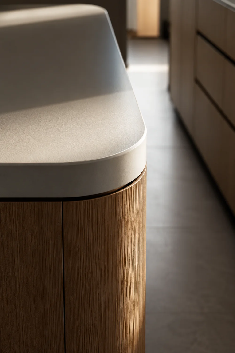
Sharp, ninety-degree cabinet corners are one of the most common casualties of a small kitchen, catching hips and forearms in a way that larger kitchens simply have more room to avoid. Rounded or curved cabinet edges, particularly on an island end or a peninsula corner, solve a real physical problem while also softening the overall geometry of a room that’s otherwise built from hard right angles: countertops, appliances, cabinet fronts, all sharp lines competing for attention.
The functional case is simple. In a kitchen under one hundred square feet, the distance between an island corner and the opposite counter is often barely wide enough for one person to pass, and a squared edge turns that already-tight gap into a genuine hazard. A curved corner effectively adds an inch or two of usable clearance without changing the island’s footprint at all, because the rounded profile pulls the sharpest point of contact away from the walking path.
Visually, a single curved element in an otherwise rectilinear kitchen also does more than its size suggests. It interrupts the repetition of straight lines running throughout the cabinetry, countertop edge, and appliance fronts, giving the eye one point of relief that reads as considered rather than accidental.
Picture a narrow galley kitchen with an island so close to the opposite counter that guests routinely bump the corner reaching for the fridge. Rounding just that one corner during a cabinet refacing project, without touching the island’s overall size, eliminated the daily collisions and, unexpectedly, became the detail visitors noticed first, the one element that made the kitchen feel custom rather than standard-issue.
This is a reminder that small-space design often comes down to solving one specific physical friction point rather than redesigning the whole room. A rounded corner costs little relative to a full renovation but addresses a problem that everyone who uses the kitchen encounters multiple times a day, which is exactly the kind of return on effort worth prioritizing in a compact layout.
7. A Slim Pull-Out Pantry That Claims the Forgotten Gap
 Save it
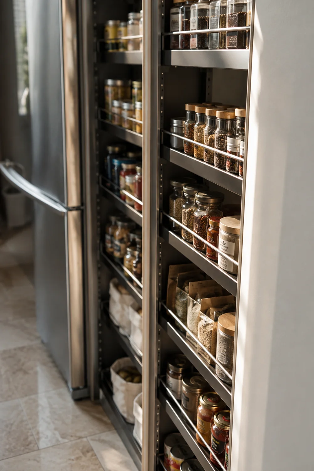
Nearly every small kitchen has a narrow, awkward gap somewhere, often between the fridge and the wall or beside the stove, too tight for any standard cabinet but too wide to write off entirely. A slim pull-out pantry tower is built specifically for that dead zone, sliding out fully to reveal shelving on both sides and turning six or eight wasted inches into genuine, accessible storage that a swinging cabinet door could never fit into that same space.
The mechanism depends entirely on the pull-out mechanism rather than the cabinet’s width. Because the entire unit slides forward on rails rather than opening outward like a door, it can be as narrow as six inches and still deliver two full faces of shelving, since both sides become accessible once it’s extended. A conventional cabinet that shallow would be nearly useless, but a pull-out design turns depth into storage rather than relying on width.
These units work best filled with items you reach for often but don’t want visible: spice jars, canned goods, snack items. Because the whole tower rolls forward, nothing gets lost at the back the way it would in a deep, fixed shelf, which is the usual failure point of narrow storage.
Adjustable shelf heights let the tower adapt as your pantry staples change over a season.
Picture a kitchen where a seven-inch gap beside the refrigerator had sat empty for years, collecting dust and the occasional stray broom. Fitting a slim pull-out tower into that exact space added the equivalent of a small extra pantry cabinet without removing a single inch of existing counter or cabinet elsewhere in the room, effectively creating storage from nothing. If your counter styling still feels crowded after a change like this, 15 Minimalist Kitchen Counter Styling Ideas You’ll Love covers how to edit what stays visible once storage catches up with what you own.
The larger point is that small kitchens are rarely as fully utilized as they appear. Gaps like this exist in most layouts, quietly wasted because they don’t match a standard cabinet size, and finding them is often more valuable than any amount of general decluttering.
8. A Scaled-Down Range Hood That Becomes the Room's Focal Point
 Save it
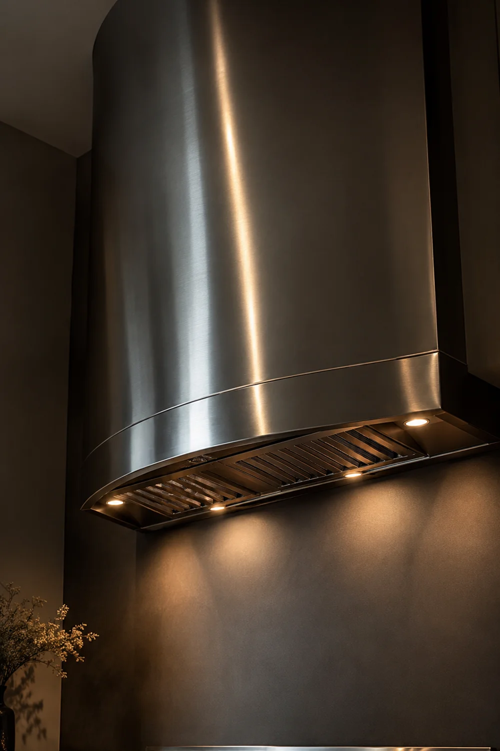
Most range hood decisions in small kitchens default to the smallest, most inconspicuous option available, on the assumption that a compact room needs everything in it to disappear. A sculptural, appropriately scaled hood, chosen deliberately rather than as an afterthought, does the opposite: it gives a tight kitchen a single confident focal point, the way a statement light fixture anchors a small dining nook, without requiring any additional floor space at all.
The reasoning is about hierarchy. A small kitchen has fewer surfaces competing for visual attention than a large one, which means whatever detail is boldest tends to define the whole room’s character. If every element is chosen to recede, the kitchen ends up feeling generic rather than genuinely minimal. A curved, wall-mounted hood in a material like brushed or matte stainless gives the eye a clear place to land above the stove, the room’s natural gathering point, rather than leaving that space visually empty.
Scale matters more than finish here. A hood sized correctly for the range beneath it, typically matching or slightly exceeding the cooktop’s width, reads as intentional, while an undersized hood chosen purely to save visual weight often ends up looking like an oversight rather than a restrained choice.
A gently curved silhouette softens what is otherwise the most mechanical-looking object in the room.
Consider a compact kitchen where the builder-installed hood was a flat, recessed unit tucked into the cabinetry, functional but entirely forgettable. Swapping it for a curved, wall-mounted stainless hood sized to the full width of the range gave the stove wall a genuine focal point for the first time, the detail that photographs of the kitchen consistently centered on, even though nothing else in the room had changed.
This idea extends a principle worth applying elsewhere in a small kitchen: not every element benefits from shrinking to save space. Some details, chosen well and placed correctly, are more effective when given the confidence to be seen rather than minimized into the background.
9. A Drop-Leaf Table That Disappears When You Need the Floor
 Save it
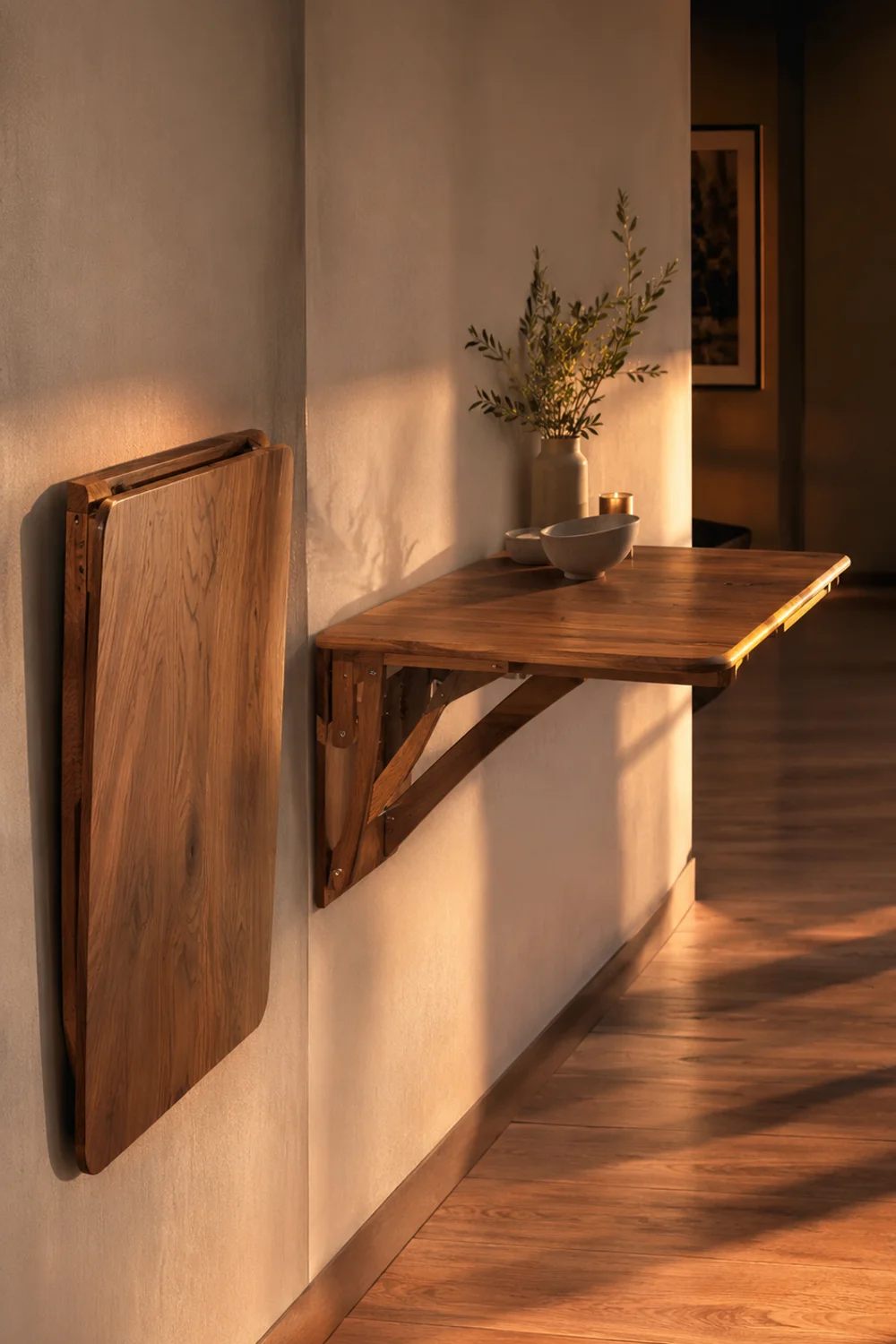
A full-size dining table is often the single biggest space commitment in a small kitchen, permanently claiming floor area whether it’s mealtime or three in the afternoon with nobody home. A drop-leaf table, with hinged sides that fold down against the central support when not in use, solves this by shrinking to a fraction of its footprint the moment it isn’t needed, then expanding back to full size for actual meals without any assembly required.
The mechanism is mechanically simple but spatially significant. With both leaves down, a drop-leaf table can occupy as little as twelve to fourteen inches of depth against a wall, barely more than a narrow console table, while still opening to seat four when both sides are raised. This means the same piece of furniture serves two completely different roles depending on the hour, without requiring storage for a second object or any folding chairs stashed elsewhere.
Solid wood versions tend to outlast the mechanism stress of daily folding better than veneer or laminate, since the hinge points bear real weight repeatedly and a lower-quality material will eventually warp or loosen at exactly that stress point.
Choosing a table with a drawer built into the apron adds a small amount of storage that a folding table wouldn’t otherwise offer.
Picture a studio apartment kitchen where a fixed table permanently blocked the path to the stove, forcing an awkward sideways shuffle every time someone cooked. Replacing it with a drop-leaf model against the same wall meant the table could sit folded flat most of the day, restoring the full walking path, then unfold in under a minute when dinner guests arrived, seating four where the fixed table had barely seated two comfortably.
The underlying idea connects back to nearly everything else in this guide: small kitchens benefit more from furniture and fixtures that adapt to different moments than from furniture chosen for a single static use. A table that changes shape, like a cart that rolls or cabinetry that reads deeper than it is, effectively gives you more kitchen than the square footage alone would suggest.
This same instinct for reclaiming space extends upward too, and once your floor plan finally has room to breathe, Above Fridge Styling Ideas for a Beautiful and Organized Kitchen shows how the vertical zones above your cabinets can carry their own quiet share of the load.
Common Mistakes to Avoid
1. Shrinking everything to save visual space
The instinct in a small kitchen is to make every object as small and inconspicuous as possible, but this often backfires, leaving the room feeling generic rather than genuinely compact. A confidently scaled hood or a bold two-tone cabinet choice can do more for the room’s character than a dozen small, cautious decisions.
2. Choosing fixed furniture over flexible pieces
A permanent island or a full dining table locks a small kitchen into one configuration for every task, whether it’s cooking for one or hosting six people. Rolling carts, drop-leaf tables, and banquettes that adapt to the moment consistently outperform fixed furniture in genuinely tight footprints.
3. Ignoring dead gaps between appliances
The narrow strips beside a fridge or stove are easy to write off as unusable, but they’re often exactly wide enough for a slim pull-out pantry or a narrow shelf. Overlooking these gaps means leaving real storage capacity unclaimed simply because it doesn’t match a standard cabinet width.
4. Treating pot racks and open storage as clutter
Hanging pots or open shelving can feel exposed compared to closed cabinetry, but hiding everything away often means the kitchen loses texture and personality along with the mess. Thoughtfully arranged open storage, grouped with intention, reads as designed rather than disorganized.
5. Matching cabinet and wall tones too closely
A monochrome kitchen can feel serene in a large room, but in a small one it frequently flattens the space, removing the visual cues that help the eye judge depth and distance. Some degree of tonal contrast, whether through two-tone cabinetry or a single bold material choice, keeps a compact kitchen from reading as cramped.
Frequently Asked Questions
Do small kitchens need to stay all-white to feel bigger?
No, and this is one of the more persistent myths in small-space design. While pale tones do reflect more light, an all-white kitchen with no tonal variation can actually flatten the room and make it harder for the eye to judge depth. A touch of contrast, whether through two-tone cabinetry or a single deeper accent, often reads as more spacious than uniform white.
Is a rolling island really as sturdy as a fixed one?
A quality rolling island with locking casters and a solid wood or butcher block top can handle everyday prep work without issue, though it isn’t meant to replace a heavy-duty butcher’s block for constant chopping. The tradeoff is flexibility: you gain the ability to reposition or store it entirely, which a fixed island can never offer, in exchange for slightly less stability during the heaviest tasks.
How do I know if my kitchen has a usable dead gap?
Look for any space beside the fridge, stove, or at the end of a cabinet run that’s wider than four inches but narrower than a standard eighteen-inch cabinet. These gaps are usually invisible because nothing standard fits them, but slim pull-out towers are built specifically for that range, and even a six-inch gap can become genuine pantry storage once measured properly.
Will a banquette make my kitchen feel more or less open?
A built-in banquette almost always opens up floor space compared to a full set of freestanding chairs, since it eliminates the clearance a chair needs to slide back from the table. The bench itself takes up a fixed footprint, but the walking path around it becomes noticeably more generous, which is often the more immediately felt change in a tight kitchen layout.
Final Thoughts
A small kitchen rewards specific decisions more than sweeping ones. Swapping a fixed island for a rolling cart, claiming one narrow dead gap with a pull-out pantry, or letting a single hood become the room’s focal point all do more collective work than a full renovation ever could, and each change can be made on its own timeline.
None of these ideas require giving up on beauty in exchange for function. A glossy backsplash that bounces light, a pot rail that turns cookware into display, a drop-leaf table that disappears when it isn’t needed: each one solves a real spatial problem while making the kitchen feel more finished, not less considered, than a larger space might.
If any of these ideas caught your eye, save this guide to come back to before your next kitchen update. And once storage and layout feel settled, take a slower look at the vertical zones you’ve been overlooking, since even the smallest kitchens still have space above eye level left to make their own.
This post contains affiliate links. I may earn a small commission at no extra cost to you.
Get cozy inspiration delivered to your inbox.
✓ 14-page beautifully designed ebook
✓ Cozy decorating ideas
✓ Practical room-by-room inspiration
You’re in! 🎉
Thanks for joining the NestFlowHome community!
Your free ebook is already on its way to your inbox. If you don’t see it within a few minutes, please check your Promotions or Spam folder.
Join the NestFlowHome community for weekly decorating inspiration.

Timeless home decor ideas and slow living inspiration for a calm, beautiful life.