
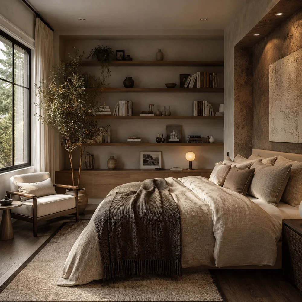
Bedroom Shelf Styling Ideas Designers Love Worth Copying Right Now
By Emily | July 27, 2026
Most people hang a shelf, load it with whatever was already sitting on the dresser, and call it done. Then they wonder why the wall looks cluttered instead of curated, why the shelf reads as storage overflow rather than a considered design moment. The truth is that shelf styling is one of the most overlooked skills in bedroom design, and it has almost nothing to do with what you own and everything to do with how you arrange it.
The instinct to fill every inch of a shelf comes from a scarcity mindset left over from smaller homes and fewer belongings. But a shelf that’s fully loaded edge to edge doesn’t look abundant, it looks anxious. Professional stylists work from the opposite instinct: they treat the shelf as a composition first, a storage solution second, and that reversal changes everything about how the finished wall feels.
This guide walks through nine specific styling techniques that designers return to again and again, from height rhythm and scale contrast to the less obvious tricks like painting a shelf’s back panel or deliberately leaning objects instead of standing them upright. Each idea is something you can execute in an afternoon with what you already own or a handful of inexpensive additions.
Read through all nine before you touch your own shelves, because several of these techniques work best in combination. A shelf styled with only one principle applied often looks flat, while two or three layered together is what actually produces that effortless, editorial look you’re after.
1. Height Rhythm and the Rule of Odd-Number Groupings
 Save it
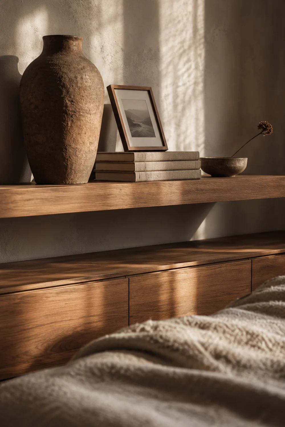
A shelf styled with objects of identical height reads as a straight line, and a straight line is the fastest way to make an arrangement look accidental rather than intentional. Height rhythm is the practice of deliberately varying the vertical scale of everything you place on a shelf, so the eye moves up and down instead of gliding flat across the surface. This single adjustment is responsible for more of the “designer” feeling in shelf styling than any specific object choice, because it’s a structural decision rather than a decorative one.
The technique works by grouping items in odd numbers, typically three, and assigning each a distinct height tier: one tall anchor, one medium-height piece, and one low, grounding object. The tall piece might be a vase or a stack of books, the medium piece a framed photograph propped rather than hung, and the low piece a small dish or paperweight tucked in front. Grouping in threes creates a natural visual triangle that the eye reads as complete, whereas pairs tend to look like leftovers and groups of four or more start to feel busy without a clear focal point.
Where this gets more nuanced is when a shelf has multiple tiers, because the rhythm needs to shift between them rather than repeat identically on every level. If the top shelf leads with height on the left side, the shelf below should lead with height on the right, so the overall composition zigzags gently down the wall instead of stacking three identical triangles directly on top of each other, which starts to look like a formula rather than a considered arrangement.
Picture a narrow floating shelf above a bedroom dresser in a rental apartment, where the resident can’t hang anything heavier than a few picture hooks. A tall textured vase anchors the left third, a stack of three hardcover books lies flat in the center supporting a small framed print leaned against the wall, and a low ceramic dish sits at the far right holding a single dried stem.
This same height-rhythm logic is the reason hotel styling always photographs better than a home dresser styled with everything the same size. It isn’t about owning fewer or better things, it’s about assigning each object a role in a height sequence before you decide where it physically sits, which is a planning step most people skip entirely in favor of just setting things down where there’s space.
2. Books as a Building Material

 Save it
Books get treated as an afterthought in most bedroom styling, tucked wherever there’s leftover space once the “real” decor is arranged. Designers flip that order entirely and treat books as structural building material first, decorative content second, which means the color of the spine or the size of the volume matters more in the moment of arranging than what’s actually printed inside it. This reframing is what separates a shelf that looks like a working library from one that looks like a magazine spread, and for bedroom styling, the magazine-spread version is almost always the goal.
The core technique is alternating orientation: some books stand vertically with spines facing out, while others lie flat in stacks of two or three, creating a riser that lifts a smaller object like a candle or a small frame to a more prominent height. A stack of three flat books instantly becomes a plinth, solving the height-rhythm problem from the previous section without buying a single new object. This is one of the fastest, cheapest styling moves available because almost every bedroom already has books somewhere in the house waiting to be repurposed this way.
Spine color deserves its own consideration, because a shelf with wildly mismatched, brightly colored spines competes with everything else on the surface for attention. The fix isn’t buying new books to match a palette, which feels performative and expensive. Instead, turn the loudest spines to face inward toward the wall so only the neutral page edges show, a trick editorial stylists use constantly that costs nothing and takes about thirty seconds per shelf to execute.
Consider a small bedroom bookshelf crowded with a mix of paperback novels, a few oversized art books, and a stack of old magazines. Rather than removing half the collection, the stylist’s move is to pull the three largest, most neutral-toned hardcovers to form a flat stack at one end, turn the brightly jacketed paperbacks spine-in along the back row, and let one single art book stand upright, angled slightly, as the tallest element in that grouping.
Once books are treated as a tool rather than a category to be minimized or hidden away, an entire shelf can be restyled using only what’s already stacked on the nightstand or floor. It’s a reminder that good shelf styling is frequently a rearranging problem rather than a shopping problem, and the objects capable of solving it were probably already in the room the whole time.
3. The Leaning Layer

 Save it
Everything on a typical bedroom shelf tends to stand perfectly upright, which is functional but visually stiff, like a row of soldiers rather than a curated moment. The leaning layer technique introduces deliberate diagonal lines by propping a framed piece, a small tray, or even a flat woven object against the back wall of the shelf instead of hanging it or standing it flush. That single diagonal against an otherwise vertical arrangement is what gives a shelf the slightly undone, lived-in quality that makes editorial spaces feel real rather than staged.
Mechanically, the leaning object should sit toward the back of the shelf, angled against the wall at roughly ten to fifteen degrees, with smaller objects arranged in front of its base rather than beside it. This creates layered depth because the eye reads the leaning piece as background and the smaller foreground objects as a separate visual plane, doubling the perceived depth of a shelf that might only be six or eight inches deep. Flush, upright arrangements can’t achieve this same sense of layering no matter how carefully the objects are chosen.
Not every leaning object needs to be art. A small woven tray, a flat metal plate displayed on its edge, or even a folded textile can perform the same diagonal function, which matters for renters or minimalists who don’t necessarily want framed prints as their primary decorative language. The key constraint is scale: a leaning object taller than about two-thirds of the shelf’s available height starts to dominate rather than support the arrangement around it, so keep the leaning piece proportionate to the objects it’s meant to be backing up.
Imagine a guest bedroom shelf above a daybed where the homeowner inherited a small unframed watercolor with sentimental value but nowhere obvious to hang it. Propped leaning against the shelf’s back wall, with a low stack of two books and a small brass object positioned in front of its lower edge, the watercolor becomes the visual anchor of the entire shelf without a single nail going into the wall, which also means it can be repositioned or swapped out in seconds whenever the mood changes.
The leaning layer is ultimately about permission: permission to treat a shelf as a place where things rest rather than a place where everything must be permanently mounted and precisely level. That looseness is exactly what separates a shelf that feels like a display case from one that feels like a genuinely inhabited part of the room.
4. Negative Space as an Active Design Choice
 Save it
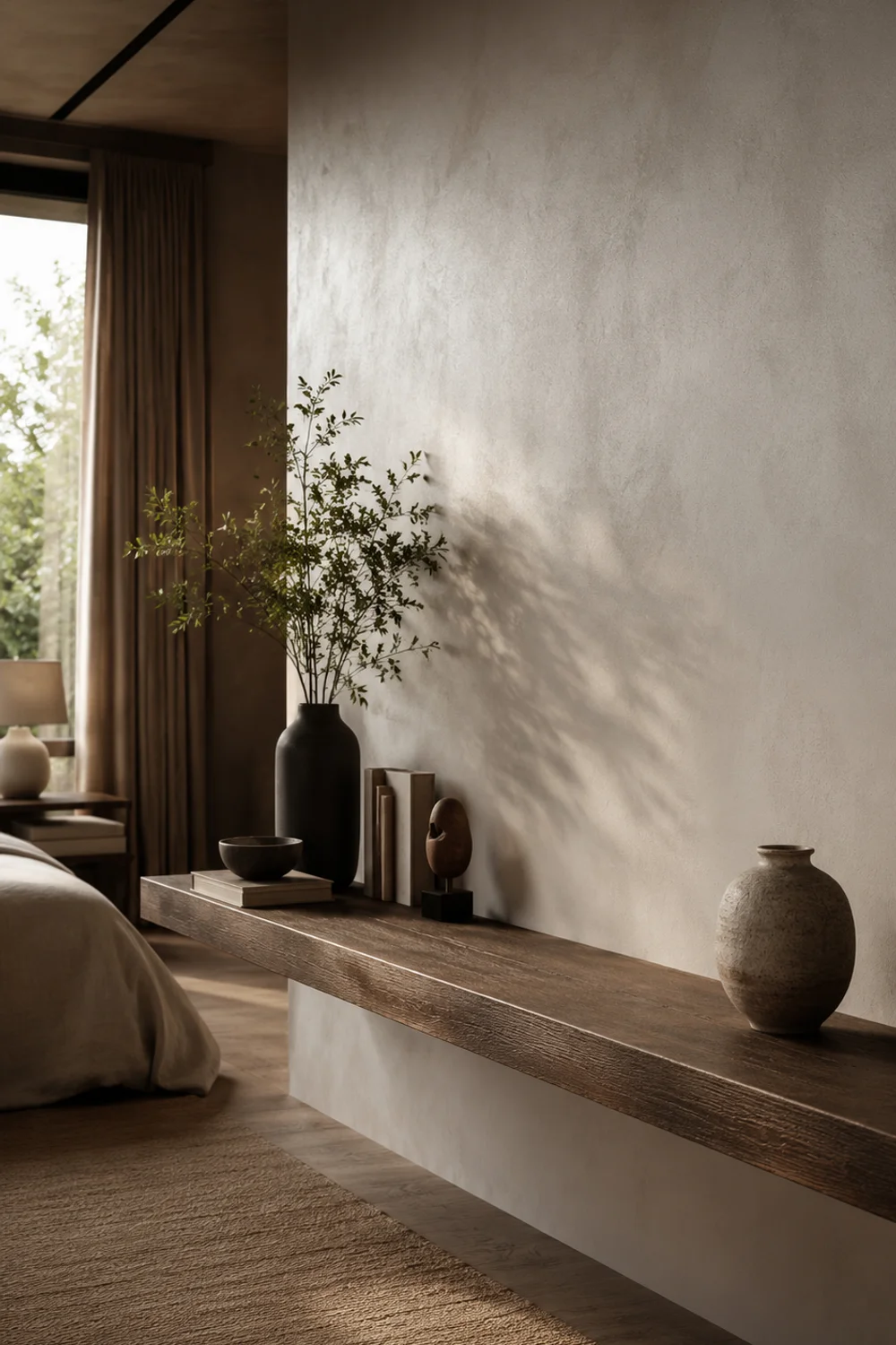
The instinct to fill a shelf completely is one of the most consistent styling mistakes in bedroom design, and it comes from treating empty space as wasted space rather than as an active compositional element. Designers use negative space the same way a photographer uses framing, letting the empty sections of a shelf give the eye somewhere to rest between groupings. A shelf that’s roughly one-third empty at any given time almost always reads as more expensive and more considered than one loaded to capacity, regardless of what the objects themselves actually cost.
The practical rule is to identify one clear empty zone per shelf tier, usually between one-quarter and one-third of the total surface, and protect it deliberately rather than letting objects creep in over time. This is harder than it sounds, because the natural tendency when adding a new item to a bedroom is to place it on the nearest open surface, which is almost always a shelf. Treating that empty zone as off-limits, the same way you’d treat a reserved parking space, keeps the arrangement from slowly filling in and losing its structure over a few months of ordinary life.
Where negative space gets more sophisticated is in how it interacts with grouping size. A shelf with one large grouping and one generous empty stretch reads as intentional, while a shelf with the same objects spread evenly across the entire surface reads as merely organized. The empty stretch does double duty: it gives the grouping room to breathe, and it signals to anyone looking at the shelf that the arrangement was chosen rather than simply accumulated, which is a distinction most people can sense even if they can’t articulate why.
Picture a bedroom shelving unit in a small apartment where the resident initially spread six or seven small objects evenly across a four-foot span, evenly spaced like museum placards. Consolidating everything into a single tight grouping on the left two feet, leaving the right half of the shelf entirely bare except for one low object near the far edge, transformed the same collection of belongings into something that looked deliberately edited rather than simply displayed.
Negative space asks for restraint in a culture that generally rewards more, which is exactly why it reads as luxurious when executed well. It’s a design decision that costs nothing to implement and is available to anyone, regardless of budget, the moment they’re willing to leave a section of shelf intentionally, visibly empty.
5. Scale Contrast: One Oversized Anchor Piece
 Save it
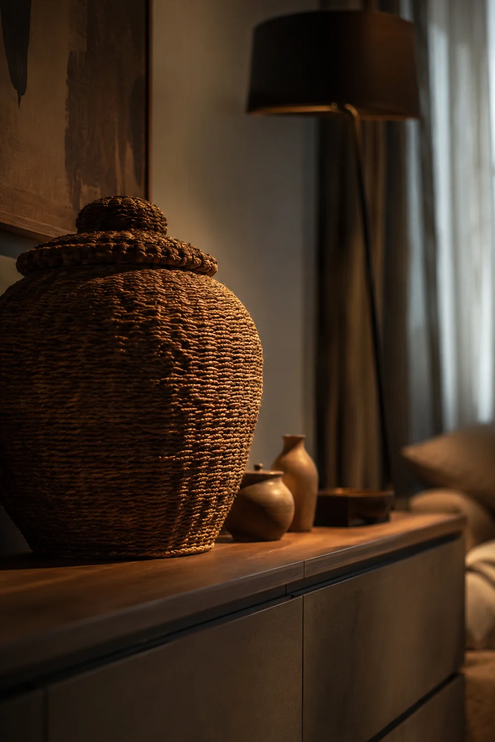
A shelf styled entirely with small, similarly sized objects tends to disappear visually, no matter how thoughtfully each individual piece was chosen, because nothing on the shelf commands enough presence to catch the eye from across the room. Scale contrast solves this by introducing one deliberately oversized object, something noticeably larger than everything else on the shelf, which functions as the single anchor point the rest of the arrangement builds around. This is a different mechanism than height rhythm, because scale contrast is about mass and volume rather than vertical positioning alone.
The oversized piece doesn’t need to be expensive or rare, it needs to be disproportionately large relative to its neighbors, which is often achieved simply by choosing the biggest object available in a category rather than the average-sized one. A single large vessel, an oversized woven basket used as sculpture rather than storage, or even a stack of the largest available coffee table books can all perform this anchoring function. The rule of thumb designers use is that the anchor piece should occupy roughly a third to half of the shelf’s visual weight on its own, with everything else arranged as clearly secondary in scale.
One common mistake is choosing an oversized piece that matches the color and texture of everything around it too closely, which flattens the intended contrast and makes the large object read as just another item rather than a focal point. The anchor works best when it differs from its neighbors in at least one dimension beyond size, whether that’s a rougher texture, a deeper color, or a more matte finish, so the eye has multiple reasons to land there first before moving on to the smaller supporting objects.
Consider a wide bedroom shelf above a low dresser where the previous arrangement featured five or six small trinkets of roughly similar size, none of which held any particular visual weight. Swapping in one oversized woven vessel at one end, sized to occupy nearly a quarter of the shelf’s length on its own, immediately gave the arrangement a focal point, and the smaller original objects, regrouped in front of and beside it, suddenly read as intentional accents rather than clutter.
Scale contrast is a reminder that variety in size does more visual work than variety in quantity. A shelf with one genuinely large object and three or four small ones will almost always outperform a shelf with eight objects of similar modest size, because the large piece gives the composition a hierarchy that the eye can navigate at a glance.
6. Painting the Shelf Backing: A Contained Color Moment
 Save it
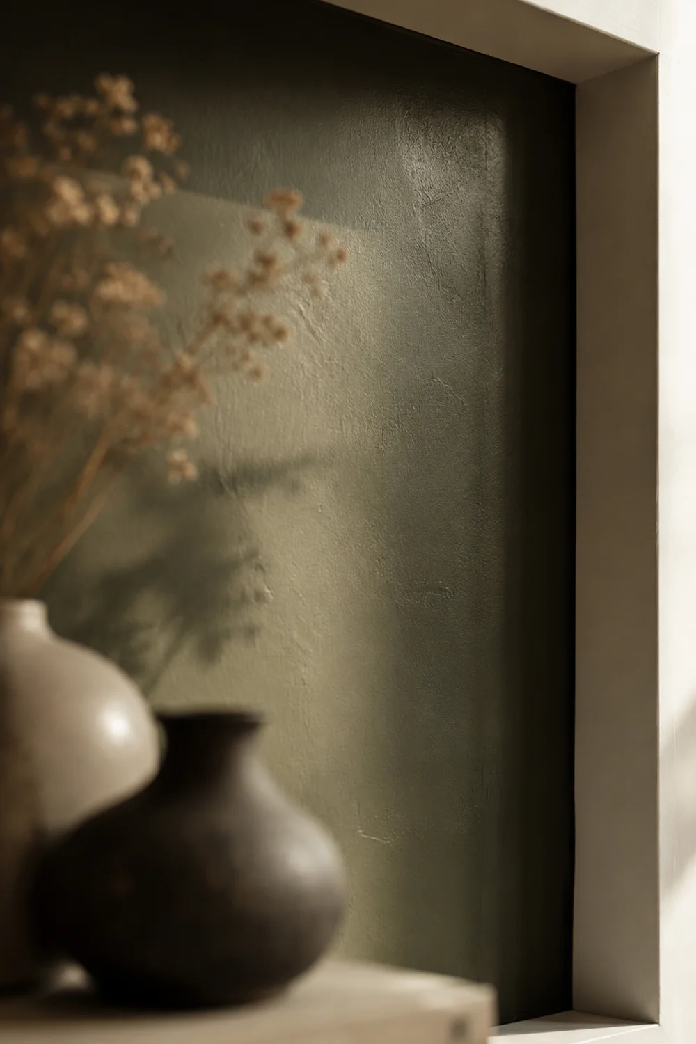
Most bedroom shelving is styled as though the shelf itself is invisible, a neutral platform that exists only to hold objects, when in fact the interior surface of a shelving unit, particularly the back panel, is one of the most underused opportunities for color in the entire room. Painting or papering that back panel a saturated, contrasting tone turns the shelf into a contained color moment, giving the room a pop of personality in a small, controlled area without the commitment of an accent wall spanning the entire surface. Because the color is confined to the shelf’s interior, it can be far bolder than most homeowners would choose for a full wall.
The mechanics are straightforward: measure the interior back panel of a bookshelf or built-in, choose a paint sample or a small offcut of removable wallpaper in a color that contrasts with the room’s overall neutral palette, and apply it only to that recessed surface, leaving the shelving frame and everything around it untouched. Because the painted area is small, it dries and can be reworked quickly, making it one of the lowest-commitment ways to introduce a strong color into an otherwise neutral bedroom, and it’s fully reversible for renters using a removable paper product instead of paint.
This technique works especially well on shelving units with visible depth, where the recessed back panel sits noticeably behind the front edge of each shelf, because the shadow line created by that depth makes the color read almost like a framed piece of art rather than a flat painted surface. Open floating shelves without any back panel obviously can’t use this trick directly, but a small piece of contrasting fabric or paper pinned flush to the wall behind the shelf’s mounting point can approximate the same effect.
Picture a bedroom built-in bookshelf originally painted the same off-white as the surrounding wall, making the objects on the shelves feel slightly lost against a background with no contrast of its own. Repainting just the interior back panel in a deep, muted color while keeping the shelf frame and trim in the original white gave every object placed in front of it, from ceramics to books, a visible outline it never had before, and the change took a single afternoon with a small foam roller.
A concept related to this idea of restrained, considered pairing across a room appears in How to Create Warm Neutral Bedroom Ideas That Will Never Go Out of Style, which explores how a single deliberate contrast point can anchor an otherwise quiet palette. The shelf backing is simply that same logic scaled down to a few square feet, which makes it approachable even for people who feel nervous committing to color anywhere else in the bedroom.
7. The Working Shelf: Merging Function and Display

 Save it
A shelf that holds only decorative objects looks beautiful in photographs but often ends up ignored in daily life, because the things a person actually reaches for, a water glass, reading glasses, a phone charger, get relegated to the nightstand while the shelf becomes a museum case nobody touches. The working shelf approach deliberately integrates one or two genuinely functional objects into the styled arrangement, chosen for their material and form as carefully as any purely decorative piece, so the shelf earns daily use instead of existing purely for show.
The technique starts by identifying which small functional items a person reaches for near the bed or dresser most often, then upgrading the material or finish of just that item rather than hiding it away. A plastic alarm clock swapped for a wood-cased or brass version, a plain water glass replaced with a carafe and tumbler set with real sculptural presence, both allow function to sit openly on a styled shelf without breaking the visual language of the rest of the arrangement. The goal isn’t concealment, it’s upgrading the object enough that it belongs in the composition on its own merits.
This differs meaningfully from simply decluttering a nightstand, because the working shelf treats functional objects as design elements from the outset rather than as clutter to be minimized or hidden in a drawer. It requires choosing, in advance, which one or two daily-use items are worth the investment of a nicer material, and being honest that everything else genuinely functional, chargers, medication, tissues, probably still belongs in a drawer rather than on display, however good it might look styled.
Picture a small bedroom shelf beside the bed in an apartment too tight for a full nightstand, where the resident had been setting a plastic water bottle and a phone charger directly on an otherwise carefully styled surface every night, undoing the arrangement each morning. Introducing a glass carafe with a matching tumbler and a small dish specifically sized to hold the charging cable turned that nightly habit from a disruption into an extension of the shelf’s existing material story, brass and glass echoing the finishes used elsewhere in the room.
The working shelf is ultimately an argument against separating “styled” from “used” spaces in a bedroom, since most people don’t actually maintain two completely different zones for beauty and function. Choosing well-made versions of the objects a person genuinely reaches for every day means the shelf stays looking intentional even after it’s been touched, moved, and used, which is the real test of whether a styling choice will survive contact with ordinary life.
8. Repetition as a Styling Rule
 Save it
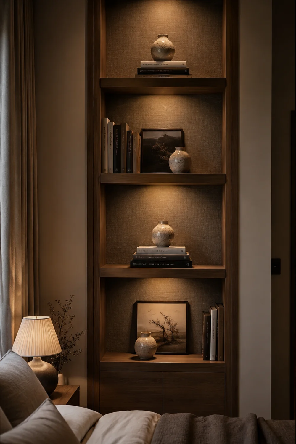
Buying one striking object and hoping it carries an entire shelf is a common instinct, but designers often reach for the opposite move: choosing the same object in two or three different sizes and repeating it across a single shelf or between adjacent tiers. Repetition creates a visual echo that reads as far more intentional than a collection of unrelated single pieces, because the eye recognizes the pattern and interprets it as a deliberate choice rather than a coincidence of what happened to be available.
The technique works best with objects that have a simple, recognizable silhouette, a rounded vase, a specific bookend shape, a particular vessel form, purchased or collected in a small graduated range of sizes. Placing the largest at one end of a shelf, the smallest tucked closer to a grouping of other objects, and a medium one bridging the gap creates a rhythm that functions almost like a visual sentence, with a clear beginning, middle, and end. This differs from simply owning matching decor, because the repetition is about a shared form across varied scale, not about buying an identical three-piece boxed set.
Repetition can also work across a full wall of shelving rather than within a single tier, with the same small object appearing once on each shelf level, spaced apart but consistent in material and shape. This creates a unifying thread that ties a multi-shelf unit together even when the surrounding objects on each tier are otherwise completely different, solving a common problem where a tall bookshelf ends up looking like several unrelated shelves stacked on top of each other rather than one cohesive piece of furniture.
Imagine a floor-to-ceiling bedroom bookshelf where four different tiers had each been styled independently over time, resulting in a wall that felt visually chaotic despite each individual shelf looking reasonable on its own. Introducing a single small ceramic object in the same glaze, one placed on each of the four tiers in a slightly different position, gave the eye a repeating anchor point traveling up the entire wall, and the shelf read as a unified composition for the first time since it was installed.
The layered, calm feeling this kind of quiet repetition produces overlaps with ideas explored in Scandinavian Cozy Bedroom Inspiration Ideas Worth Copying Right Now, where restraint and consistency across a room’s details do similar work at a larger scale. On a shelf, repetition is one of the cheapest ways to manufacture that same sense of calm cohesion, since it usually only requires buying multiples of something already affordable rather than sourcing anything rare.
9. Styling an Awkward Alcove or Corner Shelf
 Save it
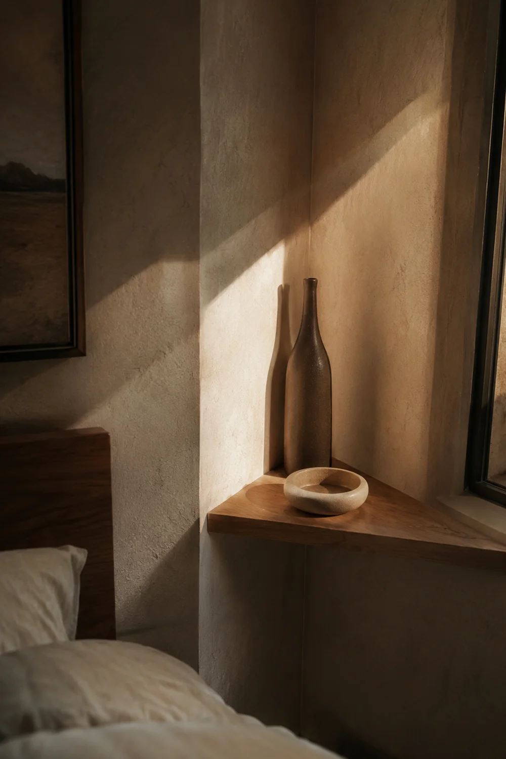
Not every bedroom offers a clean, wide, freestanding wall for shelving, and the corner or alcove shelf, tucked into an architectural nook beside a chimney breast or wedged into an oddly shaped recess, gets treated as a storage afterthought rather than a genuine styling opportunity. Designers approach these awkward spaces differently, using the corner’s inherent asymmetry as a feature rather than something to disguise, which means the styling rules that work on a wide, flat shelf need to be adapted rather than copied directly.
Because a corner shelf is viewed primarily from one angle rather than straight on, objects should be arranged with that single sightline in mind, with taller pieces positioned toward the back corner where the two walls meet, gradually stepping down toward the open front edge closest to the room. This creates a sense of the shelf receding into the architecture rather than fighting against its irregular shape, and it means the corner’s structural quirk actually becomes an asset for depth and layering rather than a limitation to work around.
Corner shelves also tend to be narrower than standard shelving, which means fewer objects need to carry more visual weight individually, making the scale-contrast and negative-space principles from earlier sections especially important here. A single well-chosen anchor object, positioned at the deepest point of the corner, paired with just one or two smaller supporting pieces toward the front, usually outperforms an attempt to fill the narrow surface with several small items competing for limited space.
Picture a small bedroom with an awkward triangular alcove created by a chimney breast, where a builder had installed a narrow corner shelf that had sat completely empty for years because nothing seemed to fit its shape properly. Placing one taller, narrow vessel at the deepest point where the walls meet, with a single small dish angled just in front of it near the open edge, finally gave that overlooked nook a reason to exist, turning what had been dead space into one of the more distinctive details in the room.
For readers dealing with limited bedroom square footage more broadly, The Best Aesthetic Closet Storage Ideas for Small Bedrooms tackles a related set of constraints around working with irregular or tight spaces, and several of its space-planning principles translate directly to awkward shelving nooks as well. An alcove shelf styled with intention rather than left empty out of uncertainty is often the detail visitors notice first, precisely because most bedrooms leave that kind of space unresolved.
A corner alcove often sits in shadow long before it sits empty, so once the shelf itself is styled, a similar attentiveness to how Bedroom Lighting Ideas That Define the Best Environment for Better Sleep treats overlooked corners of the room can determine whether that carved-out depth actually reads at night or simply disappears into the dark.
The same instinct that turns a dead triangular nook into a considered detail is worth carrying over to the bed itself, and 15 Layered Bedding Ideas That Look Like a Luxury Hotel You Will Absolutely Love shows how that same layering discipline, applied to textiles instead of objects, can give the room’s largest surface the same sense of intention you just gave its smallest one.
If the vessel anchoring your corner leans toward something with real age or patina, The Best Vintage-Inspired Bedroom Decor You Will See Everywhere offers a useful framework for choosing pieces that read as genuinely collected rather than merely placed.
Common Mistakes to Avoid
1. Styling every shelf tier identically
When a multi-tier shelf gets the exact same height rhythm, the same grouping size, and the same negative space ratio repeated on every level, the eye stops finding anything new to look at after the first tier. Vary the composition between levels, even slightly, so the whole unit reads as a considered sequence rather than one template copied downward.
2. Choosing objects for the shelf instead of for the room
Buying decor specifically labeled or marketed as “shelf decor” often results in a collection of small, forgettable trinkets with no real connection to anything else in the bedroom. The strongest shelf arrangements pull from objects that already have some relationship to the room’s materials, colors, or history, rather than starting from a blank slate at a home goods store.
3. Ignoring the shelf’s actual depth
A deep shelf styled as though it were shallow wastes the opportunity for the leaning-layer and depth-layering techniques that make an arrangement feel three-dimensional. Measure the available depth before planning an arrangement, and use the back two-thirds of a deep shelf for taller or leaning pieces rather than pushing everything flush to the front edge.
4. Overcorrecting into total minimalism
After learning that empty space matters, some people swing too far and leave a shelf almost entirely bare, mistaking absence for restraint. Negative space only reads as intentional when it’s balanced against at least one confident grouping elsewhere on the same shelf; total emptiness just looks unfinished or unused.
5. Forgetting to style at eye level from where the shelf is actually seen
A shelf styled while standing directly in front of it can look completely different once viewed from the doorway or from the bed, where most people actually experience the room. Step back and view the arrangement from the room’s main vantage points before considering it finished, since sightlines change which objects read as the visual anchor.
Frequently Asked Questions
How many objects should go on a single bedroom shelf?
There’s no fixed number, but most well-styled shelves work with somewhere between three and seven objects grouped rather than evenly spaced, with roughly a third of the surface left intentionally empty. Fewer than three tends to look sparse and accidental rather than minimal, while more than seven without any grouping logic usually reads as cluttered regardless of how nice the individual pieces are. The grouping structure matters more than the raw count.
Do all the objects on a shelf need to match in color or style?
No, and in fact shelves that match too precisely often look like a purchased set rather than a considered collection. What matters more than color matching is a shared sense of scale relationship and at least one repeated material or finish tying two or three pieces together, while everything else can vary more freely within that loose framework.
Can these techniques work on a single small floating shelf, not a full bookshelf?
Yes, and several of them, particularly height rhythm, the leaning layer, and negative space, were specifically designed with a single narrow shelf in mind rather than a full wall unit. Scale contrast and repetition require slightly more surface area to feel effective, so on a very narrow shelf, focus first on rhythm and negative space before attempting the others.
How often should a styled shelf be refreshed or rearranged?
There’s no strict schedule, but most stylists suggest revisiting a shelf every few months, less to change the objects entirely and more to reassess whether the height rhythm and negative space are still working as new items inevitably get added over time. A shelf that hasn’t been consciously edited in over a year has usually drifted back toward clutter without anyone noticing the gradual change.
Final Thoughts
Shelf styling rewards attention far more than it rewards spending, which is part of why it’s such a satisfying place to practice design instincts in a bedroom. Every technique covered here, from height rhythm to negative space to the leaning layer, works with objects most people already own, rearranged with more intention than they were the first time they landed on that surface.
The goal was never to memorize nine separate rules and apply all of them at once to every shelf in the house. Pick one or two that feel most relevant to the specific shelf giving you trouble, whether that’s an awkward corner nook or a floating shelf that always looks half-finished, and start there before layering in additional techniques.
Save the ideas that resonate most, and revisit this guide the next time a shelf in the house feels flat or overcrowded rather than considered. Small, deliberate adjustments made one shelf at a time tend to compound into a home that feels genuinely styled, rather than one that was decorated all at once and left untouched ever since.
This post contains affiliate links. I may earn a small commission at no extra cost to you.
Get cozy inspiration delivered to your inbox.
✓ 14-page beautifully designed ebook
✓ Cozy decorating ideas
✓ Practical room-by-room inspiration
You’re in! 🎉
Thanks for joining the NestFlowHome community!
Your free ebook is already on its way to your inbox. If you don’t see it within a few minutes, please check your Promotions or Spam folder.
Join the NestFlowHome community for weekly decorating inspiration.

Timeless home decor ideas and slow living inspiration for a calm, beautiful life.