
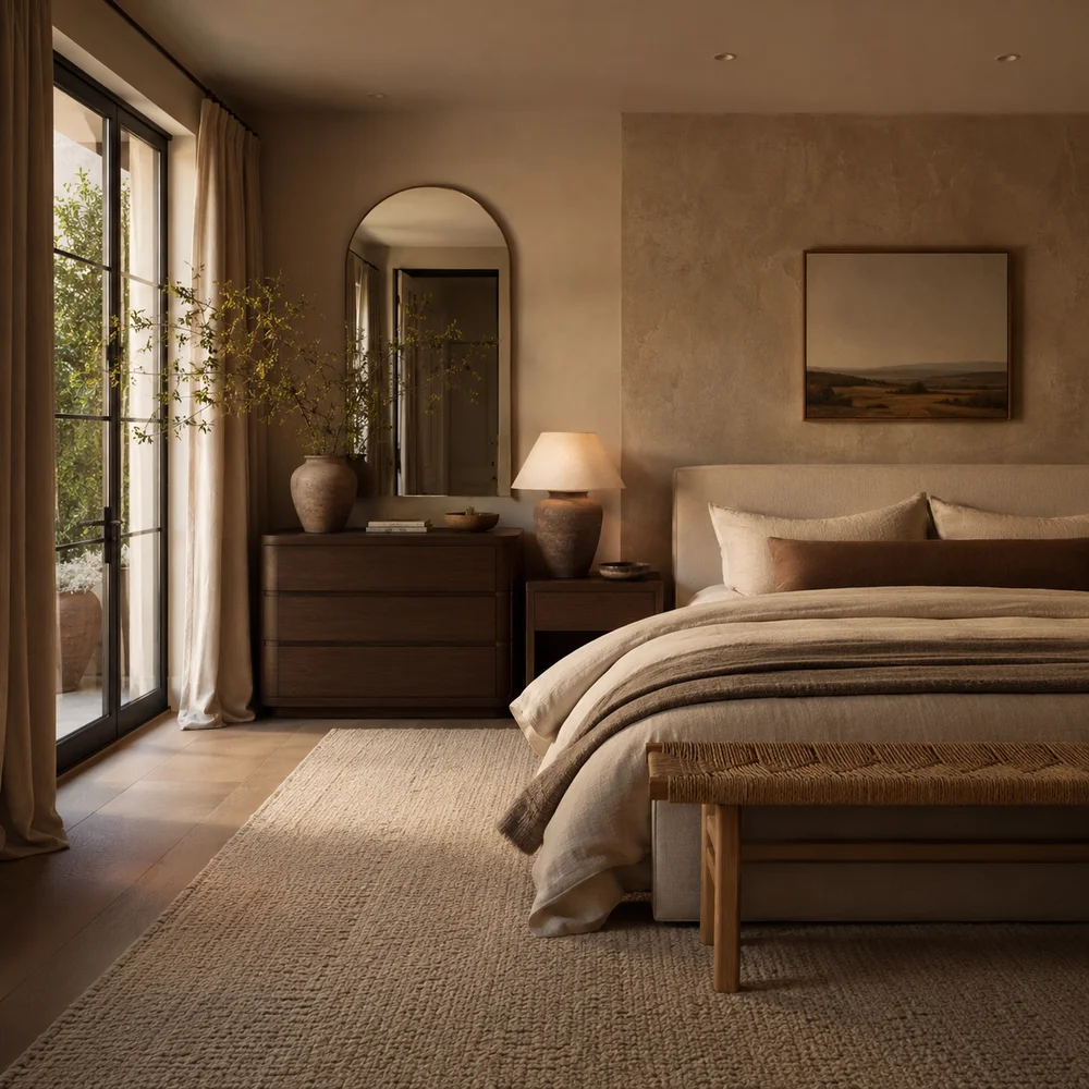
How to Create Warm Neutral Bedroom Ideas That Will Never Go Out of Style
By Emily | July 8, 2026
Most bedrooms described as “neutral” actually read as flat, cold, and strangely uninviting, and the reason has nothing to do with color choice and everything to do with execution. People assume neutral means safe, so they default to a single shade of white or gray, apply it everywhere, and wonder why the room feels more like a hotel hallway than a sanctuary. The truth is that a neutral palette without depth isn’t restrained — it’s unfinished.
A warm neutral bedroom isn’t the absence of color; it’s the presence of many quiet colors working together. Sand, oat, clay, bone, and soft taupe all read as “neutral” from a distance, but each carries its own undertone, temperature, and personality. The skill isn’t picking one — it’s layering several so the eye never quite settles, the same way a beautifully aged leather chair reads as one color but is actually dozens of shades in conversation with each other.
This guide walks through ten specific, testable techniques for building a warm neutral bedroom that reads as considered rather than default — from tonal layering and furniture silhouette to ceiling treatment, metal mixing, and the often-overlooked role of acoustic softness in how a room feels warm, not just looks it.
Use this as a working reference, not a checklist to complete in one weekend. Pick the two or three ideas that solve your bedroom’s specific problem first — whether that’s a cold north-facing window, boxy furniture, or a hard echo-y floor — and build outward from there. Warmth in a neutral room is cumulative, not immediate, and it rewards patience over a single dramatic purchase.
1. Tonal Layering: Building Depth Within One Neutral Family
 Save it
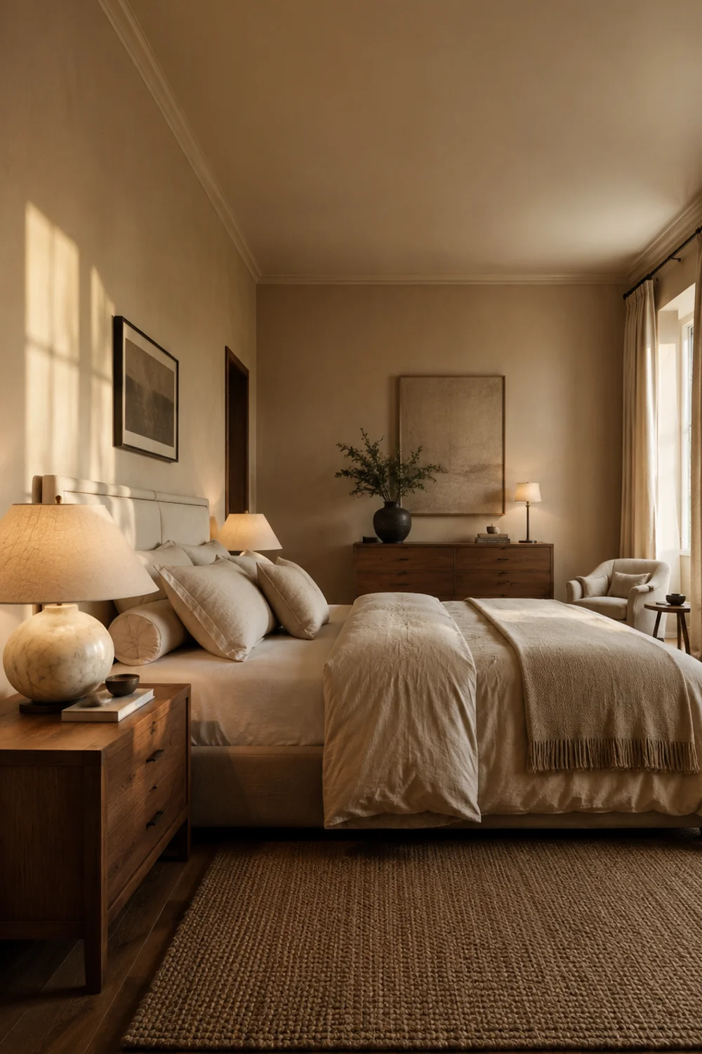
The single biggest mistake in a “neutral” bedroom is treating neutral as one color instead of a family of related tones. A wall in warm white, a bed frame in raw oak, and bedding in stark white cotton might all technically qualify as neutral, but stacked together they read as mismatched rather than intentional. Tonal layering means choosing three to five neutrals that share the same underlying warmth — think oat, sand, warm bone, and soft taupe — so that even subtle temperature shifts feel like they belong to the same conversation.
The mechanism is simpler than it sounds: undertone consistency. Warm neutrals lean yellow, pink, or orange at their base, while cool neutrals lean blue or green, and mixing the two families is what creates that flat, disjointed feeling even when every piece individually looks fine. Hold your wall paint swatch next to your bedding and your wood tones in daylight — if one looks noticeably pinker or grayer than the rest, that’s your mismatch, and it’s worth correcting before anything else in the room.
Variation matters here too. A bedroom doesn’t need five neutrals in equal measure; it needs a dominant tone doing 60 percent of the work, a secondary tone doing 30 percent, and an accent doing the rest. An alabaster table lamp with a fabric drum shade placed on a nightstand can carry that accent role beautifully, introducing texture without disrupting the tonal family.
Picture a real room: warm oat walls, a taupe upholstered bed base, sand-toned linen bedding, and a single walnut nightstand. None of these colors are identical, but they share the same warm undertone, so the whole room reads as cohesive rather than coordinated by accident. This approach overlaps beautifully with the layering philosophy explored in How to Recreate the Cozy Bedroom Trends Everyone Is Saving in 2026, which covers how warmth is built through repetition rather than a single statement piece.
The broader principle is that neutral rooms age better than trend-driven color schemes precisely because they rely on relationships between tones rather than any single fashionable shade. A homeowner who tests undertones before buying anything will spend less time returning items and more time enjoying a room that actually looks finished on day one.
2. The Power of Rounded, Soft-Edged Furniture Silhouettes
 Save it
Sharp, rectangular furniture is efficient to manufacture and easy to photograph, which is exactly why so many bedrooms end up full of it — and exactly why so many neutral bedrooms feel cold despite the “right” color palette. A rounded furniture silhouette solves a problem that color alone cannot: the visual tension created by too many hard right angles in a small, enclosed room. Soft edges signal comfort to the eye before a person even touches the furniture.
The technique works because curves interrupt the repetitive geometry of a typical bedroom — a rectangular bed frame, a rectangular dresser, a rectangular window, all lined up along rectangular walls. Introducing one or two rounded pieces, like a curved-front nightstand or an oval mirror, breaks that repetition without requiring any change to the wall color or fabric choices. The eye reads roundness as organic, and organic reads as warm, even in an otherwise minimal room.
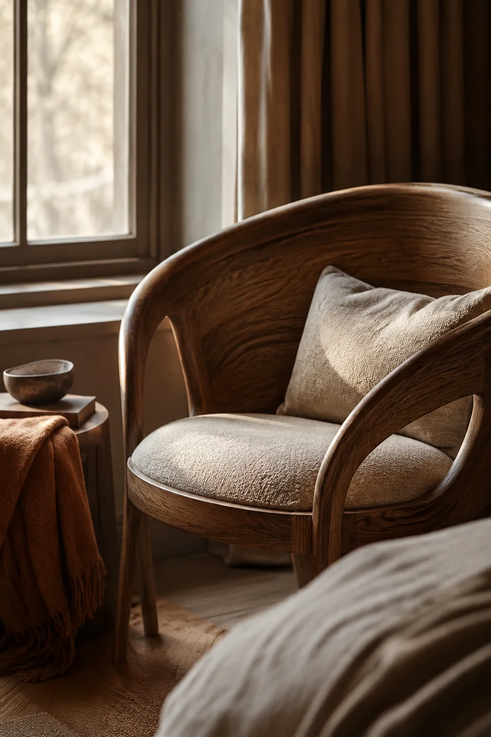
Not every piece needs to be curved, and overdoing it creates its own problem — a room full of only rounded shapes can start to feel indecisive or overly soft. The better approach is contrast: one rounded anchor piece against otherwise straight-lined furniture. A curved wood accent chair placed in a corner reading nook does this well, softening the room without erasing its structure.
Consider a narrow bedroom with a platform bed, a rectangular dresser, and a boxy closet door. Swapping only the bedside table for a rounded pedestal-style piece changes the entire feel of that corner of the room, softening the transition between bed and wall without touching anything else. For anyone furnishing a bedroom on a budget, this is also one of the more affordable upgrades, since it requires replacing a single small piece rather than a full furniture set, an idea worth exploring further in Luxury Walk-In Closet Inspiration Ideas You Will Absolutely Love, which applies similar silhouette logic to adjacent storage furniture.
The bigger lesson is that warmth in a room is often architectural before it’s ever decorative — the shapes we choose quietly instruct the nervous system on how to feel before color or texture even enters the equation.
3. Painting the Ceiling: The Fifth Wall Trick for Warmth
 Save it
Ceilings are the most consistently ignored surface in bedroom design, almost always left in flat builder-grade white regardless of what happens on the walls below. Treating the ceiling as a fifth wall and extending a warm neutral tone upward changes the entire emotional register of a room, because a stark white ceiling above warm walls creates a visual “lid” that unconsciously reads as cold and clinical, no matter how carefully the rest of the room was styled.
The mechanism is about enclosure and light reflection. A warm-toned ceiling reflects ambient light back into the room with the same warmth as the walls, rather than bouncing cool white light downward and washing out everything beneath it. This is particularly effective in bedrooms with lower ceilings, where the contrast between white ceiling and colored wall can make the room feel like it’s wearing a cap rather than existing as one continuous, enveloping space.
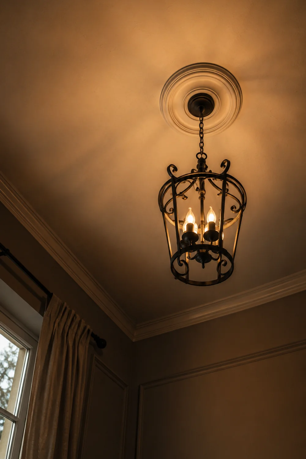
Full ceiling color isn’t the only option. A softer approach uses the same wall color at a slightly lighter tint on the ceiling, preserving the sense of height while still eliminating the jarring white-to-color transition. Some homeowners go further and add a warm-toned flush mount fixture to reinforce the effect, since the fixture itself becomes part of the ceiling’s visual temperature rather than a cool metal interruption.
A warm white flush mount ceiling light fixture works particularly well in this context, casting an amber-toned glow rather than the bluish cast of many standard fixtures.
Imagine a bedroom with warm oat walls and a stark white ceiling — a common combination — versus that same room with the ceiling painted two shades lighter than the walls. The second version photographs almost identically but feels noticeably more enclosed and calm in person, because the eye no longer registers a hard boundary between wall and ceiling.
Ultimately, ceilings are underused real estate in nearly every home, and treating them as a design surface rather than a formality is one of the most overlooked ways to make a neutral room feel deliberately warm rather than simply unfinished.
4. Mixed Metals Done Quietly: Brass, Bronze, and Matte Nickel Together
 Save it
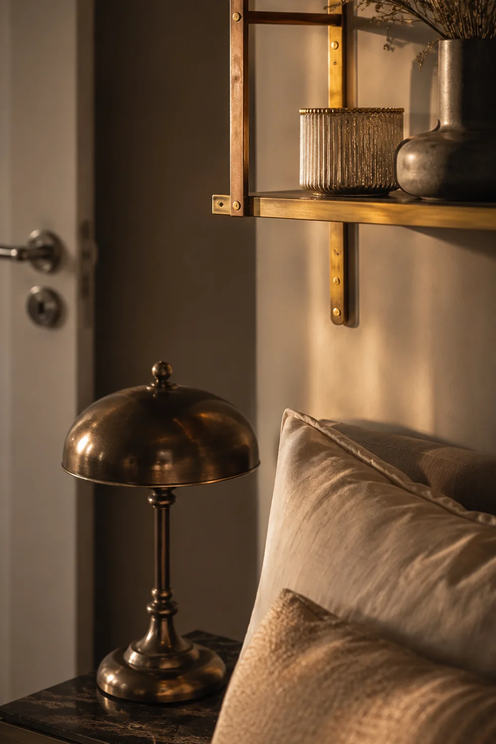
The old rule of matching every metal finish in a room — every hinge, every lamp base, every frame — has quietly fallen out of favor, and for good reason: rooms built on a single repeated metal finish can feel sterile and overly matched, like a showroom rather than a home. Mixing metals quietly means using two, sometimes three, complementary warm-toned finishes so the room feels collected over time rather than purchased as a single matching set.
The key word is quietly. This isn’t about clashing gold and chrome for visual drama; it’s about combining metals that share an undertone family, the same way the tonal layering technique works for paint and fabric. Brass, aged bronze, and warm matte nickel all sit comfortably together because none of them read as cool or stark — they’re simply different weights of the same warm metallic register, which lets them coexist without competing for attention.
A useful rule of thumb is to let one metal dominate roughly 70 percent of the room’s hardware and let the other one or two appear only in accents — a single picture ledge, a lamp base, a mirror frame. Overusing multiple metals in equal proportion is what makes mixed metal rooms look accidental rather than intentional.
A warm brass picture ledge shelf above a headboard is a low-commitment way to introduce a secondary metal tone without altering any permanent fixtures in the room.
Picture a bedroom with matte nickel door hardware and window latches, but a brass picture ledge and an aged bronze lamp base on the dresser. The room doesn’t feel mismatched — it feels like it evolved naturally, the way a bedroom actually does when furniture and fixtures are collected across different years rather than ordered from a single catalog in one afternoon.
The broader takeaway is that visual perfection isn’t the same as visual warmth, and a home that allows small, considered inconsistencies in its metal finishes often feels more genuinely lived-in than one that enforces uniformity at every turn.
5. Solid Wood Grain as a Design Feature, Not an Afterthought

 Save it
Veneer and laminate furniture dominate the mid-range market because they’re inexpensive to produce, but they solve a manufacturing problem, not a design one, and the flatness of a printed wood pattern is often the quiet reason a neutral bedroom feels less warm than it should. Solid wood grain carries visual depth, subtle color variation, and texture that a printed surface simply cannot replicate, and in a neutral room where color variety is intentionally limited, that texture becomes one of the primary carriers of warmth.
The mechanism is about light interaction. Real wood grain has natural variation in density and color that catches light unevenly across its surface, creating the kind of subtle visual movement that keeps a neutral room from feeling flat or static. A printed veneer, by contrast, reflects light uniformly, which is part of why furniture built from it can look slightly artificial even when the color match is technically correct.
This doesn’t mean every piece of furniture in the room needs to be solid wood — that would be both expensive and visually monotonous. One or two anchor pieces, like a nightstand or a bed frame, carrying visible grain is usually enough to elevate the whole room, especially when paired with the tonal layering and metal mixing already covered in earlier sections.
A solid oak nightstand with rounded edges combines two of this guide’s principles at once — real grain and a softened silhouette — making it a particularly efficient upgrade for a room that’s currently dominated by flat, printed surfaces.
Consider swapping a laminate nightstand for a solid oak one in a room where the bed frame and dresser are already warm-toned wood. The new piece doesn’t need to match exactly — in fact, a slightly different wood tone often looks more considered, since it signals the room was furnished over time. This kind of grain-forward furniture thinking pairs naturally with closet and storage planning explored in The Best Aesthetic Closet Storage Ideas for Small Bedrooms, where material honesty plays a similarly important role in making small spaces feel high-quality.
The larger principle is that texture, not just color, is doing most of the emotional work in a neutral room, and real materials will always outperform printed imitations in creating a sense of quiet, lasting quality.
6. Volume and Drape: Curtain Fullness as a Warmth Signal
 Save it
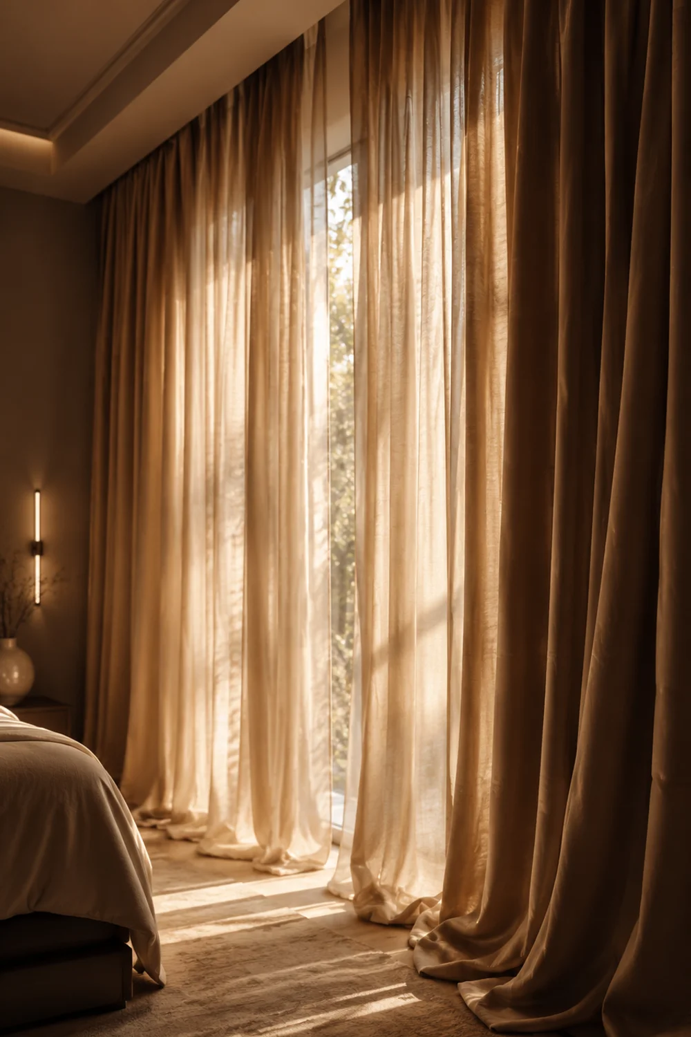
Most bedrooms hang curtains that are barely wider than the window itself, which is a functional choice but a visually cold one — thin, flat panels read as an afterthought rather than a considered element of the room. Curtain volume, meaning panels cut two to two-and-a-half times the width of the window so they hang in soft, generous folds even when open, changes the entire feel of a window wall regardless of fabric color.
The reason this works has to do with how fabric behaves under gravity. A skimpy curtain panel hangs flat and taut, catching light unevenly and looking almost architectural in its rigidity. A fuller panel falls into soft vertical folds that create their own shadow and highlight pattern, and that gentle variation in light is what reads as “soft” to the eye — the same principle behind why a loosely draped throw looks cozier than one folded into a stiff rectangle.
Fabric weight matters as much as width here. A lightweight cotton panel, even cut full, can look flimsy and insubstantial, while a mid-weight fabric holds its folds with more structure and presence. The goal is drape that looks intentional and substantial rather than sheer or wispy, which is part of why heavier weaves tend to outperform lightweight ones in this specific application.
A cotton velvet drapery panel in warm taupe achieves this fullness while adding a subtle sheen that catches ambient light differently throughout the day.
Picture a standard 36-inch window with curtain panels sized to match it exactly versus panels cut to nearly 80 inches combined width, gathered into loose folds on either side. The second version transforms the entire wall, making the window feel larger and the room feel considerably more finished, even though the window itself hasn’t changed size at all.
The underlying lesson is that generosity in proportion — giving fabric more room than strictly necessary — is one of the most consistent visual signals of warmth and intentional design across almost every element of a bedroom, not just curtains.
7. Intentional Nightstand Asymmetry
 Save it
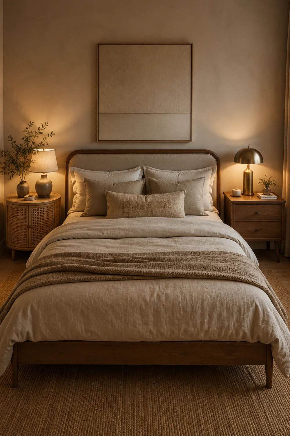
Matching nightstand pairs are the default in nearly every furniture catalog, but that very uniformity is part of why so many bedrooms feel like they were furnished from a single showroom floor rather than lived in. Intentional nightstand asymmetry — choosing two different, complementary nightstands rather than an identical pair — solves the problem of a room that looks correct but not personal, introducing variety without sacrificing balance.
The technique relies on relationship, not sameness. Two nightstands can differ in shape, material, or height while still belonging together if they share a color family or a design era — a rounded wood piece on one side and a slightly taller woven piece on the other, both in the same warm tonal range, read as a considered pairing rather than a mismatch. The asymmetry gives the eye something to notice without creating visual conflict.
This works especially well in rooms where one side of the bed serves a different function than the other — a nightstand with drawers for someone who needs storage, paired with an open, airy piece for a partner who prefers a lighter footprint. Function and form align, rather than forcing both sides of the bed into an identical, one-size-fits-all solution that may not suit either person’s actual habits.
A woven rattan nightstand with a round silhouette pairs naturally with a solid wood piece on the opposite side, keeping the room’s material palette consistent while varying the shapes.
Picture a couple’s bedroom where one partner keeps books and a reading lamp bedside while the other keeps almost nothing — a matched pair of large storage nightstands would waste space on one side and clutter the other, while an asymmetric pairing lets each side reflect how it’s actually used. This kind of practical, personality-driven furnishing decision is explored further in What Professional Organizers Really Use for Seasonal Closet Organization Success, which applies similar function-first thinking to storage planning throughout the home.
The deeper principle is that a room furnished entirely in matched pairs can start to feel impersonal, while small, deliberate asymmetries are often what make a space feel like it belongs to the specific people living in it.
8. The Dresser as a Design Anchor, Not Just Storage
 Save it
Dressers are almost universally treated as pure function — a place to store folded clothing and nothing more — which means they’re often the least considered piece of furniture in an otherwise carefully styled bedroom. Treating the dresser as a design anchor rather than a utility box means choosing it with the same intention as a headboard or an accent chair, since its scale and material presence directly shape how the whole room reads.
The reasoning is proportional. A dresser typically occupies one of the largest wall footprints in a bedroom outside the bed itself, which means a poorly chosen one — too small, too flat, too generic — creates a visual gap that no amount of styling on top of it can fully compensate for. A well-chosen dresser with real presence, whether through wood grain, a curved front, or substantial hardware, becomes a second focal point that balances the bed rather than competing with it.
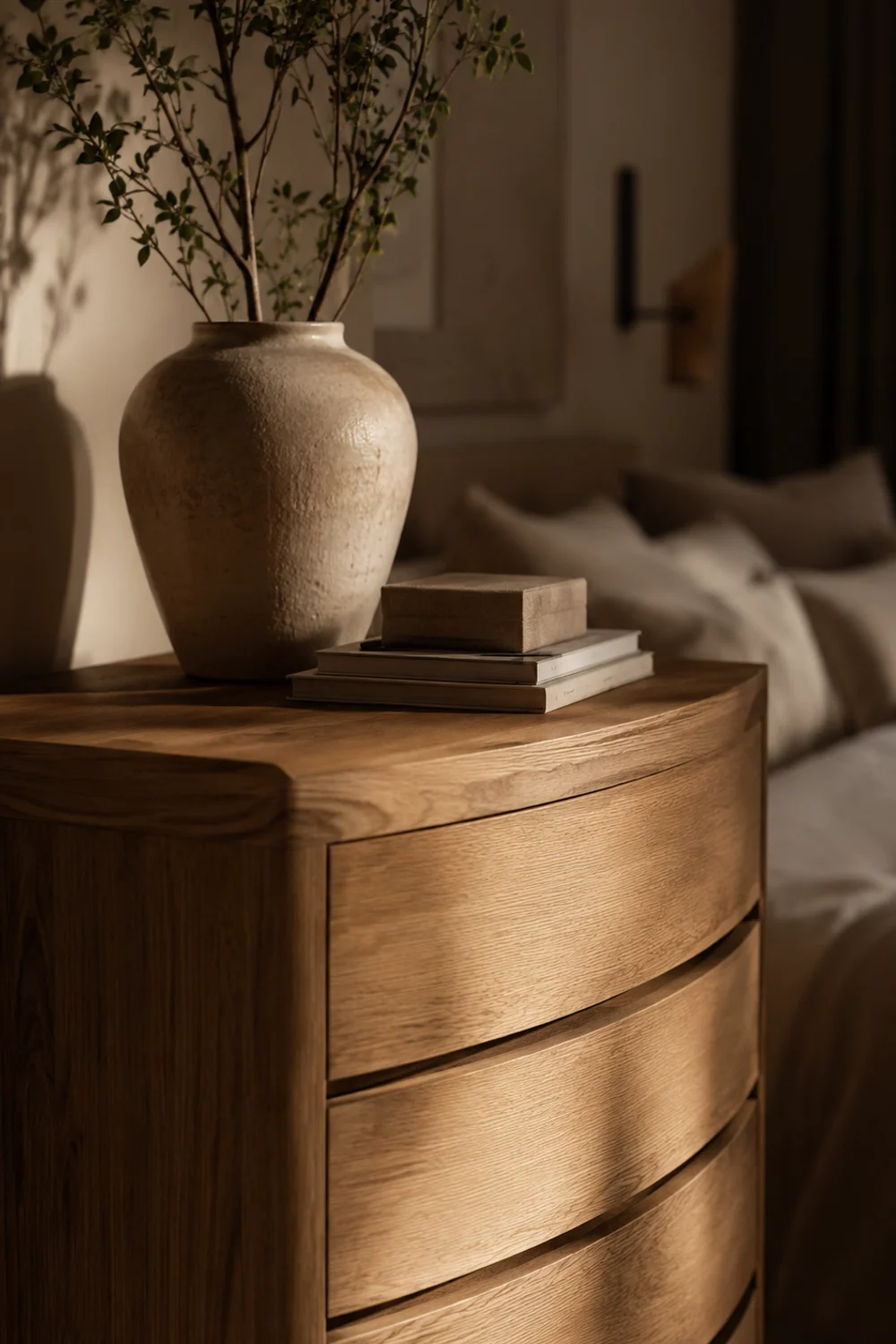
This doesn’t require an oversized or ornate piece. A dresser with curved front drawers achieves anchor status through shape alone, softening a wall that would otherwise be dominated by flat, boxy storage, and tying back naturally to the rounded silhouette principle covered earlier in this guide.
A solid wood dresser with curved front drawers demonstrates this well, combining grain, shape, and function into a single considered piece rather than a purely utilitarian one.
Imagine a bedroom where the headboard wall is beautifully styled but the opposite wall holds a flat, builder-grade dresser with mismatched hardware — the room will always feel unbalanced, because the eye naturally seeks a second point of visual weight to complete the space.
The wider lesson is that every large piece of furniture in a bedroom is doing visual work whether or not it was chosen intentionally, and dressers in particular are frequently the most under-designed opportunity in the entire room.
9. Acoustic Softness: Designing a Quieter Bedroom Through Layered Textiles
 Save it
Warmth in a bedroom isn’t only visual — it’s acoustic, and a room that looks soft but sounds hard, with footsteps echoing off bare floors and voices bouncing off flat walls, will always feel slightly less restful than one that’s been layered for sound as well as sight. Acoustic softness means deliberately using textiles not just for appearance but to absorb and dampen sound, which is a factor almost never discussed in typical bedroom design advice.
The mechanism is straightforward physics: hard, flat surfaces reflect sound waves, while soft, textured, and porous materials absorb them. A bedroom with bare floors, minimal window coverings, and little upholstered furniture will have noticeably more echo and ambient noise than one layered with a substantial rug, full drapery, and upholstered furniture pieces, even if both rooms are decorated in an identical color palette.
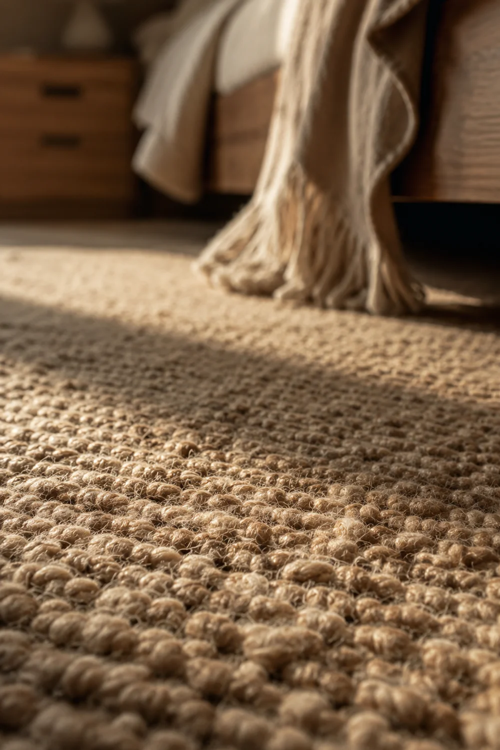
The floor does the most acoustic work of any single surface in a bedroom, since it’s the largest uninterrupted hard plane in most rooms. A dense, substantial rug placed beneath and around the bed does more to quiet a room than almost any other single change, absorbing both footstep noise and general ambient echo that would otherwise bounce between floor and ceiling.
A dense pile wool area rug in warm oatmeal offers both the acoustic benefit and a natural extension of the room’s tonal palette, tying the floor into the same warm neutral family established elsewhere in the space.
Picture two identical bedrooms, one with hardwood floors left completely bare and one with a substantial wool rug extending well beyond the bed frame on all sides — the second room will feel noticeably calmer within seconds of entering it, before a person even registers why, because the ambient sound level has dropped along with the visual hardness of the space. This layered, sensory approach to design overlaps with the broader philosophy discussed in The Ultimate Guide to Scandinavian Bathroom Design Everyone Is Obsessed With, where softness and quiet are treated as equally important design goals alongside visual style.
The takeaway is that a genuinely restful bedroom engages more than one sense, and acoustic considerations deserve the same intentional planning that color and furniture typically receive.
10. Warm Neutrals and the Psychology of Restful Sleep
 Save it
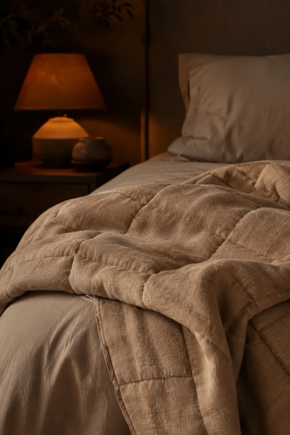
Color choice in a bedroom isn’t purely aesthetic — it has a measurable relationship to how quickly a person’s nervous system settles into rest, and this is where warm neutrals earn their reputation as more than a passing style trend. Cooler tones, particularly stark whites and blue-grays, tend to read as alert and clinical, activating the same visual cues associated with daytime and task-focused environments, while warm neutrals more closely mimic the color temperature of candlelight and sunset.
The mechanism ties back to circadian rhythm and color temperature association. Human perception has spent millennia associating warm, amber-toned light with the end of the day and the approach of rest, while cooler, bluer light is associated with daylight and alertness. A bedroom painted and furnished in warm neutral tones subtly reinforces the body’s own wind-down signals, rather than working against them the way a stark white or cool gray room can.
This doesn’t mean every warm neutral bedroom automatically guarantees better sleep, but it does mean the palette is working with the body’s natural rhythms rather than against them, which matters most in the transitional hour before sleep when lighting and color are most visually dominant in a dim room.
A weighted blanket in warm neutral cotton reinforces this psychological effect further, adding a physical sensation of calm that pairs naturally with the room’s visual warmth.
Consider someone who consistently sleeps better in hotel rooms than at home — often it isn’t the mattress, but the warm, dim, amber-toned lighting and neutral palette hotels rely on, deliberately designed to help guests relax quickly in an unfamiliar space. Recreating that same warm tonal logic at home, rather than defaulting to bright white walls and cool overhead lighting, is one of the more evidence-backed reasons to choose warmth over sterility in a bedroom specifically.
The broader principle is that a bedroom’s job is fundamentally different from every other room in the house — it exists to help the body disengage — and warm neutral tones support that function in a way that trend-driven color choices, however beautiful, often cannot match over the long term.
Common Mistakes to Avoid
1. Treating “neutral” as a single color instead of a family
This is the most common failure point in an otherwise well-intentioned neutral bedroom. People choose one shade — often a builder-grade white or greige — and apply it to walls, trim, and furniture alike, then wonder why the room feels flat rather than warm. Neutral rooms need tonal variation within a shared undertone family to read as rich rather than empty.
2. Ignoring undertone consistency between materials
A warm oak floor paired with cool gray-toned bedding and blue-white walls will always feel slightly off, even if every individual element looks fine in isolation. Undertone clashes are subtle but cumulative, and they’re one of the fastest ways to make a neutral room feel unintentional rather than curated.
3. Leaving the ceiling untouched while decorating everything else
A stark white ceiling above a carefully warmed room creates a visual “lid” that undercuts the coziness built everywhere else. This is one of the easiest fixes on this list and one of the most consistently skipped, simply because ceilings aren’t part of most people’s mental checklist when planning a room.
4. Buying curtains sized exactly to the window
Skimpy, flat curtain panels are one of the most common budget-driven mistakes in bedroom design, and they undercut an otherwise warm room by introducing a stiff, architectural element at the one place meant to feel soft. Curtains cut with real fullness cost more but transform a window wall entirely.
5. Matching every metal and every piece of furniture exactly
A room where every nightstand, every metal finish, and every wood tone matches precisely can end up feeling like a showroom rather than a home. Small, intentional inconsistencies — in metal finish, in nightstand pairing, in wood tone — often read as more genuinely warm and lived-in than perfect uniformity.
Frequently Asked Questions
What’s the difference between a warm neutral and a cool neutral, and how do I tell them apart?
Warm neutrals carry an underlying yellow, pink, or orange base — think oat, sand, or warm bone — while cool neutrals lean blue or green at their core, like most true grays and stark whites. The easiest way to tell them apart is to compare a swatch against a pure white sheet of paper in daylight; if it looks slightly yellow or pink, it’s warm, and if it looks slightly blue or gray, it’s cool. This distinction matters because mixing the two families is one of the fastest ways to make a neutral room feel disjointed.
How many different neutral tones should I actually use in one bedroom?
Most successful warm neutral bedrooms use somewhere between three and five distinct tones within the same undertone family, with one dominant shade covering the majority of the room and one or two accent tones appearing in smaller doses. Using only one tone everywhere tends to look flat, while using more than five without a clear hierarchy can start to feel busy or accidental. The goal is variation with a clear dominant note, not an even split across every tone.
Can a warm neutral bedroom still feel modern, or does it automatically read as traditional?
Warm neutrals are entirely compatible with a modern aesthetic; the modernity comes from furniture silhouette, hardware choices, and styling restraint rather than the palette itself. A room with clean-lined furniture, minimal clutter, and a tightly curated tonal palette can feel just as contemporary as a stark white and black room, while still carrying the emotional warmth that pure white-and-gray schemes typically lack. The palette sets the temperature; the furniture and styling set the era.
Is it expensive to convert an existing cool-toned bedroom into a warm neutral one?
Not necessarily — the most impactful and least expensive changes are usually paint color, bedding, and textiles rather than furniture replacement, since large furniture pieces can often be kept if their wood tone or finish already leans warm. Prioritizing paint, curtains, and a rug first, then gradually replacing one or two furniture anchors like a nightstand or dresser over time, allows the transformation to happen affordably in stages rather than requiring a single expensive overhaul.
Final Thoughts
A warm neutral bedroom isn’t defined by a single paint color or a single trending product — it’s the cumulative result of tonal consistency, material honesty, and a handful of deliberate design decisions that most people never think to make. Undertone matching, ceiling treatment, curtain volume, and even acoustic softness all contribute to a feeling that’s much harder to fake than it is to build correctly from the start.
What makes this approach durable rather than trend-dependent is that none of these techniques rely on a specific color being fashionable this year. Warm oak will still be warm oak in a decade, and a well-proportioned curtain panel will still read as generous regardless of what’s currently popular in home design media, which is exactly why this palette resists the aging that trend-driven rooms inevitably experience.
Start with whichever section addressed your bedroom’s most obvious gap — a cold ceiling, a flat dresser, an echoey floor — and build outward gradually rather than attempting every idea at once. Save the techniques that resonate, and let the room evolve one considered choice at a time; a bedroom built this way rarely needs a dramatic redo, because it was designed to age well from the very beginning.
This post contains affiliate links. I may earn a small commission at no extra cost to you.
Get cozy inspiration delivered to your inbox.
✓ 14-page beautifully designed ebook
✓ Cozy decorating ideas
✓ Practical room-by-room inspiration
You’re in! 🎉
Thanks for joining the NestFlowHome community!
Your free ebook is already on its way to your inbox. If you don’t see it within a few minutes, please check your Promotions or Spam folder.
Join the NestFlowHome community for weekly decorating inspiration.

Timeless home decor ideas and slow living inspiration for a calm, beautiful life.