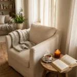
13 Modern Black and White Bathroom Decor Ideas Right Now
By Emily | June 4, 2026
There’s something quietly radical about committing to black and white in a space as personal as a bathroom. It feels bold, yet restrained. Timeless, yet perpetually current. When you strip a room down to its two most fundamental contrasts, every detail suddenly matters — the curve of a faucet, the weave of a towel, the spacing between tiles. Nothing can hide, and nothing needs to.
Black and white bathrooms have existed in some form for over a century, but right now they’re experiencing something closer to a cultural moment than a design trend. The maximalist wave of the last decade has given way to a quieter, more considered approach to home styling — and black and white sits perfectly at the center of that shift. It’s the palette that suits the linen-obsessed minimalist and the marble-loving maximalist equally. It adapts to the tiny powder room and the sprawling primary suite without losing its essential character.
What makes this palette feel modern right now isn’t just the color choice itself — it’s how people are using it. Softer, warmer versions are replacing the clinical high-contrast schemes of the past. Textured surfaces, matte finishes, and natural material accents are keeping the look grounded and lived-in rather than sterile. Lighting is becoming sculptural. Accessories are fewer, but heavier. The whole effect feels intentional in a way that previous interpretations rarely achieved.
If you’ve been circling the idea of a black and white bathroom, this is the moment to commit. These thirteen ideas span every space size, budget, and aesthetic — from the dramatically dark to the softly graphic — and each one offers something genuinely worth considering.
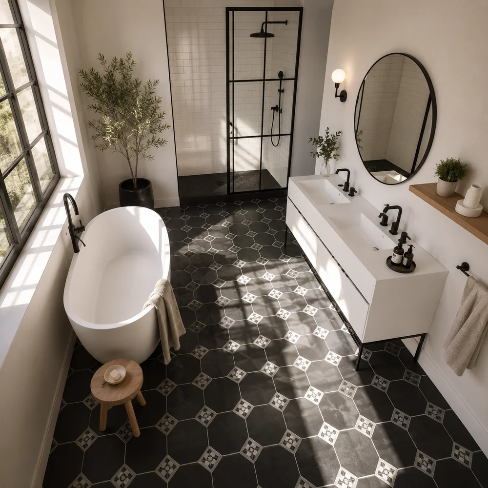
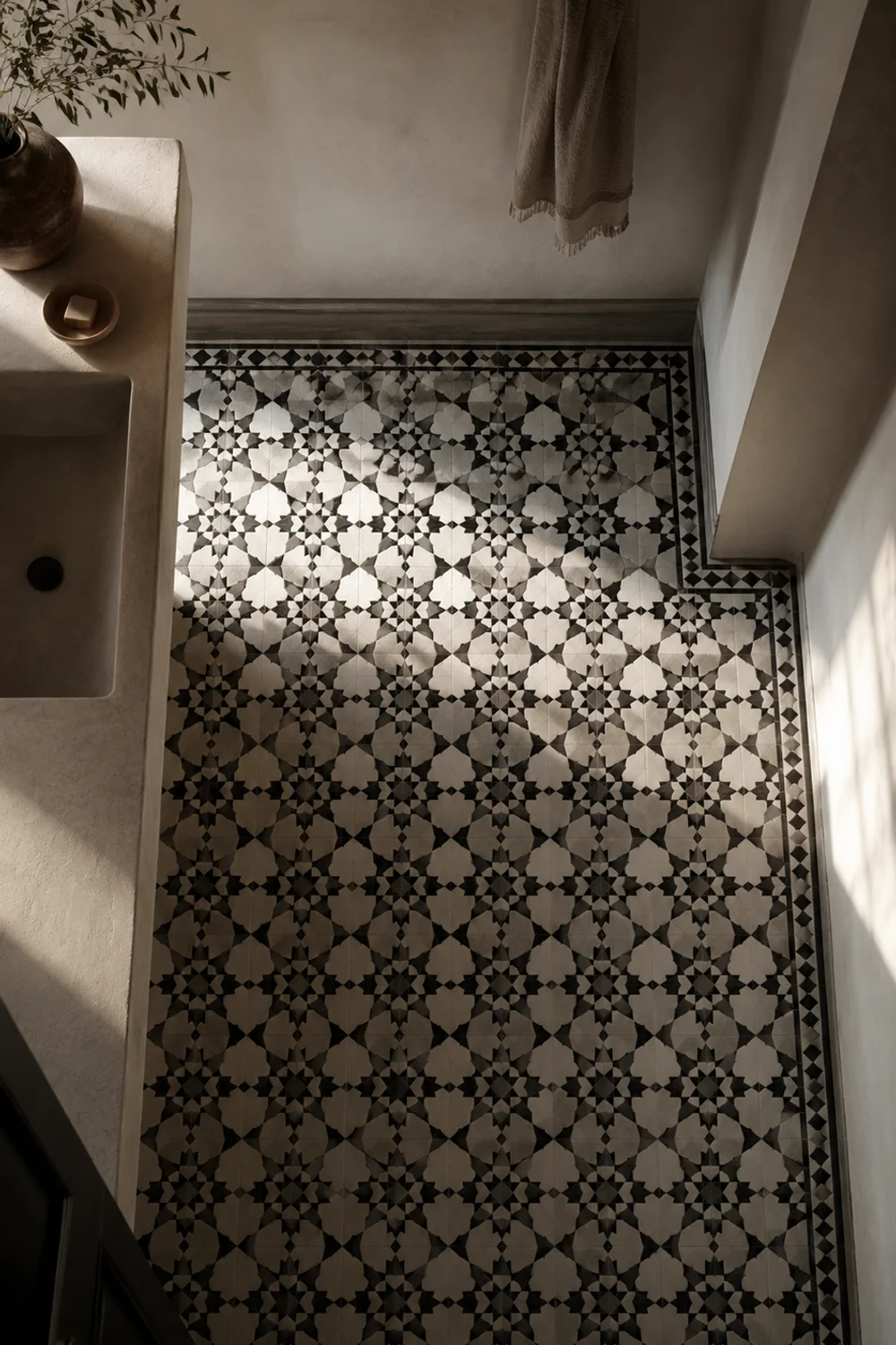
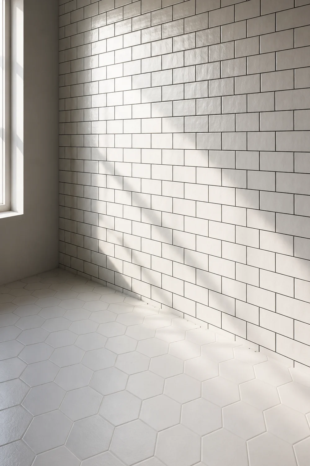
1. Graphic Mosaic Tile as the Anchor Piece
 Save it
Before anything else lands on the wall or vanity, the right floor tile can do most of the visual work for you. Black and white mosaic patterns — whether hexagonal, encaustic-inspired, or a modern geometric repeat — have a long history in bathroom design precisely because they compress enormous visual interest into a relatively small surface area. A patterned floor anchors the entire room’s personality without requiring anything beyond the tile itself.
The key is understanding what the pattern does to scale. Small, intricate patterns work beautifully in compact bathrooms — they create texture without heaviness, and the eye reads them as a field of tone rather than individual shapes. Larger, bolder graphic patterns are better suited to roomier spaces where they have the breathing room to read fully. A four-inch geometric repeat squeezed into a five-by-eight foot bathroom becomes overwhelming; the same pattern in a master bathroom with double doors reads as architectural rather than decorative.
Material matters more than people expect. Cement-look porcelain tiles give a slightly matte, chalky finish that feels softer than glazed ceramic — particularly suited to bathrooms aiming for a European editorial mood. Classic penny rounds in black and white, arranged in a traditional or herringbone layout, have a warmth that their simple description doesn’t suggest. Slip-rated finishes are worth prioritizing without apology — beauty means nothing on a wet surface.
One underused approach is restricting the graphic pattern exclusively to the floor while keeping walls entirely white. This containment strategy gives the pattern room to breathe, prevents visual competition, and makes the bathroom feel larger than its actual dimensions. The ceiling becomes part of the equation too: a white ceiling visually lifts the room away from the graphic floor, creating a sense of height and spatial calm that balances the complexity underfoot.
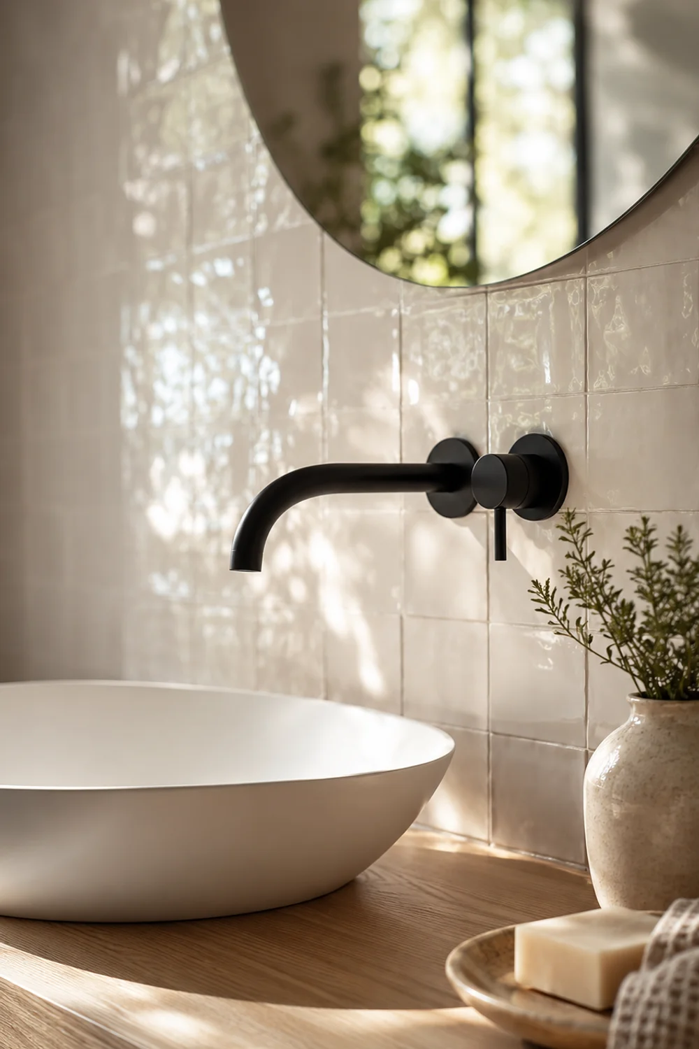
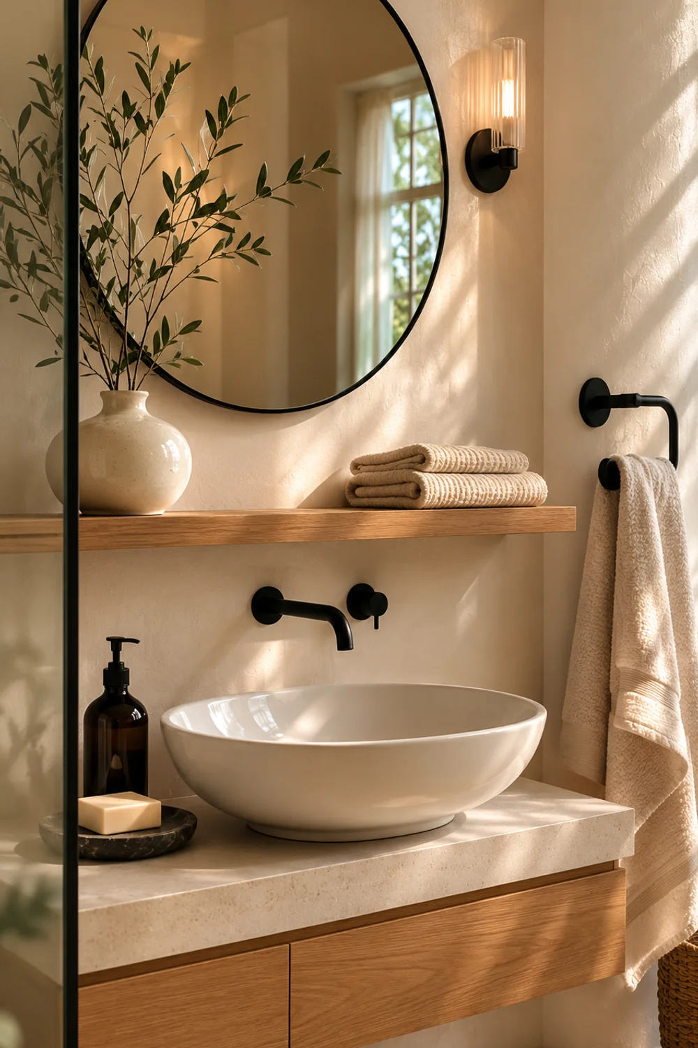
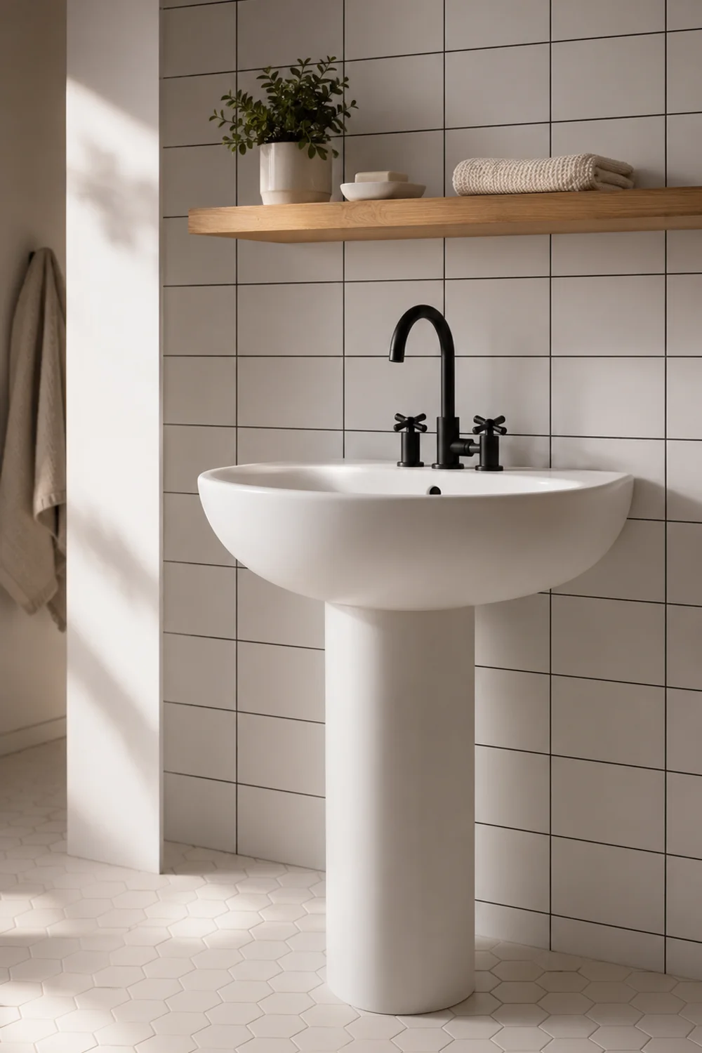
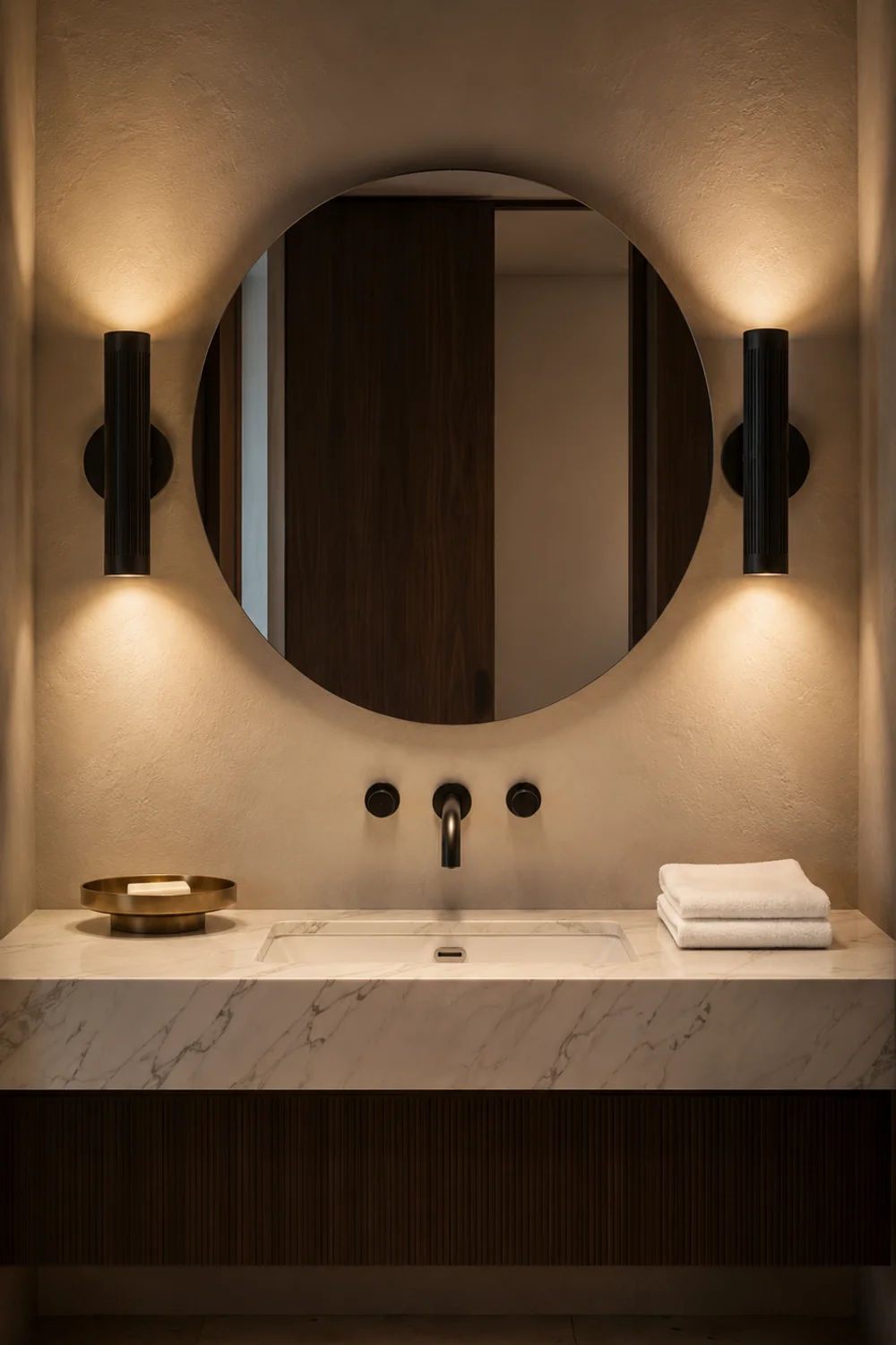
2. Matte Black Fixtures Against White Subway Tile
 Save it
The combination of matte black hardware against white subway tile has become something of a shorthand for modern bathroom sophistication — and the reason it works so consistently is rooted in contrast psychology. The eye naturally moves toward the darkest element in a room, which means matte black fixtures quietly but powerfully direct attention to the most considered moments in the design. A matte black faucet, towel bar, and mirror frame create a triangle of visual anchors that give even the most simply tiled bathroom a sense of deliberate structure.
White subway tile, meanwhile, is one of the most underappreciated choices in bathroom design. Its origins in early twentieth-century subway stations speak to its durability and visual clarity, but it’s the reflective quality that makes it so useful — a wall of white subway tile in a three-by-six or four-by-eight format reflects both natural and artificial light without glare, brightening the space in a way that painted drywall simply cannot replicate. The grout line becomes its own design decision: white grout keeps the effect serene and airy, while charcoal or dark grey grout adds graphic definition and plays directly into the black and white palette.
The finish of the black hardware matters enormously here. Matte black is warmer and less aggressive than glossy black — it absorbs light rather than reflecting it, which reduces the clinical feeling that sometimes plagues high-contrast bathrooms. Brushed or satin black falls between the two and tends to read as slightly more casual and relaxed. For a bathroom leaning toward luxury, matte is almost always the right call.
This approach pairs effortlessly with the kind of carefully layered accessory styling explored in Affordable Bathroom Counter Decor Ideas That Look High-End — where a few well-chosen objects in coordinating tones can elevate the entire vanity moment without adding visual noise.
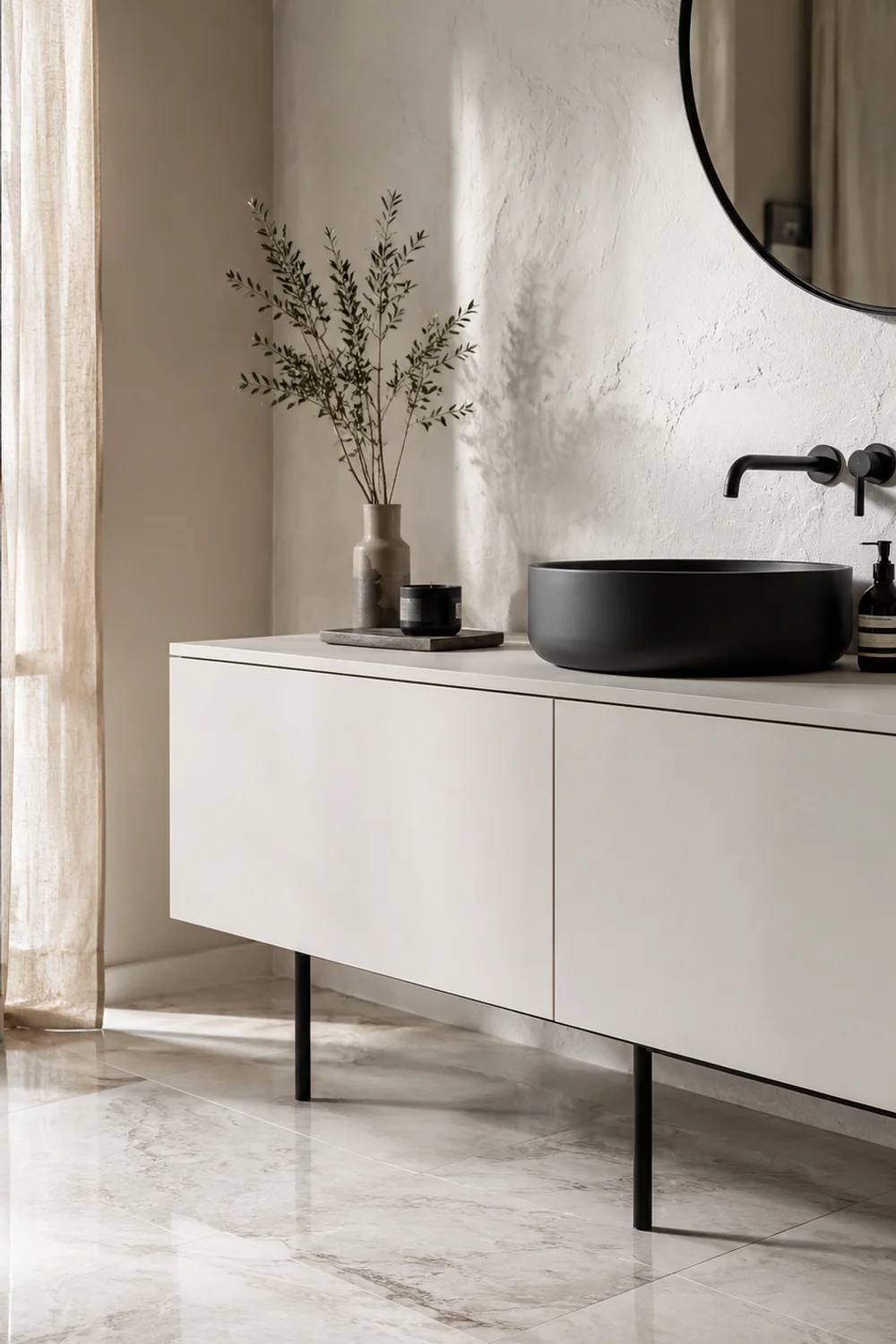
3. Statement Black Vanity in an All-White Room
 Save it
There’s a particular kind of confidence in placing a single dark element inside an entirely light space — and a black vanity delivers that effect with more authority than almost any other single piece. When everything around it is white or near-white — walls, ceiling, floor in a pale marble or soft tile — the black vanity becomes an architectural statement rather than simply a piece of furniture. It reads as chosen, decided, intentional.
The silhouette of the vanity matters as much as its color in this context. A streamlined, handleless design in matte black feels contemporary and editorial — closer to a piece of furniture than a bathroom fixture. Floating vanities in matte black are particularly effective because the gap between cabinet and floor creates a sense of lightness — the dark piece appears to hover rather than anchor itself to the ground, which prevents the visual weight from becoming oppressive.
Storage organization inside becomes part of the aesthetic when the vanity is this visually prominent — keeping the interior considered and calm reinforces the bathroom’s overall intentionality. The philosophy behind beautiful, edited storage is something that Beautiful Bathroom Shelf Styling Ideas with Modern Decor Touches explores in the kind of depth that makes the ideas feel genuinely usable.
4. Vertical Black and White Striped Walls
 Save it
Stripes might feel like a risk, but in the right proportion and application they are one of the most architecturally effective tools available in a bathroom. Vertical stripes perform a specific optical task: they draw the eye upward and elongate the perception of wall height in a way that no paint color alone can achieve. A bathroom with eight-foot ceilings feels genuinely taller with narrow vertical stripes than it does with even the palest possible solid color.
The width ratio matters considerably. Very narrow stripes — under an inch across — read at a distance as a fine texture, creating a slightly woven visual quality rather than a bold graphic statement. Medium stripes in the two-to-four inch range are the most versatile and work with the greatest variety of fixtures and accessories without competing. Wide, bold stripes are a commitment — they dominate the room and ask every other element to be relatively restrained, which can work brilliantly in a powder room where the space itself is small and visitors are spending short, high-attention moments rather than long, relaxed ones.
Application method shapes the effect significantly. Painted stripes in flat versus eggshell finishes create subtle tonal variations that catch light differently across the day. Wallpaper opens up pattern possibilities including textured grounds, metallic threads, and graphic repeats that paint cannot replicate. Tile — vertical subway tile in alternating black and white stacks, or a stripe executed in narrow marble mosaic — elevates the idea into a genuinely permanent architectural feature.
5. The Power of a White Room With Single Black Details
 Save it
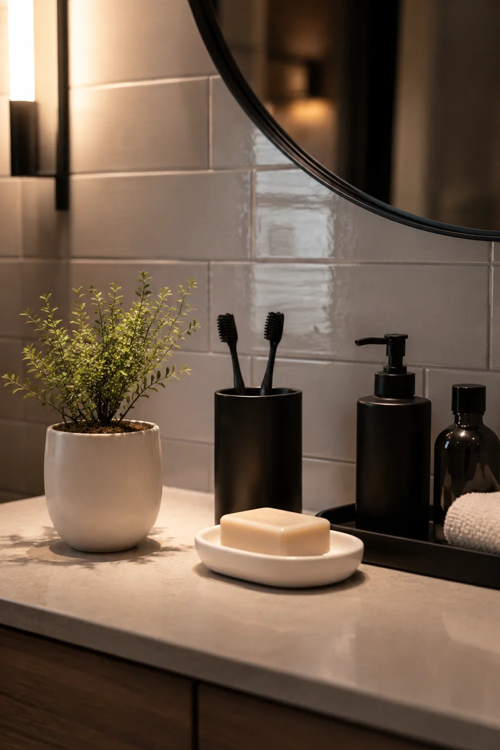
This is arguably the subtlest idea in this list, and possibly the most sophisticated. An all-white bathroom with a single recurring black detail — a thin line of black grout, and a set of black-framed mirrors, a black soap dispenser and toothbrush holder on the vanity — operates on a principle closer to jewelry than decoration. The black detail doesn’t so much decorate as it does define. It creates edges, suggests precision, and communicates that the space was thought through rather than assembled.
The repetition of a single element is what makes this approach feel designed rather than incidental. One black accessory on a white vanity can feel random. Two or three instances of the same black detail — always the same finish, always the same approximate visual weight — create a quiet rhythm that the eye reads as intentional. A thin black edge on the mirror, a black hardware pull on the cabinet, a black terrazzo tray holding folded hand towels: these three elements in dialogue give the bathroom an internal visual logic.
Lighting reinforces this approach beautifully. A matte black pendant or wall sconce against a white wall creates the same kind of focused definition — the light source becomes sculptural, and the space beneath it feels considered. In a powder room or guest bath where this graphic spareness can be taken all the way without the practical compromises that a daily-use bathroom sometimes requires, this approach can feel genuinely breathtaking in its economy.
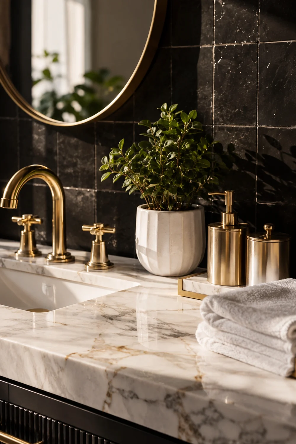
6. Marble and Black: The Timeless Material Pairing
 Save it
White Carrara marble and black stone have been paired in bathroom design for centuries, and the reason that combination refuses to feel dated is straightforward: both materials are organic, both carry depth and variation, and together they balance each other’s visual temperature in a way that manufactured surfaces rarely achieve. White marble brings warmth, movement, and translucency. Black stone — whether nero marquina marble, honed basalt, or a deep black granite — brings gravity, stillness, and absolute density.
The proportioning of these materials determines the mood entirely. A bathroom with white marble walls and a single black marble floor is dramatic but restrained — the dark ground gives the room a sense of weight and importance without overwhelming the luminosity of the lighter walls. Reversed — a dark stone wall with white marble accents — creates a more intimate, cave-like atmosphere that can be extraordinarily beautiful when lit well but risks feeling oppressive if the natural light situation is limited.
Vein direction is worth paying attention to. Marble tiles cut and laid so that the veining runs continuously across panels — a technique called bookmatching — creates a sense of flow and organic movement that fundamentally changes the feeling of a room. Standard random-set marble is beautiful and practical; bookmatched marble feels like a decision that was made with intention, which is exactly the quality that separates a designed space from a merely decorated one.
The layering of natural materials throughout a bathroom is something that feels particularly resonant alongside the earthy warmth explored in Beautiful Earthy Bathroom Decor Ideas with Warm Natural Tones — different palettes, but the same underlying logic of material honesty.
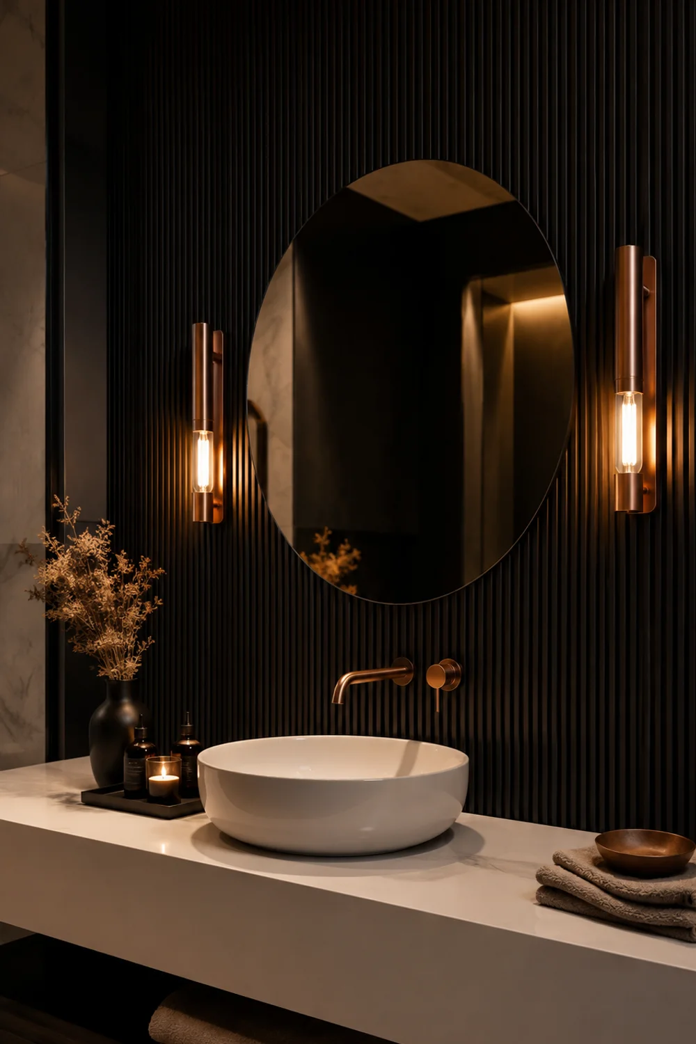
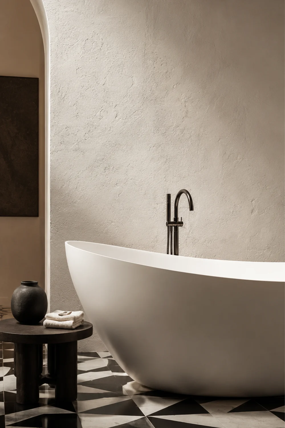
7. Black Ceiling as Architectural Intimacy
 Save it
The ceiling is the most underutilized surface in bathroom design. Painted entirely black — or covered in a deep charcoal tile or dramatic dark wallpaper — a bathroom ceiling transforms from a neutral backdrop into an active participant in the room’s atmosphere. The effect is not what most people expect. Rather than feeling oppressive or claustrophobic, a black ceiling in a bathroom tends to create intimacy. It drops the visual sky lower, making the room feel more enclosed in the best possible sense — like a retreat, a sanctuary, a deliberate step away from the rest of the house.
The contrast with white walls below is what makes this work. A black ceiling over white-tiled walls creates a sense of architectural layering — the room reads as having two distinct zones, the active daily-living zone at eye level and below, and a vaulted, sky-like zone above that operates on a different emotional register. Add a simple white pendant or globe light fixture hanging from that dark surface and the effect becomes genuinely theatrical.
Practical considerations are real but manageable. Glossy black paint will amplify any moisture streaking and reveal water marks more obviously than matte finishes — always use a ceiling-specific matte or eggshell in a moisture-resistant formulation. Ventilation matters more in a dark-ceiling bathroom because any mold or moisture damage will be visible against the dark ground.
For smaller bathrooms where this level of bold commitment feels like a risk, the principles of using dark elements to create visual focus are explored more gently in Simple Small Bathroom Decor Ideas for a Clutter-Free Look.
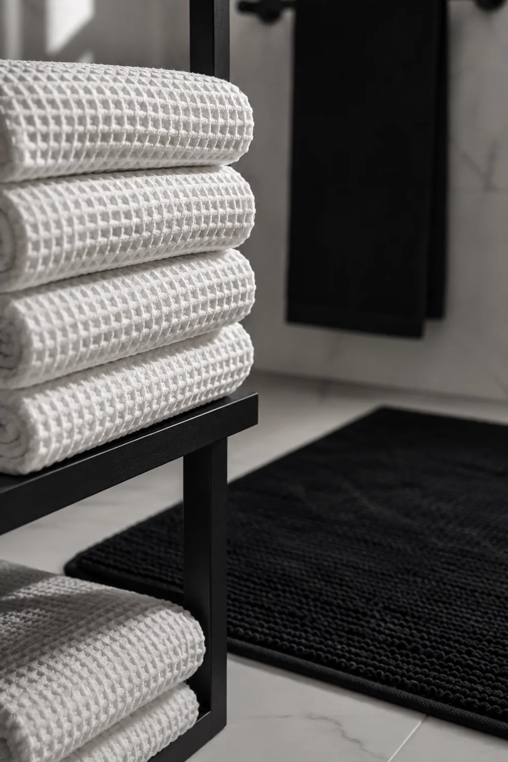
8. Textured Black and White Towels and Textiles as Design Elements
 Save it
Textiles are one of the fastest routes to a genuinely beautiful bathroom, and they are almost universally underestimated. In a black and white bathroom, towels, bath mats, and shower curtains don’t just function — they finish the space. The difference between a folded white waffle-weave bath towel and a thin, flat cotton version isn’t just tactile. It’s visual. The waffle weave creates depth and shadow in its grid pattern, catching light in a way that adds texture and dimension to what would otherwise be a flat surface.
A black and white bathroom benefits particularly from textile choices that introduce textural variation rather than simply color. A white boucle bath mat against black hexagonal floor tile creates a visual and tactile conversation between two very different surfaces. A natural linen shower curtain in ivory or off-white with a thin black geometric stripe brings movement, softness, and a moment of pattern to a space that tile and fixtures cannot provide.
Layering matters even in this small detail. Folded towels stacked in varying sizes — bath sheets, hand towels, washcloths — create a hotel-like sense of abundance that elevates the bathroom’s overall feeling without requiring a single structural change. A simple recessed shelf or floating shelf holding neatly rolled white towels with a single black terrazzo tray nearby achieves the kind of effortless luxury that appears on virtually every interior inspiration board worth saving.
9. Mixed Pattern Play: Checks, Stripes, and Dots in One Space
 Save it
The fear of mixing patterns in the same room is largely unfounded when the palette is this tightly controlled. Black and white gives you the freedom to layer checks, stripes, graphic dots, and textured weaves in a single space without the visual chaos that palette mixing would create. The shared tonal language binds every different pattern into a cohesive whole — and the effect, when executed thoughtfully, is the kind of richly layered interior that feels collected and personal rather than decorated.
The proportioning principle for mixing patterns is simple: vary the scale of each pattern to create hierarchy. A large, bold graphic tile on the floor anchors the space. A medium-scale stripe in the textiles — shower curtain or window treatment — provides rhythm at eye level. Small-scale checks or dots in accessories, such as a ceramic soap dish, a woven storage basket, or a printed hand towel, introduce detail and intimacy at the smallest scale. Each pattern is operating at a different visual frequency, which means they coexist without competing.
Restraint is still necessary. This is pattern mixing within a disciplined palette, not an invitation to crowd every surface with different graphics. Three patterns, chosen at varying scales and applied with breathing room between them, will always read better than five patterns fighting for the same visual territory.
The same principle of controlled variety that works in bathroom styling translates naturally to other areas of the home — the layering logic explored in 13 Easy Gallery Wall Ideas for Modern Living Room Styling shares this same visual rhythm, scaled up to wall-height.
10. Floating Shelves Styled in Black and White
 Save it
Open shelving in a bathroom divides people fairly neatly. For those who can maintain consistent order, it is one of the most visually rewarding approaches to bathroom storage imaginable. For those who cannot, it becomes a visual accusation. The truth is that a black and white palette simplifies the maintenance question considerably — because the color discipline extends naturally to what lives on the shelves.
A floating shelf in natural black walnut or ebonized oak against a white wall has an inherent architectural quality before a single object is placed on it. The dark timber against pale tile or white paint creates exactly the kind of black and white material dialogue the palette promises. What fills the shelf then becomes a styling exercise in tonal harmony: white ceramic bottles, a black clay soap dish, a folded white linen hand towel, a small trailing plant in a matte black pot.
The spacing between objects matters as much as the objects themselves. Over-filled shelves read as clutter regardless of how beautiful each individual piece might be. Under-filled shelves with too much empty space feel abandoned. The sweet spot is a shelf that holds five to seven objects total — some vertical, some horizontal, varying in height and width — with deliberate gaps between groupings that allow each object to breathe.
The deeper philosophy of shelf curation and layered bathroom styling is explored at length in Beautiful Bathroom Shelf Styling Ideas with Modern Decor Touches — a resource that makes the difference between a shelf that photographs beautifully and one that merely holds things tangible.
11. Above-Toilet Styling in High Contrast
 Save it
The wall above the toilet is one of those bathroom spaces that suffers most consistently from neglect. It’s too large to leave entirely blank without looking unfinished, but too visible and too awkward in its placement to approach carelessly. In a black and white bathroom, this wall offers a genuine opportunity to make a considered visual statement without competing with the vanity area, which is the room’s natural focal point.
The most effective approach for this wall in a black and white scheme is to treat it like a contained design moment — a vignette rather than a full installation. A series of three thin black-framed prints in varying sizes, arranged with deliberate asymmetry, creates a gallery-like quality that elevates the space without requiring anything permanent or expensive. The frames do the heavy visual work; the artwork inside can be relatively simple — line drawings, botanical studies in black ink on white ground, geometric abstractions.
Dimensional objects — a small sconce, a single architecturally interesting shelf with a ceramic vase, a sculptural wall hook holding a folded linen throw — work particularly well here because they add depth and shadow that flat art cannot provide. The combination of a shelf and one framed piece above it creates a layered effect that feels more considered than either element alone.
The nuances of making this specific wall space work beautifully across different bathroom configurations is covered in detail in 18 trending above toilet decor ideas for a beautiful bathroom.
12. Limewash and Black: Softening the Contrast
 Save it
Of all the ideas in this list, this one feels most distinctly of this particular moment. Limewash paint has been experiencing a sustained cultural moment in interior design, and its particular quality — chalky, layered, slightly uneven, deeply warm in its texture — makes it an unexpected but effective partner to black elements. A limewash-painted bathroom wall in an off-white or pale greige shifts the entire feeling of the black and white palette from graphic sharpness toward something more atmospheric and emotionally soft.
The contrast principle still applies — matte black fixtures against a limewashed white wall still read as a black and white space — but the mood is entirely different from a flat-painted or tiled version. Limewash absorbs and reflects light in a way that changes across the day, creating a surface that feels almost alive. Morning light reads it as warm and pale; evening light reveals its layered depth and makes the room feel more intimate. In a bathroom with a single window, this responsiveness to natural light cycles gives the room a genuine sense of soul.
Application technique matters enormously. Professional limewash is a multi-coat process involving specialized pigments and application methods that simply cannot be replicated with ordinary paint. That said, the market for quality limewash paint products has expanded considerably, and many homeowners achieve genuinely beautiful results with careful preparation and patience.
13. Black and White Gallery Wall as the Bathroom's Focal Moment
 Save it
A gallery wall in a bathroom might seem like an unusual commitment, but in a black and white space it works with a naturalness that other color palettes rarely allow. The strict tonal limitation actually simplifies the curation process considerably — every piece, regardless of medium, subject, or scale, belongs within the same visual family from the moment it’s placed inside a black frame against a white wall.
Scale and composition should vary as freely as possible while maintaining the color constraint. A large graphic print alongside several smaller line drawings, a vintage black and white photograph, and a piece of minimalist typographic art creates a collection that feels genuinely gathered over time rather than purchased as a set. The imperfection of this variety is its strongest quality — it tells a story, implies a sensibility, suggests a person behind the choices.
The physical installation matters as much as the selection. Frames hung with consistent spacing — roughly two to three inches between each piece — read as a collection. Frames spaced randomly, with some close and some far apart, feel less resolved. Gallery arrangement templates, paper mockups taped to the wall before any nails are driven, are worth every minute they take. A gallery wall is an investment in visual beauty that a single mis-hung frame can undermine for months.
For anyone ready to take this idea into other spaces in the home, the underlying principles of composition and visual hierarchy map naturally across to Beautiful Bathroom Decor Ideas to Refresh Your Space, where the conversation around creating cohesive, beautiful rooms finds its broader context.
Common Mistakes to Avoid in a Black and White Bathroom
The black and white palette is generous, but it’s not forgiving of carelessness. The most common mistake is treating it as a default — choosing it because it feels safe and neutral rather than because it’s the right decision for the space. A black and white bathroom without a genuine point of view quickly becomes cold and institutional. Every decision from tile to textile needs to carry some intention, or the restraint that makes this palette beautiful tips into blankness.
Getting the finish combinations wrong is the second most frequent error. Matte black and brushed nickel are not interchangeable in the same space — their undertones differ, their reflective qualities differ, and placing them in proximity reads as an oversight rather than a layered choice. Commit to one metal finish family and carry it consistently across faucets, hardware, mirror frames, and light fixtures.
Over-relying on contrast at the expense of texture is another significant pitfall. High contrast without material variation — flat white walls, flat black fixtures, no organic materials, no depth — produces a bathroom that looks sharp in photographs and feels cold in person. Introduce texture through tile format, textile weight, raw materials like wood or stone, or a limewash paint finish to give the space warmth and dimensionality.
Ignoring lighting temperature is a mistake that compromises even the most carefully considered scheme. Cool white LED lighting (above 4000K) in a black and white bathroom creates a clinical harshness that is flattering to neither the space nor its occupants. Warm white LEDs in the 2700–3000K range are consistently more flattering, more livable, and better suited to the emotional atmosphere that a well-designed bathroom should create.
Finally, neglecting scale is a common error that a tight palette makes invisible until the moment the installation is complete. A small mirror over a large vanity, a narrow towel bar in a spacious bathroom, a tiny tile in a generous space — these proportion mistakes read as overlooked details in any bathroom, but the clarity of a black and white scheme makes them particularly visible.
Frequently Asked Questions
Is a black and white bathroom going to feel dated quickly?
Black and white is one of the most durable color combinations in the entire history of interior design. What dates isn’t the palette itself but the specific interpretation of it — a particular tile pattern or fixture style can feel period-specific, but the underlying tonal principle never does. To keep a black and white bathroom feeling current over time, lean toward classic shapes, quality materials, and restrained accessory choices rather than trendy patterns or statement fixtures that will read as very specific to a particular year.
How do I stop a black and white bathroom from feeling cold or clinical?
The clinical feeling almost always comes from a combination of flat surfaces, cool lighting, and an absence of organic materials. Address all three simultaneously: introduce texture through tile format choices, textile weight, and raw materials like timber or stone; switch to warm white LED lighting in the 2700–3000K range; and bring in one or two natural elements — a small plant, a linen hand towel, a wooden tray — to break the manufactured quality of the space. The goal is a palette that feels disciplined but not sterile.
Can a small bathroom work in black and white without feeling dark?
Absolutely, and done well it works better in small bathrooms than many people expect. The key is proportion — keeping white as the dominant tone and using black as an accent rather than a field tone. Dark accent elements against a predominantly white background create contrast and definition without reducing the light. Large-format tiles with minimal grout lines also help by reducing the visual breaks that make small spaces feel busier than they are.
What are the best accent colors to bring into a black and white bathroom without breaking the palette?
The most harmonious accents are warm neutrals — natural timber in any tone, aged brass or brushed gold in hardware, white marble with warm grey veining, natural rattan or woven textures. These don’t introduce color so much as material warmth, which enriches the palette without disturbing its essential character. If you want to introduce a true color, dusty sage green and soft terracotta are both gentle enough to coexist with a strong black and white scheme without competing.
Do plants work in a black and white bathroom?
Yes, and they work particularly well. The green of a trailing pothos or a compact fern against a black and white background reads as a genuinely fresh and organic moment — it introduces the one element that a purely manufactured palette cannot provide. Keep plants in matte black or white ceramic pots to maintain the tonal cohesion, and choose species that genuinely tolerate low light and higher humidity rather than ones that will struggle and decline regardless of how beautiful they look on day one.
Final Thoughts
A black and white bathroom is not a compromise or a neutral choice. It’s a commitment to the idea that restraint, handled with care, produces something more interesting than abundance ever could. Every decision inside this palette carries more weight than it would in a room full of competing colors — which means the ceiling is higher, and the satisfaction when it comes together is genuinely substantial.
The ideas in this list span a wide range of approaches, moods, and investment levels. Some, like the single black detail in an all-white room, ask almost nothing of you beyond attention and a considered eye. Others, like the black ceiling or the wall-to-wall marble treatment, are architectural commitments that will define the space for years. Both ends of that spectrum are valid, and both can produce bathrooms that feel genuinely beautiful.
What they share is intention. That quality — the sense that choices were made deliberately, that the space reflects a genuine point of view — is what separates a well-designed bathroom from one that simply contains the right objects. Black and white gives you an unusually clear path to that quality, because its constraints do much of the curatorial work for you.
Start with the one idea from this list that makes you want to rearrange your own bathroom immediately. Trust that instinct. The rest follows naturally.
This post contains affiliate links. I may earn a small commission at no extra cost to you.