
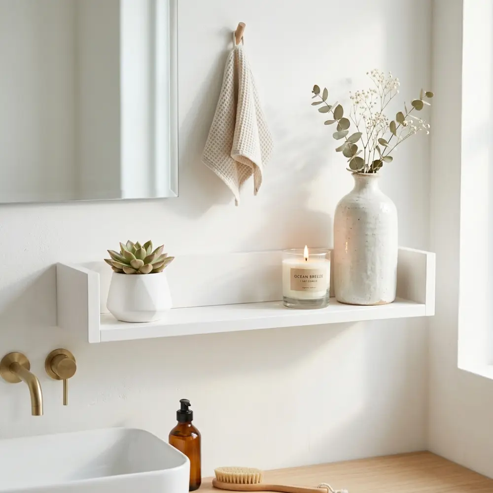
Beautiful Bathroom Shelf Styling Ideas with Modern Decor Touches
By Emily | May 21, 2026
You’re standing in front of your bathroom shelf, and somehow the same question always comes up: why does it look tidy in the catalog but chaotic at yours? You might be displaying the same things you saw on Pinterest, yet something’s missing. The answer isn’t in more decoration—it’s in how you arrange them. Shelf styling isn’t about putting out every pretty thing you find—it’s about intentionally building a visual story where each piece has a role.
Too often, we fall into the trap of treating the bathroom shelf as storage space rather than part of the room that creates atmosphere. Then we wonder why it looks cluttered, why it feels “cheap” even though we bought expensive things. The truth is, the feeling of luxury isn’t in the price tag—it’s in how you arrange things, what proportions you use, how you play with height, texture, and negative space.
In this article, you won’t learn what to buy. I’ll show you how to think about the logic behind shelf styling: why something feels messy even when it’s not, how to create balance without over-planning, and how to build a shelf that always looks fresh, never static. You won’t just see the result—you’ll understand why it works.
I’m going to walk you through this the way I’d explain it to a friend over coffee—no fluff, no generic advice. Just the real strategies that actually work, the mistakes I’ve seen people make over and over, and the small shifts that make a huge difference. By the end, you’ll look at your bathroom shelf differently—not as a problem to solve, but as a space you know how to shape.
1. Start with One Anchor Piece That Commands Attention
 Save it
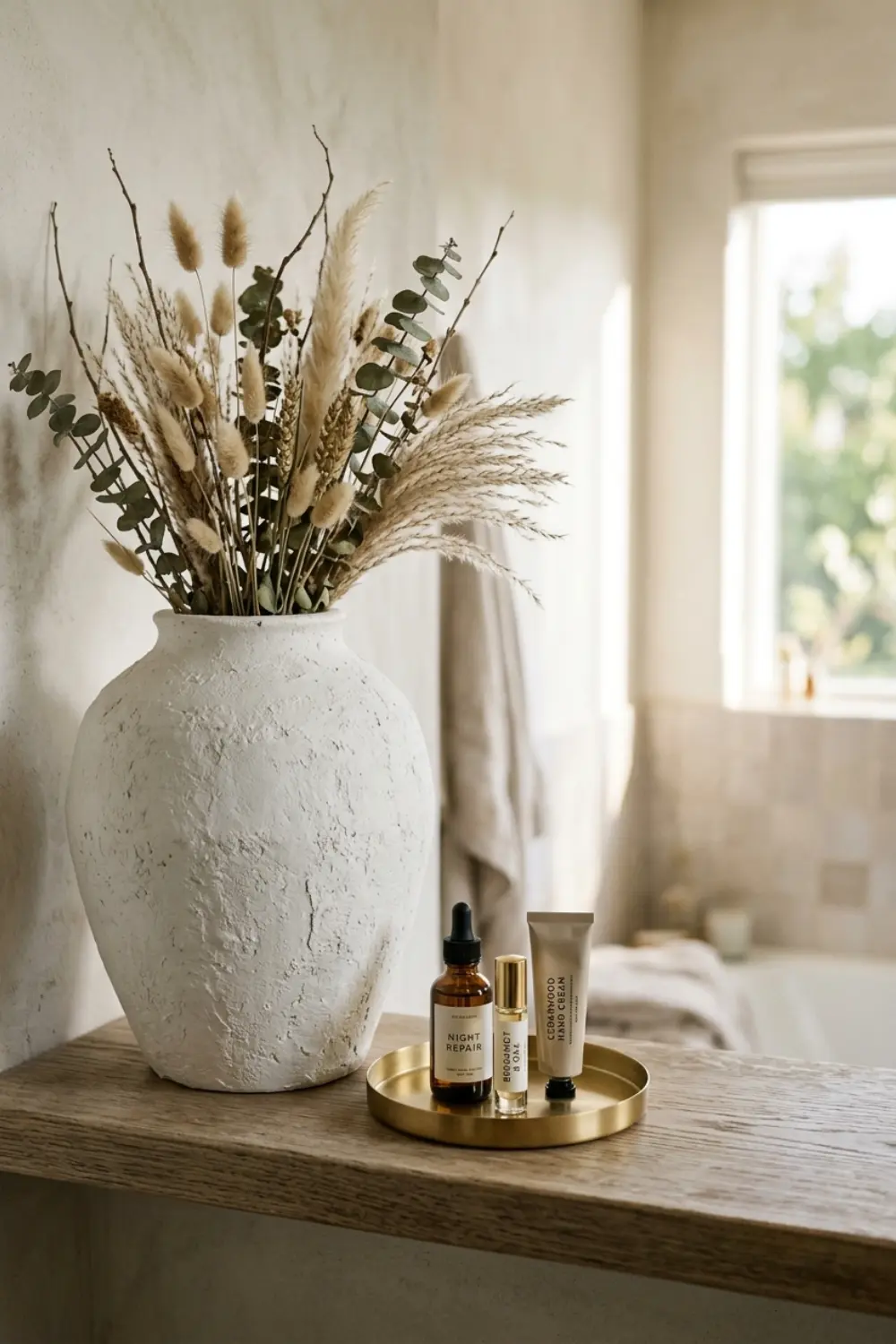
If you’re facing an empty shelf, your first mistake might be immediately filling it with small items. Don’t do that. Always start with one strong, defining piece that visually anchors the entire composition. This could be a ceramic vase, a sculptural candle holder, or even an interesting-shaped container. The point is, this should be the largest, most striking element that gives the shelf its character.
Why is this one anchor piece important? Because it creates hierarchy. Your eye will automatically land on this first, and it determines what comes next. Without this starting point, every little object carries equal weight, and your brain doesn’t know where to focus—that’s what makes a shelf feel cluttered, even when it physically isn’t.
Height is what really matters here. This anchor piece should be the tallest item on the shelf—but don’t put it in the center. This is crucial. Symmetry is boring and static. Instead, place it in the left or right third of the shelf, where your eye naturally catches first. This alone creates dynamism because it introduces asymmetry, which is far more visually interesting.
If you have a small bathroom, this doesn’t mean you should choose a small anchor piece. On the contrary: a bold, larger element creates the illusion that you have room for a statement piece, which projects confidence. Scale here isn’t about the shelf’s physical size—it’s about the proportion between your largest and smallest objects.
2. Layer Different Heights to Create Visual Movement
 Save it
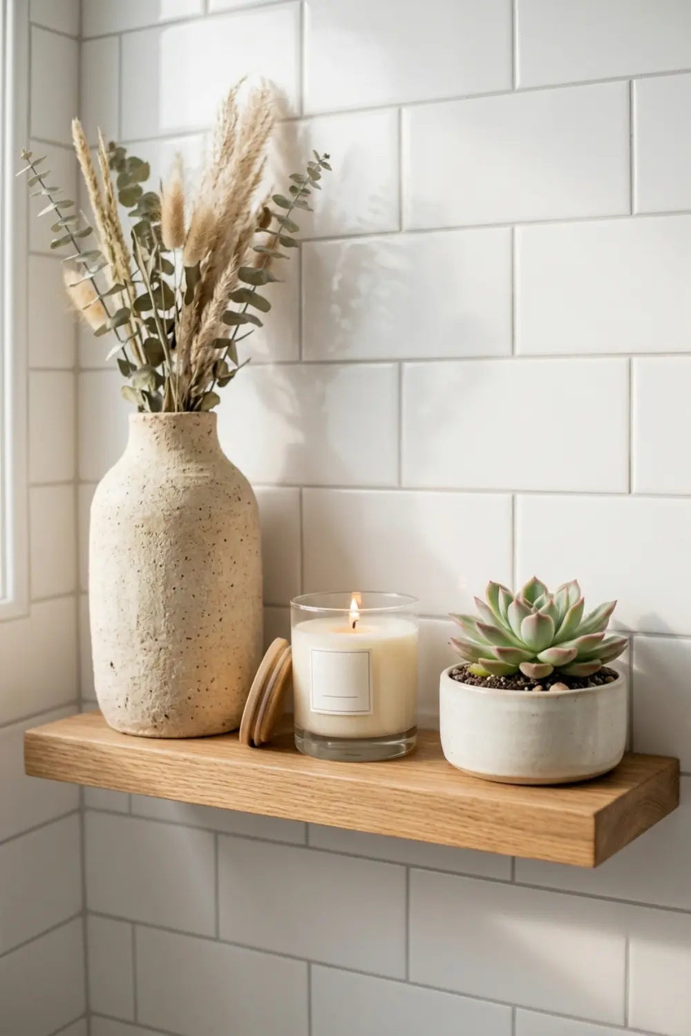
Now that you have your anchor piece, here comes the play of heights. This is what most people get wrong: they put everything at the same height level, then wonder why the shelf looks “flat.” Visual depth comes from intentionally building a height layer: tall, medium, low.
Choose a medium-sized element that’s about half the height of your anchor piece. This could be a smaller vase, a scented candle in a glass jar (a simple, clear glass jar candle about 4-5 inches tall), or a beauty product you’re intentionally displaying because it has nice packaging. It’s important that this medium element isn’t just smaller, but also a different texture. If your anchor piece is matte, let this one be glossy or transparent. This contrast moves the story forward.
Then comes the low layer: small things that fill the space but don’t dominate. These could be tiny plants with succulents, a folded hand towel, a soap dish. But be careful: these shouldn’t be too tiny, or they’ll get lost. Low doesn’t mean miniature—it means a horizontal block that supports the taller elements.
A common mistake is people thoughtlessly place things next to each other in the same row. Don’t do this. Think of heights like a staircase: up-down, up-down. This way your eye “walks” across the shelf, not just scans left to right. This is what makes styling feel alive—as if it’s in motion, even though everything is static.
If you have a wall shelf with multiple levels, apply this height play vertically too. Put taller elements on the bottom shelf, shorter ones on top—this way they don’t block each other, and the overall effect is airier. In [How to Achieve a Timeless Neutral Bathroom Decor Style], I mentioned how important vertical balance is, and the same logic applies here.
3. Use Trays to Group Small Items into One Visual Unit
 Save it
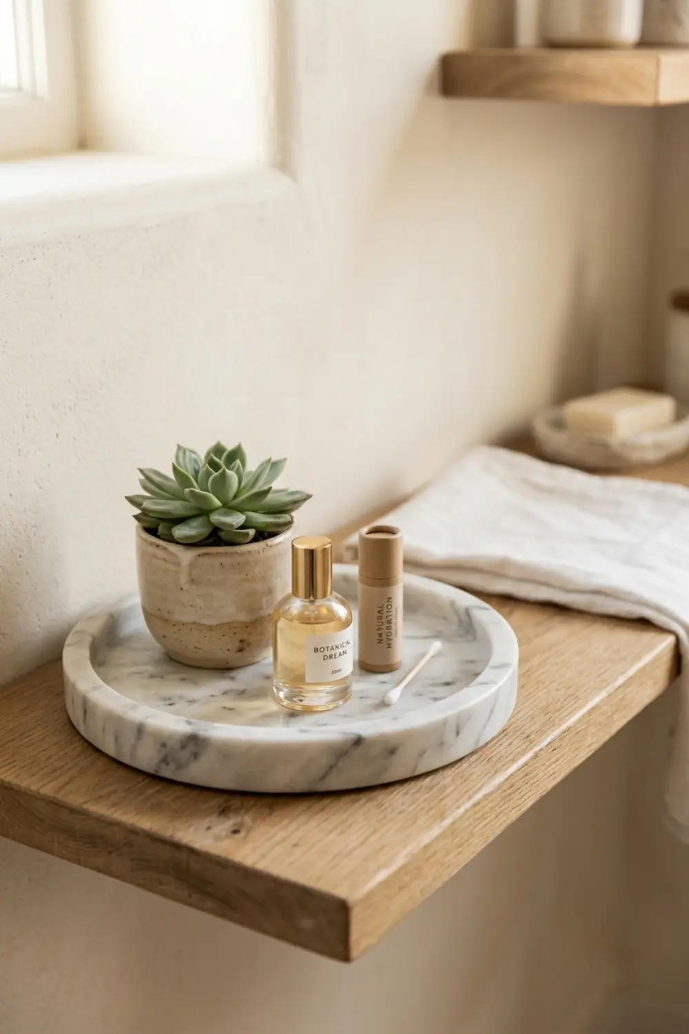
The shelf’s biggest enemy is the chaos of scattered small items. Perfumes, creams, accessories—if you put these out separately, even if there are only three pieces, it already looks like there are ten. The trick: group them on a tray, and suddenly they form one visual unit, not separate distracting elements.
Choose a simple, structured tray. The tray doesn’t just create order, it provides a frame: it signals that “these things belong together.” Your eye reads them as one unit, not individually. This reduces visual noise and creates a professional, curated effect.
But what should you put on the tray? Maximum three to four small items. Maybe a small hand cream, a roll-on fragrance, a lip balm, and perhaps a mini plant. But here too, watch the heights: don’t let them all be the same height. Place a taller element among them—say a small glass bottle or a little candle—so there’s dynamism even within this mini-composition.
Many think the tray is simply a “holder,” but it’s actually a styling tool. The tray’s material and color also matter. If you want a modern, minimalist effect, choose matte black metal or white marble-imitation. If you want a warmer, more natural feel, a stoneware tray or rattan underlay also works. But don’t let it be patterned or overly decorated—the tray is background, not the star.
In [Affordable Bathroom Counter Decor Ideas That Look High-End], I wrote in detail about how you can elevate even cheap items if you group and contextualize them smartly. The same applies to shelves: it’s not about how much the tray cost, but how intentionally you use it.
4. Introduce One Living Element for Instant Warmth
 Save it
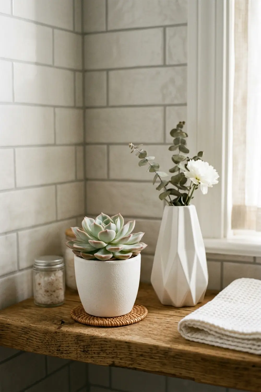
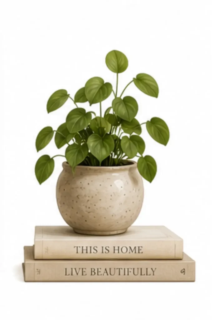
Most bathroom shelves feel cold because they only have objects on them—nothing that’s alive. A plant, even a tiny one, instantly brings warmth and liveliness to the space. You don’t need a big tropical palm—a small succulent or a eucalyptus branch in a little vase is enough to bring an organic element to the composition.
Why does this work so well? Because the plant adds soft lines next to hard, geometric forms. Most bathroom things—tiles, shelves, bottles—have sharp angles. A plant is soft, irregular, and because of this, the whole shelf becomes more alive. This is what “draws you in” to the space, rather than keeping distance.
But what plant should you choose? If you have natural light, go for succulents or cacti. In small ceramic pots (a matte white or terracotta mini pot, about 2-3 inches in diameter), they’re simple, cheap, and easy to maintain. If you don’t have much light, choose a faux plant instead, but one that looks realistic. Look for eucalyptus branches or small succulents with realistic texture—not cheap, plastic-looking ones, because that ruins the overall effect.
The plant’s placement also matters. Don’t put it in the center, but in one corner, or next to your anchor piece, to balance the composition. If your plant is too small, it disappears. If it’s too big, it overpowers the other elements. Proportion is key here too: the pot should be about the same height as one of your smallest elements, with the plant having some “head” above it.
Another option: fresh or dried flowers. In a small glass vase, 2-3 stems of eucalyptus, lily of the valley, or even dry pampas grass works great. This is seasonally changeable, so the shelf always looks fresh without having to rearrange everything.
5. Balance Organic Textures with Hard Surfaces
 Save it
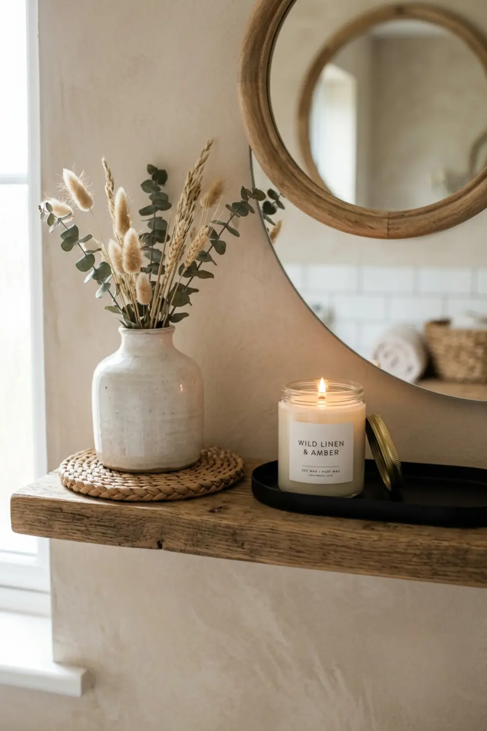
Often a shelf looks “too sterile” because every surface is hard: ceramic, glass, metal. But if you bring in soft, organic textures, it immediately becomes homier and more human. This doesn’t mean making it “rustic”—just creating balance between cold and warm elements.
A small rattan underlay (a round or square, natural-colored rattan coaster set, about 4 inches in diameter), for example, instantly adds warmth if you place it under a vase or candle. A wooden tray where you keep small accessories also works. Or even a linen-textured small fabric piece you place at the bottom of the shelf under an object—this softens the hard surface and makes it visually more interesting.
Why is this texture mix important? Because your eye registers not just shapes, but materials too. If everything is smooth and shiny, the space remains emotionally “cold.” But if there are a few rough, matte, natural elements, it immediately becomes more human. This is what distinguishes a catalog-like, lifeless shelf from one that looks like someone actually uses and loves their space.
But be careful not to overdo it. One or two texture elements are plenty. If we mix too many different materials—wood, rattan, ceramic, glass, metal, stone—the overall picture feels messy. Stick with 2-3 main materials, and one of them should always be soft or organic.
In [Beautiful Bathroom Decor Ideas to Refresh Your Space], I mentioned how important texture layering is in keeping a space from looking “flat.” The same thought applies to shelf styling: the contrast of different surfaces adds depth.
6. Leave Negative Space—It's Part of the Design
 Save it
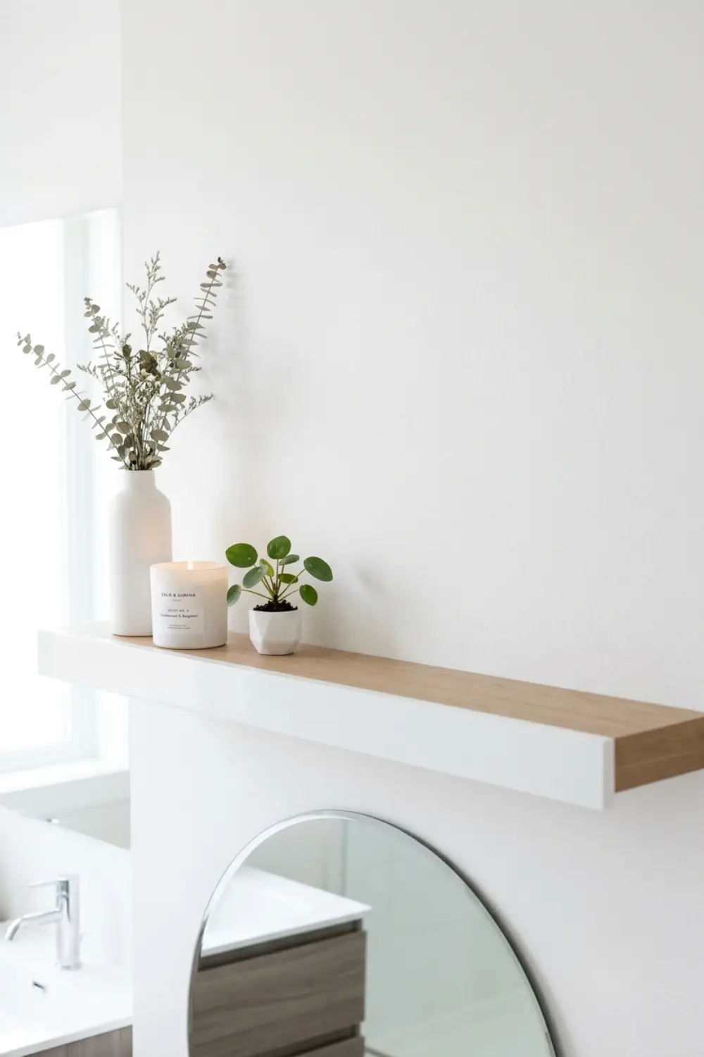
This is perhaps the hardest: leave empty space. The shelf isn’t about filling every inch—it’s about where you don’t put things. Negative space isn’t a mistake, it’s not a deficiency—it’s part of the design that gives the composition air and allows your eye to rest.
Many people think if there’s empty space on the shelf, the picture is “incomplete.” But actually, it’s the opposite: if everything is packed full, there’s nothing to highlight the important pieces. Negative space is what creates hierarchy and shows what matters. The distance between two objects is just as important as the objects themselves.
A good rule: never fill more than 60-70% of the shelf. If you have, say, a 30-inch wide shelf, at least 8-12 inches should remain empty—this can be on one edge, or distributed across multiple points. This emptiness makes the composition feel intentional and thoughtful.
How do you decide where to leave empty? Look at where the visual weight is. If, for example, you have the anchor piece on one side and 2-3 medium elements next to it, leave more empty space on the other side. This doesn’t mean the shelf will be asymmetrical—it means it’s balanced, but not symmetrically. Visual weight and physical fill are two different things.
Negative space also helps the shelf “breathe.” This is especially important in small bathrooms where space is already tight. If you overcrowd the shelf, instead of making it look bigger, it’ll actually make the space feel smaller because your eye finds no resting point. Emptiness suggests spaciousness—luxury.
7. Repeat One Material or Color for Visual Cohesion
 Save it
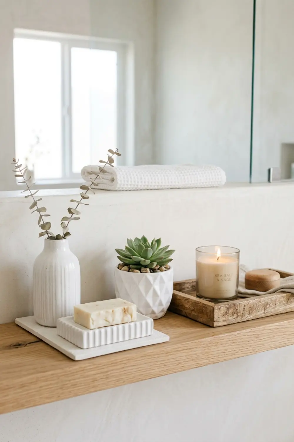
Here comes the magic: having something that ties it all together. If everything is a different color and material, even if the individual pieces are beautiful, the end result will be chaotic. Repetition—a color or material recurring—creates harmony, unity, flow.
Choose one material and repeat it at least three times on the shelf. This could be white ceramic, metal, glass, or even wood. For example, if you have a white ceramic vase as your anchor piece, then also have a white soap dish and a white little pot. This instantly makes everything “talk” to each other, even if the forms and sizes differ.
The same works with colors. You don’t need everything to be monochrome, but if there’s a dominant color—say white, black, or a natural beige shade—carry it through. This could be the tray’s color, a towel, a candle. If, say, everything on the shelf is white and woody tones, and then there’s a bright pink perfume bottle, it’ll stand out. But if you bring in another one—say a rose-scented boxed candle—then those two pink elements create a dialogue.
This repetition not only calms visually, but also communicates that you intentionally built the shelf. You didn’t just throw it together, you designed it. And that’s what makes the difference between a random bathroom shelf and a professionally styled space.
In [Simple Small Bathroom Decor Ideas for a Clutter-Free Look], I emphasized that in small spaces, coherence is what prevents visual chaos. The same applies here: repetition and a unified color palette give a sense of security, even when you’re working with bold forms.
8. Use Reflective Surfaces to Add Light and Depth
 Save it
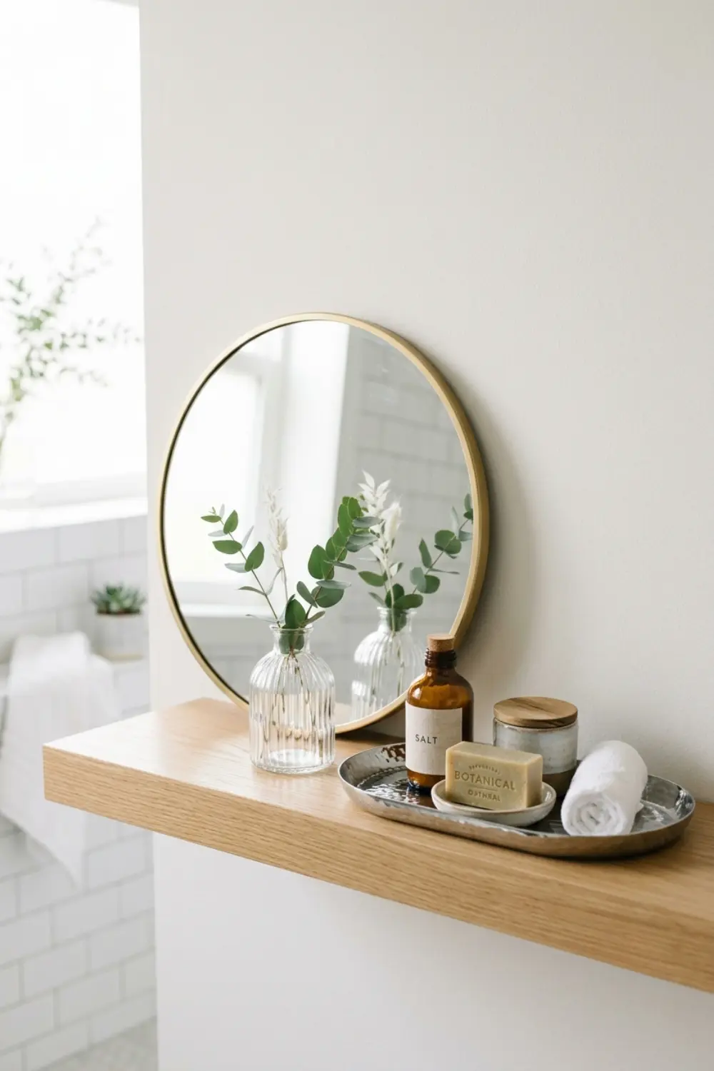
The bathroom is usually not the brightest room—especially if there’s no window or it’s small. One of the best tricks in shelf styling is bringing in reflective surfaces that bounce light and create depth. This could be a small mirror, a metal tray, a glass vase, or even a shiny ceramic piece.
A small round mirror not only works as decoration but is also functionally useful. You can lean it against the back wall of the shelf, and it instantly doubles the sense of space. The mirror reflects the lighting, making the shelf feel brighter and larger.
If you don’t have room for a dedicated mirror, still work with shiny surfaces. A glass vase, a transparent candle holder, a chrome or gold metal tray—these all reflect light. The goal isn’t to make everything sparkly, but to have 1-2 elements that provide a “light point” in the composition.
The contrast between shiny and matte elements is exciting in itself. If everything is matte, the overall effect is a bit too flat. If everything is shiny, it’s too flashy. The mix of the two is perfect: matte elements anchor the space, shiny ones make it dynamic.
This works especially well in minimal modern bathrooms where a black-and-white palette dominates. A gold or bronze tray, or a crystal-textured glass vase instantly adds warmth without diverting from the style.
9. Incorporate Personal Objects That Tell a Story
 Save it
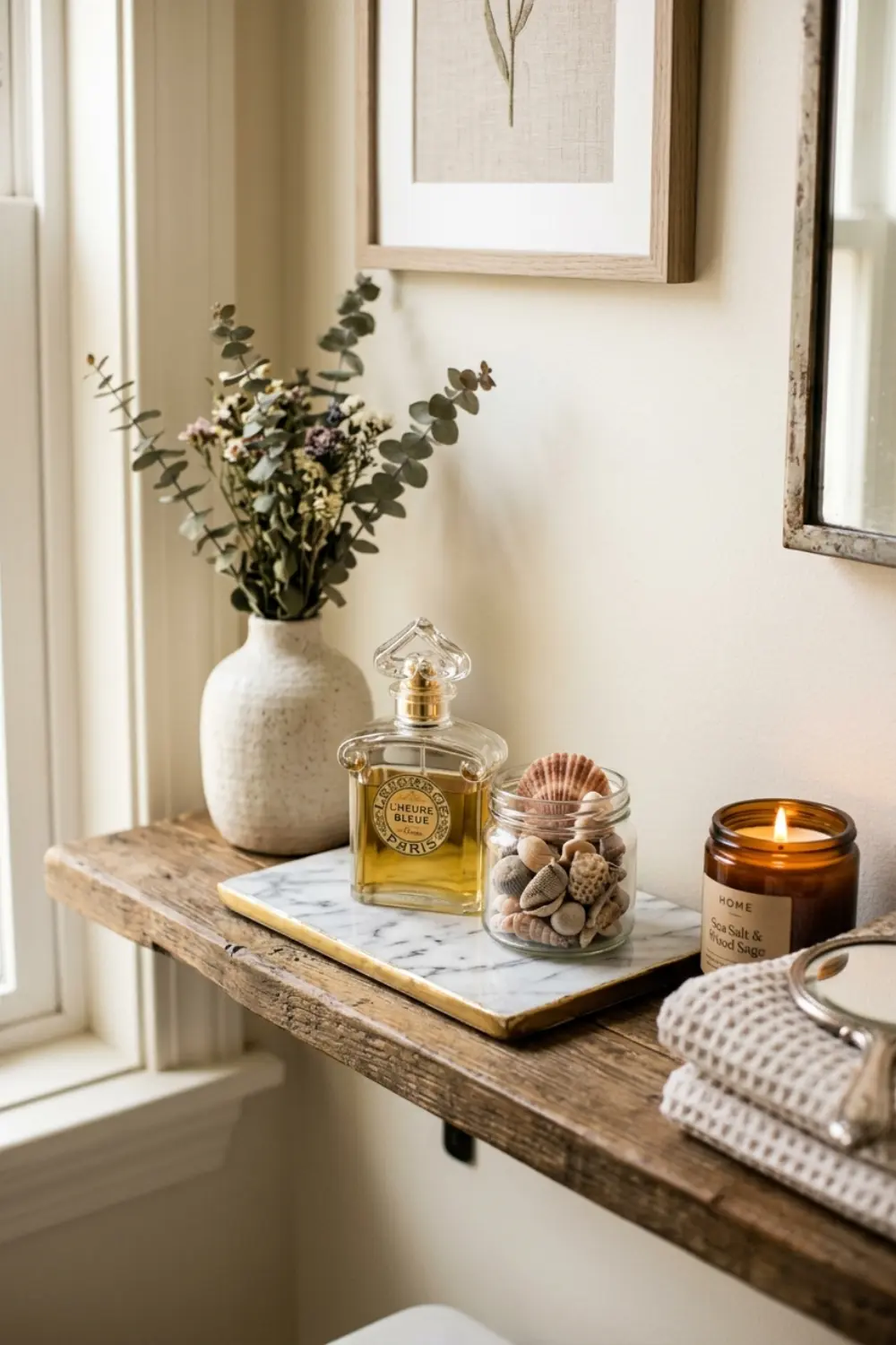
The biggest difference between a catalog-like and a real, lived-in shelf is that the latter has something personal on it. This doesn’t mean you need to put out family photos in the bathroom, but have one or two objects that tell your story. A beautiful perfume bottle you love. A vintage soap dish you got from your grandmother. A shell collection from your last beach trip in a small glass container.
These personal objects bring emotion into the space. Suddenly it’s not just “a bathroom”—it’s your bathroom. And that’s what distinguishes cold, designed spaces from ones you’re happy to step into in the morning.
But there’s an important balance here: don’t have too many personal trinkets, or it becomes cluttered. Maximum 1-2 such items per shelf is enough. These should be beautiful and stylized—not a plastic keychain or a random paper roll. If you have a personal object that’s not very pretty but important to you, place it so it gets context: put it on a nice tray, or stand it next to a vase. Context changes everything.
For example, if you have a handmade soap you love but its packaging isn’t very elegant, take it out and put it on a nice soap dish. Suddenly that soap also works as a styling element, not a distracting factor.
In [20 Beautiful Bathroom Tray Styling Ideas to Elevate Your Vanity], I also emphasized how important curating personal objects is—not every personal thing is visually equal in value, and you don’t have to display everything.
10. Think in Triangles, Not Lines
 Save it
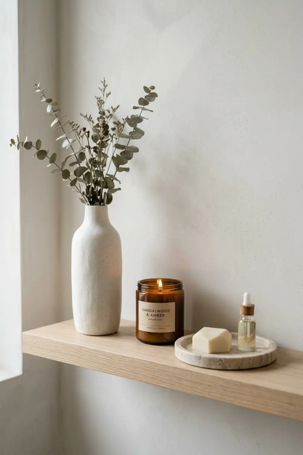
The composition’s secret weapon: the triangle. When placing objects, don’t think in straight lines, but try to position them so they form imaginary triangles. This gives dynamism, and your eye automatically follows this rhythm.
For example: on the left side is the anchor piece (tall), in the middle a medium vase, on the right side a low tray. If you connect these in your imagination, you see a triangle. Now add a second layer too: in the background, a small mirror behind the tall piece, a candle on the tray. Again, a triangle.
This triangle arrangement is why catalog and magazine shelves look so professional. It’s not accidental: stylists intentionally build this. You can do it too.
Don’t worry, you don’t have to do it with engineering precision. Just keep in mind: if you line everything up in a row, it’s boring. If you nudge things a bit up and down, and there’s depth layering, the picture will be in motion. The triangle is visually calming because our brain likes symmetry, but the triangle is also asymmetrical, so it stays interesting.
In [18 Trending Above Toilet Decor Ideas for a Beautiful Bathroom], I also wrote about how triangle arrangement works on vertical surfaces (like the shelf above the toilet). The same logic works here, horizontally.
11. Match the Style of the Shelf to the Overall Bathroom
 Save it
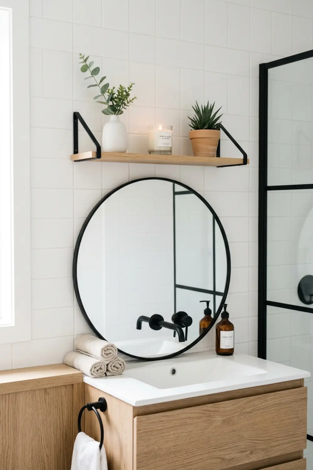
This seems obvious, but it’s often overlooked: the shelf’s style doesn’t exist on its own. If you have a modern, minimalist bathroom and you put in a rustic wolf-carved shelf, it’ll be dissonant. The shelf and styling should be coherent with the rest of the bathroom.
If you have a modern bathroom, then clean lines, neutral colors, metal and glass elements. If your style is farmhouse or rustic, then wooden trays, rattan baskets, natural textures. If it’s minimal japandi, then very few elements, lots of negative space, natural materials, neutral color palette.
But this doesn’t mean you can’t mix styles. Just don’t force it. In a modern bathroom, a rattan underlay can work well because it brings in an organic element—but a rustic log base is too much. In a rustic bathroom, a metal tray can give a modern edge—but a chrome designer vase would already be dissonant.
The point: shelf styling should be a continuation of the bathroom, not a separate, drilled-down story. If you don’t know what style your bathroom is, start by describing it in three words: modern, natural, warm? Or rather: minimal, cool, structured? Those three words should then apply to all elements of the shelf.
If you live in a rental and can’t change big things, the shelf is where you can “speak”—with small interventions, you can transform the space without damaging anything.
Rental Friendly Version & Small Bathroom Tips
If you live in a rental, or your bathroom is very small, conscious shelf styling is even more important because you can’t start big renovations. The shelf is the surface you can fully control without drilling or repainting anything.
In a small bathroom, don’t try to make “miniaturized” versions—don’t shrink everything down, but choose fewer, more impactful elements. One strong anchor piece, a tray with a few things, a plant. Done. If you put out too many things in a small space, it makes the space feel tighter, not richer.
In rentals, trays and baskets are especially good because they’re mobile—if you move, you can take them with you, and they work elsewhere too. Focus on these small, portable elements rather than built-in solutions you can’t tackle.
Now one last note before we move on to mistakes. Shelf styling isn’t a one-time project—it’s a living, evolving thing. Give yourself permission to shape it, refine it, experiment. Don’t get stuck if it’s not perfect at first glance. Sometimes you only notice days later that something’s off, and that’s okay. Styling is a process, not a finished result.
Common Mistakes to Avoid
1. Too many small items
People think the more things on the shelf, the “richer” the visual will be. But actually, the opposite is true. If you fill it with lots of little things, you create visual noise, and nothing stands out. Your eye can’t find the focal point, and the shelf feels chaotic. Instead: fewer, but more prominent pieces. If something’s too small, put it on a tray so it forms one visual unit.
2. Everything at the same height
If every object is the same height, the shelf will be “flat.” There’s no dynamism, no depth. Your eye simply glides over it, nothing catches it. Use intentionally different heights—tall, medium, low—and you can create layers. Height variation is what gives movement to the space.
3. No negative space
Empty space isn’t a deficiency, it’s part of the design. If you fill every inch, the shelf feels suffocating, crowded, and doesn’t let your eye rest. Negative space allows your eye to breathe and lets important elements stand out. At least 30% empty surface should always be on the shelf.
4. Chaos of colors and materials
If there are too many different colors and materials at once, the shelf feels confused, even if each individual piece is beautiful. Too much information. Choose 2-3 main colors and stick with that. Same with materials: don’t mix 6 different textures. Pick 2-3 dominant materials (e.g., ceramic, metal, rattan) and repeat them.
5. Using matching sets
Identical-design “bathroom accessory sets” are boring and impersonal. Instead, mix different pieces that harmonize in style but aren’t uniform. This gives character and depth.
Frequently Asked Questions
How do I make my bathroom shelf look luxurious even with cheap items?
The feeling of luxury isn’t in the price tag, but in the arrangement, negative space, and harmony of materials. Choose neutral colors, group small things on a tray, and leave lots of empty space. A cheap white ceramic vase, if you place it well and there’s air around it, looks more expensive than if it were on a packed shelf.
What colors make a bathroom feel calm?
Neutral, earth tones—white, beige, gray, soft green, warm wood—are naturally calming. Avoid bright, vibrant colors on large surfaces. If you want color, bring it in as a single accent (like in a candle), but don’t have many different bright colors at once.
How do I arrange the shelf so it doesn’t look cluttered?
Fewer elements, more negative space. Maximum 5-7 pieces on one shelf is enough. Use heights (tall-medium-low), and group small things on a tray. If it feels like too much, take off at least two—it’ll usually be instantly better.
Can I mix styles on the shelf, or should I stick to one?
You can, but only if you do it intentionally. For example, in a modern bathroom, a rattan element can work well because it adds warmth. But don’t mix too many styles at once (e.g., industrial + bohemian + minimal)—that’s too chaotic. Choose a base style and add one or two foreign elements that enrich but don’t upset it.
Conclusion
If you’ve made it this far, you now know that bathroom shelf styling isn’t about putting out every pretty thing you find. It’s about intentionally building a composition where every piece has a role: there’s a strong anchor element, there are height layers, there’s negative space, there’s texture mix, and there’s a unifying color or material palette.
The most important thing you can take away: don’t be afraid to put out less. That tendency to “fill” everything is why most shelves are cluttered and confusing. Negative space, air—that’s what truly gives a sense of luxury. The intentionally left empty space is just as important as what’s displayed.
The shelf isn’t a static display, but a living surface. It can change seasonally, it can change when you find new things that better reflect who you are. Give yourself permission to experiment, move things around, refine the arrangement. It doesn’t have to be perfect the first time—often you only notice days later what “doesn’t feel right.” And that’s normal.
The most valuable advice: don’t copy exactly what you see on Pinterest. Get inspired by it, but build your own version with your own objects, according to your own needs. Because in the end, the goal isn’t to look like a catalog—but to be your bathroom, where you enjoy spending time, and where every shelf, every corner radiates calm, order, and beauty.
Remember: style isn’t about how much you spend, but how intentionally you place things. And now you know how.
This post contains affiliate links. I may earn a small commission at no extra cost to you.
Get cozy inspiration delivered to your inbox.
✓ 14-page beautifully designed ebook
✓ Cozy decorating ideas
✓ Practical room-by-room inspiration
You’re in! 🎉
Thanks for joining the NestFlowHome community!
Your free ebook is already on its way to your inbox. If you don’t see it within a few minutes, please check your Promotions or Spam folder.
Join the NestFlowHome community for weekly decorating inspiration.

Timeless home decor ideas and slow living inspiration for a calm, beautiful life.