Transform Your Space with a Stunning Media Wall Design
By Emily | October 28, 2025
Your living room can be full of expensive furniture, carefully chosen rugs, and designer lighting—but if the wall around your TV isn’t right, the whole space feels unfinished. I see this in so many homes. The TV gets mounted, a console is pushed underneath, and that’s the end of the story. But in reality, this is where it all begins.
A media wall isn’t just a wall to hang your TV on. It’s the soul of the living room. It’s where function meets design, where the room feels cheap or premium. If you do it wrong, it ends up crowded. Do it right, and it gives the entire space a visual frame that ties everything together.
This post is for you if you want your living room to finally have a unified look. If you’re bored with your current TV environment and feel like there could be more. I’ll walk you through how to design a media wall that not only stores your devices, but also acts as a design element. You’ll learn what lighting tricks you can use to make it more spectacular, how to deal with the problem of cable clutter, and what mistakes you should definitely avoid.
If you want a living room that’s not just beautiful but thoughtfully designed, you’re in the right place.
The Basics: Measurement, Proportions, and Wall Preparation
 Save it
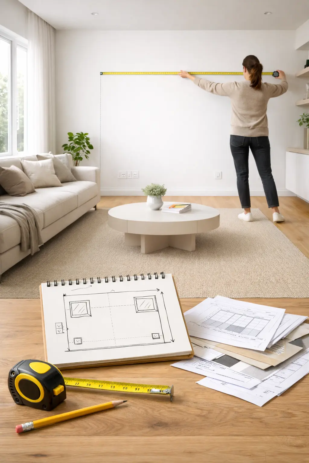
Before you order or buy anything, stop for a moment and get out your measuring tape. Seriously, this is the step most people skip and then wonder if something is wrong.
First, measure the available wall space. Don’t just measure the width and height, but also consider windows, doors, switches, and outlets. Draw a simple sketch – it doesn’t have to be artistic, just something that serves you. Mark the fixed points that you can’t change.
There’s an old rule of thumb when choosing a TV size: the ratio of the screen diagonal to the viewing distance. You should be watching the screen from about 1.5 to 2.5 times the diagonal. So if you’re watching TV from 2.5 meters away, a 55-65-inch device is ideal. But that’s just a starting point – in the context of a media wall, visual proportions also matter.
When preparing the wall, consider the load-bearing capacity of the surface. For drywall, you will need special fasteners, while brick or concrete is different. If you are planning to have floating elements, it is worth creating pre-recessed cable channels – this is where you can avoid headaches later. A quality cable concealment system makes a huge difference in the end result, especially if you cannot recess wires into the wall.
Before painting, decide whether to keep the current color or add a new background to the composition. Darker tones create a dramatic effect and optically bring the wall forward, while lighter shades expand it.
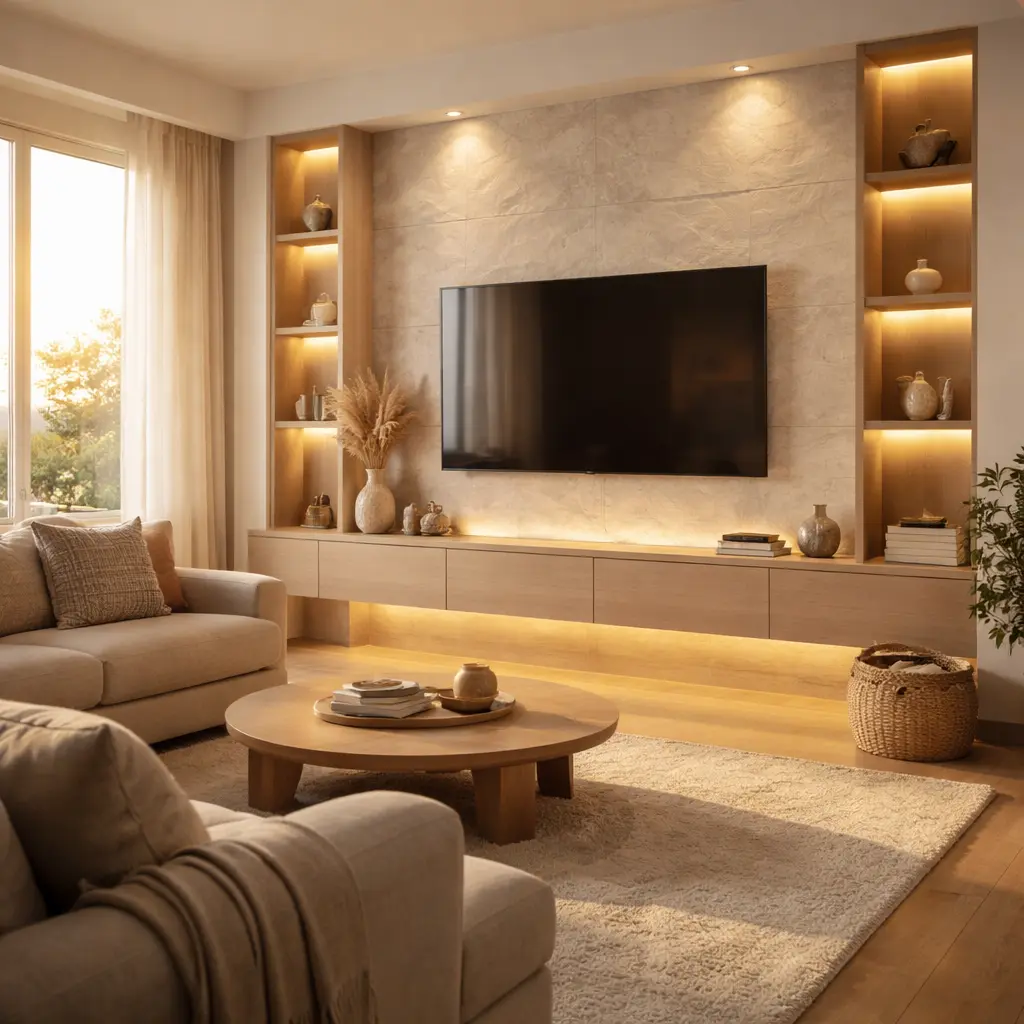
When the Wall Behind Your TV Finally Gets Character
 Save it
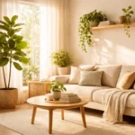
If we’re being honest, the wall behind your TV is probably… just there. Painted, maybe white or gray, and all attention is drawn to the black screen. That’s what makes a living room feel flat and unfinished. The problem isn’t the furniture—it’s that there’s no real backdrop to hold the focus.
I always think in terms of texture here. Not decoration, but structure. A vertical rhythm with a wood slat acoustic panel completely changes the room’s proportions. Vertical lines make the room feel taller, while the warm tones immediately make the tech focus feel more inviting. And surprisingly, sound improves too. Most living rooms are echoey, especially with lots of hard surfaces. An acoustic panel softens reflections, giving a fuller, calmer audio experience during movies. The trick is not to cover the whole wall. Create a deliberate band around the TV that’s wider than the screen.
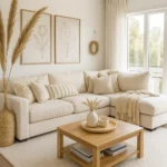
In Scandinavian interior design, for example, the media wall is often minimalist, with white or natural wood elements, while industrial style emphasizes metal details and raw textures. The key is that whatever style you choose, the media wall should not act as an island, but should organically connect with the other elements of the living room – the sofa, the rug, and even the curtains. If you are interested in how to choose the right rug for a small room, check out The Best Rugs for Small Living Rooms in Apartments, because coordinating textiles is key to the overall effect.
If your living room feels “nice but nothing special,” the wall texture is the step that elevates it.
The Floating TV Console That Erases Visual Clutter
 Save it
Let’s face it: in most living rooms, the area under the TV is the visual chaos hub. Cables, game consoles, routers, remotes—all end up there. Even a high-end console or wall finish can’t save it.
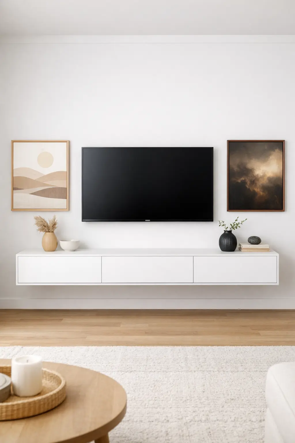
A wall-mounted, floating TV console with drawers solves this problem perfectly. The closed front hides electronics, while leaving the floor visible underneath. This instantly makes the space feel lighter and more organized. In smaller living rooms, this is especially important—every visual simplification counts.
Pay attention to proportions: the console should be wider than the TV. It creates a stable base, avoiding a “wobbly” look. Internal compartments help organize items, so the space is not only tidy from the outside but also truly functional. Combined with a textured background, horizontal and vertical lines balance each other, creating visual calm.
Many underestimate the impact of a clean zone under the media wall. Once this area is organized, the whole living room feels harmonious.
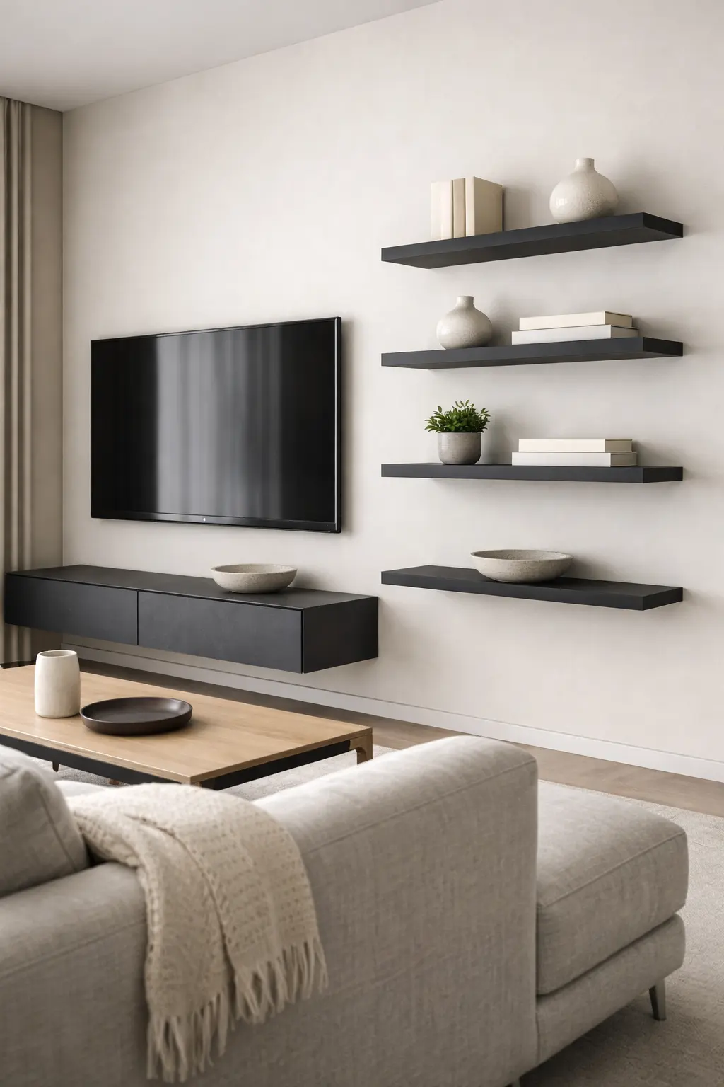
Shelves Around the TV—Intentional Composition Over Clutter
 Save it
Once you have the centerpiece, it’s time to build the supporting characters around it. Floating shelves are gold in this composition – and not just because they’re trendy, but because they also make functional sense.
The biggest advantage of floating shelves is that they visually lighten the space. There’s no plinth, no massive furniture to tie the eye to the floor. Instead, the eye is free to wander between different heights. This vertical layering is what elevates an average TV wall into a true media wall.
When arranging your shelves, avoid perfect symmetry. Sure, symmetry can work, but it can easily become boring. An asymmetrical but balanced arrangement is much more dynamic. Imagine: two narrow shelves on one side, one below the other, and a wider one, a little lower. The space between them is not empty – that’s part of the composition too.
What you put on your shelves is just as important as the shelves themselves. The goal is not to clutter them, but to create a curated look. A few books, a small plant, a vase or sculpture with character. If you’re looking for inspiration for creative uses of vases, you might want to check out From Simple to Stunning: Vase Decor Ideas You’ll Love, where I write in detail about different styles and combinations.
Choose a floating shelf system that is thick enough to have character but not overpowering. Natural wood gives a warm feel, while white or black lacquered versions create a more modern feel. The depth of the shelves also matters – between 15 and 25 centimeters is ideal for most objects.
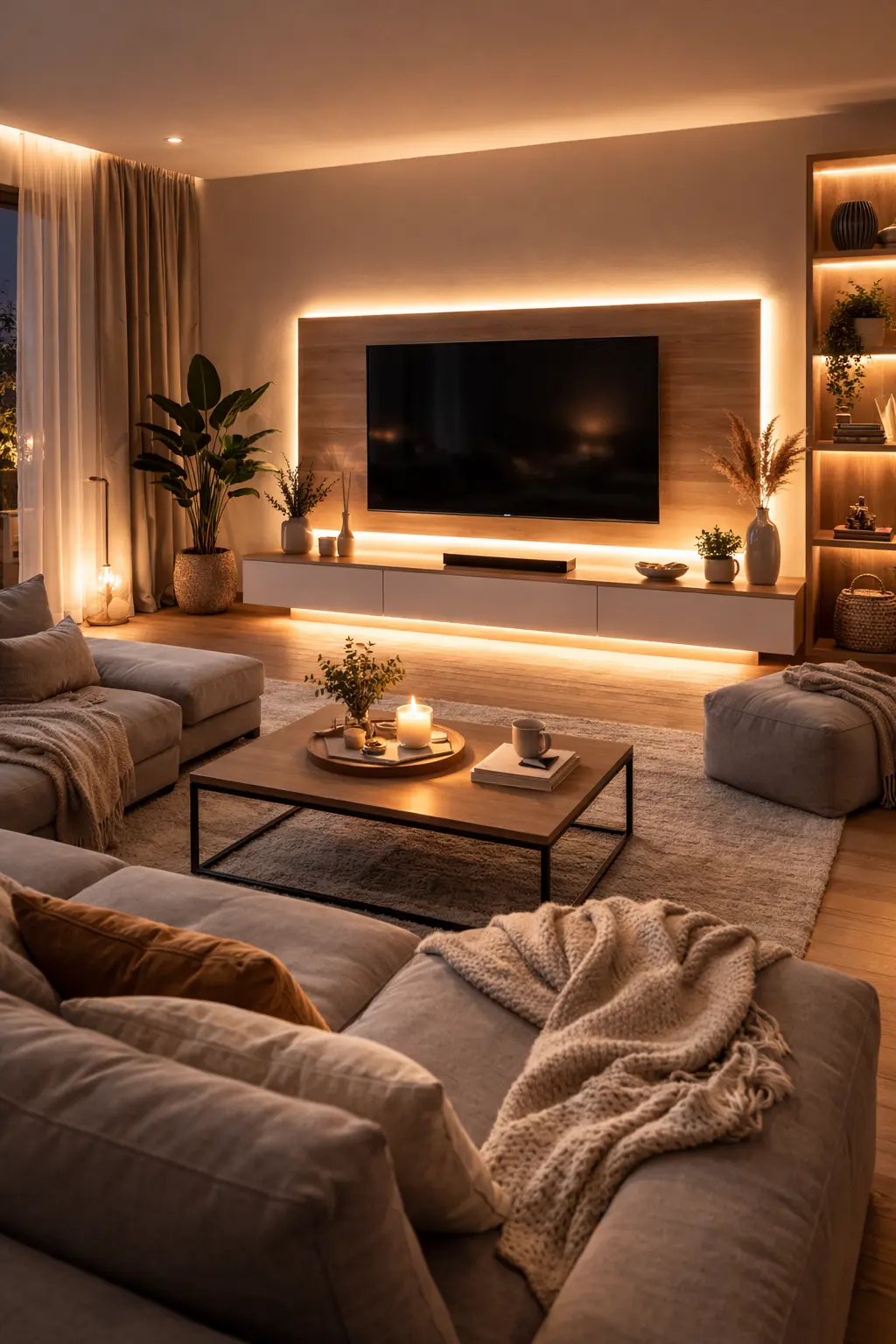
Background Lighting That Reduces Eye Strain
 Save it
Now, I’ll tell you something that most home decor articles forget to mention: lighting is what makes a media wall truly memorable. In daylight, a well-designed wall is beautiful. In the evening, with the right lighting, it’s stunning.
Ambient lighting is not about functional lighting. It’s not there to help you read – that’s what lamps are there for. This type of light creates atmosphere, adds depth, and highlights the elements you want to draw attention to.
The simplest and most effective solution is backlighting behind the TV. Let’s pause here for a moment, because it’s important to understand why it’s not just a good idea from a design perspective. The light behind the screen reduces eye strain by balancing the contrast between the illuminated screen and the dark background. So it’s not just prettier – it’s healthier too.
Among the LED strips, the color-changing, remote-controlled, or app-controlled versions are the most flexible. You can adjust it to match the mood of the movie or simply add a warm white glow to the space. A quality set of LED strips won’t cost a fortune, but the results are dramatic.
Recessed lighting mounted under or above the shelves further enhances the effect. The light casts shadows from above or below, adding depth to the composition. Recessed lights in the ceiling can be used to specifically illuminate specific parts of the media wall – say, a sculpture or a plant.
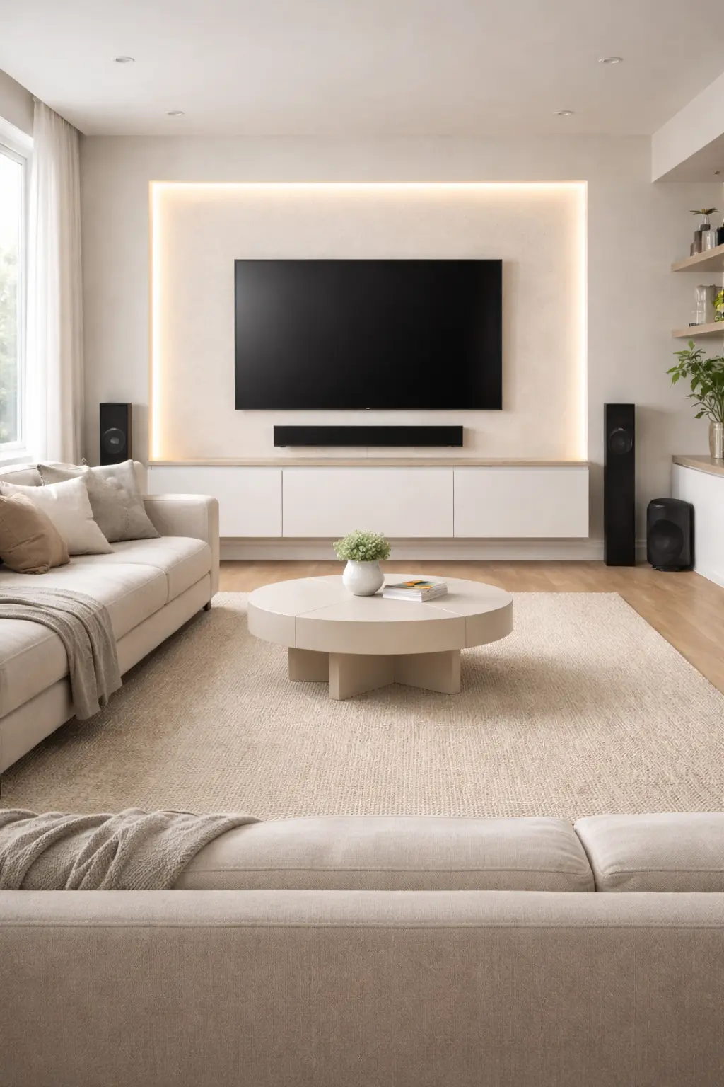
Integrating Sound: Soundbar and Speaker Placement
 Save it
In addition to the visual elements, sound is also part of the experience. A mediocre TV sound gives a mediocre experience – anyone who has tried a normal sound system once will not want to return to built-in speakers.
In the context of a media wall, a soundbar is the most obvious solution. Its thin, elongated shape naturally fits under or above the TV. Most models come with a wall bracket, so you can achieve a floating effect with it too.
When placing it, make sure that the soundbar does not cover the TV’s infrared receiver and does not visually stick out from the composition. If your TV is 55 inches, a soundbar longer than one meter will be disproportionate. Size matching is important here too.
If you want a more serious sound experience, rear speakers – part of a true surround system – are a more complex task. Hiding the wires here is a real challenge, but it can be solved. Bluetooth and wireless systems simplify a lot, although the audiophile community disputes whether the sound quality is the same as the wired version.
Positioning a subwoofer is a science in itself. It’s not good in a corner – the bass gets too strong there. Sliding it against a side wall, hidden behind the sofa, usually gives the best results. A compact soundbar sub combination can be a perfect entry point for those who are getting acquainted with the topic for the first time and don’t want a too complex system.
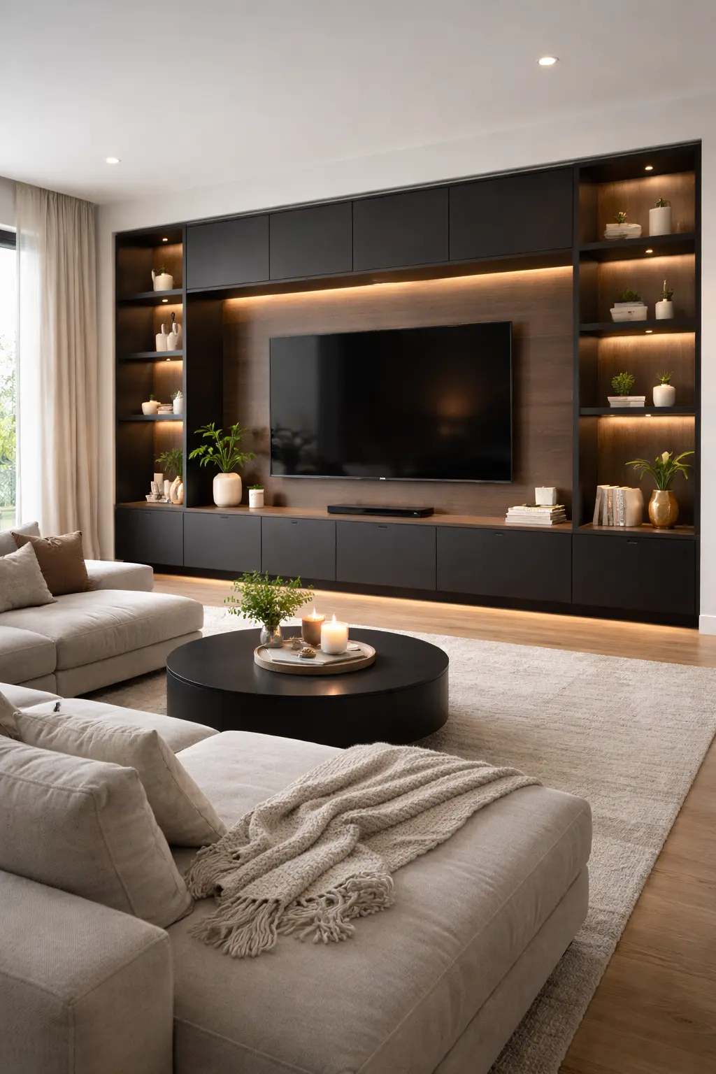
When the Full Wall System Works for You
 Save it
Sometimes, it’s not about small elements, but the full structure. In larger living rooms, a minimalist media wall with a bridge element gives true architectural presence.
A modern entertainment wall that can accommodate TVs up to 75 inches, with a top “bridge” unit, unifies the space. The TV no longer floats in emptiness—it’s embedded in a visual frame. Adjustable shelves provide flexibility, but restraint is key: the balance of open and closed elements determines clarity.
In black, this look feels ultra-modern, especially against light walls. Let the structure speak for itself—avoid overfilling it.
This solution is for those who don’t want to simply decorate the wall—they want to redefine it.
Styles and Trends: Finding the Media Wall That's Right for You
Now that we’ve laid the technical groundwork, let’s talk about what makes a project truly personal: the style.
A minimalist media wall follows the principle of “less is more.” Clean lines, hidden storage, neutral colors. The TV almost disappears into the wall, the shelves are empty or decorated with just one selected object. This style is brutally honest – every little mess is immediately visible, but if you’re consistent, the result is breathtaking.
The modern farmhouse – or as we call it, modern rustic – style combines natural materials with contemporary elements. Wood, natural texture, is welcome, but not kitschy, but restrained. The media wall in this style often includes wooden cladding or beams, which frame the TV. Wicker baskets, plants and warm lights complement it.
The industrial style celebrates raw, unfinished surfaces. Metal shelves, exposed pipes, brick wall background. The media wall in this approach doesn’t try to hide the technology – it integrates it into the raw aesthetic of the environment.
A luxury or glam media wall plays with textures and light. Marble-patterned backsplashes, metal-effect accessories, glass surfaces. Lighting plays a prominent role here – every surface is illuminated to sparkle.
Whatever style you choose, consistency is key. A media wall isn’t a standalone entity – it needs to communicate with the rest of the living room. The color of the sofa, the pattern of the rug, even the texture of the curtains are all part of the overall picture.
Before You Begin: Practical Tips for Successful Implementation
If you’ve made it this far, you probably already have an idea of what kind of media wall you want. But before you hit the “add to cart” button, let me share some practical tips that can save you from unnecessary circles.
First, create a mood board. It doesn’t have to be complicated – a Pinterest board, a folder on your phone with inspiration images. The point is to see the elements that you like together. It often turns out that what is beautiful separately, does not work together. A mood board helps you notice these clashes before you spend money.
Second, think through the order. Paint comes first – before you even install anything. After that, the fixed elements should come: brackets, cable channels, built-in fireplace. Then the furniture and shelves. Finally, the decorations and lighting. If you reverse this order, there is guaranteed to be an element that you will have to dismantle and put back.
Third, allow time for drying, transportation, and improvisation. Media wall projects tend to take longer than you expect. That’s okay—it’s better to be patient and get a good result than to rush and compromise.
Fourth, ask for help with the more difficult elements. For mounting the TV or installing the fireplace, it’s worth having another pair of hands. Not only for safety reasons, but because precise positioning is easier when you have someone watching and directing from a distance.
Finally, let the space “settle in.” After the first week, you may realize something isn’t right. Maybe a shelf is too crowded, maybe the lighting isn’t warm enough. These fine-tuning adjustments are part of the process.
Before we get into the common mistakes, it’s important to understand that a media wall isn’t a weekend project, but it doesn’t have to take months. Conscious planning and knowing what to expect in advance can save you a ton of time and money.
Typical Mistakes to Avoid at All Costs When Designing a Media Wall
I’ve seen countless media walls over the years – friends’, acquaintances’, online. And while they’re all different, the mistakes are surprisingly similar. Let me show you what they are so you don’t make them.
The television mounted too high:
This is by far the most common mistake, and I understand why it happens. It seems “logical” above the mantelpiece, “aesthetic” in the upper third of the wall. But think about it: if you have to look up from the couch, your neck muscles are constantly straining. You’ll feel it after half an hour of watching a movie. The center of the screen should be about eye level when you’re sitting – this is not a matter of perspective, but an ergonomic fact.
Ignoring proportions:
A 75-inch TV on a 3-meter wall is fantastic. The same TV on a 2-meter wall is oppressive. The size of the shelves and accessories also matters – if everything is small, the effect is lost. If everything is too big, the composition will be crowded. Use the paper trick: cut out pieces of paper the size of the planned elements, stick them on the wall, and live with them for a few days. It’s surprising how different the perspective will be.
Neglecting lighting:
I’ve seen beautiful media walls that were amazing during the day but were meaningless at night. Natural light changes and disappears at night. If you don’t have thoughtful artificial lighting, your composition will lose its impact for some of the time.
Procrastinating on organizing cables:
Many people think, “I’ll do it later.” That later usually never happens. Cable clutter is not only an aesthetic problem – it’s also a psychological one. It creates visual noise and disturbs your subconscious. It’s worth taking it seriously from the first moment.
Sacrificing functionality for aesthetics:
A media wall is primarily a center for media consumption. If the remote control doesn’t fit, if you can’t put the console anywhere, if you have to pull the cable forward every time to charge, then aesthetics aren’t worth it. Design and practicality are not mutually exclusive – but you have to plan.
Frequently Asked Questions
How do I make my media wall look premium?
Texture, deliberate proportions, and layered lighting. A wood slat panel or dark matte wall creates visual weight when properly lit.
What colors work best around the TV?
Deep gray, graphite, warm beige, and natural wood tones reduce screen contrast and create calm backdrops.
Can small living rooms have a media wall?
Yes—opt for lighter, floating elements. Heavy panels can compress the space.
How do I decorate without clutter?
Leave breaks between objects, group décor thoughtfully, and embrace empty space. Air is the best décor.
Final Thoughts
If you’ve come this far with me, you’re probably no longer thinking about “should I?” but about how to make it happen. And that’s the most important step – the decision to act.
A media wall is not just a decorative element. It’s an investment in how you feel in your own living room. How you watch a movie with your family, how you unwind after a long day, how you share the space with your guests. A consciously created space is not a luxury – it’s a choice.
Of course, it won’t be perfect the first time. Maybe the shelves need to be a little lower, maybe the lighting needs a warmer shade, maybe you’ll change the decor in a few months. This is not a failure, but a natural part of the process. Home design is not a series of decisions made once, but an ongoing dialogue with the space.
Now, step closer to that wall. Look at it with a different set of eyes. Imagine what you want to see when you get home. Then start planning—with a piece of paper, a Pinterest board, a yardstick. The most important step is always the first.

This post contains affiliate links. I may earn a small commission at no extra cost to you.