

How to Make Your Open Kitchen Look Bigger and Brighter
By Emily | October 6, 2026
An open kitchen promises space. Knock down the wall, join the cooking zone to the living room, and the whole floor should feel generous and full of light. Yet many open-plan kitchens end up feeling oddly smaller than the closed rooms they replaced. The island becomes a dark block in the middle of the floor, the back wall sinks into shadow by late afternoon, and the view from the sofa lands on a crowded counter instead of a long, calm line of cabinetry.
The reason is rarely square footage. In an open plan, the kitchen does not have its own walls to define how big it feels. It borrows its size from everything around it: the windows on the living side, the depth of the dining area, the floor that runs between them, and the objects that sit in the path of the eye. When those elements work together, the kitchen reads as one part of a single, generous room. When they compete, the eye stops at every edge, and the space shrinks.
That is the thinking behind this guide. Instead of treating the kitchen as a separate room to be lightened and decluttered on its own, each idea below removes one visual boundary between the kitchen and the spaces it opens onto. Some let daylight travel further. Others let the eye pass through furniture rather than stopping at it. A few quietly redraw the zones so the room feels organized without feeling divided.
Every section pairs one idea with a specific piece that helps you put it into practice, from sheer linen panels and an arched floor mirror to transparent counter stools and a slim bamboo console. None of them requires a renovation. Together, they make an open kitchen feel the way it was always supposed to: wide, bright, and connected to the rest of your home.
1. Pull Living-Room Daylight All the Way Into the Kitchen
 Save it
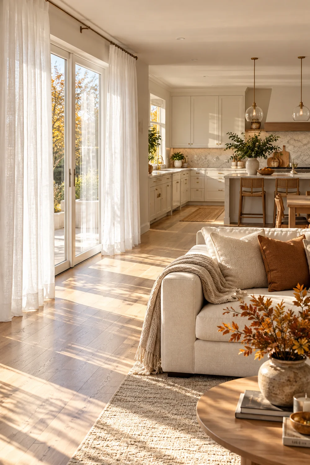
In most open-plan homes, the best windows belong to the living room. The kitchen sits deeper in the floor plan, often along the back wall, and receives whatever light survives the trip across the sofa, the rug, and the coffee table. That is why the kitchen side of an open room can feel dim even at midday. Brightening the kitchen, then, starts on the other side of the room, at the windows that actually face the sky.
Heavy drapes, dark blinds, and lined curtains hanging in a stacked bunch beside the frame all cut into that light before it begins its journey. Replacing them with white sheer linen changes the quality of the daylight rather than just the quantity. Sheer fabric diffuses sun into a soft, even glow that bounces off pale floors and walls and carries much further into the room than a hard beam of direct light. It also removes the glare that tempts people to close the blinds entirely on bright afternoons.
The sheer linen curtains come as a set of two white panels, each 52 inches wide and 84 inches long, with a linen texture and a light-filtering weave. They soften the window without darkening it, which is exactly the job in an open plan.
How you hang them matters as much as the fabric. Mount the rod several inches above the window frame and extend it well past the sides, so that when the panels are open they rest against the wall rather than over the glass. Every inch of uncovered window is light that reaches the kitchen. If your ceiling is high enough for longer panels, choose a length that grazes the floor; curtains that stop halfway down the wall visually shorten the room.
Keep the treatment consistent across every window on the living side. Mismatched blinds and curtains interrupt the long view and make the windows read as separate holes in the wall rather than one bright edge of the space. If the kitchen has its own window, dress it in the same white sheer or leave it bare, so the light on both sides of the room feels like it comes from the same source.
Finally, look at what sits directly in front of the windows. A tall bookcase, a high-backed armchair, or a cluster of large plants can block more light than any curtain. Moving one piece a few feet to the side is often the cheapest brightening upgrade an open kitchen will ever get.
2. Place a Mirror Where It Can Reflect the Whole Kitchen
 Save it
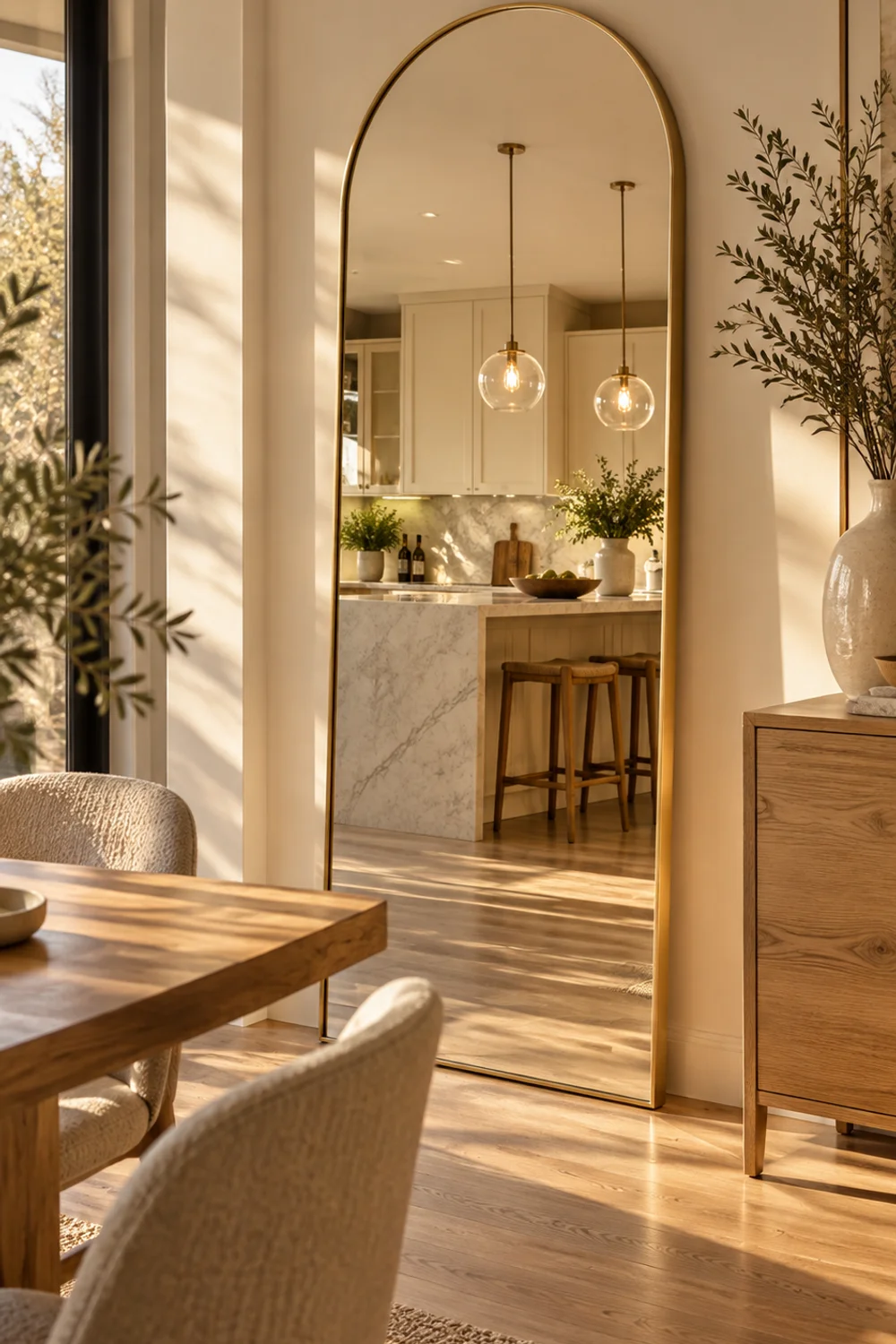
A mirror is the oldest trick for making a room feel larger, but in an open plan it is often hung in the wrong place. Mirrors in entryways and hallways reflect blank walls. A mirror placed with intention can do something far more useful: reflect the kitchen itself back across the room, so the view from the sofa doubles the depth of the cabinetry, the island, and the light falling on them.
The best position is on the wall opposite or diagonal to the kitchen, usually on the dining or living side. Stand where you most often sit, then look toward the kitchen and ask where a reflection would continue that view. A mirror on that wall makes the kitchen appear to extend beyond its actual back wall, and it catches light from the windows and bounces it into the corners that daylight never reaches directly.
Shape matters. A tall, arched mirror reads as architecture rather than decoration, almost like an extra doorway opening onto a brighter room. This arched full-length mirror stands 64 inches tall and 21 inches wide, with an arched top and a slim gold aluminum frame. Its height carries the reflection from the floor up toward the ceiling, which emphasizes the vertical scale of the room as well as its depth.
Leaning the mirror against the wall gives the room a relaxed, collected feel, while mounting it securely is the safer choice in homes with children or pets. Either way, angle it so it reflects something worth seeing: the island, a pendant light, the glow of a window. A mirror that reflects a cluttered counter or a pile of shoes will make the room feel busier, not bigger.
The thin gold frame works especially well in an open kitchen because it can echo the metal of pendant lights or cabinet hardware across the room. That small repetition ties the two zones together visually and makes the reflection feel like part of a planned scheme.
Mirrors are only one way to borrow depth from reflective surfaces. If your kitchen is compact as well as open, Modern Kitchen Decor Ideas for Small Spaces to Copy Now explores how glazed tile and other reflective finishes can expand a tight kitchen from the inside. In a larger open plan, though, a single well-placed mirror across the room is often enough to make the whole space feel noticeably deeper.
3. Trade One Wall of Upper Cabinets for Floating Shelves
 Save it
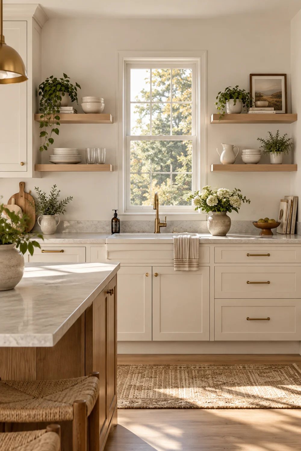
Stand in your living room and look at the kitchen. Chances are the first thing you see is a solid wall of upper cabinets. From close up they feel practical, but from across the open plan they read as a heavy horizontal band that lowers the ceiling and closes off the back of the room. Removing them from even one wall can transform how open the whole space feels.
You do not need to remove every upper cabinet, and you do not need to sacrifice storage. Choose the run that is most visible from the living area, usually the wall around a window or the shortest section beside the range, and replace it with two or three floating shelves. The wall behind them is suddenly exposed, light can reach it, and the kitchen gains depth instead of mass.
Pale wood keeps the effect light. The 24-inch oak floating shelves come as a set of two in an engineered wood construction with a white oak finish. Each shelf is about 24 inches wide and just under 8 inches deep, which is deep enough for plates, bowls, and glasses but shallow enough to keep the wall looking open.
Spacing is what makes floating shelves look intentional rather than improvised. Leave around 18 to 20 inches between the counter and the lower shelf so there is room to work, and about 14 to 16 inches between shelves so items do not look cramped. Align the shelves with something already in the room, such as the edges of a window, the range hood, or the top of the remaining cabinets, so they read as part of the architecture.
Paint the wall behind the shelves the same color as the surrounding walls rather than a contrasting accent shade. A continuous wall color is what makes the wall recede; a contrasting color brings it forward again.
What you place on the shelves will decide whether this change makes the room feel airy or cluttered. Keep the lower shelf for everyday dishes in one or two colors, and leave generous gaps between groups of objects. How to Arrange Open Shelves in Your Kitchen Like a Designer goes deeper into grouping, spacing, and keeping working shelves tidy. In an open kitchen especially, a sparsely filled shelf will always look larger than a full cabinet.
If you rent or are not ready to remove cabinets, you can still borrow the effect by taking the doors off one upper cabinet and painting its interior the same color as the wall.
4. Hang Clear Glass Pendants That Keep the Sightline Open
 Save it
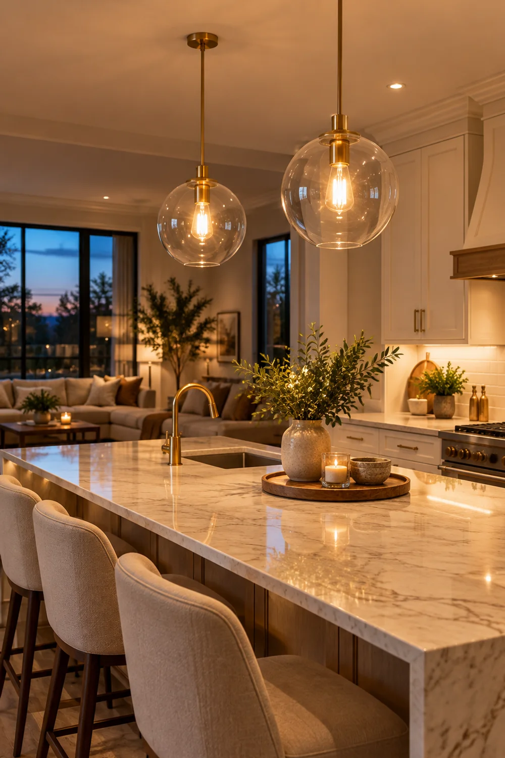
The space above an island is one of the most important sightlines in an open kitchen. It is the line your eye travels from the sofa to the back wall, and whatever hangs there either frames the view or blocks it. Large opaque pendants, drum shades, and heavy metal domes create a visual ceiling over the island and cut the room in half, even when they are beautiful on their own.
Clear glass solves this. A transparent shade lets you see straight through the light to the cabinetry and windows beyond, so the pendant adds sparkle without adding bulk. When the lights are on, clear glass also spreads light more broadly than a closed shade, washing the island and the surrounding floor in a soft, even glow instead of creating a tight pool of light with dark edges.
These pendant lights come as a 2-pack with clear glass globe shades and gold metal fittings. The round globes keep the profile soft, and the gold finish adds warmth without visual weight, especially when it echoes a gold mirror frame or brass hardware elsewhere in the open plan.
Placement determines whether pendants feel balanced. Over a standard island, hang the pair so that each light sits roughly a quarter of the way in from each end, leaving at least 24 inches between them. The bottom of the glass should typically sit around 30 to 36 inches above the counter, high enough that the view across the room passes beneath or through the globes rather than straight into them. If your ceilings are low, err toward the higher end so the lights do not crowd the room.
Bulb choice matters with clear glass, because the bulb is fully visible. Choose a warm white bulb with a pleasing shape, and add a dimmer if you can. A dimmed pair of glowing globes will make the kitchen feel welcoming at night without throwing harsh glare toward the living room.
Keep everything else above the island equally light. Avoid hanging pot racks, plant hooks, or decorative beams in the same zone. The whole point is to let the view pass uninterrupted from one end of the open plan to the other.
5. Choose Counter Stools the Eye Can See Through
 Save it
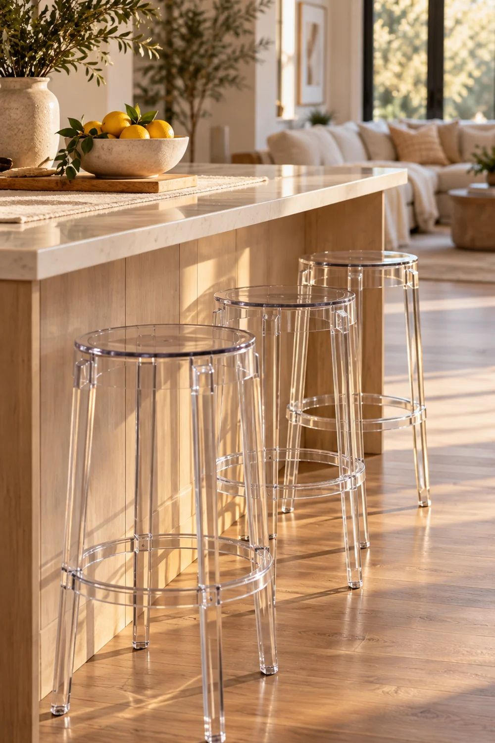
After the island itself, counter stools are often the largest pieces of furniture in an open kitchen. Lined up along the overhang, a row of upholstered or solid wooden stools forms a low wall facing the living room. From the sofa, that wall becomes the front edge of the kitchen, and everything behind it feels further away and more enclosed.
Transparent stools remove that wall. Because you can see the floor, the island panel, and the light beneath them, they take up almost no visual space, even when there are three or four in a row. The island looks lighter, the floor looks continuous, and the whole kitchen reads as more open from across the room.
This stool is a transparent, backless ghost stool with a 29.75-inch counter-height seat and a built-in foot ring. It is stackable and rated for indoor and outdoor use, so it holds up well to everyday kitchen life.
Before buying any stool, measure. A counter-height seat suits a counter that is around 36 inches high, leaving roughly 10 to 12 inches between the seat and the underside of the counter. Allow about 24 to 26 inches from the center of one stool to the center of the next so people can sit comfortably and the row does not look crowded.
Backless stools have another advantage in an open plan: they tuck fully under the overhang. When nobody is sitting, push them in so the island’s front edge stays clean. A row of stools sticking out into the walkway visually shortens the floor and makes the path between kitchen and living area feel narrow.
Transparent pieces need a little warmth around them so the kitchen does not feel cold or clinical. Pair them with natural materials on the island, such as a wood board, a linen runner, or a ceramic bowl, and with warm metal in the pendant lights above. If you want a softer seat, add small round cushions in a pale linen or bouclé that match the living room’s textiles. That way, the stools become another subtle link between the two zones rather than a separate statement.
6. Light the Back Wall So the Kitchen Reads Deeper
 Save it
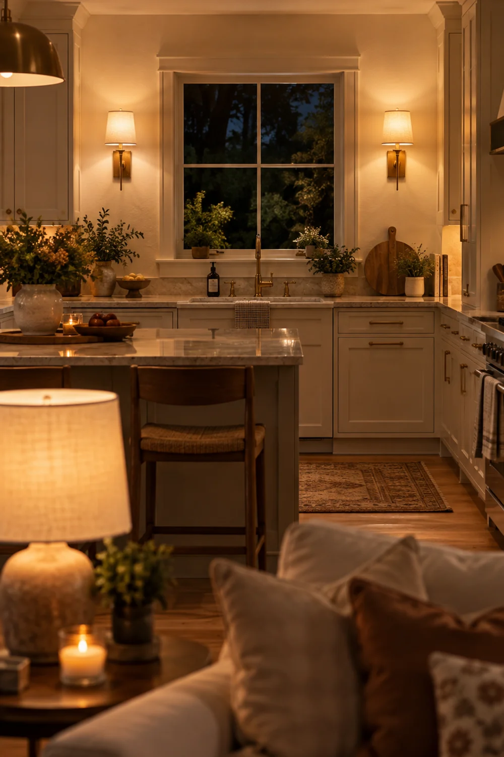
Our eyes judge the size of a room by its brightest edges. When the back wall of the kitchen is in shadow, the room seems to end before it actually does. When that wall glows, the eye travels all the way to it, and the kitchen suddenly feels deeper. This is especially true in an open plan, where the back wall of the kitchen is the farthest boundary seen from the living area.
Ceiling lights rarely solve this on their own. Recessed downlights illuminate the floor and counters but leave the upper walls dim, and a single central fixture lights the middle of the room while the edges fall away. What the back wall needs is light aimed at it directly, at eye level, where it shapes the room most clearly.
Wall sconces are the most elegant way to do this, and plug-in versions mean no new wiring. These sconces are a set of two modern gold plug-in wall lights with linen shades. The fabric shades soften the light into a warm, diffused glow that washes the wall around them, while the gold finish ties them to other warm metals in the room.
The best place for a pair of sconces is usually on either side of a central feature on the back wall: a window above the sink, a run of floating shelves, or the range hood. Mount them at roughly the same height, often a little above eye level, and keep them symmetrical so they frame the feature rather than compete with it. Run the cords neatly in paintable cord covers or behind a shelf so the wall stays clean.
Pay attention to the color of the light. Warm white bulbs make a wall look inviting, while very cool bulbs can make pale walls look gray, which visually pulls them closer. Ideally, choose a color temperature that matches the living room lamps, so the whole open space glows in one consistent tone at night.
Sconces work best as part of a layered plan rather than on their own. How to Upgrade Kitchen Lighting Without a Full Renovation explains how to combine ambient, task, and accent lighting in a kitchen without rewiring. In an open plan, though, the back-wall layer is the one that most changes how deep the room feels.
7. Let Counter Accessories Blend Into the Countertop
 Save it
From inside the kitchen, a counter full of jars, appliances, and utensils feels busy. From across an open plan, it looks like visual noise along the longest horizontal line in the room. That line, the run of countertop from one end of the kitchen to the other, is one of the strongest signals of how wide the space is. The more often the eye is interrupted along it, the shorter the kitchen feels.
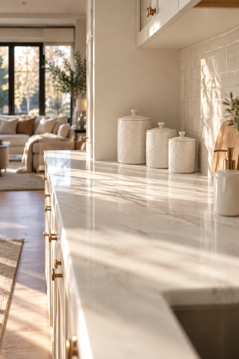
Clearing everything away is not realistic for a kitchen that people actually cook in. A more practical approach is to choose the things that stay out so they match the countertop rather than contrast with it. Tone-on-tone accessories blend into the surface from a distance, so the counter still reads as one long, uninterrupted line even when it holds the things you use every day.
On a white or pale stone counter, white ceramics are the obvious choice. This canister set includes three white stoneware canisters in graduated sizes with an embossed pattern. Up close, the embossing adds texture and interest. From the sofa, the set simply melts into the counter.
Group the canisters tightly in one spot, ideally at the end of a counter run or in a corner, rather than spreading them along the backsplash. A single cluster reads as one object; separate pieces read as clutter. Fill them with the things you would otherwise leave out in bags or boxes, such as coffee, sugar, oats, or pasta.
Apply the same principle to everything else that lives on the counter. Choose a white or pale soap dispenser, a wood or white utensil crock, and small appliances in a finish close to the counter or the cabinets. Brightly colored and mismatched items catch the eye, so if you love color, concentrate it in one deliberate place rather than scattering it.
If your counter is darker, the rule still holds; choose accessories close to that surface’s tone instead. Simple Kitchen Color Palettes That Work in Any Home can help you decide which tones belong to your kitchen’s palette, so the pieces you leave out look like part of the scheme rather than additions to it.
8. Run One Pale Floor Line Through the Open Plan
 Save it
The floor is the one surface that runs continuously through an open plan, and it plays a surprisingly large role in how big the space feels. When the eye can follow the floor without interruption from the living room into the kitchen, the two zones read as one large room. When the floor is broken into patches by contrasting rugs, mats, and thresholds, the space is divided into smaller rooms again.
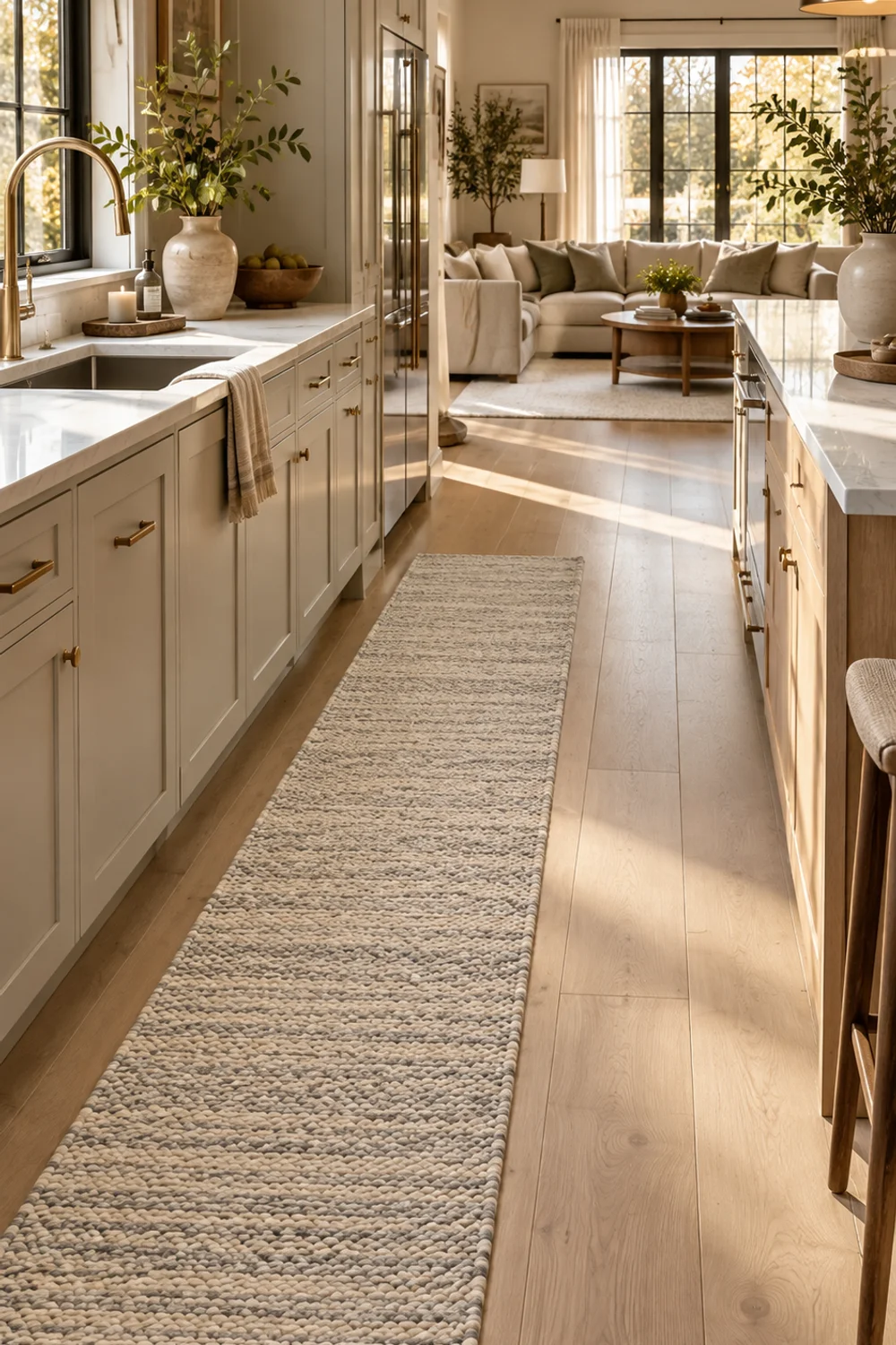
Many open kitchens are interrupted by small, dark, or busy kitchen mats placed in front of the sink and stove. They are practical, but from across the room they look like islands of color that stop the floor. A long, narrow, pale runner does the same job while making the kitchen floor look longer and lighter.
The runner is a 2-by-7-foot washable rug in a cream and grayish tone, with a low-pile braided weave in a cotton, polyester, and viscose blend and a non-slip back. The soft, neutral color reflects light rather than absorbing it, and the long proportion leads the eye down the length of the kitchen rather than across it.
Lay the runner parallel to the longest run of cabinetry, usually along the sink and prep wall, and leave a few inches of floor visible on either side. A rug that fills the entire aisle looks like wall-to-wall carpet and loses the sense of space. One long runner will always look better than two or three small mats in a row.
Coordinate the runner with the rug in the living area, but avoid matching them exactly. Choose a living room rug in a similar pale or neutral palette, so the floor seems to carry one consistent tone throughout the open plan. Strong contrasts between the two rugs will visually mark the edge of each zone, which is precisely what you are trying to soften.
Practicality is part of the appeal. A low-pile, washable runner is easy to clean after spills and will not catch on cabinet doors or chair legs. Shake it out weekly, and wash it whenever it starts to look dull, since a pale rug is only bright when it is clean.
If your kitchen and living room have different flooring materials, a long, pale runner can also help disguise the transition by drawing attention along the kitchen instead of to the line where the two floors meet.
9. Divide the Zones With a Slim Console Instead of a Wall
 Save it
Open plans still need some definition. Without it, the sofa floats, the kitchen spills into the living room, and the whole space feels unresolved rather than generous. The temptation is to create that definition with something substantial, such as a bookcase, a tall shelving unit, or a bulky sideboard, but anything tall or deep enough to divide the space will also block light and shorten the view.
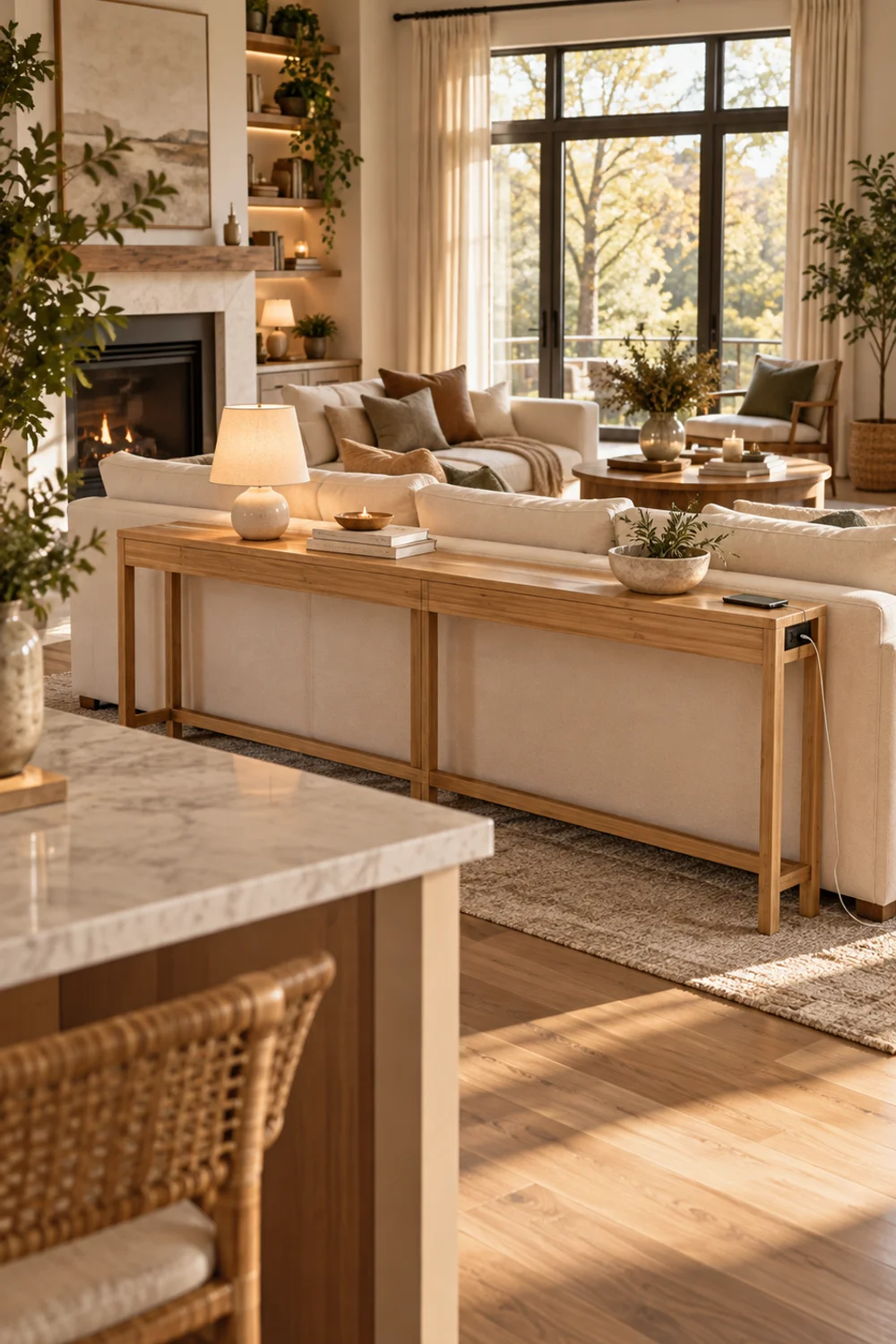
A slim console behind the sofa gives you definition with almost no visual weight. It marks the edge of the living area, gives the back of the sofa a finished look from the kitchen, and creates a useful surface for lamps, books, or a bowl for keys, while leaving the view across the room completely open.
This console is unusually narrow: about 70.9 inches long and just under 6 inches deep, at a height of about 29.5 inches. It is made of natural bamboo and includes a built-in outlet, which is useful for a table lamp or for charging phones without trailing cords across the floor.
Place the console directly against the back of the sofa so it reads as one piece. Ideally, its height should sit at or slightly below the top of the sofa back. Anything much taller will start to feel like a barrier, and anything much longer than the sofa will crowd the walkway into the kitchen.
Style it lightly and keep everything low. A small lamp with a pale shade, a short stack of books, and one ceramic bowl are usually enough. Avoid tall vases or branches that rise above eye level, as these will interrupt the sightline you have worked to keep open.
Natural bamboo also helps connect the two zones through material. Its warm tone relates to wood elements in the kitchen, like floating shelves or a cutting board, so the console seems to belong to both spaces. That is exactly the role a divider should play in an open plan: it organizes the room without breaking it into separate rooms.
If your living area sits with its back to the kitchen, a slim console can also hide the less attractive back of the sofa from the cooking side, which makes the view from the kitchen just as considered as the view toward it.
10. Put a Tall Plant Where the Kitchen Meets the Living Room
 Save it
Every open plan has a threshold: the invisible line where kitchen flooring becomes living room, where cabinetry ends and furniture begins. Because there is no wall, this line is often left empty, and the corner where the two zones meet becomes dead space. Yet that corner is one of the most effective places in the room to change how the space feels.
A tall plant placed at the threshold draws the eye upward and diagonally across the room. Instead of reading the kitchen and the living area as two separate rectangles, the eye moves along a line that connects them, and the room feels both taller and wider. Greenery also softens the meeting point between hard kitchen surfaces and softer living room textiles, so the transition feels natural rather than abrupt.
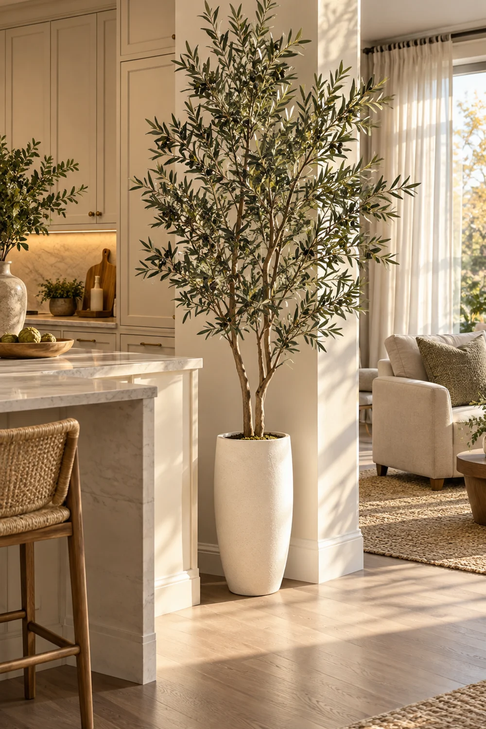
An olive tree suits this role particularly well. Its slender, silvery-green leaves are light and airy, so even a tall specimen does not block light or form a dense mass. This faux olive tree stands six feet tall in a tall white planter, with a natural wood trunk and lifelike olive fruits among the leaves.
The best location is usually at the end of the kitchen run or beside the corner of the island closest to the living area, where the tree is visible from both sides. Leave enough space around it so it does not narrow the walkway; a plant that brushes against people looks crowded and will be moved within a week.
Placing the tree near a window or in the path of the light from your sheer curtains makes the leaves glow, and their soft shadows on the wall add movement and depth. The white planter keeps the base light and clean, matching pale walls and white kitchen surfaces.
A faux tree has practical advantages in a kitchen setting. It will not drop leaves near food preparation areas, does not need a sunny window to thrive, and stays full year-round. Dust the leaves occasionally with a soft cloth or a gentle rinse, and fluff the branches once in a while so the tree keeps an open, natural shape.
Resist the urge to add several smaller plants around it. One tall, graceful tree makes a clear statement; a cluster of pots at different heights becomes clutter at the threshold.
11. Choose a Round Pedestal Table to Keep the Walkway Open
 Save it
In many open plans, the dining table sits between the kitchen and the living area, which means it is also in the middle of the main walkway. A rectangular table with four legs at the corners juts into the path, forces people to walk around sharp edges, and visually blocks the floor beneath it. The kitchen ends up feeling cut off from the rest of the room by a piece of furniture.
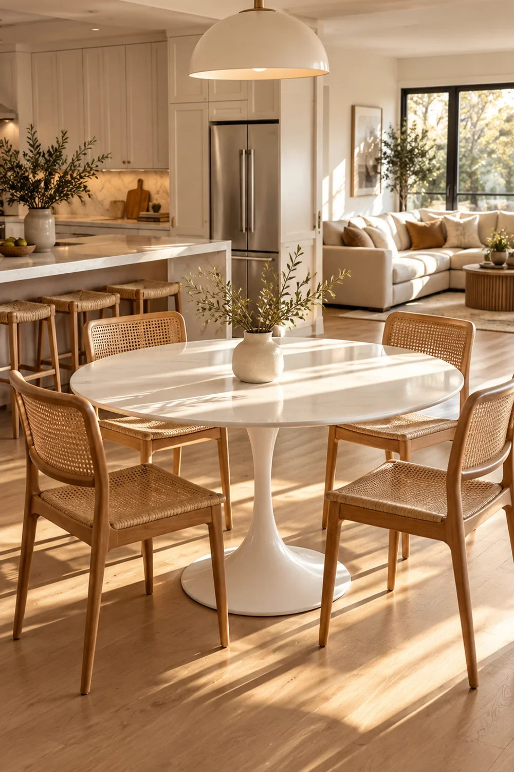
A round table on a single pedestal solves both problems. With no corners, it allows people to move around it smoothly from any direction. With only one central support, the floor beneath it stays visible, so the table seems to float in the room instead of anchoring a heavy block in the middle of the open plan.
This table has a 44-inch round top on a single pedestal base, finished in white, with an aluminum frame. At about 43.5 inches across and 29.5 inches high, it comfortably seats four, and its white finish repeats the pale surfaces used throughout this guide.
Clearance is what makes a dining table work in an open plan. Leave at least 36 inches between the edge of the table and the island or the nearest cabinets, and more if this is a main walkway. When chairs are pulled out, people should still be able to pass behind them without turning sideways.
Center the table under a single pendant light or align it with the island so the dining area relates to the kitchen. That alignment creates an invisible axis through the room that makes the layout feel intentional and calm.
Keep chairs light to complement the pedestal. Open-back or slim-legged chairs in wood, cane, or light upholstery preserve the visible floor. Heavy, high-backed chairs bring back the visual mass you removed by choosing a pedestal table. Keep the tabletop simple as well: a single bowl or a small vase in the center is enough.
A white tabletop also reflects light from the windows and pendant lights back into the room. When it is clear and uncluttered, it acts like another pale surface in the space, extending the brightness from the kitchen counters toward the living area and making the whole open plan feel lighter.
Common Mistakes
1. Treating the kitchen as a separate room
The most common mistake is trying to brighten and enlarge the kitchen in isolation. In an open plan, the kitchen’s size and brightness depend on the windows, floor, furniture, and lighting in the adjoining spaces. Decisions about curtains, rugs, or the dining table affect the kitchen as much as anything on the counter.
2. Using furniture that blocks the sightline
Tall shelving units used as room dividers, high-backed stools, and large opaque pendants all interrupt the view across the room. Before adding any piece between the kitchen and living area, stand where you usually sit and check whether it blocks the view toward the back wall.
3. Leaving the back wall in shadow
Many open kitchens are well lit around the island but dark at the back. A dim back wall makes the room feel shorter. Add light aimed at the back wall, and make sure it matches the color temperature of the lamps in the living area.
4. Breaking up the floor with small mats and contrasting rugs
A series of small, dark, or busy rugs divides the floor into separate patches and makes each zone feel smaller. Use fewer, longer, and paler rugs with coordinated tones throughout the open plan.
5. Filling every surface after decluttering
Once counters, shelves, and the console are clear, it is tempting to style them fully again. In an open plan, the eye sees all of those surfaces at once. Keep generous empty space so the room continues to feel wide and calm.
Frequently Asked Questions
What colors make an open kitchen look bigger?
Light, warm neutrals such as soft white, cream, and pale greige reflect the most light and help the kitchen blend with the living area. Using the same or closely related wall color across the whole open plan is more important than the exact shade, since color changes between zones visually shorten the room.
How can I make an open kitchen brighter without renovating?
Start with the windows on the living side and replace heavy curtains with sheer panels. Then add light to the back wall of the kitchen with plug-in sconces, hang clear glass pendants over the island, and place a mirror across from the kitchen to reflect light back into the room.
Are transparent counter stools practical for everyday use?
Yes, provided you choose sturdy stools that are designed for daily use and are the correct height for your counter. Transparent stools are easy to wipe clean, and backless designs tuck neatly under the counter when not in use, keeping the walkway clear.
How do I separate the kitchen and living room without making the space feel smaller?
Use low, narrow, or transparent elements instead of tall dividers. A slim console behind the sofa, a long runner along the kitchen, and a tall but airy plant at the transition point define each zone without blocking light or the view.
What size dining table works best in an open-plan kitchen?
A round table between 36 and 48 inches across suits most open plans for two to four people. Choose a pedestal base so the floor remains visible, and leave at least 36 inches of clearance around the table for comfortable movement.
Final Thoughts
An open kitchen feels bigger and brighter not because of one dramatic change but because many small boundaries disappear. When daylight is allowed to travel from the living room windows, when a mirror reflects the kitchen back across the room, and when stools, pendants, and the dining table let the eye pass through them instead of stopping, the whole space begins to read as one generous room.
You do not need to make every change at once. Start with the one that affects the view you see most often, whether that is the curtains, the back wall, or the cluttered line of the counter, and notice how the room shifts. Then add the next layer. Over time, the kitchen stops feeling like a separate area squeezed into the corner and becomes what an open plan was always meant to offer: a bright, connected, and spacious heart of the home.
This post contains affiliate links. I may earn a small commission at no extra cost to you.
Get cozy inspiration delivered to your inbox.
✓ 14-page beautifully designed ebook
✓ Cozy decorating ideas
✓ Practical room-by-room inspiration
You’re in! 🎉
Thanks for joining the NestFlowHome community!
Your free ebook is already on its way to your inbox. If you don’t see it within a few minutes, please check your Promotions or Spam folder.
Join the NestFlowHome community for weekly decorating inspiration.

Timeless home decor ideas and slow living inspiration for a calm, beautiful life.