

How to Bring Farmhouse Charm into a Modern Kitchen
By Emily | September 23, 2026
Some kitchens stop you in the doorway. The cabinets are flat and quiet, the counters are clear, the lighting is precise, and yet something on the far wall, a rack of everyday plates or a cane mixing bowl left out beside the stove, makes the whole room feel as though someone has been cooking in it for decades. It isn’t nostalgia, exactly. It’s evidence of use, of habit, of a household that keeps its good things within reach.
That quality is what most people mean when they say they want farmhouse charm, and it’s also what gets lost the moment they try to buy it. Shiplap on every wall, galvanized everything, a sign announcing the word “Gather” — the literal version of farmhouse turns a modern kitchen into a theme set, and it dates the minute the trend cycle turns.
The better approach is translation rather than replication. Every classic farmhouse signature — beadboard, the bridge faucet, café curtains, the plate rack, the bread bin — began as a practical answer to a daily problem. Keep that origin, change the execution, and the piece reads as character instead of costume. Clean lines, a restrained palette, and honest materials do the modernizing; the farmhouse object supplies the warmth.
What follows are thirteen of those translations, moving from the architecture of the room down to the objects you touch every morning, each paired with one specific piece that makes the idea real. You don’t need all thirteen. You need one per zone, chosen well, and the restraint to let each one breathe.
1. Paint Beadboard a Modern Color Instead of Installing Rustic Shiplap
 Save it
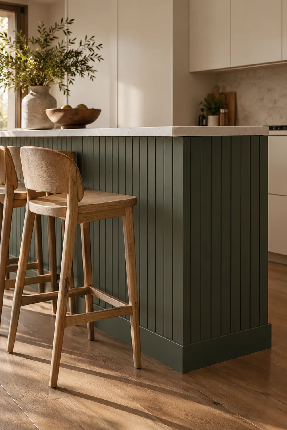
Shiplap became shorthand for farmhouse style so quickly that it now signals a specific decade more than a specific feeling. Beadboard is its older, quieter cousin — narrow vertical grooves that once protected the lower walls of working kitchens and pantries from scuffs, mops, and chair backs. The vertical rhythm is subtler than horizontal planks, and that subtlety is exactly why it translates into a modern kitchen so gracefully.
The translation happens in color and placement. Rather than whitewashing an entire wall, use beadboard in one bounded area: the back panel of an island, the wall below a window, or the lower third of a breakfast nook, finished at chair-rail height with a slim, square-edged trim. Then paint it a deliberate, saturated color — deep olive, inky blue-black, a warm mushroom taupe — in a matte or eggshell finish. The grooves catch low light and shadow, so even a dark color reads as texture rather than a flat block.
For a lower-commitment version, a paintable beadboard wallpaper gives you the groove effect without cutting and nailing panels. It’s pre-pasted rather than peel-and-stick — you soak the back briefly in water before hanging it — and it arrives white, which is the point: it’s designed to take whatever paint color you choose.
Hang it on a smooth, primed wall, let it dry fully, and then paint it with a durable, scrubbable finish, since an island back or a lower wall takes knocks from stools and shoes. Keep one beadboard zone per kitchen; repeating it on the backsplash and the island dilutes the effect and pushes the room back toward cottage pastiche.
Color choice is where this idea connects to everything else in the room. Pull the beadboard color from something fixed — the undertone of your countertop, the veining in the stone, the wood of your floors — and the painted wall will look inevitable rather than added. If you’re unsure how to anchor that decision, Simple Kitchen Color Palettes That Work in Any Home walks through building a palette from the fixed elements outward, which is exactly the logic a painted beadboard zone needs.
Pair it with flat-front cabinetry and slim hardware, and the contrast does the rest. The beadboard supplies the history; the cabinetry keeps the room firmly in the present. Seen together, neither looks like a compromise — they look like a kitchen that was allowed to evolve.
2. Swap a Gooseneck for a Heritage Bridge Faucet
 Save it
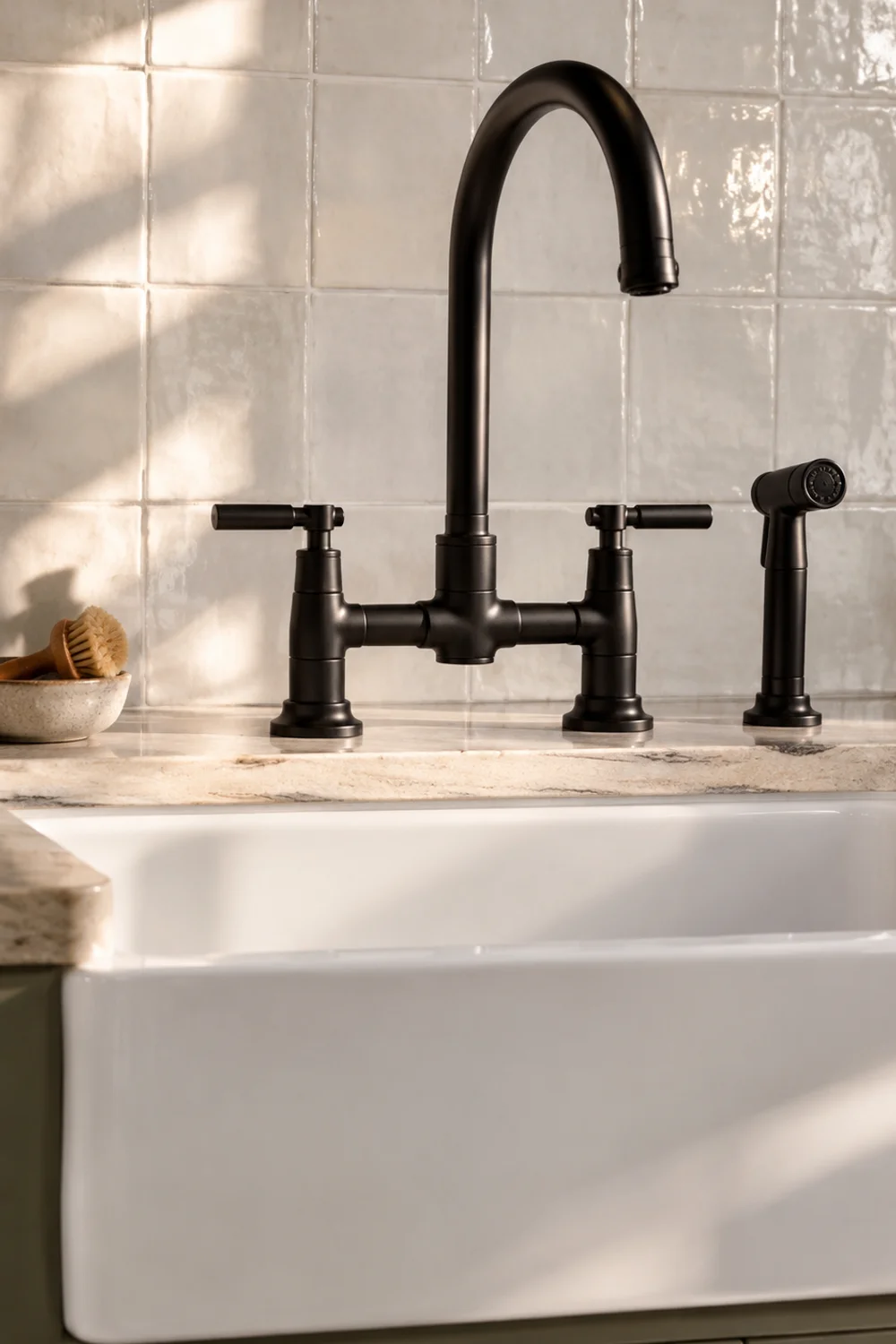
The bridge faucet is one of the most recognizable farmhouse fixtures: two handles, a horizontal bridge connecting them, and a spout rising from the center. It comes from an era when hot and cold water arrived through separate lines, and the exposed bridge made that plumbing logic visible. That honesty — a fixture that shows you how it works — is precisely what makes it compelling in a modern kitchen full of hidden mechanics.
A faucet is among the most-touched objects in the room, and it sits at the visual center of the sink wall, so changing its silhouette has an outsized effect. A bridge faucet over an undermount or apron sink instantly gives a sleek kitchen a sense of lineage, while the finish decides whether it reads traditional or current. Matte black keeps the heritage shape graphic and modern; polished nickel or brass pushes it back toward a period look.
A Faucet in matte black is a straightforward version of the idea: a two-handle, deck-mount bridge design built from brass, with a drip-free ceramic disc cartridge, a matching side sprayer, and an 8-9/16-inch center spread.
Before buying, check your sink or countertop for the right hole configuration. Bridge faucets need their handles and spout spaced across the deck, plus a separate opening for the sprayer, and a sink drilled for a single-hole pull-down may need a new cut or a different faucet. This is the one piece in this article that genuinely warrants a plumber if you aren’t comfortable with supply lines.
Styling around the faucet is an exercise in restraint. Match its finish to one other element — cabinet pulls, a light fixture, or the plate rack further along the wall — so the black reads as a deliberate thread rather than an isolated accent. Leave the area directly behind the faucet clear: no crowd of soap bottles, no sponge caddy hooked over the edge. A single wooden brush resting in a small dish is plenty.
The payoff is strongest against a simple backsplash. Next to stacked, handmade-looking tile or a plain stone slab, the bridge’s horizontal line becomes a quiet focal point, the way a well-chosen piece of furniture anchors a living room without demanding attention. You get the character of an old farmhouse sink wall without replacing the sink itself.
3. Hang Tailored Linen Café Curtains Instead of Gingham Valances
 Save it
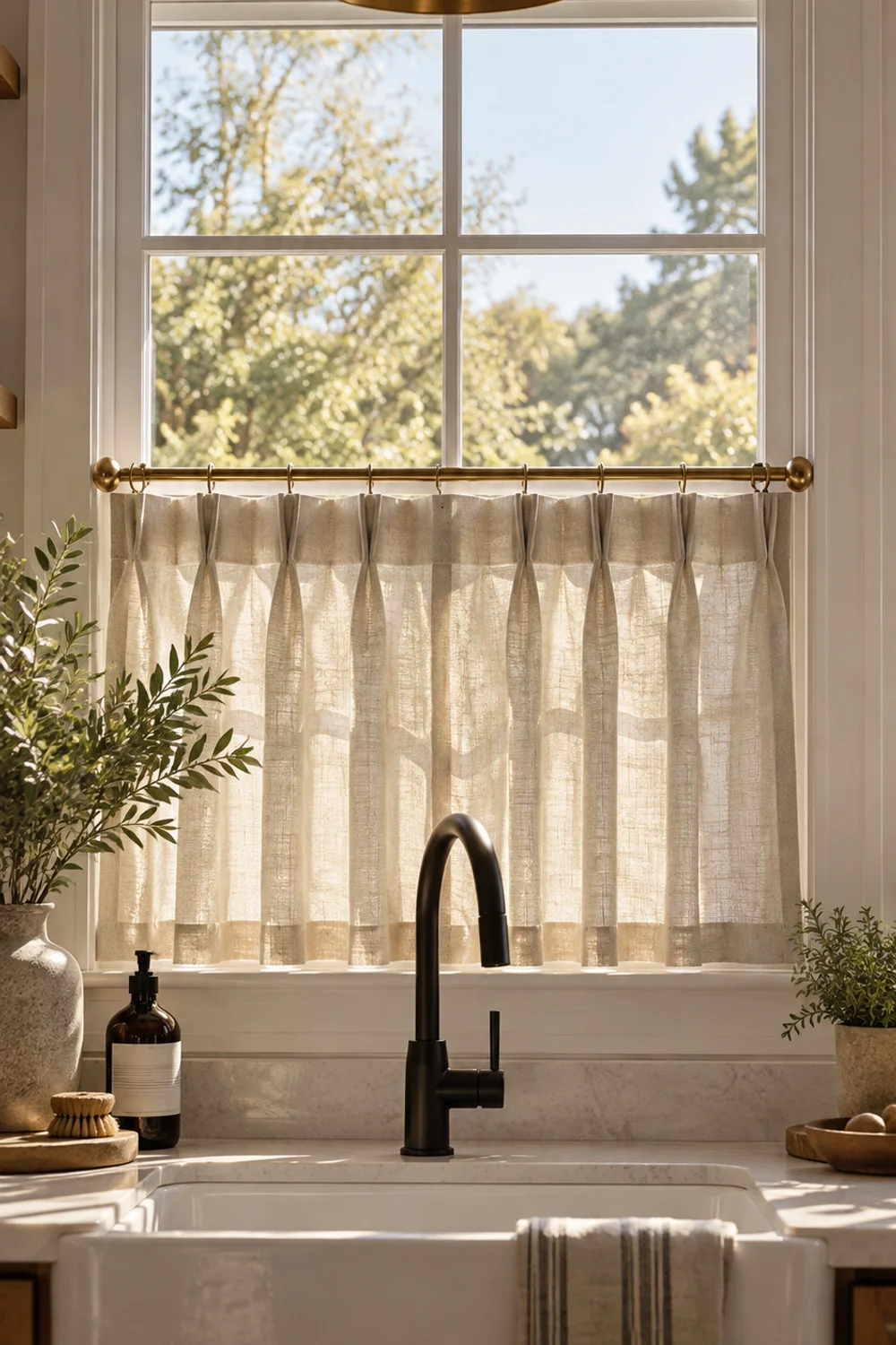
Café curtains — short panels covering only the lower half of a window — were a farmhouse and bistro answer to a simple problem: privacy at eye level, daylight overhead. Gingham valances and ruffled tiers turned the idea into a cliché, but the underlying logic is excellent for a modern kitchen, particularly one with a window over the sink that faces a neighbor or the street.
The translation lives in construction and fabric. Swap gathered cotton prints for tailored pleats in natural linen, and the curtain stops looking like a costume and starts looking like joinery — something measured and considered. Hang it on a slim café rod in black or brass, set at the window’s midpoint or slightly above, so the panel covers the working sightline without visually slicing the window in half.
A Pleated Tier Curtain show the tailored approach well: each panel has four pinch pleats and back tabs, in a natural linen-blend fabric that filters light rather than blocking it. The 26-by-30-inch size suits a typical sink window, and the listing offers other sizes worth measuring for.
Measure carefully. Panels should stop just at the sill or slightly above it — never pooling on the sill, where they’ll catch splashes from the faucet. Pleated panels already carry built-in fullness, so aim for a combined width that covers the window comfortably when drawn without stretching the pleats flat. Too narrow and they look like an afterthought; too full and they bunch against the frame.
Light is the real reason this works. Filtered linen softens hard afternoon glare without darkening the room, and it adds movement and a woven surface to a wall that’s otherwise all glass and tile. That softening is a big part of why fabric does so much work in pared-back kitchens, a theme How to Style a Cozy Neutral Kitchen on Any Budget explores through affordable, high-impact layers.
Keep the rest of the window quiet. No valance over the café panel, no second blind behind it, nothing lined along the sill except perhaps the herb pots you’ll meet later in this list. Natural linen beside a matte black bridge faucet is already a complete composition, and anything more starts to compete with the view.
4. Mount a Plate Rack So Everyday Dishes Become the Display
 Save it
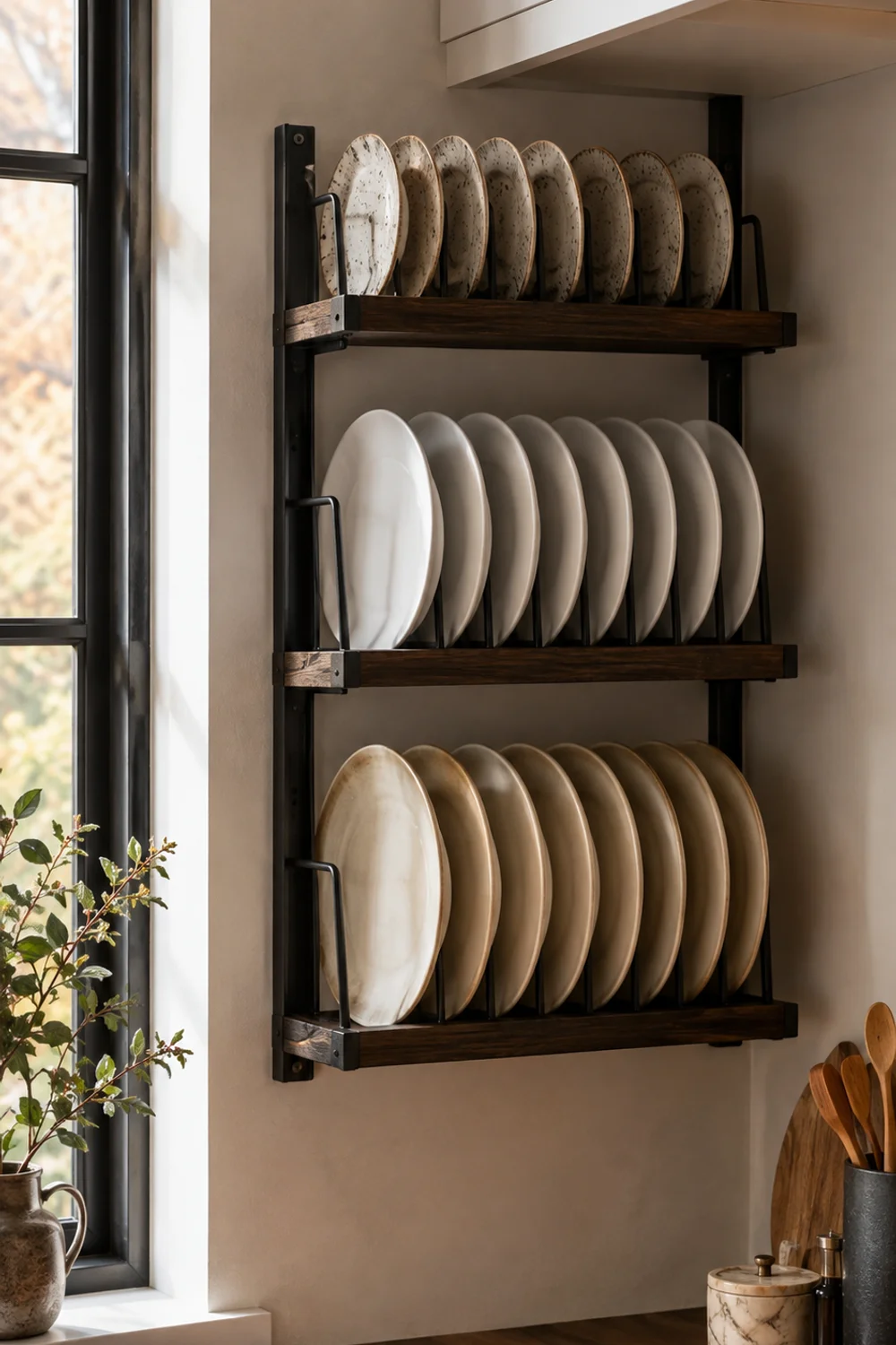
Before upper cabinets were standard, farmhouse kitchens stored plates upright on wall racks near the sink, where they could drip-dry and stay within reach. The plate rack is a working object that happens to be beautiful, and in a modern kitchen it solves a familiar problem: a blank wall section too narrow for cabinetry and too prominent to leave bare.
The modern translation comes down to the frame and what goes on it. Choose a rack with a clean, graphic frame rather than a heavily carved or distressed one, and fill it with the plates you actually use every day, in one or two coordinated glazes. Mismatched floral china pushes the look toward vintage; a stack of matte white, cream, or speckled stoneware keeps it contemporary.
A 3-Tier Wall Mounted Plate Rack combines matte black metal with dark burnt wood, holds plates from six to ten inches, and stands roughly 27 inches tall — a size that fits beside a window or in the gap between a range hood and a cabinet run.
Location matters more than you’d think. Mount the rack within a step or two of the dishwasher or sink so unloading goes straight onto it, and keep it out of the direct line of stove splatter. Align its top or bottom edge with an existing line in the room — the underside of the upper cabinets, the top of the window trim — so it looks planned rather than floating. Use wall anchors rated for a full load of plates; stoneware is heavier than it looks.
Styling is almost entirely subtraction. Keep each tier to a single plate size — dinner plates on the bottom, salad plates above, small side plates on top — which creates a graduated rhythm that reads as intentional. Resist tucking in small ornaments or propped cards; the plates are the decoration.
A plate rack also takes pressure off open shelving, which tends to get overcrowded when it’s the only display surface in the room. If you already have shelves nearby, How to Arrange Open Shelves in Your Kitchen Like a Designer covers how to keep working storage and display zones distinct, and that thinking applies just as well once a rack enters the mix.
Finally, echo the rack’s black metal once elsewhere — the faucet, a cabinet pull, a frame — and the whole wall reads as one considered decision rather than a collection of purchases.
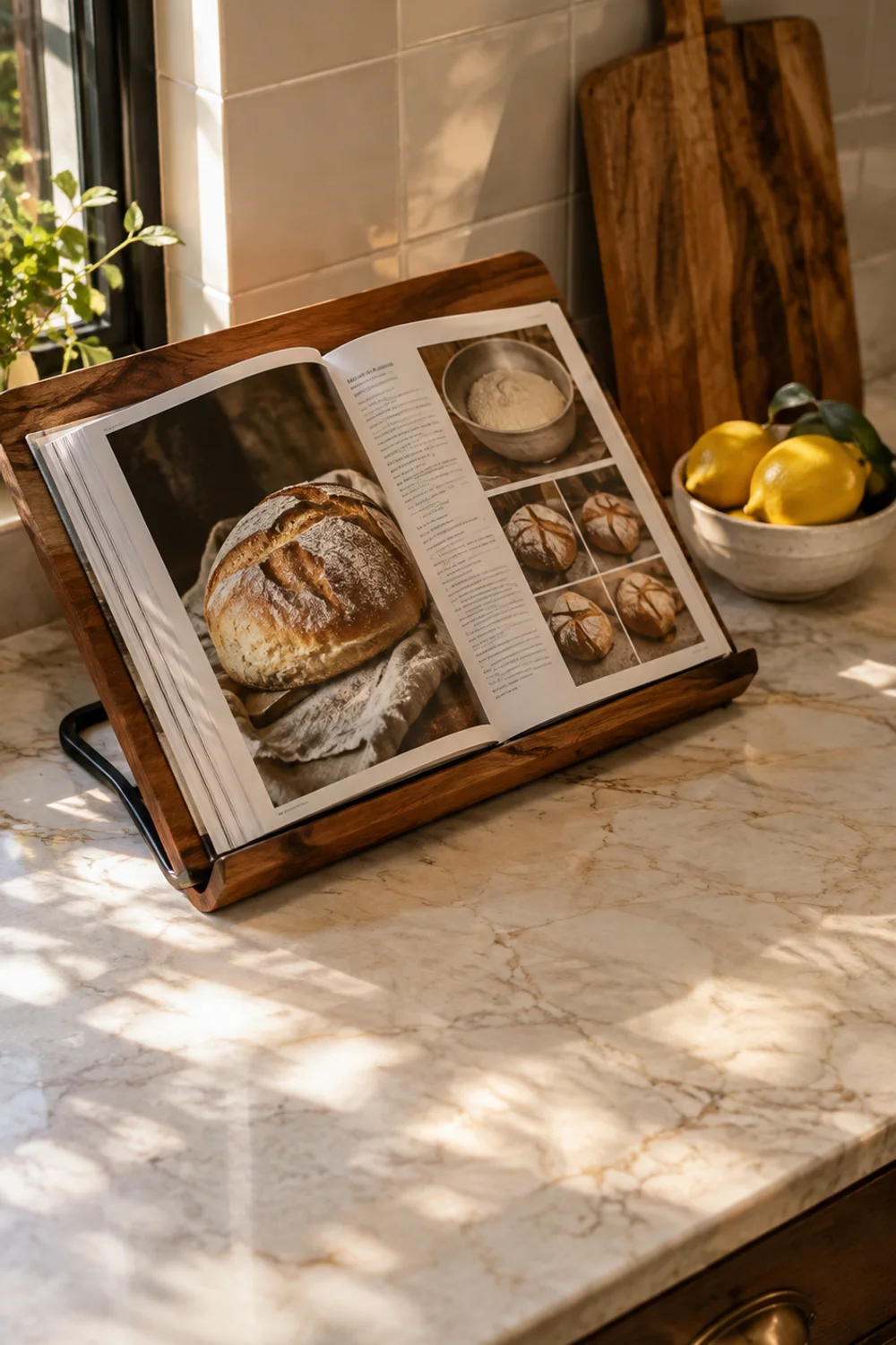
5. Keep a Favorite Cookbook Open on a Wood and Metal Stand
 Save it
Farmhouse kitchens were libraries of a sort: handwritten recipe cards, stained cookbooks passed down through a family, a well-thumbed baking guide propped against the flour tin. That sense of a kitchen with its own written history is one of the most charming — and most overlooked — ways to bring warmth into a modern space.
Rather than filing every cookbook away in a cabinet, give one a permanent place on the counter, open. An open book is personal in a way no decorative object can be: it shows what you cook, what you love, and that the kitchen is genuinely used. Choose a book with a beautiful spread — a well-photographed bread chapter, an old illustrated volume, a family collection — and turn the page with the seasons.
A Wood Cookbook Stand with a matte black metal frame, which keeps it in conversation with a black faucet or plate rack elsewhere in the room. It holds cookbooks, recipe cards, or a tablet, so it earns its counter space during actual cooking, not just as display.
Placement follows the way you cook. Set the stand toward the back of your main prep zone, against the backsplash, where it’s readable from a standing position but out of the path of sink splashes. Avoid the area right beside the range, where steam and grease will warp pages and dull the wood over time.
The stand also works as a visual anchor for a small counter vignette. Group it with one or two objects that relate to what’s on the page — a small bowl of lemons beside a citrus chapter, a bread board leaning behind a baking spread — and keep the grouping tight while the counter around it stays empty. That kind of editing is what separates a farmhouse-inspired counter from a cluttered one, an idea The Secret to Beautiful Yet Functional Kitchen Counter Decor develops in more depth.
A few refinements help the stand look better over time. Rub the acacia occasionally with food-safe mineral oil to keep the grain rich. Rotate between two or three favorite books so sunlight doesn’t fade a single cover. And if you cook from a tablet, swap it back for a physical book between meals — a screen on the stand reads as clutter, while a book reads as character.
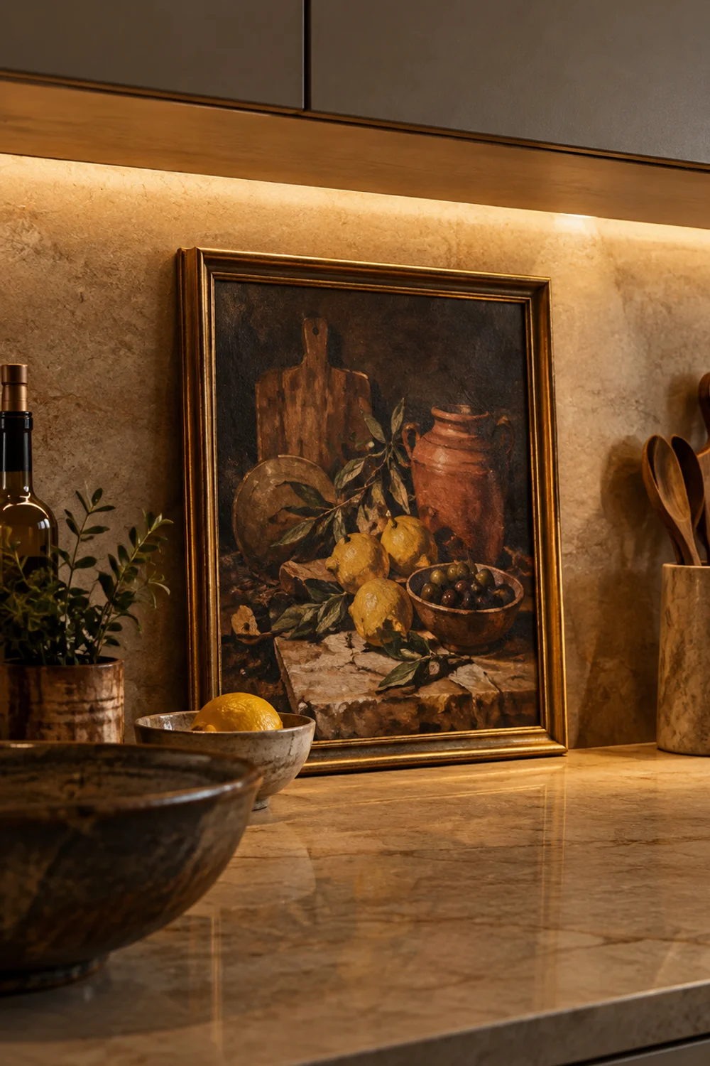
6. Hang One Vintage-Style Still Life Against Sleek Cabinetry
 Save it
Farmhouse kitchens were rarely without art: a small oil of fruit or game, a botanical print, a painting that had simply always hung beside the pantry door. Modern kitchens, by contrast, often have no art at all — only flat fronts, stone, and glass. Adding one framed still life is one of the fastest ways to make a contemporary kitchen feel lived-in and layered.
The translation is scale and restraint. A single small painting hung with intent looks collected; a grid of farmhouse signs looks purchased. Place it where it will be seen at close range: on the backsplash wall above a coffee corner, leaning on a shelf, or on the narrow strip of wall beside a window. Small works invite people to step closer, which suits the intimacy of a kitchen.
A Vintage Gold Framed Wall Art showing lemons, olives, wooden boards, and a terracotta pot inside a gold frame. The subject belongs in a kitchen, and its warm yellows introduce color without committing a whole wall to it.
Hang it lower than you would in a living room. Kitchen art is usually viewed while standing at the counter, so center it roughly 10 to 14 inches above the countertop rather than at gallery height. If you’d rather not drill into tile, lean it at the back of the counter or on a shelf, tucked slightly behind a single object like a ceramic bowl — the overlap creates depth and makes the arrangement look unhurried.
The gold frame is doing important work here. In a kitchen built around black metal and wood, a warm metallic introduces contrast and catches the glow of under-cabinet lighting in the evening. It also connects to any brass details you already have, and it softens the hardness of stone and glossy tile around it.
Pull color outward from the painting. The lemon yellow can reappear in a bowl of real lemons on the island; the terracotta can echo in a clay pot or a tea towel. These small repetitions tie the artwork into the room, so it looks like it belongs to the kitchen rather than simply hanging in it.
One practical rule: keep the canvas a few feet away from the range. Heat and airborne grease will slowly dull a printed surface, and a little distance is all it takes to protect it.
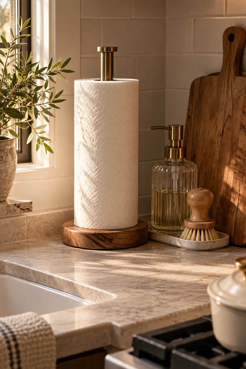
7. Replace Chrome Accessories with a Wood and Metal Paper Towel Holder
 Save it
Some of the most visible objects in any kitchen are the purely functional ones: the paper towel holder, the dish brush, the spray bottle. They’re used constantly, so they stay out, and in most modern kitchens they’re chrome or plastic — the least charming materials in the room. Upgrading everyday utility objects is one of the most underrated ways to bring farmhouse warmth into a sleek space.
The farmhouse instinct is simple: if something has to be out, make it good enough to be seen. Wood and iron were the materials of working farm kitchens precisely because they aged well and could take daily handling. Bringing those materials into the smallest, most-used objects adds warmth to the counter without adding a single purely decorative item.
A Farmhouse Paper Towel Holder combines with metal, stands about 13 inches tall, so you can tear a sheet one-handed without the holder tipping or sliding. It fits both standard and large rolls.
Place it where you actually reach for towels — usually between the sink and the stove, the stretch where spills happen. Tuck it against the backsplash or into a corner, where it’s accessible but doesn’t interrupt a clean run of counter. On an island, set it at one end rather than the middle, where it would divide the surface in two.
Once one utility object has been upgraded, look at the others. A wooden dish brush instead of a plastic sponge, a small ceramic dish instead of a suction-cup caddy, a glass bottle for dish soap — each swap is minor, but together they change the texture of the whole counter. Aim for consistency: wood, ceramic, glass, and one metal finish, with nothing that announces itself as plastic.
Keep the wooden base looking fresh by wiping it dry after spills and treating it occasionally with a food-safe oil. And be honest about scale: on a very small counter, even a well-designed holder can dominate, so test the spot with an empty roll before committing.
The payoff is subtle but real. A kitchen where even the paper towels look considered tells everyone who walks in that the whole room has been thought through, down to the last ordinary detail.
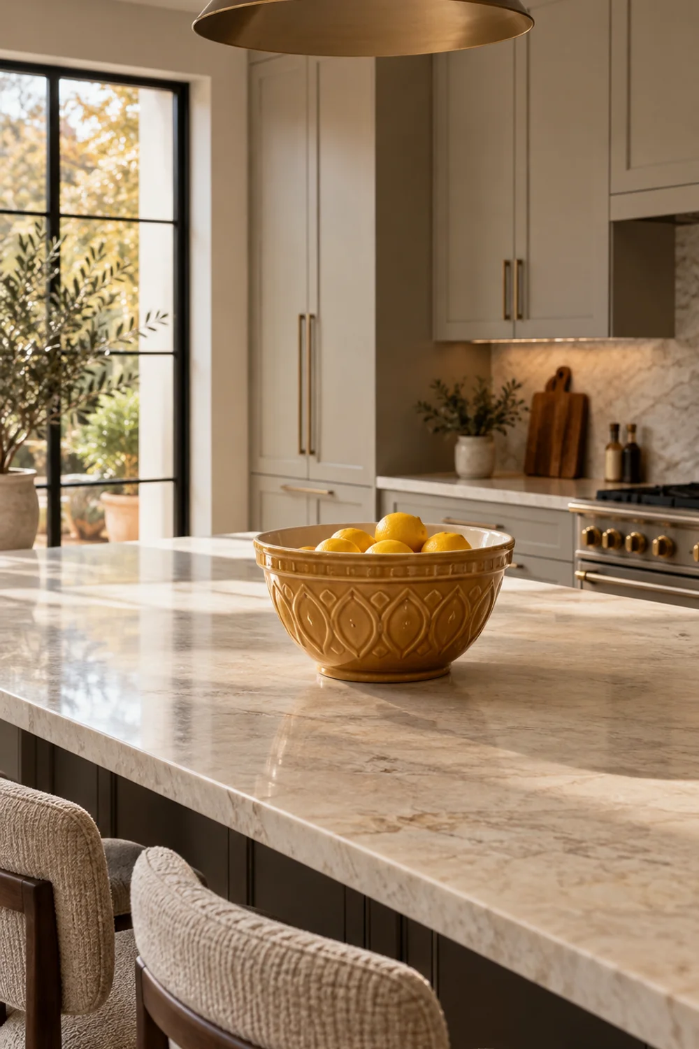
8. Leave a Heritage Stoneware Mixing Bowl Out on the Counter
 Save it
Few objects say farmhouse kitchen more immediately than the caramel-colored cane mixing bowl. The Mason Cash cane design — a textured yelloware exterior with a pale interior — has barely changed in generations, because it never needed to. It’s a working tool that became an icon by being used, not by being styled.
That history is precisely why it works in a modern kitchen. An authentic heritage object carries a weight that reproduction décor simply can’t imitate. Left out on the counter and filled with apples or lemons between baking sessions, the bowl reads as the property of someone who genuinely bakes, and it brings the warm golden tone of old earthenware into a room that might otherwise be all white, grey, and black.
A Mixing Bowl — generous enough for a batch of bread dough and substantial enough to hold its own on an island. The listing describes it as microwave, oven, freezer, and dishwasher safe.
Scale is the key styling decision. At 13 inches, this bowl works best on an island or a wide stretch of counter where it can be the only object in its zone. On a narrow counter it may crowd the workspace; in that case, a smaller size from the same line keeps the look without stealing prep room.
Treat it as a working display piece. Between uses, fill it with seasonal fruit — lemons and limes in summer, apples and pears in autumn, clementines in winter — so the bowl keeps changing without any new purchases. When you bake, it comes down and does its job; afterward, it goes back. That rhythm of use is exactly what makes farmhouse objects feel genuine rather than staged.
Consider what surrounds it. The bowl’s warm exterior pairs naturally with wood, linen, and matte black, and it softens cool quartz or marble beautifully. Avoid surrounding it with other patterned ceramics; let its texture be the only pattern on that surface.
And let it age. Faint marks from years of spoons and whisks aren’t flaws on a piece like this. They’re the patina that makes it look as if it has always belonged in your kitchen — which, after a year or two of real use, it will.
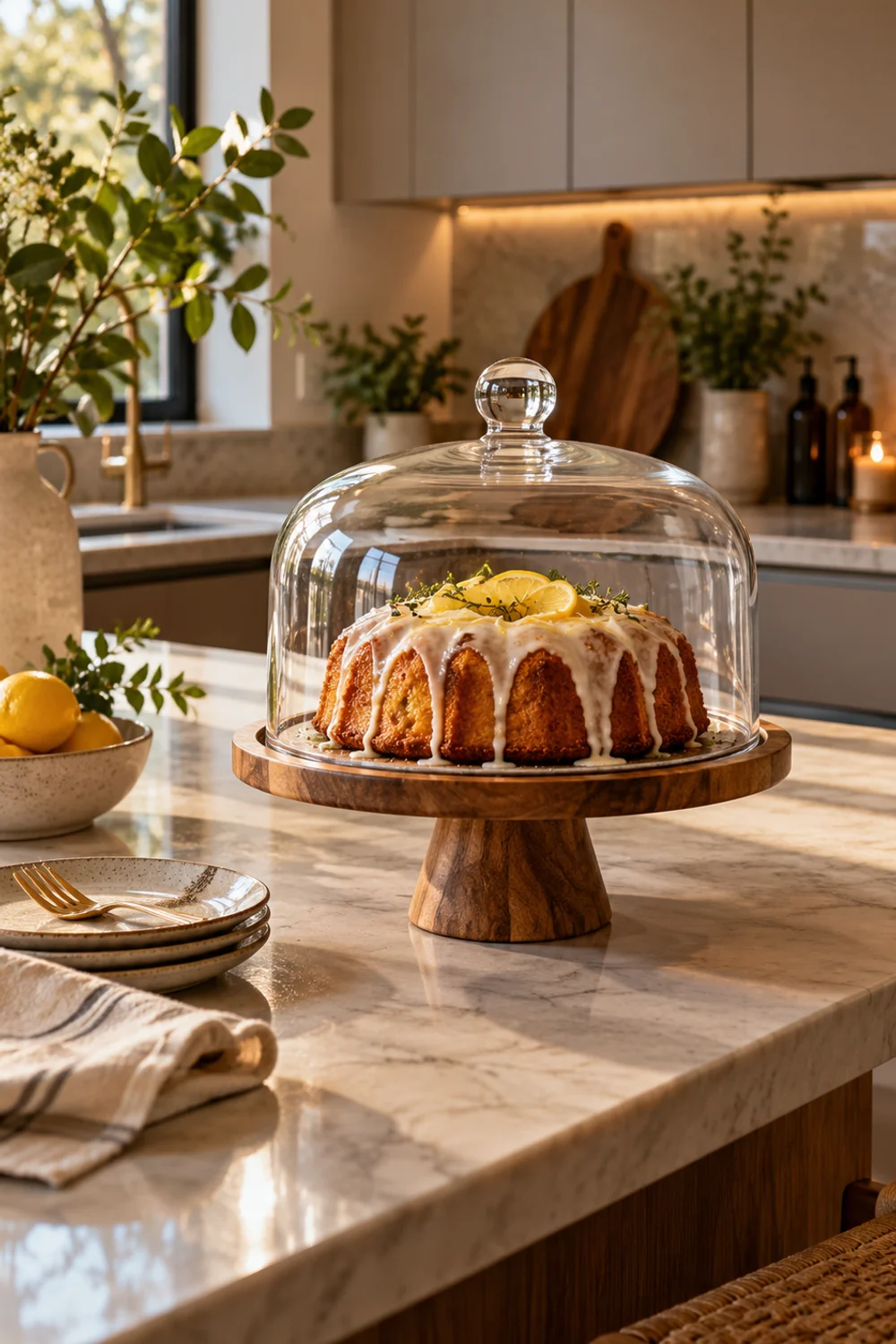
9. Display Baked Goods Under a Glass Dome on a Footed Cake Stand
 Save it
A covered cake stand on the counter was a fixture of farmhouse kitchens — something baked was almost always waiting, and the dome kept it fresh while keeping it visible. In a modern kitchen, that ritual of display translates beautifully, and a footed stand adds height to an island that’s otherwise all horizontal lines.
The appeal is layered. Glass lets light pass through, so the dome occupies space without adding visual weight. The footed base lifts whatever sits on it toward eye level, creating a focal point on a long, flat surface. And the contents change constantly: a lemon loaf one day, a pile of croissants the next, a wedge of cheese before dinner. It’s décor that behaves like food.
A Wood Cake Stand with Glass Dome combines a footed round acacia base with a clear glass dome — a pairing that feels warmer than an all-glass stand and lighter than marble. Beyond cakes, it works for pastries, cheese, and anything else worth showing off.
Position it at one end of the island, or on the counter nearest where people gather — the spot guests naturally drift toward with a cup of coffee. Give it clearance so the dome can be lifted without knocking into anything; a hand’s width of empty counter on every side is a good rule.
Change the contents with the seasons. In spring, a simple citrus cake; in summer, a few ripe peaches; in autumn, a small pumpkin loaf or a handful of mini gourds; in winter, gingerbread or a bundle of cinnamon sticks. It’s the smallest possible seasonal swap, and it lets the kitchen reflect the time of year without redecorating. When autumn arrives and you want to carry that feeling across the whole kitchen, How to Create a Cozy Fall Kitchen in a Weekend shows how to layer the season in over a single weekend.
Keep the glass spotless. A dome shows fingerprints and condensation quickly, and a hazy dome undermines the whole effect. A quick wipe each time you change the contents is enough.
When the stand is empty, resist filling it with faux food or ornaments. An empty glass dome on warm wood looks elegant in its own right — and it’s ready for whatever you bake next.
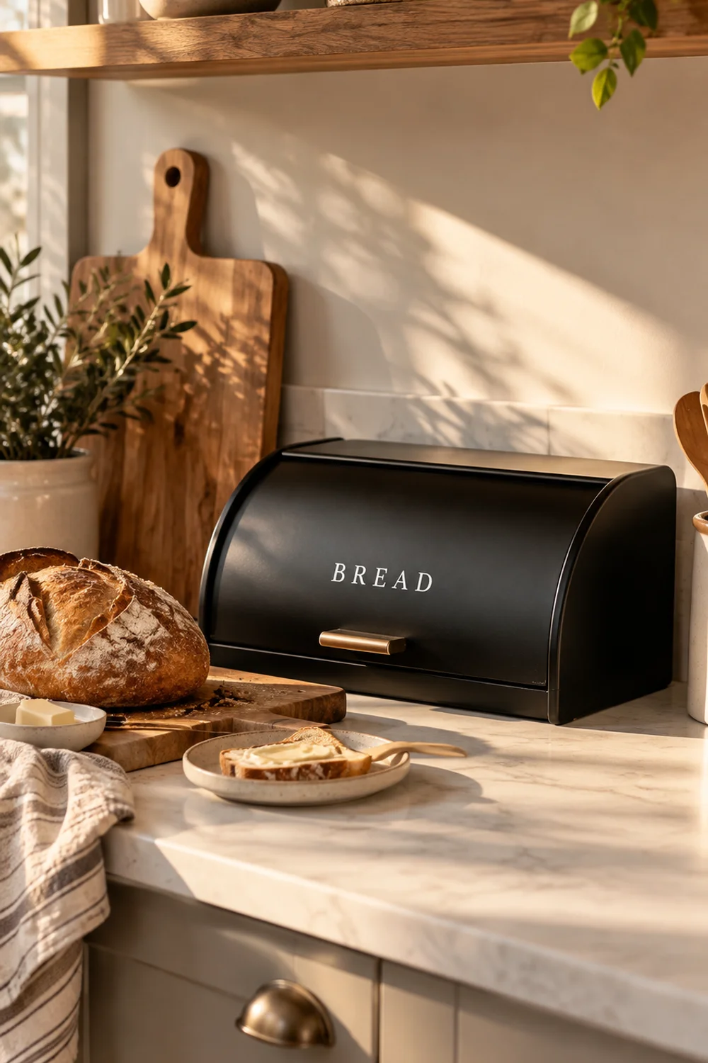
10. Bring the Enamel Bread Bin Back to the Counter
 Save it
Bread boxes disappeared from many kitchens once bread started arriving in plastic bags and living in the fridge or pantry. But the farmhouse bread bin was never just storage: it gave the daily loaf its own place on the counter, a small ritual built into the morning. For anyone who buys bakery bread or bakes at home, it’s also genuinely practical — keeping bread out of the fridge and out of sight at the same time.
Enamelware is the classic farmhouse material for this job, and it’s one of the easiest to modernize. In matte black, enamel reads graphic rather than quaint, pairs naturally with black fixtures and hardware, and gives a strong silhouette against a light countertop.
A Farmhouse Black Bread Box is a matte black enamel bin with classic white lettering and a lightly distressed finish. It measures 13 inches long, 8 inches deep, and 6 inches tall at the back, sloping to 5 inches in front — big enough for a loaf or pastries, compact enough for a standard counter.
Let placement follow your morning routine. Put the bin near the toaster, the coffee maker, or wherever breakfast is assembled, so bread travels from bin to board without crossing the kitchen. Keep it away from the stove and the dishwasher vent, where heat and moisture speed up staling.
The bin works best as one strong object in a quiet zone. Pair it with a single wooden bread board leaned behind it and the butter dish nearby, and leave the rest of that counter clear. Its dark mass balances lighter pieces elsewhere — the cream mixing bowl, the glass cake dome — so spread those around the kitchen rather than clustering everything in one corner.
A note on the lettering: it’s part of this piece’s charm, but lettered objects multiply quickly. Keep this the only lettered item in the kitchen, and it reads as a vintage detail rather than a slogan. Add a second and a third, and the room tips toward the word-art farmhouse look you’re trying to avoid.
Wipe enamel clean with a damp cloth and skip abrasive pads, which can dull a matte finish. Looked after, enamel only gets better with use — which is exactly why it has outlasted so many kitchen trends.
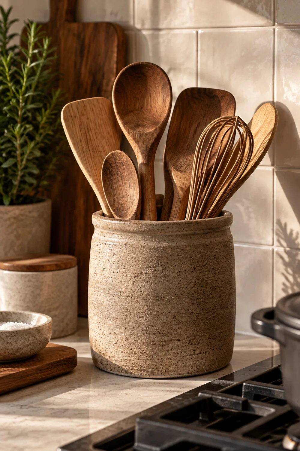
11. Corral Wooden Spoons in a Rustic Ceramic Utensil Crock
 Save it
Every farmhouse kitchen had a crock beside the stove, stuffed with wooden spoons, a whisk, and a ladle or two. It remains one of the most practical ideas in any kitchen — tools exactly where your hand reaches mid-recipe — and one of the most photographed. The challenge in a modern kitchen is avoiding the overstuffed, mismatched look that turns a crock into clutter.
The translation is in the vessel and the edit. Choose a crock with texture and a muted, earthy color rather than glossy white or a busy pattern, and fill it only with tools that share a material story — natural wood, olive wood, matte black silicone, perhaps one brushed-steel whisk. The plastic spatulas and mismatched gadgets can live in a drawer.
A Ceramic Utensil Holder has a textured ceramic finish — room for wooden spoons, spatulas, whisks, ladles, and tongs. Taupe is a quiet neutral that sits comfortably between warm wood and cool stone, so it bridges both.
Place it right beside the range, on the side of your dominant hand, so you can grab a spoon without turning away from the pan. Leave a few inches of clearance from the burners so wooden handles aren’t sitting in direct heat. If your cooktop is on an island, keep the crock toward the back edge, away from where people sit.
Curate the contents like a bouquet. Aim for varied heights — a tall spoon, a medium spatula, a shorter whisk — and roughly six to eight tools in total. More than that and the crock tips toward clutter; fewer and it looks staged. As tools wear out, replace them in matching materials so the collection stays cohesive.
The crock’s taupe also helps tie objects together across the kitchen. It echoes the warm tone of the cane mixing bowl and the acacia of the cookbook stand and butter dish, while its texture contrasts with smooth tile and stone. That tonal repetition is how a farmhouse layer becomes part of the room instead of sitting on top of it.
Empty and wash the crock every few weeks. A fine film of grease settles on anything kept near a range, and a clean crock filled with well-kept wooden tools looks honest rather than neglected.
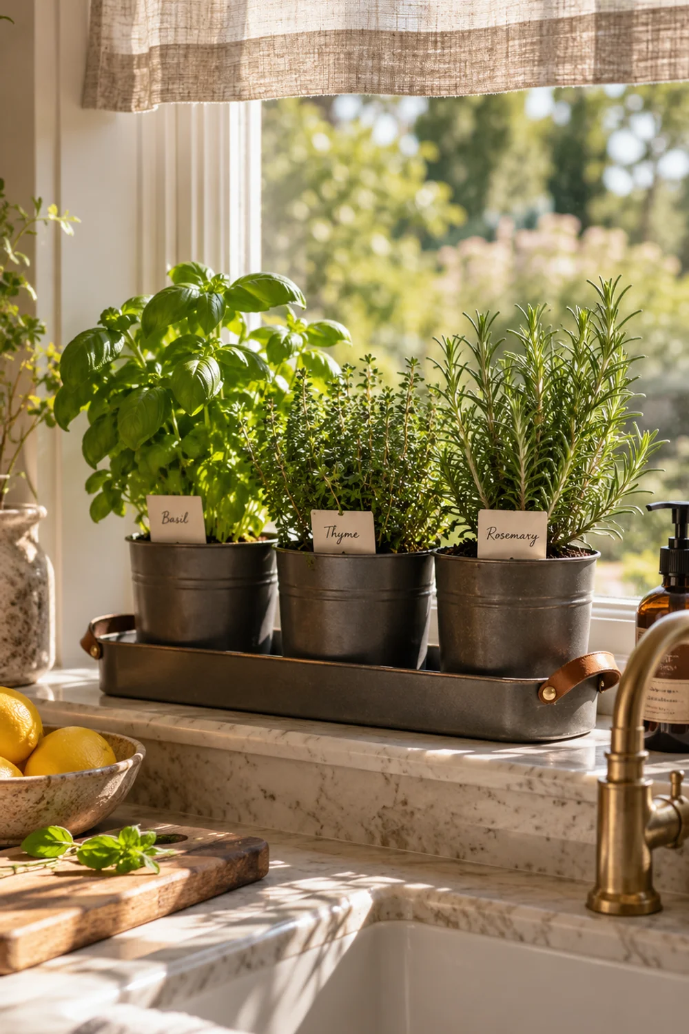
12. Plant a Working Herb Garden on the Windowsill
 Save it
The kitchen garden was the heart of the farmhouse — herbs grown steps from the door and cut minutes before cooking. A modern kitchen may not have a garden outside, but most have a sunny windowsill, and growing herbs you actually cook with is the most living version of farmhouse charm you can add.
This is different from decorative greenery. A trailing plant on a shelf looks lovely; basil, parsley, thyme, and chives look lovely and end up in dinner. That practical purpose is exactly what makes the idea feel authentic rather than styled, and it rewards you with fragrance every time you brush past the window.
An Indoor Herb Planter Set includes three charcoal grey steel pots with drainage holes and a matching tray with a leather handle, so you can move the whole set to follow the sun. The steel is a clean, modern echo of the galvanized buckets and tins that once lined farmhouse potting benches.
Light is the deciding factor. Most culinary herbs want around six hours of direct sun, so a south- or west-facing window is ideal. If your sink window faces north, choose more forgiving herbs like parsley, mint, and chives, or add a small grow light beneath the upper cabinet.
Plant what you actually use. Three herbs in heavy rotation beat six you rarely touch. Basil, thyme, and rosemary cover a great deal of everyday cooking; parsley and chives are forgiving for beginners. Harvest often by pinching from the top, which keeps plants bushy instead of leggy.
Arrange the set with care. Center the tray on the sill, or align it with one side of the faucet so it doesn’t block the view straight through the window. If you’ve hung café curtains, the pots should sit just below the panel’s hem, so light from the uncovered upper window reaches them directly.
Water at the base and let the tray catch the runoff, checking the soil every few days. Steel can warm up in strong sunlight, so on very hot afternoons, slide the tray back slightly from the glass. The label cards included with the set can go into each pot — written by hand, they become a quiet farmhouse detail of their own.
13. Keep a Ceramic Butter Dish with a Wood Lid on the Counter
 Save it
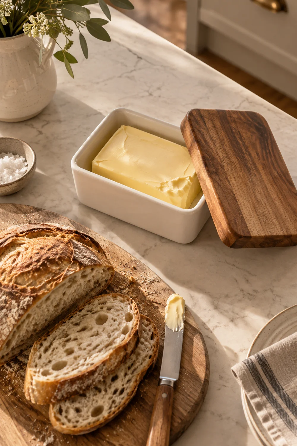
Butter left on the counter, soft and ready for warm bread, is one of the small everyday pleasures farmhouse kitchens took for granted. Many of us keep it rock-hard in the fridge, but a countertop butter dish brings back that simple ritual — and adds one more warm, tactile object to the kitchen’s daily landscape.
Design matters because this object is used every day and lives in plain sight. A heavy ceramic base keeps the butter steady; a wooden lid adds warmth and a natural material that pairs with bread boards, cookbook stands, and cake stands. Together they turn a practical container into a small piece of kitchen furniture.
A Ceramic Butter Dish with Acacia Lid has a white ceramic base and a thick acacia wood lid, holds two sticks of butter, and measures roughly 6.5 by 4 by 3 inches. The heavy base means it won’t skate across the counter when you reach for it with a knife in hand.
Place it with the breakfast things: beside the bread bin, near the toaster, or at the end of the island where people eat. Grouped with the bread box and a wooden board, it forms a compact breakfast station that feels generous without being cluttered. Keep it away from the range, sunny windowsills, and the dishwasher vent, where warmth will turn soft butter into melted butter.
The white base and acacia lid also help balance the room visually. After the black bread bin, plate rack, and faucet, small white and wooden objects keep the kitchen from tipping too dark. That interplay of dark accents, pale ceramics, and warm wood is what keeps a farmhouse-modern kitchen feeling fresh rather than heavy.
Care is simple. Hand-wash the lid instead of soaking it, and oil the acacia now and then so it doesn’t dry out. Keep only a day or two’s worth of butter in the dish at a time, especially if your kitchen runs warm, and refill it from the fridge as you go.
With this last detail, the farmhouse layer is complete — not as a theme, but as a set of daily rituals carried out with objects that are genuinely good to use: bread and butter, herbs from the sill, a cookbook open to tonight’s recipe.
Common Mistakes
1. Adding every farmhouse signature at once
The fastest way to lose the modern half of a farmhouse-modern kitchen is to install beadboard, a bridge faucet, a plate rack, café curtains, and a bread bin all in the same weekend. Each one is charming in isolation; together they become a theme. Introduce one signature per zone, live with it for a while, and add the next only when the room feels like it’s asking for more.
2. Choosing distressed finishes for everything
A little wear on one piece reads as history. Chipped paint, sanded edges, and faux-aged wood on every surface read as shabby chic, which is a different style entirely and dates quickly in a modern kitchen. Let the architecture and cabinetry stay crisp, and allow age to show only in one or two genuinely used objects.
3. Relying on word signs and slogans
Signs reading “Farmhouse,” “Kitchen,” or “Gather” try to announce a style instead of creating it. The charm of a real farmhouse kitchen comes from objects with a purpose — a mixing bowl, a bread bin, a plate rack. If you love lettering, limit it to one piece, and let everything else speak through material and form.
4. Ignoring the metal finishes you already have
Adding a matte black faucet, a brass café rod, a chrome paper towel holder, and a nickel light fixture creates visual static. Pick one dominant metal for fixtures and hardware and one accent at most, then choose every farmhouse addition to fit that decision rather than fighting it.
5. Buying décor that never gets used
Farmhouse objects look authentic because they are used — the bowl gets floury, the crock holds real spoons, the cake stand holds real cake. Pieces bought purely to be looked at quickly become clutter. Before adding anything, ask whether you’ll touch it this week; if not, it probably doesn’t belong on the counter.
Frequently Asked Questions
Can farmhouse and modern styles work together without clashing?
Yes, as long as one style provides the structure and the other provides the accents. In the most successful kitchens, modern design sets the architecture — flat cabinet fronts, clean countertops, simple lighting — and farmhouse elements arrive as a handful of carefully chosen objects and surfaces. Problems start when both styles compete for the same role, such as heavily distressed cabinets alongside ultra-glossy slab doors.
What colors work best for a farmhouse-modern kitchen?
A calm base of warm white, cream, or soft greige keeps the room modern, while matte black, natural wood, and one earthy accent color — olive, taupe, terracotta, or deep blue — bring in the farmhouse warmth. Pull accents from fixed materials like your countertop or floor so the palette feels anchored rather than decorative.
How many farmhouse elements should a modern kitchen have?
There’s no fixed number, but a good guideline is one farmhouse signature per zone: one on the walls, one at the sink, one at the window, and a few everyday objects on the counters. If you can see more than three farmhouse pieces from any single spot in the room, it’s worth editing one away.
Can I add farmhouse charm to a rental kitchen?
Absolutely. Café curtains on a tension rod, a leaning still life, a cookbook stand, a cake stand, a bread bin, a utensil crock, and a windowsill herb garden are all fully portable. Wall-mounted pieces like a plate rack only need a few small screw holes that are easy to patch, and wallcoverings or faucet swaps should be cleared with your landlord first.
Final Thoughts
The farmhouse kitchens people remember were never decorated to look like farmhouses. They were simply rooms where bread was kept on the counter, plates dried on a rack by the sink, herbs grew on the windowsill, and the same wooden spoons were reached for every evening. The charm came from use, repetition, and objects that earned their place.
That is the spirit worth bringing into a modern kitchen. Not a style to be applied, but a way of choosing: fewer pieces, better materials, and a preference for things that are both beautiful and genuinely useful. Let the architecture stay clean and quiet, and allow a handful of honest objects to supply the warmth.
Start with the one zone that feels coldest in your kitchen right now — the bare wall, the blank window, the chrome-lined counter — and translate a single farmhouse idea into it. Live with it for a few weeks. You’ll know soon enough whether the room wants another, and when it does, you’ll already know exactly how to choose it.
This post contains affiliate links. I may earn a small commission at no extra cost to you.
Get cozy inspiration delivered to your inbox.
✓ 14-page beautifully designed ebook
✓ Cozy decorating ideas
✓ Practical room-by-room inspiration
You’re in! 🎉
Thanks for joining the NestFlowHome community!
Your free ebook is already on its way to your inbox. If you don’t see it within a few minutes, please check your Promotions or Spam folder.
Join the NestFlowHome community for weekly decorating inspiration.

Timeless home decor ideas and slow living inspiration for a calm, beautiful life.