
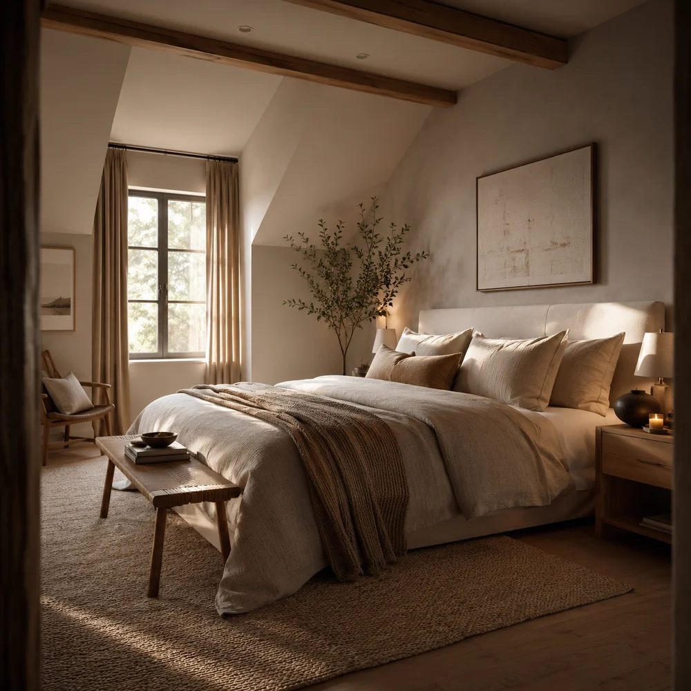
Scandinavian Cozy Bedroom Inspiration Ideas Worth Copying Right Now
By Emily | July 13, 2026
Most people assume a Scandinavian bedroom is simply a white room with a few plants and a linen duvet, and then wonder why their own version still feels flat, cold, or strangely unfinished. The truth is that Scandinavian coziness has almost nothing to do with a color palette and everything to do with restraint, material honesty, and a handful of deliberate choices most homeowners skip entirely. It’s not about buying less — it’s about choosing fewer, better things and giving each one room to matter.
The real problem isn’t taste. It’s that Scandinavian design gets flattened into a moodboard aesthetic — white walls, a throw blanket, a candle — without any of the underlying logic that actually makes those rooms feel calm instead of sparse. A genuinely cozy Scandinavian bedroom is built on functional decisions: how furniture sits in the room, how light behaves across the day, how surfaces reflect or absorb. Skip that logic and you’re left with a room that photographs well but never quite feels like somewhere you want to linger.
This guide walks through eleven ideas that go past the surface-level version of Scandinavian style, focusing on the structural and material choices that give these rooms their particular sense of quiet. You’ll find guidance on wood tone, flooring, furniture arrangement, architecture, contrast, and the small personal touches that keep a minimal room from feeling impersonal. Each section explains not just what to do, but why it works the way it does in a real, lived-in bedroom.
You don’t need to apply every idea here at once, and you shouldn’t try to. Read through with your own room in mind — its light, its proportions, its existing furniture — and pick the two or three ideas that address what’s actually missing. Scandinavian coziness rewards patience and editing far more than it rewards a single dramatic purchase, so treat this as a set of tools rather than a checklist to complete this weekend.
1. Pale Whitewashed Wood as the Room's Quiet Foundation
 Save it
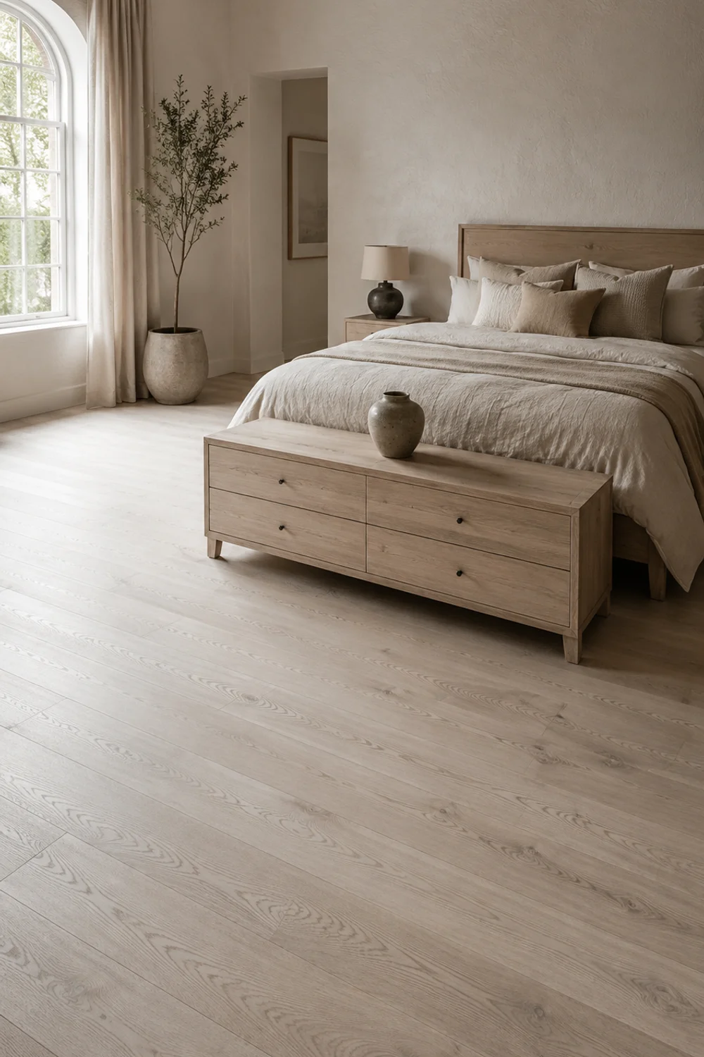
Most bedrooms default to whatever wood tone the furniture came in, and the result is often a mismatched mix of orange oak, dark walnut, and grey-washed pine competing for attention. Scandinavian rooms avoid this by choosing one consistent, pale whitewashed wood tone as the room’s baseline, used across flooring, furniture, or trim. This isn’t a stylistic preference so much as a functional one: pale wood reflects available light back into the room rather than absorbing it, which matters enormously in the low-light conditions common across Scandinavia and in any bedroom that doesn’t get strong direct sun.
The mechanism is straightforward once you notice it. Darker woods pull the eye and visually shrink a space because they read as mass and shadow, while pale, almost bleached wood tones behave more like an extension of the wall than a heavy object sitting in front of it. This is why Scandinavian floors are so often limed oak or whitewashed pine rather than rich mahogany — the goal is a surface that brightens rather than grounds. Whitewashed oak flooring planks achieve this without requiring a full renovation if you’re working with an existing dark floor.
Not every room can commit to new flooring, and that’s fine — the same logic applies at the furniture level. A pale wood dresser, bed frame, or nightstand introduces the same light-reflecting quality without touching the floor at all, and it’s often the faster, cheaper fix for a room that currently feels heavier than intended. If your existing furniture leans dark, even swapping one large piece, like a headboard or a dresser, toward a pale tone can shift the whole room’s temperature more than people expect from a single item.
Picture a north-facing bedroom with a dark walnut dresser inherited from a previous apartment — the room reads dim by early afternoon no matter how many lamps are switched on. Swap that dresser for one in pale ash or whitewashed pine, and the same room, with the same light fixtures and the same wall color, suddenly photographs brighter and feels less enclosed by four in the afternoon. Nothing else changed except the wood tone doing more of the visual work that the ceiling light was being asked to do alone.
This is a principle worth carrying into every room, not just the bedroom: material color does more for perceived brightness than almost any other single decision, including paint. A pale wood base gives you permission to introduce darker accents elsewhere — a black lamp base, a charcoal throw — without the room tipping into heaviness, because the foundation is already doing the work of keeping things light. This same logic is explored from a slightly different angle in How to Create Warm Neutral Bedroom Ideas That Will Never Go Out of Style, which looks at how undertone consistency affects a room’s overall warmth.
2. Wall-to-Wall Wool Carpet for Uninterrupted Warmth

 Save it
Layered area rugs have become the default underfoot solution in most cozy-bedroom guides, but that approach only works in rooms with a strong, clearly defined floor material worth partially covering. In many Scandinavian bedrooms, the more effective choice is the opposite: a single, wall-to-wall wool carpet that removes the floor as a visual variable entirely. Instead of negotiating between a hard floor and a rug’s edges, the whole surface becomes one continuous, soft plane, which does more for a room’s perceived warmth than any single rug ever could.
The reasoning is about consistency of sensation rather than pattern or texture layering. A hard floor with an area rug still has a cold perimeter — the strip between the rug’s edge and the wall, the entry point by the door, the space beside the bed on the side without a rug. A full wool carpet removes that inconsistency completely, so every step in the room, from getting out of bed to walking to the closet, happens on the same soft, warm surface. This matters more in bedrooms than almost any other room, because bare feet make first contact with the floor before anything else in the morning.
Wall-to-wall doesn’t mean wall-to-wall carpet in the American shag sense. A low-pile natural wool carpet in a pale oat or dove grey reads as distinctly Scandinavian rather than dated, precisely because the pile height stays low and the color stays close to the wood tones around it. This is a very different look from a thick, plush carpet in a saturated color, and choosing the wrong pile height is the fastest way to make this idea feel like a 1990s renovation rather than a considered Scandinavian choice.
Consider a small bedroom with an awkward footprint — an alcove for the bed, a narrow strip beside the closet, an odd angle where the ceiling slopes. Trying to place a rectangular area rug in that kind of room usually looks accidental, cut off at odd points and leaving hard, cold gaps in the corners that actually get used. Wall-to-wall wool carpet solves the geometry problem automatically, following the room’s real shape instead of imposing a rectangle onto it, which is often the more practical solution in exactly the rooms where rug layering looks most forced.
The broader takeaway is that comfort underfoot is one of the most underrated levers in bedroom design, more felt than seen, and often more responsible for how a room “feels” than its visible styling. A guest walking into a wool-carpeted bedroom rarely names the carpet as the reason the room feels inviting, but they notice the absence of a hard, cold floor without being able to say why. That quiet, sensory register is exactly where Scandinavian coziness tends to live.
3. Restrained Symmetry in Furniture Placement
 Save it
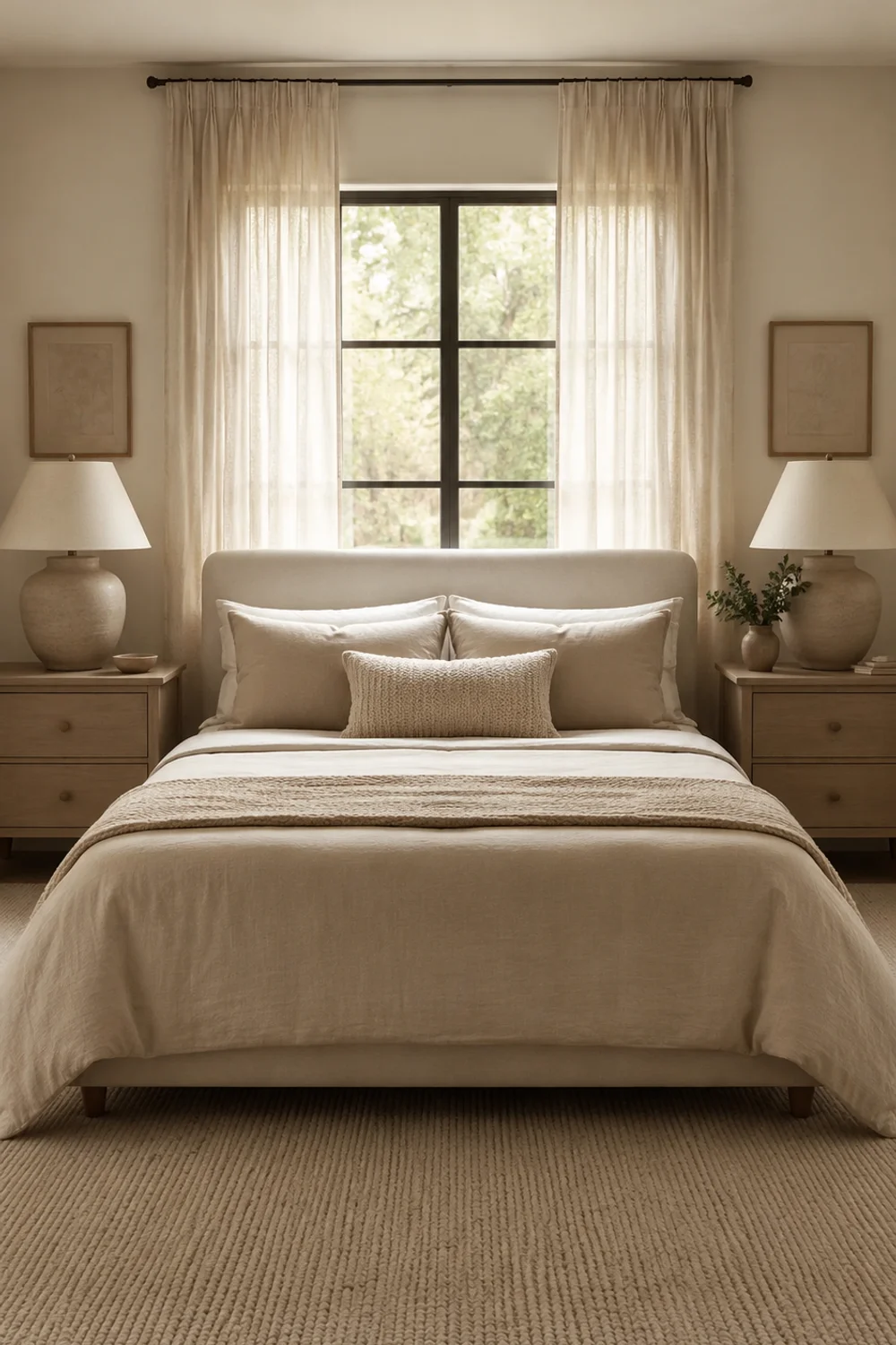
A room can contain beautiful individual pieces and still feel unsettled if the furniture is arranged without any underlying logic — a nightstand slightly off-center, a chair angled toward nothing in particular, a dresser competing with the bed for visual weight. Scandinavian bedrooms solve this through restrained symmetry, arranging furniture around a clear central axis, usually the bed, so the eye has an obvious resting point the moment it enters the room. This isn’t about matching furniture pairs for their own sake; it’s about giving the room a legible structure that reads as calm before a single design detail is even noticed.
The mechanism here is closer to architecture than decorating. A symmetrical arrangement — matching nightstands, evenly spaced wall art, a centered headboard against a centered window — reduces the number of competing focal points a person’s eye has to process on entry. Asymmetrical arrangements can absolutely work, but they require more deliberate visual weighting to avoid feeling haphazard, and most bedrooms simply aren’t styled with that level of intention. Symmetry gives you calm by default, which is exactly the shortcut a busy household usually needs.
This doesn’t mean every element must be identical. A solid beech wood bench placed centered at the foot of the bed reinforces the room’s central axis even if nothing else in the room is perfectly paired, because it anchors the strongest sightline in the room — the one running straight from the doorway to the headboard. Symmetry works at the level of structure, not decoration, so a few asymmetrical accents layered onto a symmetrical bones actually read as more intentional, not less.
Picture a rectangular bedroom where the bed currently sits pushed to one side to make room for a desk crammed into the opposite corner. The room feels cramped and busy even though it technically has enough square footage, because nothing in it aligns with anything else. Centering the bed on its wall, even if that means relocating the desk to a hallway nook or a different room entirely, immediately gives the space a sense of order that no amount of styling on the desk itself could have achieved.
This principle scales beyond furniture placement into how a room is photographed, walked through, and lived in day to day. A centered, symmetrical bedroom is easier to keep tidy because clutter has fewer places to accumulate unnoticed, and it’s easier to relax in because the brain isn’t quietly working to resolve visual imbalance every time you walk in. Structure, more than styling, is often the real difference between a room that looks put-together in photos and one that actually feels calm to live in.
4. Sloped Ceilings and Exposed Beams as a Cozy Asset
 Save it
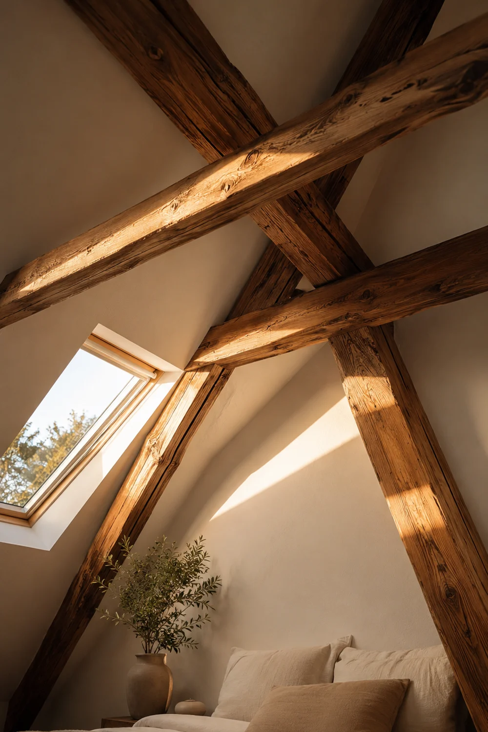
Attic bedrooms and rooms with sloped ceilings are routinely treated as design problems to minimize rather than features to embrace, and that instinct works against the room rather than for it. In classic Scandinavian interiors, a sloped ceiling with exposed wood beams is treated as one of the room’s most valuable architectural assets, not a limitation to disguise with flat paint and low furniture pushed away from the walls. The angle itself creates a sense of enclosure that flat-ceilinged rooms have to manufacture artificially through headboards and canopies.
The reasoning connects directly to how humans read shelter and safety in a space. A sloping ceiling that lowers toward one side of the room subconsciously reads as more protective, closer to the scale of a cabin or a nest, than a uniform flat ceiling ever does — this is part of why attic bedrooms, once properly finished, so often become the coziest room in a house rather than the least usable one. Exposed structural beams reinforce this further, giving the eye something tactile and real to register overhead instead of a blank plane.
The key variation is in how the beams are treated. Painted white beams against a white sloped ceiling keep the room feeling bright and airy while still preserving the architectural interest, which suits a smaller attic bedroom that can’t afford visual heaviness overhead. Left in natural, unpainted wood, the same beams read warmer and more rustic, better suited to a larger sloped room with enough floor space to absorb that extra visual weight without feeling closed in.
Picture an underused attic bedroom where the previous owner painted the sloped ceiling the same flat white as the walls and pushed all the furniture into the one section with full standing height, leaving the rest of the room essentially abandoned. Leaving the beams exposed and painting them a soft, contrasting off-white against a warmer ceiling tone turns that same sloped section into the room’s most photographed corner instead of its most avoided one, often becoming the natural spot for a low bench or a stack of books rather than dead space.
Architectural features like slope and beam are permanent in a way that furniture and textiles are not, which is exactly why they’re worth designing around rather than against. A room that works with its own bones, rather than fighting them with flat paint and standard rectangular furniture, ends up feeling more resolved and more distinctly its own space — a quality that a perfectly flat, generic bedroom often struggles to achieve no matter how carefully it’s styled.
5. Quiet Black Accents Against a White Backdrop
 Save it
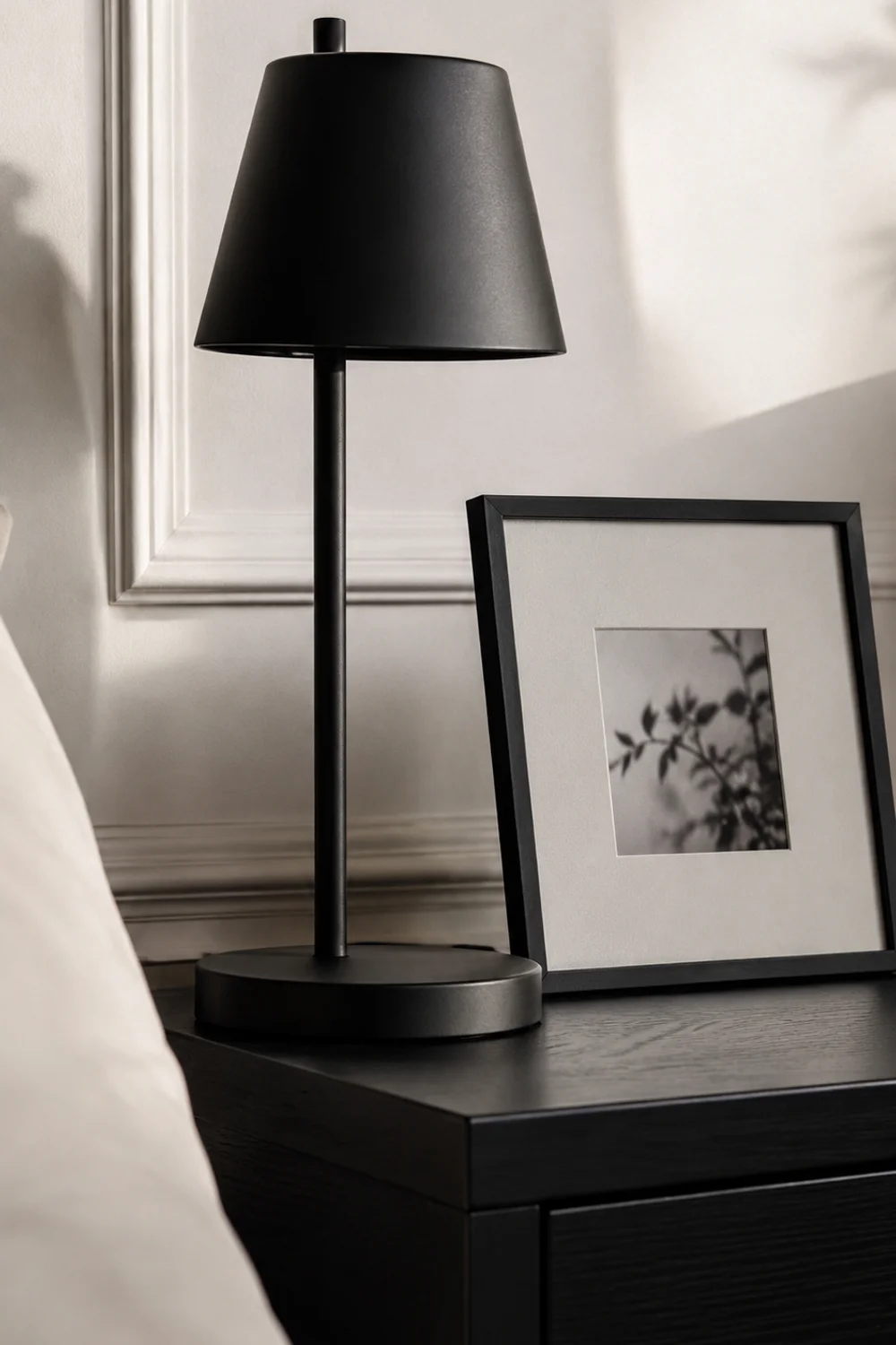
Scandinavian rooms are often described as all-white, but the most memorable ones almost always include a small amount of considered black, used sparingly enough to read as punctuation rather than a competing color scheme. A matte black picture frame or a single black-finished lamp base against white walls does more compositional work than an equivalent amount of any other accent color, because black and white create genuine visual contrast without introducing a hue that has to be coordinated with everything else in the room. It’s the lowest-maintenance way to keep a white room from feeling flat.
The mechanism is about contrast doing the job that color usually does. In a room built almost entirely from whites, creams, and pale wood, the eye has very little to grab onto — everything sits in a similar tonal range, which can start to feel indistinct rather than calm if taken too far. A small amount of true black breaks that tonal sameness immediately, giving the eye a clear anchor point without requiring the introduction of a second or third color that then needs its own coordination across textiles, walls, and furniture.
The proportion matters more than the placement. One or two black elements in a room read as intentional restraint; five or six start to tip the room toward a harder, more industrial feeling that works against the softness Scandinavian style is generally after. A black metal wall hook by the door, paired with one black-framed print, is usually enough — resist the urge to also add a black rug, black bedding, and black hardware, since the effect depends entirely on scarcity.
Consider an all-white bedroom that has started to feel sterile rather than serene, despite following every rule about pale wood and soft textiles. Adding a single black-framed mirror or a black-shaded lamp on one nightstand, while leaving everything else untouched, often resolves that flatness within minutes, because the room finally has one area with real tonal weight for the eye to settle on. Nothing else about the room needs to change for this shift to register.
This is a useful principle to keep in mind whenever a neutral room starts to feel underwhelming rather than calm: the fix is rarely more color, and it’s often less color used more deliberately. A small, disciplined dose of contrast — black against white, dark against pale wood — does more for a room’s sense of intention than an entire additional color story, and it’s a technique worth testing before assuming a room needs a bigger palette change.
6. One Sculptural Chair as the Room's Focal Object
 Save it
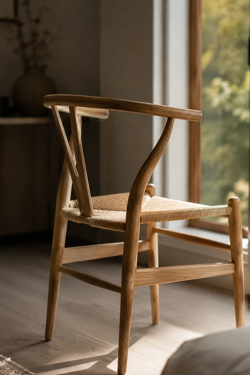
Bedrooms tend to accumulate furniture that serves no real function beyond holding discarded clothing, and a chair is usually the worst offender — bought without much thought, then forgotten under a pile of laundry within a month. Scandinavian design takes the opposite approach, treating a single, well-chosen sculptural wood chair as a deliberate focal object rather than incidental seating, positioned somewhere it can actually be seen and appreciated on its own. The goal isn’t a chair you sit in daily; it’s a chair that functions almost like a piece of art with legs.
This works because a genuinely well-designed chair, with a distinctive silhouette and visible joinery, carries enough visual interest to anchor a corner of the room without needing a lamp, a rug, or a side table to justify its presence. Scandinavian furniture history is full of exactly this kind of object — chairs designed as much for their form as their function — and placing one deliberately, rather than defaulting to a generic accent chair, gives a bedroom a sense of curation that most rooms are missing entirely.
The key distinction is choosing form over upholstered comfort. A chair with exposed, sculptural wood joinery and a simple woven or leather seat reads as intentional in a way that an overstuffed, heavily cushioned chair never quite manages, no matter how expensive the fabric. Solid oak dining-style chairs with a woven cord seat work particularly well in this role because the negative space within the frame keeps the piece from feeling heavy, even placed in a smaller room.
Picture a bedroom corner currently occupied by a folding chair holding a stack of unworn outfits, functioning as nothing more than an overflow surface. Replacing it with one deliberately chosen sculptural chair, placed at a slight angle near the window rather than pushed flush to the wall, turns that same corner into a spot worth photographing — and, somewhat counterintuitively, people are less likely to pile clothes on a chair that clearly reads as a design object rather than furniture.
The broader lesson is that a single well-considered object can carry more design weight than several mediocre ones, a principle that applies well beyond seating. A bedroom doesn’t need five decorative pieces if it has one genuinely good one, positioned with intention rather than tucked wherever there happened to be floor space. This is part of why Scandinavian rooms so often feel more resolved with less furniture overall, not despite the reduced quantity but because of it.
7. Crisp, Unfussy Bedding as a Design Statement

 Save it
Cozy bedroom guides tend to push toward more — more throw pillows, more layers, more texture piled onto the bed until it resembles a boutique hotel display. Scandinavian bedrooms often move in the opposite direction, treating crisp, minimally patterned bedding in a single tone as the more sophisticated and more genuinely restful choice. A bed made with two or three well-chosen pieces, rather than eight decorative pillows that get removed every night, communicates calm through restraint rather than abundance.
The reasoning connects to how a room reads at a glance and how it actually functions day to day. A heavily layered bed looks impressive in a photograph taken once, but in daily use it becomes a nightly chore of pillow removal and a morning chore of reassembly, which most people eventually abandon — leaving a half-made bed that looks worse than a simply made one ever would. A duvet in a single crisp tone, paired with one flat sheet edge folded neatly over the top, stays visually resolved with almost no daily effort, which is precisely the kind of low-maintenance elegance Scandinavian interiors prize.
The variation worth knowing is texture without pattern. A cotton percale duvet cover in a single pale tone gives the bed a crisp, hotel-like finish through its weave and slight sheen rather than through printed pattern or piecing, which keeps the whole look feeling architectural rather than decorative. This differs meaningfully from a heavily textured knit or a patchwork of layered throws — the goal here is precision and cleanliness, not visible coziness for its own sake.
Consider a bed currently dressed with a patterned duvet, a mismatched throw, and six assorted pillows collected over several years — attractive individually, chaotic together. Stripping it back to a single pale percale duvet, one firm bolster, and nothing else transforms the same bed from busy to genuinely serene within minutes, and it stays that way every morning without requiring the ten-minute pillow-arranging ritual the previous setup demanded. The room reads calmer immediately, even though objectively less has been placed on it.
This is a useful test to apply to any bedroom that feels cluttered without an obvious culprit: count the decorative pillows and layers currently on the bed, and consider what the room would feel like with half of them removed. Restraint on the bed itself, more than almost any other single surface in the room, tends to be the fastest way to shift a Scandinavian bedroom from busy to genuinely restful — a philosophy explored more broadly in How to Recreate the Cozy Bedroom Trends Everyone Is Saving in 2026, which looks at how simplified layering affects a room’s overall pace.
8. A Single Oversized Art Print as the Room's One Bold Moment
 Save it
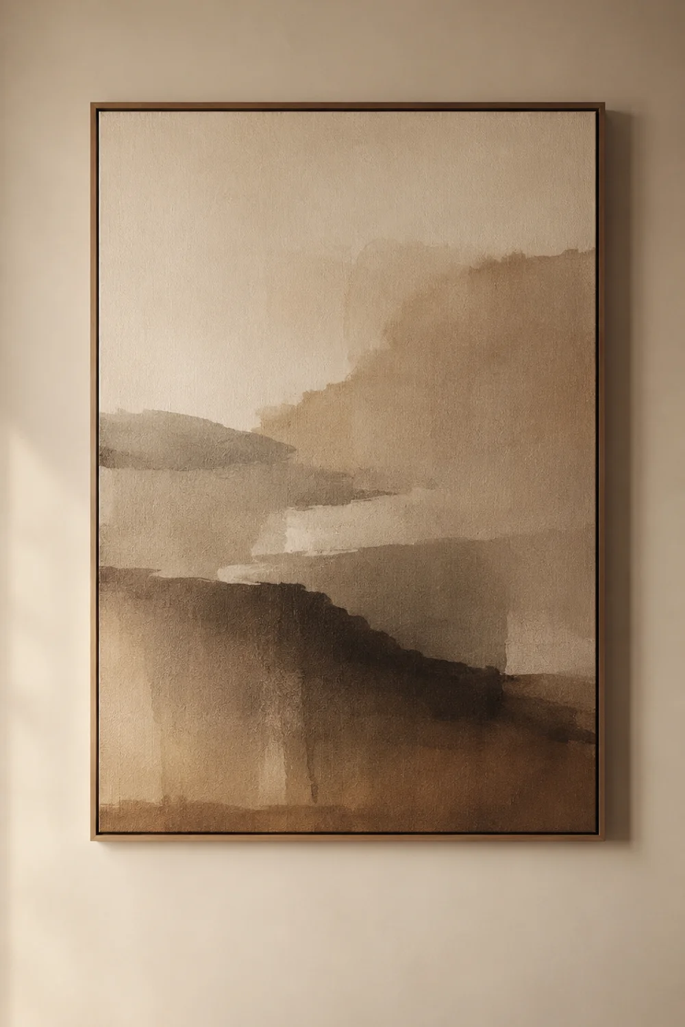
Gallery walls have become the default answer for bedroom art, but a cluster of small framed pieces often adds visual noise to a room that’s otherwise working hard to feel calm. The more distinctly Scandinavian move is the opposite: one oversized, unframed art print, scaled large enough to function almost like a piece of architecture on the wall rather than a decorative accessory. A single bold statement does more for a room’s sense of intention than six smaller pieces competing for the same wall.
The logic is about giving the eye one clear place to land rather than several small ones to scan across. A gallery wall, even a well-curated one, requires the eye to process multiple frames, multiple gaps, and multiple edges before settling — which, in a room built around calm, works against the very effect it’s usually trying to achieve. One large-format print, sized to occupy real proportional space on the wall, resolves in a single glance and reads as considered rather than accumulated over time.
The choice of subject matters more than people expect. Abstract, tonal, or landscape-based prints in muted, earthy colors integrate into a Scandinavian room far more successfully than anything busy, saturated, or figurative, because the print needs to feel like an extension of the room’s palette rather than an interruption of it. A large-format abstract linen-textured art print works particularly well because the paper itself has a soft, matte quality that avoids the glossy, mass-produced look smaller prints often have.
Picture a bedroom wall currently holding four or five mismatched frames collected from different apartments, none of them quite the right scale for the wall they’re on. Removing all of them and hanging a single large print, sized to cover roughly a third of the wall’s width, instantly gives that same wall a sense of purpose it never had as a scattered collection — and it becomes the wall guests actually comment on, rather than one they scan past without registering any single piece.
This same restraint principle applies to almost every decorative decision in a Scandinavian bedroom, not just art: one considered, well-scaled choice consistently outperforms several smaller, less resolved ones. It’s worth asking, before adding another decorative object to a wall or shelf, whether a single larger and better-chosen piece would actually do more work — a question that applies just as well to the earthy, texture-driven approach covered in 14 Earthy Bedroom Decor Inspiration Ideas Every Cozy Home Actually Needs Right Now.
9. Unobstructed Windows That Let Daylight Lead
 Save it
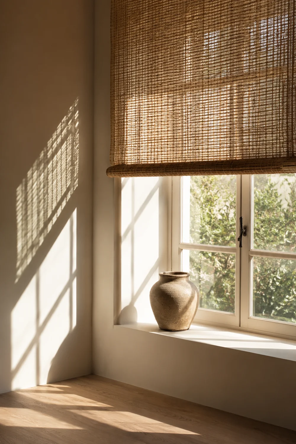
Heavy drapery gets treated as an automatic cozy-bedroom upgrade, but in genuinely Scandinavian interiors, the opposite instinct often wins: keeping windows as unobstructed as functionally possible, so daylight can move fully into the room rather than being filtered or blocked before it arrives. This isn’t about rejecting privacy or window treatments altogether — it’s about recognizing that in a climate and design tradition built around long, dark winters, daylight is treated as the room’s most valuable and least renewable resource.
The reasoning is seasonal and practical rather than purely aesthetic. A heavily draped window loses a meaningful percentage of the daylight hours a room receives, which matters enormously in northern climates where winter daylight is already scarce, and matters more than most people realize even in sunnier regions during shorter winter days. Scandinavian interiors prioritize maximum daylight capture during the hours it’s available, treating dimness as something to actively design against rather than something curtains should create on demand.
The practical variation is choosing minimal treatments over heavy ones where privacy allows. A single sheer or lightly textured panel, kept pulled to the side rather than drawn across the glass, preserves both the sense of an unobstructed window and a basic layer of softness at the edges of the frame. A simple wood roman shade in a natural fiber offers privacy control without the visual weight of full-length drapery, and it disappears entirely into the window frame when raised, leaving the glass genuinely clear during the day.
Consider a bedroom with heavy, floor-length drapery that stays mostly closed because opening and closing it feels like effort, leaving the room artificially dim well into the afternoon even on a bright day. Replacing that drapery with a woven roman shade that stays raised by default, dropped only at night for privacy, changes the room’s entire daytime character without touching a single other element — the same furniture and walls suddenly read as brighter and more alive simply because daylight is finally reaching them unobstructed.
This is a genuinely different lens than most window-treatment advice, which tends to focus on mood and softness rather than daylight quantity. Before adding drapery to a bedroom, it’s worth asking whether the goal is evening atmosphere or daytime brightness, because the two often call for opposite solutions — and a bedroom that already struggles with dimness is usually better served by clearing the window than by dressing it further.
10. A Practical Bench at the Foot of the Bed
 Save it
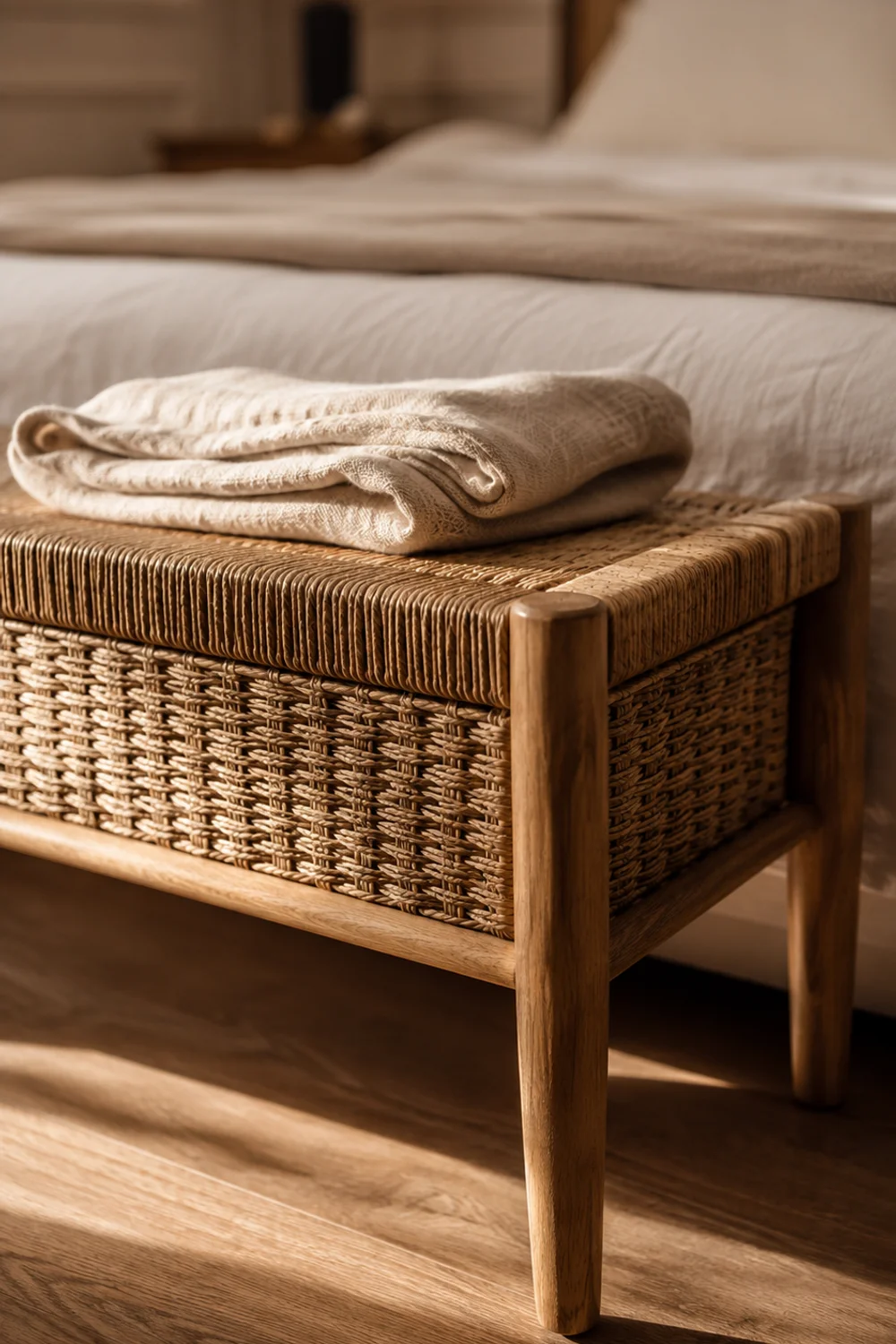
The space at the foot of a bed is one of the most consistently wasted areas in a bedroom, usually left empty or, worse, becoming a permanent landing spot for whatever clothing didn’t make it back into the closet. A simple upholstered bench, sized to the width of the bed frame, gives that space a real function — somewhere to sit while putting on shoes, somewhere to set a folded outfit the night before — rather than leaving it as unclaimed floor.
The functional logic is about daily friction rather than pure aesthetics. Without a bench, the instinct is to sit on the edge of the made bed to put on shoes, which disturbs the bedding within minutes of it being made, or to drape clothes across a chair from across the room. A bench at the foot of the bed removes both of those small daily frictions at once, giving the room a dedicated surface that absorbs the transitional moments of getting dressed without disturbing anything else.
The variation worth knowing is scale and proportion. The bench should generally sit at roughly two-thirds the width of the bed frame, not the full width, so it reads as a considered piece rather than an oversized obstacle blocking the foot of the bed. A narrow woven-seat bench adds a small amount of concealed storage for extra blankets without adding visual bulk, since the woven front keeps the piece feeling light even with functional depth.
Picture a bedroom where the foot of the bed is currently bare, and the routine every morning involves sitting on the edge of the freshly made duvet to tie shoes, undoing the crisp look achieved just minutes earlier. Adding a simple bench in that space breaks that habit almost immediately, because it becomes the obvious place to sit, and the bed itself stays undisturbed through the rest of the morning routine. The change is small, but it’s one of the few design decisions that actually reduces daily effort rather than adding to it.
This is a useful lens for evaluating any empty stretch of floor in a bedroom: rather than asking what would look good there, ask what daily task currently has no dedicated spot and is quietly happening somewhere less convenient instead. A bench at the foot of the bed is a small, specific answer to that question, and it’s the kind of practical addition that Scandinavian design tends to prioritize over purely decorative filler.
11. A Sparse, Personal Display of Objects on One Shelf
 Save it
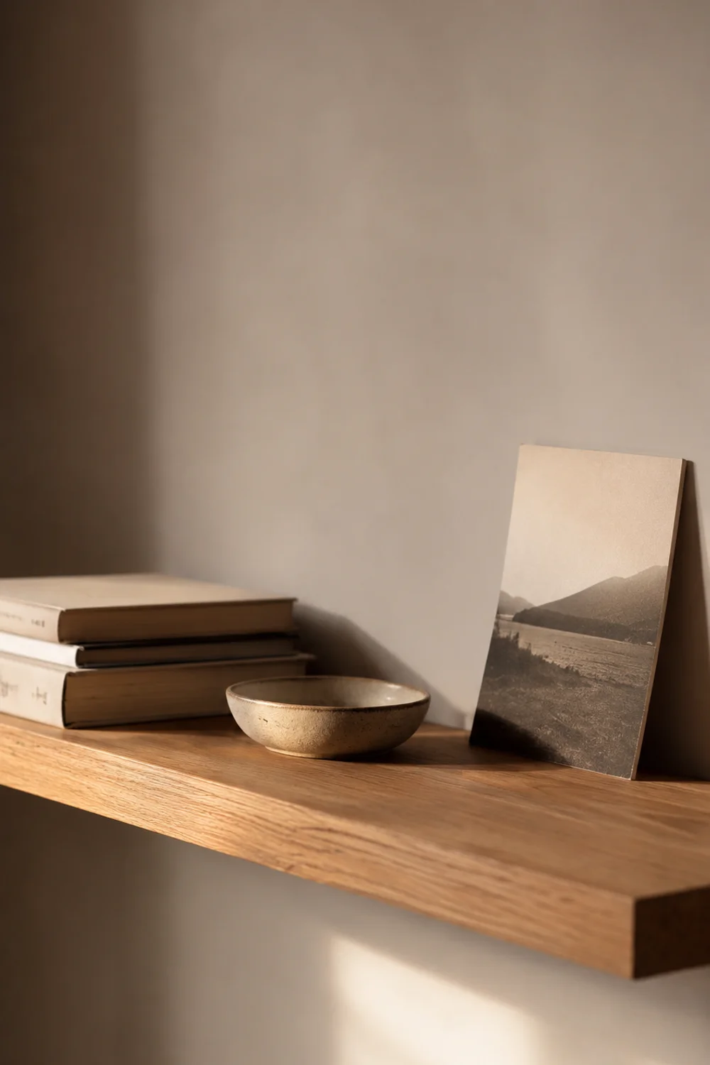
Minimalism gets misread as an instruction to remove personality entirely, which leaves plenty of Scandinavian-style bedrooms feeling correct but strangely anonymous, as though nobody actually lives there. The fix is a single narrow shelf, styled with three or four genuinely meaningful objects — a stack of well-worn books, one ceramic piece, a small personal photograph — rather than either a bare wall or a shelf overloaded with decorative filler bought specifically to fill it. Sparse doesn’t have to mean impersonal; it just means edited.
The mechanism is about signal versus noise. A shelf crowded with a dozen small objects makes it impossible to actually notice any single one, so the room communicates “decorated” without communicating anything specific about the person living there. Three or four carefully chosen objects, given real space between them, each get seen individually — which is what actually reads as personal, rather than the sheer quantity of things on display. Fewer objects, more space around each one, is the entire technique.
The variation worth understanding is intentional imperfection in scale. Objects of noticeably different heights and shapes — a tall stack of books, a low round object, one taller vertical piece — create a more interesting visual rhythm on a narrow shelf than a uniform row of similarly sized items ever could. A narrow floating oak shelf mounted at a considered height, rather than centered arbitrarily on the wall, gives this small collection somewhere specific and deliberate to live.
Picture a bedroom wall currently holding nothing at all, left blank because the room felt “finished” everywhere else and nobody got around to adding anything personal. A single narrow shelf with three objects — a small stack of favorite books, one ceramic bowl, a single framed photograph propped rather than hung — turns that blank stretch into the one spot in the room that actually reflects who lives there, without introducing the visual clutter a fuller display would bring. It takes minutes to set up and changes how the whole room reads.
This same principle of sparse, meaningful display extends naturally beyond the bedroom into adjoining spaces, including how a shelf or ledge is styled in a connected bathroom, an idea covered in more depth in The Ultimate Guide to Scandinavian Bathroom Design Everyone Is Obsessed With. The underlying rule stays the same across every room: a few well-chosen, well-spaced objects will always read as more intentional, and more personal, than a shelf filled simply because it was empty.
This same instinct for restraint carries over into how you approach storage, too, since a closet edited down to what you actually love works on the same principle explored in The Best Aesthetic Closet Storage Ideas for Small Bedrooms — fewer things, chosen with intention, always read as more personal than a space filled just because there was room to fill it.
Common Mistakes to Avoid
1. Treating “Scandinavian” as a single color palette
The most common mistake is assuming the entire style can be achieved through white walls and pale wood alone, without addressing furniture arrangement, architecture, or the restraint that actually defines the look. A room can be perfectly white and still feel cluttered, poorly proportioned, or cold if the underlying structural choices aren’t there to support it.
2. Layering too many textures at once
Cozy is often mistaken for maximal, leading to bedrooms stacked with knit throws, sheepskin, patterned pillows, and layered rugs all competing simultaneously. Scandinavian coziness depends on restraint — one or two textural moments, given room to be noticed, do far more than five competing for attention on the same surface.
3. Choosing furniture scale without measuring the room
An oversized bench, an undersized chair, or a shelf mounted at an arbitrary height all disrupt the sense of proportion that makes these rooms feel calm. Every piece should be measured against the room’s actual dimensions rather than chosen because it looked right in a photograph of a different, larger space.
4. Blocking daylight with heavy window treatments
Full-length, heavy drapery is often added reflexively for coziness, but it frequently does the opposite by keeping a room dim during the exact hours natural light is most available. In a genuinely Scandinavian approach, daylight takes priority over evening drama, and window treatments should be chosen with that trade-off in mind rather than defaulting to the heaviest option available.
5. Overcrowding display shelves and walls
A shelf filled with a dozen small trinkets, or a wall covered in mismatched frames, reads as clutter rather than personality no matter how much each individual object is loved. Editing down to a few meaningful pieces, spaced generously, will almost always look more intentional and more genuinely personal than a fuller, busier display.
Frequently Asked Questions
Does a Scandinavian bedroom have to be all white?
No — white is common because it maximizes light reflection, but the defining feature is restraint and material honesty, not a specific color. Pale wood, soft neutrals, and small doses of contrast like black accents all fit comfortably within the style. What matters more than the exact palette is keeping the room’s tones consistent and avoiding visual competition between too many colors or finishes at once, which is what actually creates the sense of calm people associate with the look.
How do I make a small bedroom feel Scandinavian without it feeling empty?
Focus on restraint rather than reduction — a small room styled with a few well-chosen, well-scaled pieces feels intentional, while an empty room simply feels unfinished. Prioritize one focal piece, like a sculptural chair or a large art print, alongside functional basics like a bed and storage, rather than trying to fill every wall. Pale wood tones and a wall-to-wall carpet also help a small room feel complete without requiring additional furniture to compensate.
Is dark furniture ever appropriate in a Scandinavian bedroom?
Yes, in small, deliberate doses. A single black lamp base, a dark-framed print, or one black hardware detail can add necessary contrast to an otherwise pale room without undermining the style. The mistake is introducing dark furniture as a dominant material rather than an accent — a full dark wood dresser or bed frame shifts the room toward a different aesthetic entirely, while a few small black details keep the pale, light-reflecting foundation intact.
What’s the fastest way to make an existing bedroom feel more Scandinavian?
Start by removing rather than adding — clear excess pillows from the bed, take down a crowded gallery wall in favor of one larger piece, and open heavy drapery to let more daylight in during the day. These changes cost nothing and can be done in an afternoon, and they address the structural issues — clutter, dimness, visual competition — that usually matter more than any single new purchase. Once the room feels edited, targeted additions like pale wood furniture become far more effective.
Final Thoughts
A Scandinavian bedroom isn’t built through a single dramatic renovation or a carefully curated shopping list — it’s built through a series of smaller, structural decisions that most guides skip in favor of surface-level styling tips. Pale wood, considered furniture placement, unobstructed daylight, and a genuinely restrained approach to decoration all work together quietly, and none of them depend on a large budget or a full room overhaul to make a real difference.
What separates a room that merely looks Scandinavian from one that actually feels calm to live in is usually restraint applied consistently, not any single standout feature. A sparse shelf, a crisp duvet, one sculptural chair — each idea here works best in combination with a few others, rather than as an isolated purchase dropped into an otherwise unchanged room. Start with whichever idea addresses your room’s most obvious gap, and let the rest follow gradually rather than all at once.
If any of these ideas resonated with your own space, it’s worth saving this guide and returning to it as you work through your room one decision at a time. Scandinavian coziness rewards patience far more than urgency, and a bedroom edited slowly over a season will almost always feel more resolved than one assembled in a single weekend rush.
This post contains affiliate links. I may earn a small commission at no extra cost to you.
Get cozy inspiration delivered to your inbox.
✓ 14-page beautifully designed ebook
✓ Cozy decorating ideas
✓ Practical room-by-room inspiration
You’re in! 🎉
Thanks for joining the NestFlowHome community!
Your free ebook is already on its way to your inbox. If you don’t see it within a few minutes, please check your Promotions or Spam folder.
Join the NestFlowHome community for weekly decorating inspiration.

Timeless home decor ideas and slow living inspiration for a calm, beautiful life.