
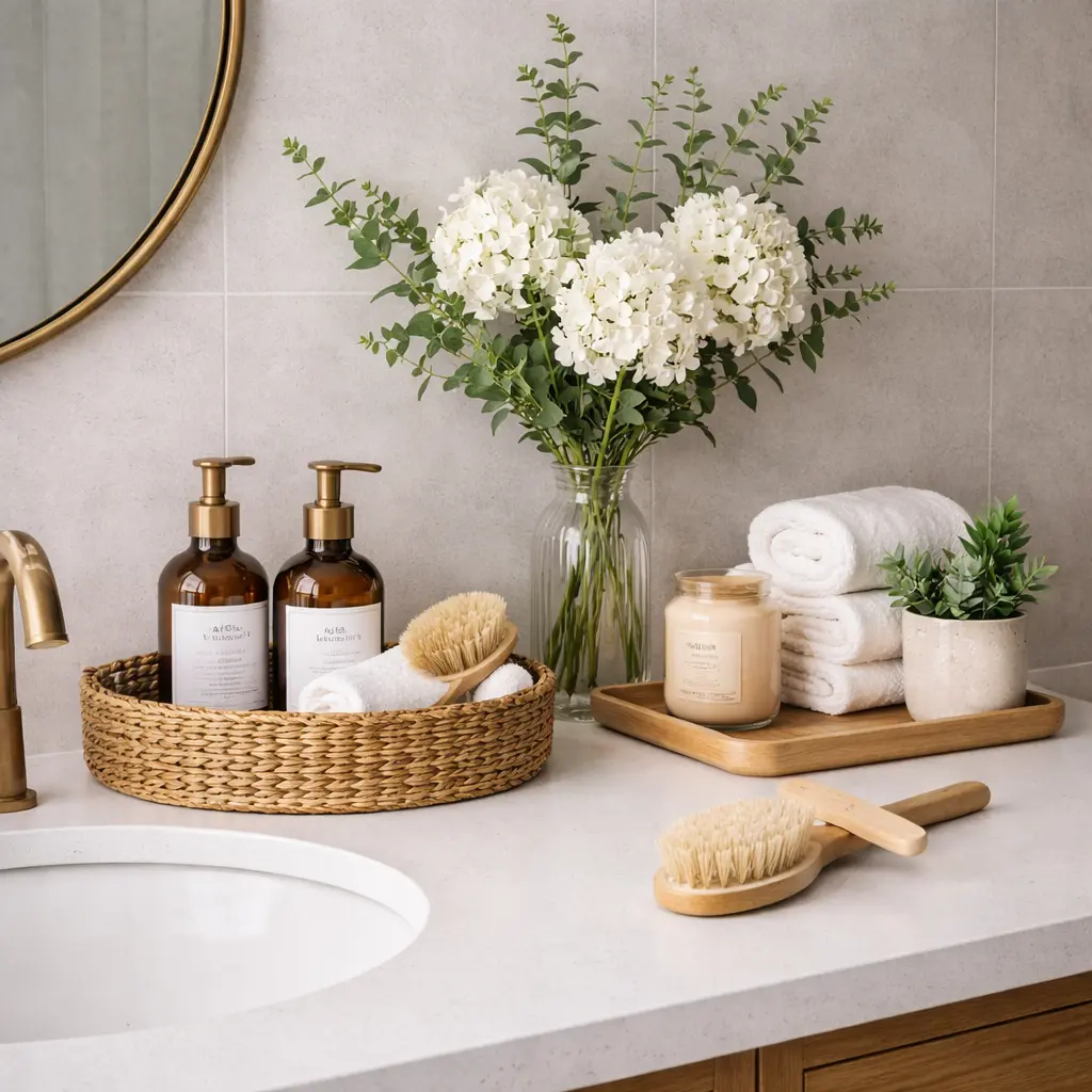
Affordable Bathroom Counter Decor Ideas That Look High-End
By Emily | January 12, 2026
Bathroom counters are often the first casualty of daily life. Towels accumulate. Toiletries multiply. Everyday essentials demand surface space. Even in a meticulously clean, well-organized bathroom, counters can quickly feel cluttered and chaotic. The visual weight of necessary items – bottles, jars, containers, grooming tools – can make a space feel busy rather than serene. Yet here’s the surprising truth: the difference between a bathroom counter that looks expensive and polished versus one that looks cluttered and cheap has almost nothing to do with budget.
High-end appeal comes from restraint, not expense. It comes from intentional curation and strategic placement rather than accumulation. Too many items, regardless of their quality or cost, create visual chaos and cognitive overload. Thoughtful placement of fewer items highlights what matters and creates a sense of calm and order. The most expensive designer bathrooms aren’t visually overwhelming – they’re visually peaceful. They balance the practical necessity of counter storage with aesthetic intention. They make everyday items feel like design choices rather than clutter.
The good news is that affordable bathroom counter decor can absolutely look high-end. You don’t need luxury materials or expensive products. You need understanding: understanding of composition, negative space, proportion, and visual hierarchy. You need to know how to group items strategically, when to leave breathing room, and which small touches – a quality tray, a thoughtful soap dispenser, a small plant – elevate a space without overwhelming it. These principles work regardless of budget.
You’ll discover practical, immediately actionable strategies for styling your bathroom counters. You’ll learn how to choose decorative accents that feel intentional, group items effectively to create visual coherence, and maintain a clutter-free, high-end aesthetic that works with your actual daily routines. By the end, your bathroom counters will feel polished, curated, and genuinely inviting – a space that balances everyday practicality with elevated, intentional style. And you’ll accomplish this affordably, through smart choices rather than expensive purchases.
Anchor the Space With a Single, Grounded Element
 Save it
One of the most common styling mistakes is allowing items to float independently across the counter surface. When objects are scattered with no relationship to each other, the eye has nowhere to rest. The composition feels accidental, haphazard, rather than curated and intentional. The counter looks used rather than designed. This scattered approach is the visual equivalent of throwing items on a shelf and calling it styling.
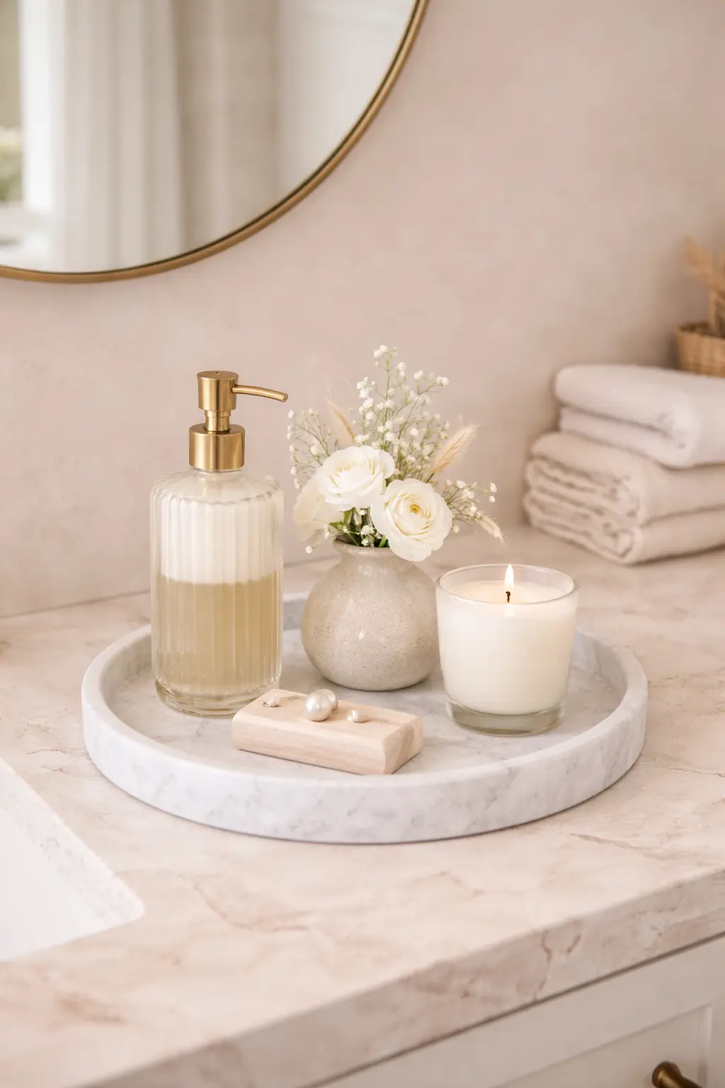
Designers solve this fundamental problem by introducing a grounding element – a single piece that visually contains smaller items and provides context for their existence. A tray does this beautifully. It’s both practical and psychological: it signals clear intention. It says to anyone looking at the counter: “these pieces belong together, they’ve been thoughtfully selected and arranged.” A tray creates a mini-composition within the larger bathroom surface. Instead of individual items demanding attention separately, they become a unified element.
Imagine a soft marble-look tray resting beside your sink, holding a refillable soap dispenser, a small textured hand soap, and a delicate vase with minimal greenery. Suddenly, those everyday objects that would otherwise feel utilitarian and scattered feel composed. They become a styled vignette. The counter feels designed with intention rather than simply used. A simple marble-look tray blends effortlessly into both modern and classic bathrooms while adding subtle visual weight and elegance to the surface.
The effectiveness of this approach lies not in extravagance but in restraint. Don’t fill the tray completely. Allow meaningful space between each item. That breathing room – that intentional negative space – is precisely what creates the sense of luxury and intentionality. A crowded tray looks like a catch-all shelf. A tray with thoughtful spacing looks like design. This single principle – using a tray and leaving space within it – can transform your bathroom counter from cluttered to curated.
Replace Temporary Packaging With Permanent Pieces
 Save it
Nothing disrupts the refined, polished feeling of a carefully styled bathroom faster than bright plastic packaging. Even neutral, minimalist spaces can feel less elevated and less intentional when everyday product packaging – with its commercial colors, branding, and plastic materials – introduces visual clutter. The packaging speaks of temporary, transient use rather than permanent, curated design.
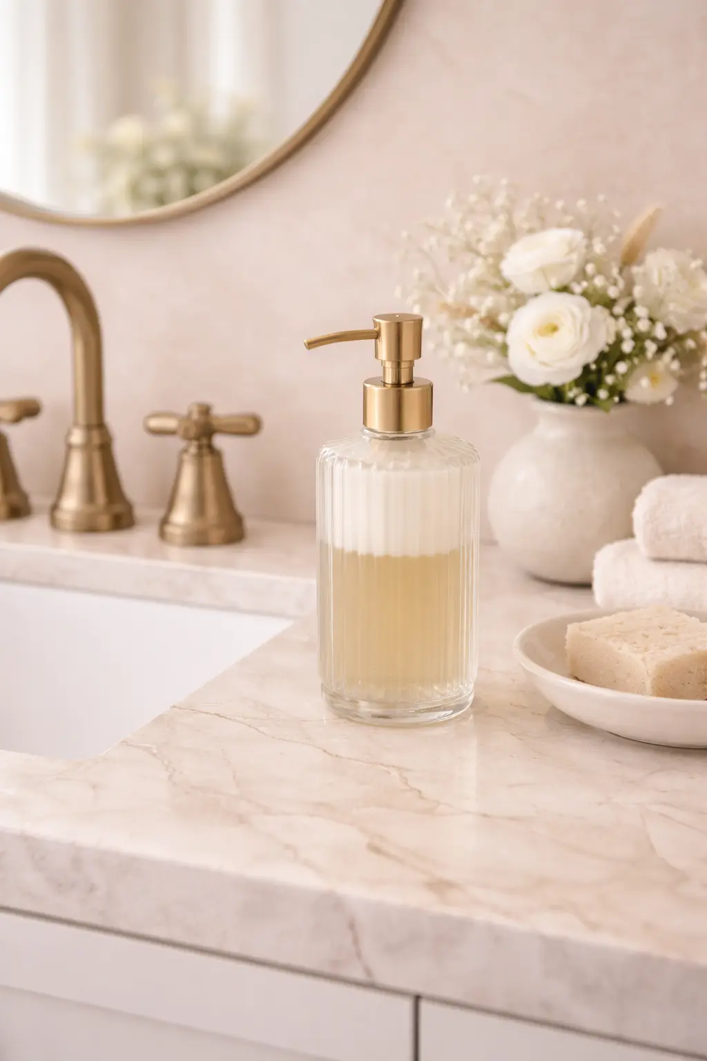
Swapping disposable, commercial packaging for refillable containers and permanent pieces immediately and dramatically shifts the tone and feel of the entire room. Ceramic dispensers, glass containers, and matte-finish vessels feel more permanent, more intentional, more designed. They suggest that the space has been thoughtfully considered and that everyday functionality has been intentionally presented. They communicate luxury. The key to success here is cohesion – visual harmony across your chosen accessories.
If your faucet is brushed nickel, echo that cool metallic tone in your accessories and dispensers. If your hardware leans warm – gold, warm brass, or bronze – choose finishes that complement and reinforce that warmth rather than compete with it. Cohesion creates sophistication. A matte ceramic dispenser feels understated and architectural without drawing excessive attention or creating visual disruption. This approach isn’t about hiding functionality. It’s the opposite: it’s about presenting functionality in a way that aligns with and enhances the overall mood and aesthetic of the space. When your soap dispenser coordinates with your aesthetic, it becomes a design element rather than a utilitarian necessity.
Introduce Height to Create Movement
 Save it
Flat surfaces are static. When every object on your bathroom counter sits at roughly the same level – essentially creating a horizontal line – the eye moves across that line and then stops. The composition feels flat, one-dimensional, lacking visual interest. There’s no movement, no invitation for the eye to explore. This flatness can make even a clean counter feel boring or dull.
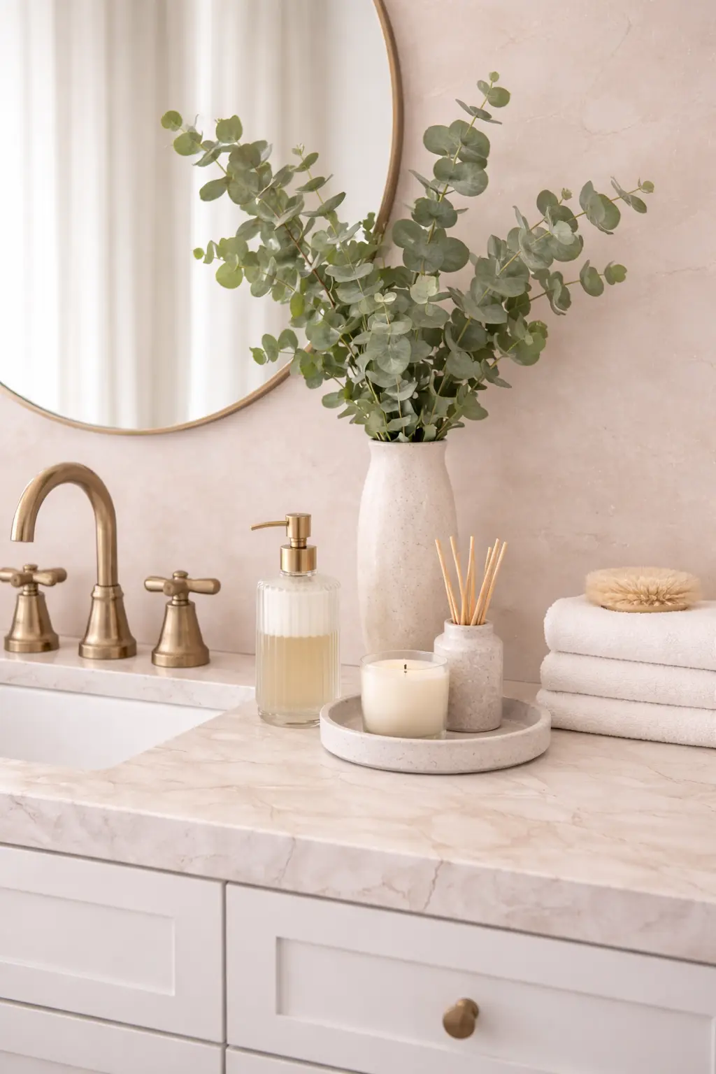
Adding a single element with height – a vertical element that breaks the horizontal plane – introduces movement and dimension instantly. It invites the eye upward. It creates a focal point. Even in small bathrooms where every inch of surface matters, this principle applies. A slender vase with a few carefully chosen stems can be entirely sufficient. You don’t need an enormous flowering arrangement – in fact, those often feel wrong in a bathroom. You need just enough greenery to introduce that vertical movement and organic texture.
Greenery works particularly well in bathroom styling because it provides essential visual and psychological softness. Bathrooms are dominated by hard materials – stone, tile, glass, chrome. These materials are necessary and beautiful, but they can feel cold or sterile without organic contrast. Greenery – whether living plants or high-quality faux eucalyptus – softens this hardness. A simple eucalyptus bundle with just a few stems introduces that vertical lift while keeping your color palette calm and completely cohesive. The effect is subtle, almost understated, but it transforms how the entire counter feels. Instead of a flat plane, the counter becomes layered. Instead of static, it becomes dynamic. Instead of one-dimensional, it becomes dimensional.
For deeper insight into how vases create spaces that feel genuinely lived-in, explore From Simple to Stunning: Vase Decor Ideas You’ll Love.
Layer Texture for Depth
 Save it
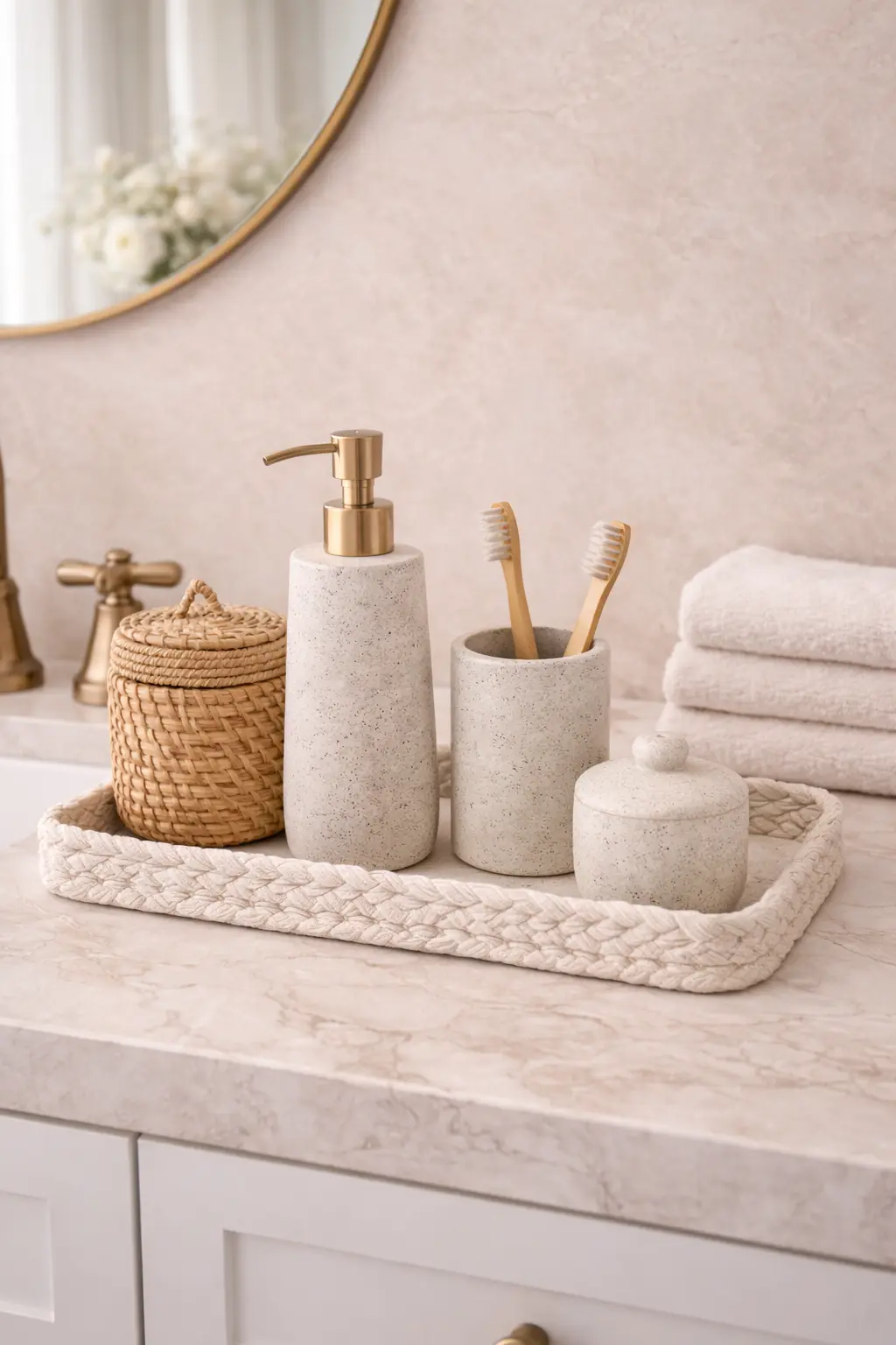
Luxury interiors rarely build visual interest through bold, saturated colors. Instead, they create depth and richness through thoughtful texture layering. A smooth, polished countertop paired with something woven, matte, or rough introduces quiet, sophisticated contrast that feels expensive and intentional. Texture creates visual interest without color, which is crucial in bathrooms where color saturation should remain restrained.
If your bathroom feels sterile, overly polished, or somehow cold despite careful attention to lighting and color, the missing element is often texture. Introducing tactile, textured elements creates warmth and prevents the space from feeling like a showroom or hotel. Consider adding a woven container for neatly folded, rolled hand towels – a common designer touch. Or a textured box constructed from natural materials to hold everyday essentials. These woven and textured pieces introduce warmth and craft to cool, manufactured materials. They make the space feel more human, more lived-in.
A neutral woven basket can warm up cooler materials while still maintaining the minimal, refined aesthetic you’re cultivating. Texture makes a space feel curated and intentional in a way that smooth, uniform materials cannot. It prevents sterility. It adds character and depth. Yet when texture is used thoughtfully it enhances elegance rather than diminishing it. The goal is controlled texture, not bohemian maximalism. Each textured piece should feel like a conscious design choice contributing to overall harmony.
Embrace Negative Space as a Design Element
 Save it
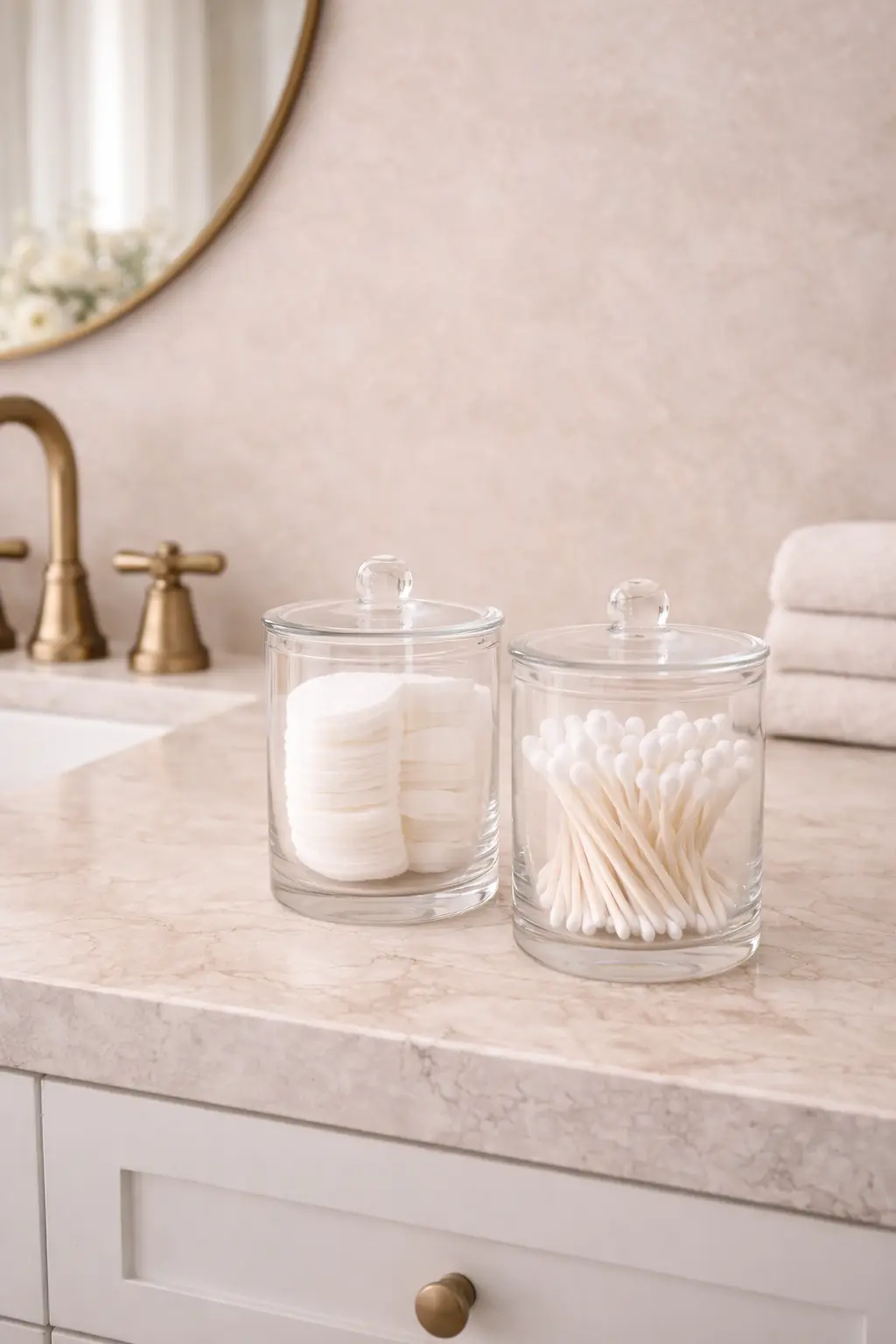
High-end styling is often defined not by what’s present and visible, but by what’s deliberately absent. Negative space – the area around and between objects – is a design element in itself, not just empty counter space. When every inch of counter is occupied with items, the space feels tense, overwhelming, and chaotic. It communicates that the room is demanding, that it needs constant attention, that it’s struggling to contain everything. Conversely, allowing generous areas of open surface creates calm and confidence. It signals that the space doesn’t need to prove itself through excess. It communicates restraint and intention.
Before adding any new decorative elements to your counter, try a radical editing exercise: remove everything. Clear the entire counter completely. Then slowly return only the pieces that feel genuinely essential or genuinely beautiful. You may discover that three thoughtfully placed items feel far more luxurious and intentional than ten. This exercise recalibrates your sense of proportion and necessity. It reveals what you actually use and love versus what you’ve kept out of habit.
Negative space isn’t simply empty – it’s intentional quiet. It’s a design choice that communicates sophistication. When you look at a high-end, luxury bathroom, one of the first things you notice is how little is on display. Not because the person doesn’t have products or needs – they do – but because those items are stored away. Only the most beautiful, most essential, or most meaningful pieces are visible. The rest exist invisibly, supporting the beauty and calm of the visible space. This principle applies equally to affordable bathrooms. Negative space is free. It’s one of your most powerful design tools.
Include One Element That Feels Personal
 Save it
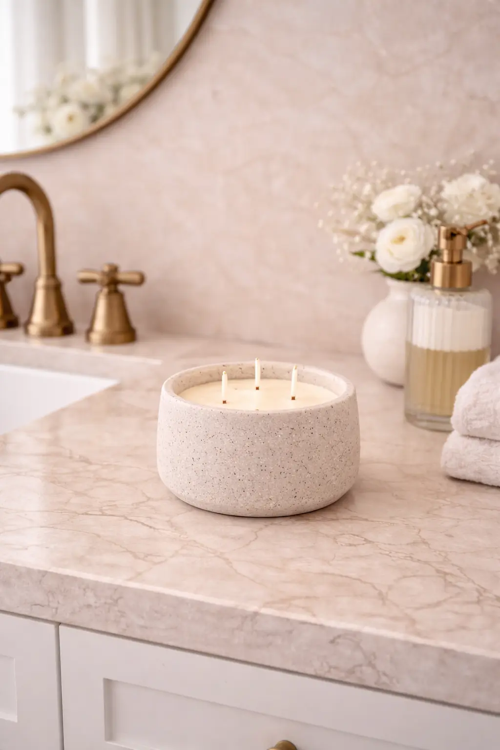
Designer bathrooms – the ones that feel sophisticated and intentional rather than generic or staged – often include one object that feels slightly unexpected. Something that serves more of an emotional purpose than a practical one. It could be a sculptural candle with an interesting form. It might be a small art print leaning casually against the backsplash. It could be a decorative object – perhaps a small sculptural piece, a meaningful memento, or an item that reflects your personal taste and interests.
These personal pieces create character. They prevent the room from feeling like a generic bathroom that could belong to anyone. They communicate that someone lives here, someone with tastes and preferences. They add a layer of humanity that pure function cannot provide. The goal isn’t decoration for decoration’s sake – adding items just to fill space or because they look nice. The goal is adding one layer of personality that makes the space feel curated and intentional rather than staged or sterile.
A minimalist stone-look candle can act as a quiet focal point on your counter. It’s beautiful as an object. It provides ambiance and scent when lit. It occupies minimal space. It doesn’t compete with other elements but rather harmonizes with them. It’s the kind of piece that someone notices – not consciously analyzing why they notice it, but simply registering that this bathroom feels different, more thoughtful, more designed.
Practical Tips and Useful Advice
Start by taking an honest inventory of what currently lives on your counter. Categorize items: daily essentials, decorative objects, and items that don’t belong on display. Immediately remove everything in the third category. Store it elsewhere. Next, assess your current color palette and finishes. What finishes does your hardware already have? What colors dominate? Your new accessories should coordinate with what’s already established, not compete with it.
Invest in a quality tray – this is your foundation. It’s worth spending $30-50 on something that genuinely coordinates with your bathroom rather than buying something cheap that looks obviously budget-friendly. Next, replace at least one branded product packaging with a refillable dispenser. Start with soap – this single change often has outsized visual impact. Choose a finish (ceramic, glass, brushed metal) that coordinates with your established palette.
Add one vertical element – a simple vase with eucalyptus or greenery. This doesn’t need to be expensive. An eucalyptus bundle from a grocery store or plant shop works beautifully. Finally, introduce one personal element – whether that’s a meaningful object, a beautiful candle, or a small art piece. This piece should make you genuinely happy when you see it, not feel like a decoration you added because you thought you should.
Review your counter weekly. Remove anything that’s accumulated. Return items to their designated places. Wipe surfaces clean. This maintenance prevents the gradual slide back into clutter. Small, consistent effort maintains your intentional styling far better than occasional dramatic cleanups.
Common Mistakes That Diminish a High-End Look
1. Overcrowding the Counter with “Just One More Thing”
The biggest mistake is gradual accumulation. You add something “for now” and never remove it. Soon, counters are packed. Each new item feels justified individually, but collectively they create chaos. Set a strict rule: for every item added, one must be removed or stored.
2. Mixing Finishes Without Intention
Using multiple finishes – brushed nickel, chrome, gold, copper – without coordination looks chaotic. Choose a primary finish and echo it consistently. If you add a secondary finish, it should feel like a conscious design choice, not an accident.
3. Choosing Beautiful Items Without Considering Function
An object might look beautiful in a store but not work in your actual bathroom. If you never use it, if it gets wet constantly, if it requires high maintenance – it won’t work long-term. Beauty must serve function or the piece will eventually frustrate you.
4. Neglecting to Remove Protective Packaging or Labels
Small details matter. Remove protective stickers, factory labels, or plastic wrapping from dispensers and containers. These small touches communicate care and intentionality. They’re the difference between “just purchased” and “carefully integrated.”
5. Underestimating the Power of Cleanliness
The most expensive styling looks cheap if it’s dusty, grimy, or cluttered with used towels and toiletries. Conversely, minimal styling looks expensive if everything is clean and in its place. Cleanliness is non-negotiable for the high-end appearance you’re cultivating.
Frequently Asked Questions
How do I style my counter if I have limited space?
Vertical styling is your solution. Use a wall-mounted shelf above the counter. Use tall, narrow containers instead of wide ones. Choose a single tray to anchor items. Embrace negative space ruthlessly. A small counter with four intentional items looks more expensive than a larger counter packed with twelve items.
Can I style my counter if I have to store everything visibly?
Yes, but it requires intentional containment. Group items in coordinating containers. Use a tray to create visual unity. Choose uniform, neutral-colored storage solutions. The cohesion matters more than the space. Unified chaos looks intentional; random items never do.
What’s the best tray material for a bathroom?
Marble, wood, ceramic, or metal all work beautifully. Choose what coordinates with your bathroom’s existing materials and finish. A marble or wood tray feels warm and approachable. A metal tray feels modern. There’s no single “best” – choose what harmonizes with your space.
Should I use real plants or faux in a bathroom?
Both work. Real plants add life and improve air quality but require specific humidity and light conditions. High-quality faux plants look beautiful without maintenance demands. Choose based on your bathroom conditions and how much plant care you want to manage.
Conclusion
Creating a high-end-looking bathroom counter has almost nothing to do with budget. It has everything to do with intention, curation, restraint, and understanding fundamental design principles: negative space, visual hierarchy, proportion, and cohesion. A $50 carefully styled counter looks infinitely more expensive than a $500 cluttered counter. The difference isn’t money – it’s thoughtfulness.
What makes bathroom counters feel expensive is the feeling they communicate: that someone has made deliberate choices, that every item serves a purpose, that the space is curated rather than accumulated. These feelings don’t require expensive items. They require intention. They require removing more than you add. They require choosing a few beautiful things over many average things.
Start this week. Choose one strategy – perhaps investing in a quality tray or replacing one piece of packaging. Notice how it shifts your entire counter’s appearance. Build from there. Your bathroom counter is waiting to feel intentional, polished, and genuinely high-end – achieved through thoughtful styling rather than expensive purchases.
This post contains affiliate links. I may earn a small commission at no extra cost to you.
Get cozy inspiration delivered to your inbox.
✓ 14-page beautifully designed ebook
✓ Cozy decorating ideas
✓ Practical room-by-room inspiration
You’re in! 🎉
Thanks for joining the NestFlowHome community!
Your free ebook is already on its way to your inbox. If you don’t see it within a few minutes, please check your Promotions or Spam folder.
Join the NestFlowHome community for weekly decorating inspiration.

Timeless home decor ideas and slow living inspiration for a calm, beautiful life.