Wall Art Ideas That Make Your Home Feel Finished
By Emily | December 15, 2025
When a room in your home almost feels complete but still slightly unfinished, the missing piece is often wall art. Furniture sets the function, textiles add comfort, but artwork defines atmosphere. Without it, even a beautifully styled space can feel flat or temporary. Choosing wall art isn’t about filling empty walls. It’s about creating balance, proportion, and intention. The size, placement, and style of a piece influence how cohesive a room feels. A well-chosen painting or print ties together color palettes, anchors furniture, and adds depth without crowding the space.
When I first redecorated my own living room, I realized how easy it is to overthink: the walls felt bare, so I started adding pieces randomly. The result? Visual chaos, despite “matching” frames and colors. The breakthrough came when I shifted from adding more to editing carefully. Each piece earned its place, and suddenly the room felt polished, purposeful, and effortless.
In this article, we’ll explore strategies to choose and arrange wall art that makes any room feel finished and cohesive without clutter. You’ll learn how to assess your walls, mix materials and textures, and select pieces that elevate your home while reflecting your personal style.
By the end, you’ll see how small, deliberate decisions create spaces that feel thoughtful, polished, and completely “done.”
Oversized Art That Grounds the Entire Room
 Save it
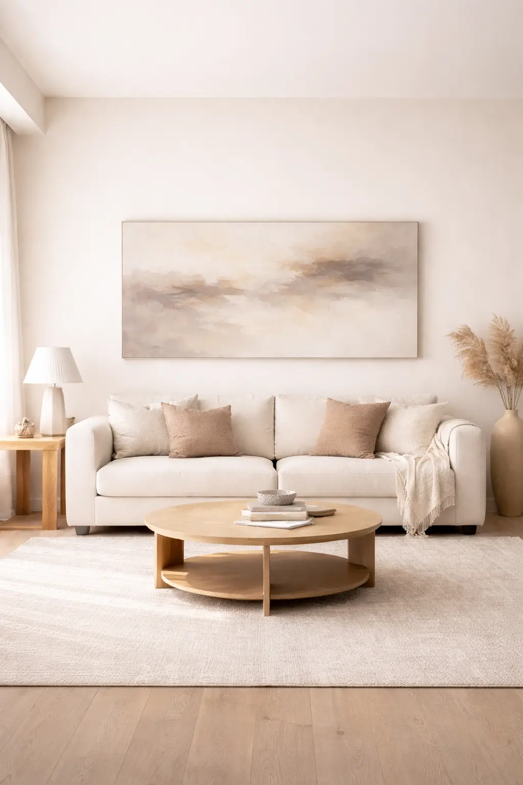
The most transformative shift I ever made was going larger. Small frames create hesitation. Oversized art communicates certainty. When artwork is too small for the wall it occupies, the furniture beneath it feels like it’s floating. When scale is correct, everything settles.
In my own living room, replacing a cluster of undersized prints with a single large textured canvas changed the room immediately. The visual noise disappeared. The seating area felt defined. The wall stopped whispering and started anchoring.
A substantial neutral abstract canvas — similar to this oversized textured wall art — works especially well because it introduces movement without overwhelming the palette. The key is proportion, not color matching.
As a general rule, art above a sofa should span about two-thirds of the sofa’s width. That ratio creates visual stability. Anything significantly smaller begins to feel apologetic.
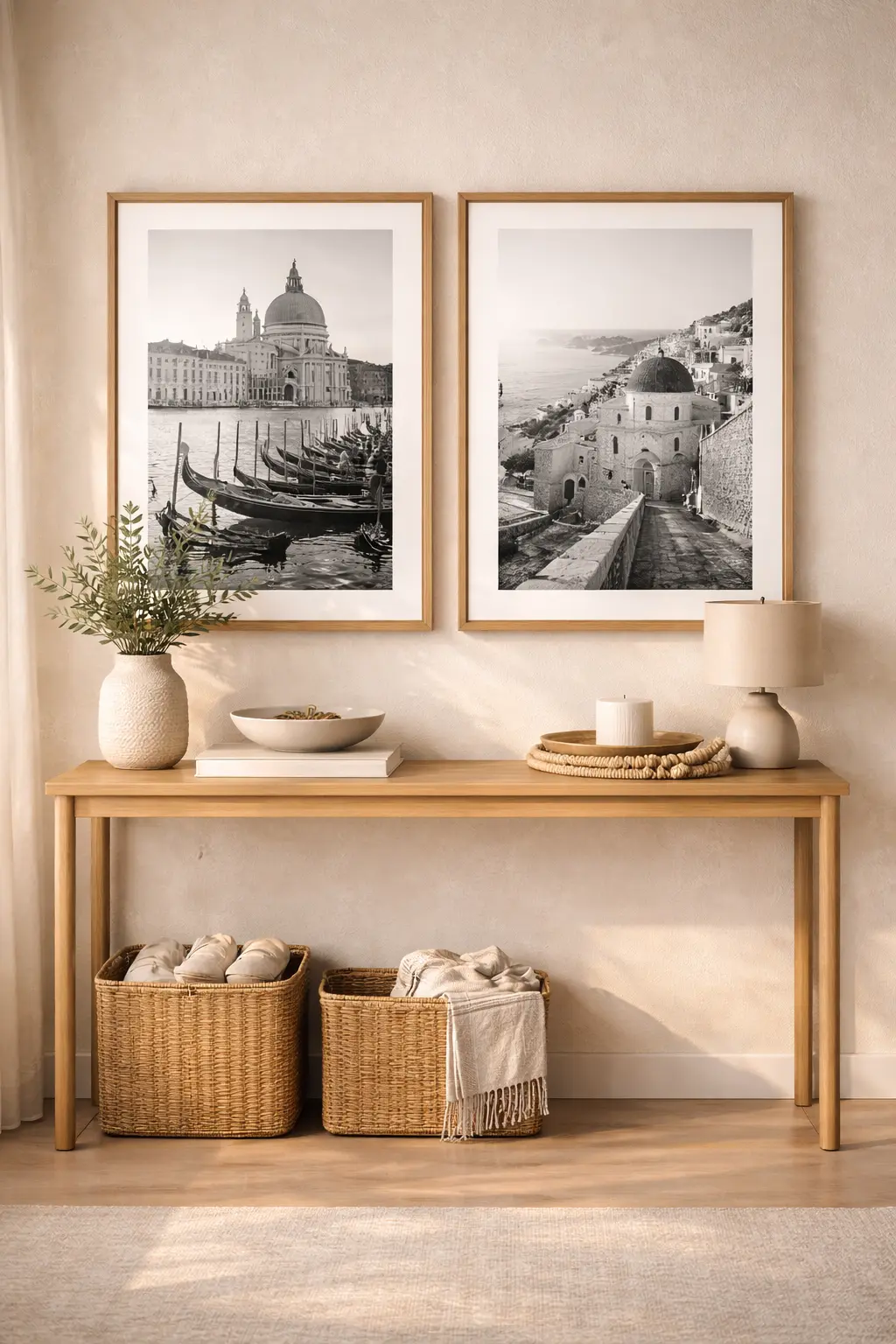
Framed Sets That Create Continuity
 Save it
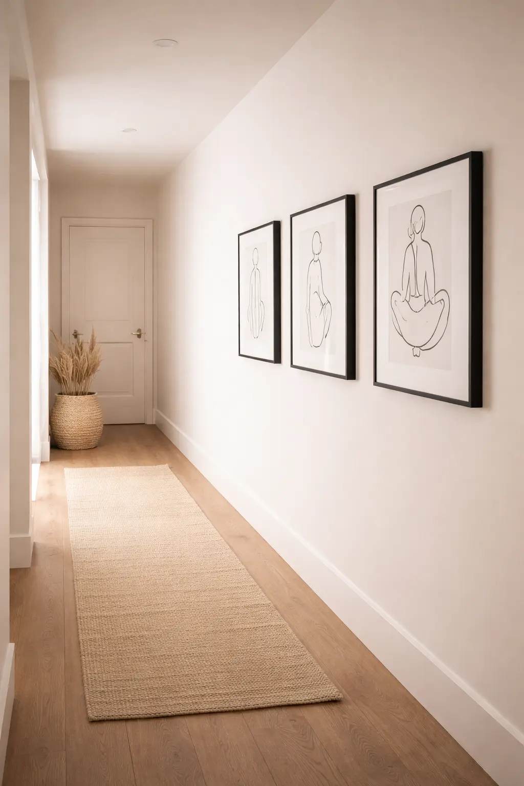
Not every wall calls for a singular statement. In transitional spaces — hallways, staircases, entry corridors — repetition creates rhythm.
When I styled a long hallway that once felt like an afterthought, I installed three evenly spaced framed prints in matching black frames with generous white matting. The transformation wasn’t dramatic. It was subtle — and that’s why it worked.
A curated minimalist gallery wall set, similar to this modern framed print collection, helps eliminate decision fatigue. Identical frames create cohesion. Even spacing adds intention. The result feels architectural rather than decorative.
Wall art can quietly guide someone through your home. That thread of continuity is what makes separate rooms feel like parts of a whole.
Textural Pieces That Add Dimension
 Save it
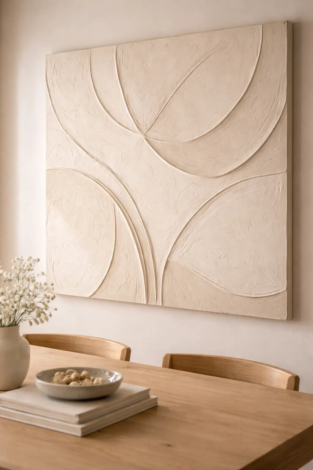
One of the most overlooked layers in a home is dimensional wall art — plaster relief panels, woven textile pieces, heavily textured canvases. These don’t compete for attention. They deepen it.
In my dining area, I added a monochromatic plaster-style art piece. During the day, it blended into the wall. In the evening, side lighting created shadows that made it feel alive.
A neutral textured wall sculpture like this minimalist panel works beautifully in restrained spaces. It absorbs light differently throughout the day, which prevents the room from ever feeling static.
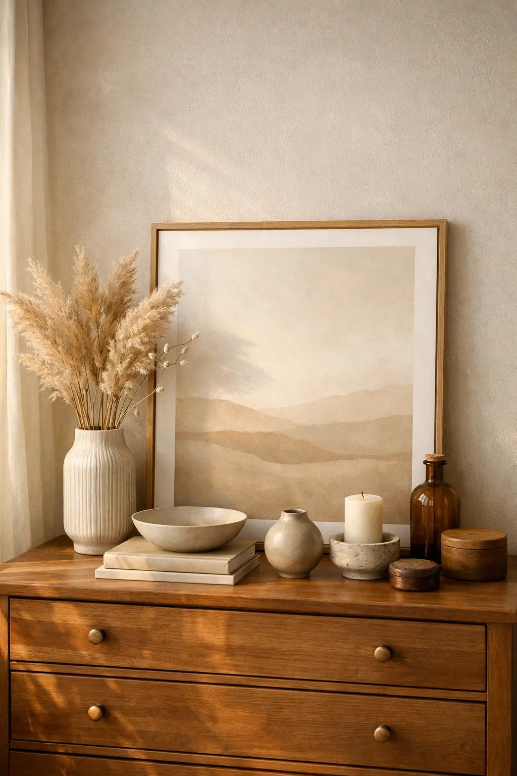
Leaning Art for Relaxed Structure
 Save it
Not every piece needs to be hung. Leaning framed artwork against a wall — on a dresser, console, or shelf — introduces a softer edge to structured interiors. In my bedroom, a large framed neutral print rests against the wall behind the dresser. In front of it sits a ceramic vase and a short stack of books. It feels layered rather than installed.
A substantial framed canvas like this minimalist wood-framed artwork works particularly well because the frame itself becomes part of the composition.
The key is weight and proportion. Leaning art should feel intentional — not temporary.
Relaxed design still requires structure.
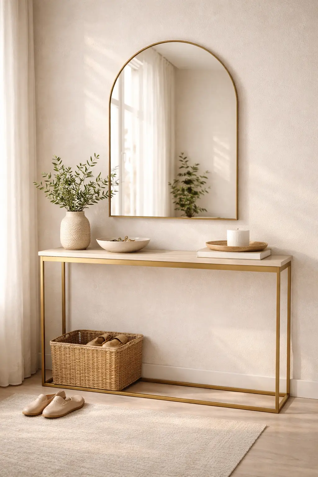
Statement Mirrors That Function as Art
 Save it
Sometimes the piece that completes a wall isn’t traditional art.
It’s a mirror.
In smaller rooms especially, a mirror acts as both sculpture and architecture. It reflects light, doubles perceived depth, and interacts with its environment rather than simply occupying space.
When I installed an oversized arched mirror in my entryway, the area transformed from transitional to intentional. It no longer felt like a passage — it felt like an introduction.
An oversized arched mirror like this modern statement piece adds visual height while echoing other finishes in the room. Frame selection matters. Repeating metal tones from hardware or lighting creates cohesion. Mirrors don’t just decorate walls. They activate them.
Personal Art That Feels Edited, Not Random
 Save it
Family photos, travel photography, even a child’s drawing can elevate a space — but presentation determines whether it feels curated or chaotic. When I printed travel photographs in large format and framed them consistently, they stopped feeling like memories pinned to a wall. They started feeling like art.
Using cohesive wood or black frames — similar to this minimalist frame set — keeps personal pieces aligned with the room’s aesthetic. Editing is the difference between clutter and curation.
A finished home reflects personality — but through restraint.
Wall art doesn’t exist independently from the rest of your decor. It interacts with lighting, textiles, furniture shape, and even negative space.
If you’re building cohesion from the ground up, revisiting foundational elements — like those discussed in How to Create a Cozy Living Room with Simple Design Tricks — can make wall decisions easier. When the base is clear, the art selection becomes obvious.
Common Wall Art Mistakes That Disrupt Completion
Hanging art too high is the most common error. When artwork floats far above a sofa or console, it disconnects visually from the furniture beneath it. The wall and the room begin speaking different languages.
Going too small creates fragmentation. Multiple tiny pieces scattered across a large wall create visual hesitation rather than cohesion.
Trend-chasing also ages a room quickly. Choosing art solely because it’s popular often leads to replacement within a year. Finished homes feel stable because their art aligns with long-term aesthetic direction.
If you’re refining your main living space, you might also find ideas in How to Create a Cozy Living Room with Simple Design Tricks. Many of the same principles of proportion and layering apply to wall styling as well.
Completion is rarely accidental.
It’s intentional restraint.
FAQ
How big should wall art be above a sofa?
Roughly two-thirds the width of the sofa creates visual balance and grounding.
Should all frames match?
Not necessarily, but consistency in tone or material creates cohesion.
Is a mirror better than artwork?
In smaller spaces, mirrors often provide more visual impact because they reflect light and depth.
What type of art works best in neutral homes?
Oversized abstracts, textural panels, and monochromatic photography tend to feel cohesive.
Closing Thoughts
Wall art doesn’t simply fill empty space. It signals that the space has been considered.
When proportion is correct, when material contrasts are intentional, and when placement relates to furniture, a room stops feeling temporary. It feels complete.
And completion, in design, is often the quietest decision you make.

This post contains affiliate links. I may earn a small commission at no extra cost to you.