Luxury Walk-In Closet Inspiration Ideas You Will Absolutely Love
By Emily | June 24, 2026
There is a particular kind of calm that comes from walking into a space that was designed entirely around you. Not around a storage problem. Not around a limited budget or a difficult layout or the constraints of a rental agreement. Just around the experience of getting dressed in the morning — and how that experience can feel less like a routine and more like a ritual.
The walk-in closet has always been aspirational, but it has also been misunderstood. Most people approach it the way they would approach any other storage space: more shelving, better organization, a system that keeps everything visible and accessible. And while those things matter, they are not what separates a walk-in closet from a beautifully designed room. The difference is intention. The difference is treating the space as an interior design project rather than a logistics problem.
This article is not about maximizing every inch. It is not about capsule wardrobes or seasonal rotation or the moral weight of owning fewer things. It is about what happens when you stop solving and start designing — when you let the closet become the room it was always meant to be. A space with its own palette, its own furniture, its own atmosphere. A space that earns its own time in your morning.
What follows are nine design ideas drawn from the most considered walk-in closets in residential interior design — each one exploring a specific element that transforms the space from functional to genuinely beautiful.
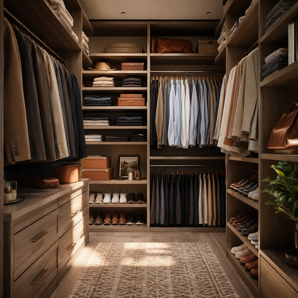
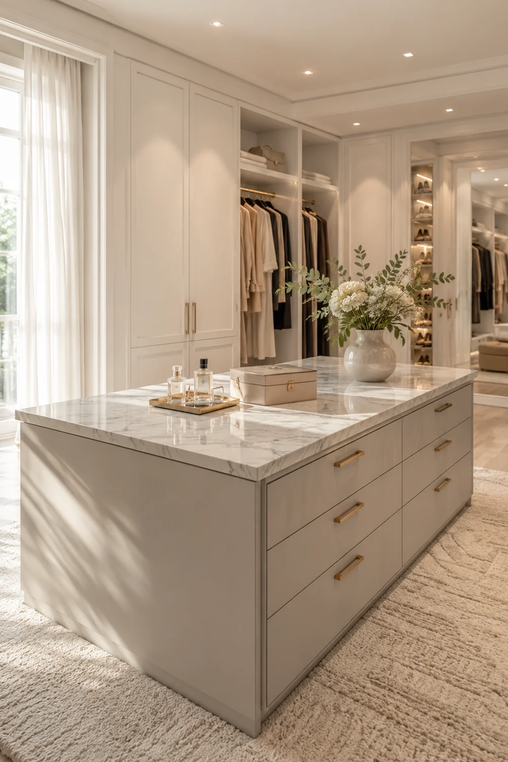
1. The Island: The Piece That Makes It a Room, Not a Closet
 Save it
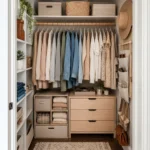
No single element signals a fully designed walk-in closet more clearly than an island. Not because of what it stores — though it stores a great deal — but because of what it communicates about the space. An island in the center of a closet says: this room has a middle. It has a gravitational center. There is somewhere to put things down, to stand, to move around. It gives the closet the spatial logic of a kitchen or a jeweler’s showroom rather than a corridor lined with clothes.
The most functional island configurations combine drawers below the counter surface with open display or cabinetry above. Drawers are the right choice for folded items, accessories, and anything that benefits from being hidden but immediately accessible. The counter surface itself is critical — it should be finished in a material that reads as furniture rather than infrastructure. Marble, quartz, wood, or a lacquered surface all work. What does not work is a utilitarian laminate top in an otherwise considered space. The island is the visual anchor of the room, and the counter is what you see first when you walk in.
The closet island also serves as a display surface in a way that the surrounding cabinetry cannot. A tray holding a few perfume bottles, a small vase, a folded scarf — these are the details that transform a storage unit into a dressing room. The depth of the island matters: somewhere between twenty-four and thirty inches is standard, which leaves enough clearance to move comfortably around all four sides. If the closet is narrower, a peninsula configuration — attached to one wall — achieves the same effect with less floor space required.
The design logic that applies to a bedroom, a bathroom, or a living room applies here too: proportion matters, material selection matters, the relationship between surfaces and light matters. For those who have worked through the smaller-scale challenges of wardrobe organization, Small Closet Organization Ideas That Actually Work and Look Stunningly Beautiful explores the foundational systems that can be scaled upward into a full walk-in. The walk-in closet is not the endpoint of that journey. It is the beginning of a different one — where the constraint lifts, and the design can finally take precedence.
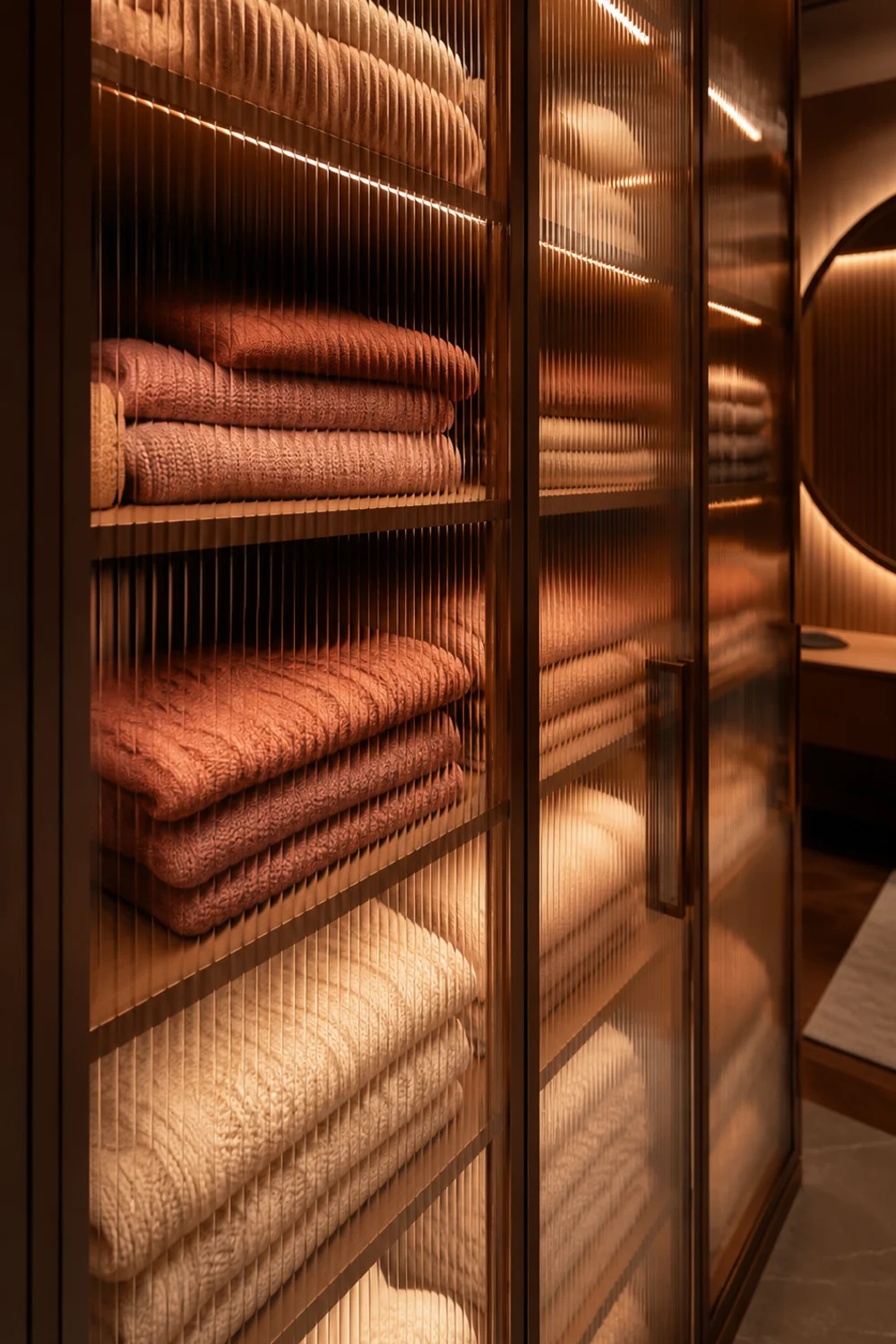
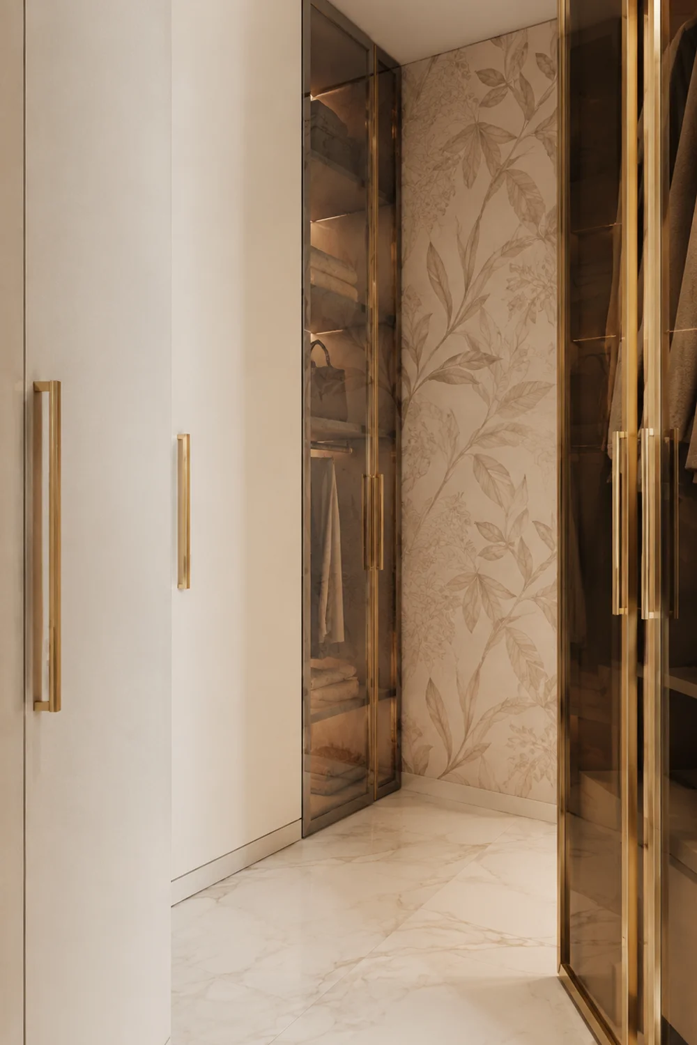
2. Glass-Front Cabinetry — When Display Logic Replaces Concealment
 Save it
There is a design decision embedded in every closet that most people never consciously make: should the contents be visible or hidden? Standard cabinetry defaults to concealment — solid doors, opaque panels, the assumption that what is stored should be kept from view. Glass-front cabinetry inverts this entirely. It applies the logic of a well-curated bookshelf or a beautiful kitchen cabinet to the closet itself, treating what you own as something worth seeing rather than something that needs to be contained.
The visual effect of glass-front closet cabinetry is significant. When the shelves behind the glass are styled with consistency — folded sweaters in tonal colors, handbags arranged by size, shoes on evenly spaced shelves — the cabinet becomes less like storage and more like a display case. The glass panel creates a layer between the viewer and the contents that is both practical and aesthetic: it keeps things dust-free, it signals order even when the interior is not perfectly organized, and it creates a visual rhythm across the wall that solid doors cannot achieve. Fluted or reeded glass panels add texture to this effect without sacrificing visibility.
The challenge with glass-front cabinetry is the discipline it implies. Unlike solid doors, glass does not forgive disorganization. What is inside becomes part of the room’s visual composition, which means the contents need to be arranged as thoughtfully as the cabinetry itself. This is not a drawback so much as a design constraint that produces better habits: when you know the contents are visible, you are more likely to put things back carefully. The glass becomes a quiet accountability system.
There is also a spatial dimension worth considering. Glass-front cabinetry makes the walls of a walk-in feel less solid and more layered. Light moves through the glass panels in a way it cannot through wood or MDF, which softens the room and reduces the slight claustrophobia that can come from being surrounded by opaque storage on all sides. In a walk-in closet that lacks a window, this effect — light bouncing through glass against a pale interior — can make a genuine difference to how spacious the room feels.
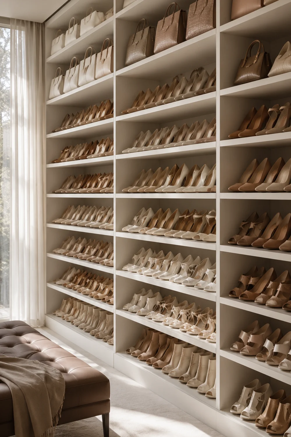
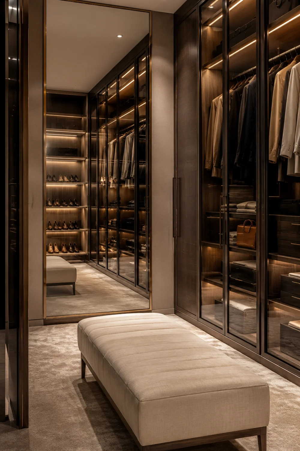
3. The Shoe Wall: Floor-to-Ceiling Display as Architecture
 Save it
A shoe wall is one of the most visually arresting elements in residential interior design, and it is also one of the most underestimated. Not because shoes are inherently beautiful objects — though many are — but because a floor-to-ceiling wall of curated footwear, arranged with care and lit properly, functions as architecture. It is not a storage solution. It is a surface treatment, as considered as a gallery wall or a built-in bookcase. The shoes are incidental to the effect. The wall is the point.
The structural requirements of a shoe wall are relatively simple: adjustable shelves at consistent depth — somewhere between eight and ten inches is sufficient for most footwear — running from floor to ceiling across the full width of the allocated wall. What transforms this from utilitarian to extraordinary is the consistency of the arrangement. Shoes grouped by color, by style, or by frequency of use all produce different effects, but all require the same thing: intentionality. A shoe wall that is simply full is not a design feature. A shoe wall that is curated — where the arrangement itself carries visual logic — is an entirely different object.
For readers thinking through how footwear storage relates to spatial constraints outside of a full walk-in, Stunning Shoe Storage Ideas for Small Spaces That Look Amazing offers solutions that are particularly useful when the dedicated wall does not yet exist. Inside the walk-in, however, the conversation shifts. The question is not where to put the shoes — it is how the wall they occupy contributes to the overall composition of the room. Negative space on the shelves, meaning a few intentionally empty spots, keeps the wall from feeling overwhelmed and gives it room to breathe visually.
The shoe wall also invites a conversation about what else it might display. Handbags at the upper shelves, boots at the lower ones, flats and heels organized by color in the middle — this kind of layering means the wall is doing multiple things simultaneously. It is solving storage, yes, but it is also creating the visual complexity that makes a walk-in closet feel genuinely curated rather than simply stocked. The difference between the two is visible immediately and felt every morning.
4. Jewelry and Accessories: The Inner Sanctum of the Walk-In
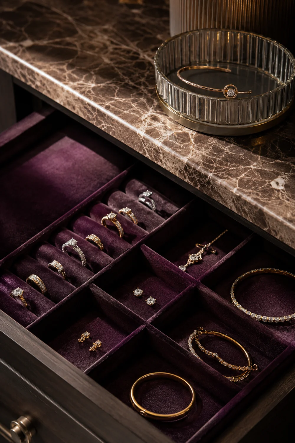
 Save it
If the shoe wall is the most visually dramatic element of a walk-in closet, the jewelry and accessories zone is the most intimate. It is the part of the closet that belongs entirely to the person using it — not to the design, not to the aesthetic, but to the specific, private accumulation of pieces that matter. Getting this zone right is less about display and more about access: the ability to find what you want quickly, to see everything at once, and to put things away in a way that actually preserves them.
Pull-out drawers lined in velvet are the standard for a reason. The velvet surface prevents scratching, keeps pieces from sliding, and creates a visual warmth that no other material quite matches. Velvet-lined drawer inserts with individual compartments — ring slots, long channels for bracelets and watches, deeper pockets for earrings and pendants — allow a full collection to be visible in a single glance when the drawer opens. This is the difference between a jewelry box and a jewelry zone: one piece at a time versus the whole collection at once.
The display layer above the drawer zone — a small counter surface, a tray, a tiered stand — is where the most-used pieces live. Rings worn daily, a favorite bracelet, a watch that comes off at night — these are the items that benefit from being out rather than stored. A tiered glass or acrylic jewelry stand on the counter surface means the most-reached-for pieces are immediately accessible without opening anything. The visual effect is also undeniable: a small arrangement of jewelry on a counter reads as styling, not clutter, in a way that a pile of pieces in a dish never will.
What the accessories zone ultimately provides is not just organization but a sense of ceremony around getting dressed. When the process of choosing a necklace or a watch involves opening a beautiful drawer, seeing everything clearly, and making a considered choice — that experience is qualitatively different from digging through a box. The walk-in closet, more than any other domestic space, has the capacity to make the mundane feel considered. The jewelry zone is where that transformation is felt most directly.
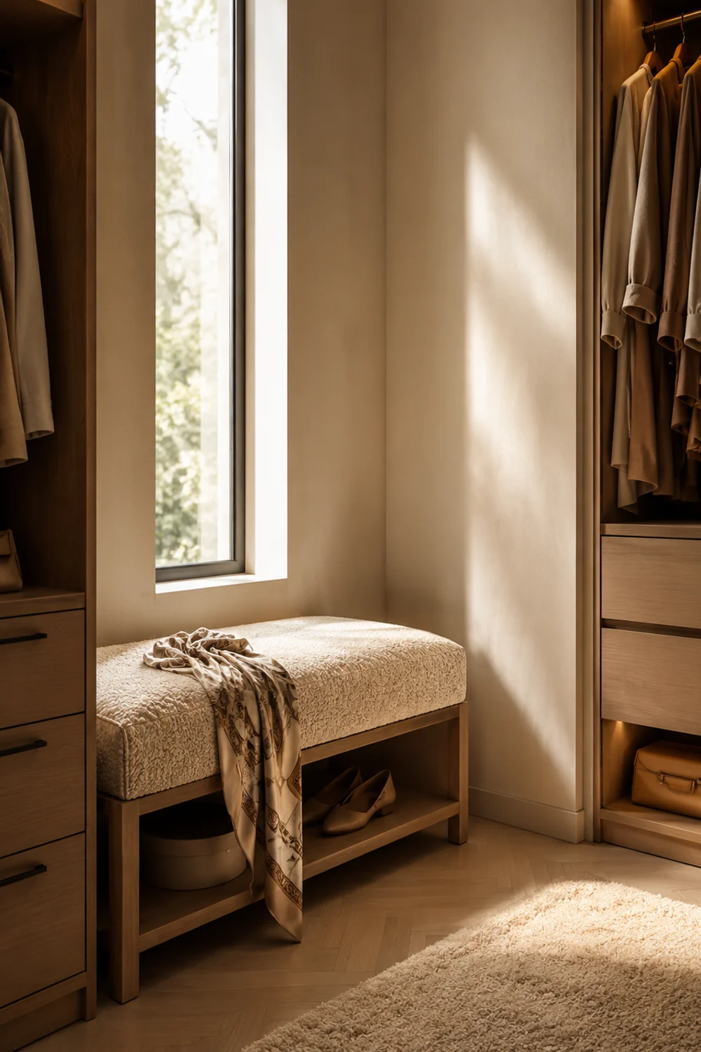
5. Seating Inside the Closet — The Chair or Ottoman That Completes It
 Save it
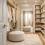
There is a single piece of furniture that converts a well-organized walk-in closet into a dressing room, and it is simpler than almost any other element on this list: a place to sit. A chair, an ottoman, a small bench — the exact form matters less than the presence of seating itself. Because what seating does to a room is not primarily functional. It is declarative. It says: this is a room. You are meant to spend time in here, not pass through.
The practical case for seating in a walk-in closet is also strong. Getting dressed involves sitting down — to put on shoes, to pull on trousers, to fasten a clasp or adjust a hem. Without seating, these moments happen awkwardly, leaning against a wall or balanced on the edge of a drawer. With an upholstered closet ottoman or a tufted bench scaled for the space, the same moments happen naturally, even elegantly. The ottoman also functions as a surface: a place to set a garment while you consider it, to lay out pieces for the following day, to rest a bag while you load it.
The sizing question is the one that trips people up most often. The instinct is to choose something small — a pouf, a compact stool — on the assumption that the closet cannot afford the floor space. But a piece that is too small reads as apologetic rather than intentional, and it does not deliver the visual weight that seating requires to anchor a room. A bench or ottoman that is proportional to the island — somewhere between twenty-four and thirty-six inches in length — holds the space far more effectively and genuinely transforms how the room is perceived.
The upholstery choice connects to the broader material palette of the closet. Boucle, velvet, and linen all read as residential and elevated. Neutral tones — cream, warm taupe, soft sage — tend to photograph well and age gracefully. A seating piece in a contrasting color or texture can also serve as a design accent, particularly in closets where the surrounding cabinetry is monochromatic. The chair or ottoman is, ultimately, the piece that gives the closet its residential quality. Everything else can be beautifully organized. This is what makes it feel lived in.
6. The Folded Zone: Drawers, Shelving, and What Does Not Hang

 Save it
There is a category of clothing that hanging rods simply cannot address, and it is larger than most closet designs acknowledge. Knitwear, denim, athletic wear, pajamas, loungewear, casual t-shirts — all of these benefit from being folded rather than hung, either because hanging distorts their shape or because the volume of pieces in these categories makes rod space prohibitively valuable. The folded zone is the area of the closet that handles this category, and designing it well is what separates a truly functional walk-in from one that looks beautiful but quietly creates friction every morning.
The principle governing the folded zone is visibility. Unlike hanging items, which are visible at a glance along the rod, folded items tend to stack — and stacking creates the problem of items at the bottom being forgotten or inaccessible. The solution is a combination of open shelving and deep drawers used for different purposes. Open shelves work best for folded items that are accessed frequently and that hold their shape when stacked — jeans, sweatshirts, heavier knitwear. Drawers work better for smaller items — socks, underwear, athletic wear — where open shelving tends to look disordered within days.
For those thinking through the organizational logic that applies to smaller-scale versions of this challenge, Everything You Need to Know About Organizing a Small Apartment Closet covers the same principles in a more constrained context. In the walk-in, the primary advantage is that scale allows the folded zone to be genuinely generous — deep enough to handle a full seasonal wardrobe without the seasonal rotation that smaller closets require. This is one of the most practical luxuries a walk-in provides: the ability to have everything accessible at once.
The shelf depth and spacing in the folded zone deserve specific attention. Shelves that are too deep — more than fourteen inches — cause items to be pushed to the back and forgotten. Shelves spaced too closely together — less than ten inches of clear height — make it impossible to remove a folded item cleanly without disturbing everything around it. Twelve to fourteen inches of clear height per shelf, at a depth of ten to twelve inches, is the sweet spot for most folded garments. Getting these numbers right before building or purchasing is the difference between a folded zone that stays organized and one that quietly becomes the most chaotic corner of the closet.
7. Materials and Finish — Designing the Closet's Own Interior Palette
 Save it
A walk-in closet that has been designed with its own material palette reads immediately as a room rather than a storage space, and the distinction is visible the moment you walk through the door. The question of which materials belong in a closet is genuinely interesting, because the space sits between the bedroom — where warmth and softness dominate — and the dressing room — where precision and luxury tend to lead. The most successful closets navigate this tension by choosing a palette that borrows from both, prioritizing materials that feel residential and elevated simultaneously.
Cabinet color is typically the largest surface area in the walk-in, and it sets the emotional register of the entire space. Warm whites and soft off-whites create an airy, bright environment that makes the contents of the closet feel highlighted rather than contained. Deeper tones — warm greiges, dusty sage, muted navy — make the closet feel more enveloping and intentional, closer to the atmosphere of a boutique or a private dressing room. The decision between light and deep is also a decision about how the closet’s contents will read against the background: light cabinets let the clothing become the color; dark cabinets create a dramatic contrast that tends to feel more curated.
Hardware is the jewelry of the closet’s cabinetry, and it is worth choosing with the same care. Brushed brass, matte black, and satin nickel are the three finishes that translate most successfully across different cabinet colors and design directions. What matters is consistency: the same finish across all drawer pulls, cabinet handles, and rod brackets. A peel-and-stick removable wallpaper panel on the back wall of the closet — behind the island or at the focal point of the room — adds a layer of visual interest that painted walls cannot achieve, and can be changed without commitment.
The floor treatment is the final and most often overlooked material decision. Most walk-in closets continue the flooring from the adjacent bedroom, which is a reasonable starting point, but not the only option. A large-format tile, a patterned cement tile border, or a layered area rug on top of hardwood can give the closet floor its own character — a quiet signal that this space has been thought about from the ground up. The material palette of the closet does not need to match the bedroom exactly. It needs to relate to it coherently. That distinction is what makes the transition between rooms feel intentional rather than accidental.
8. The Full-Length Mirror as Architectural Moment
 Save it
In smaller closets, the full-length mirror is a practical necessity that earns its place through function alone. In a walk-in, the same object becomes a design decision with significantly more weight. The scale of the space means the mirror can be large enough to function architecturally — to double the visual depth of the room, to multiply the light, to become one of the defining compositional elements of the interior. A mirror this significant deserves to be chosen and placed with the same intention as a piece of furniture.
The placement question in a walk-in closet is more interesting than it appears. The instinct is to put the mirror at the end of the room, opposite the entry — the obvious position, and one that works well for sightlines but can feel expected. Placing the mirror on a perpendicular wall, adjacent to the island or beside the seating, creates a more dynamic visual experience: when you stand at the island, the mirror catches a reflection of the hanging zone, the cabinetry, the light. The closet appears to extend sideways rather than simply lengthwise, which changes the spatial feel of the room considerably.
For those working through how mirrors function as design decisions in adjacent spaces, Why Japandi Bathrooms Are the Biggest Interior Design Trend You Need to Try Right Now explores the same spatial psychology in a bathroom context — and many of the same principles around scale, placement, and frame choice transfer directly. In the walk-in, the full-length floor-leaning or wall-mounted oversized mirror has the additional advantage of being movable during the design process, allowing the optimal position to be found empirically rather than planned in advance.
The frame choice connects the mirror to the broader material palette of the closet. An unframed mirror with a polished or beveled edge reads as modern and minimal. A thin brass or matte black frame adds definition without dominating the wall. A thicker, more architectural frame — wood, lacquered panel, or fluted detail — makes the mirror a statement piece in the way that a framed artwork would. The closet’s scale means it can absorb a more substantial frame than a bathroom or bedroom might. What it cannot absorb is a mirror that feels like an afterthought — too small for the wall, poorly placed, or visually disconnected from everything around it. In a room designed with this level of care, the mirror is the moment that confirms it.
The relationship between the mirror and the The Best Aesthetic Closet Storage Ideas for Small Bedrooms principles becomes most apparent here: a mirror placed to reflect the most beautiful section of the closet — the glass-front cabinetry, the shoe wall, the island — effectively doubles the visual richness of the room. That is not an accident. It is design.
Common Mistakes to Avoid
1. Designing the layout before establishing the daily routine
The most persistent mistake in walk-in closet design is making spatial decisions — where the hanging zones go, where the island sits, how the shelving is distributed — before honestly mapping out how the space will actually be used. Not how it should be used theoretically, but how it will be used by a specific person with specific habits. Someone who hangs almost everything needs more rod space and fewer drawers. Someone who primarily folds needs the opposite. A couple sharing the space needs zones that allow simultaneous use without interference. Getting the layout right is a function of understanding behavior first and then designing around it.
2. Prioritizing visual symmetry over functional zoning
Walk-in closets designed primarily for photography tend to prioritize visual balance — matching elements on either side, consistent heights, a mirror-image layout. This looks beautiful in a reveal shot and creates friction in daily use. The reality is that most people’s wardrobes are not symmetrical: there may be significantly more hanging items than folded ones, or the shoe collection may require far more dedicated space than the jewelry zone. A closet designed around actual volume distribution — even if it is slightly asymmetrical — functions better and continues to look considered because everything in it has the right amount of room.
3. Choosing cabinet hardware last, as an afterthought
Hardware is typically selected at the end of the design process, after the cabinetry color, the flooring, and the countertop have all been committed to. This is backwards. The hardware finish influences how every other material in the room is perceived. Brass hardware against white cabinetry reads very differently from matte black hardware against the same cabinet. Making the hardware decision early — and allowing it to inform the material selections around it — produces a more coherent result than trying to find a hardware finish that matches an already-committed palette.
4. Under-scaling the mirror
The full-length mirror in a walk-in closet is routinely under-scaled. A thirty-inch mirror in a twelve-foot room is not a design feature — it is an oversight. The mirror needs to be large enough to function architecturally: at minimum sixty inches tall, ideally taller, and wide enough to reflect a meaningful portion of the room rather than just the person standing directly in front of it. Choosing a mirror that is proportional to the wall it occupies, rather than proportional to the space available for hanging clothes, is the right frame of reference.
5. Ignoring the transition between closet and bedroom
The walk-in closet does not exist in isolation — it opens directly from the bedroom, and the visual and material relationship between the two spaces matters. A closet with a completely different aesthetic register from the bedroom it serves can feel disjointed: a bright white closet opening from a moody, dark-toned bedroom, for example, creates a visual interruption rather than a transition. The closet does not need to replicate the bedroom’s palette exactly, but it should share at least one material or finish with it to create a sense of continuity through the doorway.
Frequently Asked Questions
What is the minimum square footage needed for a functional walk-in closet?
Most designers consider eighty to one hundred square feet the threshold at which a walk-in closet can comfortably accommodate an island in addition to perimeter cabinetry and hanging rods. Below that — in the fifty to eighty square foot range — the space functions well as a walk-in but benefits from a peninsula configuration rather than a freestanding island. Closets smaller than fifty square feet are technically walk-ins but tend to function more like reach-ins with a turning radius. The layout decisions change significantly depending on which category the space falls into, so establishing the actual square footage before designing is the essential first step.
How do I choose between open shelving and glass-front cabinetry?
The choice between open shelving and glass-front cabinetry is essentially a choice about how much visual discipline you want the space to require. Open shelving is less expensive and more immediately accessible, but it collects dust and requires the contents to be styled consistently to look considered. Glass-front cabinetry provides dust protection, adds a layer of visual depth through the glass, and makes even modest organization look more curated from a distance. For most people, a combination works best: glass-front cabinetry for items that are used less frequently or that benefit from display, open shelving for everyday-access zones.
Can a walk-in closet feel luxurious in a modest square footage?
Yes, but the investment needs to be concentrated in the right places. In a smaller walk-in, the island is typically the first element to be removed for space reasons — which is understandable but costly in terms of the room’s character. A peninsula attached to one wall achieves a similar effect at lower spatial cost. The mirror, the hardware, and the cabinetry finish all carry significant visual weight relative to their actual footprint, meaning that upgrading these elements in a smaller space has a proportionally greater impact than adding square footage alone.
How should I approach lighting in a walk-in closet?
While this article has deliberately focused on elements other than lighting, it is worth noting that closet lighting is a functional necessity that should be handled competently before the design work begins. Recessed lighting on a dimmer provides good general illumination. Under-cabinet or in-cabinet LED strips improve visibility in specific zones. The key decision is light temperature: warm white LEDs in the 2700 to 3000 Kelvin range are most flattering and most coherent with a residential aesthetic. Cool white lighting in a closet creates the kind of functional but uninviting atmosphere that belongs in a changing room, not a designed space.
What is the best way to handle a shared walk-in closet between two people?
The most effective approach to a shared walk-in is hard zoning rather than shared surfaces. Each person should have a clearly defined section of the closet — their own hanging zone, their own drawers, their own shelving — even if the sections are not equal in size. Shared surfaces, like the island counter, can remain neutral, but the storage itself works far better when it is individually allocated. This eliminates the negotiation that happens when shared storage is used differently by two people and the system gradually collapses under the weight of different habits.
Final Thoughts
A walk-in closet designed with genuine intention is one of the most underestimated investments in domestic life. Not because of what it stores, but because of what it transforms: the experience of getting dressed, which for most people happens twice a day, every day, for the entire time they live in a space. When that experience takes place in a room that has been thought about — a room with a considered palette, a piece of furniture that fits, a mirror placed for effect, drawers lined in velvet — the mundane becomes something quieter and more satisfying.
The ideas in this article are not reserved for renovations with unlimited budgets. Many of them — the wallpaper panel on the back wall, the tiered jewelry stand on the counter, the upholstered ottoman in the corner — can be introduced incrementally, one element at a time, without a full redesign. The philosophy behind them, however, requires a shift that has to happen first: the decision to treat the closet as a room worth designing rather than a problem worth organizing.
Start with whatever element resonates most. The island if you have the space. The mirror if you do not. The hardware if you are beginning a renovation. The velvet drawer insert if you are simply looking for the smallest possible step toward something better. Each change compounds. Each element makes the next choice easier to see. And gradually, the closet that was once a storage problem becomes something you are genuinely glad to walk into.
That transformation is quiet, personal, and entirely worth pursuing.

This post contains affiliate links. I may earn a small commission at no extra cost to you.