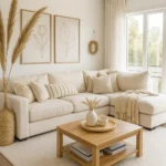
Beautiful Bathroom Decor Ideas to Refresh Your Space
By Emily | July 14, 2025
Have you ever felt like your bathroom is functionally fine, yet somehow exhausting to walk into? It’s not chaotic, it’s not dirty — it just doesn’t give anything back. There’s no sense of calm. None of that quiet, hotel-level premium feeling you’re looking for at the end of a long day.
That’s exactly why I started intentionally decorating my own bathroom years ago — not to make it “look nicer,” but to make it work better mentally. The bathroom is the space where you reset at the beginning and end of your day. If this space is too sterile, too cluttered, or simply lacking character, it subtly affects your mood without you even noticing.
In this article, I’ll show you how to refresh the atmosphere of your bathroom without starting a full renovation. We’ll go through how to use textures, lighting, composition, and proportions in a way that makes the end result feel magazine-worthy, yet still livable. I’ll share styling tricks that can turn a simple countertop into a visual focal point — and when it’s better to scale things back.
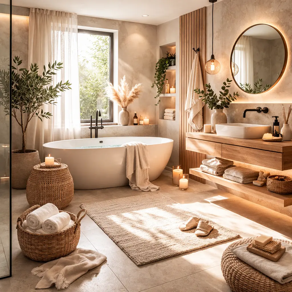
1. The Bathroom as a Mental Reset Space: Why Most Don’t Work
 Save it
Most home bathrooms are solutions to logistical problems. Where does the hairdryer fit? Where should I put the extra body wash? What about everyday products? This kind of thinking works functionally — but visually, it overloads the brain.
A well-functioning space always has a focal point and a background. The focal point might be a beautifully styled counter, a unique mirror, or a textured wall detail. Everything else supports it rather than competing with it. If you apply this one principle — what is the main character, and what is the background? — the space instantly becomes more readable.
A well-composed bathroom, by contrast, acts as a kind of visual filter. It doesn’t show more things — it shows fewer, but intentionally. That’s the difference between a space that is used and one that is cared for.
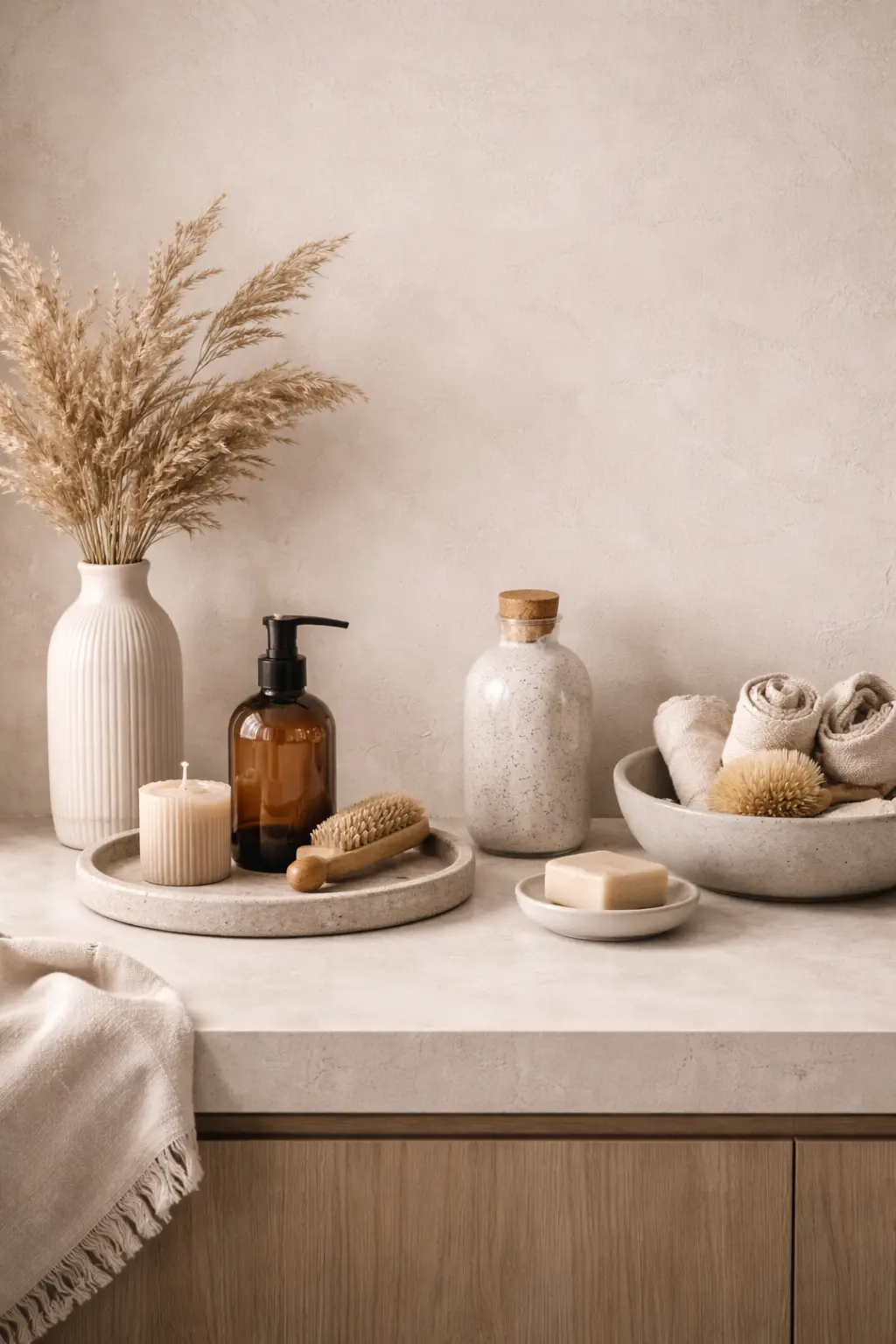
2. Texture Layering: How to Add Depth to a Flat Surface
 Save it
A bathroom countertop is fundamentally a flat, cold surface. Ceramic, stone, or laminate all reflect light and can easily appear “flat” — even when the materials are expensive.
Texture layering here isn’t an aesthetic game, but a way of creating depth. The sense of depth doesn’t come from new furniture, but from placing different textures next to each other. When a matte ceramic dispenser sits beside a subtly grained wooden tray, broken up by a glass surface or soft textile, the eye begins to interpret the scene in layers.
This is the point where a well-chosen refillable dispenser becomes not a “pretty object,” but a light-management tool. Different surfaces together create shadow play that adds movement to a static composition — especially in natural light. In the morning, matte surfaces soften incoming light, while in the evening, warmer lighting gently appears in the grain of wood or the fibers of a textile.
Together, these create that “put-together” feeling many people mistakenly associate with price.
It’s also worth noticing how the presence of water changes the character of textures. A wet stone tray becomes darker, a cotton towel takes on a deeper tone — these small, daily visual shifts bring life into the space.
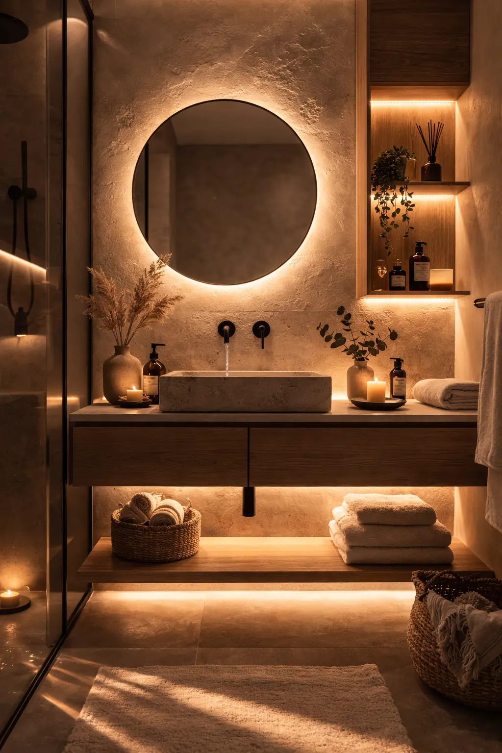
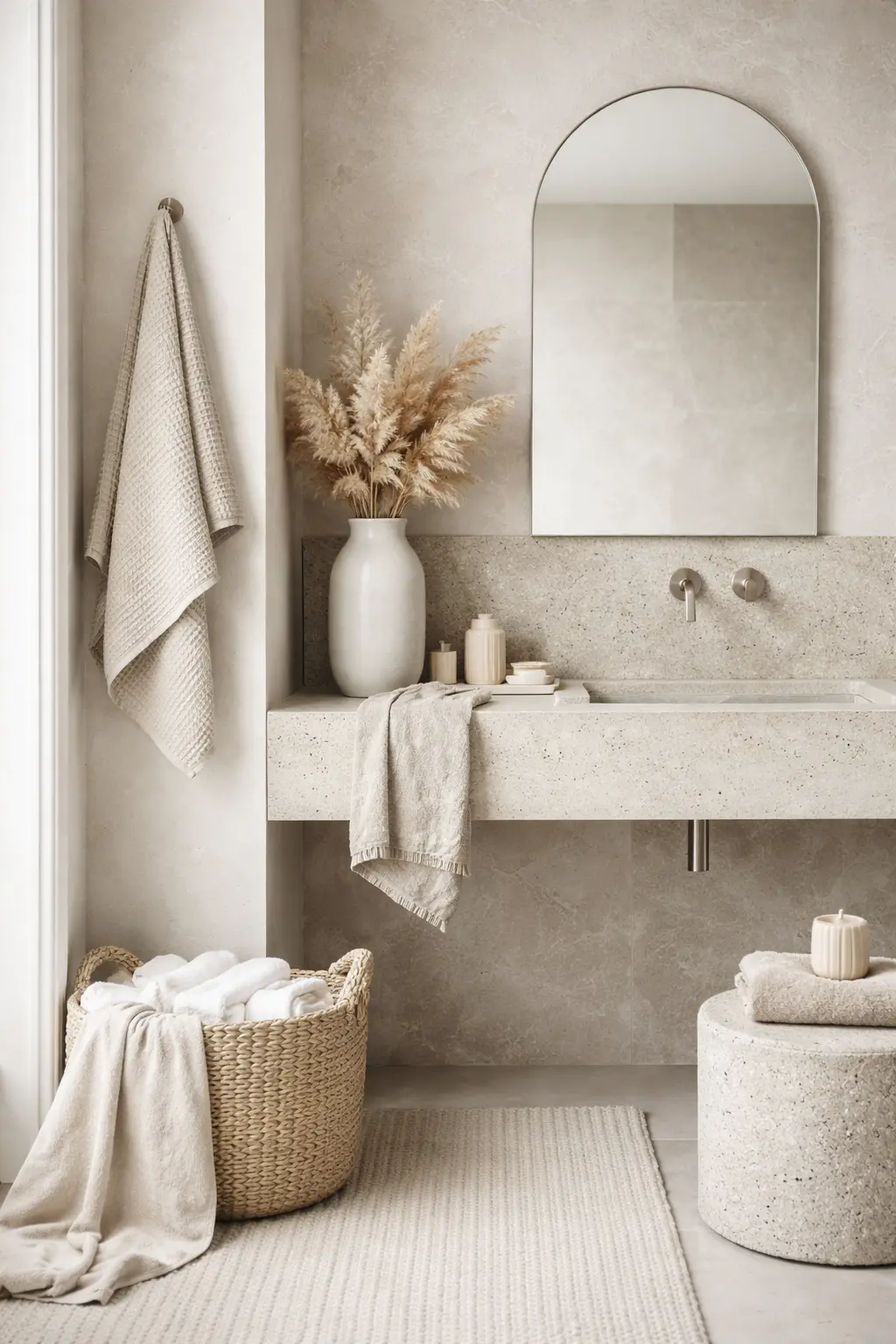
3. Lighting Design in Small Spaces: The Role of Indirect Glow
 Save it
Direct ceiling light illuminates every surface evenly. This is practical, but visually sterile.
In the evening, your nervous system is much more sensitive to cold light. If you rely only on overhead lighting, your body stays in daytime mode. A lower-intensity, warm supplementary light source can help you slow down without creating total darkness.
The direction of light is just as important as its intensity. A hidden LED strip behind the mirror. A small warm lamp on a shelf. Or even a scented candle in the evening. Indirect light creates zones — making the space feel both larger and more intimate at the same time. This is especially effective in smaller bathrooms where every bit of visual depth matters.
If you’d like to unwind in the evening and create the right environment for it, I wrote about this in more detail in the post Feeling Stressed? Here’s How to Build a Relaxing Bathroom Retreat.
4. Countertop Composition: Creating Visual Rhythm
 Save it
Most countertops feel scattered because they lack hierarchy.
When elements vary in height, mass, and visual weight, the eye automatically arranges them in sequence. This creates compositional rhythm. A vase with pampas grass or diffuser introduces vertical direction, while a lower tray adds horizontal stability.
Together, they form a kind of visual triangle that acts as a focal point. If everything is the same size or shape, the eye slides over it — and the space feels temporary.
It’s also important to leave breathing room between objects. Arranging things too tightly creates a sense of clutter even when there are only a few elements. Intentionally leaving empty space isn’t wasted — it’s a visual buffer that highlights the rest of the composition.
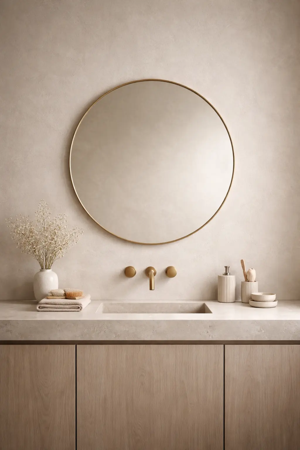
5. Color Palette: Tone-on-Tone Calm
 Save it
A tone-on-tone palette allows differences to come from material rather than color — which is especially important in a space where most surfaces are already hard and reflective.
For example, placing a matte ceramic soap dispenser and an off-white textured hand towel on a sand-colored stone tray makes the eye see not separate objects, but a unified composition. This is the point where a simple minimalist ceramic dispenser or a neutral-toned cotton hand towel becomes more than a functional tool — it becomes a visual “silencer.”
Variations within the same tone — such as combining a warmer beige with a cooler greyish shade — add subtle dynamism without breaking the overall look. This helps avoid monotony while keeping the space calm.
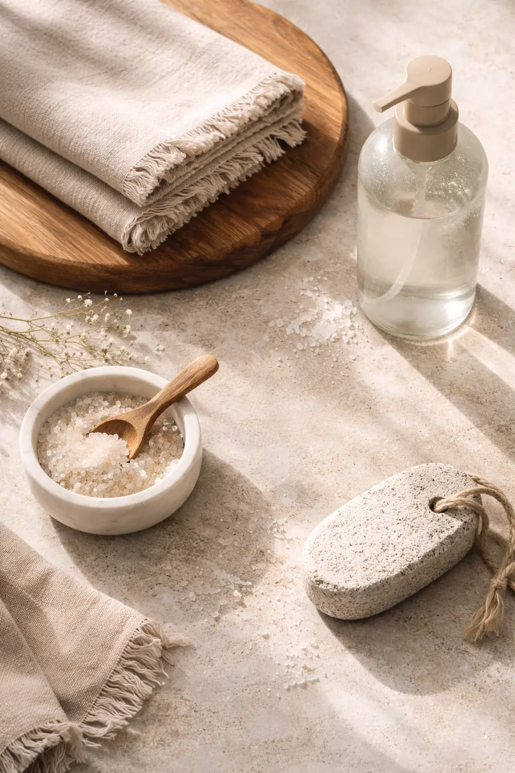
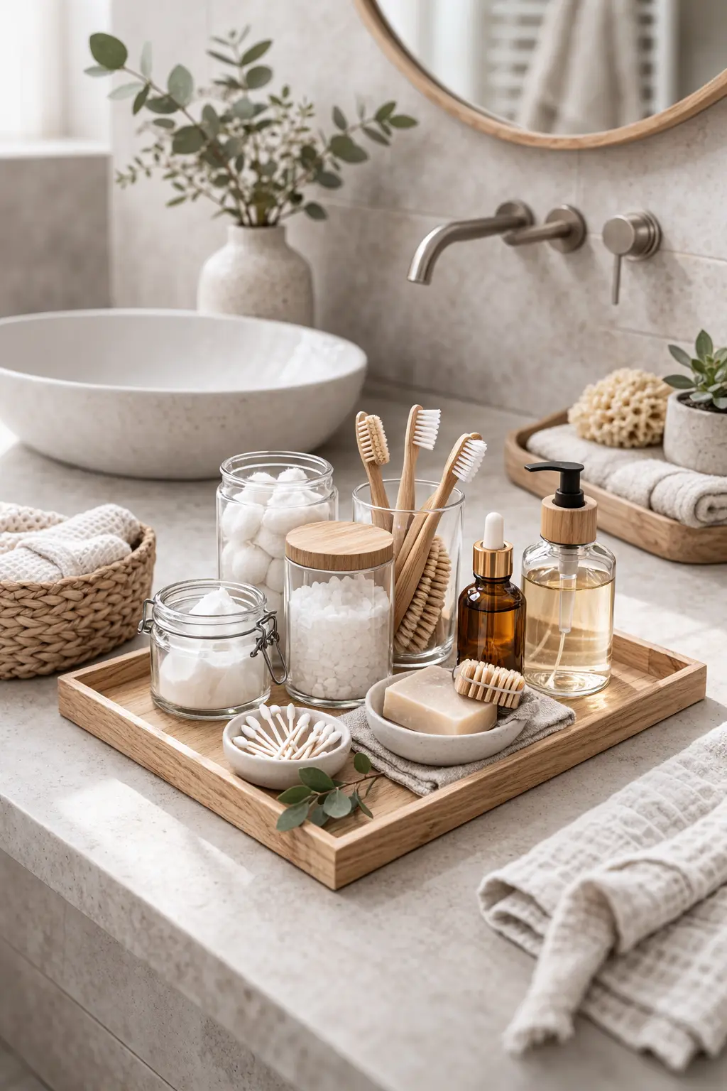
6. Storage That’s Also Aesthetic
 Save it
Open storage is not the same as clutter — if it’s structured. Uniform, decanted containers allow everyday items to appear visually coordinated. For example, a transparent acrylic organizer box or a lidded glass jar for cotton pads or swabs immediately reduces the visual noise caused by branded packaging.
Apothecary-style glass jars work especially well because they hint at their contents without adding typographic or color information. This kind of visual softening helps maintain a sense of order even with open storage.
If you place them on a unified tray or bamboo base, separate elements appear as a single composition — making storage not just practical, but an integral part of styling.
I wrote more about this in the article Affordable Bathroom Counter Decor Ideas That Look High-End.
How Does This Come Together in Practice?
One of the least discussed, yet most powerful tools is “visual cleaning” around the mirror. Try styling the surfaces reflected in the mirror as well. What’s visible in the mirror counts twice. If there’s chaos there, it doesn’t matter how tidy your counter is.
Another trick is “limited rotation.” You don’t need to use all your decor at once. Keep 3–4 alternative elements (textiles, trays, branches) in a small box and rotate them seasonally. This keeps the space fresh without overloading it.
Pay attention to scent as a design tool. Scent and visuals together shape atmosphere. A minimalist diffuser can work visually while activating another sensory channel.
And finally: think in terms of noise reduction. Soft textiles dampen not only visual but also acoustic reflections from hard surfaces. This is the detail that makes a space feel truly “softer.”
Before changing too much, though, it’s worth knowing what to avoid.
Common Mistakes
One of the most common mistakes is over-decorating. When every surface gets something: a tray, a candle, a figurine, a diffuser. The end result isn’t rich — it’s noisy.
Another typical issue is ignoring scale. Small objects get lost on large counters, while an oversized tray can dominate a narrow sink. This disrupts balance.
People also tend to mix metals: chrome faucet with a gold pump, black frame with a rose-toned mirror. This rarely looks eclectic — more often, it feels random.
Lighting scented candles with cool-toned light is another frequent mistake. Warm mood objects lose their function this way.
And finally: original packaging. Even premium brand bottles fragment the visual field when different typography and colors are involved.
Frequently Asked Questions
How can I make my bathroom look more expensive without renovating?
With uniform storage, texture layering, and indirect lighting, you can achieve a significant visual upgrade. The goal isn’t a new object — it’s a new composition.
Which colors help with relaxation?
Warm neutral tones — sand, sage, off-white — reduce visual stimulation, making it easier for your nervous system to switch off.
How can I decorate without creating clutter?
Use grouping. A tray helps frame elements so they don’t scatter.
Are faux plants a good solution?
Yes, if they’re textured and not glossy. Matte leaves look more natural.
What’s the quickest change?
Switching to a warm-toned light bulb.
Summary
Refreshing your bathroom isn’t a weekend project — it’s a mindset shift. Once you start thinking in terms of composition, lighting, and materials, the space gradually transforms.
You don’t need to replace everything. It’s enough to be intentional about what stays out, why it stays out, and how it relates to everything else.
The goal isn’t a photo-ready interior, but an environment that supports you in slowing down. One that doesn’t overstimulate you in the morning and helps you wind down at night.
Start with a single surface. Notice how you respond to it. And let that guide your next decision.

This post contains affiliate links. I may earn a small commission at no extra cost to you.