
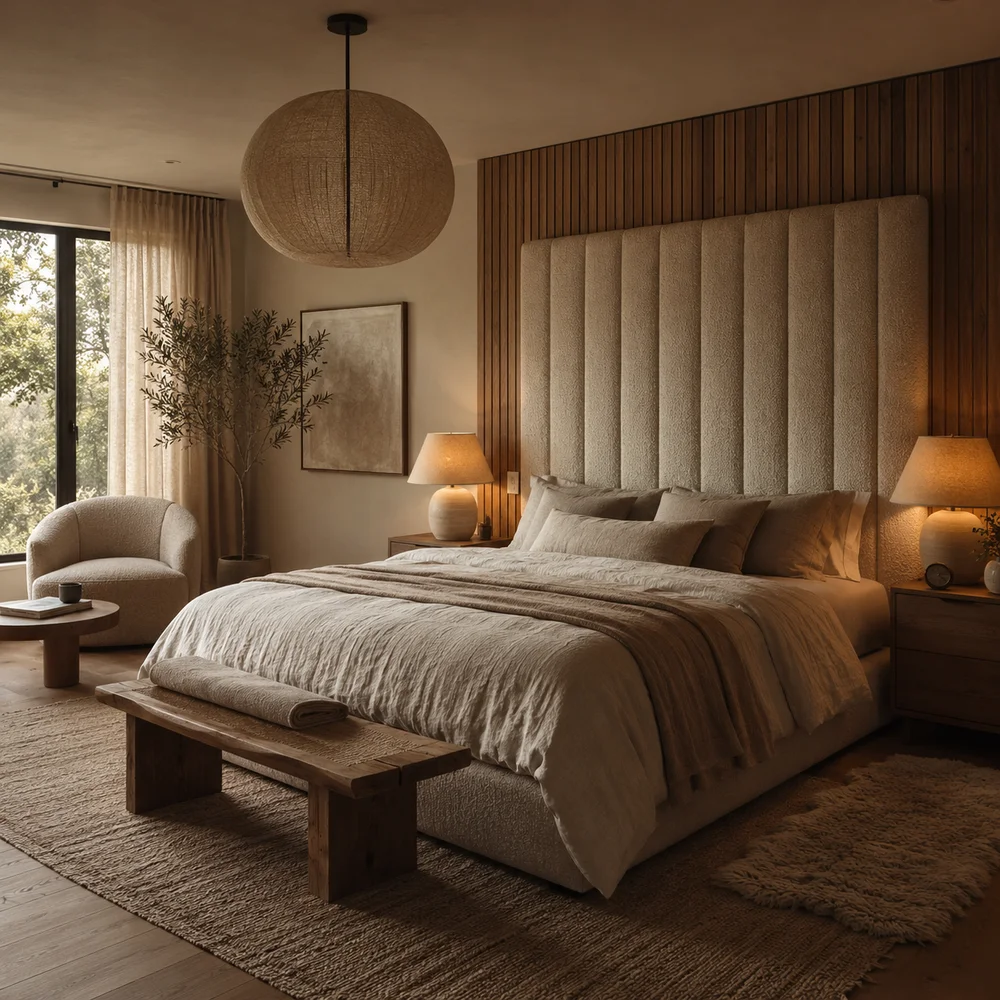
How to Recreate the Cozy Bedroom Trends Everyone Is Saving in 2026
By Emily | July 6, 2026
You have pinned dozens of bedrooms that all seem to share the same quality: heavy, warm, undeniably inviting. Yet when you look at your own room, something feels flat by comparison, even when you have followed the same shopping guides everyone else swears by. The problem usually is not taste. It is that most advice focuses on individual products instead of the underlying logic that makes these spaces feel finished rather than furnished.
What people are actually responding to in these saved images is not a color or a single statement piece. It is weight, texture, and restraint working together. A cozy bedroom in 2026 reads as intentional because every element supports the same mood, rather than fighting for attention. Once you understand this, shopping stops being about finding “the perfect item” and becomes about building a coherent atmosphere.
This guide breaks the trend into its real components: the textiles carrying the visual weight, the palettes replacing sterile neutrals, the furniture scale shaping the room’s architecture, and the small rituals of lighting and styling that separate a bedroom people photograph from one they simply sleep in. Thirteen specific ideas, each explained through the reasoning behind it, not just the look.
Use this as a working reference rather than a strict checklist. Some ideas will apply immediately to your space; others might require a season of small changes. The goal is not to copy a picture exactly, but to understand why each choice works, so you can adapt it to your own room’s proportions, light, and budget with genuine confidence.
1. Why Bedrooms Are the Most-Saved Room on Pinterest Right Now
 Save it
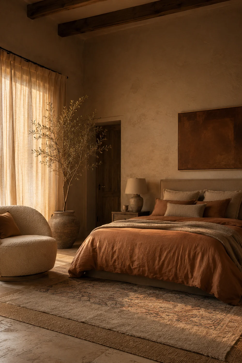
Bedrooms have overtaken kitchens and living rooms as the most-saved interior category, and the shift says something about how people are using their homes. After years of open-plan living and shared spaces, the bedroom has become the one room dedicated entirely to a single person’s comfort. It is private, low-traffic, and does not need to perform for guests, which makes it the safest place to experiment with mood-driven design rather than practical design.
This matters because a room without an audience can prioritize feeling over function. Kitchens must be efficient. Living rooms must accommodate other people’s preferences. Bedrooms answer only to the person sleeping in them, which is why the saved images lean toward softness, warmth, and sensory richness rather than crisp, photograph-ready perfection. People are decorating for their nervous system, not for visitors.
There is also a practical driver behind the trend: many of these looks are achievable without renovation. Unlike kitchen remodels or living room furniture overhauls, a cozy bedroom transformation often relies on textiles, lighting, and small furniture moves that do not require permits, contractors, or major budgets. This accessibility is part of why the aesthetic spreads so quickly and why so many versions of it look slightly different from each other.
Picture a renter in a one-bedroom apartment who cannot repaint the walls or install permanent fixtures. She swaps her thin duvet for a heavyweight quilted coverlet, adds a floor lamp with a warm bulb, and layers two rugs by the bed. Nothing structural changed, yet the room reads completely differently in photos and in person, which is exactly the appeal driving the volume of saves.
The deeper pattern is that comfort has become aspirational in a way it was not a decade ago. People are not chasing minimalism or maximalism as a lifestyle statement anymore; they are chasing the feeling of a room that holds them at the end of a long day. That shift in motivation, more than any single product, explains why this particular category of bedroom content keeps circulating.
2. The Weight of Textile: Bouclé, Heavy Knits, and Why Nothing in These Rooms Is Thin

 Save it
If you compare a cozy 2026 bedroom to a sterile one, the difference is rarely color. It is weight. Thin cotton throws, flat cushion covers, and lightweight linen curtains all read as functional rather than luxurious, no matter how expensive they are. The rooms people save almost universally feature bouclé, chunky knits, and heavyweight wovens that visibly hold their shape and cast real shadow, giving the eye something substantial to rest on.
This works because texture communicates temperature before anyone touches anything. A flat-weave blanket photographs as cold even under warm lighting, while a deep-pile bouclé throw or a cable-knit blanket reads as warm regardless of the actual room temperature. The brain associates visual density with physical warmth, so heavier textiles do psychological work that no paint color can replicate on its own.
Not every piece needs to be maximally thick. The trick is contrast: one or two genuinely heavy textiles, like a bouclé accent chair or a chunky knit throw, paired with lighter linens elsewhere so the room does not feel oppressive.
A studio apartment bedroom with a single window and cool northern light is the hardest environment to make feel cozy. Adding a bouclé lumbar pillow, a heavyweight knit throw folded at the foot of the bed, and swapping a thin cotton rug for one with real pile height solved this exact problem for a reader who had spent months trying paint colors instead. The textiles did in a weekend what wall color never managed.
The broader principle here applies well beyond bedrooms: texture is often a faster, cheaper fix than color or furniture. This overlaps with the reasoning found in The Best Aesthetic Closet Storage Ideas for Small Bedrooms, where layered materials inside storage systems create the same sense of depth. Once you start noticing texture weight, you start seeing why some rooms feel considered and others feel merely decorated.
3. Warm Mineral Palettes Replacing Cool Neutrals: Terracotta, Mocha Mousse, and Clay
 Save it
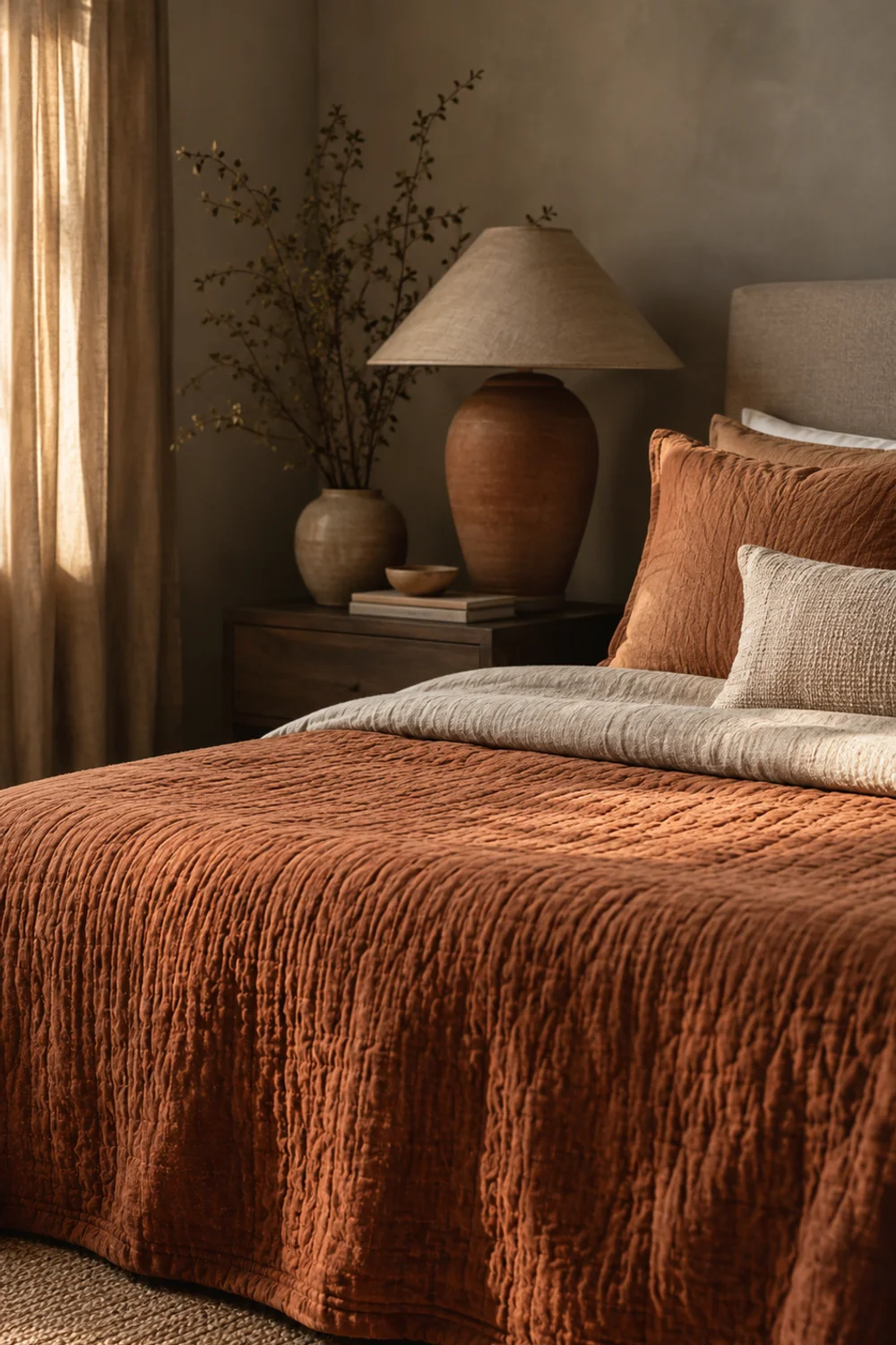
For nearly a decade, the dominant bedroom palette was some variation of cool gray, greige, or icy white. That era is fading in the images people are saving now, replaced by warm mineral tones: terracotta, mocha mousse, clay, and soft rust. These colors do not photograph as trendy accent walls so much as foundational choices, appearing on bedding, upholstery, and even wall paint in ways that feel earthy rather than decorative.
The mechanism is straightforward once you notice it: cool grays reflect blue-toned light and can make a room feel clinical, especially in climates with limited sun. Warm mineral tones absorb and reflect light differently, giving off an amber cast even under ordinary bulbs. This is why a terracotta or clay-toned room can feel warm and inviting even on a gray afternoon, while a cool gray room can feel sterile even with excellent natural light.
You do not need to repaint an entire room to adopt this. A single clay-toned bedding set or a terracotta velvet headboard can shift the emotional temperature of a space that otherwise remains neutral, which is why this trend has spread so easily among renters who cannot alter their walls.
Consider a bedroom that had been painted a cool dove gray during a previous owner’s renovation. Rather than repainting, the current resident introduced a mocha mousse quilted coverlet, rust-colored ceramic lamps, and a clay-toned woven basket for throw blankets. The wall color, technically still cool, reads as neutral background rather than dominant tone, because the warm textiles now carry the emotional weight of the palette.
This palette shift also connects to a broader movement away from stark minimalism toward what designers sometimes call “grounded” interiors, spaces that feel connected to natural materials rather than manufactured perfection. It is the same philosophy driving renewed interest in unlacquered brass, raw plaster, and unfinished wood across other rooms of the home, not just bedrooms.
4. The Oversized Headboard as the Room's Architecture
 Save it
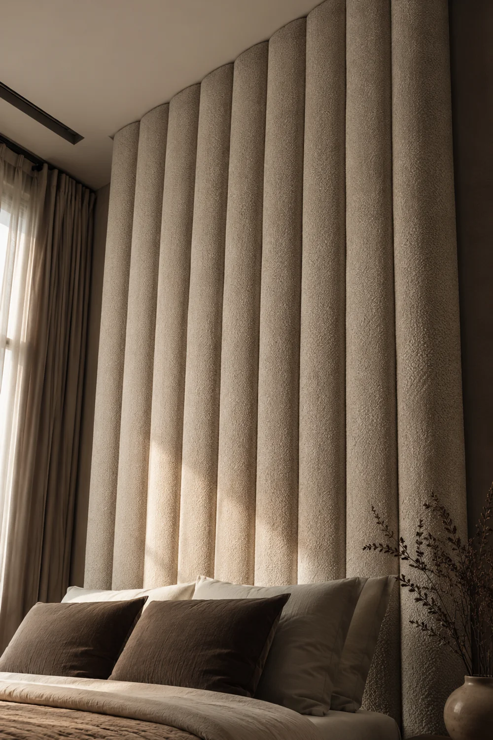
Most bedrooms treat the headboard as an afterthought, a slim rectangle that exists mainly to prevent pillows from falling. The rooms generating the most saves take the opposite approach, using an oversized, often channel-tufted or curved headboard as the architectural anchor of the entire space. The headboard is no longer decoration behind the bed; it is treated as the room’s primary structural feature, the way a fireplace anchors a living room.
Scale is the mechanism at work. A headboard that extends several inches beyond the mattress on either side and rises well above eye level when seated creates a sense of enclosure and shelter, echoing the psychological comfort of a canopy bed without the cost or commitment. This is why so many of the saved images feature headboards in bouclé, channel-tufted velvet, or curved upholstered shapes rather than simple wood panels.
An oversized headboard does not require a custom furniture order. Many upholstered headboards designed to mount independently of the bed frame allow you to scale up dramatically without replacing your existing mattress base, which keeps the upgrade both affordable and renter-compatible.
Picture a queen bed with a slim 40-inch-wide headboard in a room with 9-foot ceilings; the proportions leave the wall looking unfinished and the bed looking small. Replacing that headboard with a 70-inch-wide, floor-to-near-ceiling curved upholstered version fills the negative space entirely, and the same mattress and bedding suddenly photograph as part of a considered, expensive-looking room, without a single other change made.
The underlying lesson extends to furniture choices throughout a home: undersized furniture almost always reads as cheap, regardless of quality, because it leaves visual gaps the eye interprets as incomplete. Oversizing the single largest piece in a room, rather than adding more small pieces, is consistently the more efficient way to create a finished feeling.
5. Layered Bedding: The Hotel Roll and the Duvet-Plus-Throw Formula
 Save it
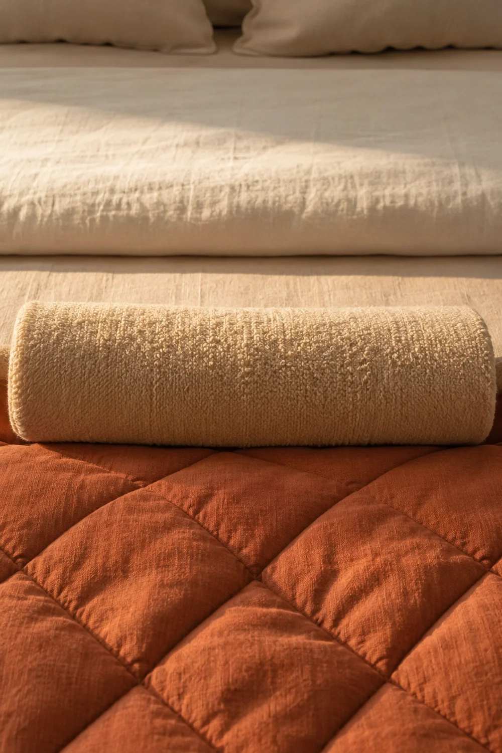
The single most copied detail from luxury hotel bedrooms is the layered bedding formula, and it is far easier to replicate than most people assume. Rather than a fitted sheet and a single duvet, hotel-style beds use a flat sheet, a duvet, a folded coverlet or blanket at the foot, and a rolled bolster or throw across the base. This layering is not about having more blankets; it is about creating visual rhythm through folded and rolled shapes.
The technique that makes this look intentional rather than cluttered is the “hotel roll,” where a lightweight blanket or throw is rolled lengthwise and placed horizontally across the foot of the bed, rather than draped or folded flat. This single fold creates a clean horizontal line that anchors the entire bed visually, the same way a belt defines an outfit. Without it, even expensive bedding can look unmade rather than styled.
Choosing the right combination of weights matters more than the number of layers. A matelassé coverlet paired with one heavier knit throw gives enough visual texture without becoming bulky or difficult to actually sleep under each night.
A reader with a plain white duvet and no additional bedding tried this formula using items she already owned: an extra flat sheet folded at the foot, a thin cotton throw rolled across the base, and two euro pillows added behind her standard pillows for height. The bed looked considerably more finished within minutes, without a single new purchase, proving that the formula is really about arrangement, not accumulation.
This layering principle mirrors a broader styling habit that shows up across the home, where the difference between “furnished” and “styled” often comes down to intentional folding, stacking, and grouping rather than simply owning more objects. Hotels understand this instinctively because their rooms are reset daily by people trained specifically in these small, repeatable gestures.
6. Window Treatments as Mood Control: Blackout Drama Meets Sheer Softness
 Save it
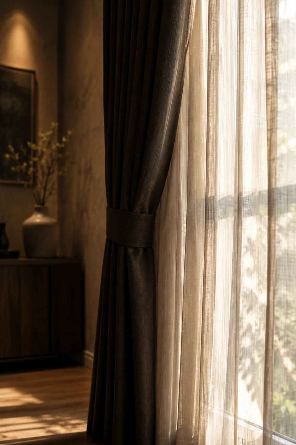
Window treatments in the most-saved bedrooms are rarely a single panel doing double duty. Instead, they combine a heavy blackout drapery with a sheer inner layer, mounted on a double rod so both can move independently. This layering is not primarily decorative; it functions as a mood dial, letting the room shift between bright and airy during the day and completely enclosed and dark at night.
The mechanism relies on contrast between opacity levels. Sheer linen alone lets in soft, diffused daylight that photographs beautifully but does nothing for sleep quality, while blackout drapery alone can make a room feel heavy and closed off even in daytime. Running both together means the sheer stays closed for privacy and gentle light filtering, while the blackout panel opens fully during the day and closes completely at night, giving one window two entirely different personalities.
Mounting height changes the entire effect. Hanging curtain rods close to the ceiling rather than directly above the window frame, using extra-long curtain panels that graze or slightly pool on the floor, makes ceilings read taller and windows read larger than they actually are, a trick borrowed directly from theater set design.
A north-facing bedroom with a single small window struggled with both too little privacy and too much midday glare in different seasons. Installing a double rod with a warm-toned linen sheer and a charcoal blackout panel mounted eight inches above the window frame solved both issues: the sheer diffused winter light beautifully, and the blackout layer handled summer glare and early sunrise, without a single structural change to the window itself.
This approach to layered function over single-purpose objects is a recurring theme across cozy interiors generally, and it echoes the reasoning behind The Ultimate Guide to Scandinavian Bathroom Design Everyone Is Obsessed With, where layered lighting solves a similarly competing set of daytime and nighttime needs in a different room entirely.
7. The Reading Corner as a Second Gravitational Point
 Save it
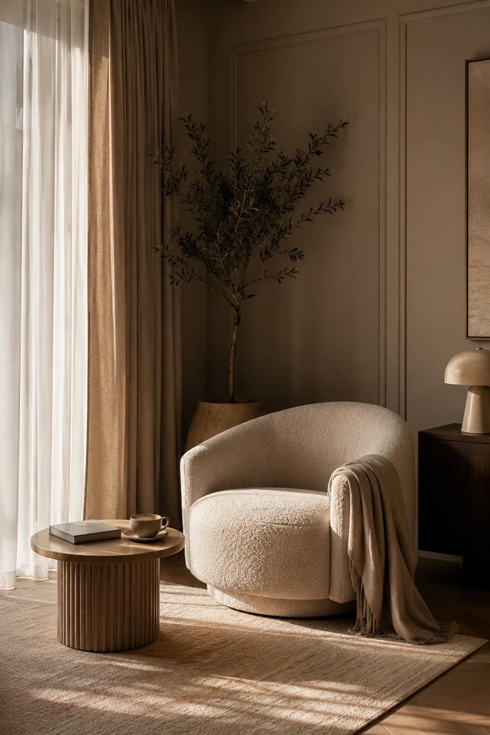
A bedroom with only a bed reads as a room with a single function, no matter how well the bed itself is styled. The most-saved bedrooms almost always include a secondary seating moment, typically a single accent chair positioned near a window or in an underused corner, creating a second reason to be in the room besides sleeping. This second gravitational point is what makes a bedroom feel like a retreat rather than simply a place to store a mattress.
The psychological effect comes from implied use. An empty corner reads as wasted space, but a chair with a throw blanket draped over the arm and a small side table beside it reads as a space someone actually occupies, even if it goes unused most days. This single vignette does more to suggest a lived-in, cared-for room than almost any other single addition, because it implies routine and ritual rather than just storage.
The chair itself matters less than the surrounding details. A compact accent chair in bouclé or velvet, paired with a small round side table just large enough for a mug and a book, creates the vignette without requiring the square footage a full reading nook would demand.
A narrow bedroom with only 18 inches of unused floor space beside the window seemed too tight for any additional furniture. A slim-profile swivel chair, chosen specifically for its narrow footprint, fit into that gap with a small round table tucked beside it, transforming what had been dead space into the most-photographed corner of the room, according to the homeowner’s own account of guest reactions.
The broader idea, that every room benefits from at least one secondary activity zone, applies well beyond bedrooms and connects naturally to Luxury Walk-In Closet Inspiration Ideas You Will Absolutely Love, where a small seating or vanity area inside a closet performs the same psychological function of implied ritual and daily use.
8. Nightstand Styling as a Tiny Still Life

 Save it
Nightstands in the most-saved bedrooms are rarely treated as simple surfaces for a lamp and a phone charger. Instead, they are styled the way a photographer might arrange a still life: a small stack of books, a ceramic object, a candle, and a lamp, each chosen for how it interacts with the others rather than for pure function. This deliberate arrangement is what separates a “styled” nightstand from a functional one, and it is one of the cheapest updates on this entire list.
The principle at work is the rule of odd numbers combined with height variation. Objects arranged in odd-numbered groupings, typically three, at varying heights, read as intentional to the eye in a way that identical, evenly-spaced objects do not. A stack of two books, a small ceramic vase, and a single taper candle at three different heights creates visual interest that a phone charger and a lamp alone cannot achieve.
Material consistency across the nightstand objects matters more than most people expect. A ceramic table lamp with a linen shade, paired with a matching ceramic catch-all dish for jewelry, ties the vignette together without requiring every object to be purchased as a matched set.
A reader with only a lamp and a glass of water on her nightstand added a small stack of two hardcover books, a taper candle in a brass holder, and a small ceramic dish for her rings before bed. The change took under ten minutes and cost nothing beyond items she already owned scattered elsewhere in the house, yet the nightstand now anchors the entire side of the bed in every photo she has taken since.
This same still-life logic, small groupings at varied heights using consistent materials, is the exact styling principle behind 11 Stunning Open Closet Styling Ideas Worth Copying Right Now, where open shelving succeeds or fails based on identical grouping and height-variation rules applied to folded textiles and accessories instead of nightstand objects.
9. Rug Layering Underfoot: Two Rugs, Not One
 Save it
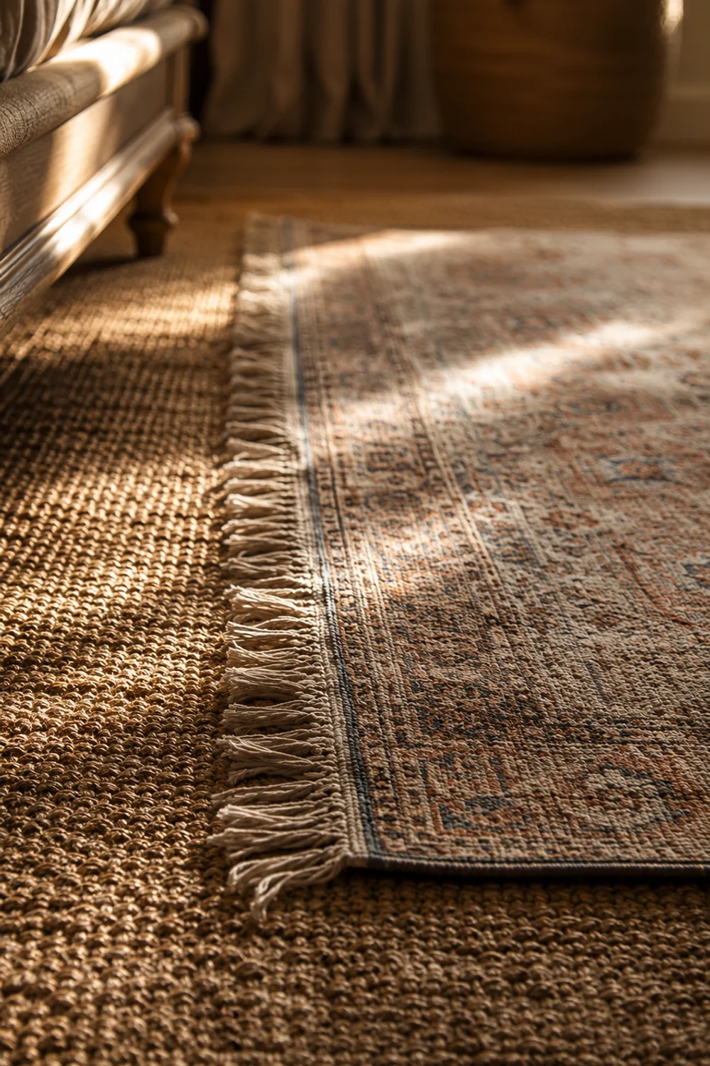
A single rug placed squarely under the bed is the default most people default to, and it is precisely why so many bedrooms feel flat underfoot despite an otherwise considered design. The trend driving current saves is rug layering, placing a smaller, textured rug, often vintage-style or high-pile, on top of a larger flat-weave base rug. This combination creates depth at floor level the way the headboard creates it at eye level.
The reasoning is largely about scale and texture contrast working together. A large flat-weave jute or wool rug anchors the room’s proportions and defines the seating or bed zone, while a smaller, higher-pile or patterned rug layered on top adds warmth exactly where feet land first each morning, beside the bed. Without the base layer, a single small rug can look like an afterthought floating in the middle of hard flooring.
Getting proportions right prevents this from looking cluttered. The base rug should extend at least a foot beyond the bed frame on all visible sides, while the top layer, often a vintage-style Persian or Moroccan rug, should sit centered and slightly offset rather than perfectly squared to avoid looking accidental.
A bedroom with cold hardwood floors and a single small rug that barely reached beyond the nightstands felt perpetually unfinished despite expensive bedding and furniture. Adding a large jute base rug that extended well past the bed frame, then layering a smaller vintage-pattern wool rug centered under the foot of the bed, solved both the visual gap and the literal cold-floor problem in one move, at a fraction of the cost of replacing flooring.
The underlying principle, that layering rather than upsizing a single object often solves proportion problems more elegantly, recurs throughout interior design and connects directly to The Most Searched Neutral Closet Aesthetic Ideas Homeowners Are Obsessing Over Right Now, where layered textures on shelving solve an analogous flatness problem in a completely different context.
10. Wall Treatments Beyond Paint: Plaster, Paneling, and Fabric Panels
 Save it
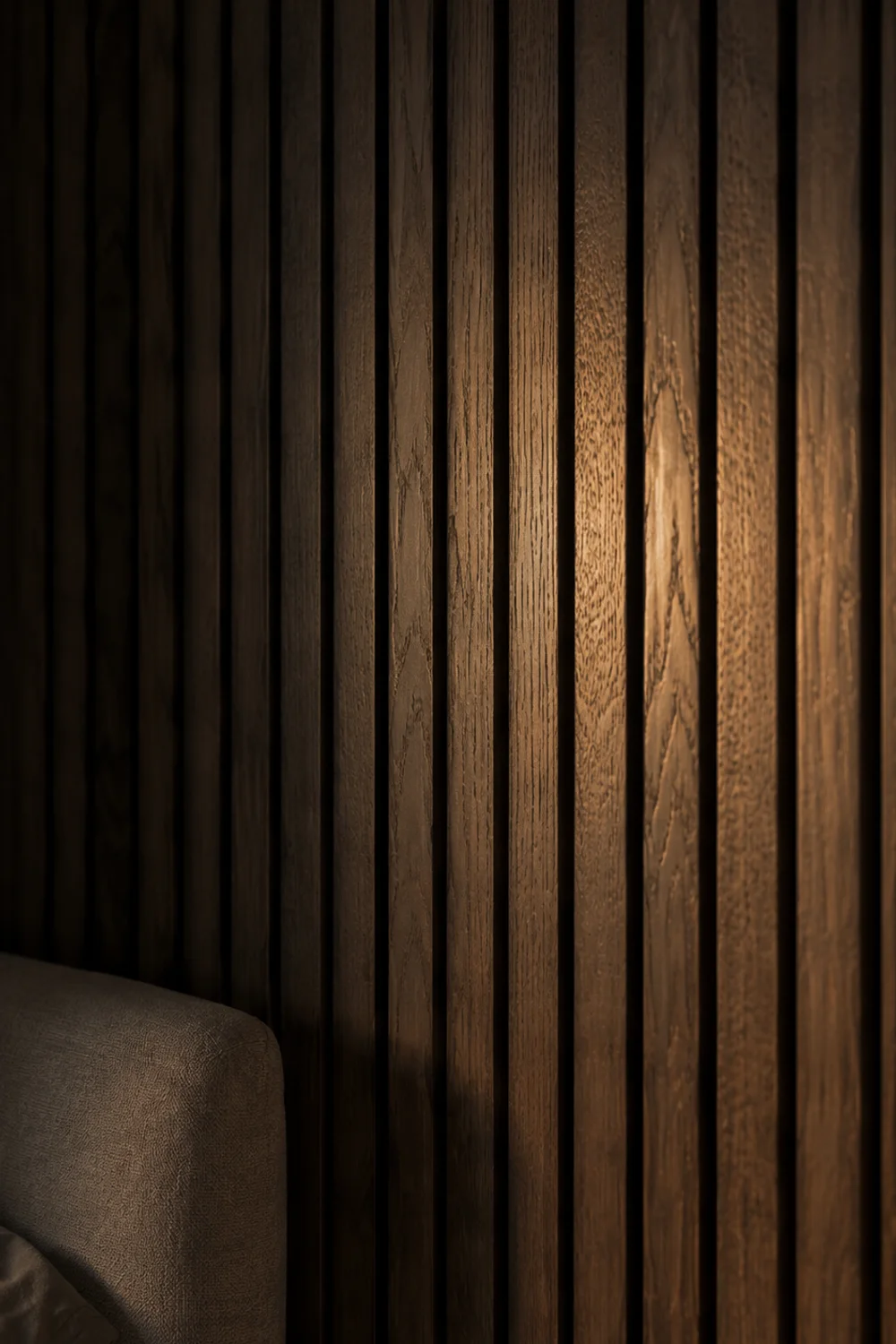
Paint alone increasingly reads as unfinished in the bedrooms generating the most saves this year. In its place, homeowners are reaching for limewash plaster, vertical wood paneling, or upholstered fabric wall panels, treatments that add tactile depth to a surface paint simply cannot replicate. This shift reflects a broader fatigue with flat, uniform walls in favor of surfaces that catch and scatter light unevenly.
The mechanism behind why these treatments photograph and feel so different comes down to light behavior. Flat paint reflects light uniformly, which can look clean but also slightly artificial under any lighting condition. Limewash plaster and textured paneling scatter light unevenly across their surface, creating subtle shadow and highlight variation throughout the day, the same quality that makes natural materials like stone or raw wood feel inherently warmer than manufactured, flat surfaces.
Renters need not skip this trend entirely. Peel-and-stick vertical paneling or fabric wall panels mounted with removable adhesive can replicate the visual texture of a full plaster wall without any permanent alteration, making this one of the more accessible high-impact changes on this list despite how permanent it looks in photographs.
A rented apartment bedroom with builder-grade flat white walls felt sterile no matter what furniture or textiles were added. Installing removable vertical paneling behind the headboard wall only, rather than the entire room, gave the space the architectural texture of the saved images without violating the lease terms, and the change was fully removable within an hour when the tenant eventually moved out.
This selective, single-wall approach to texture is a useful budget principle that applies broadly: concentrating a bigger investment on one accent wall rather than spreading a smaller budget across an entire room almost always produces a more convincing result, whether the material is plaster, paneling, or simply a bolder paint color used with intention.
11. The Bedside Lamp and Dimmer Duo: Light That Behaves Like Candlelight
 Save it
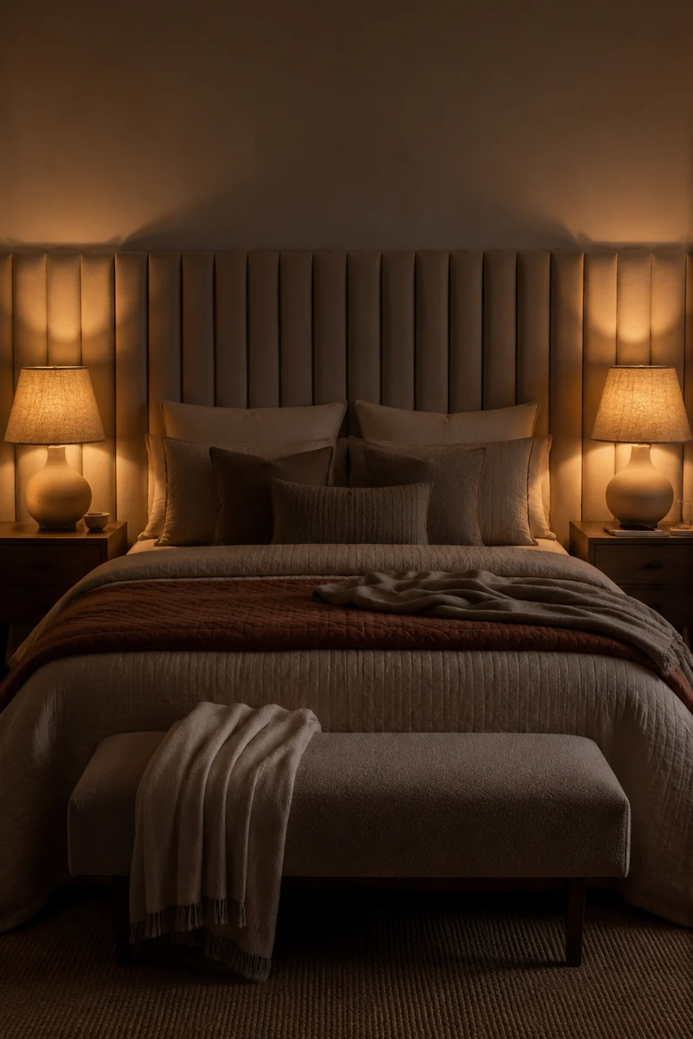
Overhead lighting is largely absent from the bedrooms generating the most saves, replaced almost entirely by layered bedside lamps on dimmer switches. This is not merely an aesthetic preference; overhead light in a bedroom tends to flatten shadows and create a flat, clinical quality that no amount of styling elsewhere can compensate for, while lamp light pooling at bed height mimics the warmth of candlelight far more convincingly.
The mechanism is about color temperature and light direction working together. A bulb rated around 2700K, combined with a linen or fabric lampshade that diffuses rather than exposes the bulb directly, produces light that behaves the way firelight does: warm, uneven, and directional rather than flat and even. Adding a dimmer switch allows this warmth to scale from bright enough to read by down to nearly candle-level ambiance without changing bulbs.
Matching lamps on either side of the bed reinforces the symmetry the eye expects from a well-composed bedroom, though slight variation in shade texture, such as one linen shade and one pleated fabric shade, keeps the pairing from feeling like a purchased set rather than a considered choice.
A bedroom that relied entirely on a single ceiling fixture for years felt harsh and hospital-like every evening, regardless of how the bed itself was styled. Adding two matching table lamps with warm bulbs and a simple plug-in dimmer, without any electrical work, changed the entire evening atmosphere of the room within a single weekend, and the ceiling fixture is now used only occasionally for cleaning rather than daily living.
This lighting-first philosophy, prioritizing warm, layered, dimmable light over bright overhead fixtures, is consistently one of the most cost-effective mood changes available in any room of a home, and it explains why so many of the most-saved interior photographs, across bedrooms, living rooms, and beyond, are lit primarily by lamps rather than ceiling fixtures.
12. Analog Objects and the Deliberate Absence of Visible Technology
 Save it
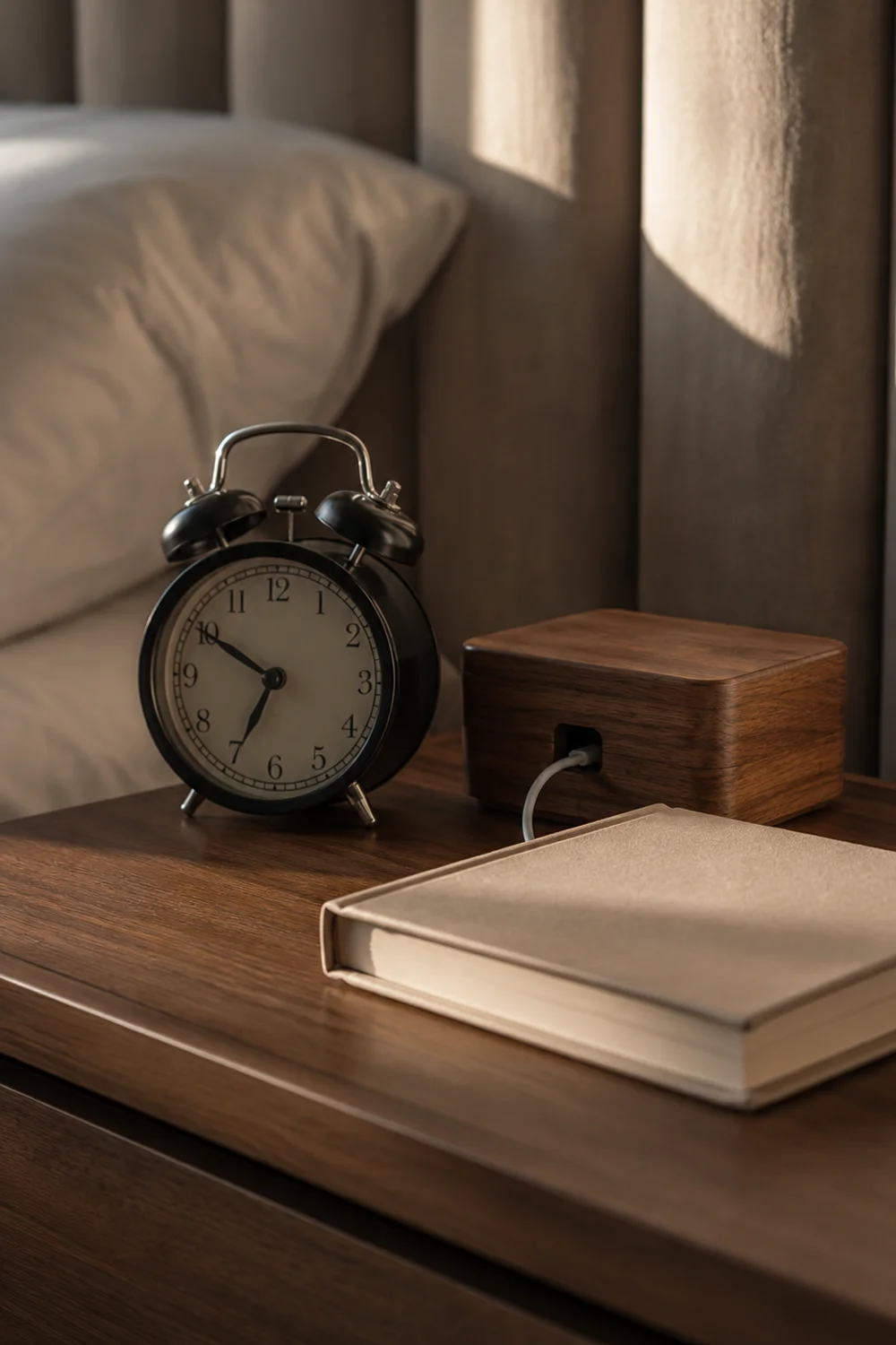
A quiet but consistent detail across the most-saved bedrooms is what is missing rather than what is present: visible chargers, cluttered cable knots, and prominently displayed phones. In their place sit analog objects, a wind-up alarm clock, a stack of physical books, a record or a simple radio, signaling a bedroom designed around rest rather than connectivity. This absence is deliberate, not accidental, and it does real psychological work.
The reasoning connects to how the brain associates visible technology with alertness and stimulation, the opposite of what a bedroom is meant to encourage. A nightstand with a glowing phone screen or a tangle of charging cables signals “still connected,” while a nightstand with a wind-up clock and a closed book signals “off duty.” Removing visible tech does not require removing the technology itself, only relocating and concealing it thoughtfully.
Cable management tools make this achievable without lifestyle changes. A small cable organizer box tucked behind or beneath the nightstand keeps chargers accessible but invisible, letting the surface itself remain styled the way a still life would be, undisturbed by cords or glowing screens.
A reader who charged her phone directly on her nightstand every night found that simply moving the charging cable into a small hidden box, then charging her phone in a kitchen drawer overnight instead, changed both the appearance of her nightstand and, unexpectedly, the quality of her sleep, since she was no longer reaching for the phone in the dark. The visual change and the behavioral change turned out to be linked in ways she had not anticipated.
The broader lesson: an object’s location often matters as much as its existence, since the same charger tucked away is invisible while the same charger draped across a nightstand becomes the dominant visual element in the entire room, regardless of how carefully everything else has been styled.
13. The Case for Imperfection: Why the Most-Saved Bedrooms Have Something Deliberately Unfinished

 Save it
Every trend on this list could tip into looking like a showroom rather than a lived-in home, and the detail that prevents that is the presence of something deliberately imperfect. The most-saved bedrooms almost always include one slightly rumpled, asymmetrical, or unpolished element, an intentionally undone duvet corner, a slightly crooked stack of books, a chair angled instead of squared, that signals human presence rather than staged perfection.
This works because total symmetry and crispness read, paradoxically, as cold and unlived-in, even when every individual choice is warm. A bed with every corner tucked to hospital precision, or a nightstand arranged with ruler-straight alignment, can undercut all the cozy textures and warm tones layered elsewhere. A single imperfect gesture reassures the eye that this is a real room someone actually uses, not a photograph staged once and never touched again.
The trick is making the imperfection look intentional rather than genuinely careless. A deliberately rumpled linen duvet cover, chosen specifically for the fabric’s tendency to wrinkle attractively, achieves this more reliably than simply neglecting to make the bed, since the wrinkling itself becomes part of the material’s designed character.
A meticulously styled bedroom photographed for a home tour still felt strangely sterile until the owner, on a stylist’s suggestion, pulled back one corner of the duvet and left a single book open face-down on the nightstand rather than closed and stacked. Those two small, deliberately imperfect gestures were the detail viewers commented on most, more than the headboard, the lamps, or the rug layering combined.
This principle, that a single imperfect detail often does more work than another round of polish, is worth remembering any time a room feels technically correct but emotionally flat. Cozy, ultimately, is not the absence of mess; it is the presence of just enough of it to feel real.
Common Mistakes to Avoid
1. Treating every textile as equally weighted
Buying an expensive heavy throw but pairing it with thin, flat cushion covers and a lightweight bedskirt creates visual inconsistency. The eye notices when only one element in a room carries weight while everything else feels thin, and the overall effect ends up reading as unfinished rather than intentionally layered.
2. Choosing a trendy color without checking undertones
Warm mineral palettes only work when the undertones across bedding, walls, and furniture actually agree with each other. A terracotta duvet paired with a pink-toned blush wall can clash rather than harmonize, because not all “warm” tones share the same underlying hue family, and mismatched undertones are more noticeable in warm palettes than in neutral ones.
3. Oversizing the headboard but underscaling everything else
An oversized headboard is meant to anchor the room, not dwarf every other piece of furniture. Pairing a dramatic, floor-to-near-ceiling headboard with small, delicate nightstands and a thin lamp creates a proportion mismatch that undermines the very effect the headboard was meant to create.
4. Layering rugs without matching pile direction or texture logic
Placing a shaggy rug directly on top of another textured rug, rather than a flat-weave base, creates a lumpy, unstable-feeling combination underfoot. The base rug should always be flatter and larger, with the textured or patterned rug layered smaller on top, or the layering reads as accidental rather than designed.
5. Relying entirely on warm bulbs without any dimming control
Switching to warm-toned bulbs helps, but without a dimmer, the room still only offers one lighting mode. The candlelight effect people are actually responding to in saved images depends on the ability to lower brightness gradually in the evening, not simply on bulb color temperature alone.
6. Adding analog objects without hiding the technology they’re meant to replace
A wind-up alarm clock placed next to a still-visible phone charger and tangled cables cancels out the intended effect. The analog objects only read as a deliberate lifestyle choice when the competing technology is also concealed, not merely supplemented.
Frequently Asked Questions
Do I need to repaint my walls to get this cozy, warm-palette look?
No. While a warm mineral wall color amplifies the effect, most of the palette shift can be achieved through bedding, throws, and accent furniture layered over an existing neutral wall. A terracotta coverlet, clay-toned ceramic lamps, and a rust-colored throw pillow can shift a room’s perceived temperature significantly without touching the paint, which is especially useful for renters who cannot alter wall color at all.
How many textiles is too many before a bedroom starts feeling cluttered rather than cozy?
The general guideline is contrast, not quantity. Two or three genuinely heavy textiles, such as a bouclé throw, a chunky knit blanket, and one textured rug, paired with lighter linens elsewhere, typically reads as layered rather than cluttered. Once every visible surface carries equal textural weight with no lighter moments to rest the eye, the room starts to feel heavy rather than warm.
Is the oversized headboard trend practical for smaller bedrooms, or does it only work in larger rooms?
Oversized headboards can work in smaller rooms specifically because they eliminate the need for additional wall decor above the bed, consolidating visual interest into one element rather than several competing pieces. The key adjustment in a smaller room is choosing a headboard that extends generously in width but stays proportionate in height, rather than maximizing both dimensions at once.
What is the fastest, lowest-cost change from this list to try first?
Nightstand styling and bedside lighting typically offer the highest visual return for the lowest cost, since both often use items already owned elsewhere in the home. Rearranging existing books, candles, and ceramic objects into an intentional grouping, combined with switching to a warmer bulb, can meaningfully shift a room’s atmosphere within a single evening and without any purchases at all.
Final Thoughts
The bedrooms generating the most saves in 2026 are not the result of a single expensive purchase or a dramatic renovation. They are built from a series of small, deliberate decisions about weight, warmth, and restraint, each one reinforcing the others until the whole room feels considered rather than simply decorated. Understanding the reasoning behind each choice matters more than copying the exact products in any single photograph.
Start small and prioritize the changes that require the least commitment: nightstand styling, lamp warmth, and textile layering can all be tested and adjusted within a weekend, long before committing to a new headboard or a wall treatment. Notice which changes actually shift how the room feels to you personally, since not every trend translates identically into every space, light condition, or budget.
Save the ideas that resonate, and revisit this list as your room evolves over time rather than trying to implement everything at once. A cozy bedroom is rarely finished in a single weekend; it is refined gradually, one considered layer at a time, until the space finally feels like the version you have been quietly collecting inspiration for all along.
This post contains affiliate links. I may earn a small commission at no extra cost to you.

Get cozy inspiration delivered to your inbox.
✓ 14-page beautifully designed ebook
✓ Cozy decorating ideas
✓ Practical room-by-room inspiration
You’re in! 🎉
Thanks for joining the NestFlowHome community!
Your free ebook is already on its way to your inbox. If you don’t see it within a few minutes, please check your Promotions or Spam folder.
Join the NestFlowHome community for weekly decorating inspiration.

Timeless home decor ideas and slow living inspiration for a calm, beautiful life.