
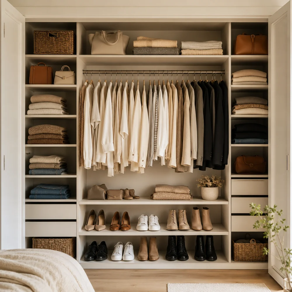
11 Stunning Open Closet Styling Ideas Worth Copying Right Now
By Emily | June 29, 2026
There’s a moment — somewhere between folding the same shirt for the third time and staring into a closet that somehow contains everything and offers nothing — when the idea of an open wardrobe stops being a Pinterest fantasy and starts feeling like a genuine solution. Not a compromise. Not a student-apartment workaround. An actual design choice.
The open closet is one of those ideas that looks effortless in photographs and terrifying in practice. But the people who pull it off aren’t working with better clothes or more space — they’re working with a different understanding of what a wardrobe is for. It isn’t just storage. It’s a surface. It’s part of the room. And when it’s treated that way, everything changes.
What follows isn’t a list of products to buy or bins to label. It’s a set of principles — visual, spatial, emotional — that explain why some open wardrobes look like they belong in a design hotel and others look like the closet door was simply removed and forgotten. The difference is always intentional, and it’s almost always replicable.
These ideas work in rented bedrooms, in small apartments, in rooms that were never designed with storage in mind. They work with a single rail and a few good hangers. They work when you’re building from scratch. The common thread is thinking about the open wardrobe not as a problem to solve but as a feature to design — the same way you’d approach a gallery wall, a kitchen shelf, or a bedside table styled to feel considered rather than convenient.
1. Why the Open Closet Is a Styling Decision, Not a Storage Solution
 Save it
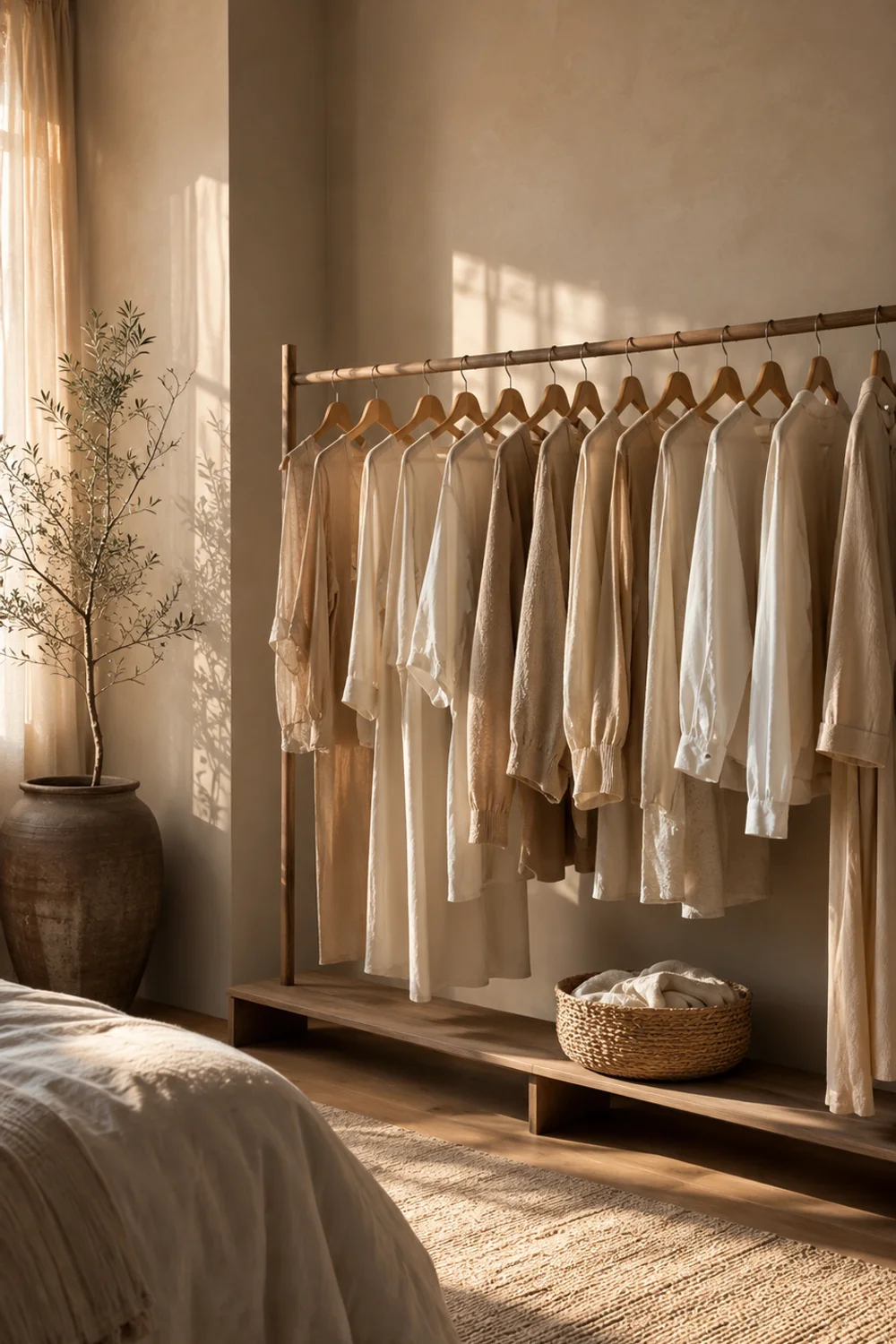
Most people arrive at the open wardrobe out of necessity — a rental with no built-ins, a bedroom too small for a freestanding armoire, a renovation that never quite finished. But the ones who get it right arrive at a different conclusion somewhere along the way: this isn’t a storage compromise, it’s a display choice. That shift in perspective changes everything about how the space gets designed.
When you think of your clothing as objects in a room — the same way you’d think of a book collection on a shelf or ceramics on a kitchen counter — the decisions you make about arrangement, color, and editing become visual decisions rather than purely logistical ones. The rack isn’t furniture that holds clothes. It’s a composition. And like any composition, it responds to intention. Too much and it becomes visual noise. Too little and it reads as unfinished. The goal is balance that looks easy.
This is why the first step isn’t buying anything. It’s editing. An open wardrobe functions like a curated collection — only the pieces you wear, love, or genuinely need have a place on the rail. Everything else migrates elsewhere. This isn’t minimalism for its own sake; it’s the practical requirement of any display-style storage. The moment a rack holds more than it can visually contain, the logic breaks down and the whole effect collapses into chaos. The discipline of curation is what makes everything else possible.
What’s worth recognizing is that this approach to storage connects to a broader shift in how people relate to their homes. For those building out a thoughtful, carefully edited bedroom aesthetic, The Most Searched Neutral Closet Aesthetic Ideas Homeowners Are Obsessing Over Right Now captures the broader visual language that makes an open wardrobe feel cohesive rather than accidental. The open closet works best when it exists within a room that has already made a few clear decisions about tone, material, and palette — it belongs to a whole, not a vacuum.
2. Choosing the Right Rack: When the Frame Becomes the Furniture
 Save it
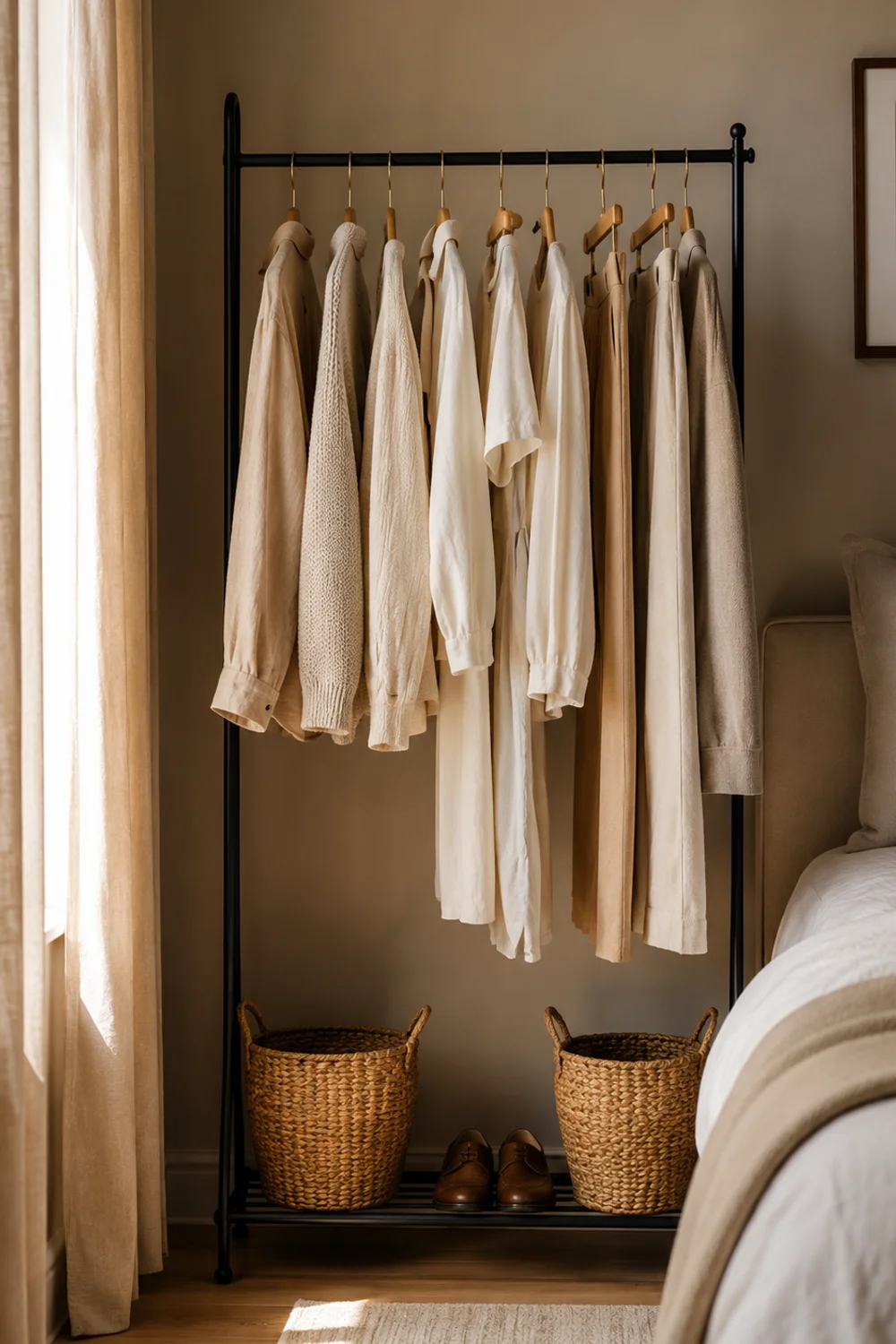
The clothing rack is the architectural core of an open wardrobe, which means it functions less like a utilitarian object and more like a piece of furniture. Its silhouette is visible from every point in the room. Its finish reads in relation to every other surface. And unlike a closed wardrobe, there’s nowhere to hide a frame that doesn’t fit the space — which is exactly why the choice of rack matters as much as anything that hangs on it.
The most versatile options for residential use are freestanding racks in matte black or brushed brass — both finishes that sit comfortably within the widest range of bedroom aesthetics without competing with the clothing they’re meant to display. Matte black frames read clean and architectural, particularly against white or off-white walls. Brushed brass introduces warmth and a material richness that softens more minimal rooms. What to avoid are chrome finishes — they catch light aggressively and compete with the visual hierarchy rather than receding behind it.
A freestanding clothing rack in matte black or brushed brass becomes a design object in its own right.
Proportions matter equally. A rack that’s too low relative to the ceiling height makes the room feel compressed. One that’s too narrow for the number of garments it holds will always look overcrowded, no matter how carefully the clothes are arranged. The rail height should allow long garments — dresses, trousers hung full-length — to clear the floor with a few inches of breathing room. That gap is part of the visual.
Beyond the finish, consider whether the rack includes a lower rail, a base shelf, or both. These horizontal elements create layers in the display — zones that can hold folded pieces, shoes, or objects — and they make the whole structure feel more considered. A rack with nothing below it can look incomplete, as if it landed in the room without context. The base zone is where the composition becomes genuinely three-dimensional.
3. The Backdrop: What the Wall Behind Your Clothes Does to a Room
 Save it
In a conventional wardrobe, the back wall is invisible — pressed against the interior, seen only when the doors are open. In an open closet, the back wall is always on display, which transforms it from a structural element into a design decision. And it’s one that most people underestimate, because the wall behind your clothes does something quietly powerful: it sets the tone for everything in front of it.
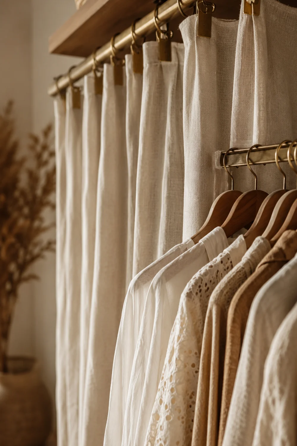
A plain white wall is the neutral default, and it works — particularly with a curated selection of light-toned garments that seem to float against it. But the real opportunity is in using the wall to create contrast or depth. A warm limewash paint in a sand or clay tone makes light neutrals feel luminous. A linen-effect wallpaper adds texture that gives the rack a sense of context, almost like a shop interior or a changing room in a boutique hotel. The wall stops being background and starts being a material element in the composition.
For renters, the practical answer is a linen curtain panel hung from a brass clip-ring rail mounted directly behind the rack. This creates a soft, textile backdrop that photographs beautifully, adds acoustic warmth, and can be removed without damage. It also solves an underrated problem: walls behind clothing racks can accumulate scuffs and marks over time, and a panel eliminates this concern entirely while adding a layer of material richness that paint alone rarely achieves.
The broader principle here is that the open wardrobe doesn’t exist in isolation. It reads against the wall, against the floor, against the ceiling. Every surface within sight line contributes to whether the whole thing feels designed or assembled. The backdrop is simply the element closest to the clothes — which makes it the most immediately visible, and the most worth attending to.
4. The Color Composition of Displayed Garments

 Save it
There’s a reason certain open wardrobes look like they were styled by a professional and others look like a moving box that never got unpacked. The difference, in most cases, has nothing to do with the quality of the clothes or the price of the rack. It has everything to do with how color is handled on the rail — which is to say, how deliberately someone has thought about what hangs next to what, and whether the garments as a group form a coherent visual story.
The most reliable approach is color-blocking by tone rather than category. This means grouping all neutrals together, all navies together, all warm-toned pieces together — regardless of whether they’re shirts or trousers or dresses. The result is a gradient or tonal band that reads as intentional from across the room. It’s the same logic a bookseller uses when arranging spines: visual coherence creates the impression of curation, even when the individual pieces are entirely ordinary.
Natural wood hangers with a polished brass hook reinforce this tonal logic by providing a consistent visual rhythm across the rail. Mismatched hangers — a wire one here, a plastic one there — fragment the visual and draw attention to the mechanics of storage rather than the display itself. Uniform, quality hangers are one of the highest-return investments in an open wardrobe. They’re also one of the most frequently skipped.
The broader observation is that color discipline on the rail functions as a form of editing. When you commit to a palette — even loosely — you’re making a decision about which pieces actually belong in the display and which are better stored elsewhere. Seasonal rotation becomes natural rather than forced. The rail starts to feel like it belongs to a considered wardrobe rather than a full wardrobe, which is a meaningful distinction when the goal is a space that feels calm rather than crowded.
5. The Discipline of Breathing Room: What You Choose Not to Hang
 Save it
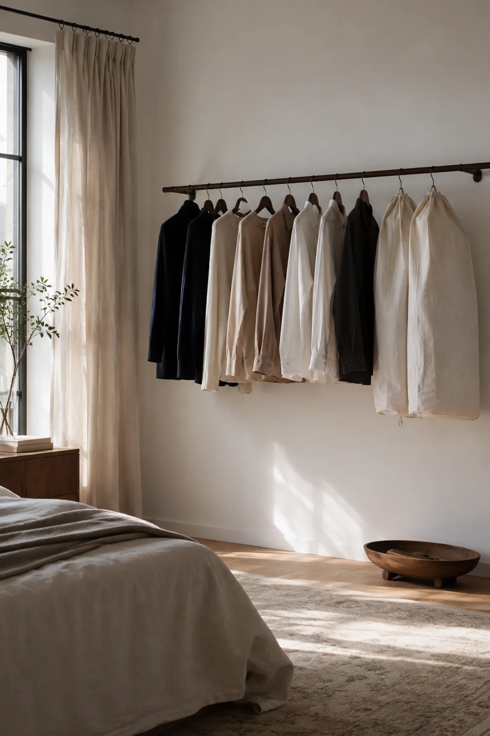
Every beautifully styled open wardrobe has one thing in common that rarely gets mentioned: the gaps. The deliberate spaces between garments, between sections, between a hanging cluster and an empty stretch of rail. These gaps are not accidents or evidence of an unfinished wardrobe. They are a design tool — arguably the most important one — and the decision about where to leave space is as considered as the decision about what to hang.
The tendency, especially when transitioning from a closed wardrobe, is to fill the available rail completely. It feels wrong to leave space when there are clothes to store. But a rail at capacity doesn’t read as full — it reads as overwhelmed. The eye has nowhere to land, nothing to focus on, no sense of hierarchy. Visual calm requires contrast, and contrast in an open wardrobe is created through restraint. Sixty to seventy percent capacity is the practical ceiling for a rail that’s meant to feel curated rather than strained.
Breathable linen garment dust covers placed over off-season or less-frequently-worn pieces serve a dual function here. They protect the garments from light and dust while visually quieting sections of the rail that might otherwise read as too busy. A cluster of covered pieces at one end of the rack creates a soft, uniform zone that gives the eye a place to rest — and directs attention toward the uncovered pieces that are meant to be displayed.
The deeper principle is about understanding that negative space is not wasted space. In interior design, in typography, in visual art — the empty areas are what give the occupied areas meaning. An open wardrobe that practices this discipline doesn’t just look more beautiful. It functions more clearly, because everything visible is visible for a reason. The editing is legible. The intention is readable. And that’s precisely what makes it feel designed rather than merely organized.
6. The Floor Zone: Styling What Lives Beneath the Rack
 Save it
The space directly beneath a clothing rack is one of the most neglected in any open wardrobe setup. Most people either leave it empty — which makes the rack look unanchored, as if it hasn’t fully settled into the room — or fill it with whatever doesn’t fit anywhere else, which undermines every visual decision made above. Neither approach is wrong, exactly, but both miss an opportunity that the floor zone offers quite generously.
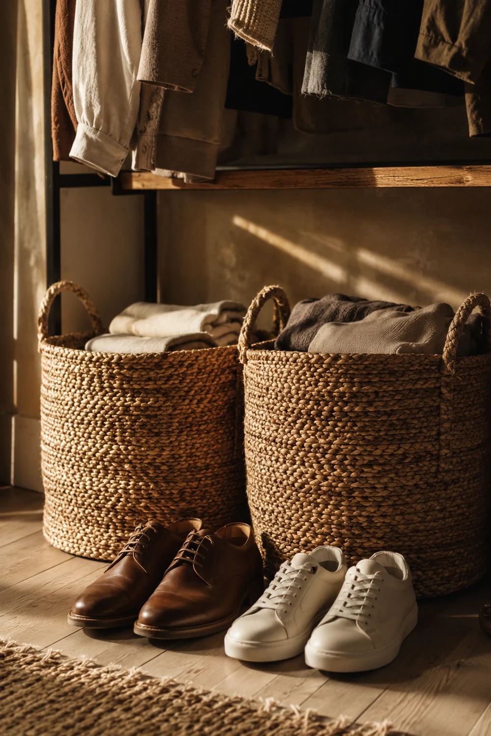
What works best is treating the under-rack zone as a distinct styling layer within the same composition. Shoes can live here, but not as a scattered collection — arranged by height, color, or category, with enough order that they read as intentional. Objects in pairs or sets have an inherent visual logic that single items often lack. Two identical boots facing the same direction look considered. The same boots dropped at different angles look forgotten. The floor zone rewards the same intention given to the rail above it.
Open-weave jute baskets placed on the floor beneath the rack are one of the most effective ways to introduce warmth, texture, and functional storage in the same move. They hold items that don’t photograph well on their own — folded scarves, workout pieces, extra belts — while contributing a material layer that connects the rack to the floor and gives the composition a natural base. The texture of jute reads as grounded, organic, and warm, which counterbalances the harder lines of a metal rack above.
The connection between the floor zone and the broader styling conversation is worth noting for anyone working with a smaller bedroom where multiple storage strategies need to coexist. For those managing a compact footprint, Small Closet Organization Ideas That Actually Work and Look Stunningly Beautiful covers exactly how to layer visible and concealed storage in ways that feel resolved rather than improvised — principles that apply directly to what happens beneath the rail.
7. Accessories in Plain Sight: Bags, Scarves, and Jewelry as Part of the Display
 Save it
Accessories are the part of the wardrobe that most people either hide entirely — tucked into drawers, stuffed into bins — or hang in a way that reads as purely utilitarian: a hook, a hook, another hook. What rarely happens is treating accessories as display objects in their own right. But accessories are, often, the most visually interesting things in a wardrobe. Their materials — leather, silk, beaded surfaces, knotted textures — are what give an open wardrobe its sensory richness when handled thoughtfully.
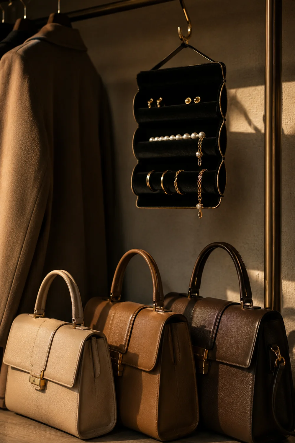
Bags, in particular, have a sculptural quality that earns them a place in the composition. Arranging them on the floor zone or on a low shelf, organized by color or material, creates the effect of a boutique interior — considered, accessible, beautiful in aggregate. Leather pieces benefit from occasional conditioning, which also keeps them looking display-worthy rather than simply stored. A natural leather care and conditioning kit positioned somewhere accessible is both a functional tool and a small signal that the displayed pieces are genuinely cared for.
Scarves and jewelry require a different approach. The best solution for an open wardrobe is a hanging velvet jewelry roll or soft hanging organizer — one that can be draped from the rail or hung from a hook, keeping small pieces accessible and legible without the tangle that drawers inevitably create. Velvet surfaces hold pieces in place and photograph luxuriously, which matters when the goal is a display that looks intentional from a distance.
The broader principle is about consistency of treatment. Accessories displayed as an afterthought undermine the visual logic of a well-arranged rail. But accessories displayed with the same intention as the clothing — grouped, edited, shown off — contribute to the sense that the entire wardrobe was designed as a whole. A marble or stone-effect tray on the nearest surface becomes the landing zone for whatever comes off first at the end of the day, giving everyday habits a beautiful structure.
8. The Shelf Above: Building a Complete Top Layer
 Save it
Most open wardrobes stop at the rail. And for a certain kind of room — spare, rigorously minimal, deliberately edited — that’s enough. But in most bedrooms, a rail alone feels like something was left unfinished. The vertical space above the rack is where the composition can either stay flat or become genuinely layered, and a narrow floating wood shelf positioned above the rail is one of the most effective ways to close that gap.
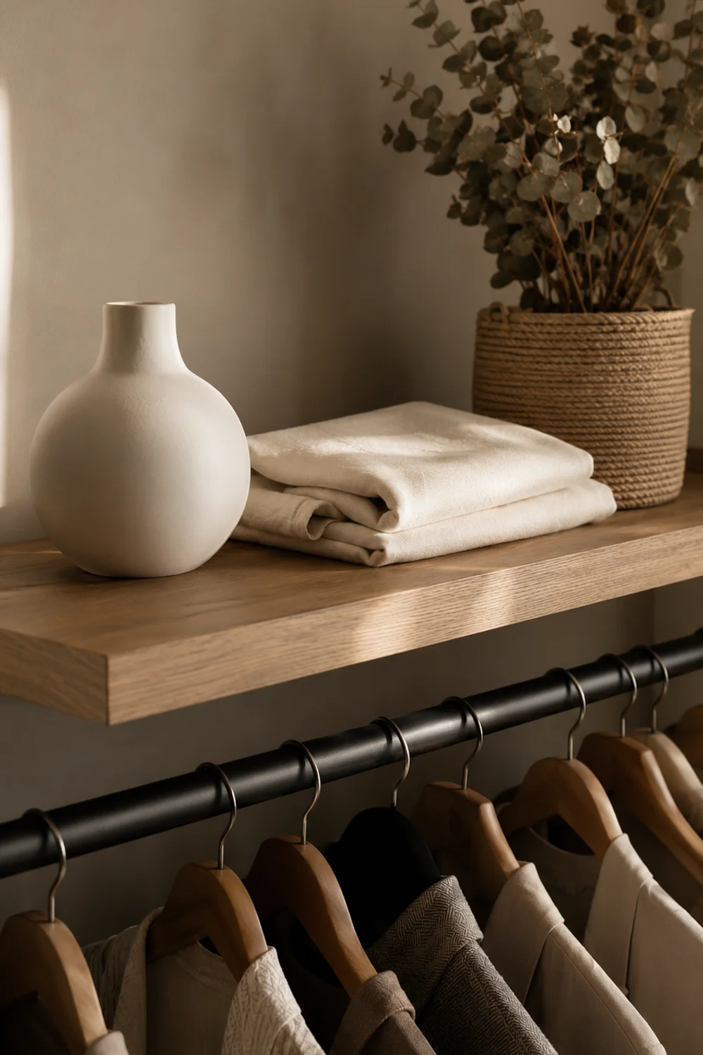
The shelf above the rack serves two distinct functions. The first is practical: it holds the pieces that don’t hang well or belong on the rail — folded knitwear, hats, bags, seasonal accessories. The second is visual: it creates a horizontal plane that anchors the composition to the wall and gives the eye a clear upper boundary. Without it, the rail can feel like it floats in the middle of the wall, disconnected from the architectural context around it.
What goes on this shelf should be edited with the same discipline applied to the rail. The objects that work best here are those that read as clearly as possible from below — things with strong silhouettes, deliberate scale, and material interest. A minimalist ceramic vase or object set introduces a sculptural element that lifts the composition into genuine styling territory. Pair these with a folded textile, a single plant, or a small framed piece and the shelf begins to function like a styled surface — the same logic as a mantlepiece or a sideboard.
The connection between the shelf layer and a broader closet aesthetic is direct. For anyone building out a more complete wardrobe environment — not just a rail but a genuinely styled storage feature — The Best Aesthetic Closet Storage Ideas for Small Bedrooms explores how vertical layering translates across different room scales and closet configurations. The shelf above the rack is where an open wardrobe stops being a clothing rail and starts being a designed object.
9. Lighting the Open Wardrobe: Directed Light, Not Ambient Fill
 Save it
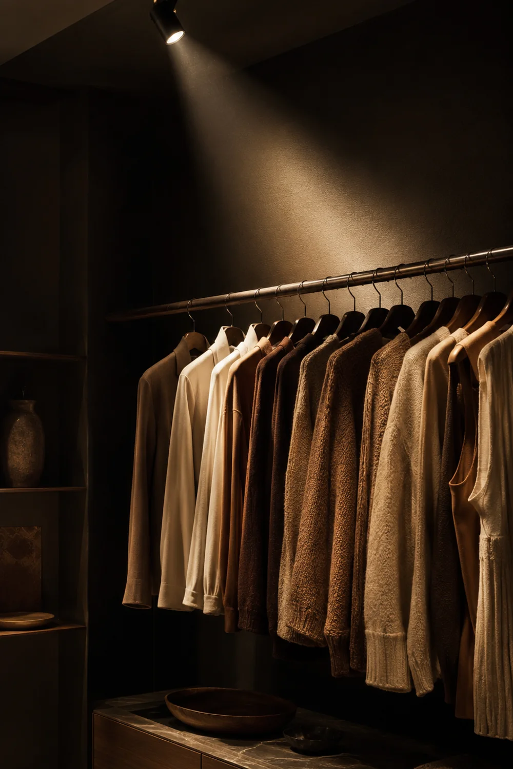
Here’s the part that almost no one gets right, and it’s the part that separates an open wardrobe that looks like a retail installation from one that looks like a storage rack with good lighting nearby. The question isn’t whether to add light near the wardrobe. It’s whether the light source is treating the rack as an object worth illuminating — the way a gallery treats a sculpture or a shop window treats merchandise. The logic is architectural, not atmospheric.
Adjustable picture rail clip spotlights or track-mounted accent fixtures are the correct tool here. They allow precise beam direction, which means you can position a cone of light to graze across the garments from above, casting each piece in sharp relief while leaving the wall behind in relative shadow. This is called accent lighting in architectural terms — light that picks out a specific subject and gives it visual prominence rather than flooding the surrounding space with even illumination. The effect on a clothing rack is immediate: the pieces look considered, displayed, chosen.
The mounting position matters as much as the fixture itself. A spot positioned directly overhead creates flat, downward-facing light that flattens texture and reads as functional rather than designed. The more effective approach is to position the fixture at an angle — offset from the rack by 12 to 18 inches, angled inward at roughly 30 degrees. This raking angle is what creates shadow and depth across folded textures and hanging fabric, making the visual weight of the display legible even from across the room. It’s the same principle applied in commercial window dressing and museum display cases.
The practical reality for most bedrooms is that this requires either a track system installed in the ceiling or a clip-on spotlight attached to a picture rail. Both are low-commitment and fully reversible. Neither requires rewiring. What they require is a conscious decision to light the rack as a feature — not as a corner of the room that needs to be bright enough to see what you own, but as a designed element that deserves the same quality of light you’d give a piece of art.
10. Making It Work in a Small Bedroom Without Visual Overwhelm
 Save it
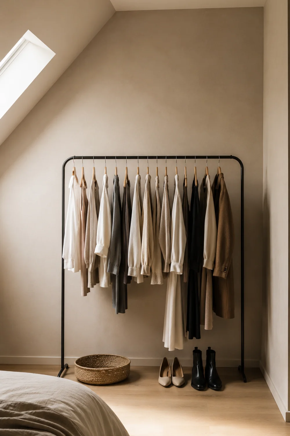
An open wardrobe in a small bedroom is either the best decision you made or the reason the room never feels calm — and the difference comes down almost entirely to scale and placement. The instinct in a small space is to compress everything, to find the smallest rack and the tightest configuration. But compression in an open wardrobe creates visual density, and visual density in a small room creates the feeling of clutter even when nothing is technically out of place.
The more counterintuitive — and more effective — approach is to choose one section of wall and give the wardrobe genuine space to breathe within it. A focused, well-edited rail on a single wall reads better than two cramped configurations competing with each other. This also means the surrounding floor area should stay as clear as possible. The open wardrobe needs visual margin to register as a feature rather than as furniture that couldn’t fit anywhere else. For anyone navigating the specific challenges of a smaller room, Luxury Walk-In Closet Inspiration Ideas You Will Absolutely Love offers a useful perspective on how spatial hierarchy works in storage design — even when the actual scale is considerably more compact.
Color restraint becomes more critical in a small bedroom. A rack holding a range of strong colors, patterns, and competing textures in a limited space will always feel chaotic regardless of how well it’s organized. A tonal palette — neutrals, near-neutrals, or a single restricted color family — keeps the visual weight contained. Paired with a pale or receding backdrop and a single directed light source, even a very modest rack can read as a considered styling decision rather than a space-efficiency measure.
The final tool is what lives below and beside the rack. Keeping the floor zone minimal — one or two baskets rather than a crowded arrangement of shoes and objects — maintains the sense of breathing room that makes small spaces feel livable. Stunning Shoe Storage Ideas for Small Spaces That Look Amazing covers the specific question of footwear in compact rooms, which is often the piece that breaks an otherwise well-edited open wardrobe when it’s not handled with the same discipline as the hanging zone above.
11. Keeping the Open Wardrobe Looking Intentional Every Day
 Save it
The open wardrobe is an honest object. It reflects exactly the state of the habits that surround it — which is both its greatest strength and its most demanding characteristic. A closed wardrobe can absorb disorder invisibly. An open one cannot. This isn’t a flaw in the concept; it’s a structural truth that, once accepted, becomes surprisingly liberating. The wardrobe working as a design feature depends entirely on the daily behaviors that maintain it.
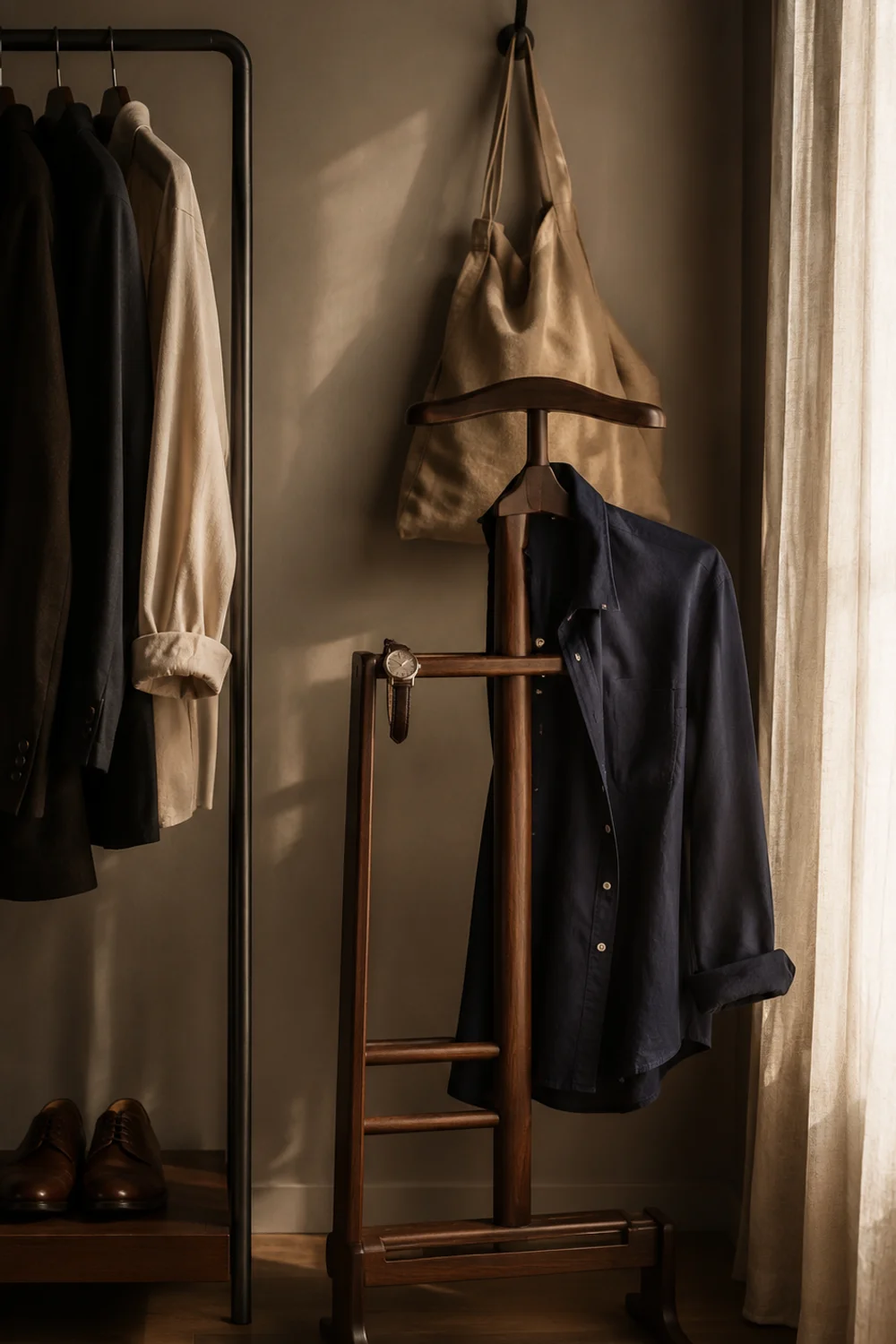
The single most important habit — and the one that requires the least time — is returning garments to their designated zone immediately rather than placing them temporarily on the nearest surface. The tried-on-and-returned shirt is the moment when most open wardrobes begin to unravel. A garment on the chair beside the rack is still functionally in the wardrobe, but visually, it breaks the composition and signals the beginning of entropy. A single hook or small valet stand positioned beside the rack for exactly this purpose — pieces that need to air before going back — contains the problem without eliminating the habit that causes it.
Seasonal rotation is the second pillar. An open wardrobe that tries to hold twelve months of clothing will never achieve the edit required for the display to look curated. Off-season pieces belong in covered storage — under the bed, in a secondary space — or managed with breathable linen dust covers that quiet them visually without removing them entirely. This rotation is also a natural editing moment: pieces that don’t make it back onto the rail after a season rarely need to come back at all.
The broader observation is that the open wardrobe functions as a kind of ongoing commitment to the aesthetic of the room it’s in. For anyone who finds the discipline rewarding — who enjoys the daily ritual of a well-maintained display — it becomes one of the most satisfying design decisions in the home. For those exploring how this storage philosophy connects to a wider bedroom or closet aesthetic, The Most Searched Neutral Closet Aesthetic Ideas Homeowners Are Obsessing Over Right Now maps the visual language that makes open storage feel effortless rather than exposed.
Common Mistakes
1. Filling the rail to capacity immediately
The impulse after acquiring a beautiful clothing rack is to transfer everything from the previous wardrobe directly onto it. This is the mistake that kills the concept before it has a chance to work. An open wardrobe at full capacity reads as overcrowded, not organized. The display logic requires editing first — only the pieces you wear regularly, the ones you genuinely love, and the ones that contribute to a cohesive visual palette belong on the rail. Everything else needs a secondary storage solution. The editing process is not optional; it is the foundation of the entire system.
2. Using mismatched hangers
This is the detail that most visibly signals whether an open wardrobe is curated or simply unconcealed. Mismatched hangers — plastic, wire, velvet, and wood all mixed together — fragment the visual rhythm of the rail and make even beautifully chosen garments look chaotic. Uniform wooden hangers with consistent hook finishes create the visual regularity that allows the clothes themselves to become the focus. This is one of the lowest-cost, highest-impact changes available and one of the most frequently skipped.
3. Ignoring the wall behind the rack
In the early setup phase, most people focus entirely on the rail and the garments on it, treating the wall behind as a neutral non-factor. But the backdrop is part of the composition. A scuffed, unpainted, or visually inconsistent wall behind an open wardrobe undermines every other design decision made in the space. Painting it a distinct tone, adding a textile panel, or even applying a removable wallpaper section transforms the entire register of the display. The wall is not background — it’s part of the picture.
4. Neglecting the floor zone
Leaving the space beneath the rack completely empty creates an open wardrobe that looks visually unanchored, as if the rack landed in the room by accident. Filling it randomly with whatever doesn’t fit elsewhere creates visual disorder that contradicts the curation above. The floor zone needs to be styled with the same intentionality as the rail — which usually means a small number of considered objects: two or three baskets, a curated shoe display, or a simple textile element that grounds the composition.
5. Using lighting that serves the room rather than the rack
General overhead lighting treats the clothing rack as one object among many in a room rather than as the designed feature it’s meant to be. Directed spot lighting — angled from above or slightly to the side — is what gives the rack genuine visual prominence and makes the garments read with depth and texture. This is the detail that consistently separates open wardrobes that look styled from those that look functional.
Frequently Asked Questions
How many garments should hang on an open clothing rack?
The practical limit is around 60–70% of the rail’s total capacity. This isn’t a rigid number — it’s a visual principle. A rail that looks full to the eye reads as overcrowded, and overcrowding collapses the display logic that makes an open wardrobe work. The goal is for individual garments to be legible from across the room: their color, silhouette, and material should all be readable at a glance. When garments are compressed tightly against each other, they stop reading as individual pieces and start reading as mass — which is the opposite of curation. Start with less than you think is right and adjust from there.
Does an open closet work in a shared bedroom?
Yes, but it requires agreement on a few baseline principles. The most important is palette — if one person gravitates toward bold color and the other toward neutrals, a shared rail will read as visually inconsistent regardless of how well each individual section is maintained. The practical solution is either two separate racks positioned symmetrically or a single rail divided clearly into two zones by color or hanger type. The second requirement is shared editing discipline: the open wardrobe only functions as a display feature if both contributors maintain the same standard of return and rotation. When that agreement exists, a shared open wardrobe can function beautifully.
What do you do with clothes that aren’t display-worthy?
This is the most honest question about open wardrobes, and the answer is straightforward: they live elsewhere. Gym wear, worn-in basics, heavily used casual pieces, and off-season clothing all belong in secondary storage — under-bed drawers, a secondary wardrobe, breathable bags, or covered sections of the same rail. The open wardrobe is a display, which means only display-worthy pieces belong on it. This isn’t an aesthetic choice so much as a functional one: the system only works when the visible zone holds only what you’ve consciously chosen to show.
Can an open closet work without dedicated wardrobe lighting?
Technically, yes — but the effect will be noticeably flatter. Bedroom ambient lighting is rarely positioned in a way that gives a clothing rack genuine visual prominence. Without a directed light source aimed at the display, the garments tend to recede into the room rather than being picked out as a feature. If dedicated track or spot lighting isn’t feasible immediately, positioning the rack near a natural light source — a window wall or opposite a window — is the most accessible alternative. The goal is a light source that hits the rack at an angle, creating enough shadow and depth that the display reads with dimension.
Final Thoughts
The open closet is one of those ideas that looks complicated but is, at its core, about a single shift in thinking: treating what you own as something worth displaying rather than something worth concealing. That shift changes every decision downstream — what goes on the rail, how it’s arranged, what the wall behind it looks like, how the floor zone is handled, how the light falls across it in the morning. Everything follows from the first decision to take the display seriously.
What makes this approach genuinely rewarding over time is that it creates a feedback loop with your own wardrobe. When clothing is visible, you use it more intentionally. When a piece stops earning its place on the rail, you notice sooner. The open wardrobe makes the editing process continuous rather than seasonal, which tends to mean that over time, the wardrobe itself becomes more coherent — not through dramatic decluttering but through the quiet daily habit of displaying only what belongs.
Start with one wall, one rack, and a commitment to filling it at sixty percent. Add the shelf above and style it the way you’d style any other surface in your home. Direct a single light source toward the rail and notice what it does. The transformation is rarely dramatic all at once — but it tends to be one of those changes that makes the room feel more like a choice than a circumstance.
This post contains affiliate links. I may earn a small commission at no extra cost to you.

Get cozy inspiration delivered to your inbox.
✓ 14-page beautifully designed ebook
✓ Cozy decorating ideas
✓ Practical room-by-room inspiration
You’re in! 🎉
Thanks for joining the NestFlowHome community!
Your free ebook is already on its way to your inbox. If you don’t see it within a few minutes, please check your Promotions or Spam folder.
Join the NestFlowHome community for weekly decorating inspiration.

Timeless home decor ideas and slow living inspiration for a calm, beautiful life.