The Secret to Beautiful Yet Functional Kitchen Counter Decor
By Emily | January 5, 2026
There’s a version of your kitchen counter that exists only in your head — the one that looks like it belongs in an architecture magazine, where every object seems deliberately placed and nothing feels out of order. Then there’s the actual counter: the one with the mail, the random charger, the fruit bowl that’s become a catch-all, and the three appliances you keep meaning to find a better home for. The gap between those two versions isn’t a matter of budget or square footage. It’s a matter of understanding one principle that most home décor advice completely skips over: a beautiful counter isn’t decorated — it’s edited.
Decorating a kitchen counter is one of those tasks that sounds simple until you’re standing in front of it with a candle, a cutting board, and a vague sense that something isn’t working. The problem is that most people approach the counter as a display surface — something to style — rather than a functional zone that happens to also be visible. When function comes first and aesthetics follow, the result is a counter that looks intentional because it is intentional. When it’s the other way around, you end up with something that photographs beautifully for exactly one day before the chaos reclaims it.
This article is for anyone who has tried to “style” their counter and felt like they were missing something. For anyone who loves the look of a clean, curated kitchen but doesn’t want to sacrifice the functionality that makes cooking actually enjoyable. For anyone who has pinned hundreds of kitchen inspiration images and still can’t figure out why their own counter never quite gets there.
What you’ll find here is a practical, editorial approach to counter décor — grounded in real design principles, tailored to both farmhouse and minimalist aesthetics, and honest about what actually works in a kitchen that gets used every day. By the end, you’ll know exactly what belongs on your counter, how to arrange it, and — just as importantly — what needs to go.
Understand the "Rule of Three" to Style Your Counter Like a Designer
 Save it
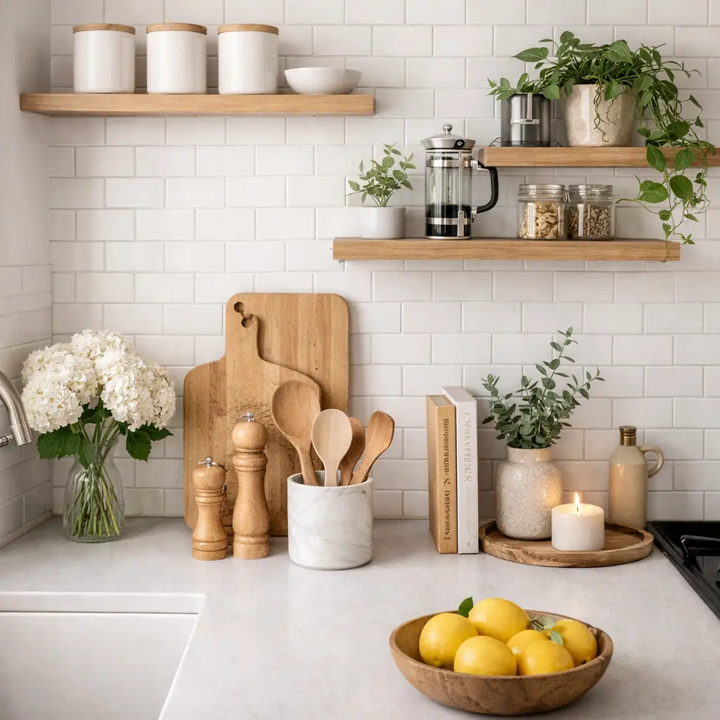
Walk into any beautifully styled kitchen and look closely at the counter. You’ll almost never see a single object standing alone, and you’ll almost never see more than three objects grouped together in one visual cluster. This is the rule of three — one of the oldest and most reliable principles in visual design — and it works in kitchens for the same reason it works in art, photography, and window displays: odd numbers create natural tension and visual interest in a way that even groupings simply don’t. The rule isn’t about having exactly three things on the counter. It’s about grouping objects in threes when you create a styled vignette, and leaving deliberate negative space between clusters. One tall element, one medium, one low — or one object with texture, one with color, one with natural material. The variation in height and material is what creates the sense of a “composed” arrangement rather than a random pile.
In a farmhouse kitchen, this translates beautifully into a grouping of a tall ceramic crock holding wooden utensils, a medium-height bread box in weathered wood, and a small potted herb — something living that anchors the arrangement in the natural world. In a minimalist kitchen, the same principle applies with restraint: a sleek pour-over coffee setup, a single low bowl of fruit, and a clean-lined oil bottle. Different aesthetics, same underlying logic.
Where most people go wrong is treating every inch of counter as a canvas. The rule of three only works when the space around the grouping is allowed to breathe. That negative space — the clean stretch of counter on either side of the arrangement — is not emptiness. It’s the visual equivalent of silence in music: it gives the composed elements their weight and presence. Without it, even a perfectly styled grouping disappears into visual noise.
A beautiful farmhouse-style utensil crock in matte ceramic is one of the most versatile anchors for this kind of arrangement — tall enough to anchor the grouping, textured enough to add warmth, and functional enough to justify its counter space completely
Choose Counter Décor That Earns Its Place Every Single Day
 Save it
The single most important question to ask about any object on your counter is this: does it earn its space? Not in a sentimental way, and not in a purely aesthetic way — but in a practical, daily-use way. If you wouldn’t reach for it at least once every two or three days, it belongs somewhere else. The counter is prime real estate in the most-used room of your home. Every object that occupies it should pay rent in function, not just look.
This is where the concept of “beautiful utility” becomes the guiding principle for counter styling. The most effective counter arrangements are made entirely of objects that are both used regularly and worth looking at. A quality olive oil bottle with a clean pour spout. A wooden cutting board that comes out every morning. A canister set that holds coffee, tea, and sugar — opened daily. These aren’t décor items that happen to be functional. They’re functional items that happen to be beautiful, and that distinction is everything.
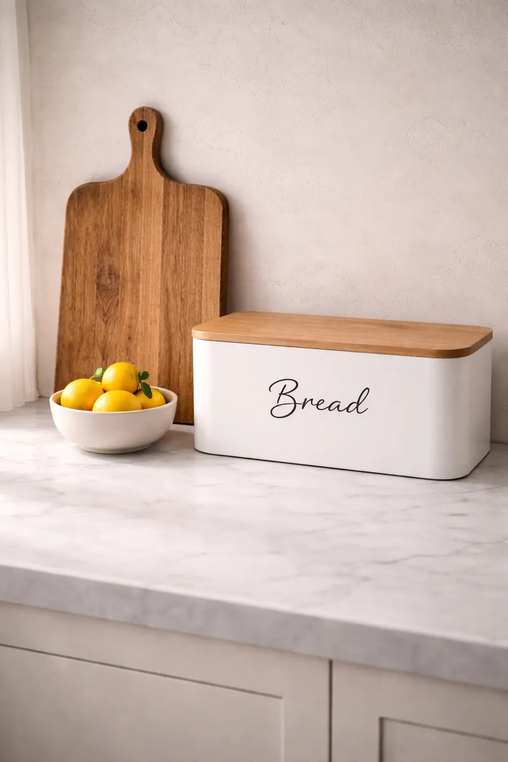
The farmhouse aesthetic handles this balance particularly well, because the style itself is rooted in working kitchens where beauty and function were never separated. A bread box in aged wood or painted metal keeps bread fresh, clears the counter of bags and packaging, and contributes a warm, grounded presence to the space. It doesn’t pretend to be decorative — it simply is both things at once.
In a minimalist kitchen, the same principle applies with even stricter editing. Every object needs to justify itself twice: once for function, once for form. A matte black soap dispenser that matches the faucet. A single, beautiful bowl that holds fruit. Nothing that requires explaining, nothing that was placed “just because.”
Layer Texture and Material to Make Your Counter Feel Designed
 Save it
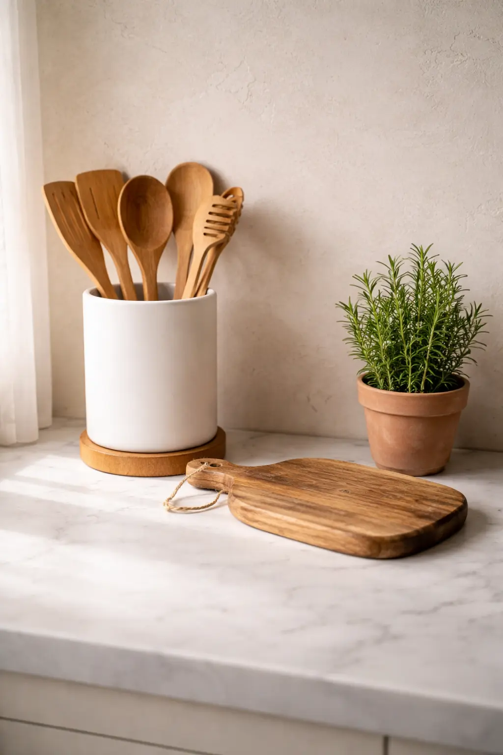
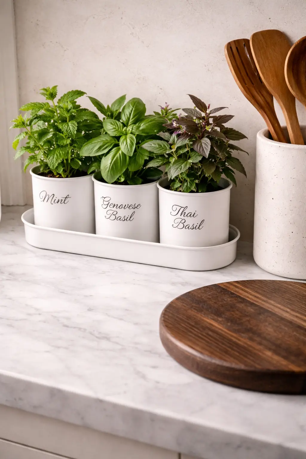
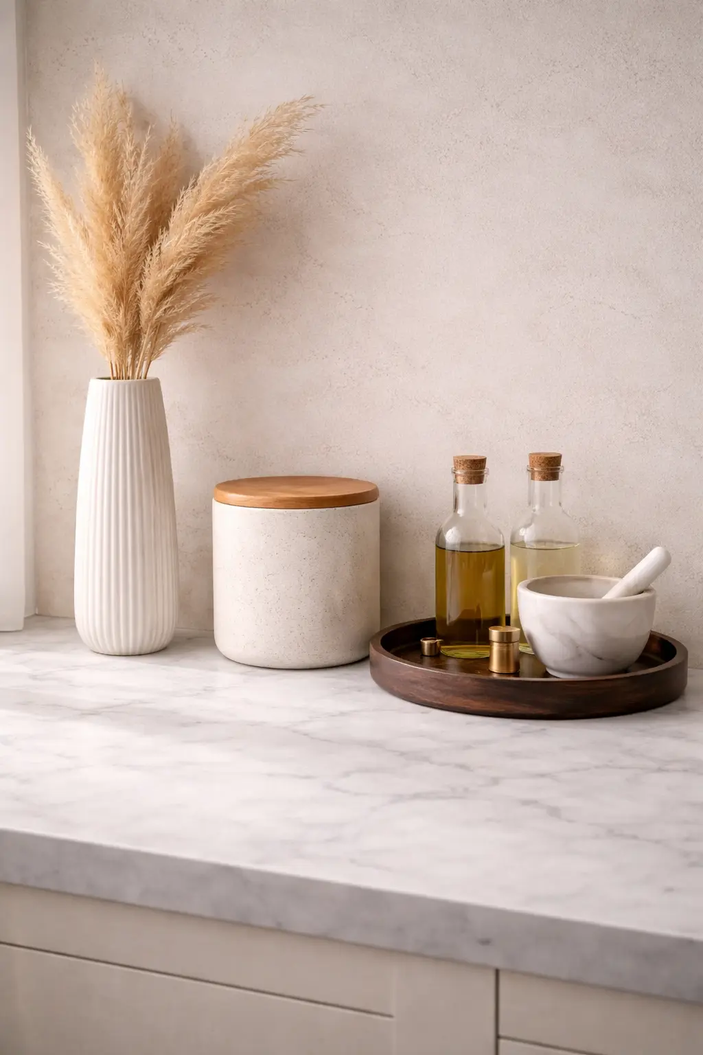
One of the most reliable ways to tell a styled counter from a random collection of objects is the intentional layering of texture and material. A counter where everything is the same material — all ceramic, all stainless steel, all wood — feels flat, even if each individual piece is beautiful. A counter where different materials are thoughtfully combined creates depth, warmth, and that elusive quality designers call “visual interest.” The rule is straightforward: aim for at least three different material families in any counter arrangement. In a farmhouse kitchen, this might look like natural wood (a cutting board or trivet), matte ceramic (a crock or canister), and something living (an herb in a terracotta pot). The combination of rough, smooth, and organic creates a layering that feels collected over time rather than assembled in an afternoon.
In a minimalist kitchen, the material palette narrows but the principle holds. Concrete or stone (a trivet or small tray), brushed metal (a faucet or dispenser), and one natural element (a single plant or a linen cloth folded neatly on the counter’s edge) create the quiet, textured restraint that defines the style. The fewer objects there are, the more each material needs to do.
What to avoid is matching everything. A counter where the canisters, the utensil holder, and the soap dispenser are all identical in material and finish looks like a catalog page, not a lived-in kitchen. Cohesion comes from a consistent color palette, not from identical materials. Within that palette, let the textures breathe and differ.
A handmade-style metal herb planter brings the organic, living texture that no other material can replicate — and in both farmhouse and minimalist counters, a small plant is often the single element that makes an arrangement feel genuinely alive rather than arranged.
Create Visual Height to Stop Your Counter from Looking Flat
 Save it
A common mistake in kitchen counter styling — and one that’s rarely named explicitly — is treating the counter as a purely horizontal plane. Everything sits at the same height: the canisters, the fruit bowl, the utensil holder, all roughly the same level. The result is a counter that looks tidy at best, but never truly designed. What separates a curated counter from a cleared counter is the deliberate use of vertical variation — objects at different heights that create a visual rhythm the eye wants to follow.
Think of it as a skyline. A great city skyline is interesting because of the variation in height — the way tall buildings give way to shorter ones, and how the transitions create movement. A counter arrangement works the same way. One tall element (a utensil crock, a tall bottle, a vase with dried stems), one medium element (a canister, a small appliance, a bread box), and one low element (a small tray, a flat cutting board, a low bowl) creates a composition that has genuine visual lift.
In a farmhouse kitchen, height variation comes naturally from the style’s embrace of collected, mismatched pieces. A tall mason jar with dried flowers, a medium-height enamel canister, a low wooden tray — each at a different level, each in a different material, together creating a tableau that feels genuinely gathered rather than purchased as a set. In a minimalist kitchen, height variation requires more deliberate restraint. The tall element should be the most architecturally interesting: a sculptural bottle, a single tall vase with one stem, or a sleek pour-over coffee stand. The lower elements should have strong horizontal presence — a wide, flat tray that anchors everything, or a cutting board laid flat as a base layer for the arrangement.
A tall, minimalist ceramic white vase with dried pampas adds vertical lift without clutter — and dried botanicals require no maintenance, no water, and no replacing, making them the most low-friction source of organic height in a styled counter arrangement.
Style Your Counter Around a Focal Point, Not a Collection
 Save it
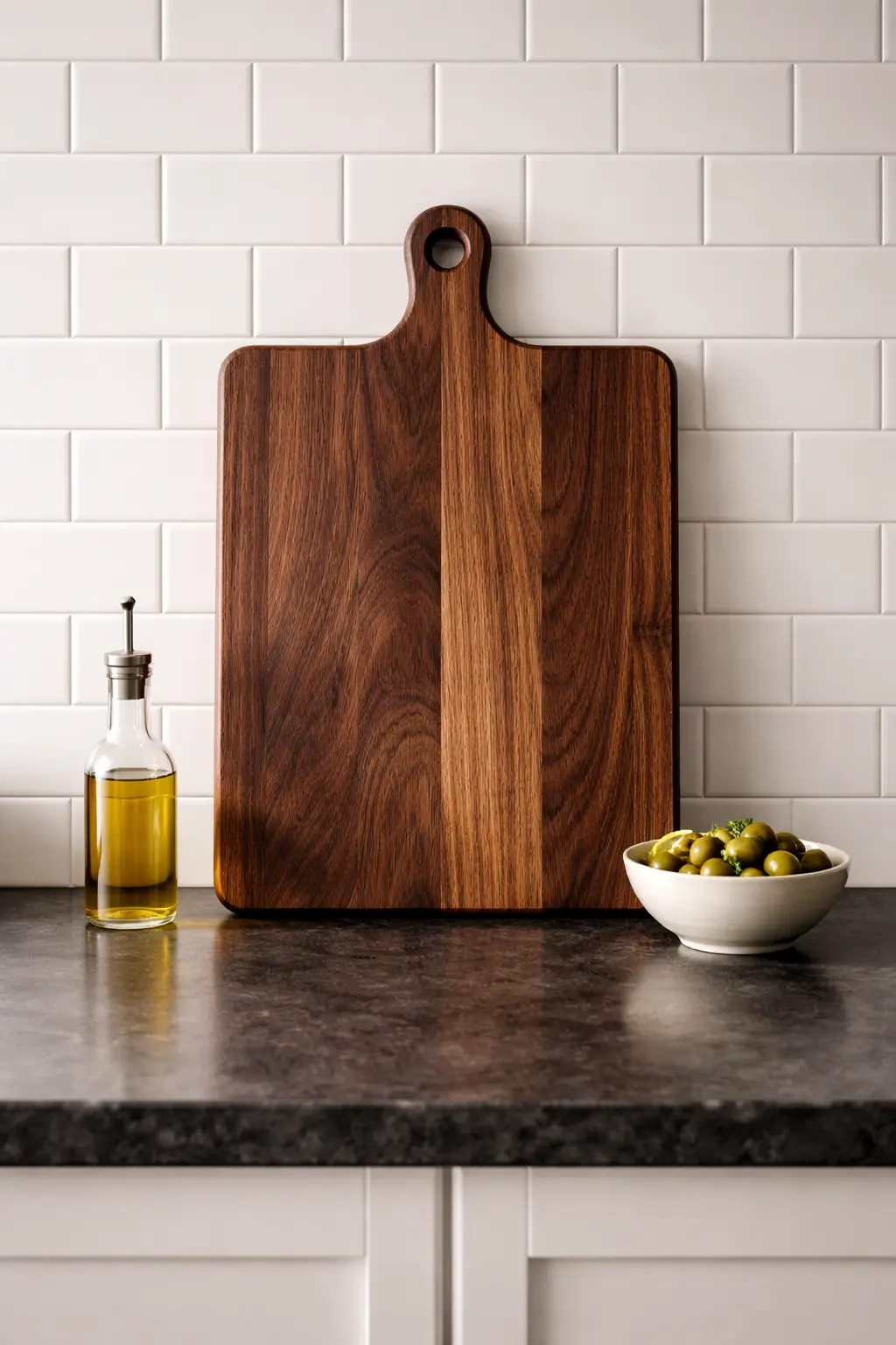
One of the most overlooked principles in counter styling is the idea of a focal point — a single dominant element that the rest of the arrangement is built around, rather than a collection of equally weighted objects competing for attention. When everything on a counter has the same visual weight, the eye doesn’t know where to rest, and the overall impression is one of busyness, even if each individual object is beautiful. A focal point doesn’t have to be large. It needs to be visually dominant — either through height, through contrast, or through material distinction. In a farmhouse kitchen, the focal point might be a large, beautiful wooden cutting board propped against the backsplash like a piece of art. In a minimalist kitchen, it could be a single sculptural object — a perfectly shaped ceramic bowl, a statement coffee maker in matte black, or a striking plant in an architectural pot.
Everything else in the arrangement should defer to the focal point. Smaller, quieter, lower — supporting characters rather than leads. This is the principle that makes the difference between a counter that feels “done” and one that feels like a work in progress. When you can look at a counter and immediately identify what the eye is meant to land on first, the arrangement has succeeded.
The internal logic of this principle also makes the counter easier to maintain. When there’s a clear focal point, it’s much easier to decide what belongs and what doesn’t — because the question becomes “does this support the focal point or compete with it?” rather than the much harder “does this look good here?”
For a kitchen that gets used every day and links beautifully to a wider approach to counter organization — which I go into in detail in How to Create a Clutter-Free Kitchen You Actually Enjoy — a large, end-grain hardwood cutting board is one of the most versatile focal points available: functional daily, beautiful when propped against the wall, and a genuine investment piece that improves with age and use.
Use a Tray to Anchor Your Counter and Create Instant Intention
 Save it
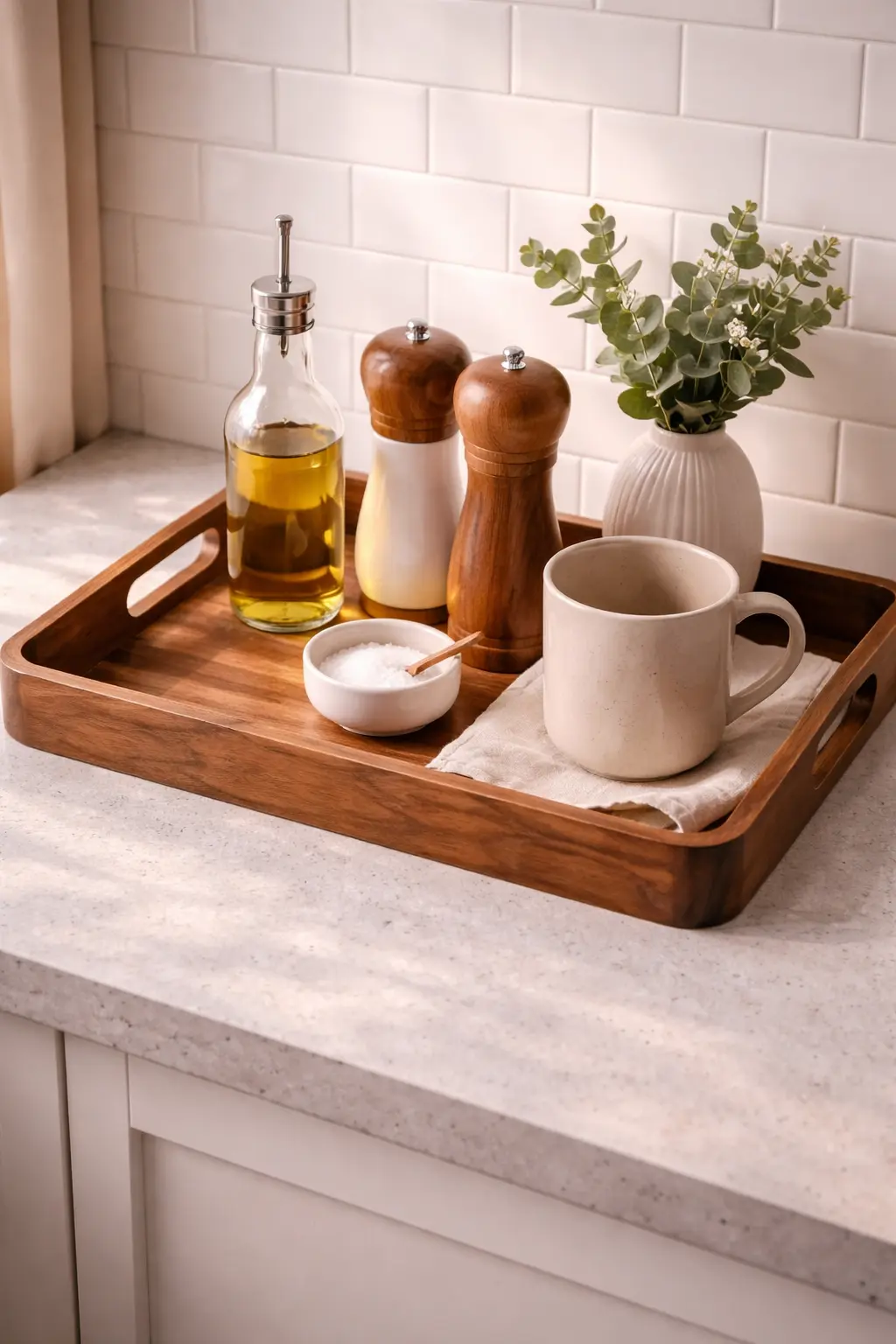
There is one single purchase that improves counter styling more reliably than almost anything else — and it’s not a canister set, a new plant, or a statement piece. It’s a tray. Not because trays are inherently beautiful, though many are, but because of what they do to the visual logic of a counter arrangement. A tray creates an implicit boundary: everything inside it belongs together, and everything outside it has its own space. That simple act of containment transforms a loose collection of objects into a deliberate vignette. The psychology behind this is straightforward. When objects sit directly on the counter, the eye reads them as separate and potentially random — even if each one was consciously placed. When the same objects sit on a tray, the eye reads them as a group: intentional, composed, considered. The tray is a frame, and frames change everything.
What makes a tray genuinely powerful as a styling tool is its ability to create a “room within a room” on the counter. Think of the counter as a stage and the tray as a smaller stage within it — one with its own rules, its own atmosphere, its own visual logic. You can change the objects on the tray seasonally without touching anything else on the counter, and the whole arrangement feels refreshed. You can lift the tray entirely to wipe the counter beneath it. You can move it from counter to table for a dinner party and back again without disrupting the kitchen’s overall composition.
A solid acacia wood tray with handles brings exactly the kind of warm, natural material presence that elevates objects placed on it. The wood grain adds texture, the handles give it a purposeful, functional quality, and the anti-skid base means it stays exactly where you put it. On a counter, it works as a defined zone for a soap dispenser, a small plant, and a candle — three objects that might otherwise drift across the surface independently, but together on the tray become a composed moment.
This kind of tray also bridges the gap between styled and lived-in, which is the quality that separates a counter that photographs well from one that actually feels good every day. It doesn’t demand matching accessories or a perfectly curated collection. It simply gathers what’s near it and makes it look considered — and that quality, once you experience it, makes going back to a tray-free counter feel surprisingly incomplete.
Display Your Oils and Vinegars Like a Considered Collection

 Save it
Most people store their cooking oils and vinegars inside a cabinet — which is perfectly practical, but represents a missed opportunity. A small, well-chosen collection of quality bottles displayed on the counter does something that almost no other object can: it signals that this kitchen is used by someone who cooks with intention. It’s the culinary equivalent of a bookshelf — a visible expression of the kind of cooking that happens here, and a genuinely beautiful one when handled well. The key word is “collection.” A single bottle of olive oil sitting alone on the counter can look abandoned. Three bottles of different heights — an olive oil, a balsamic vinegar, a finishing oil or infused vinegar — arranged with deliberate spacing, look curated. The variation in height, label color, and liquid color (golden, amber, dark brown) creates exactly the kind of material and tonal contrast that makes a counter arrangement feel designed.
This display works in both a farmhouse kitchen and a modern one, but the execution differs. In a farmhouse-style space, dark-labeled Italian or Spanish bottles with cork stoppers feel entirely at home — especially grouped on a small wooden board or tray to define the zone. In a more contemporary kitchen, clean-label, minimal-design bottles in similar shapes create a more architectural, gallery-like arrangement.
What makes this approach genuinely practical is the daily accessibility it creates. When your best olive oil is on the counter and visible, you use it more — and that changes how you cook. There’s a reason restaurant kitchens always have oils and acids within arm’s reach: proximity changes behavior, and in this case, the behavior it changes is cooking better, more instinctively, with less friction.
A sleek, non-drip olive oil dispenser bottle with a brushed metal pour spout brings the counter display to the next level — refillable from a larger bottle stored in the cabinet, it keeps the counter version small, clean, and beautiful without sacrificing the practicality of buying in bulk.
Common Mistakes to Avoid
1. Too Many Small Decorative Items
Small objects add up quickly. A tiny bowl, a figurine, a candle, a sign – and the visual unity falls apart. The eye can’t rest. Choose fewer, more impactful pieces instead.
2.Sacrificing Function for Aesthetics
If you have to move decorations every time you cook, your system isn’t working. The kitchen counter is first and foremost a functional surface. If you sacrifice that for looks, frustration will follow.
3.Mixing Styles Without a Concept
Everything can be beautiful on its own. But together, they may not harmonize. If your kitchen is modern, an overly rustic element may feel out of place – unless you’re using it as a deliberate contrast. Concept is key.
4.Leaving Every Tool Out “Just in Case”
The “what if I need it” mindset quickly leads to clutter. If you don’t use it daily, it can go in a cabinet. Editing isn’t loss – it’s freedom.
FAQ
How many items should I have on my kitchen counter?
There’s no universal number, but a useful guideline is this: if you can’t name a daily function for each object, it’s probably one too many. For most counters, three to seven items — depending on the counter’s length — is the sweet spot between styled and sparse. The goal isn’t a specific count. It’s the feeling that everything there is there for a reason.
How do I make my kitchen counter look expensive without spending a lot?
Editing is free. Removing five things costs nothing and immediately makes a counter look more intentional and elevated. After that, the highest-impact investment is one quality focal point piece — a beautiful cutting board, a well-made ceramic canister set, or a statement tray. One great piece surrounded by breathing room reads as expensive every time.
Should my counter décor match my kitchen cabinets?
It doesn’t need to match — but it should harmonize. If your cabinets are dark, lighter counter objects create contrast and visual lift. If your cabinets are white or light, warmer materials (wood, terracotta, aged brass) add warmth and prevent the space from feeling clinical. The goal is balance, not coordination.
How do I keep my counter looking styled when I’m actually cooking?
The answer is in the editing. A counter with few, intentional objects is easy to reset after cooking — a quick wipe-down and everything returns to its place in seconds. The more objects there are, the harder and more time-consuming the reset. A styled counter should be recoverable in under a minute. If it isn’t, there’s too much on it.
Closing Thoughts
A beautiful kitchen counter isn’t the result of buying the right things. It’s the result of making the right decisions — about what stays, what goes, what earns its place, and what the space is actually for. The principles in this article aren’t complicated, but they require a different kind of attention than most decorating advice asks for: not “what can I add?” but “what can I remove?” Not “what looks good?” but “what works every day and happens to look good while doing it?”
Start with one corner. Apply the rule of three. Bring in one material contrast. Choose a focal point. Put everything else away. Then stand back and notice how different the space feels — not because you added something, but because you finally stopped adding, and let the counter become what it was always capable of being.
That’s the secret. It was never about the décor.
This post contains affiliate links. I may earn a small commission at no extra cost to you.